Quantcast
Channel: PSD2WordPress
Viewing all 163 articles
Browse latest View live

WordPress Notifications Made Easy

$
0
0

WordPress Notifications Made Easy

WordPress Notifications Made Easy

Jakub Mikita

WordPress doesn’t offer any kind of notification system. All you can use is the wp_mail() function, but all of the settings have to be hardcoded, or else you have to create a separate settings screen to allow the user tweak the options. It takes many hours to write a system that is reliable, configurable and easy to use. But not anymore. I’ll show you how to create your own notification system within minutes with the free Notification plugin. By notification, I mean any kind of notification. Most of the time, it will be email, but with the plugin we’ll be using, you can also send webhooks and other kinds of notifications.

While creating a project for one of my clients, I encountered this problem I’ve described. The requirement was to have multiple custom email alerts with configurable content. Instead of hardcoding each and every alert, I decided to build a system. I wanted it to be very flexible, and the aim was to be able to code new scenarios as quickly as possible.

The code I wrote was the start of a great development journey. It turned out that the system I created was flexible enough that it could work as a separate package. This is how the Notification plugin was born.

Suppose you want to send an email about a user profile being updated by one of your website’s members. WordPress doesn’t provide that functionality, but with the Notification plugin, you can create such an email in minutes. Or suppose you want to synchronize your WooCommerce products with third-party software by sending a webhook to a separate URL every time a new product is published. That’s easy to do with the plugin, too.

Lessons Learned While Developing WordPress Plugins

Good plugin development and support lead to more downloads. More downloads mean more money and a better reputation. Learn how you can develop good-quality products with seven golden rules. Read more →

In this article, you’ll learn how to integrate the plugin in your own application and how to create an advanced WordPress notification system more quickly and easily than ever.

In this article, we’ll cover:

  1. how to install the plugin,
  2. the idea behind the plugin and its architecture,
  3. creating a custom scenario for notifications,
  4. creating the action (step 1 of the process),
  5. creating the trigger (step 2 of the process),
  6. creating the custom notification type,
  7. how to enable white-label mode and bundle the plugin in your package.

Installing The Plugin

To create your own scenarios, you are going to need the Notification plugin. Just install it from the WordPress.org repository in your WordPress dashboard, or download it from the GitHub repository.

Large preview

Later in the article, you’ll learn how to hide this plugin from your clients and make it work as an integrated part of your plugin or theme.

The Idea Of The Plugin

Before going into your code editor, you’ll need to know what the plugin’s architecture looks like. The plugin contains many various components, but its core is really a few abstract classes.

The main components are:

  • The notification
    This could be an email, webhook, push notification or SMS.
  • The trigger
    This is what sends the notification. It’s effectively the WordPress action.
  • The merge tag
    This is a small portion of the dynamic content, like {post_title}.

To give you a better idea of how it all plays together, you can watch this short video:

The core of the Notification plugin is really just an API. All of the default triggers, like Post published and User registered are things built on top of that API.

Because the plugin was created for developers, adding your own triggers is very easy. All that’s required is a WordPress action, which is just a single line of code and a class declaration.

Custom Scenario

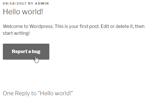
Let’s devise a simple scenario. We’ll add a text area and button to the bottom of each post, allowing bugs in the article to be reported. Then, we’ll trigger the notification upon submission of the form.

This scenario was covered in another article, “Submitting Forms Without Reloading the Page: AJAX Implementation in WordPress”.

For simplicity, let’s make it a static form, but there’s no problem putting the action in an AJAX handler, instead of in the wp_mail() function.

Let’s create the form.

The Form

add_filter( 'the_content', 'report_a_bug_form' ); function report_a_bug_form( $  content ) {      // Display the form only on posts.     if ( ! is_single() ) {         return $  content;     }      // Add the form to the bottom of the content.     $  content .= '<form action="' . admin_url( 'admin-post.php' ) . '" method="POST">         <input type="hidden" name="post_id" value="' . get_ID() . '">         <input type="hidden" name="action" value="report_a_bug">         <textarea name="message" placeholder="' . __( 'Describe what\'s wrong...', 'reportabug' ) . '"></textarea>         <button>' . __( 'Report a bug', 'reportabug' ) . '</button>     </div>';      return $  content;  } 

Please note that many components are missing, like WordPress nonces, error-handling and display of the action’s result, but these are not the subject of this article. To better understand how to handle these actions, please read the article mentioned above.

Preparing The Action

To trigger the notification, we are going to need just a single action. This doesn’t have to be a custom action like the one below. You can use any of the actions already registered in WordPress core or another plugin.

The Form Handler And Action

add_action( 'admin_post_report_a_bug', 'report_a_bug_handler' ); add_action( 'admin_post_nopriv_report_a_bug', 'report_a_bug_handler' ); function report_a_bug_handler() {      do_action( 'report_a_bug', $  _POST['post_id'], $  _POST['message'] );      // Redirect back to the article.     wp_safe_redirect( get_permalink( $  _POST['post_id'] ) );     exit;  } 

You can read more on how to use the admin-post.php file in the WordPress Codex.

This is all we need to create a custom, configurable notification. Let’s create the trigger.

Registering The Custom Trigger

The trigger is just a simple class that extends the abstract trigger. The abstract class does all of the work for you. It puts the trigger in the list, and it handles the notifications and merge tags.

Let’s start with the trigger declaration.

Minimal Trigger Definition

class ReportBug extends \BracketSpace\Notification\Abstracts\Trigger {      public function __construct() {          // Add slug and the title.         parent::__construct(             'reportabug',             __( 'Bug report sent', 'reportabug' )         );          // Hook to the action.         $  this->add_action( 'report_a_bug', 10, 2 );      }      public function merge_tags() {}  } 

All you need to do is call the parent constructor and pass the trigger slug and nice name.

Then, we can hook into our custom action. The add_action method is very similar to the add_action() function; so, the second parameter is the priority, and the last one is the number of arguments. Only the callback parameter is missing because the abstract class does that for us.

Having the class, we can register it as our new trigger.

register_trigger( new ReportBug() ); 

This is now a fully working trigger. You can select it from the list when composing a new notification.

(Large preview)

Although the trigger is working and we can already send the notification we want, it’s not very useful. We don’t have any way to show the recipient which post has a bug and what the message is.

This would be the time, then, to register some merge tags and set up the trigger context with the action parameters we have: the post ID and the message.

To do this, we can add another method to the trigger class. This is the action callback, where we can catch the action arguments.

Handling Action Arguments

public function action( $  post_ID, $  message ) {      // If the message is empty, don't send any notifications.     if ( empty( $  message ) ) {         return false;     }      // Set the trigger properties.     $  this->post    = get_post( $  post_ID );     $  this->message = $  message;  } 

Note the return false; statement. If you return false from this method, the trigger will be stopped, and no notification will be sent. In our case, we don’t want a notification to be submitted with an empty message. In the real world, you’d want to validate that before the form is sent.

Then, we just set the trigger class’ properties, the complete post object and the message. Now, we can use them to add some merge tags to our trigger. We can just fill the content of the merge_tags method we declared earlier.

Defining Merge Tags

public function merge_tags() {      $  this->add_merge_tag( new \BracketSpace\Notification\Defaults\MergeTag\UrlTag( array(         'slug'        => 'post_url',         'name'        => __( 'Post URL', 'reportabug' ),         'resolver'    => function( $  trigger ) {             return get_permalink( $  trigger->post->ID );         },     ) ) );      $  this->add_merge_tag( new \BracketSpace\Notification\Defaults\MergeTag\StringTag( array(         'slug'        => 'post_title',         'name'        => __( 'Post title', 'reportabug' ),         'resolver'    => function( $  trigger ) {             return $  trigger->post->post_title;         },     ) ) );      $  this->add_merge_tag( new \BracketSpace\Notification\Defaults\MergeTag\HtmlTag( array(         'slug'        => 'message',         'name'        => __( 'Message', 'reportabug' ),         'resolver'    => function( $  trigger ) {             return nl2br( $  trigger->message );         },     ) ) );      $  this->add_merge_tag( new \BracketSpace\Notification\Defaults\MergeTag\EmailTag( array(         'slug'        => 'post_author_email',         'name'        => __( 'Post author email', 'reportabug' ),         'resolver'    => function( $  trigger ) {             $  author = get_userdata( $  trigger->post->post_author );             return $  author->user_email;         },     ) ) );  } 

This will add four merge tags, all ready to use while a notification is being composed.

The merge tag is an instance of a special class. You can see that there are many types of these tags, and we are using them depending on the value that is returned from the resolver. You can see all merge tags in the GitHub repository.

All merge tags are added via the add_merge_tag method, and they require the config array with three keys:

  • slug
    The static value that will be used in the notification (i.e. {post_url}).
  • name
    The translated label for the merge tag.
  • resolver
    The function that replaces the merge tag with the actual value.

The resolver doesn’t have to be the closure, as in our case, but using it is convenient. You can pass a function name as a string or an array if this is a method in another class.

In the resolver function, only one argument is available: the trigger class instance. Thus, we can access the properties we just set in the action method and return the value we need.

And that’s all! The merge tags are not available to use with our trigger, and we can set up as many notifications of the bug report as we want.

(Large preview)

Creating The Custom Notification Type

The Notification plugin offers not only custom triggers, but also custom notification types. The plugin ships with two types, email and webhook, but it has a simple API to register your own notifications.

It works very similarly to the custom trigger: You also need a class and a call to one simple function to register it.

I’m showing only an example; the implementation will vary according to the system you wish to integrate. You might need to include a third-party library and call its API or operate in WordPress’ file system, but the guide below will set you up with the basic process.

Let’s start with a class declaration:

class CustomNotification extends \BracketSpace\Notification\Abstracts\Notification {      public function __construct() {          // Add slug and the title.         parent::__construct(              'custom_notification',             __( 'Custom Notification', 'textdomain' )         );      }      public function form_fields() {}      public function send( \BracketSpace\Notification\Interfaces\Triggerable $  trigger ) {}  } 

In the constructor, you must call the parent’s class constructor and pass the slug and nice name of the notification.

The form_fields method is used to create a configuration form for notifications. (For example, the email notification would have a subject, body, etc.)

The send method is called by the trigger, and it’s where you can call the third-party API that you wish to integrate with.

Next, you have to register it with the register_notification function.

register_trigger( new CustomNotification() ); 

The Notification Form

There might be a case in which you have a notification with no configuration fields. That’s fine, but most likely you’ll want to give the WordPress administrator a way to configure the notification content with the merge tags.

That’s why we’ll register two fields, the title and the message, in the form_fields method. It looks like this:

public function form_fields() {      $  this->add_form_field( new \BracketSpace\Notification\Defaults\Field\InputField( array(         'label'       => __( 'Title', 'textdomain' ),         'name'        => 'title',         'resolvable'  => true,         'description' => __( 'You can use merge tags', 'textdomain' ),     ) ) );      $  this->add_form_field( new \BracketSpace\Notification\Defaults\Field\TextareaField( array(         'label'       => __( 'Message', 'textdomain' ),         'name'        => 'message',         'resolvable'  => true,         'description' => __( 'You can use merge tags', 'textdomain' ),     ) ) );  } 

As you can see, each field is an object and is registered with the add_form_field method. For the list of all available field types, please visit the GitHub repository.

Each field has the translatable label, the unique name and a set of other properties. You can define whether the field should be resolved with the merge tags with the resolvable key. This means that when someone uses the {post_title} merge tag in this field, it will be changed with the post’s actual title. You can also provide the description field for a better user experience.

At this point, your custom notification type can be used in the plugin’s interface with any available trigger type.

(Large preview)

Sending The Custom Notification

In order to make it really work, we have to use the send method in our notification class declaration. This is the place where you can write an API call or use WordPress’ file system or any WordPress API, and do whatever you like with the notification data.

This is how you can access it:

public function send( \BracketSpace\Notification\Interfaces\Triggerable $  trigger ) {      $  title   = $  this->data['title'];     $  message = $  this->data['message'];      // @todo Write the integration here.  } 

At this point, all of the fields are resolved with the merge tags, which means the variables are ready to be shipped.

That gives you endless possibilities to integrate WordPress with any service, whether it’s your local SMS provider, another WordPress installation or any external API you wish to communicate with.

White Labeling And Bundling The Plugin

It’s not ideal to create a dependency of a plugin that can be easily deactivated and uninstalled. If you are building a system that really requires the Notification plugin to be always available, you can bundle the plugin in your own code.

If you’ve used the Advanced Custom Fields plugin before, then you are probably familiar with the bundling procedure. Just copy the plugin’s files to your plugin or theme, and invoke the plugin manually.

The Notification plugin works very similarly, but invoking the plugin is much simpler than with Advanced Custom Fields.

Just copy the plugin’s files, and require one file to make it work.

require_once( 'path/to/plugin/notification/load.php' ); 

The plugin will figure out its location and the URLs.

But bundling the plugin might not be enough. Perhaps you need to completely hide that you are using this third-party solution. This is why the Notification plugin comes with a white-label mode, which you can activate at any time.

It also is enabled as a single call to a function:

notification_whitelabel( array(     // Admin page hook under which the Notifications will be displayed.     'page_hook'       => 'edit.php?post_type=page',     // If display extensions page.     'extensions'      => false,     // If display settings page.     'settings'        => false,     // Limit settings access to user IDs.     // This works only if settings are enabled.     'settings_access' => array( 123, 456 ), ) ); 

By default, calling this function will hide all of the default triggers.

Using both techniques, white labeling and bundling, will completely hide any references to the plugin’s origin, and the solution will behave as a fully integrated part of your system.

Conclusion

The Notification plugin is an all-in-one solution for any custom WordPress notification system. It’s extremely easy to configure, and it works out of the box. All of the triggers that are registered will work with any notification type, and if you have any advanced requirements, you can save some time by using an existing extension.

If you’d like to learn more details and advanced techniques, go to the documentation website.

I’m always open to new ideas, so if you have any, you can reach out to me here in the comments, via the GitHub issues or on Twitter.

Download the plugin from the repository, and give it a try!

Smashing Editorial (ra, yk, il)


Articles on Smashing Magazine — For Web Designers And Developers

The post WordPress Notifications Made Easy appeared first on PSD 2 WordPress.


Issue #323

$
0
0

CSS WeeklyCSS Weekly

The post Issue #323 appeared first on PSD 2 WordPress.

Logging Activity With The Web Beacon API

$
0
0

Logging Activity With The Web Beacon API

Logging Activity With The Web Beacon API

Drew McLellan

The Beacon API is a JavaScript-based Web API for sending small amounts of data from the browser to the web server without waiting for a response. In this article, we’ll look at what that can be useful for, what makes it different from familiar techniques like XMLHTTPRequest (‘Ajax’), and how you can get started using it.

If you know why you want to use Beacon already, feel free to jump directly to the Getting Started section.

What Is The Beacon API For?

The Beacon API is used for sending small amounts of data to a server without waiting for a response. That last part is critical and is the key to why Beacon is so useful — our code never even gets to see a response, even if the server sends one. Beacons are specifically for sending data and then forgetting about it. We don’t expect a response and we don’t get a response.

Think of it like a postcard sent home when on vacation. You put a small amount of data on it (a bit of “Wish you were here” and “The weather’s been lovely”), put it in the mailbox, and you don’t expect a response. No one sends a return postcard saying “Yes, I do wish I was there actually, thank you very much!”

For modern websites and applications, there’s a number of use cases that fall very neatly into this pattern of send-and-forget.

Tracking Stats And Analytics Data

The first use case that comes to mind for most people is analytics. Big solutions like Google Analytics might give a good overview of things like page visits, but what if we wanted something more customized? We could write some JavaScript to track what’s happening in a page (maybe how a user interacts with a component, how far they’ve scrolled to, or which articles have been displayed before they follow a CTA) but we then need to send that data to the server when the user leaves the page. Beacon is perfect for this, as we’re just logging the data and don’t need a response.

There’s no reason we couldn’t also cover the sort of mundane tasks often handled by Google Analytics, reporting on the user themselves and the capability of their device and browser. If the user has a logged in session, you could even tie those stats back to a known individual. Whatever data you gather, you can send it back to the server with Beacon.

Debugging And Logging

Another useful application for this behavior is logging information from your JavaScript code. Imagine you have a complex interactive component on your page that works perfectly for all your tests, but occasionally fails in production. You know it’s failing, but you can’t see the error in order to begin debugging it. If you can detect a failure in the code itself, you could then gather up diagnostics and use Beacon to send it all back for logging.

In fact, any logging task can usefully be performed using Beacon, be that creating save-points in a game, collecting information on feature use, or recording results from a multivariate test. If it’s something that happens in the browser that you want the server to know about, then Beacon is likely a contender.

Can’t We Already Do This?

I know what you’re thinking. None of this is new, is it? We’ve been able to communicate from the browser to the server using XMLHTTPRequest for more than a decade. More recently we also have the Fetch API which does much the same thing with a more modern promise-based interface. Given that, why do we need the Beacon API at all?

The key here is that because we don’t get a response, the browser can queue up the request and send it without blocking execution of any other code. As far as the browser is concerned, it doesn’t matter if our code is still running or not, or where the script execution has got to, as there’s nothing to return it can just background the sending of the HTTP request until it’s convenient to send it.

That might mean waiting until CPU load is lower, or until the network is free, or even just sending it right away if it can. The important thing is that the browser queues the beacon and returns control immediately. It does not hold things up while the beacon sends.

To understand why this is a big deal, we need to look at how and when these sorts of requests are issued from our code. Take our example of an analytics logging script. Our code may be timing how long the users spend on a page, so it becomes critical that the data is sent back to the server at the last possible moment. When the user goes to leave a page, we want to stop timing and send the data back home.

Typically, you’d use either the unload or beforeunload event to execute the logging. These are fired when the user does something like following a link on the page to navigate away. The trouble here is that code running on one of the unload events can block execution and delay the unloading of the page. If unloading of the page is delayed, then the loading next page is also delayed, and so the experience feels really sluggish.

Keep in mind how slow HTTP requests can be. If you’re thinking about performance, typically one of the main factors you try to cut down on is extra HTTP requests because going out to the network and getting a response can be super slow. The very last thing you want to do is put that slowness between the activation of a link and the start of the request for the next page.

Beacon gets around this by queuing the request without blocking, returning control immediately back to your script. The browser then takes care of sending that request in the background without blocking. This makes everything much faster, which makes users happier and lets us all keep our jobs.

Getting Started

So we understand what Beacon is, and why we might use it, so let’s get started with some code. The basics couldn’t be simpler:

let result = navigator.sendBeacon(url, data); 

The result is boolean, true if the browser accepted and queued the request, and false if there was a problem in doing so.

Using navigator.sendBeacon()

navigator.sendBeacon takes two parameters. The first is the URL to make the request to. The request is performed as an HTTP POST, sending any data provided in the second parameter.

The data parameter can be in one of several formats, all if which are taken directly from the Fetch API. This can be a Blob, a BufferSource, FormData or URLSearchParams — basically any of the body types used when making a request with Fetch.

I like using FormData for basic key-value data as it’s uncomplicated and easy to read back.

// URL to send the data to let url = '/api/my-endpoint';      // Create a new FormData and add a key/value pair let data = new FormData(); data.append('hello', 'world');      let result = navigator.sendBeacon(url, data);      if (result) {    console.log('Successfully queued!'); } else {   console.log('Failure.'); } 

Browser Support

Support in browsers for Beacon is very good, with the only notable exceptions being Internet Explorer (works in Edge) and Opera Mini. For most uses, that should be fine, but it’s worth testing for support before trying to use navigator.sendBeacon.

That’s easy to do:

if (navigator.sendBeacon) {   // Beacon code } else {   // No Beacon. Maybe fall back to XHR? } 

If Beacon isn’t available and your request is important, you could fall back to a blocking method such as XHR. Depending on your audience and purpose, you might equally choose to not bother.

An Example: Logging Time On A Page

To see this in practice, let’s create a basic system to time how long a user stays on a page. When the page loads we’ll note the time, and when the user leaves the page we’ll send the start time and current time to the server.

As we only care about time spent (not the actual time of day) we can use performance.now() to get a basic timestamp as the page loads:

let startTime = performance.now(); 

If we wrap up our logging into a function, we can call it when the page unloads.

let logVisit = function() {   // Test that we have support   if (!navigator.sendBeacon) return true;          // URL to send the data to, e.g.   let url = '/api/log-visit';          // Data to send   let data = new FormData();   data.append('start', startTime);   data.append('end', performance.now());   data.append('url', document.URL);          // Let's go!   navigator.sendBeacon(url, data); }; 

Finally, we need to call this function when the user leaves the page. My first instinct was to use the unload event, but Safari on a Mac seems to block the request with a security warning, so beforeunload works just fine for us here.

window.addEventListener('beforeunload', logVisit); 

When the page unloads (or, just before it does) our logVisit() function will be called and provided the browser supports the Beacon API our beacon will be sent.

(Note that if there is no Beacon support, we return true and pretend it all worked great. Returning false would cancel the event and stop the page unloading. That would be unfortunate.)

Considerations When Tracking

As so many of the potential uses for Beacon revolve around tracking of activity, I think it would be remiss not to mention the social and legal responsibilities we have as developers when logging and tracking activity that could be tied back to users.

GDPR

We may think of the recent European GDPR laws as they related to email, but of course, the legislation relates to storing any type of personal data. If you know who your users are and can identify their sessions, then you should check what activity you are logging and how it relates to your stated policies.

Often we don’t need to track as much data as our instincts as developers tell us we should. It can be better to deliberately not store information that would identify a user, and then you reduce your likelihood of getting things wrong.

DNT: Do Not Track

In addition to legal requirements, most browsers have a setting to enable the user to express a desire not to be tracked. Do Not Track sends an HTTP header with the request that looks like this:

DNT: 1

If you’re logging data that can track a specific user and the user sends a positive DNT header, then it would be best to follow the user’s wishes and anonymize that data or not track it at all.

In PHP, for example, you can very easily test for this header like so:

if (!empty($  _SERVER['HTTP_DNT'])) {    // User does not wish to be tracked ...  } 

In Conclusion

The Beacon API is a really useful way to send data from a page back to the server, particularly in a logging context. Browser support is very broad, and it enables you to seamlessly log data without negatively impacting the user’s browsing experience and the performance of your site. The non-blocking nature of the requests means that the performance is much faster than alternatives such as XHR and Fetch.

If you’d like to read more about the Beacon API, the following sites are worth a look.

Smashing Editorial (ra, il)


Articles on Smashing Magazine — For Web Designers And Developers

The post Logging Activity With The Web Beacon API appeared first on PSD 2 WordPress.

The peculiar magic of flexbox and auto margins

$
0
0

In front-end development, there are often times when I know that I don’t know something. I might know enough to know what CSS to search for, but I have absolutely no idea how to use it or what the right syntax is. Somehow, in my head, there appears to be a filing cabinet that’s entirely empty, and when I try to look something up, all I find is an almost illegible sticky note instead.

One topic like this (which is an area I’ve sort of always known about but never really understood) is how auto margins and flexbox interact with one another.

Take this example for instance:

.parent {   display: flex }  .child {   margin: auto; }

What does this do again? I seem to recall there’s a bunch of nifty things you can do with it, and earlier this week, I half-remembered them after reading a great post by Sam Provenza from a while back that shows how auto-margins and flexbox work together. But I still didn’t quite get the concept even after reading that post, and it wasn’t until I started making demos of my own that it started to click.

In that post, Sam describes how margin: auto impacts flex items like so:

If you apply auto margins to a flex item, that item will automatically extend its specified margin to occupy the extra space in the flex container, depending on the direction in which the auto-margin is applied.

Let’s pick that apart a bit and say we have a simple parent div with a child div inside it:

<div class="parent">   <div class="child"></div> </div>

And let’s assume we’re using the following CSS to style those divs:

.parent {   display: flex;   height: 400px;   background-color: #222; }  .child {   background-color: red;   width: 100px;   height: 100px; }

The result is something like this:

See the Pen margin-auto: #1 by Robin Rendle (@robinrendle) on CodePen.

When we add margin-left: auto to the .child element like so:

.child {   background-color: red;   width: 100px;   height: 100px;   margin-left: auto; }

…then we’ll see this instead:

See the Pen margin-auto: #2 by Robin Rendle (@robinrendle) on CodePen.

Weird, huh? The left-hand margin is pushing the parent so that the child is nestled up in the far right-hand corner. But it gets a little weirder when we set all margins to auto:

.child {   background-color: red;   width: 100px;   height: 100px;   margin: auto; }

See the Pen margin-auto: #3 by Robin Rendle (@robinrendle) on CodePen.

It’s like we’re using a popular centering trick by setting justify-content and align-items to center because the child decides to rest in the center of the parent, both horizontally and vertically. Likewise, if we set margin-left and margin-top to auto, then we can let the flex item push itself into the bottom-right of the parent:

See the Pen margin-auto: #4 by Robin Rendle (@robinrendle) on CodePen.

When Sam says, “that item will automatically extend its specified margin to occupy the extra space in the flex container,” the way my empty filing cabinet brain interprets that is like so:

Setting the margin property on a flex child will push the child away from that direction. Set margin-left to auto, the child will push left. Set margin-top to auto and the child will push to the top.

After I write that down, it sounds so obvious to me now that it’s almost foolish but sometimes that’s what it takes to get a new concept to stick in my big dumb spongey noggin.

Why is this useful to know? Well, I think there are a few moments where justify-self or align-self might not get you exactly what you want in a layout where using auto margins gives you that extra flexibility to fine-tune things. A lot of demos I’ve seen out there, including the ones Sam made for her original post, mostly appear to be for aligning navigation items in a menu. So, pushing one item in that menu to the bottom or far right of a flex parent is certainly useful in those scenarios.

Anyway, I think this weird trick is important to remember, just in case.

The post The peculiar magic of flexbox and auto margins appeared first on CSS-Tricks.

CSS-Tricks

The post The peculiar magic of flexbox and auto margins appeared first on PSD 2 WordPress.

What Do You Need To Know When Converting A Flash Game Into HTML5?

$
0
0

What Do You Need To Know When Converting A Flash Game Into HTML5?

What Do You Need To Know When Converting A Flash Game Into HTML5?

Tomasz Grajewski

With the rise of HTML5 usage, many companies start redoing their most popular titles to get rid of outdated Flash and match their products to the latest industry standards. This change is especially visible in the Gambling/Casino & Entertainment industries and has been happening for several years now, so a decent selection of titles has already been converted.

Unfortunately, when browsing the Internet, you can quite often stumble upon examples of a seemingly hasty job, which results in the lover quality of the final product. That’s why it’s a good idea for game developers to dedicate some of their time for getting familiar with the subject of Flash to HTML5 conversion and learning which mistakes to avoid before getting down to work.

Among the reasons for choosing JavaScript instead of Flash, apart from the obvious technical issues, is also the fact that changing your game design from SWF to JavaScript can yield a better user experience, which in turn give it a modern look. But how to do it? Do you need a dedicated JavaScript game converter to get rid of this outdated technology? Well, Flash to HTML5 conversion can be a piece of cake — here’s how to take care of it.

Recommended reading: Principles Of HTML5 Game Design

How To Improve HTML5 Game Experience

Converting a game to another platform is an excellent opportunity to improve it, fix its issues, and increase the audience. Below are few things that can be easily done and are worth considering:

  • Supporting mobile devices
    Converting from Flash to JavaScript allows reaching a broader audience (users of mobile devices); support for touchscreen controls usually needs to be implemented into the game, too. Luckily, both Android and iOS devices now also support WebGL, so 30 or 60 FPS rendering usually can be easily achieved. In many cases, 60 FPS won’t cause any problems, which will only improve with time, as mobile devices become more and more performant.

  • Improving performance
    When it comes to comparing ActionScript and JavaScript, the latter is faster than the first one. Other than that, converting a game is a good occasion to revisit algorithms used in game code. With JavaScript game development you can optimize them or completely strip unused code that’s left by original developers.
  • Fixing bugs and making improvements to the gameplay
    Having new developers looking into game’s source code can help to fix known bugs or discover new and very rare ones. This would make playing the game less irritating for the players, which would make them spend more time on your site and encourage to try your other games.
  • Adding web analytics
    In addition to tracking the traffic, web analytics can also be used to gather knowledge on how players behave in a game and where they get stuck during gameplay.
  • Adding localization
    This would increase the audience and is important for kids from other countries playing your game. Or maybe your game is not in English and you want to support that language?

Why Skipping HTML And CSS For In-Game UI Will Improve Game Performance

When it comes to JavaScript game development, it may be tempting to leverage HTML and CSS for in-game buttons, widgets, and other GUI elements. My advice is to be careful here. It’s counterintuitive, but actually leveraging DOM elements is less performant on complex games and this gains more significance on mobile. If you want to achieve constant 60 FPS on all platforms, then resigning from HTML and CSS may be required.

Non-interactive GUI elements, such as health bars, ammo bars, or score counters can be easily implemented in Phaser by using regular images (the Phaser.Image class), leveraging the .crop property for trimming and the Phaser.Text class for simple text labels.

Such interactive elements as buttons and checkboxes can be implemented by using the built-in Phaser.Button class. Other, more complex elements can be composed of different simple types, like groups, images, buttons and text labels.

Note: Each time you instantiate a Phaser.Text or PIXI.Text object, a new texture is created to render text onto. This additional texture breaks vertex batching, so be careful not to have too many of them.

How To Ensure That Custom Fonts Have Loaded

If you want to render text with a custom vector font (e.g. TTF or OTF), then you need to ensure that the font has already been loaded by the browser before rendering any text. Phaser v2 doesn’t provide a solution for this purpose, but another library can be used: Web Font Loader.

Assuming that you have a font file and include the Web Font Loader in your page, then below is a simple example of how to load a font:

Make a simple CSS file that will be loaded by Web Font Loader (you don’t need to include it in your HTML):

@font-face {     // This name you will use in JS     font-family: 'Gunplay';     // URL to the font file, can be relative or absolute     src: url('../fonts/gunplay.ttf') format('truetype');     font-weight: 400; } 

Now define a global variable named WebFontConfig. Something as simple as this will usually suffice:

var WebFontConfig = {    'classes': false,    'timeout': 0,    'active': function() {        // The font has successfully loaded...    },    'custom': {        'families': ['Gunplay'],        // URL to the previously mentioned CSS        'urls': ['styles/fonts.css']    } }; 

It the end, remember to put your code in the ‘active’ callback shown above. And that’s it!

How To Make It Easier For Users To Save The Game

To persistently store local data in ActionScript you would use the SharedObject class. In JavaScript, the simple replacement is localStorage API, which allows storing strings for later retrieval, surviving page reloads.

Saving data is very simple:

var progress = 15; localStorage.setItem('myGame.progress', progress); 

Note that in the above example the progress variable, which is a number, will be converted to a string.

Loading is simple too, but remember that retrieved values will be strings or null if they don’t exists.

var progress = parseInt(localStorage.getItem('myGame.progress')) || 0; 

Here we’re ensuring that the return value is a number. If it doesn’t exist, then 0 will be assigned to the progress variable.

You can also store and retrieve more complex structures, for example, JSON:

var stats = {'goals': 13, 'wins': 7, 'losses': 3, 'draws': 1}; localStorage.setItem('myGame.stats', JSON.stringify(stats)); … var stats = JSON.parse(localStorage.getItem('myGame.stats')) || {}; 

There are some cases when the localStorage object won’t be available. For example, when using the file:// protocol or when a page is loaded in a private window. You can use the try and catch statement to ensure your code will both continue working and use default values, what is shown in the example below:

try {     var progress = localStorage.getItem('myGame.progress'); } catch (exception) {     // localStorage not available, use default values } 

Another thing to remember is that the stored data is saved per domain, not per URL. So if there is a risk that many games are hosted on a single domain, then it’s better to use a prefix (namespace) when saving. In the example above 'myGame.' is such a prefix and you usually want to replace it with the name of the game.

Note: If your game is embedded in an iframe, then localStorage won’t persist on iOS. In this case, you would need to store data in the parent iframe instead.

How To Leverage Replacing Default Fragment Shader

When Phaser and PixiJS render your sprites, they use a simple internal fragment shader. It doesn’t have many features because it’s tailored for a speed. However, you can replace that shader for your purposes. For example, you can leverage it to inspect overdraw or support more features for rendering.

Below is an example of how to supply your own default fragment shader to Phaser v2:

function preload() {     this.load.shader('filename.frag', 'shaders/filename.frag'); }  function create() {     var renderer = this.renderer;     var batch = renderer.spriteBatch;     batch.defaultShader =          new PIXI.AbstractFilter(this.cache.getShader('filename.frag'));     batch.setContext(renderer.gl); } 

Note: It’s important to remember that the default shader is used for ALL sprites as well as when rendering to a texture. Also, keep in mind that using complex shaders for all in-game sprites will greatly reduce rendering performance.

How To Change Tinting Method With A Default Shader

Custom default shader can be used to replace default tinting method in Phaser and PixiJS.

Tinting in Phaser and PixiJS works by multiplying texture pixels by a given color. Multiplication always darkens colors, which obviously is not a problem; it’s simply different from the Flash tinting. For one of our games, we needed to implement tinting similar to Flash and decided that a custom default shader could be used. Below is an example of such fragment shader:

// Specific tint variant, similar to the Flash tinting that adds // to the color and does not multiply. A negative of a color // must be supplied for this shader to work properly, i.e. set // sprite.tint to 0 to turn whole sprite to white. precision lowp float;  varying vec2 vTextureCoord; varying vec4 vColor;  uniform sampler2D uSampler;  void main(void) {     vec4 f = texture2D(uSampler, vTextureCoord);     float a = clamp(vColor.a, 0.00001, 1.0);     gl_FragColor.rgb = f.rgb * vColor.a + clamp(1.0 - vColor.rgb/a, 0.0, 1.0) * vColor.a * f.a;     gl_FragColor.a = f.a * vColor.a; } 

This shader lightens pixels by adding a base color to the tint one. For this to work, you need to supply negative of the color you want. Therefore, in order to get white, you need to set:

sprite.tint = 0x000000;  // This colors the sprite to white Sprite.tint = 0x00ffff;  // This gives red 

The result in our game looks like this (notice how tanks flash white when hit):

Example of the custom default shader in game development
Custom default shader (tanks flashing white).

How To Inspect Overdraw To Detect Fill Rate Issues

Replacing default shader can also be leveraged to help with debugging. Below I’ve explained how overdraw can be detected with such a shader.

Overdrawing happens when many or all pixels on the screen are rendered multiple times. For example, many objects taking the same place and being rendered one over another. How many pixels a GPU can render per second is described as fill rate. Modern desktop GPUs have excessive fill rate for usual 2D purposes, but mobile ones are a lot slower.

There is a simple method of finding out how many times each pixel on the screen is written by replacing the default global fragment shader in PixiJS and Phaser with this one:

void main(void) {     gl_FragColor.rgb += 1.0 / 7.0; } 

This shader lightens pixels that are being processed. The number 7.0 indicates how many writes are needed to turn pixel white; you can tune this number to your liking. In other words, lighter pixels on screen were written several times, and white pixels were written at least 7 times.

This shader also helps to find both “invisible” objects that for some reason are still rendered and sprites that have excessive transparent areas around that need to be stripped (GPU still needs to process transparent pixels in your textures).

Example of the Overdraw shader in action in game development
Overdraw shader in action. (Large preview)

The picture on the left shows how a player sees the game, while the one on the right displays the effect of applying the overdraw shader to the same scene.

Why Physics Engines Are Your Friends

A physics engine is a middleware that’s responsible for simulating physics bodies (usually rigid body dynamics) and their collisions. Physics engines simulate 2D or 3D spaces, but not both. A typical physics engine will provide:

  • object movement by setting velocities, accelerations, joints, and motors;
  • detecting collisions between various shape types;
  • calculating collision responses, i.e. how two objects should react when they collide.

At Merixstudio, we’re big fans of the Box2D physics engine and used it on a few occasions. There is a Phaser plugin that works well for this purpose. Box2D is also used in the Unity game engine and GameMaker Studio 2.

While a physics engine will speed-up your development, there is a price you’ll have to pay: reduced runtime performance. Detecting collisions and calculating responses is a CPU-intensive task. You may be limited to several dozen dynamic objects in a scene on mobile phones or face degraded performance, as well as reduced frame rate deep below 60 FPS.

Example of the difference in the scene of a game with and withour Phaser physics debug overlay displayed on top
Phaser’s physics debug overlay. (Large preview)

The left part of the image is a scene from a game, while the right side shows the same scene with Phaser physics debug overlay displayed on top.

How To Export Sounds From A .fla File

If you have a Flash game sound effects inside of a .fla file, then exporting them from GUI is not possible (at least not in Adobe Animate CC 2017) due to the lack of menu option serving this purpose. But there is another solution — a dedicated script that does just that:

function normalizeFilename(name) {    // Converts a camelCase name to snake_case name    return name.replace(/([A-Z])/g, '_$  1').replace(/^_/, '').toLowerCase(); }  function displayPath(path) {    // Makes the file path more readable    return unescape(path).replace('file:///', '').replace('|', ':'); }   fl.outputPanel.clear();  if (fl.getDocumentDOM().library.getSelectedItems().length > 0)    // Get only selected items    var library = fl.getDocumentDOM().library.getSelectedItems(); else    // Get all items    var library = fl.getDocumentDOM().library.items;  // Ask user for the export destination directory var root = fl.browseForFolderURL('Select a folder.'); var errors = 0;  for (var i = 0; i < library.length; i++) {    var item = library[i];    if (item.itemType !== 'sound')        continue;     var path = root + '/';     if (item.originalCompressionType === 'RAW')        path += normalizeFilename(item.name.split('.')[0]) + '.wav';    else        path += normalizeFilename(item.name);     var success = item.exportToFile(path);    if (!success)        errors += 1;    fl.trace(displayPath(path) + ': ' + (success ? 'OK' : 'Error')); }  fl.trace(errors + ' error(s)'); 

How to use the script to export sound files:

  1. Save the code above as a .jsfl file on your computer;
  2. Open a .fla file with Adobe Animate;
  3. Select ‘Commands’ → ‘Run Command’ from the top menu and select the script in the dialogue that opens;
  4. Now another dialogue file pops up for selecting export destination directory.

And done! You should now have WAV files in the specified directory. What’s left to do is convert them to, for example, MP3’s, OGG, or AAC.

How To Use MP3s In Flash To HTML5 Convertions

The good old MP3 format is back, as some patents have expired and now every browser can decode and play MP3’s. This makes development a bit easier since finally there's no need to prepare two separate audio formats. Previously you needed, for instance, OGG and AAC files, while now MP3 will suffice.

Nonetheless, there are two important things you need to remember about MP3:

  • MP3’s need to decode after loading, what can be time-consuming, especially on mobile devices. If you see a pause after all your assets have loaded, then it probably means that MP3’s being decoded;
  • gaplessly playing looped MP3’s is a little problematic. The solution is to use mp3loop, about which you can read in the article posted by Compu Phase.

So, Why Should You Convert Flash To JavaScript?

As you can see, Flash to JavaScript conversion is not impossible if you know what to do. With knowledge and skill, you can stop struggling with Flash and enjoy the smooth, entertaining games created in JavaScript. Don't try to fix Flash — get rid of it before everyone is forced to do so!

Want To Learn More?

In this article, I was focused mainly on Phaser v2. However, a newer version of Phaser is now available, and I strongly encourage you to check it out, as it introduced a plethora of fresh, cool features, such as multiple cameras, scenes, tilemaps, or Matter.js physics engine.

If you are brave enough and want to create truly remarkable things in browsers, then WebGL is the right thing to learn from the ground up. It’s a lower level of abstraction than various game-building frameworks or tools but allows to achieve greater performance and quality even if you work on 2D games or demos. Among many websites which you may find useful when learning the basics of WebGL would be WebGL Fundamentals (uses interactive demos). In addition to that, to find out more about WebGL feature adoption rates, check WebGL Stats.

Always remember that there's no such thing as too much knowledge — especially when it comes to game development!

Smashing Editorial (rb, ra, yk, il)


Articles on Smashing Magazine — For Web Designers And Developers

The post What Do You Need To Know When Converting A Flash Game Into HTML5? appeared first on PSD 2 WordPress.

Web Design Weekly #328

$
0
0

Headlines

Page Lifecycle API

Philip Walton goes into great detail about the new Page Lifecycle API, which allows browsers to better manage resources if you have a crazy amount of tabs open. (developers.google.com)

Getting to Know a Legacy Codebase

Harry Roberts gives some sound tips about getting to know a codebase that is unfamiliar. (csswizardry.com)

Sponsor Web Design Weekly and reach over 30,151 passionate designers and developers

Articles

React Suspense

Andrew Clark discusses React’s vision for how async rendering can improve data fetching, code delivery, prefetching, view transitions, and more. (youtube.com)

Fractional

A short concise post by Ethan Marcotte about why the ‘fr’ unit has become one of his favourite parts of the CSS Grid specification. (ethanmarcotte.com)

Lessons learned by creating a design system at a start-up

Anthony Zhang shares 6 lessons on how to successfully communicate, create, and organise a team to build a design system. (medium.com)

On Designing and Building Toggle Switches

An epic post by Sara Soueidan that has arisen from doing research from her talk. If you want to go deep into toggle switches this is for you. A great insight into how a developer thinks and works. (sarasoueidan.com)

If You Learn to Code… (indiehackers.com)

Tools / Resources

Art of debugging with Chrome DevTools

A good post that sheds some light on the lesser-known features in Chrome DevTools. (medium.com)

Northwestern’s MS: Information Design & Strategy

Learn to blend information architecture and experience design with branding and messaging in Northwestern’s online master’s program for designers. (northwestern.edu)

VSCode Themes

Preview themes from the VSCode marketplace. (vscodethemes.com)

Streamline 3.0

The world’s largest icon library just got even better. (streamlineicons.com)

OneGraph

Build robust integrations 10x to 100x faster. (onegraph.com)

Designing a GraphQL API (github.com)

React Select V2 (react-select.com)

Inspiration

Advice For Beginners – Syntax Episode 58 (syntax.fm)

The Next Chapter – Storybook (medium.com)

Jobs

Product Designer at Pixlee

Pixlee is seeking a hungry and empathetic Product Designer to join the team at our NYC office! As one of the members of product design team, your work will impact and drive the future of our product and how it shapes the behavior of both marketing professionals and everyday consumers around the world. (pixlee.com)

Design Curator at Creative Market

As a Design Curator on the Design Team, you will be the embodiment of the design team’s mission and vision. These will be reflected in all aspects of your shop and product curation work. (creativemarket.com)

Need to find passionate developers or designers? Why not advertise in the next newsletter

Last but not least…

GitHub User Dashboard (github.com)

The post Web Design Weekly #328 appeared first on Web Design Weekly.

Web Design Weekly

The post Web Design Weekly #328 appeared first on PSD 2 WordPress.

User Experience Psychology And Performance: SmashingConf Videos

$
0
0

User Experience Psychology And Performance: SmashingConf Videos

User Experience Psychology And Performance: SmashingConf Videos

The Smashing Editorial

Today, we’d like to shine a light on two videos from our archives as we explore two very different approaches to User Experience (UX). The first explores how we relate our websites to the needs and situations of our visitors, trying to meet them where they are emotionally. The second is a detailed technical exploration into how we measure and track the data around performance as it relates to user experience.

The second video may seem unrelated to the first video; however, while the collecting and analyzing of data might seem very impersonal, the improvements we can make based on the information makes a real difference to the experience of the people we build our sites to serve.

Designing Powerful User Experiences With Psychology

Recorded at the SmashingConf in San Francisco earlier this year, Joe Leech explains how psychology impacts user experience. Joe explains the frustrations people using our products face, and the things happening in their everyday lives and environment that can make interacting with our websites and applications difficult. He goes on to help us understand how we can design in a way to help these visitors rather than frustrate them.

How’s The UX On The Web, Really?

Once you have created a great user experience, how do you know that it is really working well? Especially in terms of site performance, we can track how people are using our sites and examine that data to see what is really happening.

At the SmashingConf in London, Ilya Grigorik was the Mystery Speaker and spoke about the ways to assess performance in real terms, and benchmark your application against other destinations on the web.

Enjoyed listening to these talks? There are many more SmashingConf videos on Vimeo. We’re also getting ready for the upcoming SmashingConf in New York — see you there? 😉

Smashing Editorial (ra, il)


Articles on Smashing Magazine — For Web Designers And Developers

The post User Experience Psychology And Performance: SmashingConf Videos appeared first on PSD 2 WordPress.

Issue #324

$
0
0

CSS WeeklyCSS Weekly

The post Issue #324 appeared first on PSD 2 WordPress.


We Are Just Getting Started: 1,000 Smashing Members

$
0
0

We Are Just Getting Started: 1,000 Smashing Members

We Are Just Getting Started: 1,000 Smashing Members

Vitaly Friedman

We’ve all been there: bringing a new product to the market is a tough nut to crack. It requires patience, commitment, and a bit of healthy stubbornness. That’s the exact attitude we started off with when we launched our shiny new Smashing Membership last October — a friendly and respectful community that keeps this website alive, along with books, webinars, discounts, networking, and a seasoned selection of fancy cats.

Thanks to the generous support of Smashing Members, we’re incredibly honored to have crossed the 1,000 members mark today. This is a very important day for us, and frankly, it’s quite flattering to see 1,000 people actively supporting our little site and sharing our goals. In fact, with Membership, sometimes it feels like walking around a small town in which everyone knows each other and their friends, and so we know many members by name, and we’ve also met some of them at Smashing Conferences. It’s a wonderful family that shares similar values and wants to get better at their work. But it’s also a family that wants to bring along a shift in the industry.

The People Behind The Scenes

When looking at obscure avatars and nicknames appearing in remote corners of the web, it’s easy to forget that there are actually real people behind them. That’s why it was important for us that the Membership experience is focused around real names and real faces of the community members — both on the new Smashing Magazine website and in our Membership Slack channel. It’s the people who shape the community and make it feel like home, and so Membership should become a humane product, with approachable and friendly authors, contributors and attendees.

We reached out to a few members to ask them why out of all the wonderful resources on the web, they chose to support the red, cat-friendly, and quirky Smashing Magazine, and what they found useful or remarkably painful during their Membership so far.

Allen Brady

Allen Brady

Allen is based in Knoxville, TN. He is passionate about building great experiences on the web for companies and their audiences. Currently he is learning to make the web more accessible with great HTML, CSS and inclusive design.

“I wanted to support Smashing Magazine as soon as they launched their membership program because not only have they been an excellent resource over the years with all the fantastic articles, books and conferences, but also because they’re so great at amplifying the voices in this industry, which is really important. I know that with my membership I’m getting a diverse range of perspectives that’s really helped shape me into a better developer.

The best part about this membership is the community. There’s a fantastic Slack group where you can talk about your projects, ask for help or just chat about whatever. The webinars have also been great. My favorite part is that we get to chat with the hosts and each other during the live recording. Involving the community in everything they can seems to be a theme with Smashing Magazine. It sets them apart from other resources out there and I love it.”

Verena Vertonghen

Verena Vertonghen

Verena‘s journey in the development world started 6 years ago. She studied Multimedia Technology with a specialisation in Web&UX in Antwerp.

“Now I’m a front-end developer who also picks up some design challenges from time to time. I love creating all sorts of things and going on walks with my dogs. Because Smashing Magazine has been an invaluable learning resource for me throughout my studies and my career. I decided on membership to support the continuation of all the great work that Smashing Magazine already offers. But also because you get even more goodies when you do.

Some of the things I really like about it are the eBooks, previews to articles, webinars and the Slack channel that gives me the opportunity to connect with people that have a similar profile. The user experience is overall really great, and SmashingMag cat mascot gives a very playful and personal vibe!”

Emily Serven

Emily Serven

Emily is a recent college graduate and new member of the workforce. In her spare time, she like practicing photography, listening to foreign music, and occasionally playing Overwatch.

“I remember checking SmashingMag regularly as far back as middle school and have always loved the quality and steady quantity of content. I know I can trust the quality of writing on Smashing (especially considering there’s so much content and noise from other places to sift through nowadays)!

I’m also a cat person, for sure. I’ve found the available resources to be really useful (eBook library and book discounts), and I can’t wait for the printed magazine to come out. That’s the other thing about Smashing; even though the medium in which I express my work as a web dev is primarily digital, Smashing still recognizes the value of well-produced and attractive physical media. I love getting the physical books for that reason.

Oh, another thing. I used to freelance more back in middle school until I got my full-time position recently. When I found Smashing for the first time, I really loved how it really ‘got’ me and my job. There was coding, but also design (Photoshop, UX, etc.) and freelance articles specifically. It all felt very well balanced. I think that helped me develop my dev skills and the other auxiliary talents in a way that led to my holistic view of dev nowadays, too.

Arthur Leonov

Arthur Leonov

Arthur is a product designer that also codes front-end. He is a firm believer that merging design and technology can solve even the most difficult problems.

“I’m a designer that codes front-end. What a combo, right? I also believe that merging design and technology can solve even the most difficult problems in this world. The Smashing community keeps me inspired and informed day in and day out.

I catch up on SmashingMag every morning because it is one of the few online magazines in this industry who puts a lot of emphasis on good quality, relevant, and practical content.”

It might sound like an overstatement, but these people have already made a difference. They’ve helped us initiate projects that we wouldn’t be able to support otherwise. Now, don’t get me wrong: with dwindling ad revenues facing us, of course our aim was to earn enough with the help of the Membership to keep the magazine independent and self-funded. But that’s just one side of the story. Our aim was also to support design education and new voices in the industry; reward great people doing great work; foster open, diverse, inclusive and accessible initiatives. Last but not least, we wanted to help community events and projects, and the people behind them.

Did we achieve any of these goals with the money we’ve earned? I’m glad you asked.

So How Much Money Did We Earn? Total: $ 33,128

Initially, we were hoping to provide a larger financial support for new design/tech education initiatives and open-source projects, but with limited resources we had to be more realistic and pragmatic. We reached 1,013 Smashing Members in 257 days, with 30 supporters, 562 members, and 421 smashers. That makes a current total of $ 6,689 gross per month for August 2019.

Since the launch of the Membership, Smashing Members contributed a total of $ 33,128 net over the course of 10 months (including current month):

MonthNet revenue
Total$ 33,128
November 2017$ 1,104
December 2017$ 1,530
January 2018$ 2,130
February 2018$ 2,181
March 2018$ 2,748
April 2018$ 4,015
May 2018$ 4,440
June 2018$ 4,750
July 2018$ 4,990
August 2018$ 5,240

It goes without saying that these kind contributions massively helped us cover monthly costs, from maintenance to honorarium for authors, in particular:

  • Honorarium for authors contributing articles and chapters for Smashing Magazine, our eBooks and printed books,
  • Honorarium for reviewers, editors, proofreaders, illustrator Ricardo Gimenes and front-end developer Ilya Pukhalski,
  • Honorarium for all webinar speakers,
  • All design education initiatives and community support is enabled by Smashing Membership,
  • All money was reinvested in the Magazine and Membership projects.

From day one, we kept things fully transparent; we’ve been sharing monthly reports on how much money we’ve earned and how we spent it. So here’s what happened since the launch of Membership last year.

Smashing TV: 24 Live Sessions

Each month, we are proud to host 2 curated webinars for Smashing Members. We’ve teamed up with active members of the community to run 1:1 interactive sessions with Smashing Members. Overall, we ran 24 Smashing TV webinars on front-end, UX, ethics, performance, accessibility and design workflow. With Marcy Sutton, Val Head, Dan Rose, Ada Rose Cannon, Martin Splitt, Michael Riethmueller, Sara Soueidan, dina Amin, Rachel Andrew and Dan Mall, among others.

The goal of every session is to be highly practical and provide actionable insights and learnings — be it in front-end or in user experience. Everyone can also suggest topics for upcoming webinars in the Membership Slack channel, and we’ll invite speakers to cover the topic. Of course, live recordings of these sessions are available as well, and are later released publicly for free for everybody.

Smashing TV: “Smashing Big Bang Redesign” with Vitaly Friedman

Design/Tech Courses And Trainings

These days there is always something to do, learn, or wrap your head around these days, and because all of us tend to get lost in small details, video tutorials and courses can be quite helpful. There are of course huge video course platforms which are wonderful, but there are also many fantastic one-man-show-teachers out there in the community who produce courses and tutorials for everybody to learn from.

That’s why we’ve teamed up with some of these teachers to provide community discounts for training and video courses. For example, for a “Debugging” course run by Remy Sharp, or “DevTools Web Performance Course” by Umar Hansa, or “CSS Layouts Course” by Rachel Andrew or “React/ES6” courses by Wes Bos — with many more courses coming up over the next months.

Supporting Community Initiatives

It’s not easy to maintain and grow a community, and we are proud to help community initiatives around the world to connect like-minded designers and developers.

Here are the projects we’ve supported so far:

If you are running a meet-up or a community in your city, we’d be happy to support you as well. Just drop us a line and tell us a bit about your community, and we’ll make it happen!

Smashing Book 6: New Frontiers In Web Design

It took us a while, but we are almost there. The brand new Smashing Book 6 is coming out early September, with contributions by Laura Elizabeth, Marcy Sutton, Rachel Andrew, Mike Riethmuller, Harry Roberts, Lyza Gardner, Yoav Weiss, Adrian Zumbrunnen, Greg Nudelman, Ada Rose Cannon, and yours truly.

It explores common pain points and solutions from real-world projects: be it accessibility in times of single-page apps, performance loading patterns, making design systems work in real-life, AR/VR, responsive art-direction, building an advanced service worker and designing for next-gen interfaces. A book packed with practical advice for designers and developers alike, designed and illustrated by Chiara Aliotta.

The cover of the Smashing Book 6, with geometric objects shaping the letter S.
Smashing Book 6 is coming. Shipping of the book will start late September, but you can already start reading the first chapters if you order your copy today. (Large preview)

The book is being finished as we speak, but we’ve been slowly releasing chapters, so Members can actually start reading the book already before its official release. All new books and eBooks — as well as upcoming Smashing Print magazine (currently in the works) — is made available for Members free of charge. But that goes without saying, doesn’t it?

Smashing Diversity Program

There is a huge amount of discrimination out there, and not everybody is getting a fair chance even though they deserve one. That’s why we’ve launched a Smashing Diversity program, providing conference and workshop tickets for students, non-profits, and people who might not be able to afford a conference ticket or attend a workshop. We also make sure that our conference volunteers can attend the sessions they’d love to see.

Beyond that, please ping us if there is a way we can help you become a better speaker. To support and encourage new voices in the industry, I’ll be heading to Paris for Mozilla’s Tech Speaker program to provide mentorship, training, and opportunities to up-and-coming speakers from all over the world.

Support New Wave Of Digital Education

Tiego Pedras and Sara Ramos run the New Digital School, a new design education initiative in Porto, Portugal. In fact, they spoke about their project at SmashingConf Freiburg last year. Their goal is to provide students with better front-end and design education to be ready for real-life world.

Each group of students had their own project to work on at The New Digital School.
Each group of students had their own project to work on at The New Digital School. (Image source: Tiago Pedras) (Large preview)
Students presented their projects and shared their results with the group.
Students presented their projects and shared their results with the group. (Image source: Tiago Pedras) (Large preview)

For two years in a row now, I was honored to be able to explore the current state of front-end, interface design, and responsive art-direction with students from all over the world. In February this year, I headed to Porto to spend a week with students from India, Malaysia, Portugal, France and USA for an entire week. Each group of students was working on their own project, ranging from interactive VR storytelling to (hello, Miguel and Sarthak!) to Olympics leaderboards (and hello to you, Prashant and Marissa!).

It might not sound like a big deal, but it was so rewarding to see the sparkle in the eyes of the students as they were working on their projects. Being able to provide an experience that hopefully many students will remember was a huge privilege and a remarkable moment in the entire experience. And it was all possible thanks to the contributions of our Smashing Members. I couldn’t be more proud of this effort.

Berlin Design Campus

Late June is usually quite slow, with most projects slowly fading into sleep mode. Well, it was quite the opposite for us. For June, we teamed up with Prjctr Design School (Kyiv, Ukraine) to run Berlin Design Campus — a week-long trip to Berlin to explore digital design agencies and studios with students from Ukraine. It was our first initiative to improve design education by setting up a project of our own.

We visited the offices of Mozilla (thanks, Emanuela and Amin!), SinnerSchrader (thanks, Martin!), EdenSpiekermann (thanks, Daniel!), Hort (thanks, Eike!), Fjord (thanks, Simon and Jake!), Contentful (thanks, Ben!), Matteo Cevucci (previously EdenSpiekermann, Thoughtworks) with hands-on workshops in those companies throughout the week.

Branding and visuals for Berlin Design Campus, designed by Prjctr Design School in Kiev, Ukraine.
We couldn’t be more proud to team up with Prjctr Design School from Kiev, Ukraine who are trying change the education landscape in Kiev, Ukraine, and London. Visuals were designed by the Prjctr team as well. (Image source) (Large preview)

We visited both design agencies and larger consultancy firms, spoke with local freelancers, artists and entrepreneurs. We’ve set up informal evening meetings in which students could ask questions, and we organized visits to offices so students could see how other professionals work. It was a fascinating week with practical insights you would never get otherwise; a look behind the scenes in actual real-life projects with early prototypes that failed and hands-on exercises to work on.

Ukrainian students visiting design agencies in Berlin.
During Berlin Design Campus, we visited a number of offices in Berlin. One of them was Mozilla’s office, with a hands-on workshop by Amin al Hazwani. (Image source) (Large preview)

You never get to visit or see how designers in those respected companies work, and what their processes look like. So happy and honored to be a part of this little initiative, and looking forward to more adventures in the future. Again, made possible through contributions of wonderful Smashing Members.

New SmashingConf Experience

With a few more resources available to us, we were able to focus on exploring new formats for Smashing Conferences. Being inspired by our Italian friends from the NoSlidesConf, we tested a brand new format in Toronto earlier this year: interactive live sessions in which speakers were not allowed to use slides (be it Powerpoint, Keynote or Reveal.js). Instead, we encouraged speakers to show how they work, how they design and build, what their setup looks like, and give audience insights into how they think as they make progress in their work.

Gemma O’Brien presenting with no slides at SmashingConf Toronto 2018
One of those unforgettable moments. When Gemma O’Brien brought her entire studio to SmashingConf Toronto, a conference where speakers weren’t allowed to use slides. We’ll be rolling out this format at all Smashing events in 2019. (Image credit: Marc Thiele) (Large preview)

Instead of speaking in front of a podium, we set up a coffee shop-alike setting with speakers sitting at the desk and literally walking the audience through their thought process. It was a quite special event. Some speakers felt challenged and excited about the new format, and attendees appreciated the fact that every session was unique and pushed the speakers outside their comfort zones. That’s why we’ll be rolling out this format for SmashingConf 2019, along with lightning talks, design nights, and a book exchange board. It goes without saying: all Smashing Members are getting a heavy discount on all Smashing Conferences.

Giving Back To The Community

Of course, Smashing Magazine has always been free, but with Rachel Andrew joining us on board last year, we now have a strong and keen Editor-in-Chief focusing on getting the best articles out there every single day. Since then, we’ve published 87 articles — all thoroughly reviewed and edited by the Smashing Editorial team. We refocus back on the heart of it all — yours truly Smashing Magazine.

We are committed to make the content we get out there accessible to as many people as possible. That goes for our eBooks as well. That’s why we also publicly released “Inclusive Design Patterns” eBook by Heydon Pickering (PDF, ePUB, Amazon Kindle), a wonderful book on inclusive design patterns — for free. Why? Because accessibility matters.

We Are Just Getting Started

1,000 is a first major milestone for us. Not many people know it, but the entire Smashing team is actually quite small, with just 13 of us floating from one project to another. Frankly, we might be a bit slow at times, but we are trying our best to bring along a positive change to our industry.

We need less craziness and narrow-mindedness around us, and we need more respect, care, and constructive help. That’s the goal we are aiming to provide with the Smashing Membership, with our next projects, and with your help. There might be something in it for you, too. We are in it for a long game. We are, after all, just getting started.

Huge thank you to Cosima Mielke for helping with preparations of this article, and Scott Whitehead for his kind support and work on the Smashing Membership. You are truly smashing!

Smashing Editorial (cm, sw, il)


Articles on Smashing Magazine — For Web Designers And Developers

The post We Are Just Getting Started: 1,000 Smashing Members appeared first on PSD 2 WordPress.

What Happens When You Create A Flexbox Flex Container?

$
0
0

What Happens When You Create A Flexbox Flex Container?

What Happens When You Create A Flexbox Flex Container?

Rachel Andrew

In a short series of articles, I’m going to spend some time in detailed unpacking of Flexbox — in the same way I have done in the past with grid. We’ll have a look at the things Flexbox was designed for, what it really does well, and why we might not choose it as a layout method. In this article, we will take a detailed look at what actually happens when you add display: flex to your stylesheet.

A Flex Container, Please!

In order to use Flexbox, you need an element that will be the flex container. In your CSS, you use display: flex:

See the Pen Smashing Flexbox Series 1: display: flex; by Rachel Andrew (@rachelandrew) on CodePen.

Let us spend a little while thinking about what display: flex really means. In the Display Module Level 3, each value of display is described as actually being a combination of two things: an inner display model, and an outer display model. When we add display: flex, we are really defining display: block flex. The outer display type of our flex container is block; it acts like a block level element in normal flow. The inner display type is flex, so items directly inside our container will participate in flex layout.

This is something you might never have really thought about but probably understand anyway. The flex container acts like any other block on your page. If you have a paragraph following by a flex container, both of these things behave as we have become accustomed to block elements behaving.

We can also define our container with a value of inline-flex which is like using display: inline flex, i.e. a flex container that acts like an inline level element, with children that participate in flex layout. The children of our inline flex container behave in the same way that children of our block flex container behave; the difference is how the container itself behaves in the overall layout.

See the Pen Smashing Flexbox Series 1: display: inline-flex; by Rachel Andrew (@rachelandrew) on CodePen.

This concept of elements having an outer display type, which defines how they behave as a box on the page (plus an inner display type) dictating how their children behave is quite useful. You can apply this thinking to any box in CSS. How does this element act? How do the children of this element act? The answers relate to their outer and inner display models.

Rows Or Columns?

Once we have defined our flex container, some initial values come into play. Without our adding any extra properties, the flex items display as a row. This happens because the initial value of the flex-direction property is row. If you don’t set it, you get a row.

The flex-direction property is how we set the direction of the main axis. Other values for flex-direction are:

  • column
  • row-reverse
  • column-reverse

With our items in a row, the items are placed with the first item at the start edge of the inline dimension and display in the order that they appear in the source. In the specification, this edge is described as main-start:

main-start is at the beginning of the row
main-start is at the start of the inline dimension (Large preview)

If we use the value column, the items begin to lay out from the start edge of the block dimension and therefore form a column.

Items laid out as a column, main-start is at the top
main-start is the start of the block dimension (Large preview)

When we use row-reverse, the location of main-start and main-end are switched; therefore, the items lay themselves out one after the other ending up in reverse order.

Items start at the end of the row
main-start is at the end of the inline dimension (Large preview)

The value column-reverse does the same thing. It’s important to remember that these values don’t “switch the order of items” although this is what we see happening, they change the place where the flow of items starts: by switching where main-start is. So our items do display in reverse order, but that is because they start laying out at the other end of the container.

It is also important to remember that when this happens, the effect is purely visual. We are asking the items to display themselves starting at the end edge; they are still flowing in the same order and this is the order that your screen reader uses and also the order they can be tabbed through. You should never use row-reverse when what you really want to do is change the order of the items. Make that change in your document source.

The Two Axes Of Flexbox

We have already exposed an important feature of flexbox: the ability to switch the main axis from row to column. This axis switching is why I think that often it is easier to understand things like alignment in Grid Layout first. With Grid, working in two dimensions, you can align on both axes in pretty much the same way. Flexbox is a little trickier because different things happen depending on whether you are working with the main axis, or the cross axis.

We have already encountered the main axis, i.e. the axis that you define as the value of flex-direction. The cross axis is the other dimension. If you have set flex-direction: row, your main axis is along the row, and your cross axis is down the columns. With flex-direction: column, the main axis is down the column and your cross axis along the rows. It is here where we need to explore another important feature of Flexbox, and that is the fact that it is not tied to the physical dimensions of the screen. We don’t talk about a row running from left to right, or a column from top to bottom, because that is not always the case.

Writing Modes

When I described row and column above, I mentioned the block and inline dimensions. This article is written in English, which is a horizontal writing mode. This means that when you ask Flexbox to give you a row, you get a horizontal display of your flex items. In this case, main-start is on the left — the place in which sentences start in English.

If I were working in a right-to-left language such as Arabic, then the start edge would be on the right:

See the Pen Smashing Flexbox Series 1: row with rtl text by Rachel Andrew (@rachelandrew) on CodePen.

The initial values of flexbox mean that if all I do is create a flex container, my items would start on the right and be displayed moving towards the left. The start edge in the inline direction is the place where sentences start in the writing mode you are using.

If you happen to be in a vertical writing mode and ask for a row, your row will run vertically, because that is the way in which rows of text run in a vertical language. You can try this by adding the writing-mode property to your flex container and setting it to the value vertical-lr. Now, when you set flex-direction to row, you get a vertical column of items.

See the Pen Smashing Flexbox Series 1: row with a vertical writing mode by Rachel Andrew (@rachelandrew) on CodePen.

So a row can run horizontally, with a main-start of the left or the right, and also run vertically with main-start at the top. It’s still a flex-direction of row even if our horizontal text accustomed minds find it hard to think of a row running vertically!

To cause the items to lay themselves out in the block dimension, we set the value of flex-direction to column or column-reverse. In English (or in Arabic), we then see the items displaying one on top of the other down the page, starting at the top of the container.

In a Vertical Writing Mode, the Block dimension runs across the page, as this is the direction blocks are laid out in those writing modes. If you ask for a column in vertical-lr, your blocks will run left to right vertically:

See the Pen Smashing Flexbox Series 1: column in vertical-lr writing mode by Rachel Andrew (@rachelandrew) on CodePen.

However, no matter in which direction the blocks are displayed, if you are working with a column then you are working in the block dimension.

Understanding the fact that a row or a column can run in different physical directions is helpful in understanding some of the terminology being used for Grid and Flexbox. We don’t refer to ‘left and right’ or ‘top and bottom’ in Flexbox and Grid because we don’t make any assumption as to the writing mode of our document. All of CSS is becoming more writing mode aware; if you are interested in some other properties and values being implemented to make the rest of CSS behave in this same way, read my article on Logical Properties and Values.

As a summary, remember that:

  • flex-direction: row

    • main axis = inline dimension
    • main-start will be where sentences begin in that writing mode
    • cross axis = block dimension
  • flex-direction: column

    • main axis = block dimension
    • main-start will be where blocks start to lay out in that writing mode
    • cross axis = inline dimension

Initial Alignment

Some other things happen when we apply display: flex. Some initial alignment happens. In a future article in this series, we will take a good look at alignment; however, in our exploration of display: flex, we should look at the initial values that are applied.

Note: It is worth noting that while these alignment properties started life in the Flexbox specification, the Box Alignment specification will ultimately supersede those defined in the Flexbox specification, as explained in the Flexbox specification.

Main-Axis Alignment

The initial value of justify-content is set to flex-start. It is as if our CSS was:

.container {     display: flex;     justify-content: flex-start; } 

This is the reason that our flex items line up at the start edge of the flex container. It’s also the reason why when we set row-reverse they switch to the end edge because that edge then becomes the start of the main axis.

When you see an alignment property which begins with justify-, then it applies to the main axis in Flexbox. So justify-content performs main-axis alignment and aligns our items to the start.

The other possible values for justify-content are:

  • flex-end
  • center
  • space-around
  • space-between
  • space-evenly (added in Box Alignment)

These values deal with the distribution of available space in the flex container. This is why the items are moved around, or spaced out. If you add justify-content: space-between, then any available space is shared out between the items. However, this can only happen if there is free space to start with. If you had a tightly packed flex container (with no extra space after all the items had been laid out), then justify-content would do nothing at all.

You can see this if you switch your flex-direction to column. Without a height on the flex container there is no free space, so setting justify-content: space-between won’t achieve anything. If you add a height and make it so that the container is taller than is required to display the items, then the property has an effect:

See the Pen Smashing Flexbox Series 1: column with a height by Rachel Andrew (@rachelandrew) on CodePen.

Cross-Axis Alignment

Items are also aligned on the cross axis with a single line flex container; the alignment that we are performing is to align the boxes against each other in the line. In the next example, one of our boxes has more content in than all the others. Something is telling the other boxes to stretch to the same height. That something is the align-items property, which has an initial value of stretch:

See the Pen Smashing Guide to Layout: clearfix by Rachel Andrew (@rachelandrew) on CodePen.

When you see an alignment property which begins with align- and you are in flexbox, then you are dealing with cross-axis alignment, and align-items aligns the items within the flex line. The other possible values are:

  • flex-start
  • flex-end
  • center
  • baseline

If you do not want the boxes to all stretch to the height of the tallest, then setting align-self: flex-start will cause them all to align to the start edge of the cross axis.

See the Pen Smashing Flexbox Series 1: align-items: flex-start by Rachel Andrew (@rachelandrew) on CodePen.

Initial Values For The Flex Items

Finally, the flex items themselves also have initial values, they are set to:

  • flex-grow: 0
  • flex-shrink: 1
  • flex-basis: auto

This means that our items will not grow by default to fill the available space on the main axis. If flex-grow were set to a positive value, this would cause the items to grow and take up any available space.

The items can shrink, however, as flex-shrink is set to the positive value of 1. This means that if we have a very narrow flex container, then the items will get as small as they can before any overflow happens. This is sensible behavior; in general, we want things to stay inside their boxes and not overflow if there is space to display them.

In order to get the best possible layout by default, flex-basis is set to auto. We will have a proper look at what that means in a future article in this series, however, most of the time you can think of auto as “big enough to fit the content”. What you will see happen, when you have flex items that fill the container, and one of those items has a larger amount of content than the others, the larger item will be given more space.

See the Pen Smashing Flexbox Series 1: initial values of flex items by Rachel Andrew (@rachelandrew) on CodePen.

This is Flexbox’s flexibility in action. With a flex-basis of auto and no sizing applied to the items, the flex items have a base size of the max-content size. This would be the size they would be if they stretched out and did no wrapping whatsoever. Then, space is taken away from each item in proportion, detailed in the following note in the flexbox specification.

“Note: The flex shrink factor is multiplied by the flex base size when distributing negative space. This distributes negative space in proportion to how much the item is able to shrink, so that e.g. a small item won’t shrink to zero before a larger item has been noticeably reduced.”

The larger item has less space taken away and so we get the final layout. You can compare the two screenshots below, both taken using the example above. However, in the first screenshot, the third box has a smaller amount of content, and therefore our columns have a more equal distribution of space.

The example with a larger item shows the item taking up more space
The items flex to give the larger item more room (Large preview)

Flexbox here is helping us to end up with a reasonable end result given no other input from the person writing the CSS. Rather than reduce the space evenly and end up with a very tall item with a couple words on each line, it assigns that item more space to lay itself out. Within this kind of behavior is the key to the real use cases for Flexbox. Flexbox is at its best when used to lay sets of things out — along one axis — in a flexible and content aware way. I’m touching on a little of the detail here, but we will take a proper look at these algorithms later in this series.

Summary

In this article, I’ve taken the initial values of Flexbox, in order to explain what actually happens when you say display: flex. It’s a surprising amount once you begin to unpack it, and contained within these few properties are many of the key features of flex layouts.

Flex layouts are flexible: they try to make good choices by default about your content — squishing and stretching to get the best readability. Flex layouts are writing mode aware: the directions of row and column relate to the writing mode being used. Flex layouts allow alignment of the items as a group on the main axis, by choosing how space is distributed. They allow alignment of items within their flex line, moving the items on the cross axis in relationship to each other. Importantly, flex layouts understand how big your content is, and try to make good basic decisions in order to display it. In future articles, we will explore these areas in more depth, and consider further exactly when and why we might choose to use Flexbox.

Smashing Editorial (il)


Articles on Smashing Magazine — For Web Designers And Developers

The post What Happens When You Create A Flexbox Flex Container? appeared first on PSD 2 WordPress.

Using data in React with the Fetch API and axios

$
0
0

If you are new to React, and perhaps have only played with building to-do and counter apps, you may not yet have run across a need to pull in data for your app. There will likely come a time when you’ll need to do this, as React apps are most well suited for situations where you’re handling both data and state.

The first set of data you may need to handle might be hard-coded into your React application, like we did for this demo from our Error Boundary tutorial:

See the Pen error boundary 0 by Kingsley Silas Chijioke (@kinsomicrote) on CodePen.

What if you want to handle data from an API? That’s the purpose of this tutorial. Specifically, we’ll make use of the Fetch API and axios as examples for how to request and use data.

The Fetch API

The Fetch API provides an interface for fetching resources. We’ll use it to fetch data from a third-party API and see how to use it when fetching data from an API built in-house.

Using Fetch with a third-party API

See the Pen React Fetch API Pen 1 by Kingsley Silas Chijioke (@kinsomicrote) on CodePen.

We will be fetching random users from JSONPlaceholder, a fake online REST API for testing. Let’s start by creating our component and declaring some default state.

class App extends React.Component {   state = {     isLoading: true,     users: [],     error: null   }    render() {     <React.Fragment>     </React.Fragment>   } }

There is bound to be a delay when data is being requested by the network. It could be a few seconds or maybe a few milliseconds. Either way, during this delay, it’s good practice to let users know that something is happening while the request is processing.

To do that we’ll make use of isLoading to either display the loading message or the requested data. The data will be displayed when isLoading is false, else a loading message will be shown on the screen. So the render() method will look like this:

render() {   const { isLoading, users, error } = this.state;   return (     <React.Fragment>       <h1>Random User</h1>       // Display a message if we encounter an error       {error ? <p>{error.message}</p> : null}       // Here's our data check       {!isLoading ? (         users.map(user => {           const { username, name, email } = user;           return (             <div key={username}>               <p>Name: {name}</p>               <p>Email Address: {email}</p>               <hr />             </div>           );         })       // If there is a delay in data, let's let the user know it's loading       ) : (         <h3>Loading...</h3>       )}     </React.Fragment>   ); }

The code is basically doing this:

  1. De-structures isLoading, users and error from the application state so we don’t have to keep typing this.state.
  2. Prints a message if the application encounters an error establishing a connection
  3. Checks to see if data is loading
  4. If loading is not happening, then we must have the data, so we display it
  5. If loading is happening, then we must still be working on it and display “Loading…” while the app is working

For Steps 3-5 to work, we need to make the request to fetch data from an API. This is where the JSONplaceholder API will come in handy for our example.

fetchUsers() {   // Where we're fetching data from   fetch(`https://jsonplaceholder.typicode.com/users`)     // We get the API response and receive data in JSON format...     .then(response => response.json())     // ...then we update the users state     .then(data =>       this.setState({         users: data,         isLoading: false,       })     )     // Catch any errors we hit and update the app     .catch(error => this.setState({ error, isLoading: false })); }

We create a method called fetchUser() and use it to do exactly what you might think: request user data from the API endpoint and fetch it for our app. Fetch is a promise-based API which returns a response object. So, we make use of the json() method to get the response object which is stored in data and used to update the state of users in our application. We also need to change the state of isLoading to false so that our application knows that loading has completed and all is clear to render the data.

The fact that Fetch is promise-based means we can also catch errors using the .catch() method. Any error encountered is used a value to update our error’s state. Handy!

The first time the application renders, the data won’t have been received — it can take seconds. We want to trigger the method to fetch the users when the application state can be accessed for an update and the application re-rendered. React’s componentDidMount() is the best place for this, so we’ll place the fetchUsers() method in it.

componentDidMount() {   this.fetchUsers(); }

Using Fetch With Self-Owned API

So far, we’ve looked at how to put someone else’s data to use in an application. But what if we’re working with our own data in our own API? That’s what we’re going to cover right now.

See the Pen React Fetch API Pen 2 by Kingsley Silas Chijioke (@kinsomicrote) on CodePen.

I built an API which is available on GitHub. The JSON response you get has been placed on AWS — that’s what we will use for this tutorial.

As we did before, let’s create our component and set up some default state.

class App extends React.Component {   state = {     isLoading: true,     posts: [],     error: null   }    render() {     <React.Fragment>     </React.Fragment>   } }

Our method for looping through the data will be different from the one we used before but only because of the data’s structure, which is going to be different. You can see the difference between our data structure here and the one we obtained from JSONPlaceholder.

Here is how the render() method will look like for our API:

render() {   const { isLoading, posts, error } = this.state;   return (     <React.Fragment>       <h1>React Fetch - Blog</h1>       <hr />       {!isLoading ? Object.keys(posts).map(key => <Post key={key} body={posts[key]} />) : <h3>Loading...</h3>}     </React.Fragment>   ); }

Let’s break down the logic

{   !isLoading ?    Object.keys(posts).map(key => <Post key={key} body={posts[key]} />)    : <h3>Loading...</h3> }

When isLoading is not true, we return an array, map through it and pass the information to the Post component as props. Otherwise, we display a “Loading…” message while the application is at work. Very similar to before.

The method to fetch posts will look like the one used in the first part.

fetchPosts() {   // The API where we're fetching data from   fetch(`https://s3-us-west-2.amazonaws.com/s.cdpn.io/3/posts.json`)     // We get a response and receive the data in JSON format...     .then(response => response.json())     // ...then we update the state of our application     .then(       data =>         this.setState({           posts: data,           isLoading: false,         })     )     // If we catch errors instead of a response, let's update the app     .catch(error => this.setState({ error, isLoading: false })); }

Now we can call the fetchPosts method inside a componentDidMount() method

componentDidMount() {   this.fetchPosts(); }

In the Post component, we map through the props we received and render the title and content for each post:

const Post = ({ body }) => {   return (     <div>       {body.map(post => {         const { _id, title, content } = post;         return (           <div key={_id}>             <h2>Using data in React with the Fetch API and axios</h2>             <p>{content}</p>             <hr />           </div>         );       })}     </div>   ); };

There we have it! Now we know how to use the Fetch API to request data from different sources and put it to use in an application. High fives. ✋

axios

OK, so we’ve spent a good amount of time looking at the Fetch API and now we’re going to turn our attention to axios.

Like the Fetch API, axios is a way we can make a request for data to use in our application. Where axios shines is how it allows you to send an asynchronous request to REST endpoints. This comes in handy when working with the REST API in a React project, say a headless WordPress CMS.

There’s ongoing debate about whether Fetch is better than axios and vice versa. We’re not going to dive into that here because, well, you can pick the right tool for the right job. If you’re curious about the points from each side, you can read here and here.

Using axios with a third-party API

See the Pen React Axios 1 Pen by Kingsley Silas Chijioke (@kinsomicrote) on CodePen.

Like we did with the Fetch API, let’s start by requesting data from an API. For this one, we’ll fetch random users from the Random User API.

First, we create the App component like we’ve done it each time before:

class App extends React.Component {   state = {     users: [],     isLoading: true,     errors: null   };    render() {     return (       <React.Fragment>       </React.Fragment>     );   } }

The idea is still the same: check to see if loading is in process and either render the data we get back or let the user know things are still loading.

To make the request to the API, we’ll need to create a function. We’ll call the function getUsers(). Inside it, we’ll make the request to the API using axios. Let’s see how that looks like before explaining further.

getUsers() {   // We're using axios instead of Fetch   axios     // The API we're requesting data from     .get("https://randomuser.me/api/?results=5")     // Once we get a response, we'll map the API endpoints to our props     .then(response =>       response.data.results.map(user => ({         name: `$  {user.name.first} $  {user.name.last}`,         username: `$  {user.login.username}`,         email: `$  {user.email}`,         image: `$  {user.picture.thumbnail}`       }))     )     // Let's make sure to change the loading state to display the data     .then(users => {       this.setState({         users,         isLoading: false       });     })     // We can still use the `.catch()` method since axios is promise-based     .catch(error => this.setState({ error, isLoading: false })); }

Quite different from the Fetch examples, right? The basic structure is actually pretty similar, but now we’re in the business of mapping data between endpoints.

The GET request is passed from the API URL as a parameter. The response we get from the API contains an object called data and that contains other objects. The information we want is available in data.results, which is an array of objects containing the data of individual users.

Here we go again with calling our method inside of the componentDidMount() method:

componentDidMount() {   this.getUsers(); }

Alternatively, you can do this instead and basically combine these first two steps:

componentDidMount() {   axios     .get("https://randomuser.me/api/?results=5")     .then(response =>       response.data.results.map(user => ({         name: `$  {user.name.first} $  {user.name.last}`,         username: `$  {user.login.username}`,         email: `$  {user.email}`,         image: `$  {user.picture.thumbnail}`       }))     )     .then(users => {       this.setState({         users,         isLoading: false       });     })     .catch(error => this.setState({ error, isLoading: false })); }

If you are coding locally from your machine, you can temporarily edit the getUsers() function to look like this:

getUsers() {   axios     .get("https://randomuser.me/api/?results=5")     .then(response => console.log(response))     .catch(error => this.setState({ error, isLoading: false })); }

Your console should get something similar to this:

We map through the results array to obtain the information we need for each user. The array of users is then used to set a new value for our users state. With that done, we can then change the value of isLoading.

By default, isLoading is set to true. When the state of users is updated, we want to change the value of isLoading to false since this is the cue our app is looking for to make the switch from “Loading…” to rendered data.

render() {   const { isLoading, users } = this.state;   return (     <React.Fragment>       <h2>Random User</h2>       <div>         {!isLoading ? (           users.map(user => {             const { username, name, email, image } = user;             return (               <div key={username}>                 <p>{name}</p>                 <div>                   <img src={image} alt={name} />                 </div>                 <p>{email}</p>                 <hr />               </div>             );           })         ) : (           <p>Loading...</p>         )}       </div>     </React.Fragment>   ); }

If you log the users state to the console, you will see that it is an array of objects:

The empty array shows the value before the data was obtained. The returned data contains only the name, username, email address and image of individual users because those are the endpoints we mapped out. There is a lot more data available from the API, of course, but we’d have to add those to our getUsers method.

Using axios with your own API

See the Pen React Axios 2 Pen by Kingsley Silas Chijioke (@kinsomicrote) on CodePen.

You have seen how to use axios with a third-party API but we can look at what it’s like to request data from our own API, just like we did with the Fetch API. In fact, let’s use same JSON file we used for Fetch so we can see the difference between the two approaches.

Here is everything put together:

class App extends React.Component {   // State will apply to the posts object which is set to loading by default   state = {     posts: [],     isLoading: true,     errors: null   };   // Now we're going to make a request for data using axios   getPosts() {     axios       // This is where the data is hosted       .get("https://s3-us-west-2.amazonaws.com/s.cdpn.io/3/posts.json")       // Once we get a response and store data, let's change the loading state       .then(response => {         this.setState({           posts: response.data.posts,           isLoading: false         });       })       // If we catch any errors connecting, let's update accordingly       .catch(error => this.setState({ error, isLoading: false }));   }   // Let's our app know we're ready to render the data   componentDidMount() {     this.getPosts();   }   // Putting that data to use   render() {     const { isLoading, posts } = this.state;     return (       <React.Fragment>         <h2>Random Post</h2>         <div>           {!isLoading ? (             posts.map(post => {               const { _id, title, content } = post;               return (                 <div key={_id}>                   <h2>Using data in React with the Fetch API and axios</h2>                   <p>{content}</p>                   <hr />                 </div>               );             })           ) : (             <p>Loading...</p>           )}         </div>       </React.Fragment>     );   } }

The main difference between this method and using axios to fetch from a third-party is how the data is formatted. We’re getting straight-up JSON this way rather than mapping endpoints.

The posts data we get from the API is used to update the value of the component’s posts state. With this, we can map through the array of posts in render(). We then obtain the id, title and content of each post using ES6 de-structuring, which is then rendered to the user.

Like we did before, what is displayed depends on the value of isLoading. When we set a new state for posts using the data obtained from the API, we had to set a new state for isLoading, too. Then we can finally let the user know data is loading or render the data we’ve received.

async and await

Another thing the promise-based nate of axios allows us to do is take advantage of is async and await . Using this, the getPosts() function will look like this.

async getPosts() {   const response = await axios.get("https://s3-us-west-2.amazonaws.com/s.cdpn.io/3/posts.json");   try {     this.setState({       posts: response.data.posts,       isLoading: false     });   } catch (error) {     this.setState({ error, isLoading: false });   } }

Base instance

With axios, it’s possible to create a base instance where we drop in the URL for our API like so:

const api = axios.create({   baseURL: "https://s3-us-west-2.amazonaws.com/s.cdpn.io/3/posts.json" });

…then make use of it like this:

async getPosts() {   const response = await api.get();   try {     this.setState({       posts: response.data.posts,       isLoading: false     });   } catch (error) {     this.setState({ error, isLoading: false });   } }

Simply a nice way of abstracting the API URL.

Now, data all the things!

As you build React applications, you will run into lots of scenarios where you want to handle data from an API. Hopefully you know feel armed and ready to roll with data from a variety of sources with options for how to request it.

Want to play with more data? Sarah recently wrote up the steps for creating your own serverless API from a list of public APIs.

The post Using data in React with the Fetch API and axios appeared first on CSS-Tricks.

CSS-Tricks

The post Using data in React with the Fetch API and axios appeared first on PSD 2 WordPress.

Attracting Users To Evaluate Your Product

$
0
0

Attracting Users To Evaluate Your Product

Attracting Users To Evaluate Your Product

Joe Leech

(This is a sponsored article.) The entire ecosystem in which we are designing and researching the user experience is shifting and changing constantly. Traditional UX skills need to be expanded to meet the reality of the modern digital ecosystem. Understanding the user is essential to the job, but you also need to understand the wider user context. How do they discover they have a need? How do they find and evaluate a product to meet that need?

This three-part series outlines the three phases of the product life cycle, the future of UX, and the skills and approach you’ll need to design modern digital products.

  • Part 1: Attraction
    Going out there to get users to evaluate your product.
  • Part 2: Activation
    Signing up, onboarding users, asking for payment.
  • Part 3: Retention
    Encouraging users to come back and keep using and paying for your product.

Due to their technical skills, creativity and deep understanding of user needs, UXers are in a perfect position to apply marketing, SEO and growth-hacking tools and processes to their work.

For focused UX efforts, it’s all about knowing user outcomes at each stage of their journey.

1. Attraction

attraction
Large preview

Getting Started

The days of changing the text on one button and having a dramatic effect on the user experience are behind us. Luckily, we have the processes and skills in our UX toolbox to meet this changing world.

More often than not, there are many small usability and experience issues throughout a user journey that cumulatively create a poor experience.

Mapping out the full user life cycle will help us discover and fix these problems. It’s often the case that a problem at the very beginning of the user journey only surfaces when a user drops out further along in the product life cycle.

We need data to help us understand how UX professional can improve performance. We’ll need user research data, business metrics, data to frame decisions made when improving UX, and metrics to help us understand the business values.

Marketing metrics tracked by team employing growth hacking.
Marketing metrics tracked by team employing growth hacking. (Source). (Large preview)

Plotting Out the Journey

When we talk about the attraction phase, we’re talking about users discovering they have a need, discovering our product and visiting our website to see if our product meets their needs.

Within the life cycle, we can split the larger three phases into smaller phases to help us plan our approach. In this case, we can use Philip Kotler’s model (expanded to six steps by Bryony Thomas):

  1. Awareness: realizing they have a need;
  2. Interest: looking for something to help with that need;
  3. Evaluation: looking at products that help with their need;
  4. Trial: trying the product to see if it meets their need;
  5. Adoption: choosing a product and using it for a while;
  6. Loyalty: deciding to continue using the product or switching to a different one.

We’re interested in the first three parts, which fall under the attraction phase.

the attraction phase
Large preview

We’ll look into trial, adoption and loyalty in future parts of this series.

We’ll use the customer life cycle to align user needs and expectations — what they want and when they need it — to business metrics. We’ll also look at a tool and UX process to use at each step on the journey.

As we move through the process we’ll use the example of a money management app that helps people understand what they are spending and save money.

1. Awareness: They Understand That They Have A Need

The first battle isn’t fought on the ground but in the mind of the customer.
It isn’t fought with your built out solution but instead with an offer.

The Science of How Customers Buy Anything

This is most challenging phase because there is very little that is concrete in terms of user need.

Users can’t articulate what they want, but by looking at how they complete a task or the context of their life, we can identify the problems they face, how they address (or don’t!) the problems now, and potential product features to address the problems.

The goal here is to identify unmet, hidden user needs. This is something Amazon, for example, is very good at.

The secret to Amazon’s success? Be the first to uncover hidden needs.
The secret to Amazon’s success? Be the first to uncover hidden needs. Jeff Bezos, founder of amazon.com. (Large preview)

How To Identify A Need And A Solution Using Fro-Tos

A good technique to use here is to plot the current problem as articulated by the user and then the result of that problem being solved.

Al Ramadan, in his book Play Bigger, named this overarching science category design.

Category design takes people on a journey. We refer to it as creating a from/to. Actually, we use a shorthand term: frotos. Remember, a great new category is one that solves a problem people didn’t know they had, or solves an obvious problem no one thought could be solved.

You have to help them move from the way they used to think, to a new frame of reference. This is what it means to condition the market. You have to first define and market the problem — and only then can you help people understand that you can solve the problem better than anyone else.

The “from” is the problem the user is facing. The “to” is the solution your product offers. The solution described here are the words the user uses to solve the problem.

If we take the example of our money management tool, in user research, we would identify the from as:

I don’t have much money left at the end of the month. Why?

The user then identifies the to as:

I need to something to help me analyze what I spend.

Put the two together and you have frotos: a definition of the problem and an articulation of the solution.

There is a slidedeck that has a good overview of Play Bigger and its techniques.

Bonus: You can also use the jobs-to-be-done timeline as a great tool to map the intent phase.

User research helps us uncover the hidden needs and identify the frotos.

User Research To Uncover Frotos And Other Useful Details

Traditionally, user research has been focused on the experience of the product. We need to expand user research to include all parts of the user acquisition phase.

It’s not easy to research with users who aren’t yet interacting with you. We can turn to the same tools that we are using to raise awareness to also find users to research with.

Recruit and conduct research with users who might respond to your product’s messaging by using Facebook ads or Google demographic targeting. You can then use a tool like Ethn.io to ask them a few questions to aid with recruitment.

The value in researching users who are in the user acquisition phase is that they don’t bring any preconceptions of your product. In fact, when you are reaching out to users for them to give you feedback, don’t talk much about who you are researching for.

Ethnographic and contextual research is the most useful tool here. Going out and observing users in their homes and offices is a great technique. Watching a user go through a typical task will help you identify their needs. You can’t simply ask users what their unmet needs are because they won’t know. The only true way to get to unmet need is to observe behavior.

With our money management app, we might observe that some potential users under 30 years of age don’t have much money left at the end of the month to save or are curious about how much they spend on coffee.

The user research can also uncover any common identifiable traits (and patterns of behavior) that your users show, such as age-related (for example, they are under 30) or interests they share (love of coffee). We can use these traits to target them in our messaging.

The goal from the user research is to uncover unmet needs and identify the frotos: the from state and the to state.

An example of a froto might be:

FROM
I love coffee, but it can get expensive. I wonder how much I spend a month on coffee?

TO
I need to know how much I spend on expensive luxuries like coffee, so that I can reduce my spend.

We can also use the jobs-to-be-done interview framework to help identify unmet needs.

Journey Maps To Understand The Details

Taking the frotos and other learnings, you can add more detail to the journey by mapping out the steps and behaviors at a granular level.

Niall O’Connor has a great overview of how to build a journey and experience map.

Below is a high-level journey map for our money management app, showing needs mapped against each phase of the life cycle.

Our money management app can help people understand their current spending.
In the awareness phase, we can see how the need is quite abstract, but we can clearly see a need for our product. Our money management app can help people understand their current spending. (Large preview)

Personas To Target

Personas are a divisive issue in the UX world. For the purpose of targeting users in the intent stage, we need to know demographic traits and interests.

We can then use tools such as Facebook ads to target the users who will respond to our frotos.

Facebook ad targeting
Facebook ad targeting: We can see how easy it is to find the users we are looking for based on their interests and age group. (Large preview)

In Facebook ads, we can target a specific age group who are coffee lovers. We can use this to target users who might be in the market for our product because they might spend a lot on coffee. Let’s roll up our sleeves and start designing the interactive elements to support this behavior.

Prototyping Attraction

Prototyping and wireframing have traditionally been limited to designing just the product. A modern UXer needs to take prototyping into the wider context and design interactions from the very beginning of the user journey. Rapid prototyping interactions at each step of the product life cycle to gather user feedback and validate ideas can save a lot of time, money and effort later.

For our money management app, we’ll design a Facebook ad to target potential users. We know what copy to include in the ad from our frotos.

An example showing how easy it is to create a Facebook ad prototype interaction.
An example showing how easy it is to create a Facebook ad prototype interaction. (Large preview)

When we get our target users and run user testing on the prototype, we’re testing the entire user experience — from awareness onwards — receiving high-quality UX insights from all parts of the user journey.

The attraction phase is really important for the user experience because it’s where expectations are set. As shown below, we need to use the tools and UX activities at our disposal to design the interactions with our user as we would design the interactions within the product.

An overview of tools and activities to use to improve the UX during the attraction phase.
An overview of tools and activities to use to improve the UX during the attraction phase. (Large preview)

2. Interest

The interest phase is characterized by the user looking for a product to help with the frotos we identified during the awareness phase.

Here, we’ll be working with our SEO colleagues, which means we UXers need to know the tools and processes that SEO practitioners use to help design the search and discovery journey.

Back To The Experience Map To Review The Interest Phase

We used user research to identify the frotos and the questions and information at each step of the journey.

We used user research to identify the frotos and the questions and information at each step of the journey.
Large preview

If we take the interest phase, we can see that the user has come to the conclusion they need something to:

  • Analyze what I spend, and
  • Manage my money.

We can take these interest statements and look to search and keyword-planning tools to refine the language used.

Using Google’s Keyword Planner:

Google’s Keyword Planner shows the suggested terms to target.
Google’s Keyword Planner shows the suggested terms to target. (Large preview)

We are offered the following:

After selecting a keyword, we are shown alternatives we might not have considered.
After selecting a keyword, we are shown alternatives we might not have considered. (Large preview)

Google’s documentation has some more useful help with the search terms report.

We can see from the related search terms what other words our target audience might type in when looking for our product. These words will help us design and improve the search user experience.

You can also use the free Google keyword research tool from SERPS.com to help define the terms used by your users to describe the problem. The higher the volume, the more likely a person is to search for that term.

A list of related search terms based on our initial query. Also shown is the relative popularity of each term.
A list of related search terms based on our initial query. Also shown is the relative popularity of each term. (Large preview)

We can use these search terms to refine the language we use when building the next part of our prototype.

Design The Ad In Your Prototype Tool

We can use Google’s Keyword Planner to design the interest phase of our prototype. You can update the text and the design will change in real time. This is the best approach because Google is constantly changing the format of paid and organic search listings, and any design templates will be quickly out of date.

Creating the ad in Google’s tool shows a live preview of how it will look.
Creating the ad in Google’s tool shows a live preview of how it will look. (Large preview)

You can also live prototype the ad in using Google’s tools on desktop and mobile.

You can preview the ad on desktop and mobile.
You can preview the ad on desktop and mobile. (Large preview)

Our prototype now contains details for the first two subphases of the attraction part of the user life cycle.

Now that we have generated interest in the product, we need to start looking at how our user will evaluate our product to see if it is something they would want to invest time in.

3. Evaluation

The evaluation phase is all about the first visit to our website and that all-important first impression.

We need to look at where users are landing from, be it Facebook ads, Google search results or indeed other routes to our product, such as YouTube, Instagram or Pinterest.

Google Analytics can tell us the most common landing pages and where people come from. A report named “Network Referrals” can help.

We can see here that Facebook is major source of inbound traffic.
We can see here that Facebook is major source of inbound traffic. (Large preview)

SiteTuners’ custom Google Analytics report identifies landing pages with a high bounce rate. We can interpret these as pages users are interested in, but users can’t find what they need or the messaging might not resonate with them. This report is fantastic for UXers to find pages that are causing problems and need to be improved.

Google Analytics shows pages with high-traffic and high-bounce rates
Google Analytics shows pages with high-traffic and high-bounce rates (i.e. problematic pages). (Large preview)

Quick Sprout’s tool is great for evaluating landing pages to give you some clues as to why the page we identified from the custom report is failing.

Prototype The Landing Page

User research has helped us define what our users need at each step, and we’ve mapped out those needs. If it’s an existing product, then we know which landing pages are causing us problems.

The journey map can help us determine the type of copy to include on the landing page — what the user is expecting to see, what questions they need answering and what concerns they may have.

The three parts of the attraction phase and user questions and information needs.
The three parts of the attraction phase and user questions and information needs. (Large preview)

We can then directly translate the user needs into the design for the landing page.

A quick mockup of the landing page meeting the user questions and information needs.
A quick mockup of the landing page meeting the user questions and information needs. (Large preview)

Understanding and mapping the problems users have, the solutions they need, as well as the questions they have when evaluating will make designing this page a straightforward task. If we have an existing but underperforming landing page, we’ll know what content the user is expecting and can evaluate and recommend what needs to change.

Previously, when prototyping we may have used lorem ipsum text. Now, we don’t need to because we have the copy we need. We can design the calls to action to reflect the problems our users are facing, increasing the likelihood of them using our product. No more need for lorem ipsum!

This landing page is just the start. In the next UX life cycle article, we’ll look at further enhancements.

Here’s more great guidance on How To Design An Effective Mobile Landing Page.

User Research The Journey, Including The Landing Page

We can now use the prototype to user test the whole attraction journey, from initial awareness to evaluation. Another Smashing Magazine article has some great suggestions to help with your user research.

Just Scratching The Surface

We’ve looked at how UXers can learn from other disciplines, such as marketing and SEO, to better understand, research, design and improve the attraction phase of the product life cycle.

If you’d like to learn more, I suggest these great books:

In the next part of the series, we’ll look at the next phase, activation: helping users to sign up, onboard and pay for your product.

This article is part of the UX design series sponsored by Adobe. Adobe XD tool is made for a fast and fluid UX design process, as it lets you go from idea to prototype faster. Design, prototype and share — all in one app. You can check out more inspiring projects created with Adobe XD on Behance, and also sign up for the Adobe experience design newsletter to stay updated and informed on the latest trends and insights for UX/UI design.

Smashing Editorial (ra, yk, il)


Articles on Smashing Magazine — For Web Designers And Developers

The post Attracting Users To Evaluate Your Product appeared first on PSD 2 WordPress.

Web Design Weekly #329

$
0
0

Headlines

The Cost Of JavaScript In 2018

Addy Osmani covers some strategies you can use to deliver JavaScript efficiently while still giving users a valuable experience. (medium.com)

The Bullshit Web

A must read for anyone that builds for the web. (pxlnv.com)

Articles

How We Ditched Redux for MobX

A look into how the talented Skillshare team moved from Redux to MobX as their state manager. If you are battling with Redux this is a good read. (medium.com)

Stunning hover effects with CSS variables

With a sprinkling of JavaScript and a little CSS you can build some awesome hover effects. Tobias Reich explains. (blog.prototypr.io)

How to get better at writing CSS

Thomas Lombart passes on some knowledge on how to write maintainable CSS code and how to organise it. (freecodecamp.org)

Reflecting on Abstract’s First Year (goabstract.com)

Tools / Resources

Switching Code Editors

Chris Coyier shares a collection of thoughts around changing editors. (css-tricks.com)

Awesome Code Review

A curated list of tools, articles, books, and any other resource related to code reviews. (github.com)

React Sight

Visualize your React applications. (reactsight.com)

React Live

A production-focused playground for live editing React code. (react-live.kitten.sh)

Evergreen

A pragmatic UI kit for building evolving products on the web. (github.com)

StyleURL

An easy way for developers & designers to collaborate on CSS changes. (styleurl.app)

React + Stripe Ecommerce Store Template (github.com)

Screely – Generate Beautiful Mockups (screely.com)

Inspiration

Simplifying our build process (cushionapp.com)

Evolving the Firefox Brand(blog.mozilla.org)

Jobs

Front End Developer and Designer at Dropbox

We are seeking an entrepreneurially-minded individual, who can act as both a designer and a front end engineer for our family of internal data-driven sales and customer insights products. (dropbox.com)

Brand Designer at Auth0

As a brand designer, you will bring well-crafted narratives to life across several channels and touch-points: online or offline pieces, environmental and video. (auth0.com)

Need to find passionate developers or designers?Why not advertise in the next newsletter

Last but not least…

Refresh – A fresh approach to the web browser (refresh.study)

The post Web Design Weekly #329 appeared first on Web Design Weekly.

Web Design Weekly

The post Web Design Weekly #329 appeared first on PSD 2 WordPress.

Issue #325

$
0
0

CSS WeeklyCSS Weekly

The post Issue #325 appeared first on PSD 2 WordPress.

Sunshine All Day Every Day (August 2018 Wallpapers Edition)

$
0
0

Sunshine All Day Every Day (August 2018 Wallpapers Edition)

Sunshine All Day Every Day (August 2018 Wallpapers Edition)

Cosima Mielke

Everybody loves a beautiful wallpaper to freshen up their desktops. So to cater for new and unique artworks on a regular basis, we embarked on our monthly wallpapers adventure nine years ago, and since then, countless artists and designers from all over the world have accepted the challenge and submitted their designs to it. It wasn’t any different this time around, of course.

This post features wallpapers created for August 2018. Each of them comes in versions with and without a calendar and can be downloaded for free. A big thank-you to everyone who participated!

Finally, as a little bonus, we also collected some “oldies but goodies” from previous August editions in this collection. Please note, that they only come in a non-calendar version. Which one will make it to your desktop this month?

Please note that:

  • All images can be clicked on and lead to the preview of the wallpaper,
  • We respect and carefully consider the ideas and motivation behind each and every artist’s work. This is why we give all artists the full freedom to explore their creativity and express emotions and experience throughout their works. This is also why the themes of the wallpapers weren’t anyhow influenced by us, but rather designed from scratch by the artists themselves.

Submit your wallpaper

We are always looking for creative designers and artists to be featured in our wallpapers posts. So if you have an idea for a wallpaper, please don’t hesitate to submit your design. We’d love to see what you’ll come up with. Join in! →

Purple Haze

“Meet Lucy: she lives in California, loves summer and sunbathing at the beach. This is our Jimi Hendrix Experience tribute. Have a lovely summer!” — Designed by PopArt Web Design from Serbia.

Purple Haze

Coffee Break Time

Designed by Ricardo Gimenes from Sweden.

Coffee Break Time

A Midsummer Night’s Dream

“Inspired by William Shakespeare.” — Designed by Sofie Lee from South Korea.

A Midsummer Night’s Dream

This August, Be The Best!

“Here is the August monthly calendar to remind you of your as well as your team’s success in the previous months. Congratulations, you guys deserved all the success that came your way. Hope you continue this success this month and in the coming months.” — Designed by Webandcrafts from India.

This August, Be The Best!

No Drama LLama

“Llamas are showing up everywhere around us, so why not on our desktops too?” — Designed by Melissa Bogemans from Belgium.

No Drama LLama

The Colors Of Life

“The countenance of the clown is a reflection of our own feelings and emotions of life in the most colorful way portrayed with a deeper and stronger expression whether it is a happy clown or a sad clown. The actions of the clown signify your uninhibited nature — the faces of life in its crudest form — larger, louder, and in an undiluted way.” — Designed by Acowebs from India.

The Colors Of Life

Hello August

“August brings me to summer, and summer brings me to fruit. In the hot weather there is nothing better than a fresh piece of fruit.” — Designed by Bram Wieringa from Belgium.

Hello August

Exploring Thoughts

“Thoughts, planning, daydreams are simply what minds do. It’s following the human impulse to explore the unexplored, question what doesn’t ring true, dig beneath the surface of what you think you know to formulate your own reality, and embrace the inherent ‘now’ of life. The main character here has been created blending texture and composition. Thoughts will never have an end.” — Designed by Sweans from London.

Exploring Thoughts

Chilling At The Beach

“In August it’s Relaxation Day on the 15th so that’s why I decided to make a wallpaper in which I showcase my perspective of relaxing. It’s a wallpaper where you’re just chilling at the beach with a nice cocktail and just looking at the sea and looking how the waves move. That is what I find relaxing! I might even dip my feet in the water and go for a swim if I’m feeling adventurous!” — Designed by Senne Mommens from Belgium.

Chilling At The Beach

Let Peace Reign

“The freedom and independence sprouts from unbiased and educated individuals that build the nation for peace, prosperity and happiness to reign in the country for healthy growth.” — Designed by Admission Zone from India.

Let Peace Reign

On The Ricefields Of Batad

“Somebody once told me that I should make the most out of vacation. So there I was, carefully walking on a stone ridge in the ricefields of Batad. This place is hidden high up in the mountains. Also August is harvesting season.” — Designed by Miguel Lammens from Belgium.

On The Ricefields Of Batad

Fantasy

Designed by Ilse van den Boogaart from The Netherlands.

Fantasy

Oldies But Goodies

The past nine years have brought forth lots of inspiring wallpapers, and, well, it’d be a pity to let them gather dust somewhere down in the archives. That’s why we once again dug out some goodies from past August editions that are bound to make a great fit on your desktop still today. Please note that these wallpapers, thus, don’t come with a calendar.

Happiness Happens In August

“Many people find August one of the happiest months of the year because of holidays. You can spend days sunbathing, swimming, birdwatching, listening to their joyful chirping, and indulging in sheer summer bliss. August 8th is also known as the Happiness Happens Day, so make it worthwhile.” — Designed by PopArt Studio from Serbia.

Happiness Happens In August

Psst, It’s Camping Time…

“August is one of my favorite months, when the nights are long and deep and crackling fire makes you think of many things at once and nothing at all at the same time. It’s about these heat and cold which allow you to touch the eternity for a few moments.” — Designed by Igor Izhik from Canada.

Psst, It’s Camping Time...

Bee Happy!

“August means that fall is just around the corner, so I designed this wallpaper to remind everyone to ‘bee happy’ even though summer is almost over. Sweeter things are ahead!” — Designed by Emily Haines from the United States.

Bee Happy!

Hello Again

“In Melbourne it is the last month of quite a cool winter so we are looking forward to some warmer days to come.” — Designed by Tazi from Australia.

Hello Again

A Bloom Of Jellyfish

“I love going to aquariums – the colours, patterns and array of blue hues attract the nature lover in me while still appeasing my design eye. One of the highlights is always the jellyfish tanks. They usually have some kind of light show in them, which makes the jellyfish fade from an intense magenta to a deep purple – and it literally tickles me pink. On a recent trip to uShaka Marine World, we discovered that the collective noun for jellyfish is a bloom and, well, it was love-at-first-collective-noun all over again. I’ve used some intense colours to warm up your desktop and hopefully transport you into the depths of your own aquarium.” — Designed by Wonderland Collective from South Africa.

A Bloom Of Jellyfish

Let Us Save The Tigers

“Let us take a pledge to save these endangered species and create a world that is safe for them to live and perish just like all creatures.” — Designed by Acodez IT Solutions from India.

Let Us Save The Tigers

Shades

“It’s sunny outside (at least in the Northern Hemisphere!), so don’t forget your shades!” — Designed by James Mitchell from the United Kingdom.

Shades

Ahoy

Designed by Webshift 2.0 from South Africa.

Monthly Quality Desktop Wallpaper - August 2012

About Everything

“I know what you’ll do this August. 🙂 Because August is about holiday. It’s about exploring, hiking, biking, swimming, partying, feeling and laughing. August is about making awesome memories and enjoying the summer. August is about everything. An amazing August to all of you!” — Designed by Ioana Bitin from Bucharest, Romania.

About Everything

Shrimp Party

“A nice summer shrimp party!” — Designed by Pedro Rolo from Portugal.

Shrimp Party

The Ocean Is Waiting

“In August, make sure you swim a lot. Be cautious though.” — Designed by Igor Izhik from Canada.

The Ocean Is Waiting

Oh La La… Paris Night

“I like the Paris night! All is very bright!” — Designed by Verónica Valenzuela from Spain.

Oh la la.... Paris night

World Alpinism Day

“International Day of Alpinism and Climbing.” Designed by cheloveche.ru from Russia.

World Alpinism Day

Estonian Summer Sun

“This is a moment from Southern Estonia that shows amazing summer nights.” Designed by Erkki Pung / Sviiter from Estonia.

Estonian Summer Sun

Aunt Toula At The Beach

“A memory from my childhood summer vacations.” — Designed by Poppie Papanastasiou from Greece.

Aunt Toula At The Beach

Flowing Creativity

Designed by Creacill, Carole Meyer from Luxembourg.

Flowing creativity

Searching for Higgs Boson

Designed by Vlad Gerasimov from Russia.

Monthly Quality Desktop Wallpaper - August 2012

Unforgettable Summer Night

Designed by BootstrapDash from India.

Unforgettable Summer Night

Join In Next Month!

Thank you to all designers for their participation. Join in next month!


Articles on Smashing Magazine — For Web Designers And Developers

The post Sunshine All Day Every Day (August 2018 Wallpapers Edition) appeared first on PSD 2 WordPress.


Web Performance For Third Party Scripts: SmashingConf Videos

$
0
0

Web Performance For Third Party Scripts: SmashingConf Videos

Web Performance For Third Party Scripts: SmashingConf Videos

The Smashing Editorial

We are continuing our exploration of video from Smashing Conferences this year with two videos that explore the impact of third party scripts. These scripts can add functionality, and give us valuable information, but what do they cost?

These two talks will help you to assess the third party scripts you might be considering adding to a site, and to be able to advise your clients or team members when the request comes in to add yet another script to a global include file!

Name That Script!

Recorded at the SmashingConf in San Francisco earlier this year, Trent Walton asks how can we objectively measure the value of third party scripts for advertising, A/B testing, or analytics? We need to consider their impact on web performance, user experience, as well as understand if they really help our business goals.

A/B Testing, Ads and Other Third Party Tags

At the SmashingConf in London, Andy Davies approached the same subject from a technical angle, showing us the impact that “just a snippet of JavaScript” can have.

Enjoyed watching these talks? There are many more SmashingConf videos on Vimeo. We’re also getting ready for the upcoming SmashingConf in New York — see you there? 😉

Smashing Editorial (ra)


Articles on Smashing Magazine — For Web Designers And Developers

The post Web Performance For Third Party Scripts: SmashingConf Videos appeared first on PSD 2 WordPress.

The Cost of JavaScript in 2018

$
0
0

Even though we mentioned it earlier, I thought this outstanding post by Addy Osmani all about the performance concerns of JavaScript was still worth digging into a little more.

In that post, Addy touches on all aspects of perf work and how we can fix some of the most egregious issues, from setting up a budget to “Time-to-Interactive” measurements and auditing your JavaScript bundles.

Embrace performance budgets and learn to live within them. For mobile, aim for a JS budget of < 170KB minified/compressed. Uncompressed this is still ~0.7MB of code. Budgets are critical to success, however, they can’t magically fix perf in isolation. Team culture, structure and enforcement matter. Building without a budget invites performance regressions and failure.

Super specific and super practical!

Surprisingly, Addy mentions that “the median webpage today currently ships about 350KB of minified and compressed JavaScript,” which seems like an awful lot lower than I’d expected, if I’m being honest. The stat that scares me most is that the median webpage takes around fifteen whole seconds until it’s interactive. And pulling all that JS into a Web Worker or caching with Service Workers won’t even make up that time to interaction. Yikes.

Another key point: not all bytes are equal. For example, 200KB of JavaScript is not equal to a 200KB JPG image file:

A JPEG image needs to be decoded, rasterized, and painted on the screen. A JavaScript bundle needs to be downloaded and then parsed, compiled, executed —and there are a number of other steps that an engine needs to complete. Just be aware that these costs are not quite equivalent.

Direct Link to ArticlePermalink

The post The Cost of JavaScript in 2018 appeared first on CSS-Tricks.

CSS-Tricks

The post The Cost of JavaScript in 2018 appeared first on PSD 2 WordPress.

How To Improve Test Coverage For Your Android App Using Mockito And Espresso

$
0
0

How To Improve Test Coverage For Your Android App Using Mockito And Espresso

How To Improve Test Coverage For Your Android App Using Mockito And Espresso

Vivek Maskara

In app development, a variety of use cases and interactions come up as one iterates the code. The app might need to fetch data from a server, interact with the device’s sensors, access local storage or render complex user interfaces.

The important thing to consider while writing tests is the units of responsibility that emerge as you design the new feature. The unit test should cover all possible interactions with the unit, including standard interactions and exceptional scenarios.

In this article, we will cover the fundamentals of testing and frameworks such as Mockito and Espresso, which developers can use to write unit tests. I will also briefly discuss how to write testable code. I’ll also explain how to get started with local and instrumented tests in Android.

Recommended reading: How To Set Up An Automated Testing System Using Android Phones (A Case Study)

Fundamentals Of Testing

A typical unit test contains three phases.

  1. First, the unit test initializes a small piece of an application it wants to test.
  2. Then, it applies some stimulus to the system under test, usually by calling a method on it.
  3. Finally, it observes the resulting behavior.

If the observed behavior is consistent with the expectations, the unit test passes; otherwise, it fails, indicating that there is a problem somewhere in the system under test. These three unit test phases are also known as arrange, act and assert, or simply AAA. The app should ideally include three categories of tests: small, medium and large.

  • Small tests comprise unit tests that mock every major component and run quickly in isolation.
  • Medium tests are integration tests that integrate several components and run on emulators or real devices.
  • Large tests are integration and UI tests that run by completing a UI workflow and ensure that the key end-user tasks work as expected.

Note: An instrumentation test is a type of integration test. These are tests that run on an Android device or emulator. These tests have access to instrumentation information, such as the context of the app under test. Use this approach to run unit tests that have Android dependencies that mock objects cannot easily satisfy.

Writing small tests allows you to address failures quickly, but it’s difficult to gain confidence that a passing test will allow your app to work. It’s important to have tests from all categories in the app, although the proportion of each category can vary from app to app. A good unit test should be easy to write, readable, reliable and fast.

Here’s a brief introduction to Mockito and Espresso, which make testing Android apps easier.

Mockito

There are various mocking frameworks, but the most popular of them all is Mockito:

Mockito is a mocking framework that tastes really good. It lets you write beautiful tests with a clean & simple API. Mockito doesn’t give you hangover because the tests are very readable and they produce clean verification errors.

Its fluent API separates pre-test preparation from post-test validation. Should the test fail, Mockito makes it clear to see where our expectations differ from reality! The library has everything you need to write complete tests.

Espresso

Espresso helps you write concise, beautiful and reliable Android UI tests.

The code snippet below shows an example of an Espresso test. We will take up the same example later in this tutorial when we talk in detail about instrumentation tests.

@Test public void setUserName() {     onView(withId(R.id.name_field)).perform(typeText("Vivek Maskara"));     onView(withId(R.id.set_user_name)).perform(click());     onView(withText("Hello Vivek Maskara!")).check(matches(isDisplayed())); } 

Espresso tests state expectations, interactions and assertions clearly, without the distraction of boilerplate content, custom infrastructure or messy implementation details getting in the way. Whenever your test invokes onView(), Espresso waits to perform the corresponding UI action or assertion until the synchronization conditions are met, meaning:

  • the message queue is empty,
  • no instances of AsyncTask are currently executing a task,
  • the idling resources are idle.

These checks ensure that the test results are reliable.

Writing Testable Code

Unit testing Android apps is difficult and sometimes impossible. A good design, and only a good design, can make unit testing easier. Here are some of the concepts that are important for writing testable code.

Avoid Mixing Object Graph Construction With Application Logic

In a test, you want to instantiate the class under test and apply some stimulus to the class and assert that the expected behavior was observed. Make sure that the class under test doesn’t instantiate other objects and that those objects do not instantiate more objects and so on. In order to have a testable code base, your application should have two kinds of classes:

  • The factories, which are full of the “new” operators and which are responsible for building the object graph of your application;
  • The application logic classes, which are devoid of the “new” operator and which are responsible for doing the work.

Constructors Should Not Do Any Work

The most common operation you will do in tests is the instantiation of object graphs. So, make it easy on yourself, and make the constructors do no work other than assigning all of the dependencies into the fields. Doing work in the constructor not only will affect the direct tests of the class, but will also affect related tests that try to instantiate your class indirectly.

Avoid Static Methods Wherever Possible

The key to testing is the presence of places where you can divert the normal execution flow. Seams are needed so that you can isolate the unit of test. If you build an application with nothing but static methods, you will have a procedural application. How much a static method will hurt from a testing point of view depends on where it is in your application call graph. A leaf method such as Math.abs() is not a problem because the execution call graph ends there. But if you pick a method in a core of your application logic, then everything behind the method will become hard to test, because there is no way to insert test doubles

Avoid Mixing Of Concerns

A class should be responsible for dealing with just one entity. Inside a class, a method should be responsible for doing just one thing. For example, BusinessService should be responsible just for talking to a Business and not BusinessReceipts. Moreover, a method in BusinessService could be getBusinessProfile, but a method such as createAndGetBusinessProfile would not be ideal for testing. SOLID design principles must be followed for good design:

  • S: single-responsibility principle;
  • O: open-closed principle;
  • L: Liskov substitution principle;
  • I: interface segregation principle;
  • D: dependency inversion principle.

In the next few sections, we will be using examples from a really simple application that I built for this tutorial. The app has an EditText that takes a user name as input and displays the name in a TextView upon the click of a button. Feel free to take the complete source code for the project from GitHub. Here’s a screenshot of the app:

Testing example
Large preview

Writing Local Unit Tests

Unit tests can be run locally on your development machine without a device or an emulator. This testing approach is efficient because it avoids the overhead of having to load the target app and unit test code onto a physical device or emulator every time your test is run. In addition to Mockito, you will also need to configure the testing dependencies for your project to use the standard APIs provided by the JUnit 4 framework.

Setting Up The Development Environment

Start by adding a dependency on JUnit4 in your project. The dependency is of the type testImplementation, which means that the dependencies are only required to compile the test source of the project.

testImplementation 'junit:junit:4.12' 

We will also need the Mockito library to make interaction with Android dependencies easier.

testImplementation "org.mockito:mockito-core:$  MOCKITO_VERSION"

Make sure to sync the project after adding the dependency. Android Studio should have created the folder structure for unit tests by default. If not, make sure the following directory structure exists:

<Project Dir>/app/src/test/java/com/maskaravivek/testingExamples 

Creating Your First Unit Test

Suppose you want to test the displayUserName function in the UserService. For the sake of simplicity, the function simply formats the input and returns it back. In a real-world application, it could make a network call to fetch the user profile and return the user’s name.

@Singleton class UserService @Inject constructor(private var context: Context) {          fun displayUserName(name: String): String {         val userNameFormat = context.getString(R.string.display_user_name)         return String.format(Locale.ENGLISH, userNameFormat, name)     } } 

We will start by creating a UserServiceTest class in our test directory. The UserService class uses Context, which needs to be mocked for the purpose of testing. Mockito provides a @Mock notation for mocking objects, which can be used as follows:

@Mock internal var context: Context? = null 

Similarly, you’ll need to mock all dependencies required to construct the instance of the UserService class. Before your test, you’ll need to initialize these mocks and inject them into the UserService class.

  • @InjectMock creates an instance of the class and injects the mocks that are marked with the annotations @Mock into it.
  • MockitoAnnotations.initMocks(this); initializes those fields annotated with Mockito annotations.

Here’s how it can be done:

class UserServiceTest {          @Mock internal var context: Context? = null     @InjectMocks internal var userService: UserService? = null          @Before     fun setup() {         MockitoAnnotations.initMocks(this)     } } 

Now you are done setting up your test class. Let’s add a test to this class that verifies the functionality of the displayUserName function. Here’s what the test looks like:

@Test fun displayUserName() {     doReturn("Hello %s!").`when`(context)!!.getString(any(Int::class.java))     val displayUserName = userService!!.displayUserName("Test")     assertEquals(displayUserName, "Hello Test!") } 

The test uses a doReturn().when() statement to provide a response when a context.getString() is invoked. For any input integer, it will return the same result, "Hello %s!". We could have been more specific by making it return this response only for a particular string resource ID, but for the sake of simplicity, we are returning the same response to any input. Finally, here’s what the test class looks like:

class UserServiceTest {     @Mock internal var context: Context? = null     @InjectMocks internal var userService: UserService? = null     @Before     fun setup() {         MockitoAnnotations.initMocks(this)     }           @Test     fun displayUserName() {         doReturn("Hello %s!").`when`(context)!!.getString(any(Int::class.java))         val displayUserName = userService!!.displayUserName("Test")         assertEquals(displayUserName, "Hello Test!")     } } 

Running Your Unit Tests

In order to run the unit tests, you need to make sure that Gradle is synchronized. In order to run a test, click on the green play icon in the IDE.

making sure that Gradle is synchronized

When the unit tests are run, successfully or otherwise, you should see this in the “Run” menu at the bottom of the screen:

result after unit tests are run
Large preview

You are done with your first unit test!

Writing Instrumentation Tests

Instrumentation tests are most suited for checking values of UI components when an activity is run. For instance, in the example above, we want to make sure that the TextView shows the correct user name after the Button is clicked. They run on physical devices and emulators and can take advantage of the Android framework APIs and supporting APIs, such as the Android Testing Support Library. We’ll use Espresso to take actions on the main thread, such as button clicks and text changes.

Setting Up The Development Environment

Add a dependency on Espresso:

androidTestImplementation 'com.android.support.test.espresso:espresso-core:3.0.1' 

Instrumentation tests are created in an androidTest folder.

<Project Dir>/app/src/androidTest/java/com/maskaravivek/testingExamples 

If you want to test a simple activity, create your test class in the same package as your activity.

Creating Your First Instrumentation Test

Let’s start by creating a simple activity that takes a name as input and, on the click of a button, displays the user name. The code for the activity above is quite simple:

class MainActivity : AppCompatActivity() {          var button: Button? = null     var userNameField: EditText? = null     var displayUserName: TextView? = null          override fun onCreate(savedInstanceState: Bundle?) {         super.onCreate(savedInstanceState)         AndroidInjection.inject(this)         setContentView(R.layout.activity_main)         initViews()     }          private fun initViews() {         button = this.findViewById(R.id.set_user_name)         userNameField = this.findViewById(R.id.name_field)         displayUserName = this.findViewById(R.id.display_user_name)              this.button!!.setOnClickListener({             displayUserName!!.text = "Hello $  {userNameField!!.text}!"         })     } } 

To create a test for the MainActivity, we will start by creating a MainActivityTest class under the androidTest directory. Add the AndroidJUnit4 annotation to the class to indicate that the tests in this class will use the default Android test runner class.

@RunWith(AndroidJUnit4::class) class MainActivityTest {} 

Next, add an ActivityTestRule to the class. This rule provides functional testing of a single activity. For the duration of the test, you will be able to manipulate your activity directly using the reference obtained from getActivity().

@Rule @JvmField var activityActivityTestRule = ActivityTestRule(MainActivity::class.java) 

Now that you are done setting up the test class, let’s add a test that verifies that the user name is displayed by clicking the “Set User Name” button.

@Test fun setUserName() {     onView(withId(R.id.name_field)).perform(typeText("Vivek Maskara"))     onView(withId(R.id.set_user_name)).perform(click())     onView(withText("Hello Vivek Maskara!")).check(matches(isDisplayed())) } 

The test above is quite simple to follow. It first simulates some text being typed in the EditText, performs the click action on the button, and then checks whether the correct text is displayed in the TextView.

The final test class looks like this:

@RunWith(AndroidJUnit4::class) class MainActivityTest {          @Rule @JvmField var activityActivityTestRule = ActivityTestRule(MainActivity::class.java)          @Test     fun setUserName() {         onView(withId(R.id.name_field)).perform(typeText("Vivek Maskara"))         onView(withId(R.id.set_user_name)).perform(click())         onView(withText("Hello Vivek Maskara!")).check(matches(isDisplayed()))     } } 

Running Your Instrumentation Tests

Just like for unit tests, click on the green play button in the IDE to run the test.

clicking on the green play button in IDE to run the test
Large preview

Upon a click of the play button, the test version of the app will be installed on the emulator or device, and the test will run automatically on it.

Large preview

Intrumentation Testing Using Dagger, Mockito, And Espresso

Espresso is one of the most popular UI testing frameworks, with good documentation and community support. Mockito ensures that objects perform the actions that are expected of them. Mockito also works well with dependency-injection libraries such as Dagger. Mocking the dependencies allows us to test a scenario in isolation. Until now, our MainActivity hasn’t used any dependency injection, and, as a result, we were able to write our UI test very easily. To make things a bit more interesting, let’s inject UserService in the MainActivity and use it to get the text to be displayed.

class MainActivity : AppCompatActivity() {          var button: Button? = null     var userNameField: EditText? = null     var displayUserName: TextView? = null          @Inject lateinit var userService: UserService          override fun onCreate(savedInstanceState: Bundle?) {         super.onCreate(savedInstanceState)         AndroidInjection.inject(this)         setContentView(R.layout.activity_main)         initViews()     }          private fun initViews() {         button = this.findViewById(R.id.set_user_name)         userNameField = this.findViewById(R.id.name_field)         displayUserName = this.findViewById(R.id.display_user_name)              this.button!!.setOnClickListener({             displayUserName!!.text = userService.displayUserName(userNameField!!.text.toString())         })     } } 

With Dagger in the picture, we will have to set up a few things before we write instrumentation tests. Imagine that the displayUserName function internally uses some API to fetch the details of the user. There should not be a situation in which a test does not pass due to a server fault. To avoid such a situation, we can use the dependency-injection framework Dagger and, for networking, Retrofit.

Setting Up Dagger In The Application

We will quickly set up the basic modules and components required for Dagger. If you are not familiar with Dagger, check out Google’s documentation on it. We will start adding dependencies for using Dagger in the build.gradle file.

implementation "com.google.dagger:dagger-android:$  DAGGER_VERSION" implementation "com.google.dagger:dagger-android-support:$  DAGGER_VERSION" implementation "com.google.dagger:dagger:$  DAGGER_VERSION" kapt "com.google.dagger:dagger-compiler:$  DAGGER_VERSION" kapt "com.google.dagger:dagger-android-processor:$  DAGGER_VERSION" 

Create a component in the Application class, and add the necessary modules that will be used in our project. We need to inject dependencies in the MainActivity of our app. We will add a @Module for injecting in the activity.

@Module abstract class ActivityBuilder {     @ContributesAndroidInjector     internal abstract fun bindMainActivity(): MainActivity } 

The AppModule class will provide the various dependencies required by the application. For our example, it will just provide an instance of Context and UserService.

@Module open class AppModule(val application: Application) {     @Provides     @Singleton     internal open fun provideContext(): Context {         return application     }          @Provides     @Singleton     internal open fun provideUserService(context: Context): UserService {         return UserService(context)     } } 

The AppComponent class lets you build the object graph for the application.

@Singleton @Component(modules = [(AndroidSupportInjectionModule::class), (AppModule::class), (ActivityBuilder::class)]) interface AppComponent {          @Component.Builder     interface Builder {         fun appModule(appModule: AppModule): Builder         fun build(): AppComponent     }          fun inject(application: ExamplesApplication) } 

Create a method that returns the already built component, and then inject this component into onCreate().

open class ExamplesApplication : Application(), HasActivityInjector {     @Inject lateinit var dispatchingActivityInjector: DispatchingAndroidInjector<Activity>          override fun onCreate() {         super.onCreate()         initAppComponent().inject(this)     }          open fun initAppComponent(): AppComponent {         return DaggerAppComponent             .builder()             .appModule(AppModule(this))             .build()     }          override fun activityInjector(): DispatchingAndroidInjector<Activity>? {         return dispatchingActivityInjector     } } 

Setting Up Dagger In The Test Application

In order to mock responses from the server, we need to create a new Application class that extends the class above.

class TestExamplesApplication : ExamplesApplication() {          override fun initAppComponent(): AppComponent {         return DaggerAppComponent.builder()             .appModule(MockApplicationModule(this))             .build()     }          @Module     private inner class MockApplicationModule internal constructor(application: Application) : AppModule(application) {         override fun provideUserService(context: Context): UserService {             val mock = Mockito.mock(UserService::class.java)             `when`(mock!!.displayUserName("Test")).thenReturn("Hello Test!")             return mock         }     } } 

As you can see in the example above, we’ve used Mockito to mock UserService and assume the results. We still need a new runner that will point to the new application class with the overwritten data.

class MockTestRunner : AndroidJUnitRunner() {          override fun onCreate(arguments: Bundle) {         StrictMode.setThreadPolicy(StrictMode.ThreadPolicy.Builder().permitAll().build())         super.onCreate(arguments)     }          @Throws(InstantiationException::class, IllegalAccessException::class, ClassNotFoundException::class)     override fun newApplication(cl: ClassLoader, className: String, context: Context): Application {         return super.newApplication(cl, TestExamplesApplication::class.java.name, context)     } } 

Next, you need to update the build.gradle file to use the MockTestRunner.

android {     ...          defaultConfig {         ...         testInstrumentationRunner ".MockTestRunner"     } } 

Running The Test

All tests with the new TestExamplesApplication and MockTestRunner should be added at androidTest package. This implementation makes the tests fully independent from the server and gives us the ability to manipulate responses. With the setup above in place, our test class won’t change at all. When the test is run, the app will use TestExamplesApplication instead of ExamplesApplication, and, thus, a mocked instance of UserService will be used.

@RunWith(AndroidJUnit4::class) class MainActivityTest {     @Rule @JvmField var activityActivityTestRule = ActivityTestRule(MainActivity::class.java)          @Test     fun setUserName() {         onView(withId(R.id.name_field)).perform(typeText("Test"))         onView(withId(R.id.set_user_name)).perform(click())         onView(withText("Hello Test!")).check(matches(isDisplayed()))     } } 

The test will run successfully when you click on the green play button in the IDE.

successfully setting up Dagger and run tests using Espresso and Mockito
Large preview

That’s it! You have successfully set up Dagger and run tests using Espresso and Mockito.

Conclusion

We’ve highlighted that the most important aspect of improving code coverage is to write testable code. Frameworks such as Espresso and Mockito provide easy-to-use APIs that make writing tests for various scenarios easier. Tests should be run in isolation, and mocking the dependencies gives us an opportunity to ensure that objects perform the actions that are expected of them.

A variety of Android testing tools are available, and, as the ecosystem matures, the process of setting up a testable environment and writing tests will become easier.

Writing unit tests requires some discipline, concentration and extra effort. By creating and running unit tests against your code, you can easily verify that the logic of individual units is correct. Running unit tests after every build helps you to quickly catch and fix software regressions introduced by code changes to your app. Google’s testing blog discusses the advantages of unit testing. The complete source code for the examples used in this article is available on GitHub. Feel free to take a look at it.

Smashing Editorial (da, lf, ra, al, il)


Articles on Smashing Magazine — For Web Designers And Developers

The post How To Improve Test Coverage For Your Android App Using Mockito And Espresso appeared first on PSD 2 WordPress.

The Complete Anatomy Of The Gutenberg WordPress Editor

$
0
0

The Complete Anatomy Of The Gutenberg WordPress Editor

The Complete Anatomy Of The Gutenberg WordPress Editor

Manish Dudharejia

It seems that Gutenberg has been a term of controversy in the world of WordPress lately. Hailed as the most significant change to WordPress 5.0 this year, the Gutenberg editor has received a mixed response from web developers and regular folk alike. All of this chaos is making it difficult to see Gutenberg for what it really is. So, I’ll try to put some of the confusion to rest once and for all.

In this article, I will cover the following:

  1. What is Gutenberg?
  2. More Than Just An Editor
  3. What Does Gutenberg Change In WordPress?
  4. Installing Gutenberg
  5. Exploring Gutenberg At Length
  6. Pros And Cons
  7. Understanding Compatibility Issues
  8. Gutenberg Is The Future
  9. Latest News And Further Resources

1. What Is Gutenberg?

Named after Johannes Gutenberg, who invented the mechanical printing press, Gutenberg was introduced to the world by Matt Mullenweg at WordCamp Europe in 2017. In essence, Gutenberg is a new WordPress editor, with dozens of cutting-edge features. It simplifies website creation and editing for the average non-technical user.

It has earned several accolades, from “WordPress’s new publishing experience” to “the future of website creation”. Some skeptics think it is the nail in the coffin for WordPress. All this babble aside, Gutenberg is going to be way more than just an editor for WordPress (which I will discuss next).

It allows website creators to build a website using blocks, which are small drag-and-drop units. Thus, it replaces the current inconsistent and distracting customization process. It also enables HTML tags such as section and figure, outputting solid HTML. At the time of writing, Gutenberg is still a plugin. However, the community is planning to merge it with WordPress 5.0 this year.

2. More Than Just An Editor

Gutenberg is more than just an editor because it allows you to handle website content in customizable chunks or blocks. You don’t need to be fluent in HTML or write shortcodes. You can control a website’s entire layout (both back end and front end) from a single console.

This new editor attempts to combine the best features from both page-builder plugins such as Divi and Visual Composer, as well as do-it-yourself platforms such as Medium, Wix and Squarespace. So, just like those page-builder plugins, you can handle multi-column layouts through a single interface.

Does this spell the end of plugins such as Divi and Beaver Builder? That’s a topic for another post, but the short answer is no. Gutenberg is unlikely to replace those plugins completely. You can continue to use them even once Gutenberg becomes the default editor.

3. What Does Gutenberg Change In WordPress?

The sole purpose of the Gutenberg editor is to provide an alternative to the current open text editor, not to mention the difficult-to-remember shortcodes, with an agile and visual user interface (UI). So, unlike the current WordPress editor, you don’t have to:

  • import images, multimedia and approved files from the media library or add HTML shortcodes;
  • copy and paste links for embeds;
  • write shortcodes for specialized assets of different plugins;
  • create featured images to be added at the top of a post or page;
  • add excerpts for subheads;
  • add widgets for content on the side of a page.

In short, Gutenberg doesn’t change how WordPress functions. It does, however, change the way website owners (or creators) interact with it. Instead of a whole lot of shortcodes and meta boxes, you will be using simple blocks.

What Are Blocks?

Consider a block as the most basic (therefore, smallest) unit of the new editor. They will be the building blocks of WordPress 5.0. In other words, everything—including content, images, quotes, galleries, cover images, audio, video, headings, embeds, custom codes, paragraphs, separators and buttons—will turn into distinct blocks. Because you can drag and drop each block, identifying these items and placing them on the page becomes a lot easier.

4. Installing Gutenberg

You can download the latest version of Gutenberg directly from the WordPress repository. You can also search for it under “Add New” plugins in your WordPress dashboard. I would recommend installing it in your staging environment. However, you’ll need the latest version of WordPress (version 4.8 or later) to install the Gutenberg editor.

  1. Sign into your WordPress admin dashboard.
  2. Go to the Plugins menu on the left side of the dashboard.
  3. Click “Plugins” to open the “Add New” menu.
  4. Type “Gutenberg” in the search box, located in the top-left corner.
  5. You will see the Gutenberg plugin in the results.
  6. Click the “Install Now” button.
  7. Click the “Activate” button to initiate the plugin.
Installing Gutenberg
Gutenberg Installation Steps (Large preview)

5. Exploring Gutenberg At Length

Once installed and activated, Gutenberg will show an icon in the left menu bar. When you launch it for the first time, you will see a new sample post, titled “Gutenberg Demo.” You can practice on the demo post before creating your own.

Gutenberg Demo
Gutenberg Sample Post (Large preview)

A. Add New

Go to “Posts” in the left menu bar of your WordPress dashboard. The new post will launch in Gutenberg first. You can later edit it in both the classic editor and Gutenberg.

Adding a new post in Gutenberg
Adding a new post in Gutenberg (Large preview)

B. Edit

Go to the “Posts” menu, and hover the mouse over a saved post to see the option to choose between the two editors. Although the classic editor option is available for the time being, it will most likely be removed with the launch of WordPress 5.0.

Editing a post in Gutenberg
Editing a post in Gutenberg (Large preview)

C. Switch Between Editors

You can also switch between the two editors when editing a post. Click on the dropdown menu in the upper-right corner to toggle between the visual editor mode and the text editor (i.e. code). Alternatively, you can also use the shortcut Ctrl + Shift + Alt + M to switch between editors.

Text editor:

The text editor in Gutenberg
The text editor in Gutenberg (Large preview)

Visual editor:

The visual editor in Gutenberg
The visual editor in Gutenberg (Large preview)

D. Copy All Content

This feature allows you to copy all content in the HTML version with just one click. You can open this feature in both editors by clicking on the dropdown menu in the upper-right corner of the dashboard.

The ‘Copy All Content’ tool in Gutenberg
“ The ‘Copy All Content’ tool in Gutenberg (Large preview)

E. Content Structures

This feature allows you to count the number of words in an entire post. You can also see the number of headings, paragraphs and blocks with just a click. Click the information icon (i) in the upper-left area.

Content Structures
Content information in Gutenberg (Large preview)

F. Redo and Undo

You can find these options next to the information icon (i). They allow you to undo or redo the last command.

Undo and Redo command
Undo/Redo Command (Large preview)

G. Page and Document Settings

This allows you to change various page and document settings. You can find it in the right menu bar. You can make the following adjustments:

  • Make a post public or private.
  • Change the publishing date.
  • Select a post’s format.
  • Add or edit categories and tags.
  • Upload featured images.
  • Write an excerpt.
  • Enable and disable comments, pingbacks and trackbacks.
Page and Document Settings
Page/Document Settings (Large preview)

H. Stick to Front Page

This feature will come handy if you’re running a blog. When you turn this on in the document settings, that particular post will always appear on the front page of your blog. And just turn it off to remove it from the front page.

Making your post stick to the front page
Making your post stick to the front page (Large preview)

I. Using Blocks

As mentioned, blocks are the fundamental unit of the new Gutenberg editor. To use Gutenberg efficiently, you need to understand how to use these blocks. I will cover the main blocks one by one. Click the plus (+) button next to the redo/undo option to open the blocks menu.

Common Blocks

Common blocks allow you to add the elements required to create a rich UI.

  • Paragraph
    The paragraph block comes with a few excellent features, such as custom font sizes, drop caps, background colors and text colors, among others. You are also able to add more CSS classes here.
Gutenberg Text Editor Options
Gutenberg Text Editor Options (Large preview)
  • Image
    This element comes with a new feature that allows you to toggle between gallery and image layouts. You also get more control over images because you can set particular size dimensions, percentage size ratios, and an alternative text description for each image.
Image Settings in Gutenberg
Image Settings in Gutenberg (Large preview)
  • Other elements include:
    • quotes,
    • galleries,
    • cover images,
    • headings,
    • lists,
    • audio,
    • files,
    • subheadings,
    • video.
Formatting

As the name suggests, these blocks comprise all of the formatting tools.

  • Table
    Adding a table using custom HTML code was a tedious job. With the table block, however, the task is a lot easier. You are able to add and remove rows and columns of a table without coding.
Table Block in Gutenberg
Table Block in Gutenberg (Large preview)
  • Custom HTML
    You can use a custom HTML code in Gutenberg. And the nice part is that you can insert your code and see a preview in the block itself.
Custom HTML in Gutenberg
Custom HTML in Gutenberg (Large preview)
  • Other elements include:
    • code,
    • classic,
    • preformatted,
    • pull quote,
    • verse.
Layout

Use your imagination to create a stunning layout using this block. Each element in this block comes with excellent features.

  • Button
    You can add buttons such as “Subscribe now” and “Buy now” using this block. It has different options, including alignment and font styles. You can also set the background color and shape of the button.
Button Layout in Gutenberg
Button Layout in Gutenberg (Large preview)
  • Columns (beta)
    Creating columns in the code-based editor is time-consuming and laborious. This block allows you to add text columns. You are able to add one to six columns in a single row.
Column Layout in Gutenberg
Column Layout in Gutenberg (Large preview)
  • Other elements include:
    • read more,
    • page break,
    • separator,
    • spacer.
Widgets

These blocks allow you to add an archive, categories, the latest posts and the latest comments with just a click anywhere on the page. You are also able to adjust these elements without any coding.

  • Latest Post
    With this block element, you can show posts in a grid view or list view, organize them in categories, and order them alphabetically or according to publication date. You can also choose to display the publication date.
Latest Posts Setting in Gutenberg
Latest Posts Setting in Gutenberg (Large preview)
Embeds

You can easily access any embeds using these blocks. Whether you want to add a YouTube or Twitter link, it’s super-easy and quick. All you need to do is paste the URL in the given blank space, and Gutenberg will embed the code for you. Here is an example of inserting a YouTube link:

Embed Youtube Link in Gutenberg
Embed Youtube Link in Gutenberg (Large preview)
Reusable Blocks

Reusable blocks give developers improved usability. You can convert any block into a reusable block so that you can use it in a different location. You can edit the same and save it as a new reusable block again.

You can also see a preview of a reusable block. All reusable blocks are available under the “Shared Block” options. Most importantly, you can turn one back into a regular block anytime.

Reusable Blocks in Gutenberg
Reusable Blocks in Gutenberg (Large preview)
Most Used

Under this option, you will see the most used blocks, for quick access. Alternatively, you can use the search box to find a block by name.

J. Edit Block

To edit any block, open the dropdown menu by clicking in the upper-right corner of the block. You will see different options, including to edit as HTML, duplicate and add to the reusable blocks.

Edit Block in Gutenberg
Edit Block in Gutenberg (Large preview)
K. Insert Blocks

Using this feature, you can insert a new block anytime. When you bring your mouse over a block, you will see a plus icon (+). Click it to insert a new block.

Insert Block in Gutenberg
Inserting a block in Gutenberg (Large preview)
L. Slash Autocomplete

The Slash Autocomplete feature is available in Gutenberg 1.1.0 and later versions. Chances are you are already familiar with the similar feature in Slack. It was added to reduce the amount of pointing and clicking required to create new blocks.

When you open a new block, just press / (slash key) on your keyboard to select any of the autocomplete options. It works in the default paragraph block only, but it might become a part of other types of blocks in the future.

Slash Autocomplete in Gutenberg
Slash Autocomplete in Gutenberg (Large preview)
M. Move Blocks

Gutenberg enables you to move each block up and down. You can use the arrows (on the left side of each block) to move them vertically.

Move Block in Gutenberg
Moving a block in Gutenberg (Large preview)

6. Gutenberg Pros And Cons

Pros

  • No technical skill is required to make a custom layout for a blog post or website. It works like Medium, so people looking for that kind of style and user-friendly editing experience will love it.
  • It allows you to create a consistent and advanced design without relying much on TinyMCE.
  • Furthermore, blocks are an excellent concept. They allow non-developers to intuitively craft complex layouts. If you are new to WordPress or have no knowledge of it whatsoever, you are still going to love it.
  • The Gutenberg editor itself works well on mobile (it’s responsive). Unlike its predecessor, it allows you to make quick edits on the go. In fact, mobile-savvy developers can manage to do more than just a few quick edits.
  • The increased screen space is proving to be a less distracting user experience for many developers.
  • Hardcore developers can still create customized reusable blocks using HTML5. So, it seems like a win-win for both geeks and non-technical users.

Cons

  • For the time being, there is no Markdown support in the beta version of the WordPress editor.
  • It still doesn’t support responsive columns. You will need to do some custom coding to make this feature responsive. So, using this feature on mobile isn’t an option right now.
  • The design layout options are inadequate at the moment.
  • Compatibility issues could be a significant concern for some WordPress users.
  • You get only partial support for meta boxes. For now, it only supports Yoast SEO. So, using most custom plugins in Gutenberg is not possible. However, developers are working hard to extend meta box support.
  • Backward compatibility is going to be a primary concern for most developers. It will destroy current plugins and themes, especially ones that require integration with TinyMCE.

7. Understanding Compatibility Issues

Despite its simplicity and agility, Gutenberg might not be everyone’s cup of tea. Most WordPress developers might find it difficult to work with, especially in the beginning. They will need to retrain their reflexes to get used to the new UX.

  • Owing to the backward-compatibility issue, you will need to update many plugins and themes to ensure they are fully compatible with the new editor.
  • For the time being, blocks are more focused on content. As a result, Gutenberg lacks precision and control over the layout of custom websites.
  • Shortcodes are replaced by shortcode blocks. However, you will still be able to add shortcodes from the widget block.
  • Meta boxes will be available under a new name and a new UI. Conflicting meta boxes are likely to lead to the classic editor, instead of Gutenberg, with an alert. While this system might prove helpful, some meta boxes will not be supported in Gutenberg.
  • Custom post types are supported and remain backward-compatible in Gutenberg.
  • You won’t be able to turn off Gutenberg once it is integrated in WordPress core. However, you can disable it using the official plugin anytime.

8. Gutenberg Is The Future

Contrary to popular opinion, Gutenberg is not a replacement for the current text editor. It is a new way to build websites. I like to think of it as Facebook for WordPress.

You don’t need to be a computer geek to publish things on Facebook or any other social media platform. Gutenberg is just a way to bring this simplicity and flexibility to WordPress, so that people don’t need to code in order to create and publish websites. That’s why I think it is going to be the future, not only for WordPress, but for the web in general.

Granted, Gutenberg has a long way to go. People (including me) have had issues with its implementation, but soon we will have Gutenberg-ready themes, plugins and tools surfacing everywhere. Nevertheless, you have to start somewhere. So, you might as well be a part of this change from the beginning.

9. Latest News And Further Resources

If you are interested in riding the Gutenberg train from the beginning, here are a few links to find the latest buzz. Keep in mind that none of these websites are officially endorsed by WordPress.

For official updates and news, you can try the following:

Wrapping Up

Whether you like it or not, Gutenberg is coming to WordPress 5.0. Do try to be a part of the ongoing discussion about it on the web. It will certainly help. In fact, while you’re at it, try to speed up the development process with your skills. Meanwhile, let me know if this post has shed some light on the topic. Drop your queries and suggestions in the comments section. I would love to keep the conversation going.

Smashing Editorial (ra, il)


Articles on Smashing Magazine — For Web Designers And Developers

The post The Complete Anatomy Of The Gutenberg WordPress Editor appeared first on PSD 2 WordPress.

Scroll Bouncing On Your Websites

$
0
0

Scroll Bouncing On Your Websites

Scroll Bouncing On Your Websites

William Lim

Scroll bouncing (also sometimes referred to as scroll ‘rubber-banding’, or ‘elastic scrolling’) is often used to refer to the effect you see when you scroll to the very top of a page or HTML element, or to the bottom of a page or element, on a device using a touchscreen or a trackpad, and empty space can be seen for a moment before the element or page springs back and aligns itself back to its top/bottom (when you release your touch/fingers). You can see a similar effect happen in CSS scroll-snapping between elements.

However, this article focuses on scroll bouncing when you scroll to the very top or very bottom of a web page. In other words, when the scrollport has reached its scroll boundary.

Collecting Data, The Powerful Way

Did you know that CSS can be used for collecting statistics? Indeed, there’s even a CSS-only approach for tracking UI interactions using Google Analytics. Read article →

A good understanding of scroll bouncing is very useful as it will help you to decide how you build your websites and how you want the page to scroll.

Scroll bouncing is undesirable if you don’t want to see fixed elements on a page move. Some examples include: when you want a header or footer to be fixed in a certain position, or if you want any other element such as a menu to be fixed, or if you want the page to scroll-snap at certain positions on scroll and you do not want any additional scrolling to occur at the very top or bottom of the page which will confuse visitors to your website. This article will propose some solutions to the problems faced when dealing with scroll bouncing at the very top or bottom of a web page.

My First Encounter With The Effect

I first noticed this effect when I was updating a website that I built a long time ago. You can view the website here. The footer at the bottom of the page was supposed to be fixed in its position at the bottom of the page and not move at all. At the same time, you were supposed to be able to scroll up and down through the main contents of the page. Ideally, it would work like this:

Scroll bouncing in Firefox on macOS
Scroll bouncing in Firefox on macOS. (Large preview)

It currently works this way in Firefox or on any browser on a device without a touchscreen or trackpad. However, at that time, I was using Chrome on a MacBook. I was scrolling to the bottom of the page using a trackpad when I discovered that my website was not working correctly. You can see what happened here:

Scroll bouncing in Chrome on macOS
Scroll bouncing in Chrome on macOS. (Large preview)

Oh no! This was not what was supposed to happen! I had set the footer’s position to be at the bottom of the page by setting its CSS position property to have a value of fixed. This is also a good time to revisit what position: fixed; is. According to the CSS 2.1 Specification, when a “box” (in this case, the dark blue footer) is fixed, it is “fixed with respect to the viewport and does not move when scrolled.” What this means is that the footer was not supposed to move when you scroll up and down the page. This was what worried me when I saw what was happening on Chrome.

To make this article more complete, I’ll show you how the page scrolls on both Mobile Edge, Mobile Safari and Desktop Safari below. This is different to what happens in scrolling on Firefox and Chrome. I hope this gives you a better understanding of how the exact same code currently works in different ways. It is currently a challenge to develop scrolling that works in the same way across different web browsers.

Scroll bouncing in Safari on macOS. A similar effect can be seen for Edge and Safari on iOS
Scroll bouncing in Safari on macOS. A similar effect can be seen for Edge and Safari on iOS. (Large preview)

Searching For A Solution

One of my first thoughts was that there would be an easy and a quick way to fix this issue on all browsers. What this means is that I thought that I could find a solution that would take a few lines of CSS code and that no JavaScript would be involved. Therefore, one of the first things I did, was to try to achieve this. The browsers I used for testing included Chrome, Firefox and Safari on macOS and Windows 10, and Edge and Safari on iOS. The versions of these browsers were the latest at the time of writing this article (2018).

HTML And CSS Only Solutions

Absolute And Relative Positioning

One of the first things I tried, was to use absolute and relative positioning to position the footer because I was used to building footers like this. The idea would be to set my web page to 100% height so that the footer is always at the bottom of the page with a fixed height, whilst the content takes up 100% minus the height of the footer and you can scroll through that. Alternatively, you can set a padding-bottom instead of using calc and set the body-container height to 100% so that the contents of the application do not overlap with the footer. The CSS code looked something like this:

html {   width: 100%;   height: 100%;   overflow: hidden;   position: relative; }  body {   width: 100%;   margin: 0;   font-family: sans-serif;   height: 100%;   overflow: hidden; }  .body-container {   height: calc(100% - 100px);   overflow: auto; }  .color-picker-main-container {   width: 100%;   font-size: 22px;   padding-bottom: 10px; }  footer {   position: absolute;   bottom: 0;   height: 100px;   width: 100%; } 

This solution works in almost the same way as the original solution (which was just position: fixed;). One advantage of this solution compared to that is that the scroll is not for the entire page, but for just the contents of the page without the footer. The biggest problem with this method is that on Mobile Safari, both the footer and the contents of the application move at the same time. This makes this approach very problematic when scrolling quickly:

Absolute and Relative Positioning
Absolute and Relative Positioning.

Another effect that I did not want was difficult to notice at first, and I only realized that it was happening after trying out more solutions. This was that it was slightly slower to scroll through the contents of my application. Because we are setting our scroll container’s height to 100% of itself, this hinders flick/momentum-based scrolling on iOS. If that 100% height is shorter (for example, when a 100% height of 2000px becomes a 100% height of 900px), the momentum-based scrolling gets worse. Flick/momentum-based scrolling happens when you flick on the surface of a touchscreen with your fingers and the page scrolls by itself. In my case, I wanted momentum-based scrolling to occur so that users could scroll quickly, so I stayed away from solutions that set a height of 100%.

Other Attempts

One of the solutions suggested on the web, and that I tried to use on my code, is shown below as an example.

html {   width: 100%;   position: fixed;   overflow: hidden; }  body {   width: 100%;   margin: 0;   font-family: sans-serif;   position: fixed;   overflow: hidden; }  .body-container {   width: 100vw;   height: calc(100vh - 100px);   overflow-y: auto;   -webkit-overflow-scrolling: touch; }  .color-picker-main-container {   width: 100%;   font-size: 22px;   padding-bottom: 10px; }  footer {   position: fixed;   bottom: 0;   height: 100px;   width: 100%; } 

This code works on Chrome and Firefox on macOS the same way as the previous solution. An advantage of this method is that scroll is not restricted to 100% height, so momentum-based scrolling works properly. On Safari, however, the footer disappears:

Missing Footer on macOS Safari
Missing Footer on macOS Safari. (Large preview)

On iOS Safari, the footer becomes shorter, and there is an extra transparent (or white) gap at the bottom. Also, the ability to scroll through the page is lost after you scroll to the very bottom. You can see the white gap below the footer here:

Shorter Footer on iOS Safari
Shorter Footer on iOS Safari.

One interesting line of code you might see a lot is: -webkit-overflow-scrolling: touch;. The idea behind this is that it allows momentum-based scrolling for a given element. This property is described as “non-standard” and as “not on a standard track” in MDN documentation. It shows up as an “Invalid property value” under inspection in Firefox and Chrome, and it doesn’t appear as a property on Desktop Safari. I didn’t use this CSS property in the end.

To show another example of a solution you may encounter and a different outcome I found, I also tried the code below:

html {   position: fixed;   height: 100%;   overflow: hidden; }  body {   font-family: sans-serif;   margin: 0;   width: 100vw;    height: 100vh;   overflow-y: auto;   overflow-x: hidden;   -webkit-overflow-scrolling: touch; }  .color-picker-main-container {   width: 100%;   font-size: 22px;   padding-bottom: 110px; }  footer {   position: fixed; } 

This actually works well across the different desktop browsers, momentum-based scrolling still works, and the footer is fixed at the bottom and does not move on desktop web browsers. Perhaps the most problematic part of this solution (and what makes it unique) is that, on iOS Safari the footer always shakes and distorts very slightly and you can see the content below it whenever you scroll.

Solutions With JavaScript

After trying out some initial solutions using just HTML and CSS, I gave some JavaScript solutions a try. I would like to add that this is something that I do not recommend you to do and would be better to avoid doing. From my experience, there are usually more elegant and concise solutions using just HTML and CSS. However, I had already spent a lot of time trying out the other solutions, I thought that it wouldn’t hurt to quickly see if there were some alternative solutions that used JavaScript.

Touch Events

One approach of solving the issue of scroll bouncing is by preventing the touchmove or touchstart events on the window or document. The idea behind this is that the touch events on the overall window are prevented, whilst the touch events on the content you want to scroll through are allowed. An example of code like this is shown below:

// Prevents window from moving on touch on older browsers. window.addEventListener('touchmove', function (event) {   event.preventDefault() }, false)  // Allows content to move on touch. document.querySelector('.body-container').addEventListener('touchmove', function (event) {   event.stopPropagation() }, false) 

I tried many variations of this code to try to get the scroll to work properly. Preventing touchmove on the window made no difference. Using document made no difference. I also tried to use both touchstart and touchmove to control the scrolling, but these two methods also made no difference. I learned that you can no longer call event.preventDefault() this way for performance reasons. You have to set the passive option to false in the event listener:

// Prevents window from moving on touch on newer browsers. window.addEventListener('touchmove', function (event) {   event.preventDefault() }, {passive: false}) 

Libraries

You may come across a library called “iNoBounce” that was built to “stop your iOS webapp from bouncing around when scrolling.” One thing to note when using this library right now to solve the problem I’ve described in this article is that it needs you to use -webkit-overflow-scrolling. Another thing to note is that the more concise solution I ended up with (which is described later) does a similar thing as it on iOS. You can test this yourself by looking at the examples in its GitHub Repository, and comparing that to the solution I ended up with.

Overscroll Behavior

After trying out all of these solutions, I found out about the CSS property overscroll-behavior. The overscroll-behavior CSS property was implemented in Chrome 63 on December 2017, and in Firefox 59 on March 2018. This property, as described in MDN documentation, “allows you to control the browser’s scroll overflow behavior — what happens when the boundary of a scrolling area is reached.” This was the solution that I ended up using.

All I had to do was set overscroll-behavior to none in the body of my website and I could leave the footer’s position as fixed. Even though momentum-based scrolling applied to the whole page, rather than the contents without the footer, this solution was good enough for me and fulfilled all of my requirements at that point in time, and my footer no longer bounced unexpectedly on Chrome. It is perhaps useful to note that Edge has this property flagged as under development now. overscroll-behavior can be seen as an enhancement if browsers do not support it yet.

Conclusion

If you don’t want your fixed headers or footers to bounce around on your web pages, you can now use the overscroll-behavior CSS property.

Despite the fact that this solution works differently in different browsers (bouncing of the page content still happens on Safari and Edge, whereas on Firefox and Chrome it doesn’t), it will keep the header or footer fixed when you scroll to the very top or bottom of a website. It is a concise solution and on all the browsers tested, momentum-based scrolling still works, so you can scroll through a lot of page content very quickly. If you are building a fixed header or footer on your web page, you can begin to use this solution.

Smashing Editorial (rb, ra, yk, il)


Articles on Smashing Magazine — For Web Designers And Developers

The post Scroll Bouncing On Your Websites appeared first on PSD 2 WordPress.

Viewing all 163 articles
Browse latest View live