How much do you love your users? Enough to devote three days to learning to be the best designer/developer you can be? Then hear our pledge: in just three days at An Event Apart, you’ll learn more about design, development, strategy, and UX than you thought possible. And kick your career and website to the next level. Three days is all we ask.
Rachel Andrew looks at the alignment properties in Flexbox while discovering some basic rules to help remember how alignment on both the main and cross axis works.
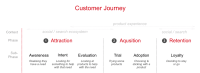
A couple of years ago, Google announced a new mobile-first initiative it wanted web designers and marketers to pick up on. This was our introduction to micro-moments.
These are not to be confused with micro-interactions, which are miniscule engagements websites have with visitors when they “touch” key points of the interface. A mouse changes its appearance when a user hovers over a clickable element. A display error appears after a field is incorrectly populated. A checkbox briefly enlarges and changes color after it’s been ticked off. These are micro-interactions.
Basically, these are four key moments in every consumer’s life when they decide to pick up their mobile device for a specific purpose. As such, it’s your job to know how to specifically design for these micro-moments.
When a visitor arrives at a mobile website (or app), they’ve come with a clear motivation:
“I want to know.”
“I want to go.”
“I want to do.”
“I want to buy.”
Seems pretty simple, right? However, as Google launched this initiative a couple of years ago, its had time to quietly observe users in these micro-moments as well as the websites that have most aptly responded to them. As you will soon see, consumers have incredibly high expectations for what the mobile web can do for them. Basically, they want you to be a mind reader and anticipate their every need (and even their location) without them having to say a word.
Is that intimidating? It shouldn’t be. You already have all the information you’d ever need to answer that question.
Here is how you should be designing your mobile website to respond to and draw in consumers as they experience these micro-moments:
1. Start With The Data
Google Analytics will help you decipher where they’re spending the most time productively on your website.
Once you know where exactly visitors see the greatest value in your product, you can then turn to third-party tools like Answer the Public to give you some insights into what relevant questions your users may be asking about you.
Ultimately, this data needs to tell you all about your customers’ journey before they ever reach you. What exactly was the question that triggered them to pick up their smartphone and do that search? If you can identify those micro-moments, you can start using various design elements to respond to these questions.
People are searching at the exact moment they need something and are looking for places that can meet their immediate need. In other words, when making these on-the-spot decisions, they are more loyal to their need than to any particular place.
Although we’ve heard a lot about customer loyalty to brands in the past, it’s interesting to get Google’s take on this matter.
While consumers may indeed still remain loyal to brands that take very good care of them and produce a high-quality product nearly 100% of the time, this opportunity to steal attention from those customers in one of their micro-moments is real. Do that enough times and your brand and website could realistically win that customer over so long as you are there every time they go searching to fill that need.
One of the ways you can do this is by providing users with instant solutions. Is your business open now? Can you mail out that new product same-day? Will there be an open table at your restaurant tonight? Answer that immediately and you could find conversions increase dramatically.
The top of the Delaware State Fair home page gives users easy access to everything they want to know and do. (Source: Delaware State Fair) (Large preview)
Look at the top of the homepage. There are the dates of the fair, which probably answer one of the most commonly searched questions. There is a link to the concert lineup as well as calendar, which answers anything people would want to know about special events they might want to go to. And then there’s a button to buy tickets right away. It’s all right there.
Office Depot is a company that also explicitly addresses immediate needs:
The Office Depot mobile site uses a variety of time-driven design elements to satisfy visitors’ needs. (Source: Office Depot) (Large preview)
As you can see in the example above, Office Depot uses a number of design tactics and elements to play into this need for immediacy.
There is a search bar at the very top. Consumers don’t have to even bother with navigation or scrolling through pages if they don’t want to/have the time to.
You’ll also see that the closest store’s hours are posted and boldly tell me how quickly I can have any products available in store.
Finally, you have the promotional categories for upcoming needs for parents that are about to send kids back to school.
Another website is Universal Studios Orlando; it does a great job sparing mobile users the trouble of sifting through irrelevant information and instead gets them to exactly what they need:
Universal Studios includes immediate options for research and booking on the home page and navigation. (Source: Universal Studios) (Large preview)
Aside from a single banner at the top of the home page, the Universal Studios website design gives visitors exactly what they want right away. The navigation includes only the most pertinent links to information and booking as does this succinct section on the home page. There’s really no time to waste when the options are so clear.
And here is one final example of a website that deals in immediacy, albeit with a more subtle design technique: Nordstrom:
Nordstrom appeals to immediacy with this one subtle trick. (Source: Nordstrom) (Large preview)
As you can see, this is a pretty typical e-commerce product page. However, there’s one key difference: Nordstrom is subtly calling attention to its Anniversary Sale and the main reason why there is a significant price drop for this purchase. Rather than use an obtrusive pop-up to announce the sale and pester users to shop, it’s made the price change directly on the page and drawn attention to it with the highlighted text.
Not only have mobile searches for ‘best’ grown over 80% in the past two years, but searches for ‘best’ have shown higher growth among ‘low-consideration’ products than ‘high-consideration’ products. In other words, we’re all becoming research-obsessed, even about the small stuff.
We understand that the opinions of family, friends, and colleagues matter greatly in the minds of consumers. But as more and more of them to turn the web to make their purchases, it means being open to trusting other opinions online as well — ones that may be more conveniently expressed from a company’s website, from an influencer’s blog, or from social media.
Wherever those words of wisdom happen to come from, it’s important to take Google’s research to heart. With so many consumers now obsessed with this idea of having the best of everything and being able to get it in a pinch, your website needs to be the answer to that question.
But that’s the tricky part. According to Google, it’s not as simple as being a dog food manufacturer and configuring your site to be the answer to:
“Best Dog Food”
Consumers experience these micro-moments at a granular level. Sure, there may be some who think, “What is the best dog food?” But isn’t it more likely that question would be more specific in nature? For instance:
Best puppy food?
Best grain-free dog food?
Best vegan dog food?
Let’s take a look at Google, for example. Here’s a variety of searches for a singular “best of” concept:
Example of the variety in “Best” searches in Google. (Source: Google) (Large preview)
As you can see, it goes beyond the basic questions. Through your design and your content, you must be ready to answer the most relevant questions your users have about your product or service.
With content, you’ll be able to answer many of the “I want to know” questions that are related to the brand with things like:
Informational pages regarding services and products.
Whitepapers, ebooks, case studies, reports, and other long-form content that provide heavily researched answers on related matters.
Blog posts, vlogs, podcasts, and other shorter content that can dabble more in appealing to the emotions of consumers.
Tutorials and guides that directly answer questions that consumers are asking.
As far as the design piece is concerned, it’s your responsibility to highlight these pages, so visitors don’t have to dig through various parts or layers of the site (like the footer or secondary navigation) to find their answers.
Google told them it was here, so it’s your job to get them right to it.
The navigation will play a big part in this, as evidenced by Globus Journeys:
As you can see in this example, Globus Journeys answers many of those micro-moments right within the navigation: tips on touring (Touring 101), tips on travel best practices (Travel Tips), deals available for travel (Deals & Offers), etc.
Another way to use navigational design to inform visitors on what they’ll learn/know from this experience can take place on the blog. Salesforce has an interesting example of this:
There is the standard navigation for the Salesforce website, and then there is the navigation that’s specific to the Salesforce blog. This gives you — as the designer and planner of the site’s layout — a chance to better and more clearly organize content found within it. So, when visitors show up and want to know tips specific to one of those categories, it doesn’t require random searches or (even worse) endless scrolling through a full blog feed.
Another way you can more quickly and thoroughly inform visitors on topics of interest to them is by using strategically placed sections within blog posts.
While you likely won’t have anything to do with the writing of a website’s blog content, you will have control over its layout and formatting. The first thing you can do to expedite the knowledge acquisition process is by using callouts to detail and link to the various sections covered on the page as Be Brain Fit does:
Be Brain Fit calls out a linkable index of topics from the blog post. (Source: Be Brain Fit) (Large preview)
Of course, the post itself is easy to scan, so readers could guide themselves to the most relevant parts. However, by placing this towards the top of the piece, you’re enabling them to get right to the information they seek.
I’m also going to suggest that pop-ups would be helpful in this matter.
Fit Small Business not only provides all the information needed, but also offers an alternative solution to what they seek. (Source: Fit Small Business) (Large preview)
I encountered this blog post after doing a search for the best way to create a Facebook page. This was one of the links on the first SERP. I was actually quite pleased with the post as a whole. It broke it up into easy-to-follow steps, attractive and informative visuals, and got me the answer I needed.
However, I was especially pleased to see the bottom banner pop-up after I finished getting through the post. Not only has Fit Small Business attempted to reach its audience by providing helpful content, but it’s also providing an alternative solution to anyone who got here and realized, “Eh, I really don’t want to bother with this on my own.”
Looking for something nearby — a coffee shop, noodle restaurant, shoe store — is one of the most common searches we do. In fact, nearly one-third of all mobile searches are related to location.
Here’s the thing though: users aren’t using “near me” qualifiers as much anymore.
Google demonstrates how location qualifiers are decreasing in use. (Source: Google) (Large preview)
According to Google, this is because many consumers now assume that search engines, websites, and mobile apps are tracking this sort of information already. They expect that if they search for something like “dog food,” Google will automatically serve them the most relevant results — and that includes taking into account location proximity.
In Google’s research, it found that about two-thirds of mobile consumers are more likely to buy something from a website or app if information is geographically personalized. There are a plethora of ways to communicate this local-friendliness to visitors — through the copy, through various design elements, and even photos.
Google is a pioneer in this space and so I want to give it a special shout-out in this section for what it does with search results:
Google’s auto-populated search results aren’t just for Google. (Source: Google) (Large preview)
The biggest thing to take away from here is the fact that Google provides its users with auto-populated search recommendations. These are based on the users’ geography, behavior, history, as well as what Google knows about the query itself. As you can see here, it expands on Baltimore to provide more specific results based on the area of the city in which the user wants to drink.
With AI-assisted search functionality, any website can offer this same level of smart search for its users.
Of course, you first need to get access to visitors’ geographic data before you can provide them with these kinds of smart and geographically relevant results. One way to do this is to require them to sign in and fill out a profile with these details. Another way, however, is by serving them with this geotargeting request as Best Buy has done:
Best Buy requests for access to users’ geographic location. (Source: Best Buy) (Large preview)
Once you have access to a visitors’ current location, however, you can start providing them with information that helps them with the “I want to go”, “I want to do”, and the “I want to buy” micro-moments that caused them to reach for the phone in the first place.
Here is what the Best Buy website shows me after I granted it permission:
Best Buy uses its visitors’ location to provide helpful in-store visit details. (Source: Best Buy) (Large preview)
The top of the page now displays the nearest location to me as well as opening hours. As I peruse the rest of the site, I will receive relevant information regarding in-store product availability, buy-online-pick-up-in-store options, and so on. This is a really great option for businesses with a sales website and brick-and-mortar location that want to merge the two experiences.
You could also benefit from using this on websites that offer services, appointments, and reservations. Here is an example of what The Palm Restaurant does with my information:
To start, it uses my information to let me know right away if there even is a location close to me. Philadelphia isn’t too far, but it’s still nice to have the address fully displayed so I can make up my mind about whether I want to dine there. And, if I do, I can choose the “Reservations” button above it.
What’s especially nice about this is that the reservation form is pre-populated:
As you can see, it’s used a mixture of my geographic location along with the most popular reservation types (i.e. two people at 7 p.m.) to pre-populate the form. This saves me, as the user, time in filling it out and making my reservation.
Every day, people are becoming more reliant on their smartphones to help make last-minute purchases or spur-of-the-moment decisions. In fact, smartphone users are 50% more likely to expect to purchase something immediately while using their smartphone compared to a year ago.
Recently, I wrote a post about what you need to know to increase mobile checkout conversions. The underlying message was that mobile consumers have certain expectations that need to be met if you intend on converting them there (as opposed to switching back to desktop).
Convenience in getting the information they want is one of them.
Speed in getting to and through checkout is another.
Handling their contact and payment information securely is the final piece.
Clearly, web designers are doing something right as over half of smartphone users reach for their phone to buy something and subsequently do. But it can’t stop with the 10 tips offered in that article. You need to be able to predict what they’re going to purchase and what exactly they want to do when you catch them in those exact micro-moments.
UPack includes a price quote form at the very top of the website. (Source: UPack) (Large preview)
At the very top of every page is a short price quote form that asks only the most pertinent details they need in order to provide a quote to interested customers. By anticipating that’s what they’re looking to do when they visit a moving company’s website, UPack likely experiences very high conversion rates.
However, if someone should arrive at this form and wonder, “Should I even bother with a quote from UPack?”, they’ve provided an answer to that on the next step down on the home page:
UPack uses an explainer graphic to sell the value of its service right away. (Source: UPack) (Large preview)
This explainer graphic is simple. It includes four points and shows how exactly someone uses the UPack service to move their home from one destination to another. When someone arrives there with the intention of getting help with their move, UPack has already made it all the more simple in just one scroll and two panels of the home page.
Then, you have a company like HostGator that doesn’t waste any time at all:
HostGator’s home page includes smart design callouts that sum up its services. (Source: HostGator) (Large preview)
If someone shows up on a web hosting company’s website — especially one that is well known as they are — of course they know what they want to do. Now, they could hop into the navigation and dig deeper into the various hosting plans (which some may do). However, HostGator is probably hoping to appeal to two specific audiences with these “Buy Now!” callouts on the home page:
The web developer who knows exactly which plan he or she needs, and doesn’t need a full page to explain the benefits to him.
The small business owner who doesn’t know a thing about web hosting, but trusts HostGator’s good name and just wants to get their web hosting purchases ASAP.
This is a really good choice of design techniques if you know that a good portion of your audience will be immediately ready to buy upon entering the site. If they don’t have to click through to another site, don’t make them do it.
And, of course, CTAs, in general, are an important element to use when designing for micro-moments. When they’re designed well — colorful, large, well-labeled — you’re essentially giving your users a shortcut to conversion.
BarkBox uses a number of these right on its home page:
BarkBox has a number of CTA shortcuts available on its website. (Source: BarkBox) (Large preview)
Since the brand is particularly well-known among dog owners, this is a good move. While there are some people who enjoy scrolling through the site to see the funny dog pictures and find out more about what’s in this month’s BarkBox, if they’ve arrived here on mobile, they shouldn’t have to wait to subscribe. BarkBox provides those shortcuts in a number of locations, ensuring there’s no friction between its customers and their goals.
Wrapping Up
It’s pretty amazing to watch the web change so quickly as consumers become more trusting of their mobile devices. Now, nearly two years after Google first began recommending that we design with micro-moments in mind, it appears that these suggestions have really paid off.
Designing for micro-moments gives us the opportunity to more effectively reach consumers in their moment of need. This, consequently, means reaching consumers who are in a more purchase-intent mindset as opposed to ones casually browsing the web. If you can use your data and design to actively reach consumers in their micro-moments, you can effectively increase your mobile site’s conversion rate in the years to come.
Each Container stores cookies separately, so you can log into the same site with different accounts and online trackers can’t easily connect the browsing.
A great idea for a feature if you ask me. For example, I have two Buffer accounts and my solution is to use different browsers entirely to stay logged into both of them. I know plenty of folks that prefer the browser version of apps like Notion, Front, and Twitter, and it’s cool to have a way to log into the same site with multiple accounts if you need to — and without weird trickery.
This is browsers competing on UI/UX features rather than web platform features, which is a good thing. Relevant: Opera Neon and Refresh.
UX And HTML5: Let’s Help Users Fill In Your Mobile Form (Part 1)
UX And HTML5: Let’s Help Users Fill In Your Mobile Form (Part 1)
Stéphanie Walter
Forms are one of the most basic primary interactions users will have with your websites (and mobile apps). They link people together and let them communicate. They let them comment on articles and explain to the author how they strongly disagree with what they’ve written. They let people chat directly on a dating app to meet “the one”. Whether for forums, product orders, online communities, account creation or online payment, forms are a big part of users’ online life.
It’s 2018, and we have more mobile than desktop users around the globe. Yet, we still treat those users as second-class citizens of the web. Everybody writes and speaks about user experience all the time. So, why, why, why are so many websites and products still doing it wrong. Why is their mobile user experience damaged for half of the world? Why is it still a pain, why is it still super-hard to book a flight and register an account in a mobile form today? Users expect better!
This is the first part of a series of two articles. In this one, I will sum up some essential best practices to improve your mobile forms, including scannability and readability. I will guide you through label and input placement, size and optimization. We will see how to choose the right form element to reduce interaction costs. Finally, you will learn how to prevent and deal with errors on mobile forms.
In the second part, I will take a closer look at specific mobile capabilities and HTML5 form elements, and we will go beyond classic form elements to make unique and enjoyable web applications and websites.
Note: While most of the code enhancement in this article are web-related (because I don’t know Swift or Java), the usability best practices hold true for mobile applications.
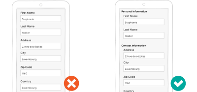
Form Design 101: Prioritizing Scannability And Readability
“A form is the name, value, pairs, in a structure for storing data on a computer barfed out as labels and input fields to human being.” This is a direct quote from Luke Wroblewski at a conference. Like him, I believe that most form usability issues come from this tendency to serve the structure of the database to users.
Strong Information Architecture
To build better forms, you first need to take a few steps away from your database’s structure. Try to understand how users want to fill in forms. This is where doing some usability testing and user research on your forms becomes handy. User mental models is a UX concept that can help you with that. Nielsen Norman Group describes it as “what the user believes about the system at hand”. Ask your tester to think aloud and tell you how they would fill the form. Which steps do they expect? What come first? What comes next? This will give you a better idea of how to structure your form in a more user-friendly way.
Visually grouping fields that belong together will also help users fill a form. In the code, use the fieldset tag to group them programmatically. It will also help screen readers understand the hierarchy.
Chunking information and grouping related pieces of information helps the human brain process this information in an easy, more readable way (Large preview)
If the form is long, don’t expose everything by default. Be smart about what you display. Use branching wisely to display only the fields that people need. In a checkout form, for example, don’t display all of the detailed fields for all of the shipment options. This will overwhelm the user. Display enough information to help them choose the right shipment option. Then, display only the details and fields related to that choice.
User attention spans get shorter with time: Ask for optional things at the end of the form. For instance, if your form is a customer-satisfaction survey, ask for demographic information at the end. Better yet, auto-fill them, if possible. Ask users only for what’s necessary.
Finally, plan ahead for localization: What will happen when your form gets translated? What will happen, say, for German? Will your design still work?
Label Placement And Input Optimization
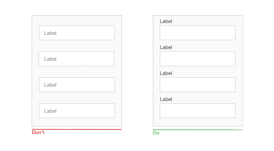
Single-Column Layout Works Best
Due to the lack of space, you don’t get endless options for placing labels and fields on mobile screens:
Present fields in a single-column layout. There’s no room on mobile for multiple columns. Multi-columns forms are not a great idea on desktop either anyway.
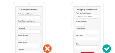
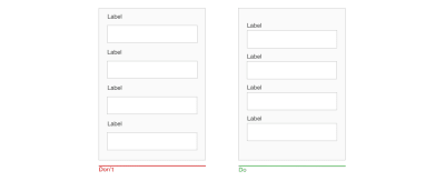
In portrait mode, it’s better to place the label on top of the field so that users can see what’s in the field when they type.
In portrait mode, it’s better to put the label on top of the field. (Large preview)
In landscape mode, the screen’s height is reduced. You might want to put labels on the left and inputs on the right. But test it to make sure it works.
In landscape mode, you want to put labels on the left and inputs on the right. (Large preview)
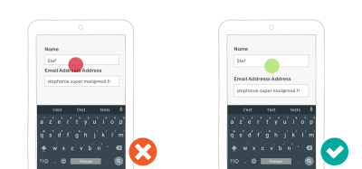
Labels Should Be Clear And Visible And Work Without Context
Remember that as soon as a field gets focus, the keyboard opens and will take at least one third of the screen’s area. On small mobile screens, users will also have to scroll to fill the form. This means that they will lose part of the context while filling the form. Plan accordingly:
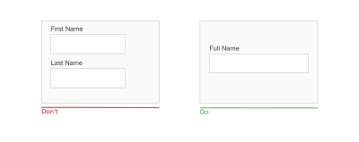
Your labels should be clear, visible text that can be read and understood without context. User should be able to complete each label and field pair as a separate task, even if they lose context.
Just “Address” without context is more complicated to process that “Shipping Address”. (Large preview)
Avoid jargon, abbreviations and industry-specific language whenever you can.
Be consistent. If you use “customer” in a label once, stick with that word. Avoid using “clients” later because it might confuse users.
The font size should be big enough. Test your form on real devices as soon as possible, and adjust the size accordingly.
All-caps text can be hard to read for some users. You might want to avoid using all-caps text on labels.
The label copy should be short and scannable. If a field needs clarification, don’t put it in the label. Use a field description instead.
Avoid full caps, jargon and very long labels. (Large preview)
Input Size Best Practice
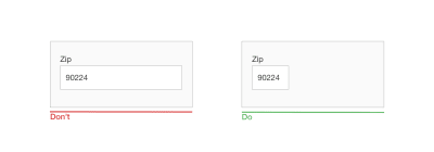
If possible, the size of the input element should match the size of the expected content. This will help users quickly fill in the form and understand what’s expected.
Properly sized inputs help the user scan the form and understand what is expected in the fields. (Large preview)
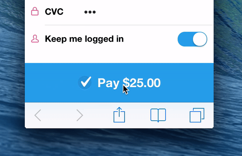
Using Masks To Avoid Splitting Inputs On Mobile
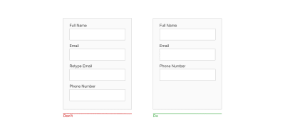
Don’t split inputs just for the sake of formatting. It’s especially annoying on mobile, where users can’t use the keyboard to navigate between fields. It requires extra taps just to go to the next field to fill in the form. You might be thinking, “But I’ll automagically put the focus on the next field when I get the required number of characters in that field”. That could work. But you will have taken control of the UI, which becomes unpredictable for the user. Also, it would be a pain if you automagically sent them to the next field and they needed to correct something in the last field. Finally, it’s more complicated to guess what’s mandatory with split inputs. So, let’s stop playing the “But what if” game and simply not split inputs.
Don’t split the phone number into many little inputs. (Large preview)
I get it: You still want to be able to format your user’s data in small pieces to help them fill in your fields. And you are perfectly right about that. To do so, you could use masks. Instead of splitting an input, just put a mask on top of it, to visually help the user fill it. Here is a video example of what a mask would look like to help users fill in a credit-card field:
Masks help to prevent errors by guiding users to the correct format. Avoid gradually revealing them — show the format directly. Also, avoid putting fake values in the mask. Users might think it’s already filled. That’s why I’ve replaced the numbers with a little “X” in my demo. Find what works best for your type of input.
Finally, remember that some data can vary between countries, and sometimes the format changes, too (phone numbers, for example). Plan accordingly.
Efficient Fields Descriptions
Displaying efficient field descriptions can make the difference between a seamless and a painful form experience.
What Can Descriptions Be Used For?
Descriptions can help users in so many ways. Here are a few examples.
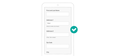
What Exactly Are You Asking For?
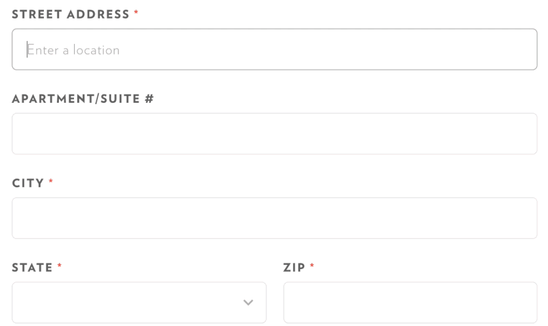
For whatever database-related reason, some shipment companies ask for “Address 1” and “Address 2” fields. This is highly confusing for users, but you might not have a choice here. Add description fields to help users understand what they need to put in each field.
Inline descriptions help users understand why you need this information. (Large preview)
The same goes for acronyms and abbreviations. I know I said that you should avoid them, but sometimes you can’t. If you work on complex forms for a particular industry, for instance, they might have their own set of abbreviations. Any new user who needs to fill in the form might not be familiar (yet) with those abbreviations. Having a description available somewhere will help them.
Why Do You Need This Information? Users might be reluctant to give you personal information if they don’t understand why you need it and what you will do with it. But sometimes you still need to ask for such information for legal reasons (like date of birth for a website that sells alcohol). Using field descriptions here will help users understand why this kind of information is needed.
On e-commerce websites, you might want to ask for the user’s phone number in case the delivery person needs to contact them. This is a legitimate reason. So, again, use descriptions to explain to e-commerce users why you need their phone number.
Sometimes you need information for legal or practical reasons. Again, tell the user why. (Large preview)
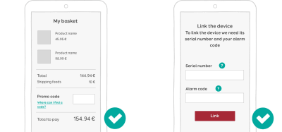
“Where Do I Find the Information?” If your users need to find certain information somewhere else in order to fill a form, tell them where to find it. I worked on a mobile app that lets user track their house. Users needed to pair the app to the monitoring device using a serial number. It’s not very easy to find this serial number on the device; it requires some instruction. We added a little ? button next to the serial number field. The button opens a modal that shows a picture and some indication to help the user understand where to find the serial number on the monitoring device. E-commerce websites do the same with promo codes: They give indicators that tell users where to find the codes.
Users can tap on the link (left) or the question mark (right) to open a popup where they can find extra information to help them fill in the field. (Large preview)
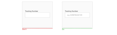
“How Should I Format The Information?” Some fields need a particular format. In this case, use descriptions to let users know the formatting rules up front. Here are a few examples:
Phone number: do I need to put the international dialing code (+xx) in front of the field?
Is there a maximum length? Twitter on mobile does a good job with that one.
When dealing with monetary amounts, is the format with comma (like 10,000) or a space (like 10 000)?
What format do you expect for dates? I’ll let you check on Wikipedia what a nightmare that is. The difference between DD MM YY and MM DD YY can cause a *lot* of trouble to users when booking online.
Note that a lot of those formatting issues can be solved by input masks. We will come to that later in the article (or you can jump right in if you are impatient).
In the old 180-character days, Twitter used to tell you exactly how many characters you had left. Also, the date format varies from one country to another, so you might want to explain what to expect. (Large preview)
How To Display Descriptions
In the examples, above, we saw a few ways to display field descriptions. Here is a summary of what to do:
Inline descriptions should be directly visible and displayed next to the field.
If you need more in-depth descriptions with heavy content, you can use tooltips or modals. Tooltips are generally triggered on hover on desktop and on tap on mobile. The same goes for the modals: Open it when the user taps the help icon or “see more” link, for instance.
The placeholder disappears when the user starts typing. The user must then rely on short-term memory to remember what they are supposed to put in the field. If they can’t, they will need to empty the field to see the indication.
It’s hard for users to double-check fields before submitting because the fields no longer have any label indications.
It’s hard to recover from errors once a field has been submitted because, again, there’s no label to help the user.
Placeholders rely on short-term memory. They make forms hard to check before submission. And recovering from errors is hard, especially when error messages don’t help much. (Large preview)
Even if you use placeholders with labels, you might still have some issues. It’s hard to tell the difference between a filled field and a field with a placeholder. I’m a UX designer who writes about mobile form design and even I got tricked last week by one of those. If it happens to me, it will happen to your users — trust me on that one. Finally, most placeholders have light-gray text, so you might have some contrast issues as well.
It’s easy to mistake some of these fields for being filled in. The right screenshot is something I’ve seen online. I’ll let you guess what is filled in and what is not. (Large preview)
Placeholders are not mandatory in HTML5. From a usability point of view, you most certainly don’t need a placeholder in every field of your form. But with the massive adoption of Bootstrap and other frameworks, it looks like a lot of people just copy and paste components. Those components have placeholders, so I guess people feel kind of obligated to add something to the placeholder in the code? If your form’s placeholders look like “Please fill your — label — here”, you’re doing it wrong.
I’m not joking: I’ve actually seen forms with 12 fields, with each placeholder less useful than the last. (Large preview)
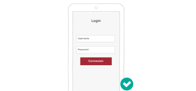
Labels inside fields could, nevertheless, work well for short forms in which fields are predictable. Login forms are a good candidate for this. But please don’t use the HTML5 placeholder to code this. Use a real label in the code and move it around with CSS and JavaScript.
Labels inside fields can work on really short forms, like login forms, where users don’t have a lot of information to remember. (Large preview)
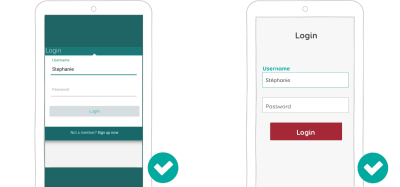
Since the success of Android’s material design, a pattern has started to emerge: the floating label. This label is inside the field when the field is not filled in, so it takes a bit less vertical space on mobile. When users start interacting with the field, the label moves above the field.
This looks like an interesting way to gain some space, without running into the “placeholders in place of labels” issues cited above. Nevertheless, it does not solve the problem of users possibly mistaking a placeholder for filled-in content.
The floating label, even if not perfect, is an interesting alternative to gaining vertical space on the screen. (Large preview)
Interaction Cost Reduction For Successful Forms
Reducing the interaction cost (i.e. the number of taps, swipes, etc.) of users achieving their task will help you build a seamless form experience. There are different techniques to achieve that. Let’s look at a few of them in detail.
A Magic Study On The Internet Told Me To Reduce The Number Of Fields
More fields mean fewer conversions, right? You might have encountered the “we reduced our subscription form from 11 to 4 fields, and it drove up conversions by 160%” study. It’s a classic. And if you look at their contact form, it kind of makes sense. Why would users want to fill in 11 fields just to contact the company? You can’t ask such a big commitment of people who barely know you, right?
Start by asking only for useful information. Why do you need a person’s gender to create an account for them? Why do you have two lines for the address if your subscription form is for an online service?
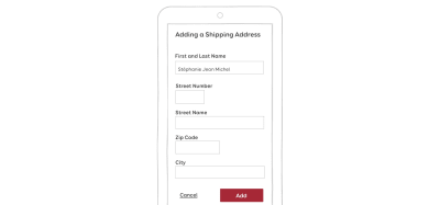
Ask only for the information you need. And then ask for the information in context. If you have an e-commerce website, users might be more inclined to give you their address in the shipping section of the checkout process than when they register. It will make your e-commerce registration form so much easier to fill on mobile!
Ask for the user’s address in the shipping section of the checkout, not when they register. (Large preview)
Also, don’t blindly trust every statistic and study you find on the Internet. Remember the 11-fields-to-4 study? Well another more recent study showed that by reducing fields from 9 to 6, conversions dropped by 14%. Shocking, isn’t it? Why? Well, they removed the most engaging fields. Long story short, they then went back to 9 fields, put the most important on the top, and voilà, conversions increased by 19.21%.
The bottom line is that while these studies are interesting, those websites are not your website. Don’t blindly trust the first study you find on the Internet.
So, what can you do? Test. Test. And test!
Do some user testing to see the time to completion of your mobile form.
Measure drop outs.
Measure problems with certain fields.
Measure the frustration associated with certain fields. How willing are users to give that information? How personal is that information?
Optimizing Touch Interactions
Making Controls Touch-Friendly
If your fields are too small or hard to reach, users will make errors and will need extra interactions to achieve their goals. Remember Fitt’s law? You could apply it to mobile design as well: Make your labels, fields and form controls easy to tap by increasing the touch target size. For labels on the web, a little more padding can increase the touchable area. Sometimes you will also need to add some margins between elements to avoid missed taps.
Also, don’t forget to link labels with their components by pairing for and ID values. That way, if the user misses a tap on the label, the corresponding field will still get focus.
On mobile, respect mobile touch-optimized best practices, and make sure inputs are big enough to be easily tappable. (Large preview)
Steven Hoober conducted some user research on touch areas. You’ll find a summary in “Designing for Touch”. Based on what he discovered, he built a little plastic ruler tool: the mobile touch template. The tool could help you make sure your touch areas are big enough for mobile forms and more generally for mobile design.
Mobile users don’t have a mouse (no kidding), so they don’t get the “click” feedback that desktop users get when hitting a button. Mobile form users need clear feedback when interacting with elements:
Provide a focus state for the form field that the user is interacting with.
Provide visual feedback when the user interacts with a button.
I’m not a big fan of material design’s ripple effect on buttons. But I must admit that the animations on Android provide clear feedback when the user interacts with a button.
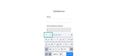
Honor The Next And Previous Button Order
Finally, honor the next and previous buttons on mobile keyboards. Users can use them to quickly navigate fields. The tabindex order should match the visual order of fields and components.
iOS has small arrows on the keyboard to go from one field to another. (Large preview)
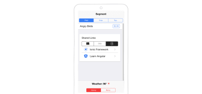
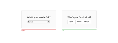
Avoid Dropdowns On Mobile If Possible
Dropdowns (the HTML select element) on the web require a lot of tabs and interactions. Therefore, as Luke Wroblewski said, they should be the UI of last resort. Many other UI components work better than dropdowns in many situations.
Segment controls and radio buttons are good alternatives to dropdowns if you have between two and four options. Why hide the options under a dropdown when you can show them all directly on one screen? Note that, like radio buttons, segment controls are mutually exclusive.
Example of segment controls in the iOnic library. (Large preview)
A country list is a good candidate for a component. A dropdown of over a hundred countries is an interaction nightmare on mobile. It’s OK if you are looking for Afghanistan (at the beginning of the list) or Zimbabwe (the end of the list). If you’re looking for Luxembourg, you will end up in a game of scrolling to reach the middle of the list, going too far to the letter M, trying to come back to L, and so on.
Long dropdowns can be replaced by predictive text input fields. When the user starts typing L, the interface would propose nine countries. If they add a U — voilà! — Luxembourg it is. Four interactions instead of two, versus as many as six or seven scrolling interactions with the dropdown.
Long dropdowns are a nightmare when you’re searching for France. Predictive fields work better. (Large preview)
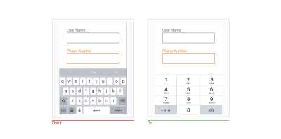
If you need users to pick a date, forget about splitting it into a day, month and year dropdown like people are used to doing on paper forms. Replace multiple date dropdowns with a date picker. The HTML5 input type=date works in most cases. But you might have some special needs and end up building your own date picker in JavaScript, especially if you are in the booking business (hotels, cars, flights).
A double date-picker built in JavaScript makes it easy to pick arrival and departure dates with a minimum of interaction (Large preview)
In his article “Mobile DropDowns Revisited”, Klaus Schaefers explains how using a date-picker for arrival and departure dates made interactions 60% faster.
Let’s stick with the booking business. Suppose the user needs to add multiple travellers to their itinerary. You can **replace the dropdown *with a* stepper** to select the number of passengers. A stepper is a control that allows the user to increase and decrease values simply by tapping on + and - buttons. That tends to be faster when fewer than six persons have to be added. It’s also more intuitive. Below is an example of a stepper used in the Android-native Airbnb app to select guests, and on the mobile-optimized website of Kayak to add passengers.
A stepper is used in the Android-native Airbnb app to select guests and on the mobile-optimized website of Kayak to add passengers. (Large preview)
A final alternative to dropdowns is the list view. The options would be listed in a specific subview, as radio buttons, for instance. This is mostly how Android settings work.
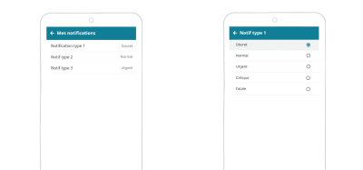
In our monitoring app, when the user clicks on “notification type 1”, it opens a list view with the options. (Large preview)
Getting Smart With Auto-Completion
If you want to decrease the interaction cost of your form, be smart. Don’t ask for information that you can auto-detect or guess based on other information users have given you. Autocomplete and prefill as much as you can.
Places and Addresses
If the user searches for a place or needs to enter an address, you can offer auto-completion to help them. As they type, an API would fill in the rest of the address for them. This also reduces errors.
In the Algolia Place demo, as the user types, it offers suggestions and can autocomplete the field.
In France and many other countries, you can guess the city based on the area code. So, if a French user enters an area code, you could automatically auto-complete or at least propose the city. My country, Luxembourg, is small (don’t make fun of me). My area code is linked to my street. So, if I enter my area code, the form should even be able to suggest my street.
Credit Cards
Another area where auto-detection is easy is credit cards. You don’t need to ask the user what type of credit card they have. You can auto-detect this based on the initial numbers they enter. There’s even a library that can do the job for you.
A demo of the payment script that detects credit card type.
In short, when you must choose between different systems, count the number of interactions each is going to require.
Mistakes Happen: Handling Errors In Mobile Forms
The last step on our journey towards better mobile forms is handling errors and mistakes. We can try to reduce mistakes to ease the user’s cognitive load. We can also help them recover from errors, because no matter how great your form design is, mistakes happen.
Avoiding Errors While Filling The Forms
“Prevention is better than a cure,” my mother used to say. That’s also true of form design: Preventing errors will improve your mobile form’s experience.
Explicit Format Limitation
“Be conservative in what you do. Be liberal in what you accept from others.” This robustness principle can be applied to form fields as well. If possible, let the user enter data in any format.
If you think you need to limit what a user can enter in the field, start by asking yourself “why”. In the user experience field, we have a technique called “the three whys”. If the answer is “because blah blah database”, maybe it’s time to change things. For instance, why do you refuse special characters like é, à and ö in the user name field? I wrote an article explaining how rude forms are to me when I try to enter “Stéphanie” as a user name. I’m still trying to figure out a good reason for that (apart from database reasons).
If you have a good reason to require a specific format from users, state this up front. You can use HTML5 placeholders to give users a hint about what the data should look like, but again, be careful with those. You could also use all of the field description techniques explained at the beginning of this article. Finally, input masks can guide users towards the right format.
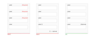
Marking Mandatory Fields (And Optional Ones)
Don’t wait for users to submit a half-completed form to tell them about required fields. If a field is mandatory, users should know about it. Marking mandatory fields with an asterix (*) and a legend has become a standard pattern for forms. The good part is that it does not take much space. The problem is that it has no semantic value, so it can cause accessibility issues if poorly coded and if you rely on people’s habits with form interaction.
You could instead explicitly mark both mandatory and optional fields with the words “required” (or “mandatory”) and “optional”. Both Baymard Institute and Luke Wroblewski agree on that. This avoids ambiguity with long forms on mobile, such as when using a scroller, proceeding with something else, then coming back and not remembering if mandatory fields were marked with an asterisk or something else.
A form with both mandatory and optional fields marked. (Large preview)
Eventually, the decision on how to mark those fields will depend on the design and length of the field and on the context. The best way to know whether you’ve made the right decision is, again, to test the form.
Sensible Defaults
Be careful about default selected options in forms. When I applied for my previous job, there was an information form. The marital status was optional. They made the first element in the dropdown, “divorced”, the default field. So, I could either not answer (because it was an optional field) and let the system believe that I was divorced, or correct this and disclose my actual marital status even if I did not want to.
Also, be careful about gender. Again, have an option for people who don’t want to disclose it; make clear why you’re asking for their gender; better yet, ask for pronouns, or don’t ask if you don’t really need to. If you are interested in this topic, I recommend “Designing Forms for Gender Diversity and Inclusion.” And if the gender is optional, again, don’t auto-check the first choice, otherwise people won’t be able to uncheck that radio button and choose not to answer.
Should I leave the default and lie, or put the right information even I don’t want to? (Large preview)
Smart defaults, on the other hand, can help users avoid mistakes when filling a form. Unless you’re in a Dr. Who episode, you’re not supposed to book a hotel in the past. Booking.com understands that. When you open the date-picker on the website, the default date is set to the current date and you can’t select a date in the past. When you select a return date, the default is the day after the departure date.
Booking.com’s smart defaults help users avoid mistakes. You can’t search in the past or before your arrival date. (Large preview)
Less Painful Password Experience
I’ve written about password-less authentication, but you can’t always use those techniques. Users will eventually have to create a password and enter it in a mobile form. And most of the time, that experience sucks. Here are a few ideas on how to make it better and help users avoid mistakes.
When Creating An Account I won’t get into the details of what kind of passwords you should require and how many characters they should be composed of — plenty of articles on that topic are on the web — just make up your mind about your password criteria. When users create an account, be proactive, not reactive. For the love of Cthulhu, don’t let people guess. Tell users your password criteria up front.
A lot of websites now show you a gauge for password strength telling you in real time what is missing. This is an interesting and excellent pattern. KLM uses it in its sign-in form:
But there are still some big problems with this design.
They don’t tell users their password criteria up front. Users who want to generate a password (using a password manager, for instance) must first guess that they need to first interact with the field in other to see the password criteria.
They limit the password’s length to 12 characters, but they never tell users how many characters are left. Sure, let’s add “counting the dots” to the cognitive load of building a password with so many criteria. After 12 characters, you can keep on typing on the keyboard, and nothing will happen.
What happens if, like me, you reached the 12-character limit but haven’t met all of the criteria? Well, you would just have to delete the entire password and start over again.
Finally, you must enter the password twice. How is a user supposed to remember and retype the password that they just created based on those criteria while counting the dots?
Back to 1, generating a password with a password manager.
If KLM wanted to make this form better, it could provide a mask/unmask option for the password. Doing so, it would not need to ask for the same password twice. Users could visually check that the password they typed is the one they want.
TransferWise doesn’t solve my first problem in the list, but at least I can unmask while typing.
When Logging In In a login form, a mask/unmask password option would tremendously improve the user experience. A button to show and hide the password in a form.
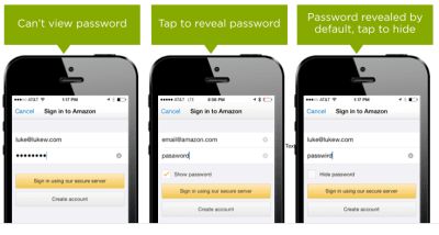
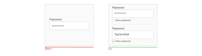
Amazon has an interesting history of iterating on passwords in its login form. It used to have a version in which you could not see the password. The next iteration allowed users to reveal it. Then, the password was revealed by default, and you could hide it. This is what is looked like in 2015:
Amazon tested the last version, and 60% people got suspicious. So, they replaced the “hide password” unchecked checkbox with a “show password” checked box. This would show the password in smaller characters, under the field, while the user typed. This is what it looks like at the time of writing this article:
Amazon’s show and hide password functionality (Large preview)
As you can see, there’s always room for improvement.
Inline Validation
If you are familiar with usability principles, you might know the Gestalt law of proximity. On mobile, avoid the summary of errors at the top of the page, with no contextual information, after the user has tapped the submit button.
Instead, error messages should be located close to the errors themselves.
You also don’t need to wait until users hit the submit button. You can validate fields and display feedback while the user is filling them in.
A few tips:
As mentioned earlier, password fields would benefit from real-time validation and feedback on each keystroke.
You might also want to validate user names in real time when accounts are being created, to make sure they’re available. Twitter does a good job of that.
Don’t validate every keystroke. Wait until the user has finished typing. (Use JavaScript blur for web forms, or just wait a few seconds to detect inactivity.)
I’m not saying that color matters just because of my current ginger, pink and purple hair color. Color really matters in form design.
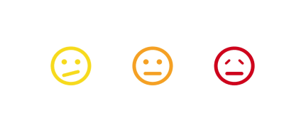
There are some conventions on the web that you don’t want to break. Non-colorblind users know that red is for errors, yellow is for warnings, and green is almost always for confirmation or success. It’s best to stick with these three colors. Red can make people anxious, though. The user might think they’ve made a really serious mistake. Using orange or yellow for error messages could cause less panic. The problem with yellow and orange is that it’s hard to find colorblind-friendly hues of them.
Colors have different connotations across countries and cultures. Be careful with them. (Large preview)
Speaking of colorblindness: Color should not be the only way to convey an error message. This is an accessibility criterion.
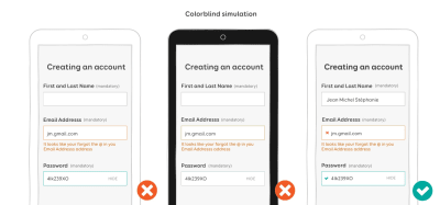
In the example below on the left, the field with an error is in orange, and the field that has been corrected has turned green. I used a colorblind testing tool to take the screenshot in the middle: You can’t distinguish between the default gray border and the green one anymore. Adding some icons in the last screenshot ensures that the error messages are conveyed to colorblind people.
Color should not be the only way to convey error messages. The colorblind simulation in the middle shows that the green border cannot be seen by a colorblind person. (Large preview)
Recovering From Errors: Writing User-Friendly Error Messages
At this point, we’ve done everything we can to help users fill our forms and avoid errors. But sometimes, despite our best effort, mistakes happen. It’s time to figure out how to help users recover from those mistakes.
First, remember: Don’t hijack control of the system. If a problem isn’t critical, the user should be able to continue interacting with as much of the rest of the interface as possible. Avoid those JavaScript alert error message and modals that blocks users whenever possible. Also, if your form needs some permission, request it in the flow of use. If permission is not granted, do not consider this an error because it is not. Be careful about the copy you use here.
You’re Not A Robot, And Neither Are Your Users
Robots are cool, I know. But you’re not a robot, and neither are your users. Yet so many error messages are still so poorly written. Here are a few tips when it comes to human-friendly error messages:
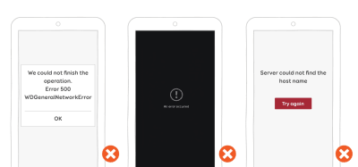
Never show a raw error message, like “An error of type 2393 has occurred. Server could not complete the operation.” Instead, explain what happened in human language and why it happened.
Never show a dead-end error message, like “An error has occurred.” Instead suggest ways to recover from the error. Write actionable copy.
Never show a vague error message, like “A server with the specified hostname could not be found”, with a “Try again” button. Instead, make error messages informative and consistent. Please don’t sound like a robot.
Don’t assume that people know the context of a message. Your users are not tech-savvy geeks. Instead, explain to them in plain language, without technical jargon, how to recover from this error.
Examples of non-human-friendly error messages. Eek! (Large preview)
Beware The Language You Use In Messages
Whatever you write, avoid making people feel stupid about a mistake. If possible, leave out negative words; they tend to scare people and make them even more anxious. Use a courteous, positive, affirming tone instead.
Don’t blame users for mistakes; blame the system instead. The system won’t hold a grudge, I promise. Shift the user’s attention to how the system could not process the action, and explain to them how to find a solution.
A little trick is to read your own message out loud. It will help you hear whether it works or is too harsh or too casual, etc.
You could also get creative with error messages and incorporate imagery and humour to make them less threatening. This will really depend on your brand’s identity and tone, though.
To help you write better error message, I suggest you read the following:
The user has filled in the form, there are no more errors, and everything looks good. Finally, it’s time to submit the form!
The first rule is, don’t mask the submit button. Seriously! I wonder what twisted mind came up with this idea, but I’ve seen it in some forms. The submit button would be displayed only once all required fields were filled in without any errors. It’s disturbing for the user to wonder whether something is wrong or the form’s button has not loaded or the website is broken and so on.
If you don’t want users to be able to hit the submit button if there’s missing mandatory fields or there are validation errors, use the disabled HTML attribute on the submit input. You will need to re-enable the button using JavaScript once the form is valid and ready for submission.
Do not hide the submit button. Instead, deactivate it until users have filled in the required information. (Large preview)
If you have a primary and secondary call to action, use color, size and styling to show the hierarchy.
Example of primary and secondary actions (Large preview)
If are wondering whether the confirmation button should come before or after the cancellation button, so am I (and a lot of other people). If you are building a native app, stick to the OS guidelines. It’s become particularly fun since Android changed the button positions in its fourth version. On the web, it’s more complicated because there are no real guidelines. Regardless of the OS, here are some general guidelines for mobile-optimized submit buttons:
Give the call to action descriptive, actionable verbs.
Provide visual feedback when the user taps it.
If you have two buttons, make the primary action stand out.
Unless you’re working on a very specific back-office enterprise form (in which case, you’ll have a lot of challenges optimizing for mobile), avoid a reset button. Users might confuse it with the submit button and will lose all of their data by accident.
Conclusion
In this first part, I’ve discussed a lot of little techniques to take your form to the next level and help users fill it in. Some of these general guidelines and mobile best practices might not work 100% of the time — that’s the catch with best practices. So, always test your forms on real users and real devices, and adapt the guidelines to your users’ specific needs and experience.
Also, do some regression and automated functional testing — again, on real devices. Chrome’s mobile emulator won’t be enough to test touch-optimized forms. I say this because I had launched an e-commerce website with a search form that didn’t work on mobile. We only did automated testing using an emulator. Here is what happened. The search form was hidden under a search icon. You could tap on the button, which opened a box with the search field. It worked by emulating a mouse hover as a touch event. We tested tapping on the button, and it opened the box. Nobody tried to launch a search. So, nobody (not even the client) saw that the search field disappeared as soon as users tried to interact with it. What happened? When the input element got focus, the button lost the hover state, so it closed the box with the field. Automated testing was not able to catch this because the input was not losing focus. So, we launched an e-commerce website without search functionality on mobile. Not a super experience.
In the second part of this series, we will see more advanced mobile-specific techniques. We will see how to use cool HTML5 features to format fields and how to use mobile capabilities to take the mobile user experience to the next level.
Designing The Invisible: 3 Things I Learned Designing For Voice
Designing The Invisible: 3 Things I Learned Designing For Voice
William Merrill
The current iteration of voice-controlled digital assistants are still struggling to integrate as seamlessly as the big three voice players of Amazon, Google and Apple would hope. A 2017 report by Voicelabs states there’s only a 3 percent chance a user will be active in the second week after downloading a voice application and 62 percent of Alexa’s skills are still to get any kind of rating on its store (as of September 2017).
As designers, we have a real opportunity to provide valuable meaning to these assistants but we’re still trying to work out where the technology can add real benefits to the user. For many, embarking on a voice UI (VUI) project can be a bit like entering the Unknown. There are few success stories for designers or engineers to be inspired by, especially within contexts that illustrate how this nascent technology could help people thrive in new ways.
Experimenting With speechSynthesis
The Web Speech API gives you the ability to voice-enable your website in two directions: listening to your users via the SpeechRecognition interface and talking back to them via the speechSynthesis interface. All of this is done via a JavaScript API, making it easy to test for support. Read article →
As part of BBC2’s Big Life Fix docuseries where teams of inventors create new and life-changing solutions for people in need, I had the opportunity to test and build a voice-controlled assistant for a woman called Susan. Susan has been living with a progressive form of Multiple Sclerosis for over 20 years and is now unable to complete everyday tasks for herself easily. With full-time carers, she relies on others to wash and dress her and has no ability to even change the channel on the TV without help.
While voice technology seemed like it would provide the smoothest pathway to overcoming Susan’s physical difficulties, Susan has never used a smartphone, so propelling her straight into an interaction with a voice assistant was never going to be easy — we had to think cleverly to help her learn to communicate with an incredibly alien technology.
The result for Susan is a highly customized voice-controlled assistant that now empowers her to complete everyday tasks with the freedom that others take for granted — from making a phone call to family, to listening to music. Built as an enhanced version of Amazon Alexa technology on their Echo Dot device, Susan’s voice assistant also involved physical customization as we 3D printed a casing in the shape of her favorite animal, an owl.
As we rapidly experimented and iterated on a solution for Susan, my team and I uncovered dozens of intricacies that come with designing for voice in a more inclusive and accessible way. Although it was a unique project, there were three key takeaways that are applicable to any VUI project.
1. Make It Personal
The tech works. It’s not just a matter of sitting back and waiting for computing power to increase in line with user expectation. We found the voice detection, recognition, and synthesis of each of the devices far more powerful than we anticipated. And it’s not as though there’s a lack of choice. There are over 30,000 Alexa skills on Amazon with an average of 50 new ones being published daily. Skills are specific capabilities that enable designers and developers to create a more personalized voice experience when using devices like the Amazon Echo Dot. They operate much like an app within the App store on your smartphone, allowing you to customize your voice assistant the way you please.
However, there currently is a big barrier to access. Skills must be added via the app rather than the device, often negating the benefits of a VUI and breaking the conversational flow (not to mention excluding those who can’t/won’t use a smartphone). This makes the process feel clumsy and disjointed at best, completely isolating at worst. Even once a skill is installed, no skill visibility and a restricted time frame for interaction result in a lack of confidence and anxiety; can it do what I want? How do I talk to it? Has it heard me? So, how do you build that connection and trust?
For Susan, it meant stripping away the unnecessary and presenting a curated selection of core functionality. By personalizing the content to the unique behaviors and requirements, we presented much-needed clarity and a more meaningful experience. Susan wanted to perform key tasks: answer the phone, make a call, change the TV channel, play music, and so on. By getting to understand her and her needs, we created an assistant that always felt relevant and useful. This was quite a manual process, but there is a huge opportunity for machine learning and AI here. If every voice assistant could offer an element of personalization, it could make the experience feel more relevant for everyone.
As we were designing for one individual, we could easily tailor the physical elements of the product for Susan. This meant designing — then 3D printing — a light diffuser in the shape of an owl (her favorite animal and something with a significant meaning to her). The owl acted as a visual manifestation of the technology and gave her something to talk to and project towards. It was her guide that gave her access to those skills she wanted, such as listening to music. As it was personal to her, it made the potentially alien, intimidating technology feel much more approachable and familiar.
Humanizing technology helps make it more accessible: Susan’s personalized owl glows in response to her voice, letting her know she is being heard and understood. (Large preview)
Although a fully custom 3D printed housing isn’t an option for every VUI project, there is an opportunity to create a more relevant device for people to communicate with, especially if their needs or usage of home assistants is quite specific. For example, you might talk to a voice-enabled light about your home lighting and a fridge about your groceries.
2. Think About Audio Affordances
Currently, the user does all the heavy lifting. With an obscured mental model and no hand-holding from the tech, we’re forced to imagine our desired endpoint and work backwards through the necessary commands. The simplest tasks aside (set a timer for 5 minutes, play Abba on Spotify, etc.), that’s incredibly hard to do, especially if you suffer from ‘foggy moments’ something that Susan explained to us — difficulty in finding the right words.
When Apple famously used skeuomorphic visual elements for their early iPhone apps, the user gained valuable, familiar reference points which afforded its use and method of interaction. Only once the mental model became more established did they have the freedom to move away from this literal representation, into their current flat UI.
When designing our VUI, we decided to lean on the well-established menu system seen throughout digital and web navigation. It’s a familiar tool which demands less cognitive processing from the user and allowed us to incorporate methods of way-finding that didn’t result in starting from the beginning if things went wrong.
As an example, Susan found verbalizing what she wanted, in the time frame offered by current digital assistants, a stressful and often unpleasant experience; often compounded by an error message from the device at the end of it. Rather than expecting her to give an explicit command such as “Alexa, play Abba from my Spotify playlist,” we decided to create a guided menu tool that could help her start slowly and get incrementally more specific about what she wanted Alexa to do.
Susan’s owl now prompts her with a curated list of options such as, “Play Music” or “Watch Something.” If she chooses music, it gets more specific as she progresses through each decision gate, to uncover the genre she feels like listening to; in the case of Abba, she would select “60s music.” This enables Susan to navigate to her desired outcome much more easily, and at a pace that suits her. All the while, the owl was glowing and responding to her voice, letting her know she was being heard and understood.
Susan’s voice assistant gives her back some of the independence she lost to her condition, from empowering her to making a phone call to family, or simply listening to music. (Large preview)
3. There’s More To VUIs Than Voice
The non-lexical components of verbal communication impart a great deal of meaning to a conversation. Some can be replicated by the synthesized voice (intonation, pitch, and speed of speaking, hesitation noises, to name a few), but many can’t (such as gesture and facial expression). The tangible elements of the product need to replace these traditional, visual cues for the interaction for it to feel even slightly natural. But there’s more to it than that.
Firstly, when someone interacts with a product designed to replicate human behaviors, the visual components are interpreted by the user’s preconceived notions of the world (both inherent and learned) and affect their emotional responses. If something looks imposing and cold, you’re much less likely to initiate a conversation than with something that looks cute and cuddly.
In our case, as the technology was so foreign to the user, we needed to make it feel as familiar and inviting as possible — an owl. In doing so, we hoped to remove the feelings of anxiety and frustration we had experienced with other products. We also amplified the visual side of it — there is one color for an idle state — a gentle glow, almost like breathing, but when Susan says the wake words the light changes to awake and listening.
You can go further. Apple, for example, has a full-color display on their Homepod which affords a higher level of nuance to their interaction and visualization. Adding a visual experience might sound counterintuitive, but visualizations can be very helpful for the user.
Conclusion
Although applied to an individual use-case, these top-level learnings can help any project hoping to utilize the inherent benefits voice affords. Personalizing the content (where possible) provides much-needed clarity and a logical, relatable navigation system reduces cognitive load. Finally, don’t underestimate the importance of the visual components; when done well, they not only deliver fundamental conversation cues, they set the tone for the whole interaction.
For those looking to experiment with voice, Amazon now showcases tens of thousands of skills from companies like Starbucks and Uber, as well as those created by other innovative designers and developers. The Alexa Skills Kit (ASK) is a collection of self-service APIs, tools, documentation, and code samples that make it easy for you to add skills to Alexa, and start creating your own solutions. Wondering if voice even makes sense? Here’s some considerations before you get started.
An oldie but a goodie. Andrej Karpathy from the AI team at Tesla shares some thought provoking words around a fundamental shift in how we write software. (medium.com)
A high level guide for designers and developers who write CSS, but want to be more strategic about building moderate to large scale CSS systems. (medium.com)
Ben Schwarz, the founder of Calibre takes a look into the new Chrome feature dubbed “Blink LazyLoad”. If this is the first you have heard about it, this is a great starting point. (calibreapp.com)
Service workers allow developers to manage resource caching more efficiently so that users don’t experience interruptions even if they disconnect from the internet. This guide will explain how a service worker can propel your web app’s performance to new heights. (keycdn.com)
Three days of design, code, and content for interaction designers and developers packed with tips, techniques, and insights—you’ll come away inspired! (aneventapart.com)
Facundo Corradini looks at a pure CSS solution for making sure the text colour can accessibly adapt to the color of the background as it changes. (css-tricks.com)
We are seeking an entrepreneurially-minded individual, who can act as both a designer and a front end engineer for our family of internal data-driven sales and customer insights products. (dropbox.com)
If you are passionate about design and interested in helping us visualize the future of Zendesk, we would love to hear from you. You will be an integral part of the product design team working closely with other designers, product managers, engineers and UX researchers. (zendesk.com)
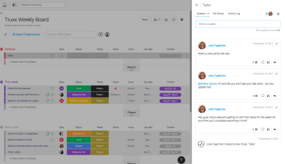
monday.com is intuitive to use, displays color-coded team management information on its dashboard, and is suitable for teams of any size, for both single and multiple projects, and it promotes project transparency, empowers team members, and encourages team communication.
Making Distributed Product Teams Work More Efficiently With monday.com
Making Distributed Product Teams Work More Efficiently With monday.com
Nick Babich
(This is a sponsored article.) The way that product teams work is changing: The software industry is quickly moving to remote work. In the US alone, 43% of employed Americans have spent at least some time working remotely, and that number has steadily increased in recent years. Many successful digital products on the market today were designed and developed by a distributed team. Such teams don’t have an office in the traditional sense. Everyone chooses to work from where they like, both geographically and functionally (in a coworking space, coffee shop, home office, etc.).
While a distributed product team might sound tempting to you, creating an effective design process on such a team requires a lot of effort. Collaboration and communication are two of the most significant challenges distributed teams face. Managing a distributed team requires an understanding of how the individuals on your team operate, as well as requires a digital toolset that makes the team’s operations as efficient as possible. That’s why investing in the right remote tools and technology is so critical for product managers.
If you’re a team manager who is looking to establish a robust design process for a distributed team, then this article for you. You’ll find seven of the most common challenges distributed product teams should overcome and learn how a team-management tool called monday.com (formerly dapulse) can help them with that.
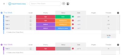
1. Build A Shared Understanding Of A Project’s Goals
When it comes to organizing a work process on a remote team, one of the key goals is to keep the whole team on the same page. Management needs to set goals and make sure everyone on the team understands and accepts them. Building understanding is especially important on remote teams because interaction tend to be more sporadic. Ensure that everyone on the team knows the following:
What are the project’s overall goals? When a team clearly understand’s the product strategy (what they want to build and why), that understanding motivates engagement.
What is expected of them, and how do they fit in the bigger picture? People want to know their role in the process. Even though every team member will be deep in the details when working on a project, understanding the big picture will help them to focus on what’s really important.
What are other people involved in the project doing? Each team member should have visibility on what the other team members are working on.
The more everyone knows, the better they can work as a team.
Visualize The Product Development Process
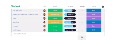
Helping everyone on the team know what is expected of them and when is possible using monday.com’s feature named the “timeline.” The timeline makes tasks more visual — team members will be able to see when each task is scheduled for, how long it will take and how it fits in the entire project. The tool enables you to see not only what tasks your team members are working on, but also how those tasks are distributed over time. It is great for when some activities depend on others (for example, developers are waiting on mockups from designers).
The timeline enables team members to see a high-level roadmap. (Large preview)
2. Manage The Team’s Workload
As anyone who has ever worked on a remote team will tell you, remote working is quite different from working face to face. Many project managers find it hard to manage the team’s workload.
Most product teams use project-tracking software to plan and estimate their work. Usually, a team will prepare all of the work in a task list, in which each task has a text description and a time estimate. The biggest downside of this approach is that it’s not very representative. For example, Kanban boards, used by many product teams today, are not very representative — it’s almost impossible from a glance at the board to understand the order in which tasks should be completed, especially when they have dependencies.
Using a Kanban board might make it hard to see how tasks should be distributed in time. (Image source) (Large preview)
Track Everything Your Team Is Working On
Interaction cost (i.e. the cognitive or physical effort required to complete an action) plays a vital role in the user experience of a product. The more effort required to complete an operation, the less usable the interface becomes for the end user. If the project manager has to switch to different products to see the team’s progress, that will create unnecessary friction and hinder the team from working efficiently.
monday.com assembles and displays progress data in a logical and understandable way. The tool has a feature called a board. The board is where all team members can track everything the team is working on. The main advantage of the board is that it enables product managers to monitor the team’s progress in real time and instantly see who is working on what and see where things stand.
monday.com gives you a clear sense of what needs to get done and who is responsible for what. The board provides in-depth insight into a project and its tasks. (Large preview)
Communicate Current Status
Each team needs a mechanism that makes it easy to understand what’s going on at a glance.
One way to solve this problem is to use color coding for different elements. Color coding speeds up visual search because it allows users to quickly filter a particular object (or objects) by knowing the color associated with it. monday.com uses color coding to indicate the current status of a task. For example, it’s easy to see where things have gotten stuck just by looking at the board and finding all tasks colored in red.
Adding tasks in a project-management tool doesn’t sound very exciting. Generally, the more time it takes, the less happy the product manager will be.
monday.com simplifies the process of data input. Managers can quickly add rows to the board — monday.com calls them pulses. Pulses can be tasks, projects, missions, to-do items, etc. Creating a pulse requires just a few clicks.
After you create a pulse, simply assign it to a team member.
Assign teammates to particular tasks or projects. (Large preview)
Tailor The Platform To Your Needs
There’s no such thing as a universal design process. Every project is different and requires its own design process. A product-management tool should be very adaptive to change; the product team should be able to customize the process according to their needs, without having to put much effort into customization.
monday.com is extremely customizable and lets the user configure almost any option. You can customize monday.com to manage any workflow or process, to address any challenge and to manage basically anything.
When it comes to creating a board, you don’t need to start from scratch. A multitude of templates allow you to start quickly. For example, the “Team Tasks” template would be very useful for product teams.
Finding the right template for your activity is really simple because all templates are visualized. (Large preview)
After selecting a template for your needs, you can customize it by manipulating different sections. Product teams often need to combine task into groups, whereby each group represents a milestone (for example, “Release 1”, “Release 2”, etc.). Doing this in monday.com is relatively simple. As a board owner, you can have as many groups as you want.
Easy to organize tasks. You can have as many groups as you want. (Large preview)
But it doesn’t stop there. You can use the checklist feature to break down tasks even further. For example, each task can be broken down into smaller to-do steps. This feature is handy when a few activities need to get done before the task can be completed — for example, if a product specification needs to be approved by a few designers before it can be handed over to the development team. The checklist sits within a pulse, in the “Updates” section, and can help create a structure for each pulse.
The checklist sits within a pulse, in the “Updates” section. This feature can help create a structure for each pulse. (Large preview)
Plan The Team’s Workload Visually
Designers, developers and managers often work with compressed timeframes and simultaneous projects. A team must be able to respond quickly to feedback on their product from stakeholders and users. Following the build-measure-learn cycle, a product team should be really flexible; it should be ready to implement feedback from testing sessions and adjust the design process according to the new information. The same level of flexibility should be in all products the team uses.
Using monday.com’s timeline, it’s possible to make corrections and improve the team’s efficiency. The visual editor makes the process of managing tasks easy. The product manager can see where each project is at each point, and can see and focus on areas of struggle, quickly and effectively.
The timeline makes it possible to see each team member’s capacity over a set period of time (say, the next few weeks), seeing where they have room to take on more work and where they need to delegate tasks to others.
Change the time range in the timeline. The time range is updated in real time. (Large preview)
3. Create Effective Internal Communications
Communication plays a critical role in the design process. When it comes to product design, it’s essential for all team members to be on the same page. Unlike colocated teams, a distributed team won’t have an opportunity to arrange regular face-to-face meetings. When you take out face-to-face interaction, you can’t expect things to just work the same way. Poorly established communication patterns can lead to some team members feeling like they’re working in a vacuum.
Tools matter more in remote work because they are the foundation for communication. The goal is to make sure everyone on the team feels connected.
Centralize All Communication
In today’s world, we communicate with a variety of tools: from traditional email to online messengers such as Skype, WhatsApp, Slack and Facebook Messenger. Having to switch from a task-management tool to another tool for communication can be stressful. Worse, some information can get lost during the transition (for example, an email inbox can fill up to the point that a team member can overlook a critical email).
Product teams can use monday.com as a single communication platform for their workplace. And it would be a much better solution because it allows for communication in the context of each task. With monday.com, you no longer need to use email for internal communication. When a team member clicks on a pulse on any board, a box opens to the right of the screen, showing the “updates”. Simply mention a person’s username (“@johndoe”), and send your message. The great thing is that the chat thread stays with that task, so finding a conversation after a while is relatively easy.
Cut Down On Meetings And Optimize Required Meetings
Meetings are an essential part of the communication process. When it comes to reviewing plans and brainstorming on design decisions, there’s no substitute for a meeting. But for a distributed team, the number of potential hours available for real-time meetings can be limited, so it’s essential to make the best use of that time. A distributed team should continually try to reduce their number of meetings and maximize the effectiveness of the time that team members have together.
Take a weekly kickoff meeting as an example. This meeting happens on a Monday, and team members come together to discuss plans for the week. For many teams, such meetings are rarely productive. Quite often, the information shared in a weekly kickoff meeting becomes outdated shortly after the meeting, and team members need to reprioritize tasks.
monday.com saves the team vast amounts of time in meetings. Instead of discussing the plan for the week, the product manager can break down complex tasks into weekly achievable goals. This will help team members plan the week based on what they need to get done.
Share Valuable Resources With The Entire Team, Not Individual Members
Imagine you’ve found a really valuable resource and want to share it with your peers. You tweet about it and send a link to a group chat. You get feedback like, “Awesome resource! Thanks!” from some people in the chat. Shortly after, most of your peers forget about the resource, especially if they can’t use it in the work they’re doing right now. Sad, right? We can do better.
Instead of sending a link to a group chat, share all resources you find on a separate board. monday.com has a template named “Design Inspiration & Resources”. The great thing about this approach is that it’ll be much easier for team members to find a particular resource when they actually need it.
Organize Better Planning And Brainstorming Sessions
Task prioritization is a typical activity in agile project management. Team members get together, discuss tasks and vote on what to implement in the next sprint.
monday.com incorporates voting. Team members can use the voting column when they want to decide on something together as a team. Simply add a voting column to a board, and team members will be able to cast their vote in one click.
Vote for ideas during brainstorming and planning sessions. (Large preview)
Notify Team Members In Real Time
Fear of missing out (FOMO) is a common problem on distributed teams. When working remotely, team members might be afraid to miss an important piece of information. As a result, they spend a lot of time in communication tools, checking mail and messengers. This can get really distracting. Team members should spend less time in communication tools and more time in tools they use to design (tools for prototyping and development). It’s all too easy to waste the day reading messages and replying.
A communication tool should serve vital information just when team members need it; it should have an effective mechanism of notification. monday.com notifies users via desktop and mobile in real time. The platform has an app for iOS and Android. The app allows team members to stay connected on their phone or tablet and to respond quickly from anywhere. It’s also possible to customize notification rules. For example, you can manage which activity triggers an email.
If your team is distributed across the globe and you need to arrange a meeting, you have to be sure that it won’t happen at awkward hours (such as in the middle of the night). It would be great to see the team members’ working hours.
The work schedule board is a cornerstone of your business operations. Team members in each time zone can commit to the times that work for them. This helps product managers schedule meetings at times that work for everybody.
The work schedule board shows when team members will be online and available for chat. (Large preview)
4. Involve Users In The Design Process
Most commercially successful products were created with a strong focus on the target audience. Designers know that if they want to release a successful product, they need to introduce real users to the design process. User involvement is most efficient and influential in the early stages of product development, because the cost of making changes increases as the system develops. Generally, the earlier you create a strong feedback loop, the better the final product will be.
Share Designs With Users And Gather A Valuable Feedback
The feedback that a product team gets from users is extremely valuable. It can validate that the design team is moving in the right direction.
On monday.com, users can create a board and choose whom to share it with. For example, if you are working with a client, you can set up a board for their project and invite them to work as a guest. The board could include key features you want to work on. As soon as you share the board, the client will get a notification and then can open the board, review the plan and request modifications.
5. Find All Required Information Easily
Documentation is another challenge. Distributed teams don’t have a physically shared space where they can share product documentation. Information might be stored in many different places: email, cloud drives, local computers, etc. It could lead to team members missing an important piece of information and being unaware of it. This leads to fragmented knowledge.
Centralize All Documents
Having all documents in one place is critical to success. monday.com syncs all information in a single accessible hub. All team members can store all relevant discussions in a searchable database. The platform provides an option to upload different types of files simply by dragging and dropping. The next time a designer needs to share a product’s specifications, all they need to do is upload a file to the platform.
Upload all assets by dragging and dropping. (Large preview)
Search Anything And Everything
Anyone who has ever worked with a knowledge base will tell you how critical search functionality is. Without proper search, your chance of finding information decreases significantly.
monday.com allows you to quickly find anything your team has ever worked on, including images, updates, projects and assignments. Your work becomes a rich knowledge base.
For example, when you need to find the latest version of a product’s specification, all you need to do is click the search box, select the “Files” tab and enter the project’s name as a search query.
6. Make The Collaboration Tool A Natural Part Of The Team
The platform you choose for team management should feel like second nature. Technology should work for you and your team, not the other way around.
Minimize The Time Required To Learn A Tool
When you introduce a new tool in the design process, one goal should be to have total agreement to work using this tool. This agreement is not always easy to come by because team members are usually skeptical about the next “magical tool that will solve all of their problems”. What’s worse is that they have to spend extra time learning how to use it. Nobody wants to learn new software.
One of the most significant advantages of monday.com is its intuitiveness. Regardless of whether you’ve used a similar app before, monday.com can be picked up with no training. Team members will be able to understand how to use the tool without preparation.
monday.com provides basic onboarding to help users get started. (Large preview)
Scalable
When companies select a collaboration tool, they often think of it as an investment. They want a tool that will scale with the business.
monday.com is suitable for any sized team, from two freelancers working together to thousands collaborating across the globe. The tool scales with you, from simplicity to complexity, with total ease. Also, as your business expands, monday.com makes it painless to shift to a premium version (Standard, Pro or Enterprise) and get more of the platform’s premium features.
Integrate The Platform With Existing Tools
A task-management tool is essential for any team hoping for good results. But the team’s toolbox also needs to support the design process (for prototyping and development) and the collection of design artifacts (for example, on Google Drive or Dropbox). It’s essential that the team-management tool integrates seamlessly with other tools the team uses.
When it comes to integration, monday.com does a lot to be part of the established software ecosystem. It can connect to Dropbox, Zapier, Google Drive and other sharing tools. As a team member, you can attach a mockup file to your updates, sharing it in the context of the tasks it relates to.
monday.com also comes with an open API architecture, which lets developers build their own integrations.
Having the right atmosphere is extremely important. Team leaders should not only be in tune with each person on the team, but should continually look for ways to increase engagement.
Celebrate Successes With Team Members
It’s natural for people to seek acknowledgment. The need for social approval drives us to look for confirmation from people we know (parents, friends, colleagues). When someone recognizes our results by saying something as simple as “Great job!”, we feel motivated to work towards our goals. It’s essential for team players to get acknowledged, especially when working remotely.
monday.com has a few features that help create a sense of acknowledgment. The first one is the thumb-up feature, which is basically a positive reaction to an activity. Most people are familiar with this from social networks. People are used to measuring the effect of a post by the number of likes they get. monday.com allows you to give a thumb up to your teammates’ work.
Another nice feature are the animated GIFs. You can liven up comments with GIFs. monday.com lets you pick from thousands of GIFs when responding to teammates, which will add a bit of personality to your comments.
Last but not least, monday.com has a confetti feature. As soon as a designer completes their last “in progress” task on a board, they will see an animated confetti effect. This subtle detail adds a bit of delight and motivates team members to have an all-green board.
Establishing an effective process on a distributed team is hard. What works for a colocated team won’t necessarily work for a distributed team, and what works for one distributed team won’t necessarily work for another.
Build a remote-friendly work culture by focusing on following priorities:
Prioritize transparency. Keep important information accessible to everyone.
Stay on top of the team’s activity. Understand what every member of your team is doing and where the team is in the process at a glance.
Build an effective communication system. The foundation of distributed teams is communication. Create a healthy system of meetings and habits to keep people communicating.
Lower the barrier to entry. Choose a team-collaboration tool that will be the least painful for everyone to get on board with. It should be a reference point that brings everything together.
Onboarding Users Of Your Product: From Trial To Payment
Onboarding Users Of Your Product: From Trial To Payment
Joe Leech
(This is a sponsored article.) In part one of this series, we looked at the Attraction phase of the customer lifecycle. This three-part series outlines the three phases of the product lifecycle, the future for UX, and the skills and approach you’ll need to design modern digital products.
Part 1: Attraction Going out there to get users to evaluate your product.
Part 2: Activation Signing up, onboarding users, asking for payment.
Part 3: Retention Encouraging users to come back and keep using and paying for your product.
Part Two: Activation
Plotting Out The Journey
When we talk about the Attraction phase, we’re talking about users discovering they have a need, discovering our product and visiting our website to see if our product meets their needs.
Within the lifecycle, we can split the larger three phases into smaller phases to help us plan our approach. In this case, we can use Philip Kotler’s model (expanded to 6 steps by Bryony Thomas).
Awareness Realizing they have a need.
Interest Looking for something to help with that need.
Evaluation Looking at products that help with their need.
Trial Trying the product to see if it meets their need.
Adoption Choosing a product and using it for a while.
Loyalty Deciding to stay using the product or switch to a different one.
We’re interested in the middle two parts that fall under the Acquisition phase.
In part one, we looked at the Evaluation phase. The user is now ready to sign up and get going with our product; we used the example of the money management app:
Let’s take that app forward into the Acquisition phase of the lifecycle.
A. Trial/Onboarding
In the Trial phase, our user is going to sign up and see if it is the product for them.
The first challenge is to onboard the user. Onboarding is a real challenge as it can be complex, involving the user entering personal information as well as getting to grips with what the product does. There is a huge potential for users to drop out and leave.
Joshua Porter sums it up:
“Onboarding should not be a separate function/consideration/afterthought. It should be an initial (and primary) focus of design.”
So with that in mind, let’s take a look at onboarding.
Onboarding: Steady Progress Showing Value
For our money management app to work well we need for our user we need to accomplish three goals:
Collect some personal data from our users. Who they are (including email, mobile phone number, etc.).
Bank account access, to auto pull in transactions. As we’re in the EU, open banking regulations mean that all banks have to provide API access to transaction data.
Familiarize them with the product.
That’s a big ask. Let’s think about how we can soften that. We need a simple hook to get started. We use a concept in psychology called ‘incremental commitment.’ We ask for a low commitment to the product and then when the user gets something in return was ask for more.
We ask the simple question, “How much do you think you spend on coffee a month?”
This can be done along with a hook to encourage people to compare their spend to others. There’s now a quick, easy win for the user.
We give something back, in this case comparing to the average. Then, we ask the next question.
Incremental commitment in action. We ask a follow-up. (Large preview)
It allows us to build trust, and for the user to get value from our product early.
Next, the big ask. We want bank account access. If we’d asked for this early, we’d see a larger dropout. But we now have built some trust, and our user is invested in the product.
We then go for the big ask, granting bank access. As you can see, we are gently guiding our user through the onboarding, showing useful content at each step, trying to make it feel natural.
Asking for what could be challenging data like the mobile phone number is much easier if we offer context and say what benefit there is to the user. We could include the following on the sign-up page asking for the mobile number.
Showing how giving us your mobile number adds value. (Large preview)
We can then ask further questions, like email and for a password which will have less impact being asked later after we’ve shown value.
Interaction by interaction we’re asking a question, gathering some data and showing how the product works.
Things To Avoid During Onboarding
There are other pitfalls to designing a product onboarding flow.
Avoid the term registration, Registration is a meaningless concept, offer a reason for why you are asking for a pieces of information.
Similarly don’t ask too many questions, that might sound obvious, but the more you ask the more likely it is for users to drop out.
Answer these three simple questions when it comes to form fields:
Why are you asking the question?
What will you use the data for?
What value does the user get from giving us this data?
And, of course, if your users are located in the EU, you need to wrangle with GDPR.
B. Adoption
Onboarding doesn’t end when the user has signed up. This is a common mistake made by organizations big and small. “Great, our new registrations are up month on month. But our retention rate is really poor” is a common problem.
We need to support our users through the first few weeks and months of using our app. We need to give them a reason to come back to us.
In part one, we talked about SEO and Marketing skills and tools we can use to improve the experience.
We’ll be expanding our skill set to look at email, and how we can improve the email experience. To encourage product adoption, we need to understand and map the email user journey.
Any modern UX or product designer needs to know how to design multi-channel experiences, and after the product itself email is the most important.
Planning And Encouraging The Second Visit
For our money management app we have access to the users’ bank transaction data. Rather than hoping they return to our app, we need to reach out and give them a reason to come back.
The pull: using email to get users to come back to our app
Let’s look at an email we can send them the next day. But before we do that, let’s look back at one question we asked users:
Notice that the ‘on coffee’ can be changed for other spending items. (Large preview)
The user could have changed ‘on coffee’ to be ‘at Restaurants’ or ‘at Amazon’ or another discretionary purchase option.
This is a tiny piece of personalization, and the best follow-up emails are personalized.
When designing an email the most important element is the subject line. A good subject line encourages the user to open it.
Let’s look at the most common email provider of them all, Gmail. Like we did in part one when designing Facebook ads, we’ll design in context, in this case the crowded inbox. Actually, the promotions inbox on Gmail.
There’s one email in there that stands out, yes it’s us! (Large preview)
By referencing the Frotos we identified in part one (Frotos: are the current bad state the user has and their wish for a new state. The From and the To, Froto) we should get a better open rate.
Don’t forget to test your emails to make sure they look as designed — Litmus is great at this.
User Research And Email
It’s a good idea to user research your emails, you’ll be surprised at what useful ideas you’ll get back. Using the emails as prompt material will encourage users to answer the question “What could you offer me that would make me come back to the app?”
Drip, Drip, Drip That Email
That’s email one done, great job! But now we need to think about an ongoing programme of emails. It takes a while to form a habit, and that’s what we’re after. Getting our users to keep coming back. It can take from 18 to 254 days so we need to keep sending those emails.
These emails should offer value to our users. The key insights our product offers should be easy to deliver by email, SMS, or indeed any digital channel.
Our product promises a “Personalised Savings Plan” that’s what we need to deliver.
The best performing products work seamlessly across digital channels.
To encourage product adoption and to help our user save we could offer SMS messages.
Researching the effectiveness of email and SMS is best done through AB testing. Testing different variants to see which performs better.
User research can help understand what content users will find useful and by what channel.
The Secret To Onboarding And Adoption: It Takes Time
Onboarding should be done gently, in short chunks offering value immediately. When it comes to asking for precious information like mobile phone number, bank account or email we need to demonstrate how we will deliver value.
To get a user to adopt our service takes time. We need to be able to deliver useful content over a long period of time to encourage them to keep using the product.
Next Up, Retention
In the first part we talked about the beginnings of the customer journey how to attract or users.
Coming up next, we’ll talk about how to retain users and get them to pay for our product — that holy grail of our user taking out a monthly subscription. Stay tuned!
This article is part of the UX design series sponsored by Adobe. Adobe XD tool is made for a fast and fluid UX design process, as it lets you go from idea to prototype faster. Design, prototype, and share — all in one app. You can check out more inspiring projects created with Adobe XD on Behance, and also sign up for the Adobe experience design newsletter to stay updated and informed on the latest trends and insights for UX/UI design.
This is a follow up to my previous post looking into clip paths. Last time around, we dug into the fundamentals of clipping and how to get started. We looked at some ideas to exemplify what we can do with clipping. We’re going to take things a step further in this post and look at different examples, discuss alternative techniques, and consider how to approach our work to be cross-browser compatible.
One of the biggest drawbacks of CSS clipping, at the time of writing, is browser support. Not having 100% browser coverage means different experiences for viewers in different browsers. We, as developers, can’t control what browsers support — browser vendors are the ones who implement the spec and different vendors will have different agendas.
One thing we can do to overcome inconsistencies is use alternative technologies. The feature set of CSS and SVG sometimes overlap. What works in one may work in the other and vice versa. As it happens, the concept of clipping exists in both CSS and SVG. The SVG clipping syntax is quite different, but it works the same. The good thing about SVG clipping compared to CSS is its maturity level. Support is good all the way back to old IE browsers. Most bugs are fixed by now (or at least one hope they are).
This is what the SVG clipping support looks like:
This browser support data is from Caniuse, which has more detail. A number indicates that browser supports the feature at that version and up.
Desktop
Chrome
Opera
Firefox
IE
Edge
Safari
4
9
3
9
12
3.2
Mobile / Tablet
iOS Safari
Opera Mobile
Opera Mini
Android
Android Chrome
Android Firefox
3.2
10
all
4.4
67
60
Clipping as a transition
A neat use case for clipping is transition effects. Take The Silhouette Slideshow demo on CodePen:
A “regular” slideshow cycles though images. Here, to make it a bit more interesting, there’s a clipping effect when switching images. The next image enters the screen through a silhouette of of the previous image. This creates the illusion that the images are connected to one another, even if they are not.
The transitions follow this process:
Identify the focal point (i.e., main subject) of the image
Create a clipping path for that object
Cut the next image with the path
The cut image (silhouette) fades in
Scale the clipping path until it’s bigger than the viewport
Complete the transition to display the next image
Repeat!
Let’s break down the sequence, starting with the first image. We’ll split this up into multiple pens so we can isolate each step.
Silhouette zoom slideshow explained I by Mikael Ainalem (@ainalem) on CodePen.
For this image, we then want to create a mask of the focal point — in this case, the person’s silhouette. If you’re unsure how to go about creating a clip, check out my previous article for more details because, generally speaking, making cuts in CSS and SVG is fundamentally the same:
Import an image into the SVG editor
Draw a path around the object
Convert the path to the syntax for SVG clip path. This is what goes in the SVG’s <defs> block.
Paste the SVG markup into the HTML
If you’re handy with the editor, you can do most of the above in the editor. Most editors have good support for masks and clip paths. I like to have more control over the markup, so I usually do at least some of the work by hand. I find there’s a balance between working with an SVG editor vs. working with markup. For example, I like to organize the code, rename the classes and clean up any cruft the editor may have dropped in there.
Mozilla Developer Network does a fine job of documenting SVG clip paths. Here’s a stripped-down version of the markup used by the original demo to give you an idea of how a clip path fits in:
Let’s use a colored rectangle as a placeholder for the next image in the slideshow. This helps to clearly visualize the shape that part that’s cut out and will give a clearer idea of the shape and its movement.
Silhouette zoom slideshow explained II by Mikael Ainalem (@ainalem) on CodePen.
Now that we have the silhouette, let’s have a look at the actual transition. In essence, we’re looking at two parts of the transition that work together to create the effect:
First, the mask fades into view.
After a brief delay (200ms), the clip path scales up in size.
Note the translate value in the upscaling rule. It’s there to make sure the mask stays in the focal point as things scale up. This is the CSS for those transitions:
Here’s what we get — an image that transitions to the rectangle!
Silhouette zoom slideshow explained III by Mikael Ainalem (@ainalem) on CodePen.
Now let’s replace the rectangle with the next image to complete the transition:
Silhouette zoom slideshow explained IV by Mikael Ainalem (@ainalem) on CodePen.
Repeating the above procedure for each image is how we get multiple slides.
The last thing we need is logic to cycle through the images. This is a matter of bookkeeping, determining which is the current image and which is the next, so on and so forth:
Note that this examples is not supported by Firefox at the time of writing because is lacks support for scaling clip paths. I hope this is something that will be addressed in the near future.
Clipping to emerge foreground objects into the background
Another interesting use for clipping is for revealing and hiding effects. We can create parts of the view where objects are either partly or completely hidden making for a fun way to make background images interact with foreground content. For instance, we could have objects disappear behind elements in the background image, say a building or a mountain. It becomes even more interesting when we pair that idea up with animation or scrolling effects.
This example uses a clipping path to create an effect where text submerges into the photo — specifically, floating behind mountains as a user scrolls down the page. To make it even more interesting, the text moves with a parallax effect. In other words, the different layers move at different speeds to enhance the perspective.
We start with a simple div and define a background image for it in the CSS:
Parallax clip Explained I by Mikael Ainalem (@ainalem) on CodePen.
The key part in the photo is the line that separates the foreground layer from the layers in the background of the photo. Basically, we want to split the photo into two parts — a perfect use-case for clipping!
Let’s follow the same process we’ve covered before and cut elements out by following a line. In your photo editor, create a clipping path between those two layers. The way I did it was to draw a path following the line in the photo. To close off the path, I connected the line with the top corners.
Here’s visual highlighting the background layers in blue:
Parallax clip Explained II by Mikael Ainalem (@ainalem) on CodePen.
Any SVG content drawn below the blue area will be partly or completely hidden. This creates an illusion that content disappears behind the hill. For example, here’s a circle that’s drawn on top of the blue background when part of it overlaps with the foreground layer:
Parallax clip Explained III by Mikael Ainalem (@ainalem) on CodePen.
Looks kind of like the moon poking out of the mountain top!
All that’s left to recreate my original demo is to change the circle to text and move it when the user scrolls. One way to do that is through a scroll event listener:
Don’t pay too much attention to the + 5 used when calculating the distance. It’s only there as a sloppy way to offset the element. The important part is where things are divided by 10, which creates the parallax effect. Scrolling a certain amount will proportionally move the element and the clip path. Template literals convert the calculated value to a string which is used for the transform property value as an offset to the SVG nodes.
Combining clipping and masking
Clipping and masking are two interesting concepts. One lets you cut out pieces of content whereas the other let’s you do the opposite. Both techniques are useful by themselves but there is no reason why we can’t combine their powers!
When combining clipping and masking, you can split up objects to create different visual effects on different parts. For example:
I created this effect using both clipping and masking on a logo. The text, split into two parts, blends with the background image, which is a beautiful monochromatic image of the New York’s Statue of Liberty. I use different colors and opacities on different parts of the text to make it stand out. This creates an interesting visual effect where the text blends in with the background when it overlaps with the statue — a splash of color to an otherwise grey image. There is, besides clipping and masking, a parallax effect here as well. The text moves in a different speed relative to the image when the user hovers or moves (touch) over the image.
To illustrate the behavior, here is what we get when the masked part is stripped out:
parallax logo blend Explained I by Mikael Ainalem (@ainalem) on CodePen.
This is actually a neat feature in itself because the text appears to flow behind the statue. That’s a good use of clipping. But, we’re going to mix in some creative masking to let the text blend into the statue.
Here’s the same demo, but with the mask applied and the clip disabled:
parallax logo blend Explained II by Mikael Ainalem (@ainalem) on CodePen.
Notice how masking combines the text with the statue and uses the statue as the visual bounds for the text. Clipping allows us to display the full text while maintaining that blending. Again, the final result:
Clipping is a fun way to create interactions and visual effects. It can enhance slide-shows or make objects stand out of images, among other things. Both SVG and CSS provide the ability to apply clip paths and masks to elements, though with different syntaxes. We can pretty much cut any web content nowadays. It is only your imagination that sets the limit.
If you happen to create anything cool with the things we covered here, please share them with me in the comments!
(This article is kindly sponsored by Adobe.) Forms are the linchpin of all mobile interactions; it stands between the person and what they’re looking for. Every day, we use forms for essential online activities. Recall the last time you bought a ticket, booked a hotel room or made a purchase online — most probably those interactions contained a step with filling out a form.
Forms are just a means to an end. Users should be able to complete them quickly and without confusion. In this article, you’ll learn practical techniques that will help you design an effective form.
What Makes For An Effective Form
The primary goal with every form is completion. Two factors have a major impact on completion rate:
Perception of complexity The first thing users do when they see a new form is estimate how much time is required to complete it. Users do this by scanning the form. Perception plays a crucial role in the process of estimation. The more complex a form looks, the more likely users will abandon the process.
Interaction cost Interaction cost is the sum of efforts — both cognitive and physical — that the users put into interacting with an interface in order to reach their goal. Interaction cost has a direct connection with form usability. The more effort users have to make to complete a form, the less usable the form is. A high interaction cost could be the result of data that is difficult to input, an inability to understand the meaning of some questions, or confusion about error messages.
The Components Of Forms
A typical form has the following five components:
Input fields These include text fields, password fields, checkboxes, radio buttons, sliders and any other fields designed for user input.
Field labels These tell users what the corresponding input fields mean.
Structure This includes the order of fields, the form’s appearance on the page, and the logical connections between different fields.
Action buttons The form will have at least one call to action (the button that triggers data submission).
Feedback Feedback notifies the user about the result of an operation. Feedback can be positive (for example, indicating that the form was submitted successfully) or negative (saying something like, “The number you’ve provided is incorrect”).
This article covers many aspects related to structure, input fields, labels, action buttons and validation. Most points mentioned in this article have visual do and don’t examples; all such examples were created using Adobe XD.
Input Fields
When it comes to form design, the most important thing a designer can do is to minimize the need for typing. Reducing input effort is essential. Designers can achieve this goal by focusing on form field design.
Minimize The Total Number Of Fields
Every field you ask users to fill out requires some effort. The more effort is needed to fill out a form, the less likely users will complete the form. That’s why the foundational rule of form design is shorter is better — get rid of all inessential fields.
Baymard Institute analyzed checkout forms and found that a too long or too complicated checkout process is one of the top reasons for abandonment during checkout. The study found that the average checkout contains almost 15 form fields. Most online services could reduce the number of fields displayed by default by 20 to 60%.
Many designers are familiar with the “less is more” rule; still, they ask additional questions in an attempt to gather more data about their users. It might be tempting to collect more data about your users during the initial signup, but resist that temptation. Think about it this way: With every additional field you add to your form, you increase the chance of losing a prospective user. Is the information you gain from a field worth losing new users? Remember that, as long as you’ve collected a user’s contact information, you can always follow up with a request for more data.
Clearly Distinguish All Optional Fields
Before optimizing optional fields, ask yourself whether you really need to include them in your form. Think about what information you really need, not what you want. Ideally, the number of optional fields in your form should be zero.
If after a brainstorming session, you still want to include a few optional questions in your form, make it clear for users that those fields are optional:
Mark optional fields instead of mandatory ones. If you ask as little as possible, then the vast majority of fields in your form will be mandatory. Therefore, mark only those fields in the minority. For instance, if five out of six fields are mandatory, then it makes sense to mark only one field as optional.
Use the “Optional” label to denote optional fields. Avoid using the asterisk (*) to mean “optional.” Not all users will associate the asterisk with optional information, and some users will be confused by the meaning (an asterisk is often used to denote mandatory fields).
Clearly distinguish all optional fields. (Large preview)
Size Fields Accordingly
When possible, use field length as an affordance. The length of an input field should be in proportion to the amount of information expected in the field. The size of the field will act as a visual constraint — the user will know how much text is expected to be entered just by looking at the field. Generally, fields such as ones for area codes and house numbers should be shorter than ones for street addresses.
The size of a field is used as a visual constraint. (Large preview)
Offer Field Focus
Auto-focus the first input field in your form. Auto-focusing a field gives the user an indication and a starting point, so that they are able to quickly start filling out the form. By doing that, you reduce the interaction cost — saving the user one unnecessary tap.
Make the active input field prominent and focused. The field focus itself should be crystal clear — users should be able to understand at a glance where the focus is. It could be an accented border color or a fade-in of the box.
Amazon puts strong visual focus on the input field. (Large preview)
Don’t Ask Users To Repeat Their Email Address
The reason why an extra field for the email address is so popular among product developers is apparent: Every company wants to minimize the risk of hard bounces (non-deliverables caused by invalid email addresses). Unfortunately, following this approach doesn’t guarantee that you’ll get a valid address. Users often copy and paste their address from one field to another.
Avoid asking users to retype their email address. (Large preview)
Provide “Show Password” Option
Duplicating the password input field is another common mistake among product designers. Designers follow this approach because they believe it will prevent users from mistyping a password. In reality, a second field for a password not only increases interaction cost, but also doesn’t guarantee that users will proceed without mistakes. Because users don’t see what they’ve entered in the field, they can make the same mistake twice (in both fields) and will face a problem when they try to log in using a password. As Jakob Nielsen summarized:
Usability suffers when users type in passwords and the only feedback they get is a row of bullets. Typically, masking passwords doesn’t even increase security, but it does cost you business due to login failures.
Instead of duplicating the password field, provide an option that allows users to view the password they have chosen to create. Have an icon or checkbox that unmasks the password when clicked. A password preview can be an opportunity for users to check their data before sending.
Not being able to see what you’re typing is a huge issue. Providing a ‘Show password’ option next to the password field will help to solve this problem. (Large preview)
Don’t Slice Data Fields
Do not slice fields when asking for a full name, phone number or date of birth. Sliced fields force the user to make additional taps to move to the next field. For fields that require some formatting (such as phone numbers or a date of birth), it’s also better to have a single field paired with clear formatting rules as its placeholder.
Avoid splitting input fields; don’t make people jump between fields. Instead of asking for a first name and last name in two separate fields, have a single ‘Full name’ field. (Large preview)
Avoid Dropdown Menus
Luke Wroblewski famously said that dropdowns should be the UI of last resort. Dropdowns are especially bad for mobile because collapsed elements make the process of data input harder on a small screen: Placing options in a dropdown requires two taps and hides the options.
If you’re using a dropdown for selection of options, consider replacing it with radio buttons. They will make all options glanceable and also reduce the interaction cost — users can tap on the item and select at once.
Formatting uncertainty is one of the most significant problems of form design. This problem has a direct connection with form abandonment — when users are uncertain of the format in which they should provide data, they can quickly abandon the form. There are a few things you can do to make the format clear.
Placeholder Text
The text in an input field can tell users what content is expected. Placeholder text is not required for simple fields such as “Full name”, but it can be extremely valuable for fields that require data in a specific format. For example, if you design search functionality for tracking a parcel, it would be good to provide a sample tracking number as a placeholder for the tracking-number field.
It’s vital that your form should have a clear visual distinction between the placeholder text and the actual value entered by the user. In other words, placeholder text shouldn’t look like a preset value. Without clear visual distinction, users might think that the fields with placeholders already have values.
Masked Input
Field masking is a technique that helps users format inputted text. Many designers confuse field masking with placeholder text — they are not the same thing. Unlike placeholders, which are basically static text, masks automatically format the data provided by the user. In the example below, the parentheses, spaces and dashes appear on the screen automatically as a phone number is entered.
Masked input also makes it easy for users to validate information. When a phone number is displayed in chunks, it makes it easier to find and correct a typo.
Masked input for a phone number. (Image: Josh Morony)
Provide Matching Keyboard
Mobile users appreciate apps and websites that provide an appropriate keyboard for the field. This feature prevents them from doing additional actions. For example, when users need to enter a credit card number, your app should only display the dialpad. It’s essential to implement keyboard matching consistently throughout the app (all forms in your app should have this feature).
Set HTML input types to show the correct keypad. Seven input types are relevant to form design:
input type="text" displays the mobile device’s normal keyboard.
input type="email" displays the normal keyboard and ‘@’ and ‘.com’.
input type="tel" displays the numeric 0 to 9 keypad.
input type="number" displays a keyboard with numbers and symbols.
input type="date" displays the mobile device’s date selector.
input type="datetime" displays the mobile device’s date and time selector.
input type="month" displays the mobile device’s month and year selector.
When users tap into a field with credit card number, they should see a numerical dialpad — all numbers, no letters. (Large preview)
Use A Slider When Asking For A Specific Range
Many forms ask users to provide a range of values (for example, a price range, distance range, etc.). Instead of using two separate fields, “from” and “to”, for that purpose, use a slider to allow users to specify the range with a thumb interaction.
Sliders are good for touch interfaces because they allow users to specify a range without typing. (Large preview)
Clearly Explain Why You’re Asking For Sensitive Information
People are increasingly concerned about privacy and information security. When users see a request for information they consider as private, they might think, “Hm, why do they need this?” If your form asks users for sensitive information, make sure to explain why you need it. You can do that by adding support text below relevant fields. As a rule of thumb, the explanation text shouldn’t exceed 100 characters.
A request for a phone number in a booking form might confuse users. Explain why you are asking for it. (Large preview)
Be Careful With Static Defaults
Unlike smart defaults, which are calculated by the system based on the information the system has about users, static defaults are preset values in forms that are the same for all users. Avoid static defaults unless you believe a significant portion of your users (say, 95%) would select those values — particularly for required fields. Why? Because you’re likely to introduce errors — people scan forms quickly, and they won’t spend extra time parsing all of the questions; instead, they’ll simply skip the field, assuming it already has a value.
Protect User Data
Jef Raskin once said, “The system should treat all user input as sacred.” This is absolutely true for forms. It’s great when you start filling in a web form and then accidentally refresh the page but the data remains in the fields. Tools such as Garlic.js help you to persist a form’s values locally until the form is submitted. This way, users won’t lose any precious data if they accidentally close the tab or browser.
Automate Actions
If you want to make the process of data input as smooth as possible, it’s not enough to minimize the number of input fields — you should also pay attention to the user effort required for the data input. Typing has a high interaction cost — it’s error-prone and time-consuming, even with a physical keyboard. But when it comes to mobile screens, it becomes even more critical. More typing increases the user’s chance of making errors. Strive to prevent unnecessary typing, because it will improve user satisfaction and decrease error rates.
Here are a few things you can do to achieve this goal:
Autocomplete
Most users experience autocompletion when typing a question in Google’s search box. Google provides users with a list of suggestions related to what the user has typed in the field. The same mechanism can be applied to form design. For example, a form could autocomplete an email address.
This form suggests the email host and saves users from typing a complete address. (Image: GitHub)
Autocapitalize
Autocapitalizing makes the first letter a capital automatically. This feature is excellent for fields like names and street addresses, but avoid it for password fields.
Autocorrect
Autocorrection modifies words that appear to be misspelled. Turn this feature off for unique fields, such as names, addresses, etc.
Auto-filling of personal details
Typing an address is often the most cumbersome part of any online signup form. Make this task easier by using the browser function to fill the field based on previously entered values. According to Google’s research, auto-filling helps people fill out forms 30% faster.
Use The Mobile Device’s Native Features To Simplify Data Input
Modern mobile devices are sophisticated devices that have a ton of amazing capabilities. Designers can use a device’s native features (such as camera or geolocation) to streamline the task of inputting data.
Below are just a few tips on how to make use of sensors and device hardware.
Location Services
It’s possible to preselect the user’s country based on their geolocation data. But sometimes prefilling a full address can be problematic due to accuracy issues. Google’s Places API can help solve this problem. It uses both geolocation and address prefilling to provide accurate suggestions based on the user’s exact location.
Using location services, it’s also possible to provide smart defaults. For example, for a “Find a flight” form, it’s possible to prefill the “From” field with the nearest airport to the user based on the user’s geolocation.
Biometric Authorization
The biggest problem of using a text password today is that most people forget passwords. 82% of people can’t remember their passwords, and 5 to 10% of sessions require users to reset a password. Password recovery is a big deal in e-commerce. 75% of users wouldn’t complete a purchase if they had to attempt to recover their password while checking out.
The future of passwords is no passwords. Even today, mobile developers can take advantage of biometric technologies. Users shouldn’t need to type a password; they should be able to use biometric readers for authentication — signing in using a fingerprint or face scanning.
eBay took advantage of the biometrics functionality on smartphones. Users can use their thumbprint to login into their eBay account. (Large preview)
Camera
If your form asks users to provide credit card details or information from their driver’s license, it’s possible to simplify the process of data input by using the camera as a scanner. Provide an option to take a photo of the card and fill out all details automatically.
Let users scan their identity card, instead of having to fill out their credit card information manually. (Image: blinkid)
But remember that no matter how good your app fills out the fields, it’s essential to leave them available for editing. Users should be able to modify the fields whenever they want.
Voice
Voice-controlled devices, such as Apple HomePod, Google Home and Amazon Echo, are actively encroaching on the market. The number of people who prefer to use voice for common operations has grown significantly. According to ComScore, 50% of all searches will be voice searches by 2020.
As users get more comfortable and confident using voice commands, they will become an expected feature of mobile interactions. Voice input provides a lot of advantages for mobile users — it’s especially valuable in situations when users can’t focus on a screen, for example, while driving a car.
When designing a form, you can provide voice input as an alternative method of data input.
Google Translate provides an option to enter the text for translation using voice. (Large preview)
Field Labels
Write Clear And Concise Labels
The label is the text that tells users what data is expected from them in a particular input field. Writing clear labels is one of the best ways to make a form more accessible. Labels should help the user understand what information is required at a glance.
Avoid using complete sentences to explain. A label is not help text. Write succinct and crisp labels (a word or two), so that users can quickly scan your form.
Place The Label And Input Close Together
Put each label close to the input field, because the eye will visually know they’re tied together.
A label and its field should be visually grouped, so that users can understand which label belongs to which field. (Large preview)
Don’t Use Disappearing Placeholder Text As Labels
While inline labels look good and save valuable screen estate, these benefits are far outweighed by the significant usability drawbacks, the most critical of which is the loss of context. When users start entering text in a field, the placeholder text disappears and forces people to recall this information. While it might not be a problem for simple two-field forms, it could be a big deal for forms that have a lot of fields (say, 7 to 10). It would be tough for users to recall all field labels after inputting data. Not surprisingly, user testing continually shows that placeholders in form fields often hurt usability more than help.
Don’t use placeholder text that disappears when the user interacts with the field. (Large preview)
There’s a simple solution to the problem of disappearing placeholders: the floating (or adaptive) label. After the user taps on the field with the label placeholder, the label doesn’t disappear, it moves up to the top of the field and makes room for the user to enter their data.
Floating labels assure the user that they’ve filled out the fields correctly. (Image: Matt D. Smith)
Top-Align Labels
Putting field labels above the fields in a form improves the way users scan the form. Using eye-tracking technology for this, Google showed that users need fewer fixations, less fixation time and fewer saccades before submitting a form.
Another important advantage of top-aligned labels is that they provide more space for labels. Long labels and localized versions will fit more easily in the layout. The latter is especially suitable for small mobile screens. You can have form fields extend the full width of the screen, making them large enough to display the user’s entire input.
Title case: Capitalize every word. “This Is Title Case.”
Sentence case: Capitalize the first word. “This is sentence case.”
Using sentence case for labels has one advantage over title case: It is slightly easier (and, thus, faster) to read. While the difference for short labels is negligible (there’s not much difference between “Full Name” and “Full name”), for longer labels, sentence case is better. Now You Know How Difficult It Is to Read Long Text in Title Case.
Avoid Using Caps For Labels
All-caps text — meaning text with all of the letters capitalized — is OK in contexts that don’t involve substantive reading (such as acronyms and logos), but avoid all caps otherwise. As mentioned by Miles Tinker in his work Legibility of Print, all-capital print dramatically slows the speed of scanning and reading compared to lowercase type.
All-capitalized letters are hard to scan and read. (Large preview)
Layout
You know by now that users scan web pages, rather than read them. The same goes for filling out forms. That’s why designers should design a form that is easy to scan. Allowing for efficient, effective scanning is crucial to making the process of the filling out a form as quick as possible.
Use A Single-Column Layout
A study by CXL Institute found that single-column forms are faster to complete than multi-column forms. In that study, test participants were able to complete a single-column form an average of 15.4 seconds faster than a multi-column form.
Multiple columns disrupt a user’s vertical momentum; with multiple columns, the eyes start zigzagging. This dramatically increases the number of eye fixations and, as a result, the completion time. Moreover, multiple-column forms might raise unnecessary questions in the user, like “Where should I begin?” and “Are questions in the right column equal in importance to questions in the left one?”
In a one-column design, the eyes move in a natural direction, from top to bottom, one line at a time. This helps to set a clear path for the user. One column is excellent for mobile because the screens are longer vertically, and vertical scrolling is a natural motion for mobile users.
There are some exceptions to this rule. It’s possible to place short and logically related fields on the same row (such as for the city and area code).
If a form has horizontally adjacent fields, the user has to scan the form following a Z pattern. When the eyes start zigzagging, it slows the speed of comprehension and increases completion time. (Large preview) (Large preview)
Create A Flow With Your Questions
The way you ask questions also matters. Questions should be asked logically from the user’s perspective, not according to the application or database’s logic, because it will help to create a sense of conversation with the user. For example, if you design a checkout form and asks for details such as full name, phone number and credit card, the first question should be for the full name. Changing the order (for example, starting with a phone number instead of a name) leads to discomfort. In real-world conversations, it would be unusual to ask for someone’s phone number before asking their name.
Defer In-Depth Questions To The End
When it comes to designing a flow for questions you want to ask, think about prioritization. Follow the rule “easy before difficult” and place in-depth or personal questions last. This eases users into the process; they will be more likely to answer complex and more intrusive questions once they’ve established a rapport. This has a scientific basis: Robert Cialdini’s principle of consistency stipulates that when someone takes a small action or step towards something, they feel more compelled to finish.
Group Related Fields Together
One of the principles of Gestalt psychology, the principle of proximity, states that related elements should be near each other. This principle can be applied to the order of questions in a form. The more related questions are, the closer they should be to each other.
Designers can group related fields into sections. If your form has more than six questions, group related questions into logical sections. Don’t forget to provide a good amount of white space between sections to distinguish them visually.
Generally, if your form has more than six questions, it’s better to group related questions into logical sections. Put things together that make sense together. (Large preview)
Make A Long Form Look Simpler
How do you design a form that asks users a lot of questions? Of course, you could put all of the questions on one screen. But this hinder your completion rate. If users don’t have enough motivation to complete a form, the form’s complexity could scare them away. The first impression plays a vital role. Generally, the longer or more complicated a form seems, the less likely users will be to start filling in the blanks.
Minimize the number of fields visible at one time. This creates the perception that the form is shorter than it really is.
There are two techniques to do this.
Progressive Disclosure
Progressive disclosure is all about giving users the right thing at the right time. The goal is to find the right stuff to put on the small screen at the right time:
Initially, show users only a few of the most important options.
Reveal parts of your form as the user interacts with it.
Using progressive disclosure to reduce cognitive load and keep the user focused on a task. (Image: Ramotion)
Chunking
Chunking entails breaking a long form into steps. It’s possible to increase the completion rate by splitting a form into a few steps. Chunking can also help users process, understand and remember information. When designing multi-step forms, always inform users of their progress with a completeness meter.
Designers can use either a progress tracker (as shown in the example above) or a “Step # out of #” indicator both to tell how many steps there are total and to show how far along the user is at the moment. The latter approach could be great for mobile forms because step indication doesn’t take up much space.
Action Buttons
A button is an interactive element that direct users to take an action.
Make Action Buttons Descriptive
A button’s label should explain what the button does; users should be able to understand what happens after a tap just by looking at the button. Avoid generic labels such as “Submit” and “Send”, using instead labels that describe the action.
Label should help users finish the sentence, ‘I want to…’ For example, if it’s a form to create an account, the call to action could be ‘Create an account’. (Large preview)
Don’t Use Clear Or Reset Buttons
Clear or reset buttons allow users to erase their data in a form. These buttons almost never help users and often hurt them. The risk of deleting all of the information a user has entered outweighs the small benefit of having to start again. If a user fills in a form and accidentally hits the wrong button, there’s a good chance they won’t start over.
Use Different Styles For Primary And Secondary Buttons
Avoid secondary actions if possible. But if your form has two calls to action (for example, an e-commerce form that has “Apply discount” and “Submit order”) buttons, ensure a clear visual distinction between the primary and secondary actions. Visually prioritize the primary action by adding more visual weight to the button. This will prevent users from tapping on the wrong button.
Ensure a clear visual distinction between primary and secondary buttons. (Large preview)
Design Finger-Friendly Touch Targets
Tiny touch targets create a horrible user experience because they make it challenging for users to interact with interactive objects. It’s vital to design finger-friendly touch targets: bigger input fields and buttons.
The image below shows that the width of the average adult finger is about 11 mm.
People often blame themselves for having “fat fingers”. But even baby fingers are wider than most touch targets. (Image: Microsoft) (Large preview)
According to material design guidelines, touch targets should be at least 48 × 48 DP. A touch target of this size results in a physical size of about 9 mm, regardless of screen size. It might be appropriate to use larger touch targets to accommodate a wider spectrum of users.
Not only is target size important, but sufficient space between touch targets matters, too. The main reason to maintain a safe distance between touch targets is to prevent users from touching the wrong button and invoking the wrong action. The distance between buttons becomes extremely important when binary choices such as “Agree” and “Disagree” are located right next to each other. Material design guidelines recommend separating touch targets with 8 DP of space or more, which will create balanced information density and usability.
Forms actions commonly require some time to be processed. For example, data calculation might be required after a submission. It’s essential not only to provide feedback when an action is in progress, but also to disable the submit button to prevent users from accidentally tapping the button again. This is especially important for e-commerce websites and apps. By disabling the button, you not only prevent duplicate submissions, which can happen by accident, but you also provide a valuable acknowledgment to users (users will know that the system has received their submission).
This form disables the button after submission. (Image: Michaël Villar)
Assistance And Support
Provide Success State
Upon successful completion of a form, it’s critical to notify users about that. It’s possible to provide this information in the context of an existing form (for example, showing a green checkmark above the refreshed form) or to direct users to a new page that communicates that their submission has been successful.
Users will make mistakes. It’s inevitable. It’s essential to design a user interface that supports users in those moments of failures.
While the topic of errors and validation deserves its own article, it’s still worth mentioning a few things that should be done to improve the user experience of mobile forms.
Use Input Constraints for Each Field
Prevention is better than a cure. If you’re a seasoned designer, you should be familiar with the most common cases that can lead to an error state (error-prone conditions). For example, it’s usually hard to correctly fill out a form on the first attempt, or to properly sync data when the mobile device has a poor network connection. Take these cases into account to minimize the possibility of errors. In other words, it’s better to prevent users from making errors in the first place by utilizing constraints and offering suggestions.
For instance, if you design a form that allows people to search for a hotel reservation, you should prevent users from selecting check-in dates that are in the past. As shown in the Booking.com example below, you can simply use a date selector that allows users only to choose today’s date or a date in the future. Such a selector would force users to pick a date range that fits.
You can significantly decrease the number of mistakes or incorrectly inputted data by putting constraints on what can be inputted in the field. The date picker in Booking.com’s app displays a full monthly calendar but makes past dates unavailable for selection. (Large preview)
Don’t Make Data Validation Rules Too Strict
While there might be cases where it’s essential to use strict validation rules, in most cases, strict validation is a sign of lazy programming. Showing errors on the screen when the user provides data in a slightly different format than expected creates unnecessary friction. And this would have a negative impact on conversions.
It’s very common for a few variations of an answer to a question to be possible; for example, when a form asks users to provide information about their state, and a user responds by typing their state’s abbreviation instead of the full name (for example, CA instead of California). The form should accept both formats, and it’s the developer job to convert the data into a consistent format.
Clear Error Message
When you write error messages, focus on minimizing the frustration users feel when they face a problem in interacting with a form. Here are a few rules on writing effective error messages:
Never blame the user. The way you deliver an error message can have a tremendous impact on how users perceive it. An error message like, “You’ve entered a wrong number” puts all of the blame on the user; as a result, the user might get frustrated and abandon the app. Write copy that sounds neutral or positive. A neutral message sounds like, “That number is incorrect.”
Avoid vague or general error messages. Messages like “Something went wrong. Please, try again later” don’t say much to users. Users will wonder what exactly went wrong. Always try to explain the root cause of a problem. Make sure users know how to fix errors.
Make error messages human-readable. Error messages like “User input error: 0x100999” are cryptic and scary. Write like a human, not like a robot. Use human language, and explain what exactly the user or system did wrong, and what exactly the user should do to fix the problem.
Display Errors Inline
When it comes to displaying error messages, designers opt for one of two locations: at the top of the form or inline. The first option can make for a bad experience. Javier Bargas-Avila and Glenn Oberholzer conducted research on online form validation and discovered that displaying all error messages at the top of the form puts a high cognitive load on user memory. Users need to spend extra time matching error messages with the fields that require attention.
It’s much better to position error messages inline. First, this placement corresponds with the user’s natural top-to-bottom reading flow. Secondly, the errors will appear in the context of the user’s input.
The time at which you choose to display an error message is vital. Seeing an error message only after pressing the submit button might frustrate users. Don’t wait until users finish the form; provide feedback as data is being entered.
Use inline validation with real-time feedback. This validation instantly tells people whether the information they’ve typed is compatible with the form’s requirements. In 2009, Luke Wroblewski tested inline validation against post-submission validation and found the following results for the inline version:
22% increase in success rate,
22% decrease in errors made,
31% increase in satisfaction rating,
42% decrease in completion times,
47% decrease in the number of eye fixations.
But inline validation should be implemented carefully:
Avoid showing inline validation on focus. In this case, as soon as the user taps a field, they see an error message. The error appears even when the field is completely empty. When an error message is shown on focus, it might look like the form is yelling at the user before they’ve even started filling it out.
Don’t validate after each character typed. This approach not only increases the number of unnecessary validation attempts, but it also frustrates users (because users will likely see error messages before they have completed the field). Ideally, inline validation messages should appear around 500 to 1000 milliseconds after the user has stopped typing or after they’ve moved to the next field. This rule has a few exceptions: It’s helpful to validate inline as the user is typing when creating a password (to check whether the password meets complexity requirements), when creating a user name (to check whether a name is available) and when typing a message with a character limit.
Reward early, punish late is a solid validation approach. (Image: Mihael Konjević)
Accessibility
Users of all abilities should be able to access and enjoy digital products. Designers should strive to incorporate accessibility needs as much as they can when building a product. Here are a few things you can do to make your forms more accessible.
Ensure The Form Has Proper Contrast
Your users will likely interact with your form outdoors. Ensure that it is easy to use both in sun glare and in low-light environments. Check the contrast ratio of fields and labels in your form. The W3C recommends the following contrast ratios for body text:
Small text should have a contrast ratio of at least 4.5:1 against its background.
Large text (at 14-point bold, 18-point regular and up) should have a contrast ratio of at least 3:1 against its background.
Measuring color contrast can seem overwhelming. Fortunately, some tools make the process simple. One of them is Web AIM Color Contrast Checker, which helps designers to measure contrast levels.
Do Not Rely On Color Alone To Communicate Status
Color blindness (or color vision deficiency) affects approximately 1 in 12 men (8%) and 1 in 200 women in the world. While there are many types of color blindness, the most common two are protanomaly, or reduced sensitivity to red light, and deuteranomaly, or reduced sensitivity to green light. When displaying validation errors or success messages, don’t rely on color alone to communicate the status (i.e. by making input fields green or red). As the W3C guidelines state, color shouldn’t be used as the only visual means of conveying information, indicating an action, prompting a response or distinguishing a visual element. Designers should use color to highlight or complement what is already visible. Support colorblind people by providing additional visual cues that help them understand the user interface.
Use icons and supportive text to show which fields are invalid. This will help colorblind people fix the problems. (Large preview)
Allow Users To Control Font Size
Allow users to increase font size to improve readability. Mobile devices and browsers include features to enable users to adjust the font size system-wide. Also, make sure that your form has allotted enough space for large font sizes.
WhatsApp provides an option to change the font size in the app’s settings. (Large preview)
Test Your Design Decisions
All points mentioned above can be considered as industry best practices. But just because something is called a “best practice” doesn’t mean it is always the optimal solution for your form. Apps and websites largely depend on the context in which they are used. Thus, it’s always essential to test your design decisions; make sure that the process of filling out a form is smooth, that the flow is not disrupted and that users can solve any problems they face along the way. Conduct usability testing sessions on a regular basis, collect all valuable data about user interactions, and learn from it.
Conclusion
Users can be hesitant to fill out forms. So, our goal as designers is to make the process of filling out a form as easy as possible. When designing a form, strive to create fast and frictionless interactions. Sometimes a minor change — such as properly writing an error message — can significantly increase the form’s usability.
his article is part of the UX design series sponsored by Adobe. Adobe XD tool is made for a fast and fluid UX design process, as it lets you go from idea to prototype faster. Design, prototype and share — all in one app. You can check out more inspiring projects created with Adobe XD on Behance, and also sign up for the Adobe experience design newsletter to stay updated and informed on the latest trends and insights for UX/UI design.
In this hi-tech, fast-paced world, it’s good to take a breather every now and then and recharge. The Mindful Notebook is here to help. This physical journal is an amazing tool designed to keep you focused and kickstart each day with the right mindset to achieve your goals.
To master all the ins and outs of the Sketch, get yourself a copy of Smashing Magazine’s The Sketch Handbook by Christian Krammer. The book is packed with practical examples and tutorials covering everything from layer manipulation to responsive baseline grids.
Sara Soueidan gives brilliant advice: “Write. Publish. Share. If you don’t have a blog already, make one. You’ll never know how many doors one small article might open up for you.”
Until Next Week
Thanks for reading and thanks for your support, *|FNAME|*.
In this article, I will introduce the subject of competitive analysis, which is basically a method to determine how well your competitors are performing. My aim is to introduce the subject to those of you who are new to the concept. It should be useful if you are new to product design, UX, interaction or digital design, or if you have experience in these fields but have not performed a competitive analysis before.
No prior knowledge of the topic is needed because I’ll be explaining what the term means and how to perform a competitive analysis as we go. I am assuming some basic knowledge of the design process and UX research, but I’ll provide plenty of practical examples and reference links to help with any terms and concepts you might be unfamiliar with.
Note:If you are a beginner in UX and interaction design, it would be good to know the basics of the design process and to know what is UX research (and the methods used for UX research) before diving into the article’s main topic. Please read the next section carefully because I’ve added reference links to help you get started.
Competitive Analysis, Service Design Cycle, Five-Stages Design Process
If you are a UX designer, then you might be aware of the service design cycle. This cycle contains four stages: discover, explore, test and listen. Each one of these stages has multiple research methods, and competitive analysis is part of the exploration. Susan Farrell has very helpfully distinguished different UX research methods and activities that can be performed for your project. (You can check this detailed segregation in her “UX Research Cheat Sheet”.)
The image below shows the four steps and the most commonly used methods in these steps.
Please don’t confuse the five-stages design process with the service design cycle. Basically, they serve the same purpose in the design thinking process, but are explained in different styles. Here is a brief explanation of what these five stages contain:
Empathize This stage involves gaining a clear understanding of the problem you are trying to solve from the user’s point of view.
Define This stage involves defining the correct statement for the problem you are trying to solve, using the knowledge you gained in the first stage.
Ideate In this stage, you can generate different solution ideas for the problem.
Prototype Basically, a prototype is an attempt to give your solution some form so that it can be explained to others. For digital products, a prototype could be a wireframe set created using pen and paper or using a tool such as Balsamiq or Sketch, or it could be a visual design prototype created using a tool such as Sketch, Figma, Adobe XD or InVision.
Test Testing involves validating and evaluating all of your solutions with the users.
You can perform UX research at any stage. Many articles and books are available for you to learn more about this design process. “Five Stages in the Design Thinking Process” by Rikke Dam and Teo Siang is one of my favorite articles on the topic.
The most frequent methods used by UX professionals during the exploration stage of the design life cycle. (Nielsen Norman Group, “User Experience Careers” survey report) (Large preview)
According to Nielsen Norman Group’s “User Experience Careers” survey report, 61% of UX professionals prefer to do the competitive analysis for their projects. But what exactly is competitive analysis? In simple language, competitive analysis is nothing but a method to determine how your competitors are performing, what they are offering and how well they are doing it.
Sometimes, competitive analysis is referred as competitive usability evaluation.
Why Should You Do A Competitive Analysis?
There are many reasons to do a competitive analysis, but I think the most important reason is that it helps us to understand the rights and wrongs of our own product or service.
Using competitive analysis, you can make decisions based on knowledge of what is currently working well for your users, rather than based on guesses or intuition. In doing competitive analysis, you can also identify risks in your product or service and use those insights to add value to it.
Recently, I was working on a project in which I did a competitive analysis of a feature (collaborative meeting note-taking) that a client wanted to introduce in their web app. Note-taking is not exactly a new or highly innovative thing, so the biggest challenge I was facing was to make this functionality simpler and easier to handle, because the product I was working on was in the very early stages of development. The feature, in a nutshell, was to create a simple text document where some interactive action items could be added.
Because a ton of apps are out there that allow you to create simple text documents, I decided to do a competitive analysis for this functionality. (I’ll explain this process in more detail later in the section “Five Easy Steps to Do a Competitive Analysis”.)
How To Find The Right Competitors?
Basically, there are two types of competitors: direct and indirect. As a UX designer, your role is to study the designs of these competitors.
Jaime Levy gives very good definitions of direct and indirect competitors in her book UX Strategy. You can learn more about competitive analysis (and types of competitors) in chapter 4 of the book, “Conducting Competitive Research”.
Direct competitors are the ones who offer the same, or a very similar, set of features to your current or future customers, which means they are solving a similar problem to the one you are trying to solve, for a customer base that you are targeting as well.
Indirect competitors are the ones who offers a similar set of features but to a different customer segment; or, they target your exact customer base without offering the exact same set of features, which means indirect competitors are solving the same problem but for a different customer base, or are solving the same problem but offer a different solution.
You can search for these types of competitors online (by doing a simple web search), or you can directly ask your current and potential customers what they are using already. You can also look for your direct and indirect competitors on websites such as Crunchbase and Product Hunt, and you can search for them in the Google Play and the iOS App Store.
Five Easy Steps To Do A Competitive Analysis
You can perform a competitive analysis for your existing or new product using the following five-step process.
5 steps to do a competitive analysis. (Large preview)
1. Define And Understand The Goals
Defining and understanding the goal is an integral part of any UX research process. You must define an accurate goal (or set of goals) for your research; otherwise, there is a chance you’ll get the wrong outcome.
Draft all of your goals right before starting your process. When defining your goals, consider the following questions: Why are you doing this competitive analysis? What kind of outcome do you expect? Will this analysis affect UX decisions?
Remember: When setting up goals for any kind of UX research, be as specific as possible.
I mentioned earlier that I recently performed a competitive analysis for a collaborative meeting note-taking feature, to be introduced in the app that I was developing for a client. The goals for my research were very general because innumerable apps all provide this type of functionality, and the product I was working on was in the very early stages of development.
Even though your research goals might be simple, make them as specific as possible, and write them all down. Writing down your goals will help you stay on the right track.
The goals for my analysis were more like questions for which I was trying to find the answers. Here is the list of goals I set for this research:
Which apps do users prefer for note-taking? And why do they prefer them? Goal: To find out the user’s behavior with these apps, their preferences and their comfort zone.
What is the working mechanism of these apps? Goal: To find how out competitors’ apps work, so that we can identify their pros and cons.
What are the “star” features of these apps? Goal: To identify functionalities that we were trying to introduce as well, to see whether they already exist and, if they exist, how exactly they were implemented.
How comfortable does a user feel when using these apps? Goal: To identify user loyalty and engagement in the apps of our competitors.
How does collaborative editing work in these competitive apps? Goal: To identify how collaborative-editing functionality works and to study its technical aspects.
What is the visual structure and user interface of these apps? Goal: To check the visual look and feel of the apps (user interface and interaction).
2. Find The Right Competitors
After setting the goals, go on a search and make a list of both direct and indirect competitors. It’s not necessary to analyze all of the competitors you find. The number is completely up to you. Some people suggest analyzing at least two to four competitors, while others suggest five to ten or more.
Finding the right competitors for my research wasn’t a hard task because I already knew many apps that provided similar features, but I still did a quick search on Google, and the results were a bit surprising — surprising because most of the apps I knew turned out to be more like indirect competitors to the app I was working on; and later, after a bit more searching, I also found the apps that were our direct competitors.
Putting each competitor in the right list is a very important part of competitive analysis because the features and functionality in your competitors’ apps are based on exactly what users of those apps want. Let’s assume you put one indirect competitor, XYZ, under the “direct competitors” list and start doing your analysis. While doing the research, you might find some impressive feature in XYZ’s app and decide to add a similar feature in your own app; then, later it turns out that the feature you added is not useful for the users you are targeting. You might end up wasting a lot of energy, time and money building something that is not at all useful. So, be careful when sorting your competitors.
For my research, the competitors were as follows:
Direct competitors br>Quip, Cisco Spark Meeting Notes, Workboard, Lucid Meeting, Less Meeting, MeetingSense, Minute-it, etc.
All of the apps above provide the same type of functionality, which we were trying to introduce for almost the same type of user base.
Indirect competitors br>Evernote, Google Keep, Google Docs, Microsoft Word, Microsoft OneNote and other traditional note-taking apps and pen-paper note-taking methods.
The user base for all of the above is not exactly different from the user base we were targeting, but most of the users we were targeting were using these apps because they were unaware of the more convenient ways to take meeting notes.
3. Make A Competitive Analysis Matrix
A competitive analysis matrix is not complex, just a simple spreadsheet. You can use Microsoft Excel, Google Sheets, Apple Numbers or any other tool you are comfortable with.
First, divide all competitors you’ve found into two groups (direct and indirect) and put them in a spreadsheet. Jamie Levy suggests making the following columns:
competitor’s name,
URL,
login credentials,
purpose,
year founded.
Example of competitive analysis matrix spreadsheet from UX Strategy, Jaime Levy’s book. (Large preview)
I would recommend digging a bit deeper and adding a few more columns, such as for “unique features”, “pros and cons”, etc. It would help to summarize your analysis. It’s not necessary to set your columns exactly as mentioned above. You can modify the columns to your own research goals and needs.
For my analysis, I created only four columns. My competitive analysis matrix looked as follows:
Competitor name br>In this column, I put the names of all of the competitors.
URL br>These are website links or app download links for these competitors.
Features/comments br>In this column, I put all of my comments, some ”star” features I needed to focus on, and the pros and cons of the competitor. I color-coded the cells so that later I (or anyone viewing the matrix) could easily identify the difference between them. For example, I used light yellow for features, light purple for comments, green for pros and red for cons.
Screenshots/video links br>In this column, I put all of the screenshots and videos related to the features and comments mentioned in the third column. This way, it became very easy and quick to understand what a particular comment or feature was all about.
Once you are done with the analysis matrix spreadsheet, move on and create a summary of your findings. Be as specific as possible, and try to answer all of your questions while setting up a goal or during the overall process.
This will help you and your team members and stakeholders make the right design and UX decisions. This summary will also help you find new design and UX opportunities in the product you’re building.
In writing the summary and the presentation for the competitive analysis that I did for this collaborative note-taking app, the competitive analysis matrix helped me a lot. I drafted a document with all of the high-level takeaways from this analysis and answered all of the questions that were set as goals. For the presentation, I shared the document with the client, which helped both the client and me to finalize the features, the flows and the end requirements for the product.
5. Presentation
The last step of your competitive analysis is the presentation. It’s not a typical slideshow presentation — rather, just share all of the data and information you collected throughout the process with your teammates, stakeholders and/or clients.
Getting feedback from everywhere you can and being open to this feedback is a very important part of the designer’s workflow. So, share all of your finding with your teammates, stakeholders and clients, and ask for their opinion. You might find some missing points in your analysis or discover something new and exciting from someone’s feedback.
Conclusion
We live in a data-driven world, and we should build products, services and apps based on data, rather than our intuition (or guesswork).
As UX designers, we should go out there and collect as much data as possible before building a real product. This data will help us to create a solid product that users will want to use, rather than a product we want or imagine. These kinds of products are more likely to succeed in the market. Competitive analysis is one of the ways to get this data and to create a user-friendly product.
Finally, no matter what kind of product you are building or research you are conducting, always try to put yourself in the users’ shoes every now and then. This way, you will be able to identify the users’ struggles and ultimately deliver a better solution.
I hope this article has helped you plan and make your first competitive analysis for your next project!
Further Reading
If you want to become a better UX, interaction, visual (UI) or product designer, there are a lot of sources from which you can learn — articles, books, online courses. I often check the following few: Smashing Magazine, InVision blog, Interaction Design Foundation, NN Group and UX Mastery. These websites have a very good collection of articles on the topics of UI and UX design and UX research.
Come Rain Or Come Shine: Inspiring Wallpapers For September 2018
Come Rain Or Come Shine: Inspiring Wallpapers For September 2018
Cosima Mielke
September is a time of transition. While some are trying to conserve the summer feeling just a bit longer, others are eager for fall to come with its colorful leaves and rainy days. But no matter how you feel about September or what the new month might be bringing along, this wallpaper collection sure has something to inspire you.
Just like every month since more than nine years already, artists and designers from across the globe once again challenged their creative skills and designed wallpapers to help you break out of your routine and give your desktop a fresh makeover. Each one of them comes in versions with and without a calendar for September 2018 and can be downloaded for free.
As a little extra goodie, we also went through our archives on the look for some timeless September wallpaper treasures which you’ll find assembled at the end of this post. Please note that these oldies, thus, don’t come with a calendar. Happy September!
Please note that:
All images can be clicked on and lead to the preview of the wallpaper,
You can feature your work in our magazine by taking part in our Desktop Wallpaper Calendar series. We are regularly looking for creative designers and artists to be featured on Smashing Magazine. Are you one of them?
“Seasons come and go, but our brave cactuses still stand. Summer is almost over, and autumn is coming, but the beloved plants don’t care.” — Designed by Lívia Lénárt from Hungary.
“This is our way of asking the summer not to go away. We were inspired by travel and exotic islands. In fact, it seems that September was the seventh month in the Roman calendar, dedicated to Vulcan, a god of fire. The legend has it that he was the son of Jupiter and Juno, and being an ugly baby with a limp, his mother tried to push him off a cliff into a volcano. Not really a nice story, but that’s where the tale took us. Anyway, enjoy September — because summer’s not over yet!” — Designed by PopArt Studio from Novi Sad, Serbia.
“The lands are painted gold lit with autumn blaze. And all at once the leaves of the trees started falling, but none of them are worried. Since, everyone falls in love with fall.” — Designed by Mindster from India.
“Summer is officially over and we will no longer need our inflatable flamingos. Now, we’ll need umbrellas. And some flamingos will need an umbrella too!” — Designed by Marina Bošnjak from Croatia.
“September is the beginning of the course. We see it as a never ending road because we are going to enjoy the journey.” — Designed by Veronica Valenzuela from Spain.
“They say ‘patience is a virtue’, and so great opportunities and opulence in life come to those who are patient. Here we depicted a snail in the visual, one which longs to seize the shine that comes its way. It goes by the same watchword, shows no impulsiveness and waits for the right chances.” — Designed by Sweans from London.
Some things are too good to be forgotten and our wallpaper archives are full of timeless treasures. So here’s a small selection of favorites from past September editions. Please note that these don’t come with a calendar.
Autumn Rains
“This autumn, we expect to see a lot of rainy days and blues, so we wanted to change the paradigm and wish a warm welcome to the new season. After all, if you come to think of it: rain is not so bad if you have an umbrella and a raincoat. Come autumn, we welcome you!” — Designed by PopArt Studio from Serbia.
“As summer comes to a close, so does the end of blue crab season in Maryland. Blue crabs have been a regional delicacy since the 1700s and have become Maryland’s most valuable fishing industry, adding millions of dollars to the Maryland economy each year. With more than 455 million blue crabs swimming in the Chesapeake Bay, these tasty critters can be prepared in a variety of ways and have become a summer staple in many homes and restaurants across the state. The blue crab has contributed so much to the state’s regional culture and economy, in 1989 it was named the State Crustacean, cementing its importance in Maryland history.” — Designed by The Hannon Group from Washington DC.
“It is inevitable. Summer is leaving silently. Let us think of ways to make the most of what is left of the beloved season.” — Designed by Bootstrap Dashboards from India.
“September is usually considered as early autumn so I decided to draw some trees and leaves. However, nobody likes that summer is coming to an end, that’s why I kept summerish colours and style.” — Designed by Kat Gluszek from Germany.
“While September’s Autumnal Equinox technically signifies the end of the summer season, this wallpaper is for all those summer lovers, like me, who don’t want the sunshine, warm weather and lazy days to end.” — Designed by Vicki Grunewald from Washington.
“We all know the saying ‘Miss, my dog ate my homework!’ Well, not everyone has a dog, so here’s a wallpaper to inspire your next excuse at school ;)” — Designed by Ricardo Gimenes from Sweden.
“This summer we have seen lighting come to the forefront of design once again, with the light bulb front and center, no longer being hidden by lampshades or covers. Many different bulbs have been featured by interior designers including vintage bulbs, and oddly shaped energy-saving bulbs. We captured the personality of a variety of different bulbs in this wallpaper featuring the Bulb family.” — Designed by Carla Genovesio from the USA.
“In the night from September 20th to 21st, the world has one of the most unusual environmental events — Night of the bats. Its main purpose: to draw public attention to the problems of bats and their protection, as well as to debunk the myths surrounding the animals, as many people experience unjustified superstitious fear, considering them vampires.” — Designed by cheloveche.ru from Russia.
“September is the start of spring in Australia so this bright wallpaper could brighten your day and help you feel energized!” — Designed by Tazi Design from Australia.
Please note that we respect and carefully consider the ideas and motivation behind each and every artist’s work. This is why we give all artists the full freedom to explore their creativity and express emotions and experience throughout their works. This is also why the themes of the wallpapers weren’t anyhow influenced by us, but rather designed from scratch by the artists themselves.
Thank you to all designers for their participation. Join in next month!
If a Data Saver user is on a 2G-speed or slower network according to the NetInfo API, Chrome disables scripts and sends an intervention header on every resource request. Users are shown a UI at the bottom of the screen indicating the page has been modified to save data. Users can enable scripts on the page by tapping “Show original” in the UI.
An excellent idea for people in low-bandwidth situations: automatically disable JavaScript. As long as the site is built with progressive enhancement, there’s no problem (and if not, the user is presented with the choice to enable scripts).
Power to the people!
This reminds me of the importance of a very useful building strategy called “Progressive Enhancement”
This is huge news for developing countries where mobile data packets may cost a lot and are not be affordable to all. Enabling NoScript by default will make sure that users don’t burn through their data without knowledge. The feature will probably be available in the Chrome 69, which will also come with the new Material Design refresh.
Building A Room Detector For IoT Devices On Mac OS
Building A Room Detector For IoT Devices On Mac OS
Alvin Wan
Knowing which room you’re in enables various IoT applications — from turning on the light to changing TV channels. So, how can we detect the moment you and your phone are in the kitchen, or bedroom, or living room? With today’s commodity hardware, there are a myriad of possibilities:
One solution is to equip each room with a bluetooth device. Once your phone is within range of a bluetooth device, your phone will know which room it is, based on the bluetooth device. However, maintaining an array of Bluetooth devices is significant overhead — from replacing batteries to replacing dysfunctional devices. Additionally, proximity to the Bluetooth device is not always the answer: if you’re in the living room, by the wall shared with the kitchen, your kitchen appliances should not start churning out food.
Another, albeit impractical, solution is to use GPS. However, keep in mind hat GPS works poorly indoors in which the multitude of walls, other signals, and other obstacles wreak havoc on GPS’s precision.
Our approach instead is to leverage all in-range WiFi networks — even the ones your phone is not connected to. Here is how: consider the strength of WiFi A in the kitchen; say it is 5. Since there is a wall between the kitchen and the bedroom, we can reasonably expect the strength of WiFi A in the bedroom to differ; say it is 2. We can exploit this difference to predict which room we’re in. What’s more: WiFi network B from our neighbor can only be detected from the living room but is effectively invisible from the kitchen. That makes prediction even easier. In sum, the list of all in-range WiFi gives us plentiful information.
This method has the distinct advantages of:
not requiring more hardware;
relying on more stable signals like WiFi;
working well where other techniques such as GPS are weak.
The more walls the better, as the more disparate the WiFi network strengths, the easier the rooms are to classify. You will build a simple desktop app that collects data, learns from the data, and predicts which room you’re in at any given time.
For this tutorial, you will need a Mac OSX. Whereas the code can apply to any platform, we will only provide dependency installation instructions for Mac.
Mac OSX
Homebrew, a package manager for Mac OSX. To install, copy-and-paste the command at brew.sh
Your desktop app will be written in NodeJS. However, to leverage more efficient computational libraries like numpy, the training and prediction code will be written in Python. To start, we will setup your environments and install dependencies. Create a new directory to house your project.
mkdir ~/riot
Navigate into the directory.
cd ~/riot
Use pip to install Python’s default virtual environment manager.
sudo pip install virtualenv
Create a Python3.6 virtual environment named riot.
virtualenv riot --python=python3.6
Activate the virtual environment.
source riot/bin/activate
Your prompt is now preceded by (riot). This indicates we have successfully entered the virtual environment. Install the following packages using pip:
numpy: An efficient, linear algebra library
scipy: A scientific computing library that implements popular machine learning models
pip install numpy==1.14.3 scipy ==1.1.0
With the working directory setup, we will start with a desktop app that records all WiFi networks in-range. These recordings will constitute training data for your machine learning model. Once we have data on hand, you will write a least squares classifier, trained on the WiFi signals collected earlier. Finally, we will use the least squares model to predict the room you’re in, based on the WiFi networks in range.
Step 1: Initial Desktop Application
In this step, we will create a new desktop application using Electron JS. To begin, we will instead the Node package manager npm and a download utility wget.
brew install npm wget
To begin, we will create a new Node project.
npm init
This prompts you for the package name and then the version number. Hit ENTER to accept the default name of riot and default version of 1.0.0.
package name: (riot) version: (1.0.0)
This prompts you for a project description. Add any non-empty description you would like. Below, the description is room detector
description: room detector
This prompts you for the entry point, or the main file to run the project from. Enter app.js.
entry point: (index.js) app.js
This prompts you for the test command and git repository. Hit ENTER to skip these fields for now.
test command: git repository:
This prompts you for keywords and author. Fill in any values you would like. Below, we use iot, wifi for keywords and use John Doe for the author.
keywords: iot,wifi author: John Doe
This prompts you for the license. Hit ENTER to accept the default value of ISC.
license: (ISC)
At this point, npm will prompt you with a summary of information so far. Your output should be similar to the following.
On line 12, change index.html to static/index.html, as we will create a directory static to contain all HTML templates.
function createWindow () { // Create the browser window. win = new BrowserWindow({width: 1200, height: 800}) // and load the index.html of the app. win.loadFile('static/index.html') // Open the DevTools.
Save your changes and exit the editor. Your file should match the source code of the app.js file. Now create a new directory to house our HTML templates.
Now, amend the package file to contain a start command.
nano package.json
Right after line 7, add a start command that’s aliased to electron .. Make sure to add a comma to the end of the previous line.
"scripts": { "test": "echo \"Error: no test specified\" && exit 1", "start": "electron ." },
Save and exit. You are now ready to launch your desktop app in Electron JS. Use npm to launch your application.
npm start
Your desktop application should match the following.
Home page with “Add New Room” button available (Large preview)
This completes your starting desktop app. To exit, navigate back to your terminal and CTRL+C. In the next step, we will record wifi networks, and make the recording utility accessible through the desktop application UI.
Step 2: Record WiFi Networks
In this step, you will write a NodeJS script that records the strength and frequency of all in-range wifi networks. Create a directory for your scripts.
mkdir scripts
Open scripts/observe.js in nano or your favorite text editor.
nano scripts/observe.js
Import a NodeJS wifi utility and the filesystem object.
var wifi = require('node-wifi'); var fs = require('fs');
Define a record function that accepts a completion handler.
/** * Uses a recursive function for repeated scans, since scans are asynchronous. */ function record(n, completion, hook) { }
Inside the new function, initialize the wifi utility. Set iface to null to initialize to a random wifi interface, as this value is currently irrelevant.
Define an array to contain your samples. Samples are training data we will use for our model. The samples in this particular tutorial are lists of in-range wifi networks and their associated strengths, frequencies, names etc.
function record(n, completion, hook) { ... samples = [] }
Define a recursive function startScan, which will asynchronously initiate wifi scans. Upon completion, the asynchronous wifi scan will then recursively invoke startScan.
function record(n, completion, hook) { ... function startScan(i) { wifi.scan(function(err, networks) { }); } startScan(n); }
In the wifi.scan callback, check for errors or empty lists of networks and restart the scan if so.
This concludes your NodeJS wifi-scanning script. This allows us to view all in-range WiFi networks. In the next step, you will make this script accessible from the desktop app.
Step 3: Connect Scan Script To Desktop App
In this step, you will first add a button to the desktop app to trigger the script with. Then, you will update the desktop app UI with the script’s progress.
Open static/index.html.
nano static/index.html
Insert the “Add” button, as shown below.
<h1 class="title" id="predicted-room-name">(I dunno)</h1> <!-- start new code --> <div class="buttons"> <a href="add.html" class="button">Add new room</a> </div> <!-- end new code --> </main>
Beneath the cli function, define a new ui function.
function cli() { ... } // start new code function ui() { } // end new code cli();
Update the desktop app status to indicate the function has started running.
function ui() { var room_name = document.querySelector('#add-room-name').value; var status = document.querySelector('#add-status'); var number = document.querySelector('#add-title'); status.style.display = "block" status.innerHTML = "Listening for wifi..." }
Partition the data into training and validation data sets.
function ui() { ... function completion(data) { train_data = {samples: data['samples'].slice(0, 15)} test_data = {samples: data['samples'].slice(15)} var train_json = JSON.stringify(train_data); var test_json = JSON.stringify(test_data); } }
Still within the completion callback, write both datasets to disk.
Invoke record with the appropriate callbacks to record 20 samples and save the samples to disk.
function ui() { ... function completion(data) { ... } record(20, completion, function(i, networks) { number.innerHTML = i console.log(" * [INFO] Collected sample " + i + " with " + networks.length + " networks") }) }
Finally, invoke the cli and ui functions where appropriate. Start by deleting the cli(); call at the bottom of the file.
function ui() { ... } cli(); // remove me
Check if the document object is globally accessible. If not, the script is being run from the command line. In this case, invoke the cli function. If it is, the script is loaded from within the desktop app. In this case, bind the click listener to the ui function.
Once all 20 samples are recorded, your app will match the following. The status will read “Done.”
“Add New Room” page after recording is complete (Large preview)
Click on the misnamed “Cancel” to return to the homepage, which matches the following.
“Add New Room” page after recording is complete (Large preview)
We can now scan wifi networks from the desktop UI, which will save all recorded samples to files on disk. Next, we will train an out-of-box machine learning algorithm-least squares on the data you have collected.
Step 4: Write Python Training Script
In this step, we will write a training script in Python. Create a directory for your training utilities.
mkdir model
Open model/train.py
nano model/train.py
At the top of your file, import the numpy computational library and scipy for its least squares model.
import numpy as np from scipy.linalg import lstsq import json import sys
The next three utilities will handle loading and setting up data from the files on disk. Start by adding a utility function that flattens nested lists. You will use this to flatten a list of list of samples.
import sys def flatten(list_of_lists): """Flatten a list of lists to make a list. >>> flatten([[1], [2], [3, 4]]) [1, 2, 3, 4] """ return sum(list_of_lists, [])
Add a second utility that loads samples from the specified files. This method abstracts away the fact that samples are spread out across multiple files, returning just a single generator for all samples. For each of the samples, the label is the index of the file. e.g., If you call get_all_samples('a.json', 'b.json'), all samples in a.json will have label 0 and all samples in b.json will have label 1.
def get_all_samples(paths): """Load all samples from JSON files.""" for label, path in enumerate(paths): with open(path) as f: for sample in json.load(f)['samples']: signal_levels = [ network['signal_level'].replace('RSSI', '') or 0 for network in sample] yield [network['mac'] for network in sample], signal_levels, label
Next, add a utility that encodes the samples using a bag-of-words-esque model. Here is an example: Assume we collect two samples.
wifi network A at strength 10 and wifi network B at strength 15
wifi network B at strength 20 and wifi network C at strength 25.
This function will produce a list of three numbers for each of the samples: the first value is the strength of wifi network A, the second for network B, and the third for C. In effect, the format is [A, B, C].
[10, 15, 0]
[0, 20, 25]
def bag_of_words(all_networks, all_strengths, ordering): """Apply bag-of-words encoding to categorical variables. >>> samples = bag_of_words( ... [['a', 'b'], ['b', 'c'], ['a', 'c']], ... [[1, 2], [2, 3], [1, 3]], ... ['a', 'b', 'c']) >>> next(samples) [1, 2, 0] >>> next(samples) [0, 2, 3] """ for networks, strengths in zip(all_networks, all_strengths): yield [strengths[networks.index(network)] if network in networks else 0 for network in ordering]
Using all three utilities above, we synthesize a collection of samples and their labels. Gather all samples and labels using get_all_samples. Define a consistent format ordering to one-hot encode all samples, then apply one_hot encoding to samples. Finally, construct the data and label matrices X and Y respectively.
def create_dataset(classpaths, ordering=None): """Create dataset from a list of paths to JSON files.""" networks, strengths, labels = zip(*get_all_samples(classpaths)) if ordering is None: ordering = list(sorted(set(flatten(networks)))) X = np.array(list(bag_of_words(networks, strengths, ordering))).astype(np.float64) Y = np.array(list(labels)).astype(np.int) return X, Y, ordering
These functions complete the data pipeline. Next, we abstract away model prediction and evaluation. Start by defining the prediction method. The first function normalizes our model outputs, so that the sum of all values totals to 1 and that all values are non-negative; this ensures that the output is a valid probability distribution. The second evaluates the model.
def softmax(x): """Convert one-hotted outputs into probability distribution""" x = np.exp(x) return x / np.sum(x) def predict(X, w): """Predict using model parameters""" return np.argmax(softmax(X.dot(w)), axis=1)
Next, evaluate the model’s accuracy. The first line runs prediction using the model. The second counts the numbers of times both predicted and true values agree, then normalizes by the total number of samples.
def evaluate(X, Y, w): """Evaluate model w on samples X and labels Y.""" Y_pred = predict(X, w) accuracy = (Y == Y_pred).sum() / X.shape[0] return accuracy
This concludes our prediction and evaluation utilities. After these utilities, define a main function that will collect the dataset, train, and evaluate. Start by reading the list of arguments from the command line sys.argv; these are the rooms to include in training. Then create a large dataset from all of the specified rooms.
def main(): classes = sys.argv[1:] train_paths = sorted(['data/{}_train.json'.format(name) for name in classes]) test_paths = sorted(['data/{}_test.json'.format(name) for name in classes]) X_train, Y_train, ordering = create_dataset(train_paths) X_test, Y_test, _ = create_dataset(test_paths, ordering=ordering)
Apply one-hot encoding to the labels. A one-hot encoding is similar to the bag-of-words model above; we use this encoding to handle categorical variables. Say we have 3 possible labels. Instead of labelling 1, 2, or 3, we label the data with [1, 0, 0], [0, 1, 0], or [0, 0, 1]. For this tutorial, we will spare the explanation for why one-hot encoding is important. Train the model, and evaluate on both the train and validation sets.
Save and exit. Double check that your file matches the following:
import numpy as np from scipy.linalg import lstsq import json import sys def flatten(list_of_lists): """Flatten a list of lists to make a list. >>> flatten([[1], [2], [3, 4]]) [1, 2, 3, 4] """ return sum(list_of_lists, []) def get_all_samples(paths): """Load all samples from JSON files.""" for label, path in enumerate(paths): with open(path) as f: for sample in json.load(f)['samples']: signal_levels = [ network['signal_level'].replace('RSSI', '') or 0 for network in sample] yield [network['mac'] for network in sample], signal_levels, label def bag_of_words(all_networks, all_strengths, ordering): """Apply bag-of-words encoding to categorical variables. >>> samples = bag_of_words( ... [['a', 'b'], ['b', 'c'], ['a', 'c']], ... [[1, 2], [2, 3], [1, 3]], ... ['a', 'b', 'c']) >>> next(samples) [1, 2, 0] >>> next(samples) [0, 2, 3] """ for networks, strengths in zip(all_networks, all_strengths): yield [int(strengths[networks.index(network)]) if network in networks else 0 for network in ordering] def create_dataset(classpaths, ordering=None): """Create dataset from a list of paths to JSON files.""" networks, strengths, labels = zip(*get_all_samples(classpaths)) if ordering is None: ordering = list(sorted(set(flatten(networks)))) X = np.array(list(bag_of_words(networks, strengths, ordering))).astype(np.float64) Y = np.array(list(labels)).astype(np.int) return X, Y, ordering def softmax(x): """Convert one-hotted outputs into probability distribution""" x = np.exp(x) return x / np.sum(x) def predict(X, w): """Predict using model parameters""" return np.argmax(softmax(X.dot(w)), axis=1) def evaluate(X, Y, w): """Evaluate model w on samples X and labels Y.""" Y_pred = predict(X, w) accuracy = (Y == Y_pred).sum() / X.shape[0] return accuracy def main(): classes = sys.argv[1:] train_paths = sorted(['data/{}_train.json'.format(name) for name in classes]) test_paths = sorted(['data/{}_test.json'.format(name) for name in classes]) X_train, Y_train, ordering = create_dataset(train_paths) X_test, Y_test, _ = create_dataset(test_paths, ordering=ordering) Y_train_oh = np.eye(len(classes))[Y_train] w, _, _, _ = lstsq(X_train, Y_train_oh) train_accuracy = evaluate(X_train, Y_train, w) validation_accuracy = evaluate(X_test, Y_test, w) print('Train accuracy ({}%), Validation accuracy ({}%)'.format(train_accuracy*100, validation_accuracy*100)) np.save('w.npy', w) np.save('ordering.npy', np.array(ordering)) sys.stdout.flush() if __name__ == '__main__': main()
Save and exit. Recall the room name used above when recording the 20 samples. Use that name instead of bedroom below. Our example is bedroom. We use -W ignore to ignore warnings from a LAPACK bug.
python -W ignore model/train.py bedroom
Since we’ve only collected training samples for one room, you should see 100% training and validation accuracies.
Next, we will link this training script to the desktop app.
Step 5: Link Train Script
In this step, we will automatically retrain the model whenever the user collects a new batch of samples. Open scripts/observe.js.
nano scripts/observe.js
Right after the fs import, import the child process spawner and utilities.
var fs = require('fs'); // start new code const spawn = require("child_process").spawn; var utils = require('./utils.js');
In the ui function, add the following call to retrain at the end of the completion handler.
function ui() { ... function completion() { ... retrain((data) => { var status = document.querySelector('#add-status'); accuracies = data.toString().split('\n')[0]; status.innerHTML = "Retraining succeeded: " + accuracies }); } ... }
After the ui function, add the following retrain function. This spawns a child process that will run the python script. Upon completion, the process calls a completion handler. Upon failure, it will log the error message.
Save and exit. For the conclusion of this step, physically move to a new location. There ideally should be a wall between your original location and your new location. The more barriers, the better your desktop app will work.
Once again, run your desktop app.
npm start
Just as before, run the training script. Click on “Add room”.
Home page with “Add New Room” button available (Large preview)
Type in a room name that is different from your first room’s. We will use living room.
Click “Start recording,” and you will see the following status “Listening for wifi…”.
“Add New Room” starting recording for second room (Large preview)
Once all 20 samples are recorded, your app will match the following. The status will read “Done. Retraining model…”
“Add New Room” page after recording for second room complete (Large preview)
In the next step, we will use this retrained model to predict the room you’re in, on the fly.
Step 6: Write Python Evaluation Script
In this step, we will load the pretrained model parameters, scan for wifi networks, and predict the room based on the scan.
Open model/eval.py.
nano model/eval.py
Import libraries used and defined in our last script.
import numpy as np import sys import json import os import json from train import predict from train import softmax from train import create_dataset from train import evaluate
Define a utility to extract the names of all datasets. This function assumes that all datasets are stored in data/ as <dataset>_train.json and <dataset>_test.json.
from train import evaluate def get_datasets(): """Extract dataset names.""" return sorted(list({path.split('_')[0] for path in os.listdir('./data') if '.DS' not in path}))
Define the main function, and start by loading parameters saved from the training script.
Save and exit. Double check your code matches the following (source code):
import numpy as np import sys import json import os import json from train import predict from train import softmax from train import create_dataset from train import evaluate def get_datasets(): """Extract dataset names.""" return sorted(list({path.split('_')[0] for path in os.listdir('./data') if '.DS' not in path})) def main(): w = np.load('w.npy') ordering = np.load('ordering.npy') classpaths = [sys.argv[1]] X, _, _ = create_dataset(classpaths, ordering) y = np.asscalar(predict(X, w)) sorted_y = sorted(softmax(X.dot(w)).flatten()) confidence = 1 if len(sorted_y) > 1: confidence = round(sorted_y[-1] - sorted_y[-2], 2) category = get_datasets()[y] print(json.dumps({"category": category, "confidence": confidence})) if __name__ == '__main__': main()
Next, we will connect this evaluation script to the desktop app. The desktop app will continuously run wifi scans and update the UI with the predicted room.
Step 7: Connect Evaluation To Desktop App
In this step, we will update the UI with a “confidence” display. Then, the associated NodeJS script will continuously run scans and predictions, updating the UI accordingly.
Open static/index.html.
nano static/index.html
Add a line for confidence right after the title and before the buttons.
<h1 class="title" id="predicted-room-name">(I dunno)</h1> <!-- start new code --> <p class="subtitle">with <span id="predicted-confidence">0%</span> confidence</p> <!-- end new code --> <div class="buttons">
Right after main but before the end of the body, add a new script predict.js.
</main> <!-- start new code --> <script> require('../scripts/predict.js') </script> <!-- end new code --> </body>
Save and exit. Open scripts/predict.js.
nano scripts/predict.js
Import the needed NodeJS utilities for the filesystem, utilities, and child process spawner.
var fs = require('fs'); var utils = require('./utils'); const spawn = require("child_process").spawn;
Define a predict function which invokes a separate node process to detect wifi networks and a separate Python process to predict the room.
After both processes have spawned, add callbacks to the Python process for both successes and errors. The success callback logs information, invokes the completion callback, and updates the UI with the prediction and confidence. The error callback logs the error.
Define a main function to invoke the predict function recursively, forever.
function main() { f = function() { predict(f) } predict(f) } main();
One last time, open the desktop app to see the live prediction.
npm start
Approximately every second, a scan will be completed and the interface will be updated with the latest confidence and predicted room. Congratulations; you have completed a simple room detector based on all in-range WiFi networks.
Recording 20 samples inside the room and another 20 out in the hallway. Upon walking back inside, the script correctly predicts “hallway” then “bedroom.” (Large preview)
Conclusion
In this tutorial, we created a solution using only your desktop to detect your location within a building. We built a simple desktop app using Electron JS and applied a simple machine learning method on all in-range WiFi networks. This paves the way for Internet-of-things applications without the need for arrays of devices that are costly to maintain (cost not in terms of money but in terms of time and development).
Note: You can see the source code in its entirety on Github.
With time, you may find that this least squares does not perform spectacularly in fact. Try finding two locations within a single room, or stand in doorways. Least squares will be large unable to distinguish between edge cases. Can we do better? It turns out that we can, and in future lessons, we will leverage other techniques and the fundamentals of machine learning to better performance. This tutorial serves as a quick test bed for experiments to come.
Albino Tonnina raises some really good points around the challenges of keeping the UI consistent and cohesive within large app. He goes into detail on how Design Systems can help, but Custom Design Systems and tailored UI Toolkits really help. (medium.freecodecamp.org)
Users can be hesitant to fill out forms. That is why it is our goal as designers to make the process of filling out a form as easy as possible. Nick Babich shares some techniques that can help you design effective forms. (smashingmagazine.com)
As a Senior UI/UX Designer, you will design impactful products for creating and consuming content for 100+ million Twitch users worldwide. The team has done ground-breaking work in Video Premieres, bringing previously recorded content to a live audience. (twitch.tv)
As a product designer, you will work alongside other designers and project stakeholders, engineers, and product managers to frame problems, develop feasible ideas, validate based on feedback, and iterate accordingly. (envoy.com)
Digital Ocean is a reliable, easy-to-use cloud computing platform, with a control panel and API that will let you spend more time coding and less time managing your infrastructure.
Elijah Manor demonstrates a simple trick with setTimeout & debugger that will help you inspect and style elements that disappear on mouse-leave, blur, or click-outside.
Scott O’Hara explains how to create breadcrumb navigation using aria-label to provide an accessible name, and aria-current to indicate the currently active link.
Chat with your visitors and customers to collect actionable feedback, identify problems and increase conversions. Chatra is a modern live chat app, loved by designers and developers around the world. Get inquiries 24/7 and reply in your own time.
CSS Shapes Level 1 has been available in Chrome and Safari for a number of years, however, this week it ships in a production version of Firefox with the release of Firefox 62 — along with a very nice addition to the Firefox DevTools to help us work with Shapes. In this article, I’ll take a look at some of the things you can do with CSS Shapes. Perhaps it’s time to consider adding some curves to your designs?
What Are CSS Shapes?
The CSS Shapes specification Level 1 defines three new properties:
shape-outside
shape-image-threshold
shape-margin
The purpose of this specification is to allow content to flow around a non-rectangular shape, something which is quite unusual on our boxy web. There are a few different ways to create shapes, which we will have a look at in this tutorial. We will also have a look at the Shape Path Editor, available in Firefox, as it can help you to easily understand the shapes on your page and work with them.
In the current specification, shapes can only be applied to a float, so any shapes example needs to start with a floated element. In the example below, I have a PNG image with a transparent background in which I have floated the image left. The text that follows the image now flows around the right and bottom of my image.
What I would like to happen is for my content to follow the shape of the opaque part of the image, rather than follow the line of the physical image file. To do this, I use the shape-outside property, with the value being the URL of my image. I’m using the actual image file to create a path for the content to flow around.
Note that your image needs to be CORS compatible, so hosted on the same server as the rest of your content or sending the correct headers if hosted on a CDN. Browser DevTools will usually tell you if your image is being blocked due to CORS.
This method of creating shapes uses the alpha channel of the image to create the shape, as we have a shape with a fully transparent area, then all we need do is pass the URL of the image to shape-outside and the shape path follows the line of the fully opaque area.
Creating A Margin
To push the line of the text away from the image we can use the shape-margin property. This creates a margin between the line of the shape and the content running alongside it.
In the case above, we have the image displayed on the page and then the text curved around it. However, you could also use an image as the path for the shape in order to create a curved text effect without also including the image on the page. You still need something to float, however, and so for this, we can use Generated Content.
In this example, we have inserted some generated content, floated it left, given it a width and a height and then used shape-outside with our image just as before. We then get a curved line against the whitespace, but no visible image.
Using A Gradient For Our Shape
A CSS gradient is just like an image, which means we can use a gradient to create a shape, which can make for some interesting effects. In this next example, I have created a gradient which goes from blue to transparent; your gradient will need to have a transparent or semi-transparent area in order to use shapes. Once again, I have used generated content to add the gradient and am then using the gradient in the value for shape-outside.
Once the gradient becomes fully transparent, then the shape comes into play, and the content runs along the edge of the gradient.
Using shape-image-threshold To Position Text Over A Semi-Opaque Image
So far we have looked at using a completely transparent part of an image or of a gradient in order to create our shape, however, the third property defined in the CSS Shapes specification means that we can use images or gradients with semi-opaque areas by setting a threshold. A value for shape-image-threshold of 1 means fully opaque while 0 means fully transparent.
A gradient like our example above is a great way to see this in action as we can change the shape-image-threshold value and move the line along which the text falls to more opaque areas or more transparent areas. This property works in exactly the same way with an image that has an alpha channel yet is not fully transparent.
This method of creating shapes from images and gradients is — I think — the most straightforward way of creating a shape. You can create a shape as complex as you need it to be, in the comfort of a graphics application and then use that to define the shape on your page. That said, there is another way to create our shapes, and that’s by using Basic Shapes.
CSS Shapes With Basic Shapes
The Basic Shapes are a set of predefined shapes which cover a lot of different types of shapes you might want to create. To use a basic shape, you use the basic shape type as a value for shape-outside. This type uses functional notation, so we have the name of the shape followed by brackets (inside which are some values for our shape).
The options that you have are the following:
inset()
circle()
ellipse()
polygon()
We will take a look at the circle() type first as we can use this to understand some useful things which apply to all shapes which use the basic shape type. We will also have a look at the new tools in Firefox for inspecting these shapes.
In the example below, I am creating the most simple of shapes: a circle using shape-outside: circle(50%). I’m using generated content again, and I have given the box a background color, and also added a margin, border, and padding to help highlight some of the concepts of using CSS Shapes. You can see in the example that the circle is created centered on the box; this is because I have given the circle a value of 50%. That value is the <shape-radius> which can be a length or a percentage. I’ve used a percentage so that the radius is half of the size of my box.
This is a really good to time have a look at the shape that has been created using the Firefox Shape Path Editor. You can inspect the shape by clicking on the generated content and then clicking the little shape icon next to the property shape-outside; your shape will now highlight.
The Shape Path Editor highlights the circle shape (Large preview)
You can see how the circle extends to the edge of the margin on our box. This is because the initial reference box used by our shape is margin-box. You already know something of reference boxes if you have ever added box-sizing: border-box to your CSS. When you do this, you are asking CSS to use the border-box and not the default content-box as the size of elements. In Shapes, we can also change which reference box is used. After any basic shape, add border-box to use the border to define the shape or content-box to use the edge of the content (inside the padding). For example:
You will see the circle appear to become much smaller. It is now using the width of the content — in this case the width of the box at 150px — rather than the margin box which includes the padding, border, and margin.
The content-box is the edge of the content of the square we created with our generated content (Large preview)
Inspecting your element in Firefox DevTools will also show you the reference boxes so you can choose which might give you the best result with your particular shape.
Reference boxes highlighted in Firefox (Large preview)
The Position Value
A second value can be passed to circle() which is a position; if you do not pass this value, it defaults to center. However, you can use this value to pull your circle around. In the next example, I have positioned the circle by using shape-outside(50% at 30%); this changes where the center of the circle is positioned.
Something useful to know is that the same <basic-shape> values can be used as a value for clip-path. This means that after creating a shape, you can clip away the image or background color that extends outside of the shape. In the example below, I am going to do this with our example gradient background, so that we end up with a circle that has text curved around from our square box.
All of the above concepts can be applied to our other basic shapes. Now let’s have a quick look at how they work.
inset()
The inset() value defines a rectangle. This might not seem very useful as a float is a rectangle, however, this value means that you can inset the content wrapping your shape. It takes four values for top, right, bottom, and left plus a final value which defines a border radius.
In the example below, I am using the values to inset the content on the right and bottom of the floated image, plus adding a border radius around which my content will wrap using shape-outside: inset(0 30px 100px 0 round 40px). You can see how the content is now over the background color of the box:
An ellipse is a squashed circle and as such needs two radii for x and y (in that order). You can then push the ellipse around just as with circle using the position value. In the example below, I am creating an ellipse and then using clip-path with the same values to remove the content outside of my shape.
In the above example, I also used shape-margin to demonstrate how we can use this property as with our image generated shapes to push the content away.
polygon()
Creating polygon shapes gives us the most flexibility, as our shapes can be created with three or more points. The value passed to the polygon needs to be three or more pairs of values which represent coordinates.
It is here where the Firefox tools become really useful as we can use them to help create our polygon. In the below example, I have created a polygon with four points. In the Firefox DevTools, you can double-click on any line to create a new point, and double-click again to remove it. Once you have created a polygon that you are happy with, you can then copy the value out of DevTools for your CSS.
As CSS Shapes are applied to a float, in many cases the fallback is that instead of seeing the content wrap around a shape, the content will wrap around a floated element (in the way that content has always wrapped around floats). Browsers ignore properties they do not understand, so if they don’t understand Shapes, it doesn’t matter that the shape-outside property is there.
Where you should take care would be in any situation where not having shapes could mean that content overlaid an area which made it difficult to read. Perhaps you are using Shapes to push content away from a busy area of a background image, for example. In that case, you should first make sure that your content is usable for the non-Shapes people, then use Feature Queries to check for support of shape-outside and overwrite that CSS and apply the shape. For example, you could use a margin to push the content away for non-Shapes visitors and remove the margin inside your feature query.
.content { margin-left: 120px; } @supports (shape-outside: circle()) { .content { margin-left: 0; /* add the rest of your shapes CSS here */ } }
With Firefox releasing their support we now only have one main browser without support for Shapes — Edge. If you want to see Shapes support across the board you could go and vote for the feature here, and see if we can encourage the implementation of the feature in Edge.
Find Out More About CSS Shapes
In this article, I’ve tried to give a quick overview of some of the interesting things that are possible with CSS Shapes. For a more in-depth look at each feature, check out the Guides to CSS Shapes over at MDN. You can also read a guide to the Shape Path Editor in Firefox.
Ever spent an hour (or even a day) working on something just to throw the whole lot away and redo it in five minutes? That isn’t just a beginner’s code mistake; it is a real-world situation that you can easily find yourself in especially if the problem you’re trying to solve isn’t well understood to begin with.
This is why I’m such a big proponent of upfront design, user research, and creating often multiple prototypes — also known as the old adage of “You don’t know what you don’t know.” At the same time, it is very easy to look at something someone else has made, which may have taken them quite a lot of time, and think it is extremely easy because you have the benefit of hindsight by seeing a finished product.
This idea that simple is easy was summed up nicely by Jen Simmons while speaking about CSS Grid and Piet Mondrian’s paintings:
“I feel like these paintings, you know, if you look at them with the sense of like ‘Why’s that important? I could have done that.’ It’s like, well yeah, you could paint that today because we’re so used to this kind of thinking, but would you have painted this when everything around you was Victorian — when everything around you was this other style?”
I feel this sums up the feeling I have about seeing websites and design systems that make complete sense; it’s almost as if the fact they make sense means they were easy to make. Of course, it is usually the opposite; writing the code is the simple bit, but it’s the thinking and process that goes into it that takes the most effort.
With that in mind, I’m going to explore building a text box, in an exaggeration of situations many of us often find ourselves in. Hopefully, by the end of this article, we can all feel more emphatic to how the journey from start to finish is rarely linear.
A Comprehensive Guide To User Testing
So you think you’ve designed something that’s perfect, but your test tells you otherwise. Let’s explore the importance of user testing. Read more →
Brief
We all know that careful planning and understanding of the user need is important to a successful project of any size. We also all know that all too often we feel to need to rush to quickly design and develop new features. That can often mean our common sense and best practices are forgotten as we slog away to quickly get onto the next task on the everlasting to-do list. Rinse and repeat.
Today our task is to build a text box. Simple enough, it needs to allow a user to type in some text. In fact, it is so simple that we leave the task to last because there is so much other important stuff to do. Then, just before we pack up to go home, we smirk and write:
<input type="text">
There we go!
Oh wait, we probably need to hook that up to send data to the backend when the form is submitted, like so:
<input type="text" name="our_textbox">
That’s better. Done. Time to go home.
How Do You Add A New Line?
The issue with using a simple text box is it is pretty useless if you want to type a lot of text. For a name or title it works fine, but quite often a user will type more text than you expect. Trust me when I say if you leave a textbox for long enough without strict validation, someone will paste the entire of War and Peace. In many cases, this can be prevented by having a maximum amount of characters.
In this situation though, we have found out that our laziness (or bad prioritization) of leaving it to the last minute meant we didn’t consider the real requirements. We just wanted to do another task on that everlasting to-do list and get home. This text box needs to be reusable; examples of its usage include as a content entry box, a Twitter-style note box, and a user feedback box. In all of those cases, the user is likely to type a lot of text, and a basic text box would just scroll sideways. Sometimes that may be okay, but generally, that’s an awful experience.
Thankfully for us, that simple mistake doesn’t take long to fix:
<textarea name="our_textbox"></textarea>
Now, let’s take a moment to consider that line. A <textarea>: as simple as it can get without removing the name. Isn’t it interesting, or is it just my pedantic mind that we need to use a completely different element to add a new line? It isn’t a type of input, or an attribute used to add multi-line to an input. Also, the <textarea> element is not self-closing but an input is? Strange.
This “moment to consider” sent me time traveling back to October 1993, trawling through the depths of the www-talk mailing list. There was clearly much discussion about the future of the web and what “HTML+” should contain. This was 1993 and they were discussing ideas such as <input type="range"> which wasn’t available until HTML5, and Jim Davis said:
“Well, it’s far-fetched I suppose, but you might use HTML forms as part of a game playing interface.”
This really does show that the web wasn’t just intended to be about documents as is widely believed. Marc Andreessen suggested to have <input type="textarea"> instead of allowing new lines in the single-line text type, [saying]: (http://1997.webhistory.org/www.lists/www-talk.1993q4/0200.html)
“Makes the browser code cleaner — they have to be handled differently internally.”
That’s a fair reason to have <textarea> separate to text, but that’s still not what we ended up with. So why is <textarea> its own element?
I didn’t find any decision in the mailing list archives, but by the following month, the HTML+ Discussion Document had the <textarea> element and a note saying:
“In the initial design for forms, multi-line text fields were supported by the INPUT element with TYPE=TEXT. Unfortunately, this causes problems for fields with long text values as SGML limits the length of attributea literals. The HTML+ DTD allows for up to 1024 characters (the SGML default is only 240 characters!)”
Ah, so that’s why the text goes within the element and cannot be self-closing; they were not able to use an attribute for long text. In 1994, the <textarea> element was included, along with many others from HTML+ such as <option> in the HTML 2 spec.
Okay, that’s enough. I could easily explore the archives further but back to the task.
Styling A <textarea>
So we’ve got a default <textarea>. If you rarely use them or haven’t seen the browser defaults in a long time, then you may be surprised. A <textarea> (made almost purely for multi-line text) looks very similar to a normal text input except most browser defaults style the border darker, the box slightly larger, and there are lines in the bottom right. Those lines are the resize handle; they aren’t actually part of the spec so browsers all handle (pun absolutely intended) it in their own way. That generally means that the resize handle cannot be restyled, though you can disable resizing by setting resize: none to the <textarea>. It is possible to create a custom handle or use browser specific pseudo elements such as ::-webkit-resizer.
It’s important to understand the defaults, especially because of the resizing ability. It’s a very unique behavior; the user is able to drag to change the size of the element by default. If you don’t override the minimum and maximum sizes then the size could be as small as 9px × 9px (when I checked Chrome) or as large as they have patience to drag it. That’s something that could cause mayhem with the rest of the site’s layout if it’s not considered. Imagine a grid where <textarea> is in one column and a blue box is in another; the size of the blue box is purely decided by the size of the <textarea>.
Other than that, we can approach styling a <textarea> much the same as any other input. Want to change the grey around the edge into thick green dashes? Sure here you go: border: 5px dashed green;. Want to restyle the focus in which a lot of browsers have a slightly blurred box shadow? Change the outline — responsibly though, you know, that’s important for accessibility. You can even add a background image to your <textarea> if that interests you (I can think of a few ideas that would have been popular when skeuomorphic design was more celebrated).
Scope Creep
We’ve all experienced scope creep in our work, whether it is a client that doesn’t think the final version matches their idea or you just try to squeeze in a tiny tweak and end up taking forever to finish it. So I ( enjoying creating the persona of an exaggerated project manager telling us what we need to build) have decided that our <textarea> just is not good enough. Yes, it is now multi-line, and that’s great, and yes it even ‘pops’ a bit more with its new styling. Yet, it just doesn’t fit the very vague user need that I’ve pretty much just thought of now after we thought we were almost done.
What happens if the user puts in thousands of words? Or drags the resize handle so far it breaks the layout? It needs to be reusable, as we have already mentioned, but in some of the situations (such as a ‘Twittereqsue’ note taking box), we will need a limit. So the next task is to add a character limit. The user needs to be able to see how many characters they have left.
In the same way we started with <input> instead of <textarea>, it is very easy to think that adding the maxlength attribute would solve our issue. That is one way to limit the amount of characters the user types, it uses the browser’s built-in validation, but it is not able to display how many characters are left.
We started with the HTML, then added the CSS, now it is time for some JavaScript. As we’ve seen, charging along like a bull in a china shop without stopping to consider the right approaches can really slow us down in the long run. Especially in situations where there is a large refactor required to change it. So let’s think about this counter; it needs to update as the user types, so we need to trigger an event when the user types. It then needs to check if the amount of text is already at the maximum length.
So which event handler should we choose?
change Intuitively, it may make sense to choose the change event. It works on <textarea> and does what it says on the tin. Except, it only triggers when the element loses focus so it wouldn’t update while typing.
keypress The keypress event is triggered when typing any character, which is a good start. But it does not trigger when characters are deleted, so the counter wouldn’t update after pressing backspace. It also doesn’t trigger after a copy/paste.
keyup This one gets quite close, it is triggered whenever a key has been pressed (including the backspace button). So it does trigger when deleting characters, but still not after a copy/paste.
input This is the one we want. This triggers whenever a character is added, deleted or pasted.
This is another good example of how using our intuition just isn’t enough sometimes. There are so many quirks (especially in JavaScript!) that are all important to consider before getting started. So the code to add a counter that updates needs to update a counter (which we’ve done with a span that has a class called counter) by adding an input event handler to the <textarea>. The maximum amount of characters is set in a variable called maxLength and added to the HTML, so if the value is changed it is changed in only one place.
var textEl = document.querySelector('textarea') var counterEl = document.querySelector('.counter') var maxLength = 200 textEl.setAttribute('maxlength', maxLength) textEl.addEventListener('input', (val) => { var count = textEl.value.length counterEl.innerHTML = $ {count}/$ {maxLength} })
Browser Compatibility And Progressive Enhancement
Progressive enhancement is a mindset in which we understand that we have no control over what the user exactly sees on their screen, and instead, we try to guide the browser. Responsive Web Design is a good example, where we build a website that adjusts to suit the content on the particular size viewport without manually setting what each size would look like. It means that on the one hand, we strongly care that a website works across all browsers and devices, but on the other hand, we don’t care that they look exactly the same.
Currently, we are missing a trick. We haven’t set a sensible default for the counter. The default is currently “0/200” if 200 were the maximum length; this kind of makes sense but has two downsides. The first, it doesn’t really make sense at first glance. You need to start typing before it is obvious the 0 updates as you type. The other downside is that the 0 updates as you type, meaning if the JavaScript event doesn’t trigger properly (maybe the script did not download correctly or uses JavaScript that an old browser doesn’t support such as the double arrow in the code above) then it won’t do anything. A better way would be to think carefully beforehand. How would we go about making it useful when it is both working and when it isn’t?
In this case, we could make the default text be “200 character limit.” This would mean that without any JavaScript at all, the user would always see the character limit but it just wouldn’t feedback about how close they are to the limit. However, when the JavaScript is working, it would update as they type and could say “200 characters remaining” instead. It is a very subtle change but means that although two users could get different experiences, neither are getting an experience that feels broken.
Another default that we could set is the maxlength on the element itself rather than afterwards with JavaScript. Without doing this, the baseline version (the one without JS) would be able to type past the limit.
User Testing
It’s all very well testing on various browsers and thinking about the various permutations of how devices could serve the website in a different way, but are users able to use it?
Generally speaking, no. I’m consistently shocked by user testing; people never use a site how you expect them to. This means that user testing is crucial.
It’s quite hard to simulate a user test session in an article, so for the purposes of this article, I’m going to just focus on one point that I’ve seen users struggle with on various projects.
The user is happily writing away, gets to 0 characters remaining, and then gets stuck. They forget what they were writing, or they don’t notice that it had stopped typing.
This happens because there is nothing telling the user that something has changed; if they are typing away without paying much attention, then they can hit the maximum length without noticing. This is a frustrating experience.
One way to solve this issue is to allow overtyping, so the maximum length still counts for it to be valid when submitted but it allows the user to type as much as they want and then edit it before submission. This is a good solution as it gives the control back to the user.
Okay, so how do we implement overtyping? Instead of jumping into the code, let’s step through in theory. maxlength doesn’t allow overtyping, it just stops allowing input once it hits the limit. So we need to remove maxlength and write a JS equivalent. We can use the input event handler as we did before, as we know that works on paste, etc. So in that event, the handler would check if the user has typed more than the limit, and if so, the counter text could change to say “10 characters too many.” The baseline version (without the JS) would no longer have a limit at all, so a useful middle ground could be to add the maxlength to the element in the HTML and remove the attribute using JavaScript.
That way, the user would see that they are over the limit without being cut off while typing. There would still need to be validation to make sure it isn’t submitted, but that is worth the extra small bit of work to make the user experience far better.
This gets us to quite a solid position: the user is now able to use any device and get a decent experience. If they type too much it is not going to cut them off; instead, it will just allow it and encourage them to edit it down.
There’s a variety of ways this could be designed differently, so let’s look at how Twitter handles it:
Twitter has been iterating its main tweet <textarea> since they started the company. The current version uses a lot of techniques that we could consider using.
As you type on Twitter, there is a circle that completes once you get to the character limit of 280. Interestingly, it doesn’t say how many characters are available until you are 20 characters away from the limit. At that point, the incomplete circle turns orange. Once you have 0 characters remaining, it turns red. After the 0 characters, the countdown goes negative; it doesn’t appear to have a limit on how far you can overtype (I tried as far as 4,000 characters remaining) but the tweet button is disabled while overtyping.
So this works the same way as our <textarea> does, with the main difference being the characters represented by a circle that updates and shows the number of characters remaining after 260 characters. We could implement this by removing the text and replacing it with an SVG circle.
The other thing that Twitter does is add a red background behind the overtyped text. This makes it completely obvious that the user is going to need to edit or remove some of the text to publish the tweet. It is a really nice part of the design. So how would we implement that? We would start again from the beginning.
You remember the part where we realized that a basic input text box would not give us multiline? And that a maxlength attribute would not give us the ability to overtype? This is one of those cases. As far as I know, there is nothing in CSS that gives us the ability to style parts of the text inside a <textarea>. This is the point where some people would suggest web components, as what we would need is a pretend <textarea>. We would need some kind of element — probably a div — with contenteditable on it and in JS we would need to wrap the overtyped text in a span that is styled with CSS.
What would the baseline non-JS version look like then? Well, it wouldn’t work at all because while contenteditable will work without JS, we would have no way to actually do anything with it. So we would need to have a <textarea> by default and remove that if JS is available. We would also need to do a lot of accessibility testing because while we can trust a <textarea> to be accessible relying on browser features is a much safer bet than building your own components. How does Twitter handle it? You may have seen it; if you are on a train and your JavaScript doesn’t load while going into a tunnel then you get chucked into a decade-old legacy version of Twitter where there is no character limit at all.
What happens then if you tweet over the character limit? Twitter reloads the page with an error message saying “Your Tweet was over the character limit. You’ll have to be more clever.” No, Twitter. You need to be more clever.
Retro
The only way to conclude this dramatization is a retrospective. What went well? What did we learn? What would we do differently next time or what would we change completely?
We started very simple with a basic textbox; in some ways, this is good because it can be all too easy to overcomplicate things from the beginning and an MVP approach is good. However, as time went on, we realized how important it is to have some critical thinking and to consider what we are doing. We should have known a basic textbox wouldn’t be enough and that a way of setting a maximum length would be useful. It is even possible that if we have conducted or sat in on user research sessions in the past that we could have anticipated the need to allow overtyping. As for the browser compatibility and user experiences across devices, considering progressive enhancement from the beginning would have caught most of those potential issues.
So one change we could make is to be much more proactive about the thinking process instead of jumping straight into the task, thinking that the code is easy when actually the code is the least important part.
On a similar vein to that, we had the “scope creep” of maxlength, and while we could possibly have anticipated that, we would rather not have any scope creep at all. So everybody involved from the beginning would be very useful, as a diverse multidisciplinary approach to even small tasks like this can seriously reduce the time it takes to figure out and fix all the unexpected tweaks.
Back To The Real World
Okay, so I can get quite deep into this made-up project, but I think it demonstrates well how complicated the most seemingly simple tasks can be. Being user-focussed, having a progressive enhancement mindset, and thinking things through from the beginning can have a real impact on both the speed and quality of delivery. And I didn’t even mention testing!
I went into some detail about the history of the <textarea> and which event listeners to use, some of this can seem overkill, but I find it fascinating to gain a real understanding of the subtleties of the web, and it can often help demystify issues we will face in the future.


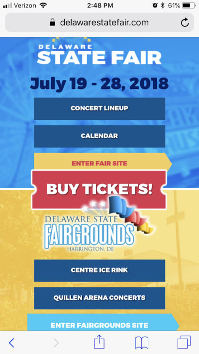
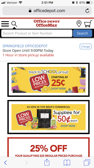
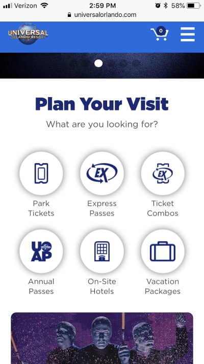

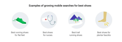

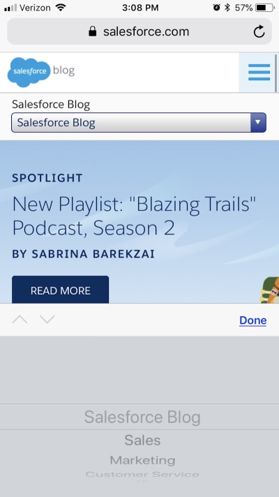
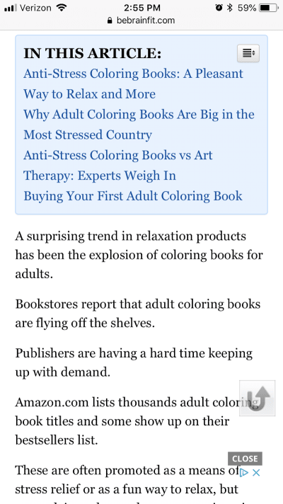
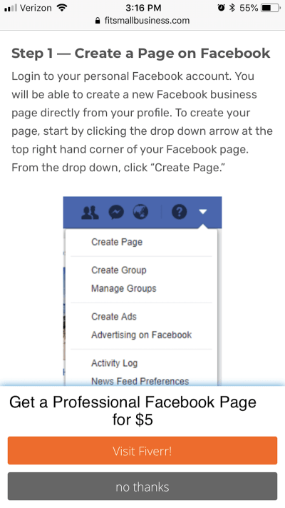
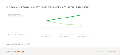
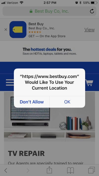
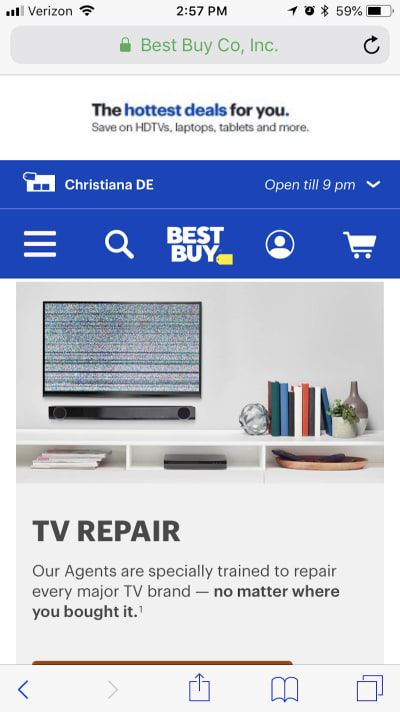

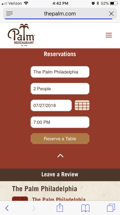
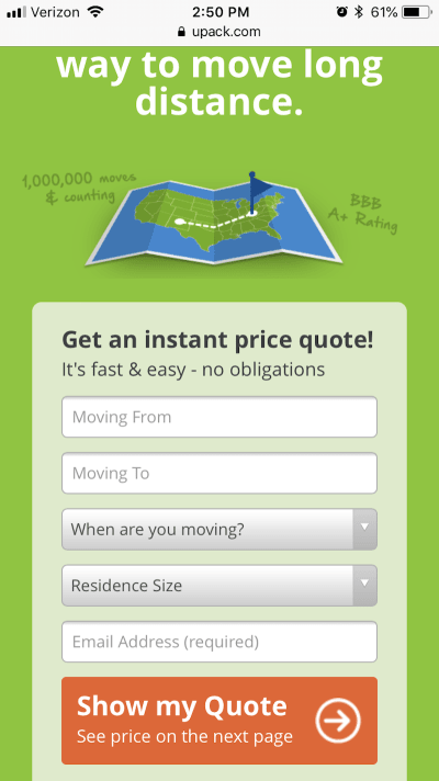
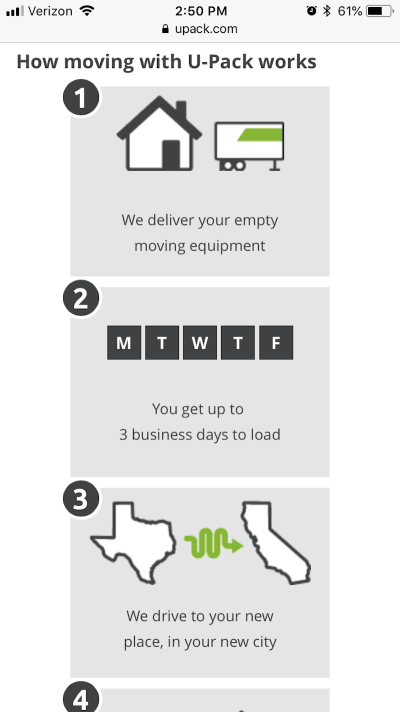

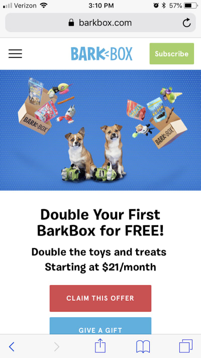