Live Accessibility And Performance Audits At SmashingConf Toronto
Live Accessibility And Performance Audits At SmashingConf Toronto
Markus Seyfferth
Earlier this year, many of your favorite speakers were featured at SmashingConf Toronto, however, things were quite different this time. The speakers had been asked to present without slides. It was interesting to see the different ways our speakers approached the challenge.
Two of our speakers chose to demonstrate how they audit a site or application live on stage: Marcy Sutton on accessibility, and Tim Kadlec on performance. Watch the videos to see an expert perform these audits, and see if there is anything you can take back to your own testing processes.
Marcy took two example components, built using React, and walked us through how these components could be made more accessible with some straightforward changes.
Performance: Tim Kadlec
Tim demonstrates how to test the performance of a site, and find bottlenecks leading to poor experiences for visitors. If you have ever wondered how to get started testing for performance, this is a talk you will find incredibly useful.
SmashingConf New York 2018: That’s What It Was Like
SmashingConf New York 2018: That’s What It Was Like
Bruce Lawson
As you may know, Smashing Magazine runs a conference — four a year, in fact. Last week saw me, Vitaly, Amanda and Mariona from the Smashing Team in New York, joined by our friend from Beyond Tellerand Marc Thiele, our amazing DJ, Tobi Lessnow, who wowed the crowd with his ‘sketchnotes to music’. And, of course, there was a full house of our Smashing Family from around the world: the Arctic and Antarctic were the only continents unrepresented.
Pins show where Smashing Conf attendees come from.
Although I’ve spoken at many Smashing Conferences, and attended even more, this was the first time as a member of the team. So I worked the Smashing booth with our amazing volunteer Scott Whitehead so I could meet attendees, and find out what they do, what they’re interested in and what drives them.
I didn’t attend all the talks, as there were many conversations to be had at the booth — but as usual, the audience collaborated on note-taking; here are the notes from Day 1 and notes from Day 2. And, of course, the videos are all online. Smashing Members got early access (as well as other benefits, such as a free monthly webinar and access to e-books, from USD $ 3 a month).
Our lovely Smashing audience enjoying the talks.
I was struck by how friendly the audience were, to conference staff, speakers and each other. I overheard strangers forming little huddles at our booth and giving each other career and technical advice, and during the breaks people were lining up to ask questions or simply chat with the speakers.
At Smashing Conferences, we don’t big up speakers to be Idols On A Pedestal — they’re developers just like the audience, who happen to have solved a problem that we think others face, so share that knowledge. We even managed an impromptu book signing session, as one of the speakers, Chiara Aliotta, designed the cover and illustrations for Smashing Book 6.
Chiara shows off her work for the cover of Smashing Book 6
It was great fun to meet so many passionate web professionals from all around the globe, some old hands and many just beginning their careers. Thank you for being there, thanks for supporting us, and thanks for buying all our books so I didn’t have to carry them home!
Conference Sketchnotes
We were blessed with having Gary Shroeder make live sketchnotes during the conference, and here are some of them:
Sketchnotes from Dan Mall’s talk. Image credit: Gary SchroederSketchnotes from Debbie Millman’s talk. Image credit: Gary SchroederSketchnotes from Josh Clark’s talk. Image credit: Gary SchroederSketchnotes from Paul Boag’s talk. Image credit: Gary Schroeder
You can also find a lot more sketchnotes on Twitter.
Conference Videos
Linked below are some of the videos recorded at Smashing Conf NY. If you’d like to be in the room with speakers like these next year, take a look at what we have planned for 2019!
Smashing Conferences are friendly, inclusive events for people who care about their work. No fluff, no fillers, no multi-track experience — just actionable insights applicable to your work right away. With live interactive sessions, showing how we all can better design and build for the web. Here’s the schedule for the next year:
San Francisco, USA (Apr 16–17) Better estimates and pricing, applying psychology to UX, design workflow, refactoring, moving to a static site setup, CSS Grid techniques, performance and deployment patterns for HTTP/2. Explore all speakers and topics ↬
Toronto, Canada (Jun 25–26) Better contracts, naming conventions, security audit, responsive art direction, front-end architecture, rendering performance, CSS Grid Layout, PWA, Vue.js, Webpack. Explore all speakers and topics ↬
Freiburg, Germany (Sep 9–10) Design process, better conversion, performance, privacy, JavaScript architecture, PWA, scalability, Webpack, multi-cultural design, AI. Super early birds are now available ↬
New York City, USA (Oct 15-16) CSS Grid, Accessibility, Front-end Performance, Progressive Web Apps, HTTP/2, Vue.js, design workflow, branding, machine learning. Super early birds are now available ↬
Why Your 404 Pages Might Be The Unexpected Hero Of Your Content Marketing Strategy
A lot of people toss around the phrase, “It’s not about the destination. It’s about the journey.” And those people are telling the truth — until they hit a roadblock.
Missed turns or poorly-given directions can cost someone hours on a trip. When you’re on a mission, those hours spent trying to find what you need could ruin the entire experience.
It doesn’t always have to end in disaster. This more optimal scenario could occur: you take a wrong turn, but after stopping at a nearby gas station, you leave with more than accurate directions to your final destination. You’ve also managed to score a free ice cream cone from the sweet old lady working behind the gas station’s register because she saw you were lost… and wanted to cheer you up.
Often, website visitors can wind up getting turned around. It’s not always their fault. They could’ve typed in the wrong URL (common) or clicked on a broken link (our mistake). Whatever the reasoning, you now have confused people who only wanted to engage with your website in some way and now can’t. You hold the reins on their navigation. You can guide them back to where you wanted them to go all along or you can leave them frustrated and in the dark. Do they need to make a U-turn? Did they get off at the wrong exit? Only you can tell them, and the best way to do so is through a 404 error page.
Your website’s 404 error page can deliver either of these scenarios with regard to getting your visitors back on their buyer’s journey. A lackluster 404 page irritates your visitors and chases them away into the hands of a competing website that better guides them to what they’re looking for. That lackluster 404 page has bland messaging with minimal visual elements. It might include a variation of the same serif text: “This page does not exist.” That’s like your web users asking you for directions and telling them nothing more than “well, what you’re looking for isn’t here. Good luck.” Nothing more.
Even brands with seemingly clever branding can neglect a 404 page! The owner of this sad excuse for an error page will remain anonymous (but it rhymes with Bards Tragainst Bubanity). (Large preview)
Unfortunately, even some of the world’s best brands use these 404 pages. No navigation. No interesting text. Nothing that reflects their brand messaging. Visitors are left even more disappointed in their encounter than before.
However, there are some 404 pages that go above and beyond. Rather than the stark white of a standard 404 error page, these pages take an opportunity to speak to users in a more personal tone. Excellent 404 pages are exactly like getting an unexpected treat from a friendly face. Well-crafted 404 Pages can redirect your pages’ visitors away from being lost and confused and to a much happier mood and onto a more helpful page on your website.
Take Amazon, for instance. On Amazon Day 2018, Amazon learned firsthand the importance of a decent 404 page. Sure, buyers were still frustrated upon reaching a 404 page — even if it included a puppy. However, could you imagine how much more irritated buyers would’ve been had the 404 page looked clinical, cold, and not helpful?
Regardless of what tone you want to take or what visuals you want to use or what copy will best engage your readers, a great 404 page does one thing above all else: Makes website visitors okay with not finding what they need — if only for a moment — and directs them to where they need to go.
While 404 pages vary greatly, the best ones all seem to do two things well:
support the company’s overall brand and messaging;
successfully redirect website visitors elsewhere on the page through clear navigation and support.
Thematically, there are a few ways to accomplish the ‘perfect’ 404 page:
1. Nail Down The Overall Tone
If content isn’t your brand’s strong suit, this could be a struggle. However, if you have a sense of your brand’s voice and messaging, you can quickly identify where you can offer something unexpected. Visitors are already going to be disappointed when they hit your 404 page; they’re not getting what they wanted. Your 404 page is an opportunity to show that your brand has humans behind its marketing rather than robotic, cold, automated messages seen elsewhere. In short, move beyond the “this page is unavailable” and its variants.
Regardless of the tone, good 404 pages work like magicians. The best illusionists often acknowledge they’re magicians; they don’t pretend to be something they’re not. 404 pages own up to being an error page; the copy and visuals often reflect that. And then, like any good magician, 404 pages pull the attention away from the problem and put that attention elsewhere. Typically, that’s done with copy that matches the visual elements.
Here are some themes/moods that successful 404 pages have leveraged in the past used to succeed.
Crack A Joke
A joke (even a corny one) can do wonders for alleviating awkwardness or inconvenience. However, unless your brand is built on crude humor (i.e. Cards Against Humanity which ironically doesn’t have a good 404 page), it’s best to make the jokes either tongue in cheek or punny rather than too crass. This example from Modcloth makes a quick pun but keeps the mood light.
Happy and snappy, this 404 page aligns with the rest of the brand’s fun copy. (Large preview)
Get Clever
It might not be outright funny, but it’s something that gets a visitor’s attention shortly after arriving on your page. It can be a little sassy, snarky, even unexpected. This 404 page from Blizzard Entertainment does a great job at flipping the script both with its visual tone and its copy.
Sarcasm pays off well for the gaming giant’s 404 page. (Large preview)
Be Friendly
Prime example would be LEGO Shop’s 404 page with a friendly customer service rep (albeit a LEGO rep). The friendliness can come from an inviting design or warm copy. Ultimately, it’s anything that culminates in a sense of “oh hey, we’re really sorry about that. Let us try to fix it.”
“If your company’s brand excels in customer service and customer care, maybe taking a tone of genuine friendliness would be most appropriate to carry over brand messaging. If that’s the case, treat your 404 page like an extension of your guest services window.”
People love to click on things, especially if they’re engaging with the 404 page on desktop. And if they’re engaging with your website, all the better! One of the best examples online of interactivity on a 404 page is from Kualo. The site hosting provider gamified its 404 page into a recreation of Space Invaders, complete with the ability to earn extra lives as you level up. Even more impressive is that Kualo actually offers discounts on its hosting for certain thresholds of points that users reach.
The gamification of Kualo’s 404 keeps users coming back for more chances to win. (Large preview)
Be Thought-provoking
Yes, your 404 pages can even be educational! 404 pages can offer up resources and links to other helpful spots on your website. It’s an unexpected distraction that could easily keep guests entertained by more information. National Public Radio (NPR) does this exceptionally well. The media outlet provides a collection of features with one major similarity: the stories are about things which have also disappeared.
Use this one with caution, as there’s a very good chance you’ll have to change your 404 message if you’re going to be topical. Pop culture references move fast; if you’re not careful, you’ve spent too much time developing a 404 page that will be irrelevant in two weeks. (And this is a cardinal sin for any organization with a target market of Millennials or younger.) The Spotify 404 page above recently underwent a shift to keep up with trends. Prior to doing a quick play on Kanye West’s “808 and Heartbreak,” the 404 page featured lyrics from Justin Bieber’s “Sorry.”
Once you have an idea of the proper tone for your 404 page, visuals are an important next step in the process. Visuals are often the first element of a 404 page people will note first — and thus, it’s the first representation of that page’s desired tone.
Static visuals help emphasize the page copy. Adding in light animation can often collaborate with the text to further a message or tone. For example, Imgur’s 404 page brings its illustrations to life by making the eyes of its characters follow a visitor’s cursor.
Interactivity among the visual elements give people an opportunity to do what frustrated internet users love to do — click on everything in an attempt at making something useful happen.
3. Nail Down The Navigation Options
You know what tone you want your business to strike. You’ve got an idea of the visuals you’ll use to present that tone. Your website visitors will think it’s great and fun — but only for a moment. Your website still has to get them to what they’re looking for. Clear navigation is the next big step in directing your lost website visitors toward their goals. A 404 page that’s cute but lacks good navigation design is like that sweet old man who is kind but he gives you the world’s worst directions.
“After making a good first impression with your 404 page, the immediate next step should be getting website visitors off it and to where they want to be. There should always be clear indications on where they should go next.”
For example, Shutterstock’s 404 page offers three distinct options. Visitors can either go back to the previous page, which is helpful if they clicked on the wrong link. They can return to the homepage for more of a hard restart in their navigation, or maybe they came in from a search engine and found a broken link, but they’re not quite ready to give up on the website and want to look around. The final option is to report a problem. If someone has been scouring your website for minutes on end and they have an idea of what they’re looking for, they can report that they might have found an issue. At the very least, it gets your web visitors involved with your company and your development team gets feedback about the accessibility of your website.
In addition to clear navigation, these other navigation-based elements could help your visitors out even more:
Chatbots / live chat: Bots are often received one of two ways. Users either find them incredibly annoying or relatively helpful. Bots that pop up within a second of landing on a page often lead visitors to click out of a site entirely as the bot seems intrusive. However, your website can use bots by simply adding a “Click to chat” option. This invites lost visitors who want your help to engage with the bot rather than the bot making a potentially annoying first move.
Search Bars: This element can do wonders for websites with a high volume of pages and information. A search bar could also offer up answers to common questions or redirect to an FAQ.
And one final navigation note — make sure those navigation tactics are just as efficient on mobile as they are on desktop. Treat your 404 page as you would any other. In order for it to succeed, it should be easily navigable to a variety of users, especially in a mobile-first world.
While the look of your 404 page is critical, you ideally never want anyone to find it on your website. Knowing the most common 404 errors on your website could give you insights in how to reduce those issues.
How To Track 404 Events Using Google Analytics
What You Need To Start Tracking
The code provided will report 404 events within Google Analytics, so you must have an up-and-running account there to take advantage of this tutorial. You also need access to your site’s 404 template and (this is important) the 404 page must preserve the URL structure of the typed/clicked page. This means that your 404 events can’t just redirect to your 404 page. You must serve the 404 template dynamically with the exact URL that is throwing the error. Most web server services (such as Apache) allow you to do this with a variety of rewrite rules.
With Google Analytics, tracking explicit 404 errors is straightforward and simple. Just ensure that your main Google Analytics tracking script is in place and then add the following code to your 404 Error Page/Template:
You will need to swap out the ID of your specific Google Analytics account. After that, the script works by sending an “event” to Google Analytics. The category is “404 Response,” the action uses JavaScript to pass the URL that throws the error, and the label uses JavaScript to pass along the previous URL the user was on. Through all of this data, you can then see what URLs cause 404 events and where people are accessing those URLs.
Tracking 404 Errors With Google Tag Manager
More and more web managers have decided to move to Google Tag Manager. This tool gives them the capability of embedding a whole host of scripts through a single container. It’s especially useful if you have a lot of tracking scripts from several providers. To begin tracking 404s through Tag Manager, first begin by creating a “Variable” called “Page Title Variable.” This variable type is a “JavaScript” variable and the Variable Name is “document.title”:
Essentially, we’re creating a variable that checks for a page’s given title. This is how we will check if we are on a 404 page.
Then create a “Trigger” called “404 Page Title Trigger.” The type is “Page View” and the trigger fires when the “Page Title Variable” contains “404 — Page Not Found” or whatever it is your 404 page title displays as within the browser.
The Variable, Trigger, and Tag all work to pass along the relevant data directly to Google Analytics.
404 Event Reporting
No matter your tracking method (be it through Tag Manager or direct event beacons), your reporting should be the same within Google Analytics. Under “Behavior,” you will see an item called “Events.” Here you will see all reported 404 events. The “Event Action” and “Event Label” dimensions will give you the pertinent data of what URLs are throwing 404 errors and their referring source.
With this in place, you can now regularly monitor your 404 errors and take the necessary steps to minimize their occurrence. In doing so, you optimize your referral sources and provide the best user experience, keeping conversions and engagement on the right path.
What To Do With Your Google Analytics Results
Now that you know how to monitor those 404 errors, what’s a developer to do? The key takeaway from tracking 404 occurrences is to look for patterns that result in those errors. The data should help you determine user intent, cluing you into what your users want. Ideally, you’ll see trends in what brings people to your 404 page, and you can apply that knowledge to adjust your website accordingly.
If your website visitors are stumbling while searching for a page, take the opportunity to create content that fills in that hole. That way people get results they hadn’t previously seen from your site.
The 404 events could be avoided with a tweak in your website’s design. Make sure the navigation on your pages are clear and direct users to logical ending points. The fix could even be as simple as changing descriptions on a page to paint a clearer picture for users.
Putting It All Together
Tone, images, and navigation — these three elements can transform any 404 page from a ghost town into a pleasant serendipitous stop for your website visitors. And while you don’t want them to stay there forever, you can certainly make sure they stay with you is enjoyable before sending them on their way. By regularly monitoring your 404 errors, you can also alleviate some of the ditches, poorly-marked signage, and potholes that frequently derail users. Being proactive and reactive with 404 errors ultimately improves the journey and the destination for your website visitors.
wordpress gutenberg is a good plugin but at the first glance we install it for checking but with custom theme development its hard to adjust, our advice is using Gutenberg is good for new basic theme developers they can use it freely its easy to use, Gutenberg may be built in competition of divi theme but they never beat that, divi is great for beginners
so try the Guttenberg if you like to go ahead with that, you can write the suggestion for help we glad to help you
Animated GIFs have a lot going for them; they’re easy to make and work well enough in literally all browsers. But the GIF format was not originally intended for animation. The original design of the GIF format was to provide a way to compress multiple images inside a single file using a lossless compression algorithm (called LZW compression) which meant they could be downloaded in a reasonably short space of time, even on slow connections.
Later, basic animation capabilities were added which allowed the various images (frames) in the file to be painted with time delays. By default, the series of frames that constitute the animation was displayed only once, stopping after the last frame was shown. Netscape Navigator 2.0 was the first browser to added the ability for animated GIFs to loop, which lead to the rise of animated GIFs as we know them today.
As an animation platform, the GIF format is incredibly limited. Each frame in the animation is restricted to a palette of just 256 colors, and over the years, advances in compression technology has made leading to several improvements the way animations and video files are compressed and used. Unlike proper video formats, the GIF format does not take advantage of any of the new technology meaning that even a few seconds of content can lead to tremendously large file sizes since a lot of repetitive information is stored.
Even if you try to tweak the quality and length of a GIF with a tool like Gifsicle, it can be difficult to cut it down to a reasonable file size. This is the reason why GIF heavy websites like Giphy, Imgur and the likes do not use the actual GIF format, but rather convert it to HTML5 video and serve those to users instead. As the Pinterest Engineering team found, converting animated GIFs to video can decrease load times and improve playback smoothness leading to a more pleasant user experience.
Hence, we’re going to look at some techniques that enable us use HTML5 video as a drop in replacement for animated GIFs. We’ll learn how to convert animated GIFs to video files and examine how to properly embed these video files on the web so that they act just like a GIF would. Finally, we’ll consider a few potential drawbacks that you need to ponder before using this solution.
Convert Animated GIFs To Video
The first step is to convert GIF files to a video format. MP4 is the most widely supported format in browsers with almost 94% of all browsers enjoying support, so that’s a safe default.
94% of all browsers support the MP4 format (Large preview)
Another option is the WebM format which offers high quality videos, often comparable to an MP4, but usually at a reduced file size. However, at this time, browser support is not as widespread so you can’t just go replacing MP4 files with their WebM equivalents.
Internet Explorer and Safari are notable browsers without WebM support (Large preview)
However, because the <video> tag supports multiple <source> files, we can serve WebM videos to browsers that support them while falling back to MP4 everywhere else.
Let’s go ahead and convert an animated GIF to both MP4 and WebM. There are several online tools that can help you do this, but many of them use ffmpeg under the hood so we’ll skip the middle man and just use that instead. ffmpeg is a free and open source command line tool that is designed for the processing of video and audio files. It can also be used to convert an animated GIF to video formats.
To find out if you have ffmpeg on your machine, fire up a terminal and run the ffmpeg command. This should display some diagnostic information, otherwise, you’ll need to install it. Installation instructions for Windows, macOS and Linux can be found on this page. Since we’ll be converting to is WebM, you need to make sure that whatever ffmpeg build you install is compiled with libvpx.
To follow along with the commands that are included in this article, you can use any animated GIF file lying around on your computer or grab this one which is just over 28MB. Let’s begin by converting a GIF to MP4 in the next section.
Convert GIF To MP4
Open up a terminal instance and navigate to the directory where the test gif is located then run the command below to convert it to an MP4 video file:
ffmpeg -i animated.gif video.mp4
This should output a new video file in the current directory after a few seconds depending on the size of the GIF file you’re converting. The -i flag specifies the path to the input GIF file and the output file is specified afterwards (video.mp4 in this instance). Running this command on my 28MB GIF produces an MP4 file that is just 536KB in size, a 98% reduction in file size with roughly the same visual quality.
But we can go even further than that. ffmpeg has so many options that you can use to regulate the video output even further. One way is to employ an encoding method known as Constant Rate Factor (CRF) to trim the size of the MP4 output even further. Here’s the command you need to run:
ffmpeg -i animated.gif -b:v 0 -crf 25 video.mp4
As you can see, there are a couple of new flags in above command compared to the previous one. -b:v is normally used to limit the output bitrate, but when using CRF mode, it must be set to 0. The -crf flag controls the quality of the video output. It accepts a value between 0 and 51; the lower the value, the higher the video quality and file size.
Running the above command on the test GIF, trims down the video output to just 386KB with no discernable difference in quality. If you want to trim the size even further, you could increase the CRF value. Just keep in mind that higher values will lower the quality of the video file.
Convert GIF To WebM
You can convert your GIF file to WebM by running the command below in the terminal:
This command is almost the same as the previous one, with the exception of a new -c flag which is used to specify the codec that should be used for this conversion. We are using the vp9 codec which succeeds the vp8 codec.
In addition, I’ve adjusted the CRF value to 41 in this case since CRF values don’t necessarily yield the same quality across video formats. This particular value results in a WebM file that is 16KB smaller than the MP4 with roughly the same visual quality.
Now that we know how to convert animated GIFs to video files, let’s look at how we can imitate their behavior in the browser with the HTML5 <video> tag.
Replace Animated GIFs With Video In The Browser
Making a video act like a GIF on a webpage is not as easy as dropping the file in an <img> tag, but it’s not so difficult either. The major qualities of animated GIFs to keep in mind are as follows:
They play automatically
They loop continuously
They are silent
While you get these qualities by default with GIF files, we can cause a video file to act the exact same way using a handful of attributes. Here’s how you’ll embed a video file to behave like a GIF:
This markup instructs the browser to automatically start the video, loop it continuously, play no sound, and play inline without displaying any video controls. This gives the same experience as an animated GIF but with better performance.
To specify more that once source for a video, you can use the <source> element within the <video> tag like this:
This tells the browser to choose from the provided video files depending on format support. In this case, the WebM video will be downloaded and played if it’s supported, otherwise the MP4 file is used instead.
To make this more robust for older browsers which do not support HTML5 video, you could add some HTML content linking to the original GIF file as a fallback.
<video autoplay loop muted playsinline> <source src="video.webm" type="video/webm"> <source src="video.mp4" type="video/mp4"> Your browser does not support HTML5 video. <a href="/animated.gif">Click here to view original GIF</a> </video>
Or you could just add the GIF file directly in an <img> tag:
Now that we’ve examined how to emulate animated GIFs in the browser with HTML5 video, let’s consider a few potential drawbacks to doing so in the next section.
Potential Drawbacks
There are a couple of drawbacks you need to consider before adopting HTML5 video as a GIF replacement. It’s clearly not as convenient as simply uploading a GIF to a page and watch is just work everywhere. You need to encode it first, and it may be difficult to implement an automated solution that works well in all scenarios.
The safest thing would be to convert each GIF manually and check the result of the output to ensure a good balance between visual quality and file size. But on large projects, this may not be practical. In that case, it may be better to look to a service like Cloudinary to do the heavy lifting for you.
Another problem is that unlike images, browsers do not preload video content. Because video files can be of any length, they’re often skipped until the main thread is ready to parse their content. This could delay the loading of a video file by several hundreds of milliseconds.
Additionally, there are quite a few restrictions on autoplaying videos especially on mobile. The muted attribute is actually required for videos to autoplay in Chrome for Android and iOS Safari even if the video does not contain an audio track, and where autoplay is disallowed, the user will only see a blank space where the video should have been. An example is Data Saver mode in Chrome for Android where autoplaying videos will not work even if you set up everything correctly.
To account for any of these scenarios, you should consider setting a placeholder image for the video using the poster attribute so that the video area is still populated with meaningful content if the video does not autoplay for some reason. Also consider using the controls attribute which allows the user to initiate playback even if video autoplay is disallowed.
Wrap Up
By replacing animated GIFs with HTML5 video, we can provide awesome GIF-like experiences without the performance and quality drawbacks associated with GIF files. Doing away with animated GIFs is worth serious consideration especially if your site is GIF-heavy.
Taking the time to convert the GIF files on your site to video can lead to a massive improvement in page load times. Provided your website is not too complex, it is fairly easy to implement and you can be up and running within a very short amount of time.
How To Build A Virtual Reality Model With A Real-Time Cross-Device Preview
How To Build A Virtual Reality Model With A Real-Time Cross-Device Preview
Alvin Wan
Virtual reality (VR) is an experience based in a computer-generated environment; a number of different VR products make headlines and its applications range far and wide: for the winter Olympics, the US team utilized virtual reality for athletic training; surgeons are experimenting with virtual reality for medical training; and most commonly, virtual reality is being applied to games.
We will focus on the last category of applications and will specifically focus on point-and-click adventure games. Such games are a casual class of games; the goal is to point and click on objects in the scene, to finish a puzzle. In this tutorial, we will build a simple version of such a game but in virtual reality. This serves as an introduction to programming in three dimensions and is a self-contained getting-started guide to deploying a virtual reality model on the web. You will be building with webVR, a framework that gives a dual advantage — users can play your game in VR and users without a VR headset can still play your game on a phone or desktop.
Developing For Virtual Reality
Any developer can create content for VR nowadays. To get a better understanding of VR development, working a demo project can help. Read article →
In the second half of these tutorial, you will then build a “mirror” for your desktop. This means that all movements the player makes on a mobile device will be mirrored in a desktop preview. This allows you see what the player sees, allowing you to provide guidance, record the game, or simply keep guests entertained.
Prerequisites
To get started, you will need the following. For the second half of this tutorial, you will need a Mac OSX. Whereas the code can apply to any platform, the dependency installation instructions below are for Mac.
A virtual reality headset (optional, recommended). I use Google Cardboard, which is offered at $ 15 a piece.
Step 1: Setting Up A Virtual Reality (VR) Model
In this step, we will set up a website with a single static HTML page. This allows us to code from your desktop and automatically deploy to the web. The deployed website can then be loaded on your mobile phone and placed inside a VR headset. Alternatively, the deployed website can be loaded by a standalone VR headset. Get started by navigating to glitch.com. Then,
To preview the webpage, click on “Preview” in the top left. We will refer to this as your preview. Note that any changes in your editor will be automatically reflected in this preview, barring bugs or unsupported browsers.
To preview this on your VR headset, use the URL in the omnibar. In the picture above, the URL is https://point-and-click-vr-game.glitch.me/. Your working environment is now set up; feel free to share this URL with family and friends. In the next step, you will create a virtual reality model.
Step 2: Build A Tree Model
You will now create a tree, using primitives from aframe.io. These are standard objects that Aframe has pre-programmed for ease of use. Specifically, Aframe refers to objects as entities. There are three concepts, related to all entities, to organize our discussion around:
Geometry and material,
Transformation Axes,
Relative Transformations.
First, geometry and material are two building blocks of all three-dimensional objects in code. The geometry defines the “shape” — a cube, a sphere, a pyramid, and so on. The material defines static properties of the shape, such as color, reflectiveness, roughness.
Aframe simplifies this concept for us by defining primitives, such as <a-box>, <a-sphere>, <a-cylinder> and many others to make a specification of a geometry and its material simpler. Start by defining a green sphere. On line 19 in your code, right after <!-- start code here -->, add the following.
<!-- start code here --> <a-sphere color="green" radius="0.5"></a-sphere> <!-- new line --> <!-- end code here -->
Second, there are three axes to transform our object along. The x axis runs horizontally, where x values increase as we move right. The y axis runs vertically, where y values increase as we move up. The z axis runs out of your screen, where z values increase as we move towards you. We can translate, rotate, or scale entities along these three axes.
For example, to translate an object “right,” we increase its x value. To spin an object like a top, we rotate it along the y-axis. Modify line 19 to move the sphere “up” — this means you need to increase the sphere’s y value. Note that all transformations are specified as <x> <y> <z>, meaning to increase its y value, you need to increase the second value. By default, all objects are located at position 0, 0, 0. Add the position specification below.
<!-- start code here --> <a-sphere color="green" radius="0.5" position="0 1 0"></a-sphere> <!-- edited line --> <!-- end code here -->
Third, all transformations are relative to its parent. To add a trunk to your tree, add a cylinder inside of the sphere above. This ensures that the position of your trunk is relative to the sphere’s position. In essence, this keeps your tree together as one unit. Add the <a-cylinder> entity between the <a-sphere ...> and </a-sphere> tags.
<a-sphere color="green" radius="0.5" position="0 1 0"> <a-cylinder color="#84651e" position="0 -0.9 0" radius="0.05"></a-cylinder> <!-- new line --> </a-sphere>
To make this treeless barebones, add more foliage, in the form of two more green spheres.
<a-sphere color="green" radius="0.5" position="0 0.75 0"> <a-cylinder color="#84651e" position="0 -0.9 0" radius="0.05"></a-cylinder> <a-sphere color="green" radius="0.35" position="0 0.5 0"></a-sphere> <!-- new line --> <a-sphere color="green" radius="0.2" position="0 0.8 0"></a-sphere> <!-- new line --> </a-sphere>
Navigate back to your preview, and you will see the following tree:
Reload the website preview on your VR headset, and check out your new tree. In the next section, we will make this tree interactive.
Step 3: Add Click Interaction To Model
To make an entity interactive, you will need to:
Add an animation,
Have this animation trigger on click.
Since the end user is using a virtual reality headset, clicking is equivalent to staring: in other words, stare at an object to “click” on it. To effect these changes, you will start with the cursor. Redefine the camera, by replacing line 13 with the following.
The above adds a cursor that can trigger the clicking action. Note the objects: .clickable property. This means that all objects with the class “clickable” will trigger the animation and receive a “click” command where appropriate. You will also add an animation to the click cursor, so that users know when the cursor triggers a click. Here, the cursor will shrink slowly when pointing at a clickable object, snapping after a second to denote an object has been clicked. Replace the comment <!-- add animation here --> with the following code:
The above properties specify a number of configurations for the animation. The animation:
Is triggered by the click event
Modifies the tree’s position
Starts from the original position 2 0.75 0
Ends in 2.2 0.75 0 (moving 0.2 units to the right)
Animates when traveling to and from the destination
Alternates animation between traveling to and from the destination
Repeats this animation once. This means the object animates twice in total — once to the destination and once back to the original position.
Finally, navigate to your preview, and drag from the cursor to your tree. Once the black circle rests on the tree, the tree will move to the right and back.
This concludes the basics needed to build a point-and-click adventure game, in virtual reality. To view and play a more complete version of this game, see the following short scene. The mission is to open the gate and hide the tree behind the gate, by clicking on various objects in the scene.
Next, we set up a simple nodeJS server to serve our static demo.
Step 4: Setup NodeJS Server
In this step, we will set up a basic, functional nodeJS server that serves your existing VR model. In the left sidebar of your editor, select package.json.
Start by deleting lines 2-4.
"//1": "describes your app and its dependencies", "//2": "https://docs.npmjs.com/files/package.json", "//3": "updating this file will download and update your packages",
Change the name to mirrorvr.
{ "name": "mirrorvr", // change me "version": "0.0.1", ...
Update the repository URL to match your current glitch’s. The example glitch project is named point-and-click-vr-game. Replace that with your glitch project’s name.
Express This is the web framework we will use to run the server.
http This allows us to launch a daemon, listening for activity on various ports.
socket.io The sockets implementation that allows us to communicate between client-side and server-side in nearly real-time.
While importing these utilities, we additionally initialize the ExpressJS application. Note the first two lines are already written for you.
var express = require('express'); var app = express(); /* start new code */ var http = require('http').Server(app); var io = require('socket.io')(http); /* end new code */ // we've started you off with Express,
With the utilities loaded, the provided server next instructs the server to return index.html as the homepage. Note there is no new code written below; this is simply an explanation of the existing source code.
Finally, the existing source code instructs the application to bind to and listen to a port, which is 3000 by default unless specified otherwise.
// listen for requests var listener = app.listen(process.env.PORT, function() { console.log('Your app is listening on port ' + listener.address().port); });
Once you are finished editing, Glitch automatically reloads the server. Click on “Show” in the top-left to preview your application.
Your web application is now up and running. Next, we will send messages from the client to the server.
Step 5: Send Information From Client To Server
In this step, we will use the client to initialize a connection with the server. The client will additionally inform the server if it is a phone or a desktop. To start, import the soon-to-exist Javascript file in your views/index.html.
On line 14, add camera-listener to the list of properties for the camera entity.
<a-entity camera-listener camera look-controls...> ... </a-entity>
Then, navigate to public/client.js in the left sidebar. Delete all Javascript code in this file. Then, define a utility function that checks if the client is a mobile device.
/** * Check if client is on mobile */ function mobilecheck() { var check = false; (function(a){if(/(android|bb\d+|meego).+mobile|avantgo|bada\/|blackberry|blazer|compal|elaine|fennec|hiptop|iemobile|ip(hone|od)|iris|kindle|lge |maemo|midp|mmp|mobile.+firefox|netfront|opera m(ob|in)i|palm( os)?|phone|p(ixi|re)\/|plucker|pocket|psp|series(4|6)0|symbian|treo|up\.(browser|link)|vodafone|wap|windows ce|xda|xiino/i.test(a)||/1207|6310|6590|3gso|4thp|50[1-6]i|770s|802s|a wa|abac|ac(er|oo|s\-)|ai(ko|rn)|al(av|ca|co)|amoi|an(ex|ny|yw)|aptu|ar(ch|go)|as(te|us)|attw|au(di|\-m|r |s )|avan|be(ck|ll|nq)|bi(lb|rd)|bl(ac|az)|br(e|v)w|bumb|bw\-(n|u)|c55\/|capi|ccwa|cdm\-|cell|chtm|cldc|cmd\-|co(mp|nd)|craw|da(it|ll|ng)|dbte|dc\-s|devi|dica|dmob|do(c|p)o|ds(12|\-d)|el(49|ai)|em(l2|ul)|er(ic|k0)|esl8|ez([4-7]0|os|wa|ze)|fetc|fly(\-|_)|g1 u|g560|gene|gf\-5|g\-mo|go(\.w|od)|gr(ad|un)|haie|hcit|hd\-(m|p|t)|hei\-|hi(pt|ta)|hp( i|ip)|hs\-c|ht(c(\-| |_|a|g|p|s|t)|tp)|hu(aw|tc)|i\-(20|go|ma)|i230|iac( |\-|\/)|ibro|idea|ig01|ikom|im1k|inno|ipaq|iris|ja(t|v)a|jbro|jemu|jigs|kddi|keji|kgt( |\/)|klon|kpt |kwc\-|kyo(c|k)|le(no|xi)|lg( g|\/(k|l|u)|50|54|\-[a-w])|libw|lynx|m1\-w|m3ga|m50\/|ma(te|ui|xo)|mc(01|21|ca)|m\-cr|me(rc|ri)|mi(o8|oa|ts)|mmef|mo(01|02|bi|de|do|t(\-| |o|v)|zz)|mt(50|p1|v )|mwbp|mywa|n10[0-2]|n20[2-3]|n30(0|2)|n50(0|2|5)|n7(0(0|1)|10)|ne((c|m)\-|on|tf|wf|wg|wt)|nok(6|i)|nzph|o2im|op(ti|wv)|oran|owg1|p800|pan(a|d|t)|pdxg|pg(13|\-([1-8]|c))|phil|pire|pl(ay|uc)|pn\-2|po(ck|rt|se)|prox|psio|pt\-g|qa\-a|qc(07|12|21|32|60|\-[2-7]|i\-)|qtek|r380|r600|raks|rim9|ro(ve|zo)|s55\/|sa(ge|ma|mm|ms|ny|va)|sc(01|h\-|oo|p\-)|sdk\/|se(c(\-|0|1)|47|mc|nd|ri)|sgh\-|shar|sie(\-|m)|sk\-0|sl(45|id)|sm(al|ar|b3|it|t5)|so(ft|ny)|sp(01|h\-|v\-|v )|sy(01|mb)|t2(18|50)|t6(00|10|18)|ta(gt|lk)|tcl\-|tdg\-|tel(i|m)|tim\-|t\-mo|to(pl|sh)|ts(70|m\-|m3|m5)|tx\-9|up(\.b|g1|si)|utst|v400|v750|veri|vi(rg|te)|vk(40|5[0-3]|\-v)|vm40|voda|vulc|vx(52|53|60|61|70|80|81|83|85|98)|w3c(\-| )|webc|whit|wi(g |nc|nw)|wmlb|wonu|x700|yas\-|your|zeto|zte\-/i.test(a.substr(0,4))) check = true;})(navigator.userAgent||navigator.vendor||window.opera); return check; };
Next, we will define a series of initial messages to exchange with the server side. Define a new socket.io object to represent the client’s connection to the server. Once the socket connects, log a message to the console.
Check if the device is mobile, and send corresponding information to the server, using the function emit.
if (mobilecheck()) { socket.emit('newHost'); } else { socket.emit('newMirror'); }
This concludes the client’s message sending. Now, amend the server code to receive this message and react appropriately. Open the server server.js file.
Handle new connections, and immediately listen for the type of client. At the end of the file, add the following.
Again, preview the application by clicking on “Show” in the top left. Load that same URL on your mobile device. In your terminal, you will see the following.
listening on *: 3000 * Participant registered as 'host' * Participant registered as 'mirror'
This is the first of simple message-passing, where our client sends information back to the server. Quit the running NodeJS process. For the final part of this step, we will have the client send camera information back to the server. Open public/client.js.
At the very end of the file, include the following.
var camera; if (mobilecheck()) { AFRAME.registerComponent('camera-listener', { tick: function () { camera = this.el.sceneEl.camera.el; var position = camera.getAttribute('position'); var rotation = camera.getAttribute('rotation'); socket.emit('onMove', { "position": position, "rotation": rotation }); } }); }
Save and close. Open your server file server.js to listen for this onMove event.
Add the following, in the newHost block of your socket code.
socket.on('newHost', function() { console.log(" * Participant registered as 'host'"); /* start new code */ socket.on('onMove', function(data) { console.log(data); }); /* end new code */ });
Once again, load the preview on your desktop and on your mobile device. Once a mobile client is connected, the server will immediately begin logging camera position and rotation information, sent from the client to the server. Next, you will implement the reverse, where you send information from the server back to the client.
Step 6: Send Information From Server To Client
In this step, you will send a host’s camera information to all mirrors. Open your main server file, server.js.
Change the onMove event handler to the following:
socket.on('onMove', function(data) { console.log(data); // delete me socket.broadcast.emit('move', data) });
The broadcast modifier ensures that the server sends this information to all clients connected to the socket, except for the original sender. Once this information is sent to a client, you then need to set the mirror’s camera accordingly. Open the client script, public/client.js.
Here, check if the client is a desktop. If so, receive the move data and log accordingly.
if (!mobilecheck()) { socket.on('move', function(data) { console.log(data); }); }
Load the preview on your desktop and on your mobile device. In your desktop browser, open the developer console. Then, load the app on your mobile phone. As soon as the mobile phone loads the app, the developer console on your desktop should light up with camera position and rotation.
Open the client script once more, at public/client.js. We finally adjust the client camera depending on the information sent.
Amend the event handler above for the move event.
socket.on('move', function(data) { /* start new code */ camera.setAttribute('rotation', data["rotation"]); camera.setAttribute('position', data["position"]); /* end new code */ });
Load the app on your desktop and your phone. Every movement of your phone is reflected in the corresponding mirror on your desktop! This concludes the mirror portion of your application. As a desktop user, you can now preview what your mobile user sees. The concepts introduced in this section will be crucial for further development of this game, as we transform a single-player to a multiplayer game.
Conclusion
In this tutorial, we programmed three-dimensional objects and added simple interactions to these objects. Additionally, you built a simple message passing system between clients and servers, to effect a desktop preview of what your mobile users see.
These concepts extend beyond even webVR, as the notion of a geometry and material extend to SceneKit on iOS (which is related to ARKit), Three.js (the backbone for Aframe), and other three-dimensional libraries. These simple building blocks put together allow us ample flexibility in creating a fully-fledged point-and-click adventure game. More importantly, they allow us to create any game with a click-based interface.
Here are several resources and examples to further explore:
MirrorVR A fully-fledged implementation of the live preview built above. With just a single Javascript link, add a live preview of any virtual reality model on mobile to a desktop.
Bit by Bit A gallery of kids’ drawings and each drawing’s corresponding virtual reality model.
Aframe Examples, developer documentation, and more resources for virtual reality development.
Next time, we will build a complete game, using web sockets to facilitate real-time communication between players in a virtual reality game. Feel free to share your own models in the comments below.
You work hard to attract visitors to your website. Engaging with these visitors can help you connect with interested leads and give you valuable insight. For example, you may want to ask website visitors about what they are looking for to determine their interest in your service. Alternatively, you may be trying to gauge your net promoter score and question visitors about their overall satisfaction and willingness to recommend your organization. The problem is, visitors may navigate away from your website before you get any meaningful information. Or they may input incorrect contact information, making it impossible for your to follow-up with them. When this happens, you just have to wait and hope they come back to continue the conversation.
With our new website integration feature, you can start surveying website visitors while they browse your site and continue the conversation from anywhere. This is done by integrating P2W Bot with your website.
Continue your conversation from anywhere
Your website visitors may navigate away from your website before finishing a survey. With this integration, website visitors can continue your surveys from their phone, tablet, or where ever they use Messenger. The conversation history is saved in Messenger and conversations will continue exactly where they left off. The same goes if someone started a survey before navigating to your website. In this case, when someone navigates to your website, they can continue the survey where ever they left off. Conversations will be seamless and intuitive across each touchpoint.
Simple follow-up
Now, let’s say you want to follow-up with website visitors you’ve already interacted with. You may want to send them additional surveys regarding their experience with your organization or to see if there is anything else you can help them with. Anyone who started a survey on your website is automatically added to you panel, making it easy for you to follow-up with them directly in Website. You don’t need to collect any additional information, or worry that they may have provided the wrong email address. Re-engaging website visitors will be simple and automatic.
One of our Employess whic his a former Realtor (more than $200M in sales), turned marketing guru. After more than a decade of selling real estate, the boss in the corner office made me an offer…leave the suit and tie and begin marketing for the Realtors.
It was the best decision of his life. listen to his story in his own words,
I am Sadan and passionate about real estate, and I also know the struggle of juggling 50 thingthe s at time. Sadly, your personal marketing takes a back seat to all the other “pressing” issues of day.
We made a newsletter featuring your custom designed header, seasonal idea, calendar of important dates, helpful hints and more. You can print the letter and mail it out, share it on your Facebook page, insert into your listing packets and more. THE STANDARD DESIGN OF THIS GIG IS SIMILAR TO THE FEATURED IMAGE IN THE GALLERY.
I have worked with thousands of Coldwell Banker, Keller Williams, Re/Max, Prudential, Berkshire, Century 21 and more. I will brand your product with your logo and create a newsletter that gets you noticed!
Sharing Data Among Multiple Servers Through AWS S3
Sharing Data Among Multiple Servers Through AWS S3
Leonardo Losoviz
When providing some functionality for processing a file uploaded by the user, the file must be available to the process throughout the execution. A simple upload and save operation presents no issues. However, if in addition the file must be manipulated before being saved, and the application is running on several servers behind a load balancer, then we need to make sure that the file is available to whichever server is running the process at each time.
For instance, a multi-step “Upload your user avatar” functionality may require the user to upload an avatar on step 1, crop it on step 2, and finally save it on step 3. After the file is uploaded to a server on step 1, the file must be available to whichever server handles the request for steps 2 and 3, which may or may not be the same one for step 1.
A naive approach would be to copy the uploaded file on step 1 to all other servers, so the file would be available on all of them. However, this approach is not just extremely complex but also unfeasible: for instance, if the site runs on hundreds of servers, from several regions, then it cannot be accomplished.
A possible solution is to enable “sticky sessions” on the load balancer, which will always assign the same server for a given session. Then, steps 1, 2 and 3 will be handled by the same server, and the file uploaded to this server on step 1 will still be there for steps 2 and 3. However, sticky sessions are not fully reliable: If in between steps 1 and 2 that server crashed, then the load balancer will have to assign a different server, disrupting the functionality and the user experience. Likewise, always assigning the same server for a session may, under special circumstances, lead to slower response times from an overburdened server.
A more proper solution is to keep a copy of the file on a repository accessible to all servers. Then, after the file is uploaded to the server on step 1, this server will upload it to the repository (or, alternatively, the file could be uploaded to the repository directly from the client, bypassing the server); the server handling step 2 will download the file from the repository, manipulate it, and upload it there again; and finally the server handling step 3 will download it from the repository and save it.
In this article, I will describe this latter solution, based on a WordPress application storing files on Amazon Web Services (AWS) Simple Storage Service (S3) (a cloud object storage solution to store and retrieve data), operating through the AWS SDK.
Note 1: For a simple functionality such as cropping avatars, another solution would be to completely bypass the server, and implement it directly in the cloud through Lambda functions. But since this article is about connecting an application running on the server with AWS S3, we don’t consider this solution.
Note 2: In order to use AWS S3 (or any other of the AWS services) we will need to have a user account. Amazon offers a free tier here for 1 year, which is good enough for experimenting with their services.
Note 3: There are 3rd party plugins for uploading files from WordPress to S3. One such plugin is WP Media Offload (the lite version is available here), which provides a great feature: it seamlessly transfers files uploaded to the Media Library to an S3 bucket, which allows to decouple the contents of the site (such as everything under /wp-content/uploads) from the application code. By decoupling contents and code, we are able to deploy our WordPress application using Git (otherwise we cannot since user-uploaded content is not hosted on the Git repository), and host the application on multiple servers (otherwise, each server would need to keep a copy of all user-uploaded content.)
Creating The Bucket
When creating the bucket, we need to pay consideration to the bucket name: Each bucket name must be globally unique on the AWS network, so even though we would like to call our bucket something simple like “avatars”, that name may already be taken, then we may choose something more distinctive like “avatars-name-of-my-company”.
We will also need to select the region where the bucket is based (the region is the physical location where the data center is located, with locations all over the world.)
The region must be the same one as where our application is deployed, so that accessing S3 during the process execution is fast. Otherwise, the user may have to wait extra seconds from uploading/downloading an image to/from a distant location.
Note: It makes sense to use S3 as the cloud object storage solution only if we also use Amazon’s service for virtual servers on the cloud, EC2, for running the application. If instead, we rely on some other company for hosting the application, such as Microsoft Azure or DigitalOcean, then we should also use their cloud object storage services. Otherwise, our site will suffer an overhead from data traveling among different companies’ networks.
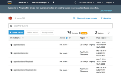
In the screenshots below we will see how to create the bucket where to upload the user avatars for cropping. We first head to the S3 dashboard and click on “Create bucket”:
S3 dashboard, showing all our existing buckets. (Large preview)
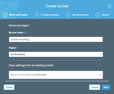
Then we type in the bucket name (in this case, “avatars-smashing”) and choose the region (“EU (Frankfurt)”):
Only the bucket name and region are mandatory. For the following steps we can keep the default options, so we click on “Next” until finally clicking on “Create bucket”, and with that, we will have the bucket created.
Setting Up The User Permissions
When connecting to AWS through the SDK, we will be required to enter our user credentials (a pair of access key ID and secret access key), to validate that we have access to the requested services and objects. User permissions can be very general (an “admin” role can do everything) or very granular, just granting permission to the specific operations needed and nothing else.
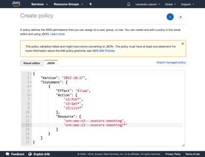
As a general rule, the more specific our granted permissions, the better, as to avoid security issues. When creating the new user, we will need to create a policy, which is a simple JSON document listing the permissions to be granted to the user. In our case, our user permissions will grant access to S3, for bucket “avatars-smashing”, for the operations of “Put” (for uploading an object), “Get” (for downloading an object), and “List” (for listing all the objects in the bucket), resulting in the following policy:
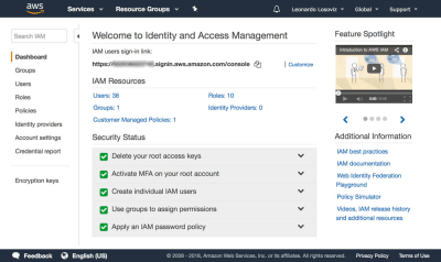
IAM dashboard, listing all the users we have created. (Large preview)
In the dashboard, we click on “Users” and immediately after on “Add User”. In the Add User page, we choose a user name (“crop-avatars”), and tick on “Programmatic access” as the Access type, which will provide the access key ID and secret access key for connecting through the SDK:
We then click on button “Next: Permissions”, click on “Attach existing policies directly”, and click on “Create policy”. This will open a new tab in the browser, with the Create policy page. We click on the JSON tab, and enter the JSON code for the policy defined above:
Creating a policy granting ‘Get’, ‘Post’ and ‘List’ operations on the ‘avatars-smashing’ bucket. (Large preview)
We then click on Review policy, give it a name (“CropAvatars”), and finally click on Create policy. Having the policy created, we switch back to the previous tab, select the CropAvatars policy (we may need to refresh the list of policies to see it), click on Next: Review, and finally on Create user. After this is done, we can finally download the access key ID and secret access key (please notice that these credentials are available for this unique moment; if we don’t copy or download them now, we’ll have to create a new pair):
After the user is created, we are offered a unique time to download the credentials. (Large preview)
Connecting To AWS Through The SDK
The SDK is available through a myriad of languages. For a WordPress application, we require the SDK for PHP which can be downloaded from here, and instructions on how to install it are here.
Once we have the bucket created, the user credentials ready, and the SDK installed, we can start uploading files to S3.
Uploading And Downloading Files
For convenience, we define the user credentials and the region as constants in the wp-config.php file:
define ('AWS_ACCESS_KEY_ID', '...'); // Your access key id define ('AWS_SECRET_ACCESS_KEY', '...'); // Your secret access key define ('AWS_REGION', 'eu-central-1'); // Region where the bucket is located. This is the region id for "EU (Frankfurt)"
In our case, we are implementing the crop avatar functionality, for which avatars will be stored on the “avatars-smashing” bucket. However, in our application we may have several other buckets for other functionalities, requiring to execute the same operations of uploading, downloading and listing files. Hence, we implement the common methods on an abstract class AWS_S3, and we obtain the inputs, such as the bucket name defined through function get_bucket, in the implementing child classes.
// Load the SDK and import the AWS objects require 'vendor/autoload.php'; use Aws\S3\S3Client; use Aws\Exception\AwsException; // Definition of an abstract class abstract class AWS_S3 { protected function get_bucket() { // The bucket name will be implemented by the child class return ''; } }
The S3Client class exposes the API for interacting with S3. We instantiate it only when needed (through lazy-initialization), and save a reference to it under $ this->s3Client as to keep using the same instance:
abstract class AWS_S3 { // Continued from above... protected $ s3Client; protected function get_s3_client() { // Lazy initialization if (!$ this->s3Client) { // Create an S3Client. Provide the credentials and region as defined through constants in wp-config.php $ this->s3Client = new S3Client([ 'version' => '2006-03-01', 'region' => AWS_REGION, 'credentials' => [ 'key' => AWS_ACCESS_KEY_ID, 'secret' => AWS_SECRET_ACCESS_KEY, ], ]); } return $ this->s3Client; } }
When we are dealing with $ file in our application, this variable contains the absolute path to the file in disk (e.g. /var/app/current/wp-content/uploads/users/654/leo.jpg), but when uploading the file to S3 we should not store the object under the same path. In particular, we must remove the initial bit concerning the system information (/var/app/current) for security reasons, and optionally we can remove the /wp-content bit (since all files are stored under this folder, this is redundant information), keeping only the relative path to the file (/uploads/users/654/leo.jpg). Conveniently, this can be achieved by removing everything after WP_CONTENT_DIR from the absolute path. Functions get_file and get_file_relative_path below switch between the absolute and the relative file paths:
abstract class AWS_S3 { // Continued from above... function get_file_relative_path($ file) { return substr($ file, strlen(WP_CONTENT_DIR)); } function get_file($ file_relative_path) { return WP_CONTENT_DIR.$ file_relative_path; } }
When uploading an object to S3, we can establish who is granted access to the object and the type of access, done through the access control list (ACL) permissions. The most common options are to keep the file private (ACL => “private”) and to make it accessible for reading on the internet (ACL => “public-read”). Because we will need to request the file directly from S3 to show it to the user, we need ACL => “public-read”:
abstract class AWS_S3 { // Continued from above... protected function get_acl() { return 'public-read'; } }
Finally, we implement the methods to upload an object to, and download an object from, the S3 bucket:
abstract class AWS_S3 { // Continued from above... function upload($ file) { $ s3Client = $ this->get_s3_client(); // Upload a file object to S3 $ s3Client->putObject([ 'ACL' => $ this->get_acl(), 'Bucket' => $ this->get_bucket(), 'Key' => $ this->get_file_relative_path($ file), 'SourceFile' => $ file, ]); } function download($ file) { $ s3Client = $ this->get_s3_client(); // Download a file object from S3 $ s3Client->getObject([ 'Bucket' => $ this->get_bucket(), 'Key' => $ this->get_file_relative_path($ file), 'SaveAs' => $ file, ]); } }
Then, in the implementing child class we define the name of the bucket:
class AvatarCropper_AWS_S3 extends AWS_S3 { protected function get_bucket() { return 'avatars-smashing'; } }
Finally, we simply instantiate the class to upload the avatars to, or download from, S3. In addition, when transitioning from steps 1 to 2 and 2 to 3, we need to communicate the value of $ file. We can do this by submitting a field “file_relative_path” with the value of the relative path of $ file through a POST operation (we don’t pass the absolute path for security reasons: no need to include the “/var/www/current” information for outsiders to see):
// Step 1: after the file was uploaded to the server, upload it to S3. Here, $ file is known $ avatarcropper = new AvatarCropper_AWS_S3(); $ avatarcropper->upload($ file); // Get the file path, and send it to the next step in the POST $ file_relative_path = $ avatarcropper->get_file_relative_path($ file); // ... // -------------------------------------------------- // Step 2: get the $ file from the request and download it, manipulate it, and upload it again $ avatarcropper = new AvatarCropper_AWS_S3(); $ file_relative_path = $ _POST['file_relative_path']; $ file = $ avatarcropper->get_file($ file_relative_path); $ avatarcropper->download($ file); // Do manipulation of the file // ... // Upload the file again to S3 $ avatarcropper->upload($ file); // -------------------------------------------------- // Step 3: get the $ file from the request and download it, and then save it $ avatarcropper = new AvatarCropper_AWS_S3(); $ file_relative_path = $ _REQUEST['file_relative_path']; $ file = $ avatarcropper->get_file($ file_relative_path); $ avatarcropper->download($ file); // Save it, whatever that means // ...
Displaying The File Directly From S3
If we want to display the intermediate state of the file after manipulation on step 2 (e.g. the user avatar after cropped), then we must reference the file directly from S3; the URL couldn’t point to the file on the server since, once again, we don’t know which server will handle that request.
Below, we add function get_file_url($ file) which obtains the URL for that file in S3. If using this function, please make sure that the ACL of the uploaded files is “public-read”, or otherwise it won’t be accessible to the user.
abstract class AWS_S3 { // Continue from above... protected function get_bucket_url() { $ region = $ this->get_region(); // North Virginia region is simply "s3", the others require the region explicitly $ prefix = $ region == 'us-east-1' ? 's3' : 's3-'.$ region; // Use the same scheme as the current request $ scheme = is_ssl() ? 'https' : 'http'; // Using the bucket name in path scheme return $ scheme.'://'.$ prefix.'.amazonaws.com/'.$ this->get_bucket(); } function get_file_url($ file) { return $ this->get_bucket_url().$ this->get_file_relative_path($ file); } }
Then, we can simply we get the URL of the file on S3 and print the image:
If in our application we want to allow the user to view all previously uploaded avatars, we can do so. For that, we introduce function get_file_urls which lists the URL for all the files stored under a certain path (in S3 terms, it’s called a prefix):
abstract class AWS_S3 { // Continue from above... function get_file_urls($ prefix) { $ s3Client = $ this->get_s3_client(); $ result = $ s3Client->listObjects(array( 'Bucket' => $ this->get_bucket(), 'Prefix' => $ prefix )); $ file_urls = array(); if(isset($ result['Contents']) && count($ result['Contents']) > 0 ) { foreach ($ result['Contents'] as $ obj) { // Check that Key is a full file path and not just a "directory" if ($ obj['Key'] != $ prefix) { $ file_urls[] = $ this->get_bucket_url().$ obj['Key']; } } } return $ file_urls; } }
Then, if we are storing each avatar under path “/users/$ {user_id}/“, by passing this prefix we will obtain the list of all files:
In this article, we explored how to employ a cloud object storage solution to act as a common repository to store files for an application deployed on multiple servers. For the solution, we focused on AWS S3, and proceeded to show the steps needed to be integrated into the application: creating the bucket, setting-up the user permissions, and downloading and installing the SDK. Finally, we explained how to avoid security pitfalls in the application, and saw code examples demonstrating how to perform the most basic operations on S3: uploading, downloading and listing files, which barely required a few lines of code each. The simplicity of the solution shows that integrating cloud services into the application is not difficult, and it can also be accomplished by developers who are not much experienced with the cloud.
CSS Frameworks Or CSS Grid: What Should I Use For My Project?
CSS Frameworks Or CSS Grid: What Should I Use For My Project?
Rachel Andrew
Among the questions I am most frequently asked is some variety of the question, “Should I use CSS Grid or Bootstrap?” In this article, I will take a look at that question. You will discover that the reasons for using frameworks are varied, and not simply centered around use of the grid system contained in that framework. I hope that by unpacking these reasons, I can help you to make your own decision, in terms of what is best for the sites and applications that you are working on, and also for the team you work with.
In this article when I talk about a framework, I’m describing a third party CSS framework such as Bootstrap or Foundation. You might argue these are really component libraries, but many people (including their own docs) would describe them as a framework so that is what we will use here. The important factor is that these are something developed externally to you, without reference to your specific issues. The alternative to using a third party framework is to write your own CSS — that might involve developing your own internal framework, using a bunch of common files as a starting point, or creating every project as a new thing. All these things are done in reference to your own specific needs rather than very generic ones.
Why Choose A CSS Framework?
The question of whether to use Grid or a framework is flawed, as CSS Grid is not a drop-in replacement for the things that a CSS framework does. Any exploration of the subject needs to consider what of our framework CSS Grid is going to replace. I wanted to start by finding out why people had chosen to use a CSS framework at all. So I turned to Twitter and posted this tweet.
A question: if you have chosen to use a CSS framework (Bootstrap, Foundation etc.) for your project, what were the main reasons for doing so?
There were a lot of responses. As I expected, there are far more reasons to use a framework than simply the grid system that it contains.
A Framework Gives Your Team Ready Made Documentation
If you are working on a project with a number of other developers then any internal system you create will need to also include documentation to help your team members use it effectively. Creating useful documentation is time-consuming, skilled work in itself, and something that the big frameworks do very well.
Framework documentation came up again and again, with many experienced front-end developers chipping in and explaining this is why they would recommend and use a CSS framework. I sometimes hear the opinion that people are using frameworks because they don’t really know CSS, many of the people replying, however, are well known to me as expert CSS developers. I’m sure that they are sometimes frustrated by the choices made by the framework, however, the positive aspects of that choice outweigh that.
Online Communities: Easy Access To Help
When you decide to use a particular tool, you also gain a community of users to ask for help. Unless you have a very clear CSS issue, and can produce a reduced use case to demonstrate it, asking for help with CSS can be difficult. It is especially so if you want to ask how to approach building a certain component. Using a framework can give you a starting point for your question; in general, you will be asking how to modify or style a particular component rather than starting from scratch. This is an easier thing to ask, as well as an easier thing to answer.
The Grid System
Despite the fact that we have CSS Grid, many people replied that the main reason they decided to use a framework was for the grid system. Of course, many of these projects may have been started a long time before CSS Grid was available. Even today, however, concerns about backwards compatibility or team understanding of newer layout methods might cause people to decide to use a framework rather than adopting native CSS.
Speed Of Project Delivery
when having a unique design and efficient css were a much lower priority than the due date
Opting for a framework will, in general, make it far quicker to deliver your project, in particular if that project fits very well with the way the framework does things and doesn’t need a lot of customization.
In the case of developing an MVP for a new idea, a framework may well be an excellent choice. You will have many things to spend time on, and be still testing assumptions in terms of what the project needs. Being able to develop that first version using a framework can help you get the product in front of users more quickly, and save burning up a lot of time developing things you then decide not to use.
I go with a framework on anything that’s an MVP — minimal dev effort on tooling and frameworks to optimise for time working on the actual concept.
I make my own CSS “framework” on anything that’s a redo of an existing large-scale site/app.
Another place where speed and a bunch of ready built components can be very useful is when developing the backend admin system for a site or application. In the case where you simply need to create a few admin screens, a framework can save a lot of time styling form fields and other components! There are even dashboard themes for Bootstrap and Foundation that can give a helpful starting point.
Collections of dasboard components make it quicker to build out the admin for an app. (Large preview)
I’m Not A Designer!
This point is the reason I’ve opted for a CSS framework in the past. I’m not a designer, and if I have to both design and build something, I’ll spend a long time trying to make design decisions I am entirely unqualified to make. It would be lovely to have the funds to hire a designer for every side project, however, I don’t, and so a framework might mean the difference between shipping the thing and not.
Dealing With CSS Bugs And Browser Compatibility Issues
Mentioned less than I thought it might be was the fact that the framework authors would already have dealt with browser issues, be that due to actual bugs or lack of support for certain features. However, this was still a factor in the decision-making for many people.
To Help With Responsive Design
Responsiveness of web pages . I found it difficult for me to decide breakpoints for web pages.
This came up a few times; people were opting for a framework specifically due to the fact it was responsive, or that I made decisions about breakpoints for them. I thought it interesting that this specifically was something called out as a factor in choosing to use a framework.
Why Not Use A Framework?
Among positive reasons why frameworks had been selected were some of the issues that people have had with that choice.
Difficulty Of Overriding Framework Code
Many people commented on the fact that it could become difficult to override the code used in the framework, and that frameworks were a good choice if they didn’t need a lot of overriding. The benefits of ease of use, and everyone on the team understanding how to use the framework can be lost if there are then a huge number of customizations in place.
All Websites End Up Looking The Same
The blame for all websites starting to look the same has been placed squarely at the door of the well known CSS frameworks. I have seen sites where I am sure a certain framework has been used, then discover they are custom CSS, so prevalent are the design choices made in these frameworks.
The difficulty in overriding framework styles already mentioned is a large part of why sites developed using a particular framework will tend to look similar. This isn’t just a creative issue, it can be very odd as a user of a few websites which have all opted for the same framework to feel that they are all the same thing. In terms of conveying your brand, and making good user experience part of that, perhaps you lose something when opting for the generic choices of a framework.
Inheriting The CSS Problems Of The Entire World
Whether front or back-end, any tool or framework that seeks to hit the mainstream has to solve as many problems as possible. Unless the tool is tightly coupled to solving one particular use-case it is going to contain a lot of very generic code, and code which solves problems that you do not have, and will never have.
You may be in the fortunate position of only needing your full experience to be viewed in the most current browsers, allowing for a more limited experience in Internet Explorer, or older versions of Chrome. Using a framework with lots of built-in support going back to IE9 would result in lots of additional code — especially given the improvements in CSS layout recently. It might also prevent you from being creative, as everything in the framework is assuming this requirement for support. Things which are possible using CSS may well be limited by the framework.
As an example, the grid systems in popular frameworks do not have an ability to span rows, as there isn’t any concept or rows in layout systems prior to Grid Layout. CSS Grid Layout easily allows for this. If you are tied to the Bootstrap Grid and your designer comes up with a design that includes elements which span rows, you are left unable to implement it — despite the fact that Grid might be supported by your target browsers.
Performance Issues
Related to the above are performance issues inherent in using fairly generic code, rather than something optimized for the exact use cases that you have. When trying to improve performance you will find yourself hitting up against the decisions of the framework.
Increased Technical Debt
Speed, mainly, though we quickly found out it was a bit of a false economy because it created substantial technical debt in the long run.
While a framework might be a great way to get your startup quickly off the ground, and at the time of making that decision you are sure that you will replace it, is there a plan to make that happen?
Learning A Framework Rather Than Learning CSS
When talking to conference and workshop attendees, I have discovered that many people have only ever used a framework to write CSS. There is nothing wrong with coming into web development via one of these tools, given the complexity of the web platform today I imagine that will be the route in for many people. However, it can become a career-limiting choice, especially if the framework you based your skills around falls out of favor.
Having front-end developers without CSS knowledge should worry a company. It makes it incredibly hard to move away from that framework if your team doesn’t actually understand how to do CSS without it. While this isn’t really a reason not to use a framework, it is something to bear in mind when using one. When the day comes to move away you would hope that the team will be ready to take on something new, not needing to remember (or learn for the first time) how to write CSS!
In our race to get our site built quickly, our desire to make things as good as possible for ourselves as the designers and developers of the site, do we forget who we are doing this for? Do the decisions made by the framework developer match up with the needs of the users of the site you are building?
Can We Replace Frameworks With “Vanilla” CSS?
If you are considering replacing your framework or starting a new project without one, what are some of the things that you could consider in order to make that process easier?
Understand Which Parts Of The Framework You Need
If you are replacing the use of a framework with your own CSS, a good place to start would be to audit your use of the current framework. Work out what you are using and why. Consider how you will replace those things in the new design.
You could follow a similar process when thinking about whether to select a framework or write your own. What parts of this could you reasonably expect to need? How well does it fit with your requirements? Will there be a lot of code that you import, potentially ask visitors to download, but never make use of?
Create A Documented Pattern Library Or Style Guide
I am a huge fan of working with pattern libraries and you can read my post here on Smashing Magazine about our use of Fractal. A pattern library or a style guide enables the creation of documentation along with all of your components. I start all of my projects by working on the CSS in the pattern library.
You are still going to need to write the documentation, as someone who writes documentation, however, I know that often the hardest thing is knowing where to start and how to structure the docs. A pattern library helps with this by keeping the docs along with the CSS for the component itself. This approach can also help prevent the docs becoming out of date as they are tightly linked to the component they refer to.
Develop Your Own CSS Code Guidelines
Consistency across the team is incredibly useful, and without a framework, there may be nothing dictating that. With newer layout methods, in particular, there are often several ways in which a pattern could be built, if everyone picks a different one then inconsistencies are likely to creep in.
Better Places To Ask For Help
Other than sending people in the direction of Stack Overflow, it seems that there are very few places to ask for help on CSS. In particular there seem to be few places which are approachable for beginners. If we are to encourage people away from third-party tools then we need to fill that need for friendly, helpful support which comes from the communities around those tools.
Within a company, it is possible that more experienced developers can become the CSS support for newer team members. If moving away from a framework to your own solution, it would be wise to consider what training might be needed to help bridge the gap, especially if people are used to using the help provided around the third party tool when they needed help in the past.
Style Guides Or Starting Points For Non-Designers
I tie myself in knots with questions such as, “Which fonts should I use?”, “How big should the headings be in relationship to the body text?”, “Is it OK to use a drop shadow?” I can easily write the CSS — if I know what I’m trying to do! What I really need are some rules for making a not-terrible design, some kind of typography starting point, or a set of basic guidelines would replace being able to use the defaults of a framework in a lot of cases.
Educating People About The State Of Modern Browser Interoperability
I have discovered that people who have been immersed in framework-based development for a number of years, often have a view of browser interoperability which is several years out of date. We have never been in a better situation in terms of CSS working cross-browser. It may be that some browsers don’t support one new shiny bit of CSS, but in general, CSS (when supported) won’t be full of strange bugs. For example, in almost all cases if you use CSS Grid in one browser your CSS will work in exactly the same way in another.
If trying to make a case for not using a framework to team members who believe that the framework saves them from browser bugs, this point may be a useful one to raise. Are the browser compatibility problems real, or based on the concerns of the past?
Will We See A New Breed Of Frameworks?
Something that interests me is whether our new layout methods will help usher in a new breed of tools and frameworks. Will we see tools which take advantage of new layout methods, allow for more creativity but still give teams and individuals some of the undeniable advantages that came out of the responses to my tweet.
Perhaps by relying on new layout methods, rather than an inbuilt grid system, a new-style framework could be much lighter, becoming a collection of useful components. It might be able to then get away from some of the performance issues inherent in very generic code.
An area a framework could help with would be in helping to create solid fallbacks for browsers which don’t support newer layout methods, or by having really solid accessibility baked into the components. This could help provide guidance into a way of working that considers interoperability and accessibility, even for those people who don’t have these things in the forefront of their minds.
I don’t think that simply switching the Bootstrap Grid for CSS Grid Layout will achieve this. Instead, authors coming up with new frameworks, should perhaps look at some of the reasons outlined here, and try to solve them in new ways, using the new functionality we have in CSS to do that.
Should You Use A Framework?
You and your team will need to answer that question yourself. And, despite what people might try to have you believe, there is no universal right or wrong answer. There is only what is right or wrong for your project. I hope that this article and the many responses to my original question might give you some things to discuss as you ponder that question.
Remember that the answer will change over time. It might be a useful thought experiment to not only consider what you need right now, in terms of initially doing the development for the site, but consider the lifespan of the site. Do you expect this still to be around in five years? Will your choice be a positive or negative one then?
Document your decisions, don’t be afraid to revisit them, and do ensure that you and your team maintain your skills outside of any framework that you decide to use. That way, you will be in a good place to move on in future and to make the best decisions for the next phases of your project.
I’d love the conversation started in that tweet to continue. Let us know your stories in the comments — they may well help other folks trying to work out what is best for their projects right now.
Using Visual Composer Website Builder To Create WordPress Websites
Using Visual Composer Website Builder To Create WordPress Websites
Nick Babich
(This is a sponsored article.) WordPress has changed the way we make websites and millions of people use it to create websites today. But this tool has a few significant limitations — it requires time and coding skills to create a website.
Even when you have aquired coding skills, jumping into code each time when you need to solve a problem (add a new UI element or change styling options for existing one) can be tedious. All too often we hear: “We need to work harder to achieve our goals.” While working hard is definitely important we also need to work smarter.
Today, I’d like to review a tool that will allow us to work smarter. Imagine WordPress without design and technical limits; the tool that reduces the need to hand-code the parts of your website and frees you up to work on more interesting and valuable parts of the design.
In this article, I’ll review the Visual Composer Website Builder and create a real-world example — a landing page for a digital product — just by using this tool.
What Is Visual Composer Website Builder?
Visual Composer Website Builder is a simple and powerful drag-and-drop website builder that promises to change the way we work with WordPress. It introduced a more intuitive way of building a page — all actions involving changing visual hierarchy and content management are done visually. The tool reduces the need to hand-code the theme parts of a website and frees you up to work on valuable parts of the design such as content.
Content is the most important property of your website. It’s the primary reason why people visit your site — for content. It’s worth putting a lot of efforts in creating good content and use tools that help you to deliver the content in the best way to visitors with the least amount of effort.
Visual Composer And WPBakery
Visual Composer Website Builder is a builder from the creators of WPBakery Page Builder. If you had a chance to use the WPBakery Page builder before you might wonder what the difference between the two plugins is. Let’s be clear about these two products:
There are a few significant differences between the two:.
The key difference between WPBakery Page builder and Visual Composer is that WPBakery is only for the content part, while with Visual Composer Website Builder you can create a complete website (including Headers and Footers).
Visual Composer is not shortcode based, which helps generate clean code. Also, disabling the plugin won’t leave you with “shortcode hell” (a situation when shortcodes can’t be rendered without an activated plugin).
Now, Visual Composer Website Builder is not an ‘advanced’ version of WPBakery. It is an entirely new product that was created to satisfy the growing needs of web professionals. Visual Composer is not just a plugin; it’s a powerful platform that can be extended as user needs continue evolving.
A Quick List Of Visual Composer’s Features
While I’ll show you how Visual Composer works in action below, it’s worth to point out a few key benefits of this tool:
It’s a live-preview editor with drag-and-drop features, and hundreds of ready-to-use content elements that bring a lot of design freedom. You can make changes instantly and see end-results before publishing.
Two ways of page editing — using frontend editor and tree view. Tree view allows navigating through the elements available on a page and makes a design process much easier.
Ready-to-use WordPress templates for all types of pages — from landing pages and portfolios to business websites with dedicated product pages, because editing an existing template is a lot easier than starting from scratch with a blank page.
Visual Composer works with any theme (i.e. it’s possible to integrate Visual Composer Website builder into your existing themes)
Responsive design out-of-the-box. All the elements and templates are responsive and mobile-ready. You can adjust responsiveness for each independent column.
Header, footer, and sidebar editor. Usually the header, footer and sidebar are defined by the theme you’re using. When web professionals need to change them, they usually move to code. But with Visual Composer, you can change the layout quickly and easily using only the visual editor. This feature is available in the Premium version of the product.
An impressive collection of add-ons (it’s possible to get add-ons from the Hub or get them from third-party developers)
There are also three features that make Visual Composer stand out from the crowd. Here they are:
1. Visual Composer Hub
Visual Composer Hub is a cloud which stores all the elements available to the users. It’s basically like a design system that keeps itself updated and where you can get new elements, templates, elements, blocks (soon).
The great thing about Visual Composer Hub is that you don’t need to update the plugin to get new elements — you can download the elements whenever you need them. As a result, your WP setup isn’t bloated with a myriad of unused elements.
2. New Technical Stack
Visual Composer Website builder is built on a new technology stack — it’s powered by ReactJS and doesn’t use any of the WordPress shortcodes. This helps to achieve better performance — the team behind Visual Composer conducted a series of internal tests and showed that pages created with Visual Composer load 1-1.5s faster than the same layouts re-created with WPBakery.
3. API
Visual Composer Website builder has a well-documented open API. If you have coding skills, you can extend Visual Composer with your own custom elements which may be helpful for some custom projects.
How To Create A Landing Page With Visual Composer
In this section, I’ll show how to create a landing page for a digital product called CalmPod (a fictional home speaker device) with the new Visual Composer Website Builder.
Our journey starts in a WP interface where we need to create a new page — give it a title and click the ‘Edit with Visual Composer button.’
The process of creating the page starts with building an appropriate layout. Usually building a layout for a landing page takes a lot of time and effort. Designers have to try a lot of different approaches before finding the one that works the best for the content. But Visual Composer simplifies the task for designers — it provides a list of ready-to-use layouts (available under the Add Template option). So, all you need to do to create a new page is to find the appropriate layout from the list of available options and see how it works for your content.
You can start with a blank page or select a ready-to-use template. (Large preview)
But for our example, we’ll select the Startup Page template. This template applies automatically as soon as we click the + symbol, so all we need to do is to modify it according to our needs.
Each layout in Visual Composer consists of rows and columns. The row is a base that defines the logical structure of the page. Each row consists of columns. Visual Composer gives you the ability to control the number of columns in a row.
Tip: Notice that Visual Composer uses different colored borders for UI units. When we select a row, we see a blue-colored border, when we select a column, we see an orange-colored border. This feature can be extremely valuable when you work on creating complex layouts.
The great thing about Visual Composer is that we can customize all properties of the layout — add/remove elements or change their styling options (such as margins, padding between elements). For example, we don’t need to dive into the code to alter the sizes of columns; we can simply drag and drop the borders of individual elements.
Visual Composer allows making the layout either boxed or stretched. If you switch the ‘Stretch content’ toggle to ‘On’, your layout will be in full width.
Visual Composer allows users to change the page title. You can do it in the Layout settings. Let’s give our page the following title: ‘CalmTech: the best digital assistant.’
And we want to place it at the top of our newly created landing page. To do that, we need to go to Visual Composer -> Headers (because the top of the page is a default place for navigation) and create a new header.
As soon as we click on the ‘Add Header’ button, we’ll see a screen that asks us to provide a title for the page — let’s give it a name “Top header.” It’s a technical name that will help us identify this object.
Next, Visual Composer will direct us to the Hub where we can add all required UI elements to our header. Since we want to have a menu, we type ‘menu’ in the search box. The Hub provides us with two options: Basic menu and Sandwich menu. For our case, we’ll use the* Basic Menu* because we have a limited number of top level navigation options and want all of them to be visible all the time (hidden navigation such as Sandwich Menu can be bad for discoverability) .
Finally, we need to choose the menu source (in our case it’ll be Main menu, the one that we have in WP) and change the appearance of the navigation options.
And that’s all. Now we can use our header page settings. Let’s modify our home page to include a Header. Hover over the *Please select Your Header*element, and you’ll see a button Add Header.
When you click on the button, you’ll see a dialog at the left part of the screen that invites you to select a header. Let’s choose the Top Header option from the list.
The foundational principle of good navigation says that a navigation menu should be available for the users all of the time. But unfortunately, on many websites, the top navigation menu hides when you scroll. Such behavior forces users to scroll way back to the top in order to navigate to another page. It introduces unnecessary interaction costs. Fortunately, there’s a simple solution for this problem — we can make the top menu sticky. A sticky menu stays visible all the time no matter where the user is on a page.
To enable stickiness, we need to turn the Sticky toggle for our header On (for the whole Menu container) and add a margin 50-pixels margin to the Margin top.
When you scroll the landing page, you’ll notice that the header stays visible all the time.
Pairing Image With Text
Next comes a really exciting part — we need to describe our product to our visitors. To create a great first-time impression, we need to provide excellent images paired with a clear description. Text description and product picture (or pictures) should work together and engage visitors in learning more about a product.
We need to replace a default image with our image. Click on the image and upload a new one. We’ll use an image with a dart background, so we also need to change the background for the container. We need to select the row and modify the background color option.
Next, we need to add a text section to the left of the image. In the western world, users scan the page from left to right, so visitors will read text description and match it with the image. Visual Composer uses Text Block object to store the text information. Let’s replace a text that came with theme with our custom text “CalmTech A breakthrough speaker that adapts to its location.” Let’s also modify the text color to make the text more relevant to the theme (white for the title and a shade of gray for the subtitle).
We have a picture of a product and a text description, but still, one element is missing. As you probably guessed, it’s a call to action (CTA). Good designers don’t just create individual pages but a holistic user journey. Thus, to create an enjoyable user journey, it’s important to guide users along the way. At the time when visitors read the necessary information, it’s vital to provide the next logical step for them, and a CTA is a precisely right element for this role.
In our case, we’ll need two CTAs — ‘Buy now’ and ‘Learn More.’ The primary call to action button “Buy now” should come first and it should be more eye-catching (we expect that users will click on it). Thus, we need to make it more contrasting while the “Learn more” button should be a hollow button.
Visual Composer makes it easier to customize the general parameters for the UI element (such as a gap) as well as individual styling options. Since we’re interested in changing individual properties, we need to click on ‘Edit’ for a particular button.
Playing With Animation To Convey Dynamics And Telling Stories
People visit dozens of different websites on a daily basis. In such a highly competitive market web professionals need to create genuinely memorable products. One way to achieve this goal is to focus on building better user engagement.
It’s possible to engage visitors to interact with a product by conveying some dynamics. If you make a site less static, there’s a better chance that visitors remember it.
Visual Composer allows you to choose from a few predefined CSS animations of a particular element. When we open design options for any UI element we can find the option Animate. When we choose the animated option, it’ll be triggered once the element will be visible in the browser window.
Let’s solve the first problem. Go to the Headers section and select our Top Header. Click on ‘+’ element and select an object Single Image. Upload new image (the icon). Notice that we can modify the size of the image right in the Visual Composer. Let’s make the size of our icon 50px x 50px (in the Size section).
Now it’s time to solve the second problem. Select the first column and adjust the size of an text (set the size to 40 for the subheader). Here is how our page will look like after the changes.
Visual Composer Website Builder simplifies the process of page building in WordPress. The process of web design becomes not only fast and easy, but it also becomes more fun because designers have a lot more creative freedom to express their ideas. And when web professionals have more creative freedom, they can come up with better design solutions.
Augmented reality has been on marketers’ minds for years now — and there’s a good reason for it. Augmented reality (or AR) is a technology that layers computer-generated images on top of the real world. With the pervasiveness of the mobile device around the globe, the majority of consumers have instant access to AR-friendly devices. All they need is a smartphone connected to the Internet, a high-resolution screen, and a camera viewfinder. It’s then up to you as a marketer or developer to create digital animations to superimpose on top of their world.
This reality-bending technology is consistently named as one of the hot development and design trends of the year. But how many businesses and marketers are actually making use of it?
As with other cutting-edge technologies, many have been reluctant to adopt AR into their digital marketing strategy.
Part of it is due to the upfront cost of using and implementing AR. There’s also the learning curve to think about when it comes to designing new kinds of interactions for users. Hesitation may also come from marketers and designers because they’re unsure of how to use this technology.
Augmented reality has some really interesting use cases that you should start exploring for your mobile app. The following post will provide you with examples of what’s being done in the AR space now and hopefully inspire your own efforts to bring this game-changing tech to your mobile app in the near future.
The Future Is Here: AR & VR Icon Set
Looking for an icon set that’ll take you on a journey through AR and VR technology? We’ve got your back. Check out the freebie →
Augmented Reality: A Game-Changer You Can’t Ignore
Unlike virtual reality, which requires users to purchase pricey headsets in order to be immersed in an altered experience, augmented reality is a more feasible option for developers and marketers. All your users need is a device with a camera that allows them to engage with the external world, instead of blocking it out entirely.
And that’s essentially the crux of why AR will be so important for mobile app companies.
This is a technology that enables mobile app users to view the world through your “filter.” You’re not asking them to get lost in another reality altogether. Instead, you want to merge their world with your own. And this is something websites have been unable to accomplish as most interactions are lacking in this level of interactivity.
Let’s take e-commerce websites, for example. Although e-commerce sales increase year after year, people still flock to brick-and-mortar stores in droves (especially for the holiday season). Why? Well, part of it has to do with the fact that they can get their hands on products, test things out and talk to people in real time as they ponder a purchase. Online, it’s a gamble.
As you can imagine, AR in a mobile app can change all that. Augmented reality allows for more meaningful engagements between your mobile app (and brand) and your user. That’s not all though. Augmented reality that connects to geolocation features could make users’ lives significantly easier and safer too. And there’s always the entertainment application of it.
To determine what kind of augmented reality makes the most sense for your website or app, look to examples of companies that have already adopted and succeeded in using this technology.
“Augmented reality will be a valuable addition to a lot of existing web pages. For example, it can help people learn on education sites and allow potential buyers to visualize objects in their home while shopping.”
But those aren’t the only applications of AR in mobile apps, which is why I think many mobile app developers and marketers have shied away from it thus far. There are some really interesting examples of this out there though, and I’d like to introduce you to them in the hopes it’ll inspire your own efforts in 2019 and beyond.
Social Media AR
For many of us, augmented reality is already part of our everyday lives, whether we’re the ones using it or we’re viewing content created by others using it. What am I talking about? Social media, of course.
There are three platforms, in particular, that make use of this technology right now.
Snapchat could have included a basic camera integration so that users could take and send photos and videos of themselves to others. But it’s taken it a step further with face mapping software that allows users to apply different “filters” to themselves. Unlike traditional filters which alter the gradients or saturation of a photo, however, these filters are often animated and move as the user moves.
Instagram is another social media platform that has adopted this tech:
Instagram filters go beyond making a face look cute. (Source: Instagram) (Large preview)
Instagram’s Stories allow users to apply augmented filters that “stick” to the face or screen. As with Snapchat, there are some filters that animate when users open their mouths, raise their eyebrows or make other movements with their faces.
One other social media channel that’s gotten into this — that isn’t really a social media platform at all — is Facebook’s Messenger service:
Users can have fun while sending photos or video chatting on Messenger. (Source: Messenger) (Large preview)
Seeing as how users have flocked to AR filters on Snapchat and Instagram, it makes sense that Facebook would want to get in on the game with its mobile property.
Use Case
Your mobile app doesn’t have to be a major social network in order to reap the benefits of image and video filters.
If your app provides a networking or communication component — in-app chat with other users, photo uploads to profiles and so on — you could easily adopt similar AR filters to make the experience more modern and memorable for your users.
Video Objects AR
It’s not just your users’ faces that can be mapped and altered through the use of augmented reality. Spaces can be mapped as well.
While I will go on to talk about pragmatic applications of space mapping and AR shortly, I do want to address another way in which it can be used.
Adding 3D objects to video with 3DBrush. (Source: 3DBrush)
At first glance, it might appear to be just another mobile app that enables users to draw on their photos or videos. But what’s interesting about this is the 3D and “sticky” aspects of it. Users can draw shapes of all sizes, colors and complexities within a 3D space. Those elements then stick to the environment. No matter where the users’ cameras move, the objects hold in place.
LeoApp AR is another app that plays with space in a fun way:
As you can see here, I’m attempting to map this gorilla onto my desk, but any flat surface will do.
A gorilla dances on my desk, thanks to LeoApp AR. (Source: LeoApp AR)
I now have a dancing gorilla making moves all over my workspace. This isn’t the only kind of animation you can put into place and it’s not the only size either. There are other holographic animations that can be sized to fit your actual physical space. For example, if you wanted to chill out side-by-side with them or have them accompany you as you give a presentation.
Use Case
The examples I’ve presented above aren’t the full representation of what can be done with these mobile apps. While users could use these for social networking purposes (alongside other AR filters), I think an even better use of this would be to liven up professional video.
Video plays such a big part in marketing and will continue to do so in the future. It’s also something we can all readily do now with our smartphones; no special equipment is needed.
As such, I think that adding 3D messages or objects into a branded video might be a really cool use case for this technology. Rather than tailor your mobile app to consumers who are already enjoying the benefits of AR on social media, this could be marketed to businesses that want to shake things up for their brand.
Gaming AR
Thanks to all the hubbub surrounding Pokémon Go a few years back, gaming is one of the better known examples of augmented reality in mobile apps today.
The app is still alive and well and that may be because we’re not hearing as many stories about people becoming seriously injured (or even dying) from playing it anymore.
This is something that should be taken into close consideration before developing an AR mobile app. When you ask users to take part in augmented reality outside the safety of a confined space, there’s no way to control what they do afterwards. And that could do some serious damage to your brand if users get injured while playing or just generally wreak havoc out in the public forum (like all those PG users who were banned from restaurants).
This is probably why we see AR more used in games like AR Sports Basketball these days.
Users can map a basketball hoop onto any flat surface with AR Sports Basketball. (Source: AR Sports Basketball)
The app maps a flat surface — be it a smaller version on a desk or a larger version placed on your floor — and allows users to shoot hoops. It’s a great way to distract and entertain oneself or even challenge friends, family or colleagues to a game of HORSE.
Use Case
You could, of course, build an entire mobile app around an AR game as these two examples have shown.
You could also think of ways to gamify other mobile app experiences with AR. I imagine this could be used for something like a restaurant app. For example, a pizza restaurant wants to get more users to install the app and to order food from them. With a big sporting event like the Super Bowl coming up, a “Play” tab is added to the app, letting users throw pizzas down the field. It would certainly be a fun distraction while waiting for their real pizzas to arrive.
Bottom line: get creative with this. AR games aren’t just for gaming apps.
Home Improvement AR
As you’ve already seen, augmented reality enables us to map physical spaces and stick interactive objects to them. In the case of home improvement, this technology is being used to help consumers make purchasing decisions from the comfort of their home (or at their job or on their commute to work, etc.)
IKEA is one such brand that’s capitalized on this opportunity.
Place IKEA products around your home or office. (Source: IKEA) (Large preview)
To start, here is my attempt at shopping for a new desk for my workspace. I selected the product I was interested in and then I placed it into my office. Specifically, I put the accurately sized 3D desk projection in front of my current desk, so I could get a sense for how the two differ and how this new one would fit.
While product specifications online are all well and good, consumers still struggle with making purchases since they can’t truly envision how those products will (physically) fit into their lives. The IKEA Place app is aiming to change all of that.
Take a photo with the IKEA map and search related products. (Source: IKEA) (Large preview)
The IKEA app is also improving the shopping experience with the feature above.
Users open their camera and point it at any object they find in the real world. Maybe they were impressed by a bookshelf they saw at a hotel they stayed in or they really liked some patio chairs their friends had. All they have to do is snap a picture and let IKEA pair them with products that match the visual description.
As you can see, IKEA has given me a number of options not just for the chair I was interested in, but also a full table set.
Use Case
If you have or want to build a mobile app that sells products to B2C or B2B consumers and these products need to fit well into their physical environments, think about what a functionality like this would do for your mobile app sales. You could save time having to schedule on-site appointments or conduct lengthy phone calls whereby salespeople try to convince them that the products, equipment or furniture will fit. Instead, you let the consumers try it for themselves.
Self-Improvement AR
It’s not just the physical spaces of consumers that could use improvement. Your mobile app users want to better themselves as well. In the past, they’d either have to go somewhere in person to try on the new look or they’d have to gamble with an online purchase. Thanks to AR, that isn’t the case anymore.
In the past, these hair color tryouts used to look really bad. You’d upload a photo of your face and the website would slap very fake-looking hair onto your head. It would give users an idea of how the color or style worked with their skin tone, eye shape and so on, but it wasn’t always spot-on which would make the experience quite unhelpful.
As you can see here, not only does this app replace my usually mousy-brown hair color with a cool new blond shade, but it stays with me as I turn my head around:
Here is an example of me feeling not so sure about the makeup palette I’ve chosen. But that’s the beauty of this app. Rather than force customers to buy a bunch of expensive makeup they think will look great or to try and figure out how to apply it on their own, this AR app does all the work.
Use Case
Anyone remember the movie The Craft? I totally felt like that using this app.
The Craft hair-changing clip definitely inspired this example. (Source: The Craft)
If your app sells self-improvement or beauty products, or simply advises users on next steps they should take, think about how AR could transform that experience. You want your users to be confident when making big changes — whether it be how they wear their makeup for date night or the next tattoo they put on their body. This could be what convinces them to take the leap.
Geo AR
Finally, I want to talk about how AR has and is about to transform users’ experiences in the real world.
Now, I’ve already mentioned Pokémon Go and how it utilizes the GPS of a users’ mobile device. This is what enables them to chase those little critters anywhere they go: restaurants, stores, local parks, on vacation, etc.
But what if we look outside the box a bit? Geo-related AR doesn’t just help users discover things in their physical surroundings. It could simply be used as a way to improve the experience of walking about in the real world.
Think about the last time you traveled to a foreign destination. You may have used a translation guidebook to look up phrases you didn’t know. You might have also asked your voice assistant to translate something for you. But think about how great it would be if you didn’t have to do all that work to understand what’s right in front of you. A road sign. A menu. A magazine article.
The Google Translate app is attempting to bridge this divide for us:
In this example, I’ve scanned an English phrase I wrote out: “Where is the bathroom?” Once I selected the language I wanted to translate from and to, as well as indicated which text I wanted to focus on, Google Translate attempted to provide a translation:
It’s not 100% accurate — which may be due to my sloppy handwriting — but it would certainly get the job done for users who need a quick way to translate text on the go.
Use Case
There are other mobile apps that are beginning to make use of this geo-related AR.
For instance, there’s one called Find My Car that I took for a test spin. I don’t think the technology is fully ready yet as it couldn’t accurately “pin” my car’s location, but it’s heading in the right direction. In the future, I expect to see more directional apps — especially, Google and Apple Maps — use AR to improve directional awareness and guidance for users.
Wrapping Up
There are challenges in using AR, that’s for sure. The cost of developing AR is one. Finding the perfect application of AR that’s unique to your brand and truly improves the mobile app user experience is another. There’s also the fact it requires users to download a mobile app, so there’s a lot of work to be done to motivate them to do so.
Gimmicks just won’t work — especially if you expect users to download your app and make use of it (remember: retention rates aren’t just about downloads). You have to make the augmented reality feature something that’s worth engaging. The first place to start is with your data. As Jordan Thomson wrote:
“AR is a lot more dependent on customer activity than VR, which is far older technology and is perhaps most synonymous with gaming. Designers should make use of big data and analytics to understand their customers’ wants and needs.”
I’d also advise you to spend some time in the apps above. Get a sense for how the technology works and discover what makes it so appealing on a personal level. Compare it to your own mobile app’s goals and see if there’s a way to take AR from just being an idea you’re tossing around to a reality.
To all the presenters of conferences, workshops, and meetups: I truly enjoy hearing your anecdotes and learning things from you. I like laughing at your jokes, especially the puns. Unfortunately, some people in your audience aren’t getting as much out of your session as me. They may not be able to see your slides, or hear you speak, or make out the details on the screen.
A few tweaks will make your presentation more inclusive. Here are some tips so next time you’re on stage, everyone in the crowd can laugh at your bad jokes.
1. Create Accessible Slides
Make Your Text Big. No, Bigger.
The back row of your presentation room is a long way from the projector screen. It’s much further than the distance between you and your laptop screen as you create your slides.
Small text in the middle of a large slide. (Large preview)
People up the back will appreciate every extra pixel you add to your font size. People with vision impairments will appreciate the larger text too — they’ve got a better chance of being able to read it.
Go big or go home. This goes for all text, even “less important” stuff like data labels, graph axes and legends, image captions, footnotes, URLs, and references.
Is Your Slide Font Readable?
I love fonts; they can really set the tone of a talk. However, before you jump into the craziest corners of Google Fonts, think of your audience members with reading difficulties. Using handwriting or script fonts, particularly ones whose letters link together, makes text much harder to read. Using uppercase reduces scannability by removing ascenders and descenders, as well as being shouty.
There’s more scope to experiment with fonts on slides than web pages due to the larger text size, but here are some best practices:
Sans serif is typically the most readable.
Be generous with spacing (between letters, words, and lines).
Use bold for emphasis — underline and italic change the letter shapes, making them less identifiable.
Do a print preview of your slides in black and white. Does it all still make sense without the color? If you send out your slides post-talk, some people may not have access to a color printer.
There’s also a good chance that someone at your talk is color-blind. If you’ve used red text for negative items and green text for positive items mixed together in a single list, they may not be able to tell them apart. If the datasets in your graphs only use color to differentiate, think about using patterns or labels to tell each bar, line or pie segment apart.
Don’t rely on color only to tell your story — enhance color with labels, icons, or other visual markers.
Every time a new slide goes up, you lose the crowd while they scan the new content. If the slide is full of text, it’s going to take a long time for their attention to come back to what you’re saying.
People with attention deficiencies will struggle to read your slides and listen to what you’re saying at the same time. Audience members with reading difficulties may not finish reading text-heavy slides before you move on, and never mind what you said while they were concentrating on the screen.
Slides aren’t speaker notes. If you need prompts, write up some cards or use your slide program’s notes function. Use keywords and short phrases in your slides, not whole sentences or paragraphs, to share the essential ideas of your talk. Write and refer to a long-form companion piece if you want to share loads of detail that doesn’t translate well to slides.
Animated Slide Transitions? Really?
My high-school self-loved slide transitions — the zanier, the better. Look, my slide is swirling down a plughole! It’s swinging back and forth like a leaf on the breeze! Fades, swipes, shutters, I was all for it.
Make your audience groan with your punny jokes, not because they feel ill.
Readability Applies To Slide Text, Too
If you’re presenting, you probably know a decent amount about your topic. You likely use specialist words and phrases and assume a minimum level of audience knowledge.
Be mindful of using jargon and acronyms, even if you think they’re well-known. Explain them, don’t assume everyone knows them. Better still, use plain language for everything.
Don’t mistake using simpler words and shorter phrases for “dumbing it down”. Slides are for clear and concise ideas, not showing off your vocabulary. Save your fancy words for your next crossword puzzle.
GIFs Aren’t Always Funny
Animated GIFs are used in lots of presentations — usually as a killer quip or a laugh out loud punchline. They’re an easy way to add fun to dry tech talks but use with care — and I’m not talking about your bad sense of humor.
While a GIF is looping on the screen, I’m half-listening to the presenter at best. It’s so distracting. If there’s an animation on screen while you relate an anecdote, I’m going to miss the story.
When you create an animated GIF, you can configure the number of times it loops. This is a good compromise — have some fun with your audience, then they can focus on what you’re saying without distraction.
How Good Is Your Color Contrast?
The word ‘Binary’ on the bottom-left of this slide is presented in a large, readable font, but the color contrast is very poor. (Large preview)
Color contrast is important for slide content too. You probably won’t have much control over the environment, so it’s a good idea to use color combinations that go beyond recommended contrast ratios. I guarantee it won’t look as clear on the projector as it does on your computer.
Don’t be subtle with your color palette. Use bold colors that make your text stand out clearly from the background. Be careful about laying text over images — do it, just make sure the contrast is good. Use a color contrast checker and aim for a ratio of at least 4.5 : 1.
(Before you flame me about the big text minimum ratio being 3 : 1 for WCAG 2.0 AA, I figure it’s big up close, but it’s smaller from the audience’s perspective. They’re not likely to complain that it’s too high contrast, are they?)
If you know the setup in advance, light-colored text on a dark background is more audience-friendly in a darkened room; a white background can be dazzling. Some people have even resorted to wearing sunglasses when they were blinded by too much glare!
Enable Your Audience To Follow Along
If you plan to share your slides or you have complementary materials, include links to these on your first slide, and mention it in your intro. This enables your audience to follow along or adapt the presentation on their own devices. People with low vision can zoom in on visual content, and blind audience members can follow along on Braille displays or with a screen reader and earbuds.
Keep Your Links Short
If there’s a web link in your slide, there are two reasons to keep it as short as possible:
Readability: Long URLs will wrap onto multiple lines, which is hard to read.
Say-ability: You should say your URL out loud for people who can’t see the screen. A long URL is very hard to say correctly, particularly if it contains strings of random characters. It’s also very hard for listeners to understand and record in real time.
Use a URL shortener to create short links that point to the destination. If you can, maximize readability by customizing the short link to contain related word or two rather than a random string.
Does Your Presentation Contain Multimedia?
Video and audio clips are a great way of presenting events, interviews, and edited content that doesn’t work in real time.
If you’re playing video, think about audience members who can’t see the screen — is the audio descriptive enough by itself? Can a blind or low-vision person get a sense of what’s going on, or who’s speaking, purely from the soundtrack? You may need to introduce or summarise the vision yourself to add context.
If your video has an audio track or you’re playing a separate sound clip, are the visuals enough for someone who is deaf or hard of hearing? You should provide captions of decent size and contrast. Given an audio clip doesn’t have a visual component, you could display equivalent text or graphics while the audio is playing.
Don’t Put The Punchline At The Bottom Of Your Slide
This is more of a general usability tip. Don’t bottom-align slide text unless you know that the bottom of the screen is located well above the audience, or the audience seating is tiered. If the bottom of the projector screen is at or below the audiences’ head-height, and the floor is flat, people seated beyond the first few rows will likely not see what you wrote at the bottom of the slide.
It can be tempting to structure your talk towards a big reveal. This is a great device for building interest, but you run the risk of losing people with attention deficit disorders. More generally, if you find yourself running out of time, you may have to rush or cut short your final grand flourish!
Set expectations upfront. Start with a quick “Today I’ll be covering…” statement. You don’t have to give the whole game away, just tantalize the crowd with an outline. They can then decide if they want to commit their brain power to focus on your talk. Let the audience know that it’s OK for them to go if they wish.
Don’t be offended if someone chooses not to stay. They may have a limited capacity for focused thought each day, so a conference of back-to-back presentations and loud breakout spaces is challenging. They must pick and choose what is most useful to them. Hopefully, they’ll come back to your talk if it’s shared later.
Give The Audience Time To Read Your Slides
Complex content like graphs with multiple datasets take time to read and understand. If your slide is a slab of text, your audience will get annoyed if you summarise it and skip onto the next topic before they’ve finished reading.
Consider how much time your audience needs to read and understand each slide, based on the amount and complexity of the content. Remember, they’re seeing it for the first time, and they don’t know as much about the topic as you. Structure your talk so complex slides stay up on the screen long enough to be read completely.
You worked hard on those slides, it’d be a shame if they weren’t appreciated!
Provide Captions And Foreign Language Translation
I’ve attended events that have provided sign language interpreters or live captions to translate or transcribe what the speakers say in real time. They’re invaluable for people who are deaf or hard of hearing. International events may also provide foreign-language translation.
If you present at an event that provides these services, send your slides or speaker notes to the interpreters and captioners in advance. They can then research and practice unfamiliar terms before the day.
Many events don’t provide captioning or translation. They’re beyond the budget of most conferences, being both specialized and labor-intensive. In this case, you can potentially provide your own captions.
MS PowerPoint has a free Presentation Translator plug-in to add real-time captions and foreign language translation. I saw a demo at A11y Camp Sydney last year:
Your choice of words may be offending or excluding some of your audience, and you may not even know you’re doing it.
Not all people that work in technology are “guys.” When a speaker says “I talked to the guys about it,” I imagine a group of men. If they’d said “I talked to the developers about it,” then my imaginary group also contains women.
There’s also ableist language. Using words like retarded, insane, lame, and crazy incorrectly is degrading to those with mental and physical disorders. What’s a normal user? Are you making assumptions about gender, sexual orientation, race, family unit, technical knowledge, physical or mental abilities, or level of education?
Then there’s swearing, commonly used to get attention or add some spice. Be careful about deploying this weapon. If you’ve misjudged the room, you could put people offside. If you’re traveling, that fairly tame curse word you use at home could be deeply offensive elsewhere.
Stories Aren’t Universal
When I discussed color contrast at A11y Bytes 2017, I moaned about not being able to see my phone screen in bright sunlight. Attempting to relate, I asked “we’ve all been there, right?”, expecting a few nods and smiles.
The retort was lightning-fast: “Can’t say I’ve found it a problem!” Laughter rippled through the crowd as I realized I’d just been heckled by a blind woman. She graciously laughed off my hasty apology.
I still tell my sunlight story, but now I’m mindful that not everyone can relate to it directly. Learn from my mistake, don’t assume your audience has the same abilities and experiences as you.
Interests And Pop Culture References Aren’t Universal Either
I don’t assume that the audience has used a Switch. I briefly explain the premise of each game and the motion input it uses before I move on to how it relates to the new success criteria. It’s a courtesy to those people who don’t share my interest in the Switch.
Similarly, much as I’d love to do a Star Wars-themed accessibility talk, I won’t because I’d be putting my own amusement ahead of informing my audience. Some people aren’t into Star Wars, just as I’m not a Trekkie or a Whovian. It’d be a shame for them to misunderstand me because they can’t translate my tenuous Star Wars associations — or worse — if they saw the themed talk title and skipped my session altogether.
Have some fun, by all means, include a pop culture reference or two, but don’t structure your entire talk around it. Make it work for someone who hasn’t watched that movie, or heard that band, or read that book, or seen that meme.
A Picture Is Worth A Thousand (Spoken) Words
Photos, graphics and drawings all add interest to your slides. You may have screenshots of a website you’ve built, or photos of people or places you’re talking about.
When your slide imagery is part of the story, remember to describe the pictures for those in the audience that can’t see it. Try not to say “As you can see here…” because someone may not be able to see there.
If you think it’s awkward to quickly rehash a sight gag, think how awkward you’d feel if you were in a room full of people that suddenly all laughed and you didn’t know why.
Slow Down, Breathe.
You’re nervous. You’ve never presented before. You’ve got a time limit and lots to share. You haven’t practiced. Your parents, friends, children, workmates, industry idols, and managers are all in the room.
Whatever the reason, you probably talk faster than usual when you present. This puts pressure on interpreters and captioners, particularly if your talk contains tech-speak. Your audience may struggle to keep up too. Note-takers mash their laptops in vain, live-tweeters’ thumbs cramp up, and sketchnoters leave a trail of half-drawn doodles in their wake. International visitors may get lost figuring out your accent. Cognitively, everyone is thinking furiously to keep up, and it’s hard work!
Practice. Slow down. No one knows your stuff as well as you; give everyone else time to take it in.
Respect The Code Of Conduct And Your Audience
Codes of conduct are found at most public speaking events, such as this one by UX Gatherings. They set the minimum behavior standard for speakers and attendees.
Read the code of conduct for every event you attend — they can differ broadly. Know the no-go zones and don’t go there.
If you are talking about sensitive topics that may upset some of your audience, give them plenty of notice so they can prepare or remove themselves from the discussion. A note in the event program, if possible. A mention on your lead slide, and during your opening remarks. Include contact details of support services if appropriate.
Make Your Code Demonstrations Accessible, Too
Well done if you have mastered the art of the live code demonstration. Few presenters can show off something meaningful that also works while providing a clear commentary.
You know what would take your code demo to the next level? Jacking up the font size. Your usual code editor font size is perfect when you’re sitting at your desk, but it’s not big enough for those sitting in the back row of your presentation.
Check your editor’s color settings too. A pure white background might be startlingly bright in a darkened room. Make sure your editor text colors have good contrast as well.
Don’t Drop The Mic
If there’s a microphone on offer, use it, even if it’s a small space.
Many public conference spaces have an audio induction (hearing) loop connected to their AV systems. The loop transmits the AV output directly to hearing aids and cochlear implants. People who are hard of hearing receive the target audio without background noise.
Congratulations! You’ve done your talk. There are just a couple more things that’ll round this thing out nicely.
Distribute Accessible Slides
Lots of presenters publish their slides after the talk is done. If this is you, make them accessible! Correct semantics, meaningful read order, ALT text on images, enough color contrast, video captions, limited animation looping, reasonable slide transitions, all the good stuff.
Fill The Gaps With Notes, A Transcript Or An Article
Help people that need more time to take in your talk and need more detail than what’s on your slides. Publish your speaker notes or a companion piece that covers your topic(s). If the event is recorded, ask the organizers to include captions or a transcript (but perhaps don’t rely on YouTube’s auto-captioning).
Conclusion
Applying these tips will make a big difference to your whole audience. Your slide content, design, and how you present can all affect how well the crowd gets your message, if at all. This is particularly true for those with physical and cognitive conditions.
Making subtle changes to what you show and your script will help all attendees, not just those with disabilities, to get the most out of your hard work.
Most applications send emails to communicate with their users. Transactional emails are those triggered by the user’s interaction with the application, such as when welcoming a new user after registering in the site, giving the user a link to reset the password, or attaching an invoice after the user does a purchase. All these previous cases will typically require sending only one email to the user. In some other cases though, the application needs to send many more emails, such as when a user posts new content on the site, and all her followers (which, in a platform like Twitter, may amount to millions of users) will receive a notification. In this latter situation, not architected properly, sending emails may become a bottleneck in the application.
That is what happened in my case. I have a site that may need to send 20 emails after some user-triggered actions (such as user notifications to all her followers). Initially, it relied on sending the emails through a popular cloud-based SMTP provider (such as SendGrid, Mandrill, Mailjet and Mailgun), however the response back to the user would take seconds. Evidently, connecting to the SMTP server to send those 20 emails was slowing the process down significantly.
After inspection, I found out the sources of the problem:
Synchronous connection The application connects to the SMTP server and waits for an acknowledgment, synchronously, before continuing the execution of the process.
High latency While my server is located in Singapore, the SMTP provider I was using has its servers located in the US, making the roundtrip connection take considerable time.
No reusability of the SMTP connection When calling the function to send an email, the function sends the email immediately, creating a new SMTP connection on that moment (it doesn’t offer to collect all emails and send them all together at the end of the request, under a single SMTP connection).
Because of #1, the time the user must wait for the response is tied to the time it takes to send the emails. Because of #2, the time to send one email is relatively high. And because of #3, the time to send 20 emails is 20 times the time it takes to send one email. While sending only one email may not make the application terribly slower, sending 20 emails certainly does, affecting the user experience.
Let’s see how we can solve this issue.
Paying Attention To The Nature Of Transactional Emails
Before anything, we must notice that not all emails are equal in importance. We can broadly categorize emails into two groups: priority and non-priority emails. For instance, if the user forgot the password to access the account, she will expect the email with the password reset link immediately on her inbox; that is a priority email. In contrast, sending an email notifying that somebody we follow has posted new content does not need to arrive on the user’s inbox immediately; that is a non-priority email.
The solution must optimize how these two categories of emails are sent. Assuming that there will only be a few (maybe 1 or 2) priority emails to be sent during the process, and the bulk of the emails will be non-priority ones, then we design the solution as follows:
Priority emails can simply avoid the high latency issue by using an SMTP provider located in the same region where the application is deployed. In addition to good research, this involves integrating our application with the provider’s API.
Non-priority emails can be sent asynchronously, and in batches where many emails are sent together. Implemented at the application level, it requires an appropriate technology stack.
Let’s define the technology stack to send emails asynchronously next.
Defining The Technology Stack
Note: I have decided to base my stack on AWS services because my website is already hosted on AWS EC2. Otherwise, I would have an overhead from moving data among several companies’ networks. However, we can implement our soluting using other cloud service providers too.
My first approach was to set-up a queue. Through a queue, I could have the application not send the emails anymore, but instead publish a message with the email content and metadata in a queue, and then have another process pick up the messages from the queue and send the emails.
However, when checking the queue service from AWS, called SQS, I decided that it was not an appropriate solution, because:
It is rather complex to set-up;
A standard queue message can store only up top 256 kb of information, which may not be enough if the email has attachments (an invoice for instance). And even though it is possible to split a large message into smaller messages, the complexity grows even more.
Then I realized that I could perfectly imitate the behavior of a queue through a combination of other AWS services, S3 and Lambda, which are much easier to set-up. S3, a cloud object storage solution to store and retrieve data, can act as the repository for uploading the messages, and Lambda, a computing service that runs code in response to events, can pick a message and execute an operation with it.
In other words, we can set-up our email sending process like this:
The application uploads a file with the email content + metadata to an S3 bucket.
Whenever a new file is uploaded into the S3 bucket, S3 triggers an event containing the path to the new file.
A Lambda function picks the event, reads the file, and sends the email.
Finally, we have to decide how to send emails. We can either keep using the SMTP provider that we already have, having the Lambda function interact with their APIs, or use the AWS service for sending emails, called SES. Using SES has both benefits and drawbacks:
Benefits:
Very simple to use from within AWS Lambda (it just takes 2 lines of code).
It is cheaper: Lambda fees are computed based on the amount of time it takes to execute the function, so connecting to SES from within the AWS network will take a shorter time than connecting to an external server, making the function finish earlier and costing less. (Unless SES is not available in the same region where the application is hosted; in my case, because SES is not offered in the Asian Pacific (Singapore) region, where my EC2 server is located, then I might be better off connecting to some Asia-based external SMTP provider).
Drawbacks:
Not many stats for monitoring our sent emails are provided, and adding more powerful ones requires extra effort (eg: tracking what percentage of emails were opened, or what links were clicked, must be set-up through AWS CloudWatch).
If we keep using the SMTP provider for sending the priority emails, then we won’t have our stats all together in 1 place.
For simplicity, in the code below we will be using SES.
We have then defined the logic of the process and stack as follows: The application sends priority emails as usual, but for non-priority ones, it uploads a file with email content and metadata to S3; this file is asynchronously processed by a Lambda function, which connects to SES to send the email.
Let’s start implementing the solution.
Differentiating Between Priority And Non-Priority Emails
In short, this all depends on the application, so we need to decide on an email by email basis. I will describe a solution I implemented for WordPress, which requires some hacks around the constraints from function wp_mail. For other platforms, the strategy below will work too, but quite possibly there will be better strategies, which do not require hacks to work.
The way to send an email in WordPress is by calling function wp_mail, and we don’t want to change that (eg: by calling either function wp_mail_synchronous or wp_mail_asynchronous), so our implementation of wp_mail will need to handle both synchronous and asynchronous cases, and will need to know to which group the email belongs. Unluckily, wp_mail doesn’t offer any extra parameter from which we could asses this information, as it can be seen from its signature:
function wp_mail( $ to, $ subject, $ message, $ headers = '', $ attachments = array() )
Then, in order to find out the category of the email we add a hacky solution: by default, we make an email belong to the priority group, and if $ to contains a particular email (eg: nonpriority@asynchronous.mail), or if $ subject starts with a special string (eg: “[Non-priority!]“), then it belongs to the non-priority group (and we remove the corresponding email or string from the subject). wp_mail is a pluggable function, so we can override it simply by implementing a new function with the same signature on our functions.php file. Initially, it contains the same code of the original wp_mail function, located in file wp-includes/pluggable.php, to extract all parameters:
And then we check if it is non-priority, in which case we then fork to a separate logic under function send_asynchronous_mail or, if it is not, we keep executing the same code as in the original wp_mail function:
function wp_mail( $ to, $ subject, $ message, $ headers = '', $ attachments = array() ) { // Continued from above... $ hacky_email = "nonpriority@asynchronous.mail"; if (in_array($ hacky_email, $ to)) { // Remove the hacky email from $ to array_splice($ to, array_search($ hacky_email, $ to), 1); // Fork to asynchronous logic return send_asynchronous_mail($ to, $ subject, $ message, $ headers, $ attachments); } // Continue all code from original function in wp-includes/pluggable.php // ... }
In our function send_asynchronous_mail, instead of uploading the email straight to S3, we simply add the email to a global variable $ emailqueue, from which we can upload all emails together to S3 in a single connection at the end of the request:
function send_asynchronous_mail($ to, $ subject, $ message, $ headers, $ attachments) { global $ emailqueue; if (!$ emailqueue) { $ emailqueue = array(); } // Add email to queue. Code continues below... }
We can upload one file per email, or we can bundle them so that in 1 file we contain many emails. Since $ headers contains email meta (from, content-type and charset, CC, BCC, and reply-to fields), we can group emails together whenever they have the same $ headers. This way, these emails can all be uploaded in the same file to S3, and the $ headers meta information will be included only once in the file, instead of once per email:
function send_asynchronous_mail($ to, $ subject, $ message, $ headers, $ attachments) { // Continued from above... // Add email to the queue $ emailqueue[$ headers] = $ emailqueue[$ headers] ?? array(); $ emailqueue[$ headers][] = array( 'to' => $ to, 'subject' => $ subject, 'message' => $ message, 'attachments' => $ attachments, ); // Code continues below }
Finally, function send_asynchronous_mail returns true. Please notice that this code is hacky: true would normally mean that the email was sent successfully, but in this case, it hasn’t even been sent yet, and it could perfectly fail. Because of this, the function calling wp_mail must not treat a true response as “the email was sent successfully,” but an acknowledgment that it has been enqueued. That’s why it is important to restrict this technique to non-priority emails so that if it fails, the process can keep retrying in the background, and the user will not expect the email to already be in her inbox:
function send_asynchronous_mail($ to, $ subject, $ message, $ headers, $ attachments) { // Continued from above... // That's it! return true; }
Uploading Emails To S3
In my previous article “Sharing Data Among Multiple Servers Through AWS S3”, I described how to create a bucket in S3, and how to upload files to the bucket through the SDK. All code below continues the implementation of a solution for WordPress, hence we connect to AWS using the SDK for PHP.
We can extend from the abstract class AWS_S3 (introduced in my previous article) to connect to S3 and upload the emails to a bucket “async-emails” at the end of the request (triggered through wp_footer hook). Please notice that we must keep the ACL as “private” since we don’t want the emails to be exposed to the internet:
class AsyncEmails_AWS_S3 extends AWS_S3 { function __construct() { // Send all emails at the end of the execution add_action("wp_footer", array($ this, "upload_emails_to_s3"), PHP_INT_MAX); } protected function get_acl() { return "private"; } protected function get_bucket() { return "async-emails"; } function upload_emails_to_s3() { $ s3Client = $ this->get_s3_client(); // Code continued below... } } new AsyncEmails_AWS_S3();
We start iterating through the pairs of headers => emaildata saved in global variable $ emailqueue, and get a default configuration from function get_default_email_meta for if the headers are empty. In the code below, I only retrieve the “from” field from the headers (the code to extract all headers can be copied from the original function wp_mail):
class AsyncEmails_AWS_S3 extends AWS_S3 { public function get_default_email_meta() { // Code continued from above... return array( 'from' => sprintf( '%s <%s>', get_bloginfo('name'), get_bloginfo('admin_email') ), 'contentType' => 'text/html', 'charset' => strtolower(get_option('blog_charset')) ); } public function upload_emails_to_s3() { // Code continued from above... global $ emailqueue; foreach ($ emailqueue as $ headers => $ emails) { $ meta = $ this->get_default_email_meta(); // Retrieve the "from" from the headers $ regexp = '/From:\s*(([^\<]*?) <)?(.+?)>?\s*\n/i'; if(preg_match($ regexp, $ headers, $ matches)) { $ meta['from'] = sprintf( '%s <%s>', $ matches[2], $ matches[3] ); } // Code continued below... } } }
Finally, we upload the emails to S3. We decide how many emails to upload per file with the intention to save money. Lambda functions charge based on the amount of time they need to execute, calculated on spans of 100ms. The more time a function requires, the more expensive it becomes.
Sending all emails by uploading 1 file per email, then, is more expensive than uploading 1 file per many emails, since the overhead from executing the function is computed once per email, instead of only once for many emails, and also because sending many emails together fills the 100ms spans more thoroughly.
So we upload many emails per file. How many emails? Lambda functions have a maximum execution time (3 seconds by default), and if the operation fails, it will keep retrying from the beginning, not from where it failed. So, if the file contains 100 emails, and Lambda manages to send 50 emails before the max time is up, then it fails and it retries executing the operation again, sending the first 50 emails once again. To avoid this, we must choose a number of emails per file that we are confident is enough to process before the max time is up. In our situation, we could choose to send 25 emails per file. The number of emails depends on the application (bigger emails will take longer to be sent, and the time to send an email will depend on the infrastructure), so we should do some testing to come up with the right number.
The content of the file is simply a JSON object, containing the email meta under property “meta”, and the chunk of emails under property “emails”:
class AsyncEmails_AWS_S3 extends AWS_S3 { public function upload_emails_to_s3() { // Code continued from above... foreach ($ emailqueue as $ headers => $ emails) { // Code continued from above... // Split the emails into chunks of no more than the value of constant EMAILS_PER_FILE: $ chunks = array_chunk($ emails, EMAILS_PER_FILE); $ filename = time().rand(); for ($ chunk_count = 0; $ chunk_count < count($ chunks); $ chunk_count++) { $ body = array( 'meta' => $ meta, 'emails' => $ chunks[$ chunk_count], ); // Upload to S3 $ s3Client->putObject([ 'ACL' => $ this->get_acl(), 'Bucket' => $ this->get_bucket(), 'Key' => $ filename.$ chunk_count.'.json', 'Body' => json_encode($ body), ]); } } } }
For simplicity, in the code above, I am not uploading the attachments to S3. If our emails need to include attachments, then we must use SES function SendRawEmail instead of SendEmail (which is used in the Lambda script below).
Having added the logic to upload the files with emails to S3, we can move next to coding the Lambda function.
Coding The Lambda Script
Lambda functions are also called serverless functions, not because they do not run on a server, but because the developer does not need to worry about the server: the developer simply provides the script, and the cloud takes care of provisioning the server, deploying and running the script. Hence, as mentioned earlier, Lambda functions are charged based on function execution time.
The following Node.js script does the required job. Invoked by the S3 “Put” event, which indicates that a new object has been created on the bucket, the function:
Obtains the new object’s path (under variable srcKey) and bucket (under variable srcBucket).
Downloads the object, through s3.getObject.
Parses the content of the object, through JSON.parse(response.Body.toString()), and extracts the emails and the email meta.
Iterates through all the emails, and sends them through ses.sendEmail.
var async = require('async'); var aws = require('aws-sdk'); var s3 = new aws.S3(); exports.handler = function(event, context, callback) { var srcBucket = event.Records[0].s3.bucket.name; var srcKey = decodeURIComponent(event.Records[0].s3.object.key.replace(/\+/g, " ")); // Download the file from S3, parse it, and send the emails async.waterfall([ function download(next) { // Download the file from S3 into a buffer. s3.getObject({ Bucket: srcBucket, Key: srcKey }, next); }, function process(response, next) { var file = JSON.parse(response.Body.toString()); var emails = file.emails; var emailsMeta = file.meta; // Check required parameters if (emails === null || emailsMeta === null) { callback('Bad Request: Missing required data: ' + response.Body.toString()); return; } if (emails.length === 0) { callback('Bad Request: No emails provided: ' + response.Body.toString()); return; } var totalEmails = emails.length; var sentEmails = 0; for (var i = 0; i < totalEmails; i++) { var email = emails[i]; var params = { Destination: { ToAddresses: email.to }, Message: { Subject: { Data: email.subject, Charset: emailsMeta.charset } }, Source: emailsMeta.from }; if (emailsMeta.contentType == 'text/html') { params.Message.Body = { Html: { Data: email.message, Charset: emailsMeta.charset } }; } else { params.Message.Body = { Text: { Data: email.message, Charset: emailsMeta.charset } }; } // Send the email var ses = new aws.SES({ "region": "us-east-1" }); ses.sendEmail(params, function(err, data) { if (err) { console.error('Unable to send email due to an error: ' + err); callback(err); } sentEmails++; if (sentEmails == totalEmails) { next(); } }); } } ], function (err) { if (err) { console.error('Unable to send emails due to an error: ' + err); callback(err); } // Success callback(null); }); };
Next, we must upload and configure the Lambda function to AWS, which involves:
Creating an execution role granting Lambda permissions to access S3.
Creating a .zip package containing all the code, i.e. the Lambda function we are creating + all the required Node.js modules.
Finally, having the bucket and the Lambda function created, we need to hook both of them together, so that whenever there is a new object created on the bucket, it will trigger an event to execute the Lambda function. To do this, we go to the S3 dashboard and click on the bucket row, which will show its properties:
Clicking on the bucket's row displays the bucket's properties. (Large preview)
Then clicking on Properties, we scroll down to the item “Events”, and there we click on Add a notification, and input the following fields:
Name: name of the notification, eg: “EmailSender”;
Events: “Put”, which is the event triggered when a new object is created on the bucket;
Send to: “Lambda Function”;
Lambda: name of our newly created Lambda, eg: “LambdaEmailSender”.
Adding a notification in S3 to trigger an event for Lambda. (Large preview)
Finally, we can also set the S3 bucket to automatically delete the files containing the email data after some time. For this, we go to the Management tab of the bucket, and create a new Lifecycle rule, defining after how many days the emails must expire:
Setting up a Lifecycle rule to automatically delete files from the bucket. (Large preview)
That’s it. From this moment, when adding a new object on the S3 bucket with the content and meta for the emails, it will trigger the Lambda function, which will read the file and connect to SES to send the emails.
I implemented this solution on my site, and it became fast once again: by offloading sending emails to an external process, whether the applications send 20 or 5000 emails doesn’t make a difference, the response to the user who triggered the action will be immediate.
Conclusion
In this article we have analyzed why sending many transactional emails in a single request may become a bottleneck in the application, and created a solution to deal with the issue: instead of connecting to the SMTP server from within the application (synchronously), we can send the emails from an external function, asynchronously, based on a stack of AWS S3 + Lambda + SES.
By sending emails asynchronously, the application can manage to send thousands of emails, yet the response to the user who triggered the action will not be affected. However, to ensure that the user is not waiting for the email to arrive in the inbox, we also decided to split emails into two groups, priority and non-priority, and send only the non-priority emails asynchronously. We provided an implementation for WordPress, which is rather hacky due to the limitations of function wp_mail for sending emails.
A lesson from this article is that serverless functionalities on a server-based application work pretty well: sites running on a CMS like WordPress can improve their performance by implementing only specific features on the cloud, and avoid a great deal of complexity that comes from migrating highly dynamic sites to a fully serverless architecture.
Implications Of Thinking In Blocks Instead Of Blobs
Implications Of Thinking In Blocks Instead Of Blobs
Leonardo Losoviz
Gutenberg is a JavaScript-based editor (more specifically, it is a React-based editor), which will soon transform the experience of creating content for WordPress and (on an upcoming stage when Gutenberg is transformed into a site builder) the experience of creating WordPress sites.
Gutenberg, the site builder, will demand a different way of thinking how to lay the foundations of a website. In what we can already call the “old” model, WordPress sites are created by giving structure through templates (header.php, index.php, sidebar.php, footer.php), and fetching the content on the page from a single blob of HTML code. In the new model, the page has (React) components placed all over the page, each of them controlling their own logic, loading their own data, and self-rendering.
To appreciate the upcoming change visually, WordPress is moving from this:
Currently pages are built through PHP templates. (Large preview)
…to this:
In the near future, pages will be built by placing self-rendering components in them. (Large preview)
I believe that switching from blobs of HTML code to components for building sites is nothing short of a paradigm shift. Gutenberg’s impact is much more than a switch from PHP to JavaScript: there are things that could be done in the past which will possibly not make sense anymore. Likewise, a new world of possibilities opens up, such as rich and powerful user interactions. Web developers will not go from creating their sites in one language to creating their sites in another language because the site will not be the same anymore; it will be a completely different site that will be built.
Gutenberg has not been fully embraced by the WordPress community yet, for many reasons. For one, the new architecture is based on a plethora of tools and technologies (React, NPM, Webpack, Redux, and so on) which is much more difficult to learn and master than the old PHP-based one. And while it may be worth learning a new stack that delivers new functionalities, not every mom&pop site needs these new, shiny features.
After all, it is no coincidence that 30% of all sites across the globe are WordPress sites: most of these are really simple sites such as blogs, not dynamic social networks like Facebook. For another, WordPress inclusivity means that anyone could build a simple website — even people without coding experience, such as designers, content marketers, and bloggers.
But the complexity of the new architecture will leave many people out (I don’t even want to think about debugging my site in minified JavaScript code). And for another, once Gutenberg goes live, Facebook-backed React will be added to as many as 30% of all websites in the world — overnight. Many folks are uncomfortable with giving so much power to any sort of JavaScript library, while many others are mistrustful of Facebook. To alleviate this concern, Gutenberg abstracts React to also enable coding in other frameworks or libraries; however, in practice, React will undoubtedly be the predominant JavaScript library.
And yet, the prospect of being offered a new world of possibilities is sweet indeed. In my case, I am excited. However, my excitement is not about the technology (React) or about the implementation (Gutenberg), but about the concept, which is to create sites using components as the building unit. In the future, the implementation may switch to another platform, such as Vue, but the concept will remain.
Foreseeing what new features we will be able to implement is not always easy. It takes time to adapt to a new paradigm, and we tend to use new tools the old way until it dawns upon us how to use the new tools to accomplish new objectives. Even PDF files (which are a representation of print, the predominant technology before the web was born) are still a common sight on the web, neglecting the advantages that the web has over print.
“Imitating paper on a computer screen is like tearing the wings off a 747 and using it as a bus on the highway.” — Ted Nelson
In this article, I will analyze several implications of building sites through a component-based architecture (as the concept) and through Gutenberg (as the implementation), including what new functionalities it can deliver, how much better it can integrate with current website development trends, and what it means to the future of WordPress.
Extended Versatility And Availability Of Content
A very important side effect of treating all content as blocks is that it allows to target chunks of HTML individually and use them for different outputs. Whereas content inserted in the HTML blob is accessible only through the webpage, as chunks it can be accessed through an API, and its metadata is readily available. Take media elements — such as videos, audio or images. As a standalone block, the video can be played in an app, the audio can be played as a podcast, and the images can be attached to the email when sending a digest — all of this without having to parse the HTML code.
Likewise, content from blocks can be adapted for different mediums: from the tiniest screen to the biggest ones, touchscreen or desktop, commanded by voice or by touch, 2D/AR/VR, or who knows what the future might bring. For instance, an audio block allows the audio to be played on an Apple Watch, commanded by voice through the In-car system or an AWS Echo, or as a floating item in our virtual world when using a VR headset. Blocks can also make it easier to set-up a single source of truth for content to be published in different outputs, such as a responsive website, AMP, mobile app, email, or any other, as was done by NPR through their Create Once, Publish Everywhere (COPE) approach.
Blocks can improve the user experience too. If browsing the site through 3G, blocks can self-render in a slow-connection mode to display low-quality images and skip loading videos. Or it can enhance the layout, such as offering to show an image gallery with one click at any point of the webpage, and not just at the place where it was embedded in the article.
These experiences can be attained by separating content from form, which implies that the presentation and the meaning of the content are decoupled, and only the meaning is saved on the database, making presentation data secondary and saving it on another place. Semantic HTML is an expression of this concept: we should always use <em> which implies meaning, instead of <i> which is a form of presentation (to make the character be displayed in italics), because then this content will be available to other mediums, such as voice (Alexa can’t read in italics, but she can add emphasis to the sentence).
Obtaining a thorough separation of content from form is very difficult since presentation code will often be added inside the block, through HTML markup (adding class “pull-right” already implies presentation). However, architecting the site using blocks already helps attain some level of separation at the layout level. In addition, blocks created to do just one thing, and do it very well, can make use of proper semantic HTML, have a good separation of concerns in its own architecture concerning HTML, JS, and CSS (so that porting them to other platforms may require only a minimum effort,) and be accessible, at least at the component-level.
Note: A general rule of thumb: The more inclusive a component is, the more prepared it is for mediums yet to be invented.
Unfortunately, Gutenberg was not designed with this purpose in mind, so blocks contain plenty of HTML markup for presentation too. For instance, an image block from an external image has, as its meaning, only the URL for the image, the alt description, and the caption (and possibly also the width and height); after creating an image block, the following chunk of code was saved in the DB (class aligncenter is for presentation, and the markup <div class="wp-block-image" /> would be completely redundant if storing only meaning):
<!-- wp:image {"align":"center"} --> <div class="wp-block-image"> <figure class="aligncenter"> <img src="https://cldup.com/cXyG__fTLN.jpg" alt="Beautiful landscape"/> <figcaption>If your theme supports it, you’ll see the "wide" button on the image toolbar. Give it a try.</figcaption> </figure> </div> <!-- /wp:image -->
In addition, blocks are saved inside the post’s content (which is a big HTML blob) instead of each having an entry of its own in the database. Reusable blocks (also called global blocks) do have their own entry though, which makes me fear that developers may convert standard blocks to reusable blocks just for a quick hack to access them straight in the DB.
Similarly, I am worried that, if not properly designed, blocks can even cause havoc in our sites. For instance, unaware developers may ignore the rule of least power, using JavaScript not just for functionality but also for CSS and markup. In addition, Gutenberg’s server-side rendering (SSR) functionality is not isomorphic (i.e. it does not allow a single codebase to produce the output for both client and server-side code), hence dynamic blocks must implement the function to generate the HTML code also as PHP as to offer progressive enhancement (without which the site is unaccessible while being initially loaded).
In summary, blocks are a step in the right direction towards making WordPress content available on any format and for any medium, but they are not a definitive solution, so much work still needs to be done.
Performance
Performance matters. Faster sites lead to happier users, which leads to better conversion rates. The team at Etsy, for instance, shelves new features, as cool as they may be, if these make their site loading time go over a critical threshold (I recommend watching Allison McKnight’s talk on Building Performance for the Long Term and slides), while the team at Twitter re-architected their site several years ago to support server-side rendering in order to show content as soon as possible, and continually implements plenty of small changes that add up to deliver a fast user experience.
As it stands now, Gutenberg is far from optimal: whereas creating a post with the old editor (for which we need to install the Classic Editor) requires loading around 1.4 MB of JavaScript, Gutenberg loads around 3.5 MB of JavaScript, just for its basic experience (that is, without installing any additional block):
That means that, as it stands now, 3.5 MB is the baseline, and loading size will only increase from there as the site admin installs more blocks. As was seen in a recent article on Smashing Magazine, creating a testimonials block required 150KB of minified JavaScript. How many blocks will a standard site require? How many MB of JavaScript will the average site need to download?
The implications are several: for one, a heavy site is out of reach to the next billion users, who have access mainly on slow connections, and who buy data plans which represent a significant chunk of their wage. For them, every MB of data makes a difference: sending Whatsapp messages is affordable, downloading several MBs of scripts just to load one site is not.
It is true that the user of the website will not need to interact with Gutenberg, since Gutenberg is simply for building the site, not for using it: Gutenberg is a back-end editor, not a front-end editor (and it may never be — at least as part of WordPress core). However, content creators will be penalized, and they are already a sizable target. In addition (as I argued earlier), users may end up being penalized too through dynamic blocks, which may create their markup through client-side JavaScript instead of server-side PHP.
There is also the issue of bloat from duplicated functionality added by 3rd party plugins. In the old days, a WordPress site may have loaded several versions of jQuery, which was relatively easy to fix. Nowadays, there is a huge array of open source libraries to choose from for implementing a needed functionality (drag and drop, calendars, multi-select components, carousels, etc.,) so more likely than not a site with dozens of 3rd party blocks will have the same functionality implemented by different libraries, creating unnecessary bloat. In addition, there is a bit of bloat added to Gutenberg itself: because blocks are registered in the frontend, unregistering an already-registered block is done by loading an additional script. In my opinion, this is one of the biggest challenges for the Gutenberg contributors: to put in place a streamlined process that allows anyone (not just developers experienced with Webpack) to remove undesired libraries and package only the minimal set of resources needed for the application.
Finally, I mention again that Gutenberg supports server-side rendering, but because it may not be easy to maintain, developers may be tempted to not rely on it. In this case, there is the cost of additional roundtrips needed to get the data from the REST endpoints, just to render the layout, during which time the user will be waiting.
In my opinion, performance will be one of the major challenges for Gutenberg, the one that could make or break in terms of widespread adoption, and there is still plenty of work that should be done, mainly targeting the next stage when Gutenberg becomes a site builder.
Web Standards
As mentioned earlier, Gutenberg abstracts React to provide a framework-agnostic approach to building blocks which, if implemented properly, can avoid WordPress being locked to React. The WordPress community is cautious when merging any JavaScript framework into WordPress core, in great part because Backbone.js, not long after being added to WordPress core, saw a sharp decline in popularity, and other than powering the Media Manager not many features were accomplished with it. Even if React is the most popular JavaScript library right now, there is no reason to believe that this will always be the case (as jQuery’s unraveling can attest), and WordPress must be prepared for when that day finally arrives (which, given the fast pace of technology, may happen sooner than expected).
The best way to avoid being locked to any library is through web standards and, more specifically in this case, the implementation of blocks through web components. Web components are strongly encapsulated components which operate with the browser APIs, so they don’t require any JavaScript library to work with. However, they can be implemented through any client-side JavaScript framework.
“React and Web Components are built to solve different problems. Web Components provide strong encapsulation for reusable components, while React provides a declarative library that keeps the DOM in sync with your data. The two goals are complementary. As a developer, you are free to use React in your Web Components, or to use Web Components in React, or both.”
As of today, prospects of this situation taking place are not looking very promising: I haven’t been able to find any tutorial for building blocks with web components. I believe the community should focus some effort towards this cause, encouraging developers to start building blocks using web components, and the sooner the better, since Gutenberg forces us to learn new technologies anyway, right now. It is an opportunity to establish a strong foundation with web standards, from the very beginning.
Interoperability Between Sites, Homogenization Of Sites
A block is a smaller entity than a theme or a plugin, so eventually blocks will be accessible on their own, and acquired through newly created block markets. Most likely there will initially be a Cambrian explosion of blocks as many players in the ecosystem rush to be the first to market their solutions, leading on the medium and long-term towards consolidation of the most successful ones.
Once the dust has settled, a few blocks will stand out and become the winners, obtaining most of the market on their specific categories. If/when that happens will be a cause of both concern and jubilation: concern about a new wave of homogenization of the web taking place (as it happened with Bootstrap), as sites using the same components may end up with the same look and feel, an jubilation about an increased interoperability between sites from relying on the same components and the same APIs, which can open the gates to new opportunities.
I am particularly excited about expanding interoperability between sites. It is an area that could, in the long term, undo kingdoms such as Facebook’s: instead of relying on a monopolistic gateway for sharing information, sites with different communities can easily share data among themselves, directly. This is not a new concept: the IndieWeb movement has long been working towards enabling anyone to own their own data on their own servers, by having websites talk to each other through microformats. For instance, their Webmention web standard allows two sites to have a conversation, in which each comment and response is stored in both of them, and Micro.blog offers a Twitter-of-sorts but based on the open web, in which the posts on the user’s timeline are gathered from RSS and JSON feeds from subscribed sites. These endeavors are wonderful, but still very small in impact, since there is some level of tech-savviness required to be part of them. Gutenberg’s component-based architecture can potentially produce a much broader impact: Popular blocks can enable scores of WordPress sites to talk to each other, eventually allowing up to 30% of all sites on the web to be part of a decentralized, loosely-coupled network.
This area will need plenty of work though, before being viable. I do not think the default REST endpoints are the best communication interface since they were not conceived for this purpose (the folks from micro.blog have proposed a better solution through their JSON interface, which is based on the RSS specification). In addition, REST is itself being made obsolete by GraphQL, so I wouldn’t place high hopes on it for the long term. I am also involved in finding a better way, for which I am currently working on a different type of API, which can retrieve all the required data in only one request, and supports extensibility through a component-based architecture.
I also expect integration with cloud services to be more prominent, since providers can release their own blocks to interact with their own services. Because a component is a standalone unit, just by drag-and-dropping the block into the page already does all the work from the user’s perspective, making it very easy to build powerful websites with little or no knowledge. For instance, an image storage provider like Cloudinary could release a block that automatically crops the image according to the viewport of the device, or requests the image as WebP if supported, or other use cases.
In summary, consolidation of the block market may bring homogenization of the way in how it looks and feels, which would be a regrettable event and should be avoided, and powerful capabilities concerning interoperability and data-sharing between sites and integration with cloud services.
Integration With Pattern Libraries
A pattern library is a collection of user interface design elements, each of them often composed by snippets of HTML, JS, and CSS. A block is an autonomous component, often made up of bits of HTML, JS, and CSS. So blocks are evidently well-suited to be documented/built with pattern libraries. Having blocks ship their pattern libraries would be a great deal since it could enable teams not to start implementing the site’s pattern library only at the site level, but as an aggregation and refinement of the mini-pattern libraries from all the required blocks.
I believe something similar to the streamlining process for producing bloatless JavaScript packages that I mentioned earlier happens in this case, but concerning UI/UX/Documentation. It would be both a challenge and an opportunity for Gutenberg contributors to put in place a process that makes it easy for block developers to create pattern libraries for their blocks which, when aggregated all together, can result in a coherent pattern library for the site. Well implemented, such feature could drive down the costs of building sites from a documentation/maintenance perspective.
What Will Become Of WordPress?
Gutenberg will certainly make websites more attractive, even though at the cost of a required level of expertise that not everyone will be able to handle. In the longer term, this may lead to higher quality, lower quantity. Coming from the WordPress maxim of “Democratizing Publishing,” this may become a problem.
I am enthusiastic about Gutenberg, but more as the concept of a component-based architecture, than the React-based implementation. In general terms, I do agree with what Matt Mullenweg said during WordCamp Europe 2018 to justify Gutenberg:
“The foundation of WordPress that is now served us well for fifteen years will not last for the next fifteen.”
However, I also believe that the WordPress of fifteen years into the future may end up being completely different than the one we know today. I wonder if WordPress will end up primarily being the client-based editor, and not much more: the initiative to integrate Gutenberg into Drupal, with the aim of making Gutenberg become the editor of the open web, will officialize WordPress as a headless CMS operating through REST endpoints. This is a good development by itself, but it will make WordPress the back-end dispensable: if any other back-end platform provides better features, there is no reason to stick to the WordPress back-end anymore. After all, client-side Gutenberg will be able to work with any of them, while the simplicity of creating a site with WordPress will be lost, leveling the playing field with all other platforms.
In particular, I would not be surprised if developers feel that maintaining two codebases (one in JavaScript and one in PHP) for rendering dynamic blocks is too taxing, and decide to shift towards platforms which support isomorphic server-side rendering. If this scenario actually happens, would Matt decide to shift the WordPress backend to Node.js?
It is mainly because of this issue that I dare to say that the WordPress from 15 years from now may be a very different entity than what it is nowadays. Who knows what will happen?
Conclusion
By making components the new unit for building sites, the introduction of Gutenberg will be transformational to WordPress. And as with any paradigm shift, there will be winners and losers. Different stakeholders will consider Gutenberg a positive or negative development depending on their own situation: while the quality of a website will go up, the price of building such a site from hiring developers who can handle its complexity will also go up, making it less affordable and less popular.
These are exciting times, but also pivotal times. From now on, WordPress may slowly start being a different entity from what we are used to, and we may eventually need to think about what WordPress is, and what it represents, all over again.
Doesn’t time fly? And don’t ships sail? A year ago, we launched our Smashing Membership programme so that members of the Smashing readership could support us for a small amount of money (most people pay $ 5 or $ 9 a month, and can cancel at any time). In return get access to our ebooks, members-only webinars, discounts on printed books and conferences, and other benefits.
We did this because we wanted to reduce advertising on the site; ad revenues were declining, and the tech-savvy Smashing audience was becoming increasingly aware of the security and privacy implications of ads. And we were inspired by the example of The Guardian, a British newspaper that decided to keep its content outside a paywall but ask readers for support. Just last week, the Guardian’s editor-in-chief revealed that they have the financal support of 1 million people.
Welcome aboard — we’re celebrating! It’s the first year of Smashing Membership (or Smashing Members’ Ship… get it?)!
Into Year Two
We recently welcomed Bruce Lawson to the team as our Membership Commissioning Editor. Bruce is well known for his work on accessibility and web standards, as well as his fashion blog and world-class jokes.
So now that the team is larger, we’ll be bringing you more content — going up to three webinars a month. The price stays the same. And, of course, we’d love your input on subjects or speakers — let us know on Slack.
When we set up Membership, we promised that it would be an inclusive place where lesser-heard voices (in addition to big names) would be beamed straight to your living room/ home office/ sauna over Smashing TV. Next month, for example, Bruce is pleased to host a webinar by Eka, Jing, and Sophia from Indonesia, Singapore, and the Philippines to tell us about the state of the web in South East Asia. Perhaps you’d like to join us?
Please consider becoming a Smashing Member. Your support allows us to bring you great content, pay all our contributors fairly, and reduce advertising on the site.
Thank you so much to all who have helped to make it happen! We sincerely appreciate it.
Monthly Web Development Update 11/2018: Just-In-Time Design And Variable Font Fallbacks
Monthly Web Development Update 11/2018: Just-In-Time Design And Variable Font Fallbacks
Anselm Hannemann
How much does design affect the perception of our products and the users who interact with them? To me, it’s getting clearer that design makes all the difference and that unifying designs to a standard model like the Google Material Design Kit doesn’t work well. By using it, you’ll get a decent design that works from a technical perspective, of course. But you won’t create a unique experience with it, an experience that lasts or that reaches people on a personal level.
Now think about which websites you visit and if you enjoy being there, reading or even contributing content to the service. In my opinion, that’s something that Instagram manages to do very well. Good design fits your company’s purpose and adjusts to what visitors expect, making them feel comfortable where they are and enabling them to connect with the product. Standard solutions, however, might be nice and convenient, but they’ll always have that anonymous feel to them which prevents people from really caring for your product. It’s in our hands to shape a better experience.
News
Yes, Firefox 63 is here, but what does it bring? Web Components support including Custom Elements with built-in extends and Shadow DOM. prefers-reduced-motion media query support is available now, too, Developer Tools have gotten a font editor to make playing with web typography easier, and the accessibility inspector is enabled by default. The img element now supports the decoding attribute which can get sync, async, or auto values to hint the preferred decoding timing to the browser. Flexbox got some improvements as well, now supporting gap (row-gap, column-gap) properties. And last but not least, the Media Capabilities API, Async Clipboard API, and the SecurityPolicyViolationEvent interface which allows us to send CSP violations have also been added. Wow, what a release!
React 16.6 is out — that doesn’t sound like big news, does it? Well, this minor update brings React.lazy(), a method you can use to do code-splitting by wrapping a dynamic import in a call to React.lazy(). A huge step for better performance. There are also a couple of other useful new things in the update.
The latest Safari Tech Preview 68 brings <input type="color"> support and changes the default behavior of links that have target="_blank" to get the rel="noopener" as implied attribute. It also includes the new prefers-color-scheme media query which allows developers to adapt websites to the light or dark mode settings of macOS.
From now on, PageSpeed Insights, likely still the most commonly used performance analysis tool by Google, is now powered by project Lighthouse which many of you have already used additionally. A nice iteration of their tool that makes it way more accurate than before.
General
Explore structured learning paths to discover everything you need to know about building for the modern web. web.dev is the new resource by the Google Web team for developers.
No matter how you feel about Apple Maps (I guess most of us have experienced moments of frustration with it), but this comparison about the maps data they used until now and the data they currently gather for their revamped Maps is fascinating. I’m sure that the increased level of detail will help a lot of people around the world. Imagine how landscape architects could make use of this or how rescue helpers could profit from that level of detail after an earthquake, for example.
From fast load times to accessibility — web.dev helps you make your site better.
HTML & SVG
Andrea Giammarchi wrote a polyfill library for Custom Elements that allows us to extend built-in elements in Safari. This is super nice as it allows us to extend native elements with our own custom features — something that works in Chrome and Firefox already, and now there’s this little polyfill for other browsers as well.
Custom elements are still very new and browser support varies. That’s why this html-parsed-element project is useful as it provides a base custom element class with a reliable parsedCallback method.
When a video doesn’t work on a website anymore and you’re using Service Workers, the problem might be the Range request. Phil Nash debugged this weird issue on his page and explains how you can do too.
Matthew Ström’s article “Just-in-time Design” mentions a solution to minimize the disconnection between product design and product engineering. It’s about adopting the Just-in-time method for design. Something that my current team was very excited about and I’m happy to give it a try.
HolaBrief looks promising. It’s a tool that improves how we create design briefs, keeping everyone on the same page during the process.
Mental models are explanations of how we see the world. Teresa Man wrote about how we can apply mental models to product design and why it matters.
Svetlin Nakov wrote a book about Practical Cryptography for Developers which is available for free. If you ever wanted to understand or know more about how private/public keys, hashing, ciphers, or signatures work, this is a great place to start.
Facebook claimed that they’d reveal who pays for political ads. Now VICE researched this new feature and posed as every single of the current 100 U.S. senators to run ads ‘paid by them’. Pretty scary to see how one security failure that gives users more power as intented can change world politics.
Privacy
I don’t like linking to paid, restricted articles but this one made me think and you don’t need the full story to follow me. When Tesla announced that they’d ramp up model 3 production to 24⁄7, a lot of people wanted to verify this, and a company that makes money by providing geolocation data captured smartphone location data from the workers around the Tesla factories to confirm whether this could be true. Another sad story of how easy it is to track someone without consent, even though this is more a case of mass-surveillance than individual tracking.
Web Performance
Addy Osmani shares a performance case study of Netflix to improve Time-to-Interactive of the streaming service. This includes switching from React and other libraries to plain JavaScript, prefetching HTML, CSS, and (React) JavaScript and the usage of React.js on the server side. Quite interesting to see so many unconventional approaches and their benefits. But remember that what works for others doesn’t need to be the perfect approach for your project, so take it more as inspiration than blindly copying it.
Harry Roberts explains all the details that are important to know about CSS and Network Performance. A comprehensive collection that also provides some very interesting tips for when you have async scripts in your code.
I love the tiny ImageOptim app for batch optimizing my images for web distribution. But now there’s an impressive web app called “Squoosh” that lets you optimize images perfectly in your web browser and, as a bonus, you can also resize the image and choose which compression to use, including mozJPEG and WebP. Made by the Google Chrome team.
While background-clip is not super new, it hasn’t been very useful due to the lack of browser support. But as Sime Vidas shows, CSS Background Clip is now widely supported, giving us great opportunities to enhance the text styling on our websites.
How to design for dark mode while maintaining accessibility, readability, and a consistent feel for your brand? Andy Clarke shares some valuable tips. (Image credit)
Work & Life
Stig Brautaset wrote about why he nearly failed to get into his job as a submarine sonar operator due to a silly hiring rule and how he made the best out of the situation and succeeded. A valuable lesson that shows that you shouldn’t stick too much to guidelines and rules when it comes to hiring people but trust your gut and listen to their stories instead.
Neil Stevenson on Steve Jobs, creativity and death and why this is a good story for life. Although copying Steve Jobs is likely not a good idea, Neil provides some different angles on how we might want to work, what to do with our lives, and why purpose matters for many of us.
Ryan Broderick reflects on what we did by inventing the internet. He concludes that all that radicalism in the world, those weird political views are all due to the invention of social media, chat software and the (not so sub-) culture of promoting and embracing all the bad things happening in our society. Remember 4chan, Reddit, and similar services, but also Facebook et al? They contribute and embrace not only good ideas but often stupid or even harmful ones. “This is how we radicalized the world” is a sad story to read but well-written and with a lot of inspiring thoughts about how we shape society through technology.
Wilderness is something special. And our planet has less and less of it, as this article describes. The map reveals that only very few countries have a lot of wilderness these days, giving rare animals and species a place to live, giving humans a way to explore nature, to relax, to go on adventures.
We definitely live in exciting times, but it makes me sad when I read that in the last forty years, wildlife population declined by 60%. That’s a pretty massive scale, and if this continues, the world will be another place when I’m old. Yes, when I am old, a lot of animals I knew and saw in nature will not exist anymore by then, and the next generation of humans will not be able to see them other than in a museum. It’s not entirely clear what the reasons are, but climate change might be one thing, and the ever-growing expansion of humans into wildlife areas probably contributes a lot to it, too.
Avoiding The Pitfalls Of Automatically Inlined Code
Avoiding The Pitfalls Of Automatically Inlined Code
Leonardo Losoviz
Inlining is the process of including the contents of files directly in the HTML document: CSS files can be inlined inside a style element, and JavaScript files can be inlined inside a script element:
<style> /* CSS contents here */ </style> <script> /* JS contents here */ </script>
By printing the code already in the HTML output, inlining avoids render-blocking requests and executes the code before the page is rendered. As such, it is useful for improving the perceived performance of the site (i.e. the time it takes for a page to become usable.) For instance, we can use the buffer of data delivered immediately when loading the site (around 14kb) to inline the critical styles, including styles of above-the-fold content (as had been done on the previous Smashing Magazine site), and font sizes and layout widths and heights to avoid a jumpy layout re-rendering when the rest of the data is delivered.
However, when overdone, inlining code can also have negative effects on the performance of the site: Because the code is not cacheable, the same content is sent to the client repeatedly, and it can’t be pre-cached through Service Workers, or cached and accessed from a Content Delivery Network. In addition, inline scripts are considered not safe when implementing a Content Security Policy (CSP). Then, it makes a sensible strategy to inline those critical portions of CSS and JS that make the site load faster but avoided as much as possible otherwise.
With the objective of avoiding inlining, in this article we will explore how to convert inline code to static assets: Instead of printing the code in the HTML output, we save it to disk (effectively creating a static file) and add the corresponding <script> or <link> tag to load the file.
There is no magic recipe to establish if some code must be inlined or not, however, it can be pretty evident when some code must not be inlined: when it involves a big chunk of code, and when it is not needed immediately.
As an example, WordPress sites inline the JavaScript templates to render the Media Manager (accessible in the Media Library page under /wp-admin/upload.php), printing a sizable amount of code:
JavaScript templates inlined by the WordPress Media Manager.
Occupying a full 43kb, the size of this piece of code is not negligible, and since it sits at the bottom of the page it is not needed immediately. Hence, it would make plenty of sense to serve this code through static assets instead or printing it inside the HTML output.
Let’s see next how to transform inline code into static assets.
Triggering The Creation Of Static Files
If the contents (the ones to be inlined) come from a static file, then there is not much to do other than simply request that static file instead of inlining the code.
For dynamic code, though, we must plan how/when to generate the static file with its contents. For instance, if the site offers configuration options (such as changing the color scheme or the background image), when should the file containing the new values be generated? We have the following opportunities for creating the static files from the dynamic code:
On request When a user accesses the content for the first time.
On change When the source for the dynamic code (e.g. a configuration value) has changed.
Let’s consider on request first. The first time a user accesses the site, let’s say through /index.html, the static file (e.g. header-colors.css) doesn’t exist yet, so it must be generated then. The sequence of events is the following:
The user requests /index.html;
When processing the request, the server checks if the file header-colors.css exists. Since it does not, it obtains the source code and generates the file on disk;
It returns a response to the client, including tag <link rel="stylesheet" type="text/css" href="/staticfiles/header-colors.css">
The browser fetches all the resources included in the page, including header-colors.css;
By then this file exists, so it is served.
However, the sequence of events could also be different, leading to an unsatisfactory outcome. For instance:
The user requests /index.html;
This file is already cached by the browser (or some other proxy, or through Service Workers), so the request is never sent to the server;
The browser fetches all the resources included in the page, including header-colors.css. This image is, however, not cached in the browser, so the request is sent to the server;
The server hasn’t generated header-colors.css yet (e.g. it was just restarted);
It will return a 404.
Alternatively, we could generate header-colors.css not when requesting /index.html, but when requesting /header-colors.css itself. However, since this file initially doesn’t exist, the request is already treated as a 404. Even though we could hack our way around it, altering the headers to change the status code to a 200, and returning the content of the image, this is a terrible way of doing things, so we will not entertain this possibility (we are much better than this!)
That leaves only one option: generating the static file after its source has changed.
Creating The Static File When The Source Changes
Please notice that we can create dynamic code from both user-dependant and site-dependant sources. For instance, if the theme enables to change the site’s background image and that option is configured by the site’s admin, then the static file can be generated as part of the deployment process. On the other hand, if the site allows its users to change the background image for their profiles, then the static file must be generated on runtime.
In a nutshell, we have these two cases:
User Configuration The process must be triggered when the user updates a configuration.
Site Configuration The process must be triggered when the admin updates a configuration for the site, or before deploying the site.
If we considered the two cases independently, for #2 we could design the process on any technology stack we wanted. However, we don’t want to implement two different solutions, but a unique solution which can tackle both cases. And because from #1 the process to generate the static file must be triggered on the running site, then it is compelling to design this process around the same technology stack the site runs on.
When designing the process, our code will need to handle the specific circumstances of both #1 and #2:
Versioning The static file must be accessed with a “version” parameter, in order to invalidate the previous file upon the creation of a new static file. While #2 could simply have the same versioning as the site, #1 needs to use a dynamic version for each user, possibly saved in the database.
Location of the generated file #2 generates a unique static file for the whole site (e.g. /staticfiles/header-colors.css), while #1 creates a static file for each user (e.g. /staticfiles/users/leo/header-colors.css).
Triggering event While for #1 the static file must be executed on runtime, for #2 it can also be executed as part of a build process in our staging environment.
Deployment and distribution Static files in #2 can be seamlessly integrated inside the site’s deployment bundle, presenting no challenges; static files in #1, however, cannot, so the process must handle additional concerns, such as multiple servers behind a load balancer (will the static files be created in 1 server only, or in all of them, and how?).
Let’s design and implement the process next. For each static file to be generated we must create an object containing the file’s metadata, calculate its content from the dynamic sources, and finally save the static file to disk. As a use case to guide the explanations below, we will generate the following static files:
header-colors.css, with some style from values saved in the database
welcomeuser-data.js, containing a JSON object with user data under some variable: window.welcomeUserData = {name: "Leo"};.
Below, I will describe the process to generate the static files for WordPress, for which we must base the stack on PHP and WordPress functions. The function to generate the static files before deployment can be triggered by loading a special page executing shortcode [create_static_files] as I have described in a previous article.
We must model a file as a PHP object with all corresponding properties, so we can both save the file on disk on a specific location (e.g. either under /staticfiles/ or /staticfiles/users/leo/), and know how to request the file consequently. For this, we create an interface Resource returning both the file’s metadata (filename, dir, type: “css” or “js”, version, and dependencies on other resources) and its content.
interface Resource { function get_filename(); function get_dir(); function get_type(); function get_version(); function get_dependencies(); function get_content(); }
In order to make the code maintainable and reusable we follow the SOLID principles, for which we set an object inheritance scheme for resources to gradually add properties, starting from the abstract class ResourceBase from which all our Resource implementations will inherit:
abstract class ResourceBase implements Resource { function get_dependencies() { // By default, a file has no dependencies return array(); } }
Following SOLID, we create subclasses whenever properties differ. As stated earlier, the location of the generated static file, and the versioning to request it will be different depending on the file being about the user or site configuration:
abstract class UserResourceBase extends ResourceBase { function get_dir() { // A different file and folder for each user $ user = wp_get_current_user(); return "/staticfiles/users/{$ user->user_login}/"; } function get_version() { // Save the resource version for the user under her meta data. // When the file is regenerated, must execute `update_user_meta` to increase the version number $ user_id = get_current_user_id(); $ meta_key = "resource_version_".$ this->get_filename(); return get_user_meta($ user_id, $ meta_key, true); } } abstract class SiteResourceBase extends ResourceBase { function get_dir() { // All files are placed in the same folder return "/staticfiles/"; } function get_version() { // Same versioning as the site, assumed defined under a constant return SITE_VERSION; } }
Finally, at the last level, we implement the objects for the files we want to generate, adding the filename, the type of file, and the dynamic code through function get_content:
class HeaderColorsSiteResource extends SiteResourceBase { function get_filename() { return "header-colors"; } function get_type() { return "css"; } function get_content() { return sprintf( " .site-title a { color: #%s; } ", esc_attr(get_header_textcolor()) ); } } class WelcomeUserDataUserResource extends UserResourceBase { function get_filename() { return "welcomeuser-data"; } function get_type() { return "js"; } function get_content() { $ user = wp_get_current_user(); return sprintf( "window.welcomeUserData = %s;", json_encode( array( "name" => $ user->display_name ) ) ); } }
With this, we have modeled the file as a PHP object. Next, we need to save it to disk.
Saving The Static File To Disk
Saving a file to disk can be easily accomplished through the native functions provided by the language. In the case of PHP, this is accomplished through the function fwrite. In addition, we create a utility class ResourceUtils with functions providing the absolute path to the file on disk, and also its path relative to the site’s root:
class ResourceUtils { protected static function get_file_relative_path($ fileObject) { return $ fileObject->get_dir().$ fileObject->get_filename().".".$ fileObject->get_type(); } static function get_file_path($ fileObject) { // Notice that we must add constant WP_CONTENT_DIR to make the path absolute when saving the file return WP_CONTENT_DIR.self::get_file_relative_path($ fileObject); } } class ResourceGenerator { static function save($ fileObject) { $ file_path = ResourceUtils::get_file_path($ fileObject); $ handle = fopen($ file_path, "wb"); $ numbytes = fwrite($ handle, $ fileObject->get_content()); fclose($ handle); } }
Then, whenever the source changes and the static file needs to be regenerated, we execute ResourceGenerator::save passing the object representing the file as a parameter. The code below regenerates, and saves on disk, files “header-colors.css” and “welcomeuser-data.js”:
// When need to regenerate header-colors.css, execute: ResourceGenerator::save(new HeaderColorsSiteResource()); // When need to regenerate welcomeuser-data.js, execute: ResourceGenerator::save(new WelcomeUserDataUserResource());
Once they exist, we can enqueue files to be loaded through the <script> and <link> tags.
Enqueuing The Static Files
Enqueuing the static files is no different than enqueuing any resource in WordPress: through functions wp_enqueue_script and wp_enqueue_style. Then, we simply iterate all the object instances and use one hook or the other depending on their get_type() value being either "js" or "css".
We first add utility functions to provide the file’s URL, and to tell the type being either JS or CSS:
class ResourceUtils { // Continued from above... static function get_file_url($ fileObject) { // Add the site URL before the file path return get_site_url().self::get_file_relative_path($ fileObject); } static function is_css($ fileObject) { return $ fileObject->get_type() == "css"; } static function is_js($ fileObject) { return $ fileObject->get_type() == "js"; } }
An instance of class ResourceEnqueuer will contain all the files that must be loaded; when invoked, its functions enqueue_scripts and enqueue_styles will do the enqueuing, by executing the corresponding WordPress functions (wp_enqueue_script and wp_enqueue_style respectively):
Finally, we instantiate an object of class ResourceEnqueuer with a list of the PHP objects representing each file, and add a WordPress hook to execute the enqueuing:
// Initialize with the corresponding object instances for each file to enqueue $ fileEnqueuer = new ResourceEnqueuer( array( new HeaderColorsSiteResource(), new WelcomeUserDataUserResource() ) ); // Add the WordPress hooks to enqueue the resources add_action('wp_enqueue_scripts', array($ fileEnqueuer, 'enqueue_scripts')); add_action('wp_print_styles', array($ fileEnqueuer, 'enqueue_styles'));
That’s it: Being enqueued, the static files will be requested when loading the site in the client. We have succeeded to avoid printing inline code and loading static resources instead.
Next, we can apply several improvements for additional performance gains.
Even though HTTP/2 has reduced the need for bundling files, it still makes the site faster, because the compression of files (e.g. through GZip) will be more effective, and because browsers (such as Chrome) have a bigger overhead processing many resources.
By now, we have modeled a file as a PHP object, which allows us to treat this object as an input to other processes. In particular, we can repeat the same process above to bundle all files from the same type together and serve the bundled version instead of all the independent files. For this, we create a function get_content which simply extracts the content from every resource under $ fileObjects, and prints it again, producing the aggregation of all content from all resources:
We can bundle all files together into the file bundled-styles.css by creating a class for this file:
class StylesSiteBundle extends SiteBundleBase { function get_filename() { return "bundled-styles"; } function get_type() { return "css"; } }
Finally, we simply enqueue these bundled files, as before, instead of all the independent resources. For CSS, we create a bundle containing files header-colors.css, background-image.css and font-sizes.css, for which we simply instantiate StylesSiteBundle with the PHP object for each of these files (and likewise we can create the JS bundle file):
$ fileObjects = array( // CSS new HeaderColorsSiteResource(), new BackgroundImageSiteResource(), new FontSizesSiteResource(), // JS new WelcomeUserDataUserResource(), new UserShoppingItemsUserResource() ); $ cssFileObjects = array_map(array(ResourceUtils::class, 'is_css'), $ fileObjects); $ jsFileObjects = array_map(array(ResourceUtils::class, 'is_js'), $ fileObjects); // Use this definition of $ fileEnqueuer instead of the previous one $ fileEnqueuer = new ResourceEnqueuer( array( new StylesSiteBundle($ cssFileObjects), new ScriptsSiteBundle($ jsFileObjects) ) );
That’s it. Now we will be requesting only one JS file and one CSS file instead of many.
A final improvement for perceived performance involves prioritizing assets, by delaying loading those assets which are not needed immediately. Let’s tackle this next.
async/defer Attributes For JS Resources
We can add attributes async and defer to the <script> tag, to alter when the JavaScript file is downloaded, parsed and executed, as to prioritize critical JavaScript and push everything non-critical for as late as possible, thus decreasing the site’s apparent loading time.
To implement this feature, following the SOLID principles, we should create a new interface JSResource (which inherits from Resource) containing functions is_async and is_defer. However, this would close the door to <style> tags eventually supporting these attributes too. So, with adaptability in mind, we take a more open-ended approach: we simply add a generic method get_attributes to interface Resource as to keep it flexible to add to any attribute (either already existing ones or yet to be invented) for both <script> and <link> tags:
interface Resource { // Continued from above... function get_attributes(); } abstract class ResourceBase implements Resource { // Continued from above... function get_attributes() { // By default, no extra attributes return ''; } }
WordPress doesn’t offer an easy way to add extra attributes to the enqueued resources, so we do it in a rather hacky way, adding a hook that replaces a string inside the tag through function add_script_tag_attributes:
class ResourceEnqueuerUtils { protected static tag_attributes = array(); static function add_tag_attributes($ handle, $ attributes) { self::tag_attributes[$ handle] = $ attributes; } static function add_script_tag_attributes($ tag, $ handle, $ src) { if ($ attributes = self::tag_attributes[$ handle]) { $ tag = str_replace( " src='$ {src}'>", " src='$ {src}' ".$ attributes.">", $ tag ); } return $ tag; } } // Initize by connecting to the WordPress hook add_filter( 'script_loader_tag', array(ResourceEnqueuerUtils::class, 'add_script_tag_attributes'), PHP_INT_MAX, 3 );
We add the attributes for a resource when creating the corresponding object instance:
abstract class ResourceBase implements Resource { // Continued from above... function __construct() { ResourceEnqueuerUtils::add_tag_attributes($ this->get_filename(), $ this->get_attributes()); } }
Finally, if resource welcomeuser-data.js doesn’t need to be executed immediately, we can then set it as defer:
class WelcomeUserDataUserResource extends UserResourceBase { // Continued from above... function get_attributes() { return "defer='defer'"; } }
Because it is loaded as deferred, a script will load later, bringing forward the point in time in which the user can interact with the site. Concerning performance gains, we are all set now!
There is one issue left to resolve before we can relax: what happens when the site is hosted on multiple servers?
Dealing With Multiple Servers Behind A Load Balancer
If our site is hosted on several sites behind a load balancer, and a user-configuration dependant file is regenerated, the server handling the request must, somehow, upload the regenerated static file to all the other servers; otherwise, the other servers will serve a stale version of that file from that moment on. How do we do this? Having the servers communicate to each other is not just complex, but may ultimately prove unfeasible: What happens if the site runs on hundreds of servers, from different regions? Clearly, this is not an option.
The solution I came up with is to add a level of indirection: instead of requesting the static files from the site URL, they are requested from a location in the cloud, such as from an AWS S3 bucket. Then, upon regenerating the file, the server will immediately upload the new file to S3 and serve it from there. The implementation of this solution is explained in my previous article Sharing Data Among Multiple Servers Through AWS S3.
Conclusion
In this article, we have considered that inlining JS and CSS code is not always ideal, because the code must be sent repeatedly to the client, which can have a hit on performance if the amount of code is significant. We saw, as an example, how WordPress loads 43kb of scripts to print the Media Manager, which are pure JavaScript templates and could perfectly be loaded as static resources.
Hence, we have devised a way to make the website faster by transforming the dynamic JS and CSS inline code into static resources, which can enhance caching at several levels (in the client, Service Workers, CDN), allows to further bundle all files together into just one JS/CSS resource as to improve the ratio when compressing the output (such as through GZip) and to avoid an overhead in browsers from processing several resources concurrently (such as in Chrome), and additionally allows to add attributes async or defer to the <script> tag to speed up the user interactivity, thus improving the site’s apparent loading time.
As a beneficial side effect, splitting the code into static resources also allows the code to be more legible, dealing with units of code instead of big blobs of HTML, which can lead to a better maintenance of the project.
The solution we developed was done in PHP and includes a few specific bits of code for WordPress, however, the code itself is extremely simple, barely a few interfaces defining properties and objects implementing those properties following the SOLID principles, and a function to save a file to disk. That’s pretty much it. The end result is clean and compact, straightforward to recreate for any other language and platform, and not difficult to introduce to an existing project — providing easy performance gains.
In case you’re still not quite familiar with Angular 7, I’d like to bring you closer to everything this impressive front-end framework has to offer. I’ll walk you through an Angular demo app that shows different concepts related to the Router, such as:
The router outlet,
Routes and paths,
Navigation.
I’ll also show you how to use Angular CLI v7 to generate a demo project where we’ll use the Angular router to implement routing and navigation. But first, allow me to introduce you to Angular and go over some of the important new features in its latest version.
Introducing Angular 7
Angular is one of the most popular front-end frameworks for building client-side web applications for the mobile and desktop web. It follows a component-based architecture where each component is an isolated and re-usable piece of code that controls a part of the app’s UI.
A component in Angular is a TypeScript class decorated with the @Component decorator. It has an attached template and CSS stylesheets that form the component’s view.
Angular 7, the latest version of Angular has been recently released with new features particularly in CLI tooling and performance, such as:
CLI Prompts: A common command like ng add and ng new can now prompt the user to choose the functionalities to add into a project like routing and stylesheets format, etc.
Adding scrolling to Angular Material CDK (Component DevKit).
Adding drag and drop support to Angular Material CDK.
Projects are also defaulted to use Budget Bundles which will warn developers when their apps are passing size limits. By default, warnings are thrown when the size has more than 2MB and errors at 5MB. You can also change these limits in your angular.json file. etc.
Introducing Angular Router
Angular Router is a powerful JavaScript router built and maintained by the Angular core team that can be installed from the @angular/router package. It provides a complete routing library with the possibility to have multiple router outlets, different path matching strategies, easy access to route parameters and route guards to protect components from unauthorized access.
The Angular router is a core part of the Angular platform. It enables developers to build Single Page Applications with multiple views and allow navigation between these views.
Let’s now see the essential Router concepts in more details.
The Router-Outlet
The Router-Outlet is a directive that’s available from the router library where the Router inserts the component that gets matched based on the current browser’s URL. You can add multiple outlets in your Angular application which enables you to implement advanced routing scenarios.
<router-outlet></router-outlet>
Any component that gets matched by the Router will render it as a sibling of the Router outlet.
Routes And Paths
Routes are definitions (objects) comprised from at least a path and a component (or a redirectTo path) attributes. The path refers to the part of the URL that determines a unique view that should be displayed, and component refers to the Angular component that needs to be associated with a path. Based on a route definition that we provide (via a static RouterModule.forRoot(routes) method), the Router is able to navigate the user to a specific view.
The path can be empty which denotes the default path of an application and it’s usually the start of the application.
The path can take a wildcard string (**). The router will select this route if the requested URL doesn’t match any paths for the defined routes. This can be used for displaying a “Not Found” view or redirecting to a specific view if no match is found.
If this route definition is provided to the Router configuration, the router will render ContactListComponent when the browser URL for the web application becomes /contacts.
Route Matching Strategies
The Angular Router provides different route matching strategies. The default strategy is simply checking if the current browser’s URL is prefixed with the path.
The patchMath attribute specifies the matching strategy. In this case, it’s prefix which is the default.
The second matching strategy is full. When it’s specified for a route, the router will check if the the path is exactly equal to the path of the current browser’s URL:
A route guard is a feature of the Angular Router that allows developers to run some logic when a route is requested, and based on that logic, it allows or denies the user access to the route. It’s commonly used to check if a user is logged in and has the authorization before he can access a page.
You can add a route guard by implementing the CanActivate interface available from the @angular/router package and extends the canActivate() method which holds the logic to allow or deny access to the route. For example, the following guard will always allow access to a route:
The Angular Router provides the routerLink directive to create navigation links. This directive takes the path associated with the component to navigate to. For example:
<a [routerLink]="'/contacts'">Contacts</a>
Multiple Outlets And Auxiliary Routes
Angular Router supports multiple outlets in the same application.
A component has one associated primary route and can have auxiliary routes. Auxiliary routes enable developers to navigate multiple routes at the same time.
To create an auxiliary route, you’ll need a named router outlet where the component associated with the auxiliary route will be displayed.
In this section, we’ll see a practical example of how to set up and work with the Angular Router. You can see the live demo we’ll be creating and the GitHub repository for the project.
Installing Angular CLI v7
Angular CLI requires Node 8.9+, with NPM 5.5.1+. You need to make sure you have these requirements installed on your system then run the following command to install the latest version of Angular CLI:
Note: You may want to use sudo to install packages globally, depending on your npm configuration.
Creating An Angular 7 Project
Creating a new project is one command away, you simply need to run the following command:
$ ng new angular7-router-demo
The CLI will ask you if you would like to add routing (type N for No because we’ll see how we can add routing manually) and which stylesheet format would you like to use, choose CSS, the first option then hit Enter. The CLI will create a folder structure with the necessary files and install the project’s required dependencies.
Creating A Fake Back-End Service
Since we don’t have a real back-end to interact with, we’ll create a fake back-end using the angular-in-memory-web-api library which is an in-memory web API for Angular demos and tests that emulates CRUD operations over a REST API.
It works by intercepting the HttpClient requests sent to the remote server and redirects them to a local in-memory data store that we need to create.
To create a fake back-end, we need to follow the next steps:
First, we install the angular-in-memory-web-api module,
Next, we create a service which returns fake data,
Finally, configure the application to use the fake back-end.
In your terminal run the following command to install the angular-in-memory-web-api module from npm:
$ npm install --save angular-in-memory-web-api
Next, generate a back-end service using:
$ ng g s backend
Open the src/app/backend.service.ts file and import InMemoryDbService from the angular-in-memory-web-api module:
import {InMemoryDbService} from 'angular-in-memory-web-api'
The service class needs to implement InMemoryDbService and then override the createDb() method:
You can set the API_URL to whatever URL since we are not going to use a real back-end. All requests will be intercepted and sent to the in-memory back-end.
Creating Our Angular Components
Before we can see how to use the different Router features, let’s first create a bunch of components in our project.
Head over to your terminal and run the following commands:
$ ng g c contact-list $ ng g c contact-detail
This will generate two ContactListComponent and ContactDetailComponent components and add them to the main app module.
Setting Up Routing
In most cases, you’ll use the Angular CLI to create projects with routing setup but in this case, we’ll add it manually so we can get a better idea how routing works in Angular.
Adding The Routing Module
We need to add AppRoutingModule which will contain our application routes and a router outlet where Angular will insert the currently matched component depending on the browser current URL.
We’ll see:
How to create an Angular Module for routing and import it;
How to add routes to different components;
How to add the router outlet.
First, let’s start by creating a routing module in an app-routing.module.ts file. Inside the src/app create the file using:
$ cd angular7-router-demo/src/app $ touch app-routing.module.ts
Open the file and add the following code:
import { NgModule } from '@angular/core'; import { Routes, RouterModule } from '@angular/router'; const routes: Routes = []; @NgModule({ imports: [RouterModule.forRoot(routes)], exports: [RouterModule] }) export class AppRoutingModule { }
We start by importing the NgModule from the @angular/core package which is a TypeScript decorator used to create an Angular module.
We also import the RouterModule and Routes classes from the @angular/router package . RouterModule provides static methods like RouterModule.forRoot() for passing a configuration object to the Router.
Next, we define a constant routes array of type Routes which will be used to hold information for each route.
Finally, we create and export a module called AppRoutingModule(You can call it whatever you want) which is simply a TypeScript class decorated with the @NgModule decorator that takes some meta information object. In the imports attribute of this object, we call the static RouterModule.forRoot(routes) method with the routes array as a parameter. In the exports array we add the RouterModule.
Importing The Routing Module
Next, we need to import this module routing into the main app module that lives in the src/app/app.module.ts file:
import { BrowserModule } from '@angular/platform-browser'; import { NgModule } from '@angular/core'; import { AppRoutingModule } from './app-routing.module'; import { AppComponent } from './app.component'; @NgModule({ declarations: [ AppComponent ], imports: [ BrowserModule, AppRoutingModule ], providers: [], bootstrap: [AppComponent] }) export class AppModule { }
We import the AppRoutingModule from ./app-routing.module and we add it in the imports array of the main module.
Adding The Router Outlet
Finally, we need to add the router outlet. Open the src/app/app.component.html file which contains the main app template and add the <router-outlet> component:
<router-outlet></router-outlet>
This is where the Angular Router will render the component that corresponds to current browser’s path.
That’s all steps we need to follow in order to manually setup routing inside an Angular project.
Creating Routes
Now, let’s add routes to our two components. Open the src/app/app-routing.module.ts file and add the following routes to the routes array:
Make sure to import the two components in the routing module:
import { ContactListComponent } from './contact-list/contact-list.component'; import { ContactDetailComponent } from './contact-detail/contact-detail.component';
Now we can access the two components from the /contacts and contact/:id paths.
Adding Navigation Links
Next let’s add navigation links to our app template using the routerLink directive. Open the src/app/app.component.html and add the following code on top of the router outlet:
We create a contacts array to hold the contacts. Next, we inject ContactService and we call the getContacts() method of the instance (on the ngOnInit life-cycle event) to get contacts and assign them to the contacts array.
Next open the src/app/contact-list/contact-list.component.html file and add:
We loop through the contacts and display each contact’s name and email. We also create a link to each contact’s details component using the routerLink directive.
When we click on the Go to details link, it will take us to ContactDetailsComponent. The route has an id parameter, let’s see how we can access it from our component.
Open the src/app/contact-detail/contact-detail.component.ts file and change the code to look similar to the following code:
We inject ContactService and ActivatedRoute into the component. In ngOnInit() life-cycle event we retrieve the id parameter that will be passed from the route and use it to get the contact’s details that we assign to a contact object.
Open the src/app/contact-detail/contact-detail.component.html file and add:
When we first visit our application from 127.0.0.1:4200/, the outlet doesn’t render any component so let’s redirect the empty path to the contacts path by adding the following route to the routes array:
We want to match the exact empty path, that’s why we specify the full match strategy.
Conclusion
In this tutorial, we’ve seen how to use the Angular Router to add routing and navigation into our application. We’ve seen different concepts like the Router outlet, routes, and paths and we created a demo to practically show the different concepts. You can access the code from this repository.
It’s Beginning To Look A Lot Like… December (2018 Wallpapers Edition)
It’s Beginning To Look A Lot Like… December (2018 Wallpapers Edition)
Cosima Mielke
What are you looking forward to in December? Spending time with family and friends during the holidays, watching the birds gather in your snowy backyard, or celebrating “Bathtub Party Day” maybe? These are just some of the things that inspired artists and designers to create their desktop wallpapers this month.
All wallpapers in this post come in versions with and without a calendar for December 2018 and can be downloaded for free — as it has been our monthly tradition since more than nine years already. To cater for an extra bit of December joy, we also collected some wallpaper favorites from past years at the end of the post. Happy December and happy holidays!
All images can be clicked on and lead to the preview of the wallpaper,
You can feature your work in our magazine by taking part in our Desktop Wallpaper Calendar series. We are regularly looking for creative designers and artists to be featured on Smashing Magazine. Are you one of them?
Christmas Wreath
“Everyone is in the mood for Christmas when December starts. Therefore I made this Christmas wreath inspired wallpaper. Enjoy December and Merry Christmas to all!” — Designed by Melissa Bogemans from Belgium.
“During Christmas season, in the cold, colorless days of winter, Cardinal birds are seen as symbols of faith and warmth! In the part of America I live in, there is snowfall every December. While the snow is falling, I can see gorgeous Cardinals flying in and out of my patio. The intriguing color palette of the bright red of the Cardinals, the white of the flurries and the brown/black of dry twigs and fallen leaves on the snow-laden ground, fascinates me a lot, and inspired me to create this quaint and sweet, hand-illustrated surface pattern design as I wait for the December 2018 snowfall in my town!” — Designed by Gyaneshwari Dave from the United States.
“December is all about coziness and warmth. Days are getting darker, shorter and colder. So a nice cup of hot cocoa just warms me up.” — Designed by Hazuki Sato from Belgium.
“You know that warm feeling when you get to spend cold winter days in a snug, homey, relaxed atmosphere? Oh, yes, we love it too! It is the sentiment we set our hearts on for the holiday season, and this sweet snowy tenderness is for all of us who adore watching the snowfall from our windows. Isn’t it romantic?” — Designed by PopArt Studio from Serbia.
“The tiny flakes of snow have just begun to shower and we know it’s the start of the merry hour! Someone is all set to cram his sleigh with boxes of love as kids wait for their dear Santa to show up! Rightly said, ’tis the season of snow, surprise and lots and lots of fun! Merry Christmas!” — Designed by Sweans Technologies from London.
“December 5th is also known as Bathtub Party Day, which is why I wanted to visualize what celebrating this day could look like.” — Designed by Jonas Vanhamme from Belgium.
“Everything that reminds me of the cold days of December. I’ve tried to put everything in one illustration, the snow, hot coffee, mountains, snowman. Also my illustration is blue, it’s a cold color, so this give the illustration more of a winter effect.” — Designed by Dennis van den Heuvel from Belgium.
“‘Christmas waves a magic wand over this world, and behold, everything is softer and more beautiful.’ (Norman Vincent Peale)” — Designed by Suman Sil from India.
“Of all the months of the year, there is not a month so welcome to the young or so full of happy associations as this last month of the year. A month of giving, celebrations, and holidays. Christmas month is here. Make this last month of the year special for you and the ones around you.” — Designed by Procurement Software from India.
“Have you ever noticed how people have characteristic (or weird) poses playing instruments? It was my inspiration for drawing very simple and funny stick-figure musicians. Over the years I have drawn everything from violinists to pipa players (Chinese instrument) and from electric guitarists to tubaists. I never get bored of drawing new instrumentalists, ensembles or, in this case, a Christmas band. I wish you a very happy December with lots of music!” — Designed by Franke Margrete from The Netherlands.
“December is that time of the year where snows starts to fall. It’s from this moment that we can go skiing and snowboarding again. It’s the best time of the year.” — Designed by Jasper Bogaert from Belgium.
“December is when winter begins, so I decided to go for some nice, cold, pastel colors and a wintery scenario. The ram is a family-related symbol and it’s cute, so I named it Meeeh.” — Designed by Ana Matos from Portugal.
“December always reminds me of snow and being with other people. That’s why I created two snowflakes Snow & Flake who are best buddies and love being with each other during winter time.” — Designed by Ian De Lantsheer from Belgium.
“Christmas is the most wonderful time of the year! Once we’ve had our fill of turkey and welcomed the holiday season, we’re constantly encouraged to get into the spirit of the festive season.” — Designed by Mobile App Development from India.
“My parents are divorced so I don’t really like the holidays because it feels like I always have to choose between my mum and dad.” — Designed by Micheline Van Looveren from Belgium.
“December automatically brings to mind the Christmas spirit, the smell of delicious food, and the joy of opening beautiful presents. A couple of years ago I volunteered in a homeless shelter for a while. I even spent New Years’ Eve at the shelter. And ever since, Christmas also reminds me that a lot of others are much less fortunate than me…” — Designed by Kim Haesen from Belgium.
“‘Christmas gives us the opportunity to pause and reflect on the important things around us.’ (David Cameron)” — Designed by Pinki Ghosh Dastidar from India.
“December 15 is International Tea Day, so I thought to design a cup of tea, which also represents the cold weather during the winter.” — Designed by Hannah De Wachter from Belgium.
“I wanted to emphasize people who do not have enough money to celebrate Christmas like everyone else in the world.” — Designed by Angelique Buijzen from Belgium.
“‘We must go beyond textbooks, go out into the bypaths and untrodden depths of the wilderness and travel and explore and tell the world the glories of our journey.’ (John Hope Franklin)” — Designed by Dipanjan Karmakar from India.
Ready for a trip back in time? Here’s a collection of December goodies from past years that are too good to be forgotten. Please note that these wallpapers don’t come with a calendar.
“Since we often yearn for a peaceful and quiet place to work, we have found inspiration in the famous house on the River Drina in Bajina Bašta, Serbia. Wouldn’t it be great being in nature, away from the civilization, swaying in the wind and listening to the waves of the river smashing your house, having no neighbors to bother you? Not sure about the Internet, though…” — Designed by PopArt Studio from Serbia.
“There’s no more special time for a fire than in the winter. Cozy blankets, warm beverages, and good company can make all the difference when the sun goes down. We’re all looking forward to generating some hygge this winter, so snuggle up and make some memories.” — Designed by The Hannon Group from Washington D.C.
“Joy to the world, all the boys and girls now, joy to the fishes in the deep blue sea, joy to you and me.” — Designed by Morgan Newnham from Boulder, Colorado.
“‘Winter is the time for comfort, for good food and warmth, for the touch of a friendly hand and for a talk beside the fire: it is the time for home.’ (Edith Sitwell) — Designed by Dipanjan Karmakar from India.
“As a Belgian, December reminds me of snow, cosiness, winter, lights and so on. However, in the Southern Hemisphere it is summer at this time. With my illustration I wanted to show the different perspectives on December. I wish you all a Merry Christmas and Happy New Year!” — Designed by Jo Smets from Belgium.
“There’s nothing better than a tall glass of Golden Eggnog while sitting by the Christmas tree. Let’s celebrate the only time of year this nectar of the gods graces our lips.” — Designed by Jonathan Shears from Connecticut, USA.
“Santa’s tired of winter (and the North Pole) and is flying to the South part of the globe to relax a little bit. He deserves a little vacation, don’t you think?” — Designed by Ricardo Gimenes from Sweden.
“My brother-in-law has been on a design buzzword kick where he calls everything minimal, to the point where he wishes people, “Have a minimal day!” I made this graphic as a poster for him.” — Designed by Danny Gugger from Madison, Wisconsin, USA.
Please note that we respect and carefully consider the ideas and motivation behind each and every artist’s work. This is why we give all artists the full freedom to explore their creativity and express emotions and experience throughout their works. This is also why the themes of the wallpapers weren’t anyhow influenced by us, but rather designed from scratch by the artists themselves.
Thank you to all designers for their participation. Join in next month!

 (ra, il)


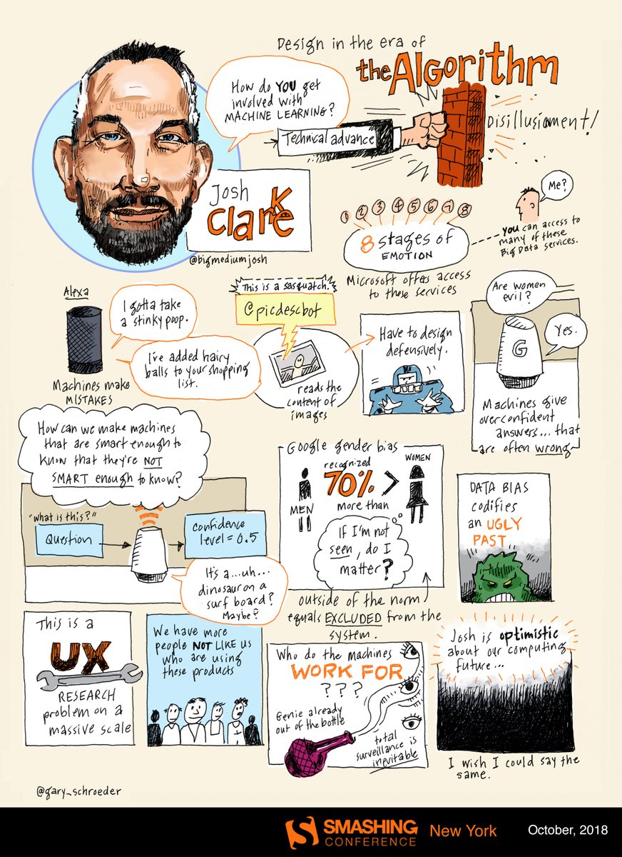
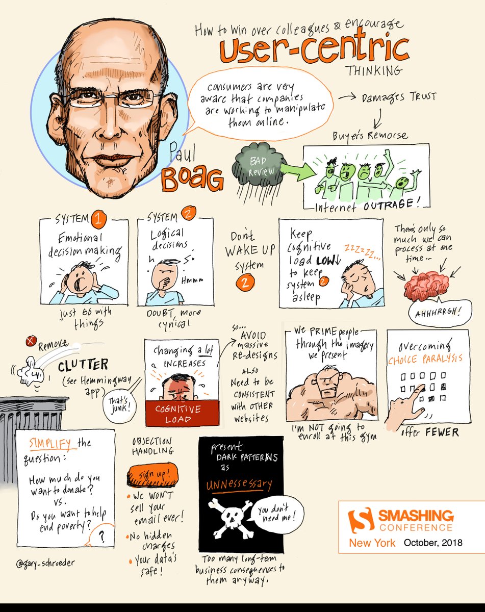
 San Francisco, USA (Apr 16–17)
  Toronto, Canada (Jun 25–26)
  Freiburg, Germany (Sep 9–10)


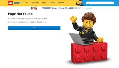

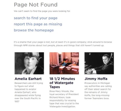


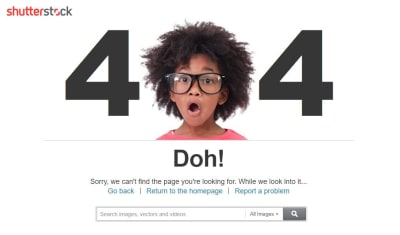
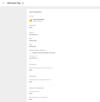
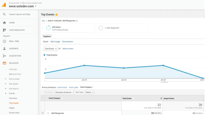


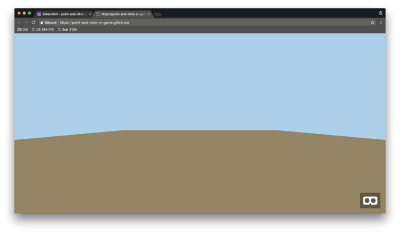


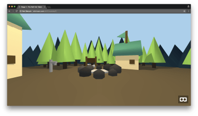
 var listener = app.listen(process.env.PORT, function() { console.log('Your app is listening on port ' + listener.address().port); });