Selecting the right CMS for a blog or website can be difficult. Every web project has its own needs and requirements, meaning one CMS may be a better fit for one site but not so much for a different site. Simple solutions might be lacking some essential features, while more complex systems can create easily overhead for a given task.
I want to cover Automad, a CMS that is less-known than, say, a behemoth like WordPress, but still offers some powerful features like it while maintaining the nimbleness of smaller, simpler solutions, like static site generators.
Specifically, Automad fills a gap between larger and smaller offerings in a few key ways:
It is file-based, but does not require a database. This ensures quick setup, portability, security, speed, and easy deployment.
Even without a database, it offers database features like searching, tagging, filtering, and sorting.
A multi-layer caching engine caches content stored in the file system efficiently.
The browser-based dashboard and the in-page (“live”) edit mode allows for intuitive content management.
But what makes Automad really different, is its integrated template engine. Templating is a core requirement for may CMSs because it creates and sets the base for a site’s visual display. Since Automad’s template engine is so close to the core, it allows you to create templates with complex navigations and to batch process images using a clean and short syntax. You’ll feel the difference once you get your hands on it, and we’ll walk through an example together in just a bit.
But first, a quick overview of templating
As a designer or a developer, you’re probably curious about how to develop themes and templates for Automad. I mean, it’s the crux for why any of us really use a CMS in the first place. If you’ve done any level of theming with WordPress, then working with Automad will feel vaguely familiar, and perhaps even easier.
The minimal requirement for creating an Automad theme is a single .php file and a theme.json file bundled together in a subdirectory you create inside the top-level /packages directory in a default Automad installation:
packages/ yourTheme/ yourTemplate.php theme.json
The tutorial package shipped with Automad provides a good starting point for understanding the basic concepts of themes.
A look at the syntax used in Automad templates
While it is possible to write templates in plain PHP, it is not required and actually not recommended. The reason is that Automad’s own template syntax is shorter, more readable, and integrates well with the user interface by automatically listing all of the used variables in the dashboard. It can be seamlessly mixed into HTML markup.
Basically, the syntax can be split into two groups:
Echoing content: @{ variable }
Statements, like functions, loops and conditionals: <@ function @> or <@ statement @>…<@ end @>
Echo content
Let’s say we want to pull the body content for a post into a template and we have a variable set up for that called text. In WordPress, this would be a global variable (the_content) that is called in PHP:
<?php the_content(); ?>
In Automad, we can do the same without PHP:
<p>@{ text }</p>
It is possible to manipulate the output of variables by passing the value to a function using the pipe (|) operator. The following example shows how to shorten a given text to a maximum of 100 characters without cutting words:
@{ text | shorten (100) }
This would be the same of thing you might do to define the excerpt of a post in WordPress using a function:
/* Limit excerpt to 20 words */ function my_custom_excerpt_length( $ length ) { return 20; } add_filter( 'excerpt_length', 'wpdocs_custom_excerpt_length', 999 ) }
One of the key benefits of some CMS solutions, like Jeykll, is that using Markdown to create site content is a native feature. Automad can do the same. Let’s say we want to convert Markdown text to HTML. It’s pretty darn simple (and efficient) using the pipe operator:
@{ text | markdown }
Using statements
Statements are a handy way to define content and display it conditionally. Unlike variables, statements are wrapped in <@ … @> delimiters. The following example can be used to create a simple top level menu by using the nav function:
<@ nav { context: "/", class: "nav" } @>
Let’s say you want to display your post content by default but display a fallback if that content does not exist for some reason. That’s where we can put conditional statements and control structures to use:
<# If the post content exists then display... #> <@ if @{ text } @> <p>...</p> <# Otherwise, display this... #> <@ else @> <p>Sorry, no content here!</p> <# OK, no more conditions. #> <@ end @>
Want to create a loop? This is where display a list of posts or any repeatable content that matches a condition is super useful. We can do that in Automad by providing one or more glob patterns in a foreach loop.
For example, let’s display all JPG and PNG images for a post cropped at 400x300 with their captions:
Did you catch that?! As shown by this example, a remarkable Automad feature is the ability to embed resizing options for each matching file inside the loop statement. No more complicated functions to register sizes that then need to be called in the template!
It’s worth noting that foreach loops can also be used to iterate over objects. Automad knows multiple types of objects. One of the most important objects is pagelist because of its ability to output all of the pages on the site, like you might want to do when building navigation. When iterating a pagelist, the context changes with every iteration to the current page in the loop. That way, it is possible to use page variables within the loop’s code block.
To configure the pagelist, we can use the newPagelist function like this:
<@ newPagelist { context: "/", type: "children" } @> <ul> <@ foreach in pagelist @> <li><a href="@{ url }">@{ title }</a></li> <@ end @> </ul>
A sneak peek behind the scenes for you super geeks 🤓
Automad’s template interpreter is written in pure PHP and it processes templates on the fly. Therefore, no extra build process is required at all. The list of system requirements is also rather short. A web server (Apache or Nginx) and PHP 5.4+ is already enough to run a site. Pages are only rendered when content has changed or after system updates.
Automad’s multi-layer caching engine stores the rendered pages in separate .html files as well as all crawled data in the file system as a kind of content object. That object is also used to speed up page searching and filtering.
Due to that mechanism, it is possible to either edit the content of a site directly in production online using the browser-based dashboard or edit a site locally and deploy it via Git or plain rsync.
Let’s write some code!
The best way to get acquainted with anything on the web is to just build websites. Here are some examples of how we’d get started with that using Automad.
Example 1: Recursive navigation
Creating a site-tree navigation is a good example for using recursion in templates. Conceptually, creating such a recursive navigation can be split into three steps:
Defining a reusable snippet of code to create a single branch of the site-tree which calls itself conditionally
Configuring a dynamic pagelist which automatically only contains children of its current context
Defining the root page of the site-tree (for instance the homepage) and call the recursive snippet initially
Let’s break those steps down into greater detail…
Defining a reusable snippet of code
In Automad, blocks of code can be defined to be reused at a later point by using the snippet keyword. Regarding this example, the following snippet will call itself conditionally when looping through a pagelist and the active page of the current iteration itself has children pages:
<@ snippet navigation @> <ul class="menu-list"> <@ foreach in pagelist @> <li> <a href="@{ url }">@{ title }</a> <# Call snippet recursively. #> <@ navigation @> </li> <@ end @> </ul> <@ end @>
Configuring a dynamic pagelist
The pagelist has to be configured a children type. The context (or parent page) will always change recursively within the snippet defined above in that way. The pagelist will automatically only contain children pages of the currently processed page.
<@ newPagelist { type: 'children' } @>
Defining the root page
In the last step, the root context of the navigation tree has to be defined and the snippet has to be called once to initiate the recursion. The with statement is used here to change the context to the homepage.
<div class="menu"> <@ with '/' @> <@ navigation @> <@ end @> </div>
Since images are super important for content management, working with them should be as easy and intuitive as possible. Automad’s template language provides handy methods for basic image processing, like resizing and cropping. When using a single image or iterating a set of images, resizing options can be passed to a with statement or foreach loop. Check out the tutorial that ships with Automad to get started quickly.
<@ foreach in '*.jpg, *.png' { width: 400, height: 300, crop: true } @> <# Code to be used for each image in the filelist. #> <img src="@{ :fileResized }" alt="@{ :basename }" title="@{ :file }" width="@{ :widthResized }" height="@{ :heightResized }" > <p>@{ :caption | markdown }</p> <@ else @> <# Code to be used when the list of images is empty. #> <@ end @>
Instead of using a glob pattern in the foreach loop, it is also possible to use the filelist object.
If you look at the example code above, you will notice the use of certain runtime variables to access image properties within a code block. While the :file variable represents the original file, :fileResized refers to path of the resized and cached version. The :caption variable enables you to get the caption text stored along with the file.
What will you build?
We merely scratched the surface of Automad here, but hopefully everything we covered gives you a good idea of the possibilities it provides for content management. While there is no one-size-fits-all mold in the CMS world, there will likely be scenarios where a CMS that sits somewhere between the robust and slimmed-down options will come in handy.
The Framer team recently released a new prototyping tool, Framer X, and I was lucky enough to be able to test it during the beta phase. In this article, I’d like to share my thoughts about this new tool and its features. I’ll make a comparison with the “legacy” Framer app as well as other tools, and I’ll discuss its brand new features such as Stacks and Scroll, and its new Code and Design components.
This article is intended for UI and UX designers who would like to learn more about Framer X’s prototyping abilities. Since it is (in many ways) a brand new product, you don’t need to be familiar with the older Framer application to read along. However, a little bit of familiarity with HTML, CSS, React, JavaScript and Node.js are beneficial.
For the purpose of this tutorial, I have also created a prototype which is a Material exploration of the Khan Academy’s app for Android.
Note: I’m in no way affiliated with Khan Academy; I just thought this would make a cool experiment — I hope you’ll agree.
Intro To Framer X
Framer X goes a few steps further than its predecessor in trying to bridge the gap between interface design and software development. Here’s how:
Dear Designers, Meet React
The key difference between the old and the new applications in this regard is the introduction of React and JavaScript / TypeScript, as opposed to using CoffeeScript for programming microinteractions and animations, loading data, and so on.
Framer X’s most important feature: It integrates tightly with ReactJS. (Large preview)
During the beta phase, people wrote some React components that I think show us the potential of how far the tool can take us. For example, you can embed actual media players (that actually stream and play music and video) within your prototypes. Or, you can embed graphs with real-time stock market data. Or how about a component that can translate your prototype’s UI into other languages. And that’s not all: Things are just getting started.
The same React code you write for a Framer X prototype could — at least hypothetically — be used in a production environment after the design phase. This can be especially useful for teams that do a lot of web development in React (and perhaps for teams who write mobile apps in React Native). Personally, I shudder at the thought of me, a designer, writing any code that goes into production, but that might work for others.
“Framer X is more like Unity than like Photoshop. An IDE for design, if you will.”
—The Framer X documentation
The Framer X Interface
If you are already a Framer user, the first thing you’d notice is that the integrated code editor is gone. Instead, if you want to write any code, you can use an editor of your choice. Most people (including myself) seem to go with VS Code.
Tools Opens all the layout and drawing tools everyone’s familiar with (shapes, path, text, frames) as well as three new toys we’ll discuss a little later: Stacks, Link, and Scroll.
Layers Contains, well, the layers of the selected frame, as well as its properties (color, position, border, shadow and so on). This bit is essentially the same as in the old Framer, and very similar to Sketch and Figma.
Components This is for any Design or Code components you may have in the file you’ve opened.
Store A new, huge feature in Framer X. It allows users to publish their creations — be it icons and illustrations or interactive code components for others to use. Currently, all components are free of charge, but I’d imagine people will be able to sell their stuff at the store in the future.
The Preview and Live Preview buttons are up at the top right corner. As with legacy Framer, you can preview your prototypes within a device picture for more realism, or preview them directly on an actual device, or in a browser.
The Khan Academy Android app isn’t a Material app, so let’s explore how it might look and behave if it was. I want to think of this as if it were a real-world project, so here are a couple of considerations that we’ll see how to handle in Framer X:
The product’s goal is to provide free education for everyone, thus it must be able to run on old and cheap devices. What this means for the design of the prototype is, it has to work on 320dp wide screens.
The design must adapt well when the app is translated into a language more verbose than English.
The first thing I’m going to do is mock up the Home screen. There are four things I want to be prominent:
A search input;
Something that will show me my most recent activity;
Something that will show me my Missions;
Something to notify me if there’s a new Mastery Challenge.
Let’s begin.
Installing Components From The Store
The first two elements I want to have here are the Android status bar and navigation bar. Instead of drawing them myself, I’ll quickly install a component bundle from the store called “Android Kit”. It contains all sorts of (static, not programmed in this case) elements like buttons, cards, switches, bars, keyboards and so on. I got my status bar and my nav bar in seconds:
Adding a component from the Store
Note: Each component is installed per-project.
The Interactive Scroll Tool
Now, if I were doing this in Sketch, I’d continue mocking up the rest of the elements on the same artboard, and if it can’t fit all elements, I’d make it taller. In Framer X, however, things work a little differently. I’ll have the content of the Home screen within a separate frame (screen/artboard) and link that frame so it scrolls beneath the navigation and status bars of the home screen:
Using the Scroll tool
Now when I run a preview, my content is scrollable:
The Scroll tool in action
Awesome! With the underlying work out of the way, I’m ready to increase the fidelity a little bit. First, I want the general style of the app to be soft and welcoming, so I’ll use 4dp (display points) border-radius for my cards and buttons, and the rounded Material icons.
Since having an actual search input is super important for this screen, I don’t want the regular Android App bar and search icon experience. I’ll go for an actual input with a CTA message along with a hamburger icon ala Google Maps.
The app bar and search input for this prototype (Large preview)
If I were to go deeper here, I’d make this bar a code component and write it so it expands to full width on scroll, like this:
I won’t do that for the purpose of this article, but I have to say I think something as simple would be easier to do in legacy Framer compared to Framer X — at least in this first version.
Linking
Let’s add some basic interactivity to this thing! When I tap on the search input, I want it to pull out a keyboard from the bottom. When I tap on the menu icon, however, I want to pull out a Navigation drawer from the left side.
Whereas in legacy Framer I’d have to write a FlowComponent for this type of thing, it’s now super easy in Framer X and with its new Link tool! It’s similar to other prototyping applications in which I’d select a UI element, link it to a frame, and choose the type of transition I want. I imported the keyboard from the Android Kit component and linked to it from the search input. I set the transition to Overlay and the direction to bottom.
Once you link two frames, you can configure the link through the Links panel. (Large preview)
Because I have too many items in the navigation drawer to fit on a screen, I had to split it into two frames just like the Home screen: one container with a scroll layer linked to a frame with the actual content inside. Here’s how that looks:
The ‘Birdseye’ view of all linked frames in the prototype so far (Large preview)
Interacting with the prototype
Neat! There is a problem with this approach, though, that the Framer team will hopefully fix. When the transition of a frame is set to Overlay, it covers and dims everything beneath it. This isn’t quite what we want when we prototype for Android: The nav bar and status bar have to be above all other screen elements — including the overlays.
Same goes for the Search interface: I don’t want any screen dimming if I want to have filtering options and/or a list of recent queries when the keyboard is pulled out. Hopefully, we’ll see some fixes for these issues in future Framer X versions.
Pinning, Positioning, And Responsiveness
Back to the Home screen of the prototype. Below the search input, I want a list with my recent activity. Just as in legacy Framer and other design tools, you can pin elements within frames so they move and scale exactly as you want them to. Framer X also shows you distances and gaps between elements, snaps them together for you, and so on. Have a look:
Once my frames are pinned appropriately, designing responsively is very easy.
Design Components
I want to add a few more things to the prototype home screen: A Mastery Challenge prompt, a streak counter, list of missions, bookmarks and some UI that allows the user to explore content they might find cool or useful.
Since the recent missions and the bookmarks are going to be cards with very similar content, the best solution Framer X has for me is to use design components. I already mentioned them above (the Material Kit component bundle). Framer X’s design components work similarly to Sketch’s symbols and Figma’s components.
To convert a frame to a component, simply press Cmd + K. This creates a Master from which you can create as many instances as you want:
A Master component and its instance: Any changes applied to the Master are applied to the Instance, but not the other way around.
Anything you do to a Master component will affect its instances, but whatever you do to the instances won’t affect the Master. You can also nest Master components and go as crazy as you like.
So, here are my Recent missions and Explore sections:
Recent missions and Explore sections as horizontally scrollable frames. (Large preview)
Each section is a frame, connected to its own scroll component, and populated with components. The text strings (as well as the bitmap images in the instances) are overrides.
Stacks
Now, what if I’m not sure how to position and distribute all these cards? Well, Framer X’s Stacks feature comes into play here:
I only had to make sure that all items I wanted into a Stack are organized into frames. It works surprisingly well, and you can have components within a stack, as well as a stack within another stack, and so on. It’s huge for anyone mocking up and prototyping lists often!
Drawing Icons And Illustrations
The drawing tools in Framer X are pretty much the same as in legacy Framer. They’re good enough to do a lot, but still somewhat lagging behind Sketch’s: There are no rulers; you can’t convert strokes to outlines; you can’t flatten shapes; there’s no scissors tool.
Code Components
Creating A Simple Code Component
Finally, let’s take a closer look at the code components. Again, these are regular React components (both Stateless and Class) that can be written in either JavaScript or TypeScript (up to you). You can also install third-party libraries to use within your components in Framer.
Let’s try and use the popular styled-components library. This will allow us to style our component using actual CSS syntax within the .tsx file.
First, go to the Components tab → New Component → from Code. After you name your component and confirm, your default system editor (in my case, VS Code) will open an example Framer X component file.
Now go to File → Show project folder, open a terminal in that same folder, install yarn if you haven’t already and add styled-components to your Framer project:
$ >yarn add styled-components
The library and its dependencies will be added to your package.json and you’re ready to go.
Here’s the source for my styled-components button, after I replaced the default code in my component’s .tsx file:
The Go button as a code component and its source (Large preview)
Note that the button label is customizable directly through the Framer X interface (because of the Framer library’s PropertyControls feature). Having my button written in code obviously has many advantages. It is customizable, responsive, and interactive. Along with the responsive paddings, it’s super easy to test if the design breaks in other languages.
The responsive Go button, translated quickly by changing the Text property directly in the Framer X UI. (Large preview)
Importing A Code Component From The Store
There’s a lot of video content on Khan Academy, so for my prototype, I want to open a video lesson. Instead of mocking up a ‘fake’ video player, I can directly embed an actual YouTube player in my prototype. There’s already a component in the Store for this purpose:
Playing a Khan Academy video in a Khan Academy prototype
You can fork the code of any Store component and edit it as you like. For now, the only way to do this is to right-click on it in the sidebar, copy its code and paste it in a newly created components’ file.
You can copy every Store component’s code and play with it. (Large preview)
Code Overrides And The Framer library
The Framer JavaScript library has now been ported to work with Framer X and React. As with the legacy Framer library, it provides us with tools (helper functions) to animate our designs and to listen to events (simple things like onClick and onMove, but also advanced events like pinch, whether the device has been rotated or whether an animation has ended, and more).
Code Overrides are bits of code (JS functions) that allow you to change any frame’s or component’s properties. Static changes such as color are applied before you run the preview, directly within the Framer app, and the animations/interactions can be seen in the Preview window or on your preview device.
Let’s have a quick look at one of the simplest and default examples. I drew this simple champions cup illustration for one of the prototype cards, and I decided to animate it:
To add an override, I have to select my target frame (in this case the illustration) and click on the Code menu item in the right sidebar. Now I need to select the override I want from Exampels (selected by default in the drop down):
The Scale code override will provide me with a fun scale animation. I can edit it’s code and adjust as I like.
Remember, overrides are just blocks of code, therefore, they can live in any file within your project. What I just selected was the Examples.tsx file which contains multiple functions for Scale, Rotation, Fade, and so on. I can create my own file and write my own Override functions, or include them in my code components source code — just as long as I keep in mind to use the Overridetype specifier when I export them.
Here’s the source code for the Scale override I chose:
In plain English: Set the initial scale value of the frame down to 0.6, then animate the scale to 1 with spring curve. Finally, export it with name Scale and specify that it is an Override.
Once applied, this is the result:
The Mastery Challenge card with some animation
Design Responsiveness
As I mentioned in the beginning, it is essential for this particular prototype to work on small device screens (320dp). This is very easy to test in Framer X (considering you’ve pinned your UI elements properly, as described above). Simply set the Preview mode to Canvas – Responsive:
Framer X makes it easy to test my designs for different screens.
This is super helpful — I am now aware of what problems my designs have on smaller screens, and I’m ready to come up with fixes for the next iteration!
Day And Night Modes
Finally, in Framer you have two themes: Light, called “Day” mode:
The application performs fast (though the beta choked a little with large project files) and it feels well designed. It’s a new tool, yet at the same time, it feels familiar. It also does give me that sense of it being a ‘design IDE’ and I think the Framer team is taking things in a very interesting direction.
Framer X makes mundane things like linking screens and scrolling fast and easy, as they should be. Though I hope to see even more of that type of thing in the future: prototyping is supposed to be a quick and dirty process, after all. To spend too many hours on a prototype is to miss the point of prototyping.
Having a Components Store is a great idea, and will certainly speed up my design process. I no longer have to spend time hunting down the plugins I need. I can imagine a couple of years from now there will be thousands of components with basically everything I need to put something relatively advanced together — relatively quickly. It may need some moderation in the future, though. I can see people uploading too many simple buttons, each a fork of the other, just because they can.
I like the focus on design systems through the components and the Private Store features. We all know, many teams struggle to collaborate meaningfully and tools like these are an immense help.
What I’m Not Sure I Like About Framer X
What worries me a little is that part of the “super easy playground for experimentation” experience of the original Framer tool is somewhat gone. The new features in X make it very easy to quickly prototype any “standard” feature or screen: you have all you need in the Store. But it is arguably more difficult to explore crazy and weird ideas for custom interactions — at least with this initial product release.
Learning React will be more intimidating to a lot of us, math and logic-impaired designers. For me personally, code reuse is not an option, since none of the projects I’m currently working on are built using web technologies. But even if it was an option, I’m thinking about programming in terms of it being a tool to express my design ideas. I’m not an engineer; using my code for anything but a prototype is not exactly a terrific idea.
Having said that, there’s a lot more documentation on JavaScript and React than on CoffeeScript. There’re also more people to help out, and the React community seems pretty welcoming. I’m very curious to see how Framer X will help designers and engineers collaborate more — if at all.
Framer X In My Toolset
I’ll definitely be using Framer X in production, but I can’t see it completely replacing Sketch for me just yet. In my organization, each designer is allowed to use their favorite tool, as long as it integrates with Zeplin, and Framer X doesn’t. Other things it lacks compared to Sketch (for now) are the pages, the crazy amount of plugins, and the more powerful drawing tools.
I will continue to use the original Framer for custom interactions — at least for the foreseeable future. When prototyping, things need to be done fast, and I also still have much to learn about React.
How To Build A News Application With Angular 6 And Material Design
How To Build A News Application With Angular 6 And Material Design
Rachid Sakara
Are you looking to combine Google’s material design with Angular applications? Well, look no further!
In this tutorial, we’re going to build a news application using two of the most powerful and popular resources out there, Angular 6 and material design. You’ll learn how to incorporate Google’s material design components into Angular application templates to change and style your application in a professional way. The tutorial also serves as a reminder of how to make HTTP requests to bring live news articles to an application using the News API.
Before we get started building the app, let’s quickly review the resources we’re going to use, Angular and material design, and see why we’ve paired them to build this application?
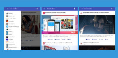
A news application with Angular 6 and Material Design. (Large preview)
“Angular is a platform that makes it easy to build applications with the web. Angular combines declarative templates, dependency injection, end-to-end tooling, and integrated best practices to solve development challenges. Angular empowers developers to build applications that live on the web, mobile, or the desktop.”
In short, it’s the most powerful JavaScript framework for building highly interactive and dynamic web applications.
“As mentioned, Angular is powerful, but also popular, which is why companies such as Upwork, Freelancer, Udemy, YouTube, Paypal, Nike, Google, Telegram, Weather, iStockphoto, AWS, Crunchbase are using it.”
What Is Google’s Material Design?
Material design is a design language introduced by Google in the summer of 2014 for Android’s new OS. Although its initial focus was touch-based mobile apps, now its functionality has been extended to reach the web design world.
It’s an adaptable system of guidelines, components, and tools that support the best practices of user interface design. It’s also backed by open-source code and supported by a large community of designers and developers who are collaborating together to build beautiful products.
Why Angular And Google’s Material Design Specifically?
It’s a matter of choice. No JavaScript framework is better than another. It’s all about what your project needs. The same goes for programming languages.
Now, I’m not going to outline the benefits and features of Angular. Instead, I’m going to share with you why I’ve picked Angular specifically to build a news application.
As is always the case with any news application, communicating with back-end services over the HTTP protocol is a crucial part. This is where the newer Angular HttpClient module, which is an improved version of the old Http, can help us easily interact with the service API.
The model-view-viewmodel (MVVM) of Angular will be handy when it comes to binding the remote data that will be stored in objects into our application template, where the component plays the part of the controller/viewmodel and where the template represents the view. This is what we call the Angular template language.
The two-way binding system, which means that any changes in the application’s state will be automatically reflected into the view, and vice versa. You’ll notice that when selecting the news resources from the side menu, that will change the state of our news article.
What I like most about Angular is the SPA technology. Loading only the part of the page that needs to be changed will definitely help our application load and perform more quickly and smoothly.
Of course, there are many other benefits and features of Angular, which you can look up with a quick online search.
What About The Visual Aspect?
We’ve chosen material design because its language is a suitable fit for Angular, and it’s easy to implement.
It’s also a very popular visual language; it’s responsive, and most Google apps are built with it. We want our app to look as much like a Google app as possible.
As an introduction, that’s all we need. It’s time to look at the project overview and then jump into the build process.
“Getting the latest live news articles from a range of sources, including BBC News, CNN, TechCrunch, Huffington Post and more, along with different categories, like technology, sports, business, science and entertainment.”
This is how your application will look when you finish it:
Once that stuff is out of the way, we can proceed.
Setting Up The Angular Project
In this section, we’re going to use the Angular command line interface (CLI) to generate a new Angular project. To do so, head over to the CLI and run this:
ng new news-app
Next, point your command line to the project’s root folder by running the following:
cd news-app
Installing Dependencies
To set up our dependencies, we’re going to install, with just one command, all of the dependencies necessary for this tutorial. Don’t worry, I’ll explain this in a second:
We have three packages being installed with this command.
@angular/material
This is the official material design package for the Angular framework.
@angular/animations
Installing the Angular animation package separately from the Angular core library is necessary. Certain material components need access to the animation libraries, which is why we’re installing it here.
@angular/cdk
The CDK part stands for “component dev kit”, which provides us with high-quality predefined behaviors for your components, since modern web development is all about components.
It is recommended to include the Angular CDK any time you want to link Google’s material design to an Angular application.
To find out more about Angular CDK, check out this article.
Let’s run our app to see that everything works just fine. You can start a development server by running the following command:
ng serve
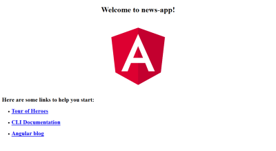
Now, if you visit http://localhost:4200/ in a browser, you should see the following page:
Running the Angular project on development server. (Large preview)
Now, in your code editor, navigate to the file /src/app/app.module.ts, and add the following packages that we’ve just installed:
… Other imports … import { BrowserAnimationsModule } from '@angular/platform-browser/animations'; import { MatButtonModule, MatCardModule, MatMenuModule, MatToolbarModule, MatIconModule, MatSidenavModule, MatListModule } from '@angular/material';
It is important to understand what’s going on here. First, we’re importing the animations package to animate our application a bit.
The next import is what’s unique to Angular material. Before, we just included a single material module. Now, we have to import each material component that we intend to use.
As you can see, we’ve added seven different modules here for material buttons, cards, menus, lists toolbars, side navigation, and icons.
After adding those packages to your app.module.ts file, make sure that your file matches the following:
import { BrowserModule } from '@angular/platform-browser'; import { NgModule } from '@angular/core'; import { HttpClientModule } from '@angular/common/http'; import { NewsApiService } from './news-api.service'; import { BrowserAnimationsModule } from '@angular/platform-browser/animations'; import { MatButtonModule, MatCardModule, MatMenuModule, MatToolbarModule, MatIconModule, MatSidenavModule, MatListModule } from '@angular/material'; import { AppComponent } from './app.component'; @NgModule({ declarations: [ AppComponent ], imports: [ BrowserModule, BrowserAnimationsModule, HttpClientModule, MatButtonModule, MatMenuModule, MatCardModule, MatToolbarModule, MatIconModule, MatSidenavModule, MatListModule, ], providers: [NewsApiService], bootstrap: [AppComponent] }) export class AppModule { }
Note: The statementimport { HttpClientModule } from @angular/common/http in the file above wasn’t generated automatically, but rather added manually. So, make sure you do that, too. And don’t worry about the NewsApiService service provider because we’re going to take care of that later on.
You might be wondering, though, how did I know the names of the modules to import? The official Angular material documentation gives you the exact code needed to import each module.
If you click on any of the components in the left menu and then click on the “API” tab, it provides you with the exact import line that you need to use.
API reference for Angular Material Component. (Large preview)
In terms of setup, that’s all we need to do before we actually begin using and integrating material components in our templates.
You just have to remember to import each unique component that you plan to use.
Acquiring Free API Key
We’re going to use the News API to feed us some news headlines as JSON data, which we’ll implement in the application template.
What is the News API service?
The News API is a simple HTTP REST API for searching and retrieving live articles from all over the web.
Now that you know what the News API is, the next step is to get a free API Key, which will help us make some call requests to the server and grab the news articles.
You can sign up for just 30 seconds. You’ll only need to provide your first name, email address, and password. That’s all.
After signing up, you’ll find the API key already generated for you in the dashboard. Just save it in a text file somewhere on your desktop; because we’ll use it in the next chapter.
Working On The Components
To start working on the components, you need to create a service provider to manage the interaction with the News API service.
Creating The Service Provider
Enter this command to generate a new service provider:
ng generate service NewsApi
After that, go to the generated /src/app/news-api.service.ts file, and add the following code to it:
It’s time to use our API Key. Just paste it where it says, “Put_YOUR_API_KEY_HERE”.
We’ve imported HttpClient, which will be responsible for making API calls to our endpoints and fetching news headlines for us.
Now, for the initSources function, we simply prepare our left-side menu with some news resources. After that, we’ve created another function, initArticles which retrieves the first articles from TechCrunch once the application gets started.
As for the last function, getArticlesByID, it’s going to simply bring some articles for the passing parameter.
The Main Component
The service provider is done. Let’s move to the /src/app/app.component.ts file and add this code:
We’re defining two properties here: mArticles, for holding news articles, and mSources, for holding news resources. Both are defined as an array.
In the constructor, we’re simply creating a NewsAPIService instance.
Next, we’re using that instance on the ngOnInit() function to initialize our two properties.
For the searchArticles function, it will be triggered whenever the user selects a specific resource from the left-side menu. Then we’re passing this parameter to the getArticlesByID service provider function to retrieves articles for it.
Defining Material’s Default Style
In our /src/styles.css file, which is generated by the Angular CLI, let’s add the following:
@import '~@angular/material/prebuilt-themes/indigo-pink.css'; body { padding: 2em 23em; background:lightgray; }
Based on your preference, you can change indigo-pink.css to:
deeppurple-amber.css
indigo-pink.css
pink-bluegrey.css
purple-green.css
I’m also adding some CSS to the body tag, only to demonstrate this layout. This helps it look more like an app, even on desktop.
Let’s also add two lines to our /src/index.html file just before the closing head tag:
First, we define a toolbar with a left-side menu, along with the application’s main title and the settings’ right menu.
Next, we’re using *ngFor for both sources and articles, and in doing so, our left-side menu will hold the news resources, and the main contents will hold the news articles.
One thing to notice is that on the click event of our list items, we’ve added two functions because that event executes any JavaScript code. The first function is searchArticles, which we’ve already explain, and the second one is sidenav.close() which will automatically close our left-side menu once the user has selected a resource.
Styling Our Component
The last thing to do with the components is to visit the /src/app.component.css file and paste the following code in it:
Move to the /src/assets directory, and create a new folder named images. Then, download these images either from a Google Drive link or the GitHub repository.
They are the logos of our news resources. Once you download them, copy and paste all of the image files into the images folder that you just created.
Once everything is complete, run this:
ng serve
Now, your app should look like the screenshot below. Pretty awesome, huh!
Launching the app after everything is complete. (Large preview)
Note that when the news snippets are loaded on the main page, a “More” button (as you can see in the picture above) takes the user to read the whole story.
Conclusion
There you have it! I hope this tutorial was useful and that you’ve enjoyed building this application. If so, feel free to leave your feedback and comments below. In the meantime, the Angular Material documentation is pretty cool. It provides you with an overview of each component, an API and an example.
The entire source code of this app is available on GitHub. You can also check out this website, which already implements the service API used in this tutorial.
Join award-winning front-end architect and speaker Harry Roberts for a groundbreaking class that will transform your approach to CSS. Harry walks through his personal method for embracing its features, avoiding overrides and workarounds, and creating code that scales as you grow.
Rachel Andrew writes about her involvement with the CSS Working Group, and why she feels it is important that web developers understand what is being worked on in CSS, and have a way to offer feedback.
Parsing through a large, existing codebase can be challenging if you’re new to a project. Anastasia Lanz shares tips for how you can make sense of other people’s code.
Trix is a rich text editor for everyday writing. It features a sophisticated document model, support for embedded attachments, and outputs terse and consistent HTML.
This year, many of your favorite speakers were featured at our conference in Toronto, however, things were quite different this time. The speakers had been asked to present without slides. Yep, and it was brilliant!
In this pairing of videos from SmashingConf Toronto, discover sketching with Eva-Lotta Lamm and SVG Animation with Sarah Drasner, but if you fancy watching all of them then head on over to our SmashingConf Vimeo channel anytime.
How I Think When I Think Visually: Eva-Lotta Lamm
Sketching is something which lends itself perfectly to the no-slides format. In this talk, Eva-Lotta demonstrates her process for visual thinking. A method which helps her order her thoughts, create sketchnotes, and visualize processes such as user journeys.
SVG And Vue Together From Start To Finish: Sarah Drasner
In this talk, Sarah starts with only an Illustrator document and by the end, makes it move! In this talk, which has an included GitHub repository to help you follow along, Sarah uses animation and Vue.js to create the final piece.
There is a lot to learn in each one! The demonstration animations they use are wonderfully well done and each guide demonstrates an interesting and effective animation technique, often paired next to a less successful technique to drive the point home. They are both heavily focused on Material Design though, which is fine, but I think Val Head said it best:
Google wrote material design for branding Google things. When you use material design on things that aren’t Google, you’re kind of using Google’s branding on a thing that is not Google, and that’s weird. Material design is Google’s opinion on motion. It’s Google’s branding opinion on motion. It’s not a de facto standard of how motion should happen.
Taming <code>this</code> In JavaScript With Bind Operator
Taming <code>this</code> In JavaScript With Bind Operator
Willian Martins
Do you want to discover the next exciting JavaScript features that you didn’t even know you needed? In this article, I will introduce one of these proposals that if accepted may change the way you write code the same way the spread operator did.
However, here’s a small disclaimer: This feature is under development and discussion. The goal here is to add some hype around it and create awareness of the hard work that TC39 is doing to find consensus, fix all the syntax and semantics issues and have it shipped with the next releases of ECMAScript. If you have any concerns, comments or desire to express your support, please go to the TC39 proposals repository, add a star to this feature to show your support, open an issue to voice your concerns and get involved.
But before, I want to ask a simple (but tricky) question:
What isthis?
In ECMAScript, this has a different semantic than this in many other programming languages, where this often refers to the lexical scope. In general, this behaves differently in the global scope, within a function, in non-strict mode and strict mode. Let’s break this behavior down into small examples.
this In The Global Scope
What is the value of this in this example?
console.info(this);
At the global scope, this refers to the global object, like the window in the browser, self on web workers and the module.exports object in NodeJS.
this In The Function Scope
At the function scope, this behaves depending on how the function is called, and this aspect makes it tricky to predict its value. We can understand it better by checking the following examples:
What Is The Value Of this Here?
function foo() { return this; } console.info(this);
Inside a function, this starts to have an interesting behavior since its value depends on how the function is called. In the example above, this still refers to the global scope, with one difference. In NodeJs, this will point to the global object instead of module.exports.
Setting a value into this sets the value into the current context. The example above logs the global scope with the property bar with the value baz in the first console.info, but it logs only { bar: ‘baz’ } in the second console.info. It happens because the new operator among other things bounds the value of this to the newly created object.
This Keyword In The Strict Mode
In strict mode, the this variable doesn’t carry the value of the context implicitly, this means if its context isn’t set, the value of this is default to undefined as shown in the following snippet.
function foo() { "use strict"; return this; } console.info(foo()); //undefined
To set the context of this in strict mode you can set the function as member of an object, use new operator, Function.prototype.call(), Function.prototype.apply() or Function.prototype.bind() methods for example.
function foo() { "use strict"; return this; } var a = { foo }; foo(); // undefined a.foo(); // { foo: ƒunction } new foo(); // Object foo {} foo.call(this); // Window / Global Object foo.apply(this); // Window / Global Object foo.bind(this)(); // Window / Global Object
Making this Variable Predictable
At this point, you may realize that the value of this in ECMAScript is quite tricky to predict. To demonstrate the available techniques to make it predictable, I’d like to present the following example that mimics a common use case of this.
<button id="button">🐱 🐾</button> <script> class MeowctComponent { constructor() { this.paw = document.getElementById('button'); } meow() { console.info('🐱 on this: ', this.paw); } } const cat = new MeowctComponent(); cat.paw.addEventListener('click', cat.meow); </script>
In the example above, I created a MeowctComponent, which has only one property paw that points to the button element and one method called meow that should print the paw instance property into the console.
The tricky part is that the meow method is executed only when the button is clicked, and because of that, this has the button tag as context, and since the button tag does not have any paw property, it logs the undefined value into the console. Tricky, isn’t it?
To fix this specific behavior we can leverage on the Function.prototype.bind() method to explicitly bind this to the cat instance, like in the following example:
<button id="button">Meow</button> <script> class MeowctComponent { constructor() { this.paw = document.getElementById('button'); } meow() { console.info('🐱 on this: ', this.paw); } } const cat = new MeowctComponent(); cat.paw.addEventListener('click', cat.meow.bind(cat)); </script>
The method .bind() returns a new permanently bound function to the first given parameter, which is the context. Now, because we bound the cat.meow method to the cat instance, this.paw inside the meow method correctly points to the button element.
As an alternative to the Function.prototype.bind() method, we can use the arrow function to achieve the same result. It keeps the value of the lexical this of the surrounding context and dispenses the need to bind the context explicitly, like in the next example:
Although arrow functions solve the majority of use cases where we need to bind the lexical this explicitly, we still have two use cases for which the use of the explicit bind is needed.
Calling A Known Function Using this To Provide Context:
let hasOwnProp = Object.prototype.hasOwnProperty; let obj = Object.create(null); obj.hasOwnProperty('x') // Type Error... hasOwnProp.call(obj, "x"); //false obj.x = 100; hasOwnProp.call(obj, "x"); // true
Let’s suppose for any reason we have this obj object that doesn’t extend Object.prototype but we need to check if obj has an x property by using the hasOwnProperty method from Object.prototype. To achieve that, we have to use the call method and explicitly pass obj as the first parameter to make it work as expected, which appears not to be so idiomatic.
Extracting A Method
The second case can be spotted when we need to extract a method from an object like in our MeowctComponent example:
<button id="button">🐱 🐾</button> <script> class MeowctComponent { constructor() { this.paw = document.getElementById('button'); } meow() { console.info('🐱 on this: ', this.paw); } } const cat = new MeowctComponent(); cat.paw.addEventListener('click', cat.meow.bind(cat)); </script>
These use cases are the baseline problem that the bind operator tries to solve.
The Bind Operator ::
The Bind operator consists of an introduction of a new operator :: (double colon), which acts as syntax sugar for the previous two use cases. It comes in two formats: binary and unary.
In its binary form, the bind operator creates a function with its left side is bound to this of the right side, like in the following example:
let hasOwnProp = Object.prototype.hasOwnProperty; let obj = Object.create(null); obj.hasOwnProperty('x') // Type Error... obj::hasOwnProp("x"); //false obj.x = 100; obj::hasOwnProp("x"); // true
That looks more natural, doesn’t it?
In its unary form, the operator creates a function bound to the base of the provided reference as a value for this variable, like in the following example:
... cat.paw.addEventListener('click', ::cat.meow); // which desugars to cat.paw.addEventListener('click', cat.meow.bind(cat)); ...
What’s so cool about the bind operator is the fact that it opens up new opportunities for creating virtual methods, as in this example of lib for iterable.
It’s super useful because the developer doesn’t need to download the whole lib to do small stuff, which reduces the amount of imported JavaScript. Besides, it makes those kinds of libs easier to extend.
How To Develop Using Bind Operator
To keep the example simple, let’s suppose we need to create a math module which the developer can chain the operations to form an math expression that, given a number as an entry it could make all calculations into a pipeline. The code to achieve this is simple and could be written as the following.
function plus(x) { return this + x; } function minus(x) { return this - x; } function times(x) { return this * x; } function div(x) { return this / x; }
As you can spot in the example above, we expect to have the value as a context and we use this to make the calculation, so then using the bind operator, we could make an expression like the following:
Going a little further, we can use it to convert a temperature from Celsius to Fahrenheit, this can be accomplished by the following function expression:
const toFahrenheit = x => x::times(9)::div(5)::plus(32); console.info(toFahrenheit(20)); // 68
So far, we demonstrate how create functions to interact with the values, but what about extending the object with virtual methods? We can do new stream compositions mixing built-in methods with custom ones. To demonstrate it, we can compose string methods with custom ones. First, let’s check the module with the custom methods with its implementation.
function capitalize() { return this.replace(/(?:^|\s)\S/g, a => a.toUpperCase()); } function doubleSay() { return `$ {this} $ {this}`; } function exclamation() { return `$ {this}!`; }
With this module in place we can do cool things like the following:
In the example above, you can spot that I extracted two methods from the String.prototype, trim() and padEnd(). Since these methods are extracted, I can use them to compose my stream of methods alongside with my virtual methods capitalize(), doubleSay() and exclamation(). This aspect is what makes bind operator so exciting and promising.
Advantages And Disadvantages Of Bind Operator
As you may realize at this point, there are some aspects that Bind Operator shines. Those are the following:
It covers the only two missing use cases that explicit bind is necessary;
It makes easy to make this variable to be predictable;
It adds a new way to extend functionality by using virtual methods;
It helps to extend built-in objects without extending the prototype chain. Do you remember Smoosh Gate?
In the other side, to compose functions with bind operator you need to rely on this to be bound, that can lead to some issues like in this example:
const plus = (x) => this + x; console.info(1::plus(1)); // "[object Window]1"
As it becomes clear in the example above, it’s not possible to compose arrow function with bind operator, since it’s not possible to bind this to an arrow function. Sometimes users don’t want to rely on this to be bound to compose their behavior through a function chain, which could be a problem if you only use bind operator to achieve this.
Another issue that is often said is the possible syntax overload that the bind operator can bring which can be a problem to onboard newcomers to the language. Realizing that a specific operator works in binary and unary form is tricky as well. One possible solution for this is to introduce the binary form to the language separately of the unary form. So once the binary form is integrated to the language, the committee can reassess if the unary form is still necessary. Meanwhile, users can get used to the binary form, and the syntax overload could potentially be mitigated.
Conclusion
Predict the value of this in JavaScript is trick. The language has some rules to explain how the context is assigned to this, but in the daily basis we want to make this value predictable. The Function.prototype.bind() method and arrow functions help us to make the value of this predictable. The bind operator comes to play to cover the two use cases that we still need to explicitly bind this.
The advent of bind operator opens an opportunity to create a new set of function composition via virtual methods, but it can add a syntax overload making difficult to onboard newcomers to the language.
The author of the bind operator is Kevin Smith, and this proposal is in Stage 0. The TC39 is open to feedback. If you like this feature and think that it’s useful, please add a star in the repository, if you have an Idea to solve the issues presented here, if you have another way to shape the syntax or semantics of this features or if you spot another issue with it, please open an issue in the repo and share your thoughts/ideas with the committee.
Tim Berners-Lee shares some wise words about why he has always believed the web is for everyone and why he is always fighting fiercely to protect it. (medium.com)
Modular CSS is a collection of principles for writing code that is performant and maintainable at scale. This post is a must read if you happen to be writing any CSS. (spaceninja.com)
The browser rendering pipeline is complicated. For that reason, it’s tricky to measure the performance of a webpage, especially when components are rendered client-side and everything becomes an intricate ballet between JavaScript, the DOM, styling, layout, and rendering. (nolanlawson.com)
By getting clever with positioning, transforming, and many other tricks, we can make lots of shapes in CSS with only a single HTML element. The master of CSS, Chris Coyier explains. (css-tricks.com)
Create React App 2.0 has been released and it brings a year’s worth of improvements in a single dependency update. Congrats to all involved. (reactjs.org)
In this guide, Rahul Nanwani covers all of the ins and outs of lazy loading images, a technique that helps improve the time it takes for a web page to load by deferring image loads until they are needed. (css-tricks.com)
In this tutorial you’ll learn how to build a Progressive Web Application, step by step, implementing the core tenets of PWAs using the Angular CLI v6. (smashingmagazine.com)
If you have a passion for product design and an aptitude to work in a collaborative environment, can demonstrate empathy and strong advocacy for our users, while balancing the vision and constraints of engineering, then this might be the role for you. (invisionapp.com)
Join the team to help us continue our meteoric growth, and your work will be used by millions of people every month. As a front-end engineer, you’ll work on a team of talented individuals working closely together to ship the best possible product. (creativemarket.com)
Practical Suggestions To Improve Usability Of Landing Pages With Animation From Slides
Practical Suggestions To Improve Usability Of Landing Pages With Animation From Slides
Nick Babich
(This is a sponsored post.) For a long time, UI animation was an afterthought for designers. Even today, many designers think of animation as something that brings delight but does not necessarily improve usability. If you share this point of view, then this article is for you. I will discuss how animation can improve the user experience of landing pages, and I’ll provide the best examples of animation created using the Slides framework.
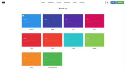
The Slides framework is an easy-to-use tool for creating websites. It allows anyone to create a sleek landing page in a few minutes. All you need to do is choose an appropriate design from the list of predefined slides.
A collection of predefined designs in Slides.
Four Ways Animation Supports Usability Of Landing Pages
Landing page design is more than just about visual presentation; it’s about interaction. Details of interaction design make a fundamental difference on modern websites. And animated effects can reinforce interactions. To improve the usability of a landing page, an animation must be a functional element, not just decoration. It should serve a clear functional purpose. Below are a few common ways that animation can improve usability.
1. Create A Narrative
Every designer is a storyteller. When we create a website, we are telling a story to our visitors. And it’s possible to tell a much more engaging story by using animation.
Animation can help bring content to life. One good example of such animation can be found on Ikonet. The animation there keeps users engaged as they scroll the page and learn about the company.
Animation can also be used to call the visitor’s attention to something they should notice and act upon. For example, if you have an important text section or a call to action, sliding them in (instead of having them just appear) can help visitors understand where they should focus. Take a look at the Preston Zeller example below. The way elements appear on the pages drives the user’s focus to those areas. The great thing about this animation is that it draws attention to important information without being disruptive.
When visitors scroll on Preston Zeller, elements gradually appear on the page. As a result, attention is drawn to vital information.
2. Provide Feedback
Human-computer interaction is based on two fundamentals: user input and system feedback. All interactive objects should react to user input with appropriate visual or audio feedback.
Below you can see the Custom Checkbox effect created using the Slides framework. The subtle bouncing animation the user sees when they change the state of the toggle reinforces the feeling of interactivity.
With Slides, you can create nice hover animations and encourage users to interact with objects. Take a look at Berry Visual. When you hover the mouse on “Send Message” or on the hamburger menu in the top-right corner, a nice animated effect occurs. It creates a sense that these elements are interactive.
Buf Antwerp is another excellent example of how on-hover animated feedback can improve the user experience. When visitors hover over a tile, a semi-transparent overlay appears, and text provides additional information about the item.
3. Create Relationships
A great place to add animation to a landing page is at moments of change. All too often, moments of change are abrupt &mdahs; for example, when users click on a link, a new screen suddenly appears. Because sudden changes are hard for users to process, such changes usually result in a loss of context — the brain has to scan the new page to understand how the new context is connected to the previous one.
Consider this example of an abrupt change:
This abrupt change feels unnatural and leads to unnecessary brain work (the brain has to scan entire layout to understand what has just happened). (Image: Adrian Zumbrunnen via Smashing Magazine)
Compare that to the following example, in which a smooth animated transition guides the user to the different parts of the screen:
A simple animated transition maintains context, making it easy to understand what has changed about a screen. (Image: Adrian Zumbrunnen via Smashing Magazine)
It’s clear that in the second example, animation prevents abrupt change — it fills the gap and connects two stages. As a result, visitors understand that the two stages belong together. This principle applies equally when you have a parent-to-child relationship between two objects:
Animated transition between preview and details. (Image: Tympanus)
It also applies when you create a transition between stages. The smooth transitions between slides in the example below create a sense of sequence, rather than separate unrelated parts of the page.
Using animation, it’s possible to define object relationships and hierarchies when introducing new elements.
4. Making Boring Tasks Fun
It might be difficult to imagine how to introduce playful elements into everyday experiences. But by adding a bit of surprise where it’s most unexpected, we can turn a familiar interaction into something unexpected and, thus, memorable.
When you visit Tympanus’ 3D Room Exhibition, it looks like any other gallery website that you’ve visited before. But your impression of the website changes immediately once you interact with a page. As you move the cursor, the page moves, and this effect creates a sense of 3D space. This feeling is reinforced when you go from one page to another; it looks like you’re traveling from one room to another within a 3D space.
Now let’s talk about something much more familiar than 3D effects: web forms. Who loves filling out forms? Probably nobody. Still, filling out forms is one of the most common tasks on the web. And it is possible to turn this dull activity into a fun exercise. Take a look Darin Senneff’s Yeti character, which is used in a form. When the user starts typing their password, the mascot covers its eyes. Such an animated effect brings a lot of delight when you see it for the first time.
The Yeti character responds to user input.
Last but not least, it’s possible to make the scrolling experience not just more visually interesting, but also helpful for readers. Below is Storytelling Map, an interactive journey in which a path along a map is animated according to the content being scrolled through on the page. The idea ties the text, visuals and locations together; visitors read the information and see it in the context of the map).
Identifying the places where animation has utility is only half the story. Designers also need to implement animation properly. In this section, we’ll find out how to animate like a pro.
1. Don’t Animate Several Elements At Once
When a few objects are animated simultaneously, it becomes distracting for users. Because the human brain and eye are hardwired to pay attention to moving objects, the user’s focus will jump from one element to another, and the brain will need extra time to figure out what just happened (especially if the movement happens very quickly). Thus, it’s important to schedule animations properly.
It’s vital to understand the concept of transition choreography: the coordinated sequence of motions that maintain the visitor’s focus as the interface changes. Minimize the number of elements that move independently; only a few things should happen at the same time (typically, no more than two or three). Thus, if you want to move more than three objects, group some objects together and transform them as a single unit, rather than animating them independently.
Don’t animate everything at the same time. It will make the objects compete for attention and divide focus. (Image: Google)
Slides offers an excellent benefit to web designers: It prevents them from overusing motion in design. Each animated effect available in Slides has been carefully designed to deliver content in the best possible way.
2. Animation Shouldn’t Conflict With Landing Page’s Personality
Each time you add animation to a design, you introduce personality. This personality will largely depend on the animated effect you choose to use.
When people interact with a product, they have certain expectations. Imagine designing a landing page for a banking service, and you decide to use a bouncing animation to introduce a form that collects the user’s personal information. Many users will hesitate to provide their details because the form conflicts with their expectations.
An example of bouncing animation. Avoid bouncing animation in forms that collect bank account details. Users might hesitate to provide their data. (Image: Joel Besada)
The Slides framework allows you to choose from 10 animated styles, such as Stack, Zen, Film, Cards and Zoom. Experiment with different effects, and choose what’s best for your case.
When it comes to designing animation, timing is everything. The timing of your animation can mean the difference between a good interaction and a bad one. When working on animation, you’ll usually spend a third of your time finding the right animated effects and the other two thirds finding the right timing to make the animation feel smooth.
Generally, keep the animation short. Animation should never get in the way of the user completing a task, because even the most beautifully executed animation would be really annoying if it slows down users. The optimal speed for a UI animation is between 200 and 500 milliseconds. An animation that lasts less than 1 second is considered as instant, whereas an animation longer than 5 seconds can convey a feeling of delay.
When it comes to creating an animated effect, one parameter has a direct impact on how the animation is perceived: easing, or timing function in CSS terms. Easing helps designers make movement more natural.
The Slides framework enables web designers to customize easing. You’ll find easing along with other effects in the section “Effect Settings”.
Animation is a double-edged sword. It can improve usability for one group of users, while causing problems for another group. Apple’s release of iOS 7 was a recent example of the latter. iOS 7 was full of animated effects, and shortly after its release, iPhone users reported that the animated transitions were making them feel dizzy.
Your responsibility as a designer is to think about how people with visual disorders will interact with your design. Check the WCAG’s guidelines on animation, and be sure that your design aligns with them. Track whether a user wants to minimize the amount of animation or motion. A special CSS media feature, “prefers-reduced-motion“, detects whether the user has requested that the system minimize the amount of animation or motion used. When it is set to “reduce”, then it’s better to minimize the amount of movement and animation (for example, by removing all non-essential movement).
Also, conduct usability testing to check that users will all abilities, including people with visual disorders, won’t have any problem interacting with your design.
5. Prototype And Test Your Design Decisions
Animation is fun to play with. It’s easy to go overboard and end up with a design that overwhelms users with too much motion. Unfortunately, there is no silver bullet for great animation; it’s hard to set clear criteria of what is “just enough”. Be ready to spend time on prototyping, testing and optimizing animated effects.
Here are a few tips worth taking into account during testing:
Test on different hardware. Many hardware factors can drastically affect animation performance: screen size, screen density, GPU performance, to name just a few. As a result, a user on a high-definition screen might have a completely different experience than a user on an older screen. Consider such factors when designing animation to prevent performance bottlenecks. Don’t blame slow hardware; optimize your animation to work great on all sort of devices.
Test on mobile. Most websites are built and tested on a desktop; the mobile experience and animation performance is often treated as an afterthought. Lack of testing on mobile could cause a lot of problems for mobile users, because some animated techniques work great on desktop but not as well on mobile. To avoid a negative experience, confirm that your design works fine on both desktop and mobile. Test on mobile early and often.
Watch animation at a slow speed. It might be hard to notice problems when an animation (especially a complex one) runs at full speed. When you slow the animation down (say, at one tenth the speed), such issues become evident. You can also record slow-motion video of your animations and show them to other people to get other perspectives.
With the Slides framework, you can create a high-fidelity interactive prototype in minutes. You can use a WYSIWYG editor to create animated effects, publish the design, and see how it works on both desktop and mobile devices.
6. Animation Shouldn’t Be An Afterthought
There’s a reason why so many designers think of animation as an unnecessary feature that overloads the user interface and makes it more complicated. In most cases, that’s true when designers introduce animation at the end of the design process, as lipstick for the design — in other words, animation for the sake of animation. Random motion without any purpose won’t benefit visitors much, and it can easily distract and annoy.
To make meaningful animation, take time at the beginning of the project to think about areas where animation would naturally fit. Only in this way will animation be natural to the user flow.
Conclusion
Good functional animation makes a landing page not just more appealing, but also more usable. When done correctly, animation can turn a landing page from a sequence of sections into a carefully choreographed, memorable experience. The Slides framework helps web designers use animation to communicate clearly.
If you’re like most of us, you’re too busy working to think about your career. But while you’re heads-down getting stuff done, the web races forward. How you can keep up … and stay inspired? That’s where we come in. 12 great speakers, one unforgettable learning experience, to take you to the next level.
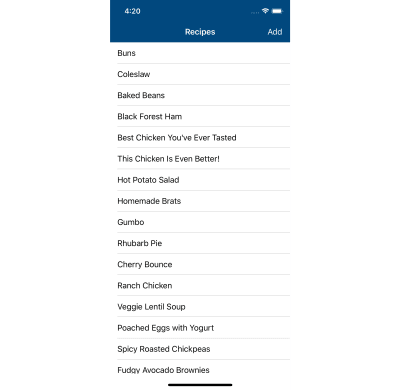
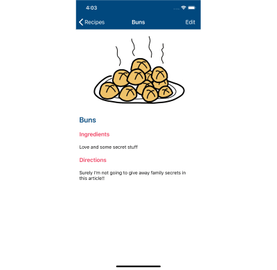
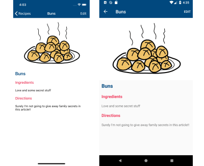
My grandma makes the best, most fluffiest, go weak-in-your-knees buns that anybody has ever tasted. The problem is, there’s a ton of secret ingredients (and I’m not just talking love) that go into those buns, and those ingredients and directions are all stored in my grandma’s head.
We all have family recipes like that, and instead of possibly forgetting them, in this article we’re going to create a mobile app for iOS and Android using Xamarin.Forms that will save them for myself and future generations of my family!
So if you’re interested in writing mobile applications, but don’t have the time to write the same app over and over again for each platform, this article is for you! Don’t worry if you don’t know C# from a Strawberry Pretzel Salad; I’ve been writing Xamarin apps for over 8 years, and this article is a tour through Xamarin.Forms that intends to give you enough information to start learning on your own.
What Is This Xamarin Stuff?
More than just a fun word to say, Xamarin allows developers to create native iOS and Android applications using the exact same SDKs and UI controls available as in Swift and XCode for iOS or Java and Android Studio for Android.
Which platform should I develop for? (Large preview)
The difference is that the apps are developed with C# using the .NET Framework and Visual Studio or Visual Studio for Mac. The apps that result, however, are exactly the same. They look, feel, and behave just like native apps written in Objective-C, Swift, or Java.
Xamarin shines when it comes to code sharing. A developer can create and tailor their UI for each platform using native controls and SDKs, but then write a library of shared app logic that’s shared across platforms.
It’s this code sharing where tremendous time savings can be realized.
And like the delicious buns my grandma bakes, once given the taste of sharing code — it’s hard not to crave more — and that’s where Xamarin.Forms comes in.
Xamarin.Forms
Xamarin.Forms takes the concept of traditional Xamarin development and adds a layer of abstraction to it.
Instead of developing the user interface for iOS and Android separately, Xamarin.Forms introduces a UI toolkit that enables you to write native mobile apps from a single code base.
Think of it this way: You have an app that needs a button. Each platform has the concept of a button. Why should you have to write the user interface a bunch of different times when you know all the user of your app needs to do is tap a button?
That’s one of the problems Xamarin.Forms solves.
It provides a toolkit of the most commonly used controls and user interaction events for them, so we only have to write the user interfaces for our apps once. It’s worth noting though that you’re not limited to the controls Xamarin.Forms provides either — you still can use controls found in only a single platform within a Xamarin.Forms app. Also, we can share the application logic between platforms as before.
The code sharing stats for apps developed with Xamarin.Forms can be off the charts. A conference organizing app has 93% of its code shared on iOS and 91% on Android. The app is open sourced. Take a peek at the code.
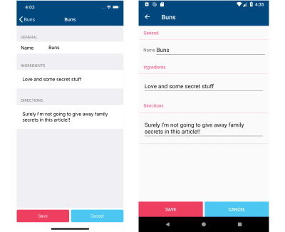
You can also get to this screen by tapping the add button from the recipe list screen.
The Development Environment
Xamarin apps are built with C# and .NET, using Visual Studio on Windows or Visual Studio for Mac on the Mac, but you need to have the iOS or Android SDKs and tooling installed, too. Getting everything installed, in the correct order could be a bit of an issue, however, the Visual Studio installers will take care of note only getting the IDE installed, but also the platform tooling.
Although a Mac is always required to build iOS apps, with Xamarin you can still develop and debug those apps from Visual Studio on Windows! So if Windows is your jam, there’s no need to change your environments altogether.
Now let’s see how Xamarin.Forms can help us save some family recipes from one code base!
Recipe List Page: Laying Out the UI
Let’s start with talking about how we’re going to layout the UI for our recipe saving app!
Overall each screen in Xamarin.Forms is comprised of 3 elements. A Page. At least one element called a Layout. And at least one Control.
The Page
The Page is the thing that hosts everything displayed on the screen at one time. The Page is also central in navigation within an app.
We tell Xamarin.Forms which Page to display via a Navigation Service. That service then will take care of displaying whatever page in a way that’s appropriate and native for the operating system.
In other words, the code to navigate between screens has been abstracted too!
Finally, although not the only way to do it, I code the UI of my Page’s in XAML. (The other way would be to use C#.) XAML is a markup language that describes how a page looks. And for now, suffice it to say, it’s kinda sorta similar to HTML.
The Layout
All the controls on a page are arranged by something called a Layout.
Forms come with many controls that will be used no matter what type of app you’re building. Things like labels, buttons, entry boxes, images, and of course, list views.
When adding a control to a screen, you add it to a layout. It’s the layout that takes care of figuring where exactly on the screen the control should appear.
There’s a couple of important things going on here.
The first is the <StackLayout>. This is telling Forms to arrange all the controls that follow in a stack.
There happens to only be a single control in the layout, and that’s a <ListView>, and we’re going to give it a name so we can reference it later.
Then there’s a little bit of boilerplate ceremony to the ListView before we get to what we’re after: the <TextCell>. This is telling Forms to display simple text in each cell of the list.
We tell the <TextCell> the text we want it to display through a technique called Data Binding. The syntax looks like Text="{Binding Name}". Where Name is a property of a Recipe class that models… well, Recipes.
So how do the recipes get added to the list?
Along with every XAML file, there is a “code-behind” file. This code-behind allows us to do things like handle user interaction events, or perform setup, or do other app logic.
There’s a function that can be overridden in every Page called OnAppearing — which as I’m sure you guessed — gets called when the Page appears.
This is telling the ListView — “Hey! All of your data is found in the enumerable App.AllRecipes (an application-wide variable) and you can use any of its child object’s properties to bind off of!”.
A list of recipes is all well and fine — but you can’t bake anything without first seeing the recipe’s details — and we’re going to take care of that next.
Event Handling
Without responding to user touches our app is nothing more than a list of delicious sounding recipes. They sound good, but without knowing how to cook them, it’s not of much use!
Let’s make each cell in the ListView respond to taps so we can see how to make the recipe!
In the RecipeListPage code-behind file, we can add event handlers to controls to listen and react to user interaction events.
Handling tap events on the list view then:
recipesList.ItemSelected += async (sender, eventArgs) => { if (eventArgs.SelectedItem != null) { var detailPage = new RecipeDetailPage(eventArgs.SelectedItem as Recipe); await Navigation.PushAsync(detailPage); recipesList.SelectedItem = null; } };
There’s some neat stuff going on there.
Whenever somebody selects a row, ItemSelected is fired on the ListView.
Of the arguments that get passed into the handler, the eventArgs object has a SelectedItem property that happens to be whatever is bound to the ListView from before.
In our case, that’s the Recipe class. (So we don’t have to search for the object in the master source – it gets passed to us.)
Recipe Detail Page
Of course, there’s a page that shows us the secret ingredients and directions of how to make each recipe, but how does that page get displayed?
Notice the await Navigation.PushAsync(detailPage); line from above. The Navigation object is a platform-independent object that handles page transitions in a native fashion for each platform.
Now let’s take a peek at the recipe details page:
Recipe detail screens on iOS (left) and Android (right) (Large preview)
This page is built with XAML as well. However, the Layout used (FlexLayout) is quite cool as it’s inspired by the CSS Flexbox.
The FlexLayout will arrange its controls in either rows or columns. The big benefit comes though with the fact that it can automatically detect how much room there is left on the screen to place a control, and if there’s not enough, then it can automatically create a new row or column to accommodate it!
This helps greatly when dealing with various screen sizes, which there are plenty of in mobile development.
Well, with the FlexLayout helping us keep the details screen looking good, we still need to edit those recipes, right?
That line is responsible for putting a button in the app’s toolbar. The Clicked="Edit_Clicked" tells the button that when it’s clicked, look in the code behind for a function of that name, and then execute its code.
Which in this case, would be instantiating the Recipe Edit Page, and pushing that onto our navigation stack using the Navigation object mentioned previously.
Recipe Edit Page
A page with a list of recipes: check! A page with all the details to make the recipes: check! All that’s now left is to create the page that we use to enter or change a recipe while we watch grandma work her magic!
First, check out the screens:
Recipe edit screens on iOS (left) and Android (right) (Large preview)
See that TheRecipe property? It’s page level, holds all the data for a particular recipe, and gets set in the constructor of the page.
Secondly, the Clicked event handlers for the saveButton and cancelButton are totally .NET-ified (and yes, I do make my own words up quite often.)
I say they’re .NET-ified because the syntax to handle that event is not native to Java nor Objective-C. When the app runs on Android or iOS, the behavior will be exactly like an Android Click or an iOS TouchUpInside.
And as you can see, each of those click event handlers are invoking appropriate functions that either save the recipe and dismiss the page, or only dismiss the page.
There it is — we have the UI down to save the recipes from now until the end of time!
CSS Wha?!? Or Making The App Pretty
Saving the best for last: Xamarin.Forms 3.0 gives us — among other things — the ability to style controls using CSS!
The Xamarin.Forms CSS isn’t 100% what you may be used to from web development. But it’s close enough that anyone familiar with CSS will feel right at home. Just like me at grandma’s!
So let’s take the Recipe Details page and refactor it, so it uses Cascading Style Sheets to set the visual elements instead of setting everything directly inline in the XAML.
First step is to create the CSS doc! In this case it will look like the following:
For the most part, it looks like CSS. There are classes in there. There is a single selector for a class type, Image. And then a bunch of property setters.
Some of those property setters, such as flex-wrap or flex-basis are specific to Xamarin.Forms. Going forward, the team will prefix those with xf- to follow standard practices.
In Xamarin.Forms, to reference the CSS document, add a <StyleSheet Source="YOUR DOC PATH" />. Then you can reference the classes in each control via the StyleClass property.
It definitely cleans up the XAML, and it makes the intention of the control clearer too. For example, now it’s pretty obvious what those <BoxView StyleClass="spacer" /> are up to!
And the Image gets itself styled all because it’s an Image and the way we defined the selector in the CSS.
To be sure, CSS in Xamarin.Forms isn’t as fully implemented as its web cousin, but it’s still pretty cool. You have selectors, classes, can set properties and, of course, that whole cascading thing going on!
Summary
Three screens, two platforms, one article, and endless recipes saved! And you know what else? You can build apps with Xamarin.Forms for more than Android and iOS. You can build UWP, macOS, and even Samsung Tizen platforms!
Xamarin.Forms is a UI toolkit that allows you to create apps by writing the user interface once and having the UI rendered natively across the major platforms.
It does this by providing an SDK that’s an abstraction to the most commonly used controls across the platforms. In addition to the UI goodness, Xamarin.Forms also provides a full-featured MVVM framework, a pub/sub messaging service, an animation API, and a dependency service.
Xamarin.Forms also gives you all the same code benefits that traditional Xamarin development does. Any application logic is shared across all the platforms. And you get to develop all your apps with a single IDE using a single language — that’s pretty cool!
Where to next? Download the source code for this Xamarin.Forms app to give it a spin yourself. Then to learn more about Xamarin.Forms, including the ability to create an app all within your browser, check out this online tutorial!
Did you know that a simple search for “depression” on the iPhone App Store brings up 198 results? In the Android Play Store, it brings up 239. The categories range from “Medical” to “Health & Fitness” to “Lifestyle.” The apps themselves offer everything from “depressing wallpaper” to “mood tracker” to “life coach.” We are approaching a golden age of digital therapeutics and design for mental health — if we as UX practitioners do our jobs well.
Given the plethora of apps available, you might assume that there are already dozens of wonderful digital therapies available for people struggling with mental health disorders. But — according to initial studies by clinical psychologists — you would be wrong. Most apps are useless at best, and harmful at worst, due primarily to a disconnect between the designers building the apps and the patients and providers in the field of mental health.
As of July 2017, 28% of digital health apps on the App Store were focused on mental health and behavioral disorders. (Large preview)
Some apps (mostly within the Lifestyle category) are harmless but useless. Emo Wallpaper, for example, is appropriately named and makes no claims to treat mental illness. It is intended as entertainment for people who are having a tough day. But there are more dangerous examples. One of the worst (since removed from the App Store) was iBipolar, which recommended that people in the middle of a manic episode drink hard liquor to help them sleep. Not only is this bad advice — alcohol does not lead to healthy sleep — but alcoholism is a problem for many people with bipolar disorder. The app was actively harmful.
Prescription drugs are regulated by the FDA, while mobile apps are not. How can we as UX designers create better apps to improve mental health treatment?
Are Apps The Answer?
Approximately one in five American adults experience mental illness each year. For some people, this can refer to a temporary depressive episode brought on by grief, such as the death of a loved one, or severe anxiety caused by external factors like a stressful job. For nearly 1 in 25 Americans (about 10 million people) it’s a chronic condition, such as bipolar disorder, chronic depression, or schizophrenia. Yet only about 40% of people experiencing mental illness are receiving treatment.
The reasons vary. For some, they are undiagnosed or may refuse treatment. They may struggle with the stigma attached to mental illness. But for many, there is a lack of access. The association Mental Health America has studied and reported on what “limited access” means, and identified four systemic barriers:
Lack of insurance or inadequate insurance;
Lack of available treatment providers:
Lack of available treatment types (inpatient treatment, individual therapy, intensive community services);
Insufficient finances to cover costs — including, copays, uncovered treatment types, or when providers do not take insurance.
With that in mind, it would appear that a mobile-based solution is the obvious answer. And yet there are plenty of inherent challenges. Key among them is the gap between the clinicians treating patients and the UX practitioners working on mental health design.
Bridge The Gap Between Clinicians And Designers
About two years ago, I began research in the mental health design space. As a UX practitioner who focuses in health care, I wanted to learn how people struggling with mental health issues differed from people struggling with other chronic illnesses. I thought the work would entail an audit of the App Store and Play Store, a few weeks of interviewing clinicians to learn about the space, and then perhaps building an app with my team.
Instead, the work has continued ever since. At the time I interviewed ten clinicians, four behavior change designers, and five UX designers who had designed apps in the mental health space. But from these interviews I learned that there are two reasons why the design for mental health is lagging behind design for other healthcare needs. Those two reasons have changed my entire perspective on what we need to do to improve design in the space. It resulted in the creation of a few guidelines which I now hope to popularize.
Here is an overview of the research I conducted, and the two themes that emerged.
The Research
I initially assumed there were no apps available. And yet my audit of the App Store and Play Store uncovered hundreds of existing apps. Obviously, building an app was not the problem. But I began to wonder: why aren’t these apps used? (Few were downloaded, and I had never heard of any of them — for all that I work in the healthcare space!) And why are those that are used unsuccessful? To find that out, I needed more research.
Over the course of a few months, I interviewed therapists, psychiatrists, psychologists, and social workers. On the design side, I interviewed behavior change analysts, UX designers, and anyone I could find who had been involved in designing an app to improve mental health.
Some questions I asked the designers included:
What do you feel is missing from the field of mental health, if anything?
What are some of the top challenges you face when designing for people with mental health challenges?
What examples exist of poorly designed interventions for mental health? What examples exist of well-designed interventions?
If they had designed an app: What was the goal of the intervention you designed?
How did you test it?
Who did you test it with?
Was it successful? Why/why not?
Meanwhile, some of the questions I asked clinicians were:
How do you diagnose a patient’s mental health?
What barriers exist to patients’ improving their mental health?
What technology currently helps patients improve or deal with their mental health/illness?
How can technology benefit your patients?
What are one or two important pieces of advice you wish more people knew when creating applications/tools to help improve mental health from afar?
After the interviews, I came away with two new understandings:
Problem #1: Designers Don’t Know What Clinicians Know
Many designers told me they were starting from scratch. They did research with patients and learned what patients thought they needed from an app. But very few spoke with healthcare providers. As a result, the designers were missing the clinical expertise.
For example, a clinician shared with me that:
“What people say they want is not often what they want.”
Broadly, patients want to feel better. In a user interview, they might say they want to take their medication, or follow a meal plan, or meet some other goal. So the designer builds an app that allows them to set goals and deadlines. But as the clinician explained it:
“Change is scary, so when [patients] find out that feeling better requires change, that is a barrier.”
The app was designed to meet what patients said they needed, not what clinical expertise shows they will respond to.
When I asked one psychiatrist what apps she might recommend to her patients, she said:
“I wish I knew what I could recommend. Nothing is clearly safe, evidence-based, and tested.”
She explained to me that she once recommended a suicide hotline, but that it made people wait on hold for 20 minutes. After that experience, she said, “never again.”
When it comes to mobile apps, the risk is even greater — she worries that an app may have good intentions, but it might not be right for a particular patient. Or it may have the right elements, but the language could be inadvertently guilt-inducing or triggering.
I already knew that designers move fast. It’s part of the tech world’s MO — just think of Facebook’s motto, “move fast and break things.” The catch is that second part: when we move fast, we break things. This is great when we’re breaking through assumptions, or breaking features that would otherwise cause issues post-launch. But it’s very bad when the things we might break are people.
“[I]t’s one thing to move fast and break things with a consumer internet app. It’s another thing when tech is used to improve human life.”
Designers are often up against deadlines. Some work for large healthcare companies that want to launch in time for a specific trade show, or before a competitor gets to market. This is very different from the world of health care, which tends to move very slowly, waiting for compliance or FDA approval, clinical trials, and multiple rounds of validation.
The challenge is adding the clinical expertise and knowledge to the design process, without hampering designers’ ability to move quickly.
Mental Health Design Guidelines
To that end, my team determined that we did not need to build a new app. After all, the mental health field is broad, and there is no one app that will reach everyone. What we need is to popularize the guidelines and communication methodologies that health providers know and use. We need to share that knowledge with designers.
During our clinical interviews, I noticed patterns. For example, though not every therapist said it the same way, they all mentioned how important friends, family, or community are for someone struggling with mental health issues. From this, we created a guideline called “Human.”
Thus, we created a set of six guidelines. Clinicians, researchers, behavior change analysts, and health writers have weighed in on the guidelines, and continue to refine them. They draw attention to six steps that any designer needs to follow in order to create an app that will live up to any provider’s standards.
Are you building a mental health app? Focus on HEALTH. (Large preview)
1. Human
As I noted above, there are systemic barriers to mental health care. For the many people who can’t afford or can’t find a therapist, mobile apps seem like a magical solution. 95% of Americans now own a cell phone! That means mobile apps could ostensibly make mental health care accessible to 95% of the population.
But technology is not the same as a human therapist, family member, or friend. As one behavior change specialist I interviewed shared, “The human-to-human connection is very important. In mental health, it is important to have a person who you can talk to and understand the other person is there for you.” Social support increases motivation, and people are vital for crises — although algorithms are working to identify a risk of suicide, the device alone is not enough to overcome the urge.
With that in mind, our first guideline is to be human. Encourage connection to external supports in addition to providing value in the app. And provide the ability to connect to a therapist or 9-1-1, as MY3 does.
The MY3 app encourages human connections. Having a therapist, friend, family member, or other human support correlates to lower rates of suicide and depression. (Large preview)
2. Evidence-Based
Mental health professionals spend years training to treat mental health illnesses. Many professionals specialize in one or two specific types of treatment, such as talk therapy, Cognitive Behavioral Therapy (CBT), Dialectical Behavioral Therapy (DBT), or other treatment frameworks.
These therapies have specific activities associated with them; they encourage patients to develop certain skills, and they even make specific language choices. Any designer building a mental health app needs to begin by choosing one of these evidence-based therapy styles to follow. What’s more, other designers and users can help evaluate UI and short-term efficacy, but make sure to also bring in clinicians to ensure the app is properly representing the therapy.
Our second guideline is: to be evidence-based. Keep problem #1 in mind: the clinicians know how to treat their patients. We as designers can’t simply replace clinical knowledge with effective UI. The two need to work hand in hand, as Pear Therapeutics THRIVETM app does.
Pear Therapeutics app is undergoing extensive research, including clinical trials with mental health professionals, and applying for FDA clearance. (Large preview)
3. Accepting
I frequently hear people talk about a favorite coach or friend who gave them “tough love.” Many people seem to see tough love as a way of accusing someone of failure, and thus prompting them to do better. (Perhaps our fictional film coaches are to blame.)
In reality, fear of failure is exactly what stops many people from trying something new. This includes seeking mental health treatment. To make matters worse, low motivation is a core symptom of many mental health illnesses. Thus, angry or accusatory language can truly harm people. Instead, our third guideline is to be accepting. Reinforce how capable a person is, and show empathy in how you communicate.
Sanofi’s RA Digital Companion is designed for people with Rheumatoid Arthritis (RA). The app understands that many people with RA suffer from depression, and focuses on acceptance.
Sanofi’s RA Digital Companion app focuses on helpful resources and uses encouraging language. (Large preview)
4. Lasting
When Pokémon Go launched, it became a nationwide craze just seven days later with an estimate of more than 65 million users. Yet the craze passed in only two months. The problem? Pokémon Go focused on short-term motivators, such as badges and gamification (as many apps do). To create a successful app that people use consistently, the motivation needs to become internal.
What does that mean? External motivators come from outside sources. Internal motivators connect to core values, such as “I want to succeed in my career” or “I care about my children.” These motivators can’t be taken away by another person, but they are not always clear. Our fourth guideline is to be lasting. This means that you should connect to an individual’s internal motivations, and help them feel responsible and in control, as Truth Initiative’s BecomeAnEX program does.
The BecomeAnEX app helps people quitting smoking to focus on their goals and internal motivators. It looks at the lasting benefits as well as how someone is feeling today, so that quitting becomes more than an impulse. (Large preview)
5. Tested
This should come as no surprise to any UX practitioner: testing is key! Clinicians and patients can and should be a part of the design process. Usability testing will help identify things you may not have considered, for example, someone having an anxiety attack may have trouble pressing small buttons. Or someone with schizophrenia having an auditory hallucination may struggle to focus on a busy page of text.
Obviously, our fifth guideline is: Be Tested. Ideally, clinical testing can become a part of more mental health apps, but even if it’s not an option usability testing should be. As noted above, design moves fast. Don’t let design move so fast that you make poor assumptions.
Lastly, we found that many apps are isolated to accomplishing a single task. And that’s fine for something like Instagram — you post photos, or you look at photos. But mental health is intrinsically linked to how people see themselves. With that in mind, a successful intervention has to fit into a person’s daily life.
This is our sixth and final guideline: be holistic. One example of this is the app Happify. While it’s far from perfect, it does an excellent job of offering options. A gratitude journal may help for one time, and the community is helpful at other times.
For any designer working on an app, it’s important to note how an app becomes holistic: the key is to learn about the target audience. Be specific: gender, age, culture, and diagnoses all impact the way a person deals with a mental illness. That’s why researchers like Dr. Michael Addis focus on specific segments of the population, as he does in his book Invisible Men: Men’s Inner Lives and Consequences of Silence.
Happify learns a lot about you as an individual before recommending anything. They ask about things that may not seem important, because they understand the holistic nature of mental health. (Large preview)
Moving Forward
There is an overarching theme to these guidelines: what works for you as a designer may not work for your end-user. Of course, that’s the tenant of UX! Yet somehow, when it comes to health care, we as UX professionals tend to forget this. We are not healthcare providers. And even those of us who have experience as patients have only our own experiences to draw on.
These guidelines are not perfect, but they are a start. Over time I hope to finesse them with additional insight from providers, as well as from the designers beginning to use them. We are on the cusp of a new world of digital health care, where designers and providers and patients must work hand-in-hand to create seamless experiences to promote health and well being.
For anyone interested in getting involved, I am continuing to work on new initiatives to continually improve design for mental health. Feel free to share your experiences in the comments, or learn more at Mad*Pow.
There is a such thing as an indeterminate checkbox value. It’s a checkbox (<input type="checkbox">) that isn’t checked. Nor is it not checked. It’s indeterminate.
We can even select a checkbox in that state and style it with CSS!
Some curious points though:
It’s only possible to set via JavaScript. There is no HTML attribute or value for it.
It doesn’t POST (or GET or whatever else) or have a value. It’s like being unchecked.
And, for whatever reason, you make that checkbox indeterminate:
let veg = document.querySelector(".veg"); veg.indeterminate = true;
If you serialize that form and take a look at what will POST, you’ll get "name=Chris". No value for the checkbox. Conversely, had you checked the checkbox in the HTML and didn’t touch it in JavaScript, you’d get "name=Chris&vegetarian=on".
Apparently, this is by design. Checkboxes are meant to be boolean, and the indeterminate value is just an aesthetic thing meant to indicate that visual “child” checkboxes are in a mixed state (some checked, some not). That’s fine. Can’t change it now without serious breakage of websites.
But say you really need to know on the server if a checkbox is in that indeterminate state. The only way I can think of is to have a buddy hidden input that you keep in sync.
let veg = document.querySelector(".veg"); let veg_value = document.querySelector(".veg-value"); veg.indeterminate = true; veg_value.value = "indeterminate";
I’ve set the indeterminate value of one input and I’ve set another hidden input value to "indeterminate", which I can POST. Serialized means it looks like "name=Chris&vegetarian-value=indeterminate". Good enough.
Smart Bundling: How To Serve Legacy Code To Legacy Browsers
Smart Bundling: How To Serve Legacy Code To Legacy Browsers
Shubham Kanodia
A website today receives a large chunk of its traffic from evergreen browsers — most of which have good support for ES6+, new JavaScript standards, new web platform APIs and CSS attributes. However, legacy browsers still need to be supported for the near future — their usage share is large enough not to be ignored, depending on your user base.
A quick look at caniuse.com’s usage table reveals that evergreen browsers occupy a lion’s share of the browser market — more than 75%. In spite of this, the norm is to prefix CSS, transpile all of our JavaScript to ES5, and include polyfills to support every user we care about.
While this is understandable from a historical context — the web has always been about progressive enhancement — the question remains: Are we slowing down the web for the majority of our users in order to support a diminishing set of legacy browsers?
Let’s try to understand how different steps in a typical build pipeline can add weight to our front-end resources:
Transpiling To ES5
To estimate how much weight transpiling can add to a JavaScript bundle, I took a few popular JavaScript libraries originally written in ES6+ and compared their bundle sizes before and after transpilation:
Library
Size (minified ES6)
Size (minified ES5)
Difference
TodoMVC
8.4 KB
11 KB
24.5%
Draggable
77.9 KB
11.5 KB
31.3%
Luxon
75.4 KB
100.3 KB
24.8%
Video.js
237.2 KB
335.8 KB
29.4%
PixiJS
370.8 KB
452 KB
18%
On average, untranspiled bundles are about 25% smaller than those that have been transpiled down to ES5. This isn’t surprising given that ES6+ provides a more compact and expressive way to represent the equivalent logic and that transpilation of some of these features to ES5 can require a lot of code.
ES6+ Polyfills
While Babel does a good job of applying syntactical transforms to our ES6+ code, built-in features introduced in ES6+ — such as Promise, Map and Set, and new array and string methods — still need to be polyfilled. Dropping in babel-polyfill as is can add close to 90 KB to your minified bundle.
Web Platform Polyfills
Modern web application development has been simplified due to the availability of a plethora of new browser APIs. Commonly used ones are fetch, for requesting for resources, IntersectionObserver, for efficiently observing the visibility of elements, and the URL specification, which makes reading and manipulation of URLs on the web easier.
Adding a spec-compliant polyfill for each of these features can have a noticeable impact on bundle size.
CSS Prefixing
Lastly, let’s look at the impact of CSS prefixing. While prefixes aren’t going to add as much dead weight to bundles as other build transforms do — especially because they compress well when Gzip’d — there are still some savings to be achieved here.
Library
Size (minified, prefixed for last 5 browser versions)
Size (minified, prefixed for last browser version)
Difference
Bootstrap
159 KB
132 KB
17%
Bulma
184 KB
164 KB
10.9%
Foundation
139 KB
118 KB
15.1%
Semantic UI
622 KB
569 KB
8.5%
A Practical Guide To Shipping Efficient Code
It’s probably evident where I’m going with this. If we leverage existing build pipelines to ship these compatibility layers only to browsers that require it, we can deliver a lighter experience to the rest of our users — those who form a rising majority — while maintaining compatibility for older browsers.
This idea isn’t entirely new. Services such as Polyfill.io are attempts to dynamically polyfill browser environments at runtime. But approaches such as this suffer from a few shortcomings:
The selection of polyfills is limited to those listed by the service — unless you host and maintain the service yourself.
Because the polyfilling happens at runtime and is a blocking operation, page-loading time can be significantly higher for users on old browsers.
Serving a custom-made polyfill file to every user introduces entropy to the system, which makes troubleshooting harder when things go wrong.
Also, this doesn’t solve the problem of weight added by transpilation of the application code, which at times can be larger than the polyfills themselves.
Let see how we can solve for all of the sources of bloat we’ve identified till now.
Tools We’ll Need
Webpack This will be our build tool, although the process will remain similar to that of other build tools, like Parcel and Rollup.
Browserslist With this, we’ll manage and define the browsers we’d like to support.
And we’ll use some Browserslist support plugins.
1. Defining Modern And Legacy Browsers
First, we’ll want to make clear what we mean by “modern” and “legacy” browsers. For ease of maintenance and testing, it helps to divide browsers into two discrete groups: adding browsers that require little to no polyfilling or transpilation to our modern list, and putting the rest on our legacy list.
Browsers that support ES6+, new CSS attributes, and browser APIs like Promises and Fetch. (View large version)
A Browserslist configuration at the root of your project can store this information. “Environment” subsections can be used to document the two browser groups, like so:
The list given here is only an example and can be customized and updated based on your website’s requirements and the time available. This configuration will act as the source of truth for the two sets of front-end bundles that we will create next: one for the modern browsers and one for all other users.
2. ES6+ Transpiling And Polyfilling
To transpile our JavaScript in an environment-aware manner, we’re going to use babel-preset-env.
Let’s initialize a .babelrc file at our project’s root with this:
Enabling the useBuiltIns flag allows Babel to selectively polyfill built-in features that were introduced as part of ES6+. Because it filters polyfills to include only the ones required by the environment, we mitigate the cost of shipping with babel-polyfill in its entirety.
For this flag to work, we will also need to import babel-polyfill in our entry point.
// In import "babel-polyfill";
Doing so will replace the large babel-polyfill import with granular imports, filtered by the browser environment that we’re targeting.
To ship polyfills for web platform features to our users, we will need to create two entry points for both environments:
require('whatwg-fetch'); require('es6-promise').polyfill(); // … other polyfills
And this:
// polyfills for modern browsers (if any) require('intersection-observer');
This is the only step in our flow that requires some degree of manual maintenance. We can make this process less error-prone by adding eslint-plugin-compat to the project. This plugin warns us when we use a browser feature that hasn’t been polyfilled yet.
4. CSS Prefixing
Finally, let’s see how we can cut down on CSS prefixes for browsers that don’t require it. Because autoprefixer was one of the first tools in the ecosystem to support reading from a browserslist configuration file, we don’t have much to do here.
Creating a simple PostCSS configuration file at the project’s root should suffice:
Now that we’ve defined all of the required plugin configurations, we can put together a webpack configuration that reads these and outputs two separate builds in dist/modern and dist/legacy folders.
That’s it. Running yarn build should now give us two builds, which are equivalent in functionality.
Serving The Right Bundle To Users
Creating separate builds helps us achieve only the first half of our goal. We still need to identify and serve the right bundle to users.
Remember the Browserslist configuration we defined earlier? Wouldn’t it be nice if we could use the same configuration to determine which category the user falls into?
Enter browserslist-useragent. As the name suggests, browserslist-useragent can read our browserslist configuration and then match a user agent to the relevant environment. The following example demonstrates this with a Koa server:
Here, setting the allowHigherVersions flag ensures that if newer versions of a browser are released — ones that are not yet a part of Can I Use’s database — they will still report as truthy for modern browsers.
One of browserslist-useragent’s functions is to ensure that platform quirks are taken into account while matching user agents. For example, all browsers on iOS (including Chrome) use WebKit as the underlying engine and will be matched to the respective Safari-specific Browserslist query.
It might not be prudent to rely solely on the correctness of user-agent parsing in production. By falling back to the legacy bundle for browsers that aren’t defined in the modern list or that have unknown or unparseable user-agent strings, we ensure that our website still works.
Conclusion: Is It Worth It?
We have managed to cover an end-to-end flow for shipping bloat-free bundles to our clients. But it’s only reasonable to wonder whether the maintenance overhead this adds to a project is worth its benefits. Let’s evaluate the pros and cons of this approach:
1. Maintenance And Testing
One is required to maintain only a single Browserslist configuration that powers all of the tools in this pipeline. Updating the definitions of modern and legacy browsers can be done anytime in the future without having to refactor supporting configurations or code. I’d argue that this makes the maintenance overhead almost negligible.
There is, however, a small theoretical risk associated with relying on Babel to produce two different code bundles, each of which needs to work fine in its respective environment.
While errors due to differences in bundles might be rare, monitoring these variants for errors should help to identify and effectively mitigate any issues.
2. Build Time vs. Runtime
Unlike other techniques prevalent today, all of these optimizations occur at build time and are invisible to the client.
3. Progressively Enhanced Speed
The experience of users on modern browsers becomes significantly faster, while users on legacy browsers continue to get served the same bundle as before, without any negative consequences.
4. Using Modern Browser Features With Ease
We often avoid using new browser features due to the size of polyfills required to use them. At times, we even choose smaller non-spec-compliant polyfills to save on size. This new approach allows us to use spec-compliant polyfills without worrying much about affecting all users.
Differential Bundle Serving In Production
Given the significant advantages, we adopted this build pipeline when creating a new mobile checkout experience for customers of Urban Ladder, one of India’s largest furniture and decor retailers.
In our already optimized bundle, we were able to squeeze savings of approximately 20% on the Gzip’d CSS and JavaScript resources sent down the wire to modern mobile users. Because more than 80% of our daily visitors were on these evergreen browsers, the effort put in was well worth the impact.
Photoshop Workflows And Shortcuts For Digital Artists
Photoshop Workflows And Shortcuts For Digital Artists
Yoanna Victorova
Adobe Photoshop plays a role in almost every digital creator’s life. Photoshop is what many digital artists, photographers, graphic designers, and even some web developers have in common. The tool is so flexible that often you can achieve the same results in several different ways. What sets us all apart is our personal workflows and our preferences on how we use it to achieve the desired outcome.
I use Photoshop every day and shortcuts are a vital part of my workflow. They allow me to save time and to focus better on what I am doing: digital illustration. In this article, I am going to share the Photoshop shortcuts I use frequently — some of its features that help me be more productive, and a few key parts of my creative process.
To profit the most from this tutorial, some familiarity with Photoshop would be required but no matter if you are a complete beginner or an advanced user, you should be able to follow along because every technique will be explained in detail.
For this article, I’ve decided to use one of my most famous Photoshop artworks named “Regret”:
1. Introduction To Shortcuts: The Path To Boosting Your Productivity
Every single designer, artist, photographer or web developer has probably once opened Photoshop and has pointed and clicked on an icon to select the Brush tool, the Move tool, and so on. We’ve all been there, but those days are long gone for most of us who use Photoshop every day. Some might still do it today, however, what I would like to talk about before getting into the details, is the importance of shortcuts.
When you think about it, you’re saving perhaps half a second by using a keyboard shortcut instead of moving your mouse (or stylus) over to the Tools bar and selecting the tool you need by clicking on the tool’s little icon. To some that may seem petty, however, do consider that every digital creator does thousands of selections per project and these half-seconds add up to become hours in the end!
Now, before we continue, please note the following:
Shortcuts Notation I use Photoshop on Windows but all of the shortcuts should work the same on Mac OS; the only thing worth mentioning is that the Ctrl (Control) key on Windows corresponds to the Cmd (Command) key on the Mac, so I’ll be using Ctrl/Cmd throughout this tutorial.
Photoshop CS6+ All the features and shortcuts mentioned here should work in Photoshop CS6 and later — including the latest Photoshop CC 2018.
2. The Keyboard Shortcuts Window
To start off, I would like to show you where you can find the Keyboard Shortcuts window where you could modify the already existing shortcuts, and learn which key is bound to which feature or tool:
Open Photoshop, go to Edit and select Keyboard Shortcuts. Alternatively, you can access the same from here: Window → Workspace → Keyboard Shortcuts & Menus.
Now you will be greeted by the Keyboard Shortcuts and Menus window (dialog box), where you can pick a category you would like to check out. There are a ton of options in there, so it could get a bit intimidating at first, but that feeling will pass soon. The main three options (accessible through the Shortcuts for:… dropdown list) are:
Application Menus
Panel Menus
Tools
Typically the Application Menus will be the first thing you’ll see. These are the shortcuts for the menu options you see on the top of Photoshop’s window (File, Edit, Image, Layer, Type, and so on).
So for example if you’re using the Brightness/Contrast option often, instead of having to click on Image (in the menu), then Adjustments and finally find and click on Brightness/Contrast item, you can simply assign a key combination and Brightness/Contrast will show right up after you press the keys assigned.
The second section, Panel Menus, is an interesting one as well, especially in its Layers portion. You get to see several options that could be of use to you depending on the type of work you need to do. That’s where the standard New Layer shortcut lies (Ctrl/Cmd + Shift + N) but also you can set up a shortcut for Delete Hidden Layers. Deleting unnecessary layers helps in lowering the size of the Photoshop file and helps improving performance because your computer will not have to cache in on those extra layers that you’re actually not using.
The third section is Tools where you can see the shortcuts assigned to all the tools found in the left panel of Photoshop.
Pro Tip:To cycle between any of the tools that have sub-tools (example: the Eraser tool has a Background Eraser and a Magic Eraser) you just need to hold yourShiftkey and the appropriate shortcut button. In case of the Eraser example, pressShift + Ea few times until you reach the desired sub-tool.
One last thing I would like to mention before wrapping up this section is that the Keyboard Shortcuts and Menus allows you to set up different Profiles (Photoshop calls them “sets” but I think that “profiles” better suits the purpose), so that if you don’t really want to mess with the Photoshop Defaults one, you can simply create a new personalized profile. It’s worth mentioning that when you create a new Profile, you get the Default set of Photoshop Shortcuts in it until you start modifying them.
Keyboard shortcuts and menus profile section (Large preview)
The Keyboard Shortcuts menu can take a bit of time to get around to, however, if you invest the time in the beginning (best if you do it in your own time rather than during a project), you will benefit later.
Focusing On The Shortcuts On The Left Side Of Your Keyboard
After people acknowledged the usefulness of using shortcuts, eventually they agreed that time is being wasted moving your hand from one side of the keyboard to the opposite one. Sounds a bit petty again, however, remember those half-seconds? They still add up, but this time it can even fatigue your arm if you’re constantly switching tools and have to move your arm around. So this probably led to Adobe adding a few more shortcut features focused on the left side of the keyboard.
Now let me show you the shortcuts that I most often use (and why).
3. How To Increase And Decrease The Brush Size
In order to increase or decrease the size of your brush, you need to:
Click and hold the Alt key. (On the Mac this would be the Ctrl and Alt keys),
Click and hold the right mouse button,
Then drag horizontally from left to right to increase, and from right to left to decrease the size.
The moment I learned about this shortcut, I literally couldn’t stop using it!
If you’re a digital artist, I believe you will particularly love it as well. Sketching, painting, erasing, just about everything you need to do with a brush becomes a whole lot easier and fluent because you wouldn’t need to reach for the all too familiar [ and ] keys which are the default ones for increasing and decreasing the brush size. Going for those keys can disrupt your workflow, especially if you need to take your eyes off your project or put the stylus aside.
4. How To Increase And Decrease The Brush Softness
It’s actually the same key combination but with a slight twist: increasing and decreasing the softness of your Brush will work only for Photoshop’s default Round brushes. Unfortunately, if you have any custom made brushes that have a custom form, this wouldn’t work for those.
Click and hold the Alt key. (On the Mac this would be Ctrl and Alt keys),
Click and hold the right mouse button,
Then drag upwards to harden the edge of your brush and drag downwards to make it softer.
Again, this shortcut doesn’t work for custom shaped brushes, although it would have been a really nice feature to have. Hopefully, we’ll be able to see that in a future update to Photoshop.
5. Quick Color Picker (HUD Color Picker)
You may or may not be aware that Photoshop offers a quick color picker (HUD Color Picker). And no, this is not the color picker that is located in the Tools section.
I am referring to what Adobe calls “HUD Color Picker” that pops up right where your cursor is located on the canvas.
This so-called HUD Color Picker is a built-in version and I believe it’s been around since at least Photoshop CS6 (which was released back in 2012). If you’re learning about this now, probably you’re as surprised as I was when I first came across it a few months ago. Yes, it took me a while to get used to, too! Well, to be fair, I do also have some reservations about this color picker, but I’ll get to them in a second.
If you’ve followed the key combinations above, you should see this colorful square. However, you’ve probably noticed that it’s a bit awkward to work with it. For example, you need to continue holding all of the keys, and while you do that, you need to hover over to the right rectangle to pick a color gamut and then hover back to the square to pick the shade. With all of the hovering that’s going on, it’s somewhat easy to miss the color that you’ve actually set your heart to pick, which could get a little annoying.
Nevertheless, I do believe that with a little practice you will be able to master the Quick Color Picker and get your desired results. If you’re not too keen on using that built-in version, there are always third-party extensions that you can strap to your Photoshop, for example, Coolorus 2 Color Wheel or Painters Wheel (works with PS CS4, CS5, CS6).
6. Working With Layers
One of the advantages of working digitally is undisputedly the ability to work with layers. They are quite versatile, and there’s a lot of things that you could do with them. You could say that one could write a book just on Layers alone. However, I’m going to do the next best thing, and that would be to share with you the options I most commonly use when working on my projects.
As you may have guessed, the Layer section is a pretty important one for any type of digital creative. In this section, I’m going to share the simpler but very useful shortcuts that could be some real lifesavers.
Clipping Mask Layer
A Clipping Mask Layer is what I most often use when I’m drawing. For those of you who do not know what that is, it’s basically a layer which you clip on to the layer below. The layer below defines what’s visible on the clipped on layer.
For example, let’s say that you have a circle on the base layer and then you add a Clipping Mask Layer to that circle. When you start drawing on your Clipping Mask Layer, you will be restricted only to the shapes in the Base Layer.
Red circle shape on transparent background (Large preview) Drawing inserted into circle shape (Large preview)
Take notice of the layers on the right side of the screen. Layer 0 is the Clipping Mask Layer of the Base Layer — Layer 1.
This option allows you to really easily create frames and the best part is that they’re non-destructive. The more shapes you add (in this case it’s Layer 1), the more visible parts of the image can be seen.
Drawly’s artwork added into various shapes as a clipping mask (Large preview)
The most common use for Clipping Mask Layers in digital art/painting is to add shadows and highlights to a base color. For example, let’s say that you’ve completed your character’s line-art and you’ve added their base skin tone. You can use Clipping Mask Layers to add non-destructive shadows and highlights.
Note: I’m using the term “non-destructive” because you cannot erase away something from the base layers — they will be safe and sound.)
So, how do you create those Clipping Mask Layers? Well, each one starts off as a regular “Layer”.
To create a regular Layer, you can use this shortcut:
Action
Keyboard Shortcut
Creates a new regular Layer
Ctrl/Cmd + Shift + N
Makes the newly created Layer into a Clipping Mask to the Layer below it
Ctrl/Cmd + Alt + G
An alternative way to make a regular layer into a Clipping Mask is to press and hold the Alt key, and click between the two Layers. The upper layer will then become the Clipping Mask of the layer below.
Selecting All Layers
Every once in a while, you may want to select all of the layers, and group them together so that you can continue building on top of them or a number of other reasons. Typically, what I used to do is simply hold the Ctrl/Cmd key and then start clicking away at all of the layers. Needless to say, that was a bit time-consuming, especially if I’m working on a big project. So here’s a better way:
What you would need to do is simply press: Ctrl/Cmd + Alt + A.
Now that should’ve selected all of your layers and you will be able to do anything you want with them.
Flattening Visible Layers
Clipping Mask Layers may be totally awesome, however, they don’t always work well if you want to modify something in the general image you’re doing. Sometimes you just need everything (e.g. base color, highlights and shadows) to stop being on different layers and just be combined into one. Sometimes you just need to merge all currently visible layers into one, in a non-destructive way.
Here’s how:
Press and hold Ctrl/Cmd + Alt + Shift + E.
Et voilà! Now you should be seeing an extra layer on the top that has all other visible layers in it. The beauty of this shortcut is that you still have your other layers below — untouched and safe. If you mess up something with the newly created layer, you can still bring things back to the way they were before and start afresh.
Copying Multiple Layers
Every now and then we’re faced with the need to copy stuff from multiple layers. Typically what most people do is duplicate the two given layers they need, merge them and then start erasing away the unnecessary parts of the image.
What you need to do instead is to make a selection and then press:
As you can see, each color dot is on a separate layer. Let’s say that we need to copy a straight rectangle through the center of the dots and copy it on a layer at the top.
Three different colored circles with a selection box inside them (Large preview)
We’ve made a selection and once you press Ctrl/Cmd + Shift + C, Photoshop will copy everything you have in your selection to the clipboard. Then all you have to do is simply paste (Ctrl/Cmd + V) anywhere, and a new layer will appear on the top of the page.
Selection box with three different colors (Large preview)
This shortcut can come really handy especially when you’re working with multiple layers, and you need just a portion of the image to be together in a single layer.
7. Working With Curves
In this section of the article, I would like to cover the importance of values as well as Curves which are generally a big topic to cover.
Starting off with the shortcut: Ctrl/Cmd + M.
Pretty simple, right? The best things in life are (almost) always simple! However, don’t let this talk about simplicity fool you, the Curves setting is one of the most powerful tools you have in Photoshop. Especially when it comes to tweaking brightness, contrast, colors, tones, and so on.
Now some of you may be feeling a bit of intimidated by the previous sentence: colors, tones, contrast,… say what now? Don’t worry, because the Curves tool is pretty simple to understand and it will do marvelous things for you. Let’s dig into the details.
Curves histogram highlighted in red square (Large preview)
This is what the Curves tool basically looks like. As you can see, there’s a moderate amount of options available. What we’re interested in, however, is the area I’ve captured inside the red square. It is actually a simple Histogram with a diagonal line across. The Histogram’s purpose is to show the values of the given image (or painting), left being the darkest points and right being the lightest ones.
Curves histogram with one anchor point added (Large preview) Curves histogram with two anchor points added (Large preview)
Using the mouse, we can put points on the diagonal line and drag it up and down. We typically decide what we want to darken or lighten. If, for example, we want to have the light parts of our image be just a bit darker, we need to click somewhere on the right side and drag down (just like in the first image).
Here’s an example. First, take a look at the normal image:
Drawly’s artwork, original colors and values. (Large preview)
Now, using Curves with the light parts toned down:
Curves histogram with one anchor point (Large preview)
AIn addition, just for demonstration purposes, here’s what would happen if we have the lighter parts darkened and the darker parts lightened:
Curves histogram with two anchor points making the ‘S’ shape (Large preview)
You see, basically the linework is the darkest part, which stayed and the other darks have been lightened to a grayish type of value.
Now let me quickly elaborate on values and why they matter: by “values,” especially in the art world, we’re referring to the amount of lightness or darkness in a drawing (painting). With values, we create depth in our painting which on its part helps with creating the illusion which element is closer to the viewer and which one is in the distance (further back).
8. Actions: Recording Everything You Need For Your Project
Every so often we all need to deal with repetitive processes which could range from adding a filter over our image to creating certain types of layers with blending modes. Does this sound familiar? If so, keep reading.
Did you know that Photoshop supports programming languages such as JavaScript, AppleScript, and VBScript to automate certain processes? I didn’t, as programming has never been my cup of tea. The good thing is that instead, I came across the Actions panel, which offers a lot of functionality and options for automating some repetitive tasks and workflows. In my opinion, this is the best automation tool that Photoshop has to offer if you don’t know how to code.
The Actions panel basically can record every process you’re doing (e.g. adding a layer, cropping the image, changing its hue, and so on); then you can assign a function key to this process and easily re-use it later at any time.
By using the Actions panel, you can capture just about anything that you do in Photoshop and then save it as a process.
Let me give you an example. Let’s say that you want to automate the process of Create a new Layer, set it as a Clipping Mask, and then set its blending mode to Multiply (or anything else). You can record this whole process which would then be available to you for re-use by the press of a button.
Here’s how it works:
Pressing Alt + F9 will open this panel:
The actions panel displaying all the default options (Large preview)
As you can probably see, there are some default (pre-recorded) processes on there. What we’re interested in, however, is creating our own action, which is done by clicking on the “Create new action” icon.
The actions panel with the “New Action” button highlighted (Large preview)
Now just like when you create a new layer in the Layers panel, once you click on the “Create new action” icon, a pop-up window opens with a few options in it.
You can choose any given name for the Action you want to create and assign a Function key for it. So, for this demonstration purpose, I’ll create an action that will do the following:
Create a new transparent Layer;
Add it as a Clipping Mask to the Layer below;
Set its blending mode to Multiply.
I’ll set its Function key to Shift + F2.
Custom name added and function key assigned in New Action box (Large preview)
Once you’re ready with these settings, what you need to do is press the Record button. Once you’ve done that, you’ll notice that the Actions panel now has a red button to show you it’s recording.
Now you just have to go about the regular process of creating a new layer, set it as a clipping mask and change its blending mode to Multiply.
Heart shape layer added (Large preview) New layer added on top of the heart shape (Large preview) New layer made in to a clipping mask to the heart shape (Large preview) Blending mode drop-down menu open, Multiply highlighted. (Large preview)
Once you’re done, you have to hit the Stop icon on the Actions panel.
Actions panel open with the red recording button (Large preview)
Your automation process is now ready to go! When you press Shift + F2, you’ll get a new Layer set as a Clipping Mask to the layer below and its blending mode set to Multiply.
I would also like to mention that the Actions automation process is not limited to just creating layers and setting blending modes. Here are some examples of some pretty handy other uses and options for actions:
You can set up to save images as certain types of files to certain folders on your computer;
Using File → Automate → Batch for processing lots of images;
The Allow Tool Recording option in the flyout Actions panel menu allows actions to include painting, and so on;
The Insert Conditional option in the flyout Actions panel menu allows actions to change their behavior, based on the state of the document;
File → Scripts → Script Events Manager lets actions run based on events, like when a document is opened or a new document is created.
Let me give you another example, I’ll create another Action that will change the size of my image and save it as a PNG file in a certain folder on my desktop.
So after we hit the New Action button on the Actions panel, we’ll proceed with picking the shortcut that we want, set a name for it, and I’ll take it a step further and assign a color to the Action (I’ll explain why this is a helpful feature in a bit).
Now about that color, you may notice that when you assign a color, it doesn’t really reflect in the Actions Panel. Instead, everything stays monochrome. The reason is because when you typically open that panel, you’re in the Edit view, where you’re able to modify the Actions, record new ones, and so on. In order to see all of the available actions in a simpler interface, do this:
On the upper-right hand corner of the panel you will see four horizontal lines. Click on those.
You’ll get a drop-down menu, where you have different Actions options. On the top, you’ll notice a Button Mode.
Actions’ drop-down menu open, highlighted ‘Button Mode’. (Large preview)
Clicking on that will change the Actions Panel interface, where you will see your available Actions as colorful buttons.
If you haven’t guessed it already, coloring your Actions will help you distinguish them more easily at a glance. In Button mode, when you take a glance at the panel, you will be able to navigate quickly to the Action that you want to apply to your image/drawing (if you don’t really remember the shortcut you’ve assigned for it).
Okay, so what we have so far is the following:
We’ve created a new action;
Set the shortcut for it;
Changed its color;
Named it.
Let’s proceed with recording the process that we need.
To open the Image Size menu, you can either go to Image → Image Size or simply hit Ctrl + Alt + I and you’ll get this window:
Next, what we want to do is use the Save As option in order to get the option to choose the type of file, destination folder, and so on. You can either go to File → Save As… or you could simply press Ctrl + Shift + S and you will get the following window:
Navigate to the dedicated folder in which you want to save the current project in and actually save it there. An additional Action you can do is to close the image/project you’re working on (don’t worry, the Actions won’t stop recording unless you close down Photoshop).
Once all of that is done, you can hit the Stop icon on the Actions Panel to stop recording your movement in Photoshop.
If you need to resize a bunch of files and save them in a dedicated folder, you just have to load them up in Photoshop and continue hitting the Action shortcut that you’ve created for Resizing and Saving.
If you take the time to get accustomed to the Actions tool in Photoshop and utilize it, you can say “Goodbye” to the bothersome repetitive work that usually eats up most of your time. You will be able to fly through these tasks with such speed that even the Flash could get jealous of.
9. Conclusion
In this article, I’ve shared some of the shortcuts I mostly use. I sincerely hope that they will help you boost up your productivity and make your workflow better as well.
Special Thanks
I would like to mention that this tutorial was made possible with the help of Angel (a.k.a. ArcanumEX). You can check out his artwork on his Facebook page, on Instagram, and on his YouTube channel.
Further Reading
In addition to everything I’ve talked about so far, I’ll include more resources that I believe you might find helpful. Be sure to check out:
The Clearleft team share some great insights in how a correctly implemented design system can help large organisations improve their web experience for their customers. (clearleft.com)
The fast & visual way to understand your users. Hotjar All-in-one Analytics and Feedback is the new and easy way to: ✓ Get ‘in-the-moment’ visual feedback ✓ See how people are really using your site ✓ Uncover insights to make the right changes (hotjar.com)
Really great UX writing can help your product stand out in even the most crowded markets. In this post, Sofia Quintero covers the three elements of really good UX writing that will help take your product or app to the next level. (blog.nomnom.it)
In this post you’ll set up a project with Webpack and Babel 7. You’ll learn the basics of Babel and get an overview of some cool features. (thebasement.be)
Christian Lüdemann looks at two levels of abstraction; one is the architecture of the app and the other is how to keep the code clean in the first place. (christianlydemann.com)
In this post, Rajat shows us how to create a simple reusable React component and also goes through some of the best practices that can help you build better components. (blog.bitsrc.io)
As leader of the engineering team, your main goal will be to facilitate the achievement of our ambitious 100% YoY growth while enabling us to become more creative, more efficient, and better learners. (wearebunnyinc.com)
Join the team to help us continue our meteoric growth, and your work will be used by millions of people every month. As a front-end engineer, you’ll work on a team of talented individuals working closely together to ship the best possible product. (creativemarket.com)
Reasons Your Mobile App Retention Rate Might Be So Low
Reasons Your Mobile App Retention Rate Might Be So Low
Suzanne Scacca
In business, there’s a lot of talk about generating customer loyalty and retaining the business of good customers. Mobile apps aren’t all that different when you think about it.
While the number of installs may signal that an app is popular with users initially, it doesn’t tell the whole story. In order for an app to be successful, it must have loyal subscribers that make use of the app as it was intended. Which is where the retention rate enters the picture.
In this article, I want to explore what a good retention rate looks like for mobile apps. I’ll dig into the more common reasons why mobile apps have low retention rates and how those issues can be fixed.
Let’s start with the basics.
Checking The Facts: What Is A Good Mobile App Retention Rate?
A retention rate is the percentage of users that remain active on your mobile app after a certain period of time. It doesn’t necessarily pertain to how many people have uninstalled the app either. A sustained lack of activity is generally accepted as a sign that a user has lost interest in an app.
To calculate a good retention rate for your mobile app, be sure to take into account the frequency of logins you expect users to make. Some apps realistically should see daily logins, especially for gaming, dating, and social networking. Others, though, may only need weekly logins, like for ride-sharing apps, Google Authenticator or local business apps.
When calculating the retention rate for anticipated daily usage, you should run the calculation for at least a week, if not more. For weekly or monthly usage, adjust your calculation accordingly.
This will give you a curve that demonstrates how well your mobile app is able to sustain users. Here is an example of how you would calculate this:
Number of New Users Acquired
Day 0
100
Day 1
91 (91% )
Day 2
85 (85%)
Day 3
70 (70%)
Day 4
60 (60%)
Day 5
49 (49%)
Day 6
32 (32%)
Day 7
31 (31%)
If you can, add the data into a line graph format. It’ll be much easier to spot trends in downward momentum or plateauing:
An example of how to calculate and chart your app’s retention rate (Image source: Google Docs) (Large preview)
This is just a basic example of how a retention rate calculation works. Curious to see what the average (Android) mobile app’s retention curve looks like?
According to this data, the average app loses 77% of users within just three days. By the time the first-month wraps, 90% of those original new users are gone.
Recent data shows that the average cost per installation of a mobile app (globally) breaks down to the following:
Average cost of each mobile app installation (Image source: Statista) (Large preview)
Basically, this is the average cost to build and market an app — a number you should aim to recuperate per user once the app has been installed. However, if your app loses about 90% of its users within a month’s time, think about what the loss actually translates to for your business.
Ankit Jain of Gradient Ventures summarized the key lesson to take away from these findings:
“Users try out a lot of apps but decide which ones they want to ‘stop using’ within the first 3-7 days. For ‘decent’ apps, the majority of users retained for 7 days stick around much longer. The key to success is to get the users hooked during that critical first 3-7 day period.”
As you can see from the charting of the top Android apps, Jain’s argument holds water:
Top Android apps still see a sharp decline in active users after about three days, but then the numbers plateau. They also don’t bleed as many new users upfront, which allows them to sustain a larger percentage of users.
This is exactly what you should be aiming for.
A Retention Recovery Guide For Mobile Apps
So, we know what makes for a good and bad retention rate. We also understand that it’s not about how many people have uninstalled or deleted the app from their devices. Letting an app sit in isolation, untouched on a mobile device, is just as bad.
As you can imagine, increasing your retention rate will lead to other big wins for your mobile app:
More engagement
More meaningful engagement
Greater loyalty
Increased conversions (if your app is monetized, that is)
Now you need to ask yourself:
“When are users dropping off? And why?”
You can draw your own hypotheses about this based on the retention rate alone, though it might be helpful to make use of tools like heat maps to spot problem areas in the mobile app. Once you know what’s going on, you can take action to remove the friction from the user experience.
To get you started, I’ve included a number of issues that commonly plague mobile apps with low retention rates. If your app is guilty of any of these, get to work on fixing the design or functionality ASAP!
1. Difficult Onboarding
Aside from the app store description and screenshots users encounter, onboarding is the first real experience they have with a mobile app. As you can imagine, a frustrating sign-in or onboarding procedure could easily turn off those who take that as a signal the rest of the app will be as difficult to use.
Let’s use the OkCupid dating app as an example. The initial splash screen looks great and is well-designed. It has a clear value proposition, and an easy-to-find call-to-action:
The first screen new OkCupid users encounter (Image source: OkCupid) (Large preview)
On the next page, users are given two options for joining the app. It’s free to use, but still requires users to create an account:
Account creation for OkCupid gives two options (Image source: OkCupid) (Large preview)
The first option is a Facebook sign-in. The other is to use a personal email address. Since Facebook logins can streamline not just signup, but the setup of dating mobile apps (since users can automatically import details, photos, and connections), this option is probably one many users’ choose.
But there’s a problem with it: After seven clicks to connect to Facebook and confirm one’s identity, here is what the user sees (or, at least, this is what I encountered the last couple of times I tried):
After connecting to Facebook, users still encounter an error signing in. (Image source: OkCupid) (Large preview)
One of the main reasons why users choose a Facebook sign-in is because of how quick and easy it’s supposed to be. In these attempts of mine, however, my OkCupid app wouldn’t connect to Facebook. So, after 14 total clicks (7 for each time I tried to sign up), I ended up having to provide an email anyway.
This is obviously not a great first impression OkCupid has left on me (or any of its users). What makes it worse is that we know there’s a lot more work to get onboarded with the app. Unlike competitors like Bumble that have greatly simplified signup, OkCupid forces users into a buggy onboarding experience as well as a more lengthy profile configuration.
Needless to say, this is probably a bit too much for some users.
2. Slow or Sloppy Navigation
Here’s another example of a time-waster for mobile app users.
Let’s say getting inside the new app is easy. There’s no real onboarding required. Maybe you just ask if it’s okay to use their location for personalization purposes or if you can send push notifications. Otherwise, users are able to start using the app right away.
That’s great — until they realize how clunky the experience is.
To start, navigation of a mobile app should be easy and ever-present. It’s not like a browser window where users can hit that “Back” button in order to get out of an unwanted page. On a mobile app, they need a clear and intuitive exit strategy. Also, navigation of an app should never take more than two or three steps to get to a desired outcome.
One example of this comes from Wendy’s. Specifically, I want to look at the “Offers” user journey:
The home page of the Wendy’s app promises “Offers” (Image source: Wendy’s) (Large preview)
As you can see, the navigation at the bottom of the app is as clear as day. Users have three areas of the app they can explore — each of which makes sense for a business like Wendy’s. There are three additional navigation options in the top-right corner of the app, too.
When “Offers” is clicked, users are taken to a sort of full-screen pop-up containing all current special deals:
As you can see, the navigation is no longer there. The “X” for the Offers pop-up also sits in the top-left corner (instead of the right, which is the more intuitive choice). This is already a problem. It also persists throughout the entire Offers redemption experience.
Let’s say that users aren’t turned off by the poor navigational choices and still want to redeem one of these offers. This is what they encounter next:
Wendy’s Offers can be used at the restaurant. (Image source: Wendy’s) (Large preview)
Now, this is pretty cool. Users can redeem the offer at that very moment while they’re in a Wendy’s or they can place the order through the app and pick it up. Either way, this is a great way to integrate the mobile app and in-store experiences.
Except…
The Wendy’s offer code takes a while to populate. (Image source: Wendy’s) (Large preview)
Imagine standing in line at a Wendy’s or going through a drive-thru that isn’t particularly busy. That image above is not one you’d want to see.
They call it “fast food” for a reason and if your app isn’t working or it takes just a few seconds too long to load the offer code, imagine what that will do for everyone else’s experience at Wendy’s. The cashiers will be annoyed that they’ve held up the flow of traffic and everyone waiting in line will be frustrated in having to wait longer.
While mobile apps generally are designed to cater to the single user experience, you do have to consider how something like this could affect the experience of others.
A poorly constructed or non-visible navigation is one thing. But a navigation that gives way too many options can be just as problematic. While a mega menu on something like an e-commerce website certainly makes sense, an oversized menu in mobile apps doesn’t.
It pains me to do this since I love the BBC, but its news app is guilty of this crime:
This looks like a standard news navigation at first glance. Top (popular) stories sit at the top; my News (customized) stories below it. But then it appears there’s more, so users are apt to scroll downwards and see what others options there are:
Now, there’s nothing wrong with personalizing the mobile app experience. I think it’s something every app — especially those that deliver global news — should allow for. However, BBC News gives an overwhelming amount of options.
What’s worse is that many of the stories overlap categories, which means users could realistically see the same headlines over and over again as they scroll through the personalized categories they’ve chosen.
If BBC News (or any other app that does this) wants to allow for such deep personalization, the app should be programmed to hide stories that have already been seen or scrolled past — much like how Feedly handles its stream of news. That way, all that personalization really is valuable.
If you expect users to take time to download and at least give your app a try, make sure it’s worth their while.
One such example of this is the USHUD mobile app. It’s supposed to provide the same exact experience to users as the website counterpart. However, the app doesn’t work all that well:
A slow-loading page on the USHUD app (Image source: USHUD) (Large preview)
In the example above, you can see that search results are slow to load. Now, if they were chock full of images and videos, I could see why that might occur (though it’s still not really acceptable).
That said, many of the properties listed on the app don’t have corresponding visual content:
USHUD is missing images in search. (Image source: USHUD) (Large preview)
Real estate apps or, really, any apps that deal in the transaction of purchasing or renting of property or products should include images with each listing. It’s the whole reason why consumers are able to rent and buy online (or at least use it in the decisionmaking process).
But this app seems to be missing many images, which can lead to an unhelpful and unpleasant experience for users who hope to get information from the more convenient mobile app option.
If you’re going to build a mobile app that’s supposed to inform and compel users to engage, make sure it’s running in tip-top shape. All information is available. All tabs are accessible. And pages load in a reasonable timeframe.
5. Complicated or Impossible Gestures
We’ve already seen what a poorly made navigation can do to the user experience as well as the problem with pages that just don’t load. But sometimes friction can come from intentionally complicated gestures and engagements.
This is something I personally encountered with Sinemia recently. Sinemia is a competitor of the revolutionary yet failing MoviePass mobile app. Sinemia seems like a reasonable deal and one that could possibly sustain a lot longer than the unrealistic MoviePass model that promises entry to one movie every single day. However, Sinemia has had many issues with meeting the demand of its users.
To start, it delayed the sending of cards by a week. When I signed up in May, I was told I would have to wait at least 60 days to receive my card in the mail, even though my subscription had already kicked in. So, there was already a disparity there.
Sinemia’s response to that was to create a “Cardless” feature. This would enable those users who hadn’t yet received their cards to begin using their accounts. As you can see here, the FAQ included a dedicated section to Sinemia Cardless:
See that point that says “I can confirm I have the latest Sinemia release installed…”? The reason why that point is there is because many Sinemia Cardless users (myself included) couldn’t actually activate the Cardless feature. When attempting to do so, the app would display an error.
The Sinemia FAQ then goes on to provide this answer to the complaint/question:
Sinemia Cardless issues with app version (Image source: Sinemia) (Large preview)
Here’s the problem: there were never any updates available for the mobile app. So, I and many others reached out to Sinemia for support. The answer repeatedly given was that Cardless could not work if your app ran on an old version. Support asked users to delete the app from their devices and reinstall from the app store to ensure they had the correct version — to no avail.
For me, this was a big problem. I was paying for a service that I had no way of using, and I was spending way too much time uninstalling and installing an app that should work straight out the gate.
I gave up after 48 hours of futile attempts. I went to my Profile to delete my account and get a refund on the subscription I had yet to use. But the app told me it was impossible to cancel my account through it. I tried to ask support for help, but no one responded. So, after Googling similar issues with account cancellations, I found that the only channel through which Sinemia would handle these requests was Facebook Messenger.
Needless to say, the whole experience left me quite jaded about apps that can’t do something as simple as activating or deactivating an account. While I recognize an urge to get a better solution on the mobile app market, rushing out an app and functionality that’s not ready to reach the public isn’t the solution.
For those of you who notice your retention rate remaining high for the first week or so from installation, the problem may more have to do with the mobile app’s limitations.
Recolor is a coloring book app I discovered in the app store. There’s nothing in the description that would lead me to believe that the app requires payment in order to enjoy the calming benefits of coloring pictures, but that’s indeed what I encountered:
Free drawings users can color with the Recolor app. (Image source: Recolor) (Large preview)
Above, you can see there are a number of free drawings available. Some of the more complex drawings will take some time to fill in, but not as much as a physical coloring book would by hand, which means users are apt to get through this quickly.
Inevitably, mobile app users will go searching for more options and this is what they will encounter:
Recolor’s more popular options are for Premium users. (Image source: Recolor) (Large preview)
When users look into some of the more popular drawings from Recolor, you’d hope they would encounter at least a few free drawings, right? After all, how many users could possibly be paying for a subscription to this app that’s not outrightly advertised as premium?
But it’s not just the Popular choices that require a fee to access (that’s what the yellow symbol in the bottom-right means). So, too, do most of the other categories:
Premium account needed to access more drawings on Recolor. (Image source: Recolor) (Large preview)
It’s a shame that so much of the content is gated off. Coloring books have proven to be good for managing anxiety and stress, so leaving users with only a few dozen options doesn’t seem right. Plus, the weekly membership to the app is pretty expensive, even if users try to earn coins by watching videos.
A mobile app such as this one should make its intentions clear from the start: “Consider this a free trial. If you want more, you’ll have to pay.”
While I’m sure the developer didn’t intend to deceive with this app model, I can see how the retention rate might suffer and prevent this app from becoming a long-term staple on many users’ devices.
As I noted earlier, those initial signups might make you hopeful of the app’s long-term potential, but a forced pay-to-play scenario could easily disrupt that after just a few weeks.
7. Impossible to Convert in-App
Why do we create mobile apps? For many developers, it’s because the mobile web experience is insufficient. And because many users want a more convenient way to connect with your brand. A mobile app sits on the home screen of devices and requires just a single click to get inside.
So, why would someone build an app that forces users to leave it in order to convert? It seems pointless to even go through the trouble of creating the app in the first place (which is usually no easy task).
The Megabus mobile app for searching and buying tickets (Image source: Megabus) (Large preview)
Megabus is a low-cost transportation service that operates in Canada, the United States and the United Kingdom. There are a number of reasons why users would gravitate to the mobile app counterpart for the website; namely, the convenience of logging in and purchasing tickets while they’re traveling.
The image above shows the search I did for Megabus tickets through the mobile app. I entered all pertinent details, found tickets available for my destination and got ready to “Buy Tickets” right then and there.
However, you can’t actually buy tickets from the mobile app:
Megabus tickets are only available online. (Image source: Megabus) (Large preview)
Upon clicking “Buy Tickets”, the app pushes users out and into their browser. They then are asked to reinput all those details from the mobile app to search for open trips and make a purchase.
For a service that’s supposed to make travel over long distances convenient, its mobile app has done anything but reinforce that experience.
For those of you considering building an app (whether on your own accord or because a client asked) solely so you can land a spot in app store search results, don’t waste users’ time. If they can’t have a complete experience within the app, you’re likely to see your retention rate tank fairly quickly.
Wrapping Up
Clearly, there are a number of ways in which a mobile app may suffer a misstep in terms of the user experience. And I’m sure that there are times when mobile app developers don’t even realize there’s something off in the experience.
This is why your mobile app retention rate is such a critical data point to pay attention to. It’s not enough to just know what that rate is. You should watch for when those major dropoffs occur; not just in terms of the timeline, but also in terms of which pages lead to a stoppage in activity or an uninstall altogether.
With this data in hand, you can refine the in-app experience and make it one that users want to stay inside of for the long run.
Monthly Web Development Update 10/2018: The Hurricane Web, End-To-End-Integrity, And RAIL
Monthly Web Development Update 10/2018: The Hurricane Web, End-To-End-Integrity, And RAIL
Anselm Hannemann
With the latest studies and official reports out this week, it seems that to avoid an irreversible climate change on Planet Earth, we need to act drastically within the next ten years. This rose a couple of doubts and assumptions that I find worth writing about.
One of the arguments I hear often is that we as individuals cannot make an impact and that climate change is “the big companies’ fault”. However, we as the consumers are the ones who make the decisions what we buy and from whom, whose products we use and which ones we avoid. And by choosing wisely, we can make a change. By talking to other people around you, by convincing your company owner to switch to renewable energy, for example, we can transform our society and economy to a more sustainable one that doesn’t harm the planet as much. It will be a hard task, of course, but we can’t deny our individual responsibility.
Maybe we should take this as an occasion to rethink how much we really need. Maybe going out into nature helps us reconnect with our environment. Maybe building something from hand and with slow methods, trying to understand the materials and their properties, helps us grasp how valuable the resources we currently have are — and what we would lose if we don’t care about our planet now.
News
Chrome 70 is here with Desktop Progressive Web Apps on Windows and Linux, public key credentials in the Credential Management API, and named Workers.
Postgres 11 is out and brings more robustness and performance for partitioning, enhanced capabilities for query parallelism, Just-in-Time (JIT) compilation for expressions, and a couple of other useful and convenient changes.
As the new macOS Mojave and iOS 12 are out now, Safari 12 is as well. What’s new in this version? A built-in password generator, a 3D and AR model viewer, icons in tabs, web pages on the latest watch OS, new form field attribute values, the Fullscreen API for iOS on iPads, font collection support in WOFF2, the font-display loading CSS property, Intelligent Tracking Prevention 2.0, and a couple of security enhancements.
Google’s decision to force users to log into their Google account in the browser to be able to access services like Gmail caused a lot of discussions. Due to the negative feedback, Google promptly announced changes for v70. Nevertheless, this clearly shows the interests of the company and in which direction they’re pushing the app. This is unfortunate as Chrome and the people working on that project shaped the web a lot in the past years and brought the ecosystem “web” to an entirely new level.
Microsoft Edge 18 is out and brings along the Web Authentication API, new autoplay policies, Service Worker updates, as well as CSS masking, background blend, and overscroll.
General
Max Böck wrote about the Hurricane Web and what we can do to keep users up-to-date even when bandwidth and battery are limited. Interestingly, CNN and NPR provided text-only pages during Hurricane Florence to serve low traffic that doesn’t drain batteries. It would be amazing if we could move the default websites towards these goals — saving power and bandwidth — to improve not only performance and load times but also help the environment and make users happier.
UI/UX
In episode 42 of their podcast, the Nori team elaborates what designers can do to help reverse climate change. The discussed content can be transferred to developers as well, so don’t be afraid to tune in despite the title.
Denislav Jeliazkov explains the importance of micro-interactions and how they can be designed well to make a difference between your and your competitor’s app.
Jonas Downey wrote about how we’re constantly manipulated by software’s ‘User Experience’ design and why the only option we have is to vote against these patterns with our wallet and pay for software that doesn’t try to manipulate us in a way that affects our privacy, security, or mindset.
Accessibility is about more than making your website accessible for people with physical impairments. We shouldn’t forget that designing for cognitive differences is essential, too, if we want to serve our sites to as many people as possible.
Trix is a rich open-source text editor by Basecamp. If you’re using Ruby already, this might be a great choice for any content editing field in your application.
Privacy
Guess what? Our simple privacy-enhancing tools that delete cookies are useless as this article shows. There are smarter ways to track a user via TLS session tracking, and we don’t have much power to do anything against it. So be aware that someone might be able to track you regardless of how many countermeasures you have enabled in your browser.
Josh Clark’s comment on university research about Google’s data collection is highlighting the most important parts about how important Android phone data is to Google’s business model and what type of information they collect even when your smartphone is idle and not moving location.
Security
Brendan McMillion from Cloudflare shares how they ensure end-to-end integrity for their IPFS (a distributed, decentralized web protocol) gateway. A very interesting insight into the future of the web.
Cloudflare’s IPFS gateway allows a website to be end-to-end secure while maintaining the performance and reliability benefits of being served from their edge network. (Image credit)
Philip Walton explains his Idle until urgent principle for optimizing the load and paint performance of websites.
How can we build a website that’s working well and is fast on low-tech devices while using as little resources as possible? The Low-Tech Magazine wanted to find out and built their website following a crazy approach to save resources. Neat additional fun fact: The website goes offline when there’s not enough sun to power the 2.5 Watt solar panel that powers the server.
Modal windows usually include a lot of custom JavaScript, CSS, and HTML code. Now we have the <dialog> element which brings us most functionality out of the box, including accessibility. Chris Manning wrote an introduction to the dialog element and how we can use and polyfill it.
JavaScript
Willian Martins shares the secrets of JavaScript’s bind() function, a widely unknown operator that is so powerful and allows us to invoke this from somewhere else into named, non-anonymous functions. A different way to write JavaScript.
Everyone knows what the “9am rush hour” means. Paul Lewis uses the term to rethink how we build for the web and why we should try to avoid traffic jams on the main thread of the browser and outsource everything that doesn’t belong to the UI into separate traffic lanes instead.
We’ve all heard a lot about how David Heinemeier Hansson from Basecamp thinks differently about work, employment, and success. This interview summarizes the “Basecamp way” and the challenges which are linked to it.
“The tech industry is growing at an exponential rate influencing society to the point that we are seeing the biggest shift, perhaps ever, in man-kind. Some tech services actually have billions of users. You read that right, not thousands, not millions, but BILLIONS of human beings using them regularly. It would be arrogant not to say that these services are forming our society and shaping our norms while their only objective was to keep the growth curve… growing.” — Anton Sten in “What about my responsibilities?”
You’re working hard to finish that project in expectation that it’ll feel so good and relaxing when it’s live. Itamar Turner-Trauring shares why this way of thinking is wrong and how we can avoid burning out.
In the Netherlands, there’s now a legal basis that prescribes CO2 emissions to be cut by 25% by 2020 (that’s just a bit more than one year from now). I love the idea and hope other countries will be inspired by it — Germany, for example, which currently moves its emission cut goals farther and farther into the future.
David Wolpert explains why computers use so much energy and how we could make them vastly more efficient. But for that to happen, we need to understand the thermodynamics of computing better.
Turning down twenty billion dollars is cool. Of course, it is. But the interesting point in this article about the Whatsapp founder who just told the world how unhappy he is having sold his service to Facebook is that it seems that he believed he could keep the control over his product.
Kelly Sutton with good advice on code reviews. Hard to pick a favorite. I like all the stuff about minding your tone and getting everyone involved, but I also think the computerization stuff is important:
If a computer can decide and enforce a rule, let the computer do it. Arguing spaces vs. tabs is not a productive use of human time.
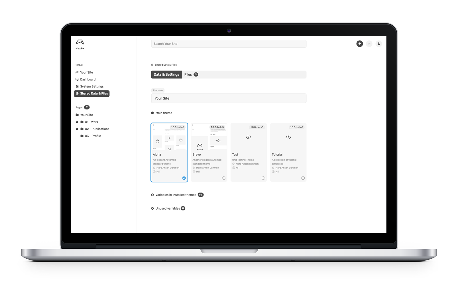
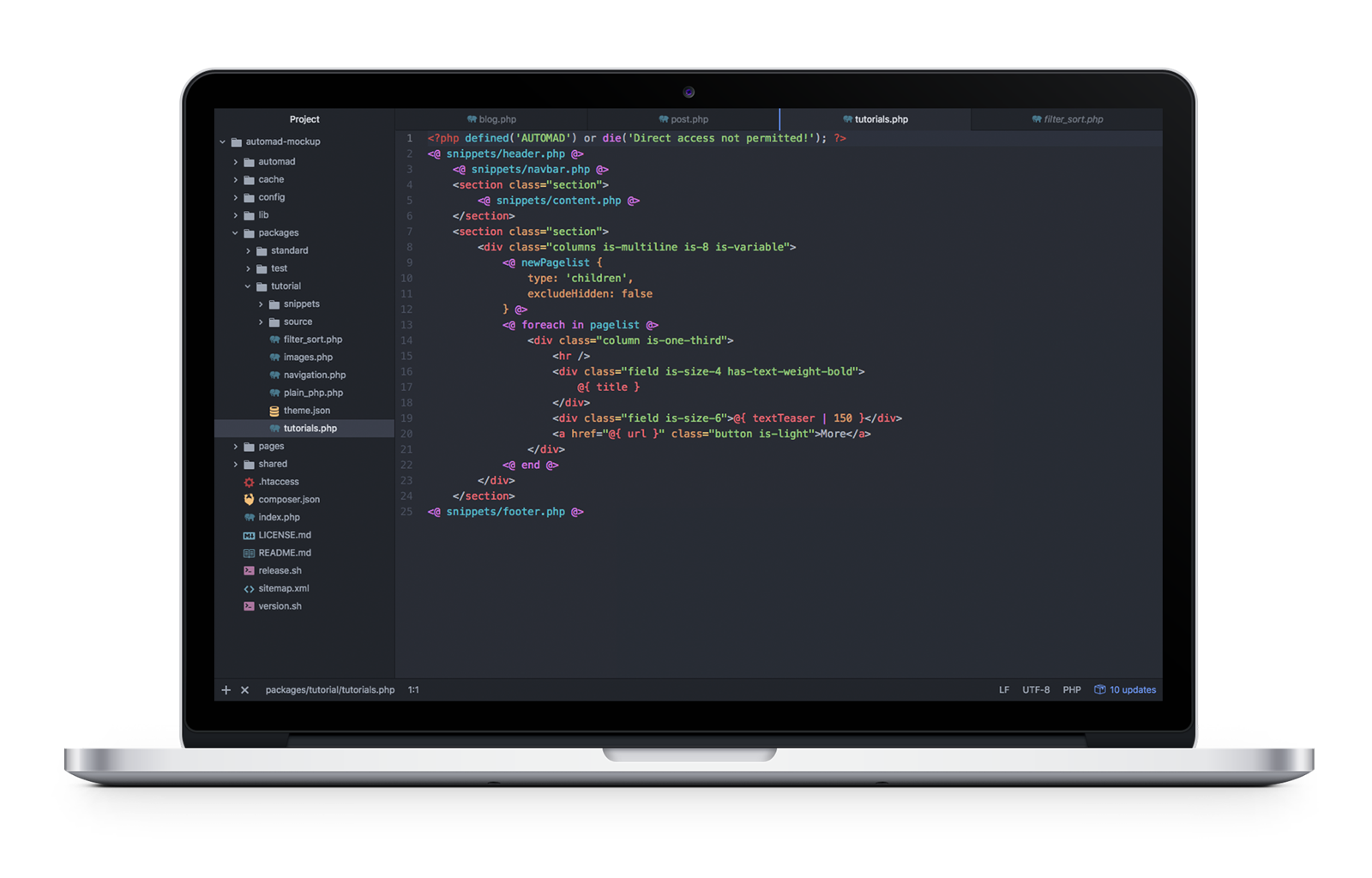
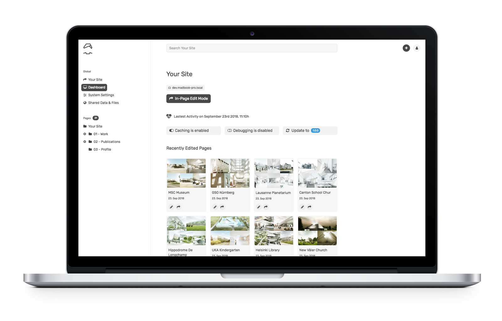

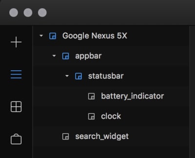


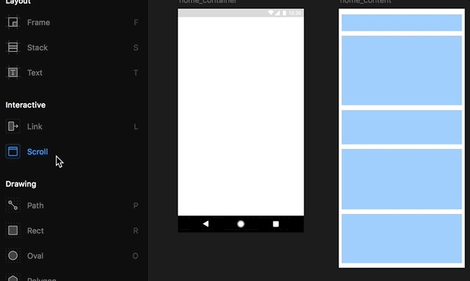
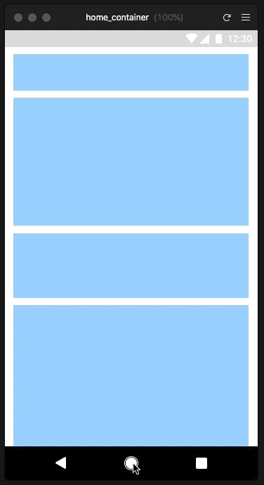
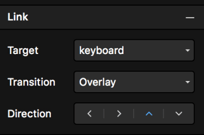
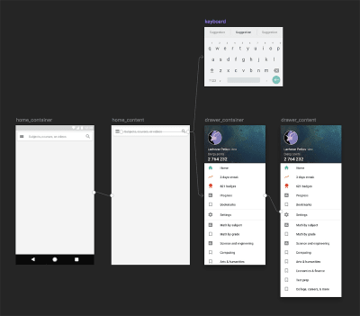
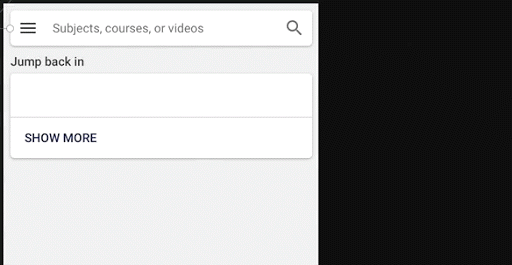
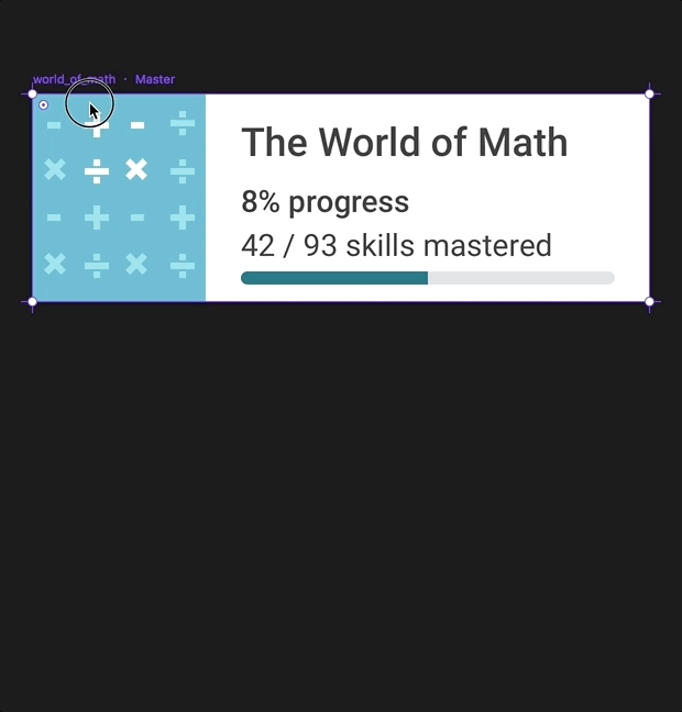

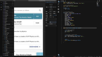
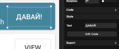
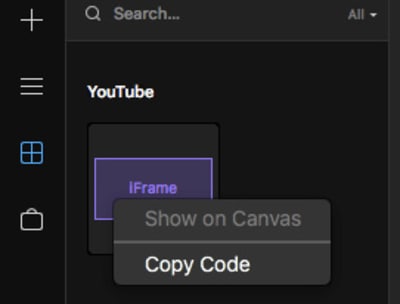


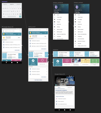