Quantcast
Channel: PSD2WordPress
Viewing all 163 articles
Browse latest View live

Getting Started With Machine Learning

$
0
0

Getting Started With Machine Learning

Getting Started With Machine Learning

Alvin Wan

The goal of machine learning is to find patterns in data and use those patterns to make predictions. It can also give us a framework to discuss machine learning problems and solutions — as you’ll see in this article.

First, we will start with definitions and applications for machine learning. Then, we will discuss abstractions in machine learning and use that to frame our discussion: data, models, optimization models, and optimization algorithms. Later on in the article, we will discuss fundamental topics that underlie all machine learning methods and conclude with practical guidance for getting started with using machine learning. By the end, you should have an understanding of how to advance your practice and study of machine learning.

Let’s begin.

So, What Exactly Is Machine Learning?

Machine learning is generically a set of techniques to find patterns in data. Applications range from self-driving cars to personal AI assistants, from translating between French and Taiwanese to translating between voice and text. There are a few common applications of machine learning that already or could potentially permeate your day-to-day.

  1. Detecting anomalies
    Recognize spikes in website traffic or highlight abnormal bank activity.
  2. Recommend similar content
    Find products you may be looking for or even Smashing Magazine articles that are relevant.
  3. Predict the future
    Plan the path of neighboring vehicles or identify and extrapolate market trends for stocks.

The above are few of many applications of machine learning, but most applications tie back to learning the underlying distribution of data. A distribution specifies events and probability of each event. For example:

  • With 50% probability, you buy an item $ 5 or less.
  • With 25% probability, you buy an item $ 5-$ 10.
  • With 24% probability, you buy an item $ 10-100.
  • With 1% probability, you buy an item > $ 100.

Using this distribution, we can accomplish all of our tasks above:

  1. Detecting anomalies
    With a $ 100 purchase, we can confidently call this an anomaly.
  2. Recommend similar content
    A purchase of $ 3 means we should recommend more items $ 5 or less.
  3. Predict the future
    Without any prior information, we can predict that the next purchase will be $ 5 or less.

With a distribution of data, we can accomplish a myriad of tasks. In sum, one goal in machine learning is to learn this distribution.

Even more generically, our goal is to learn a specific function with particular inputs and outputs. We call this function our model. Our input is denoted x. Say our model, which accepts input x, is

f(x) = ax 

Here, a is a parameter of our model. Each parameter corresponds to a different instance of our model. In other words, the model where a=2 is different from the model where a=3. In machine learning, our goal is to learn this parameter, changing it until we do “well.” How do we determine which values of a do “well”?

We need to define a way to evaluate our model, for each parameter a. To start, the output of f(x) is our prediction. We will refer to y as our label, meaning the true and desired output. With our predictions and our labels, we can define a loss function. One such loss function is simply the difference between our prediction and our label, |f(x) - y|. Using this loss function, we can then evaluate different parameters for our model. Picking the best parameter for our model is known as training. If we have a few possible parameters, we can simply try each parameter and pick the one with the smallest loss!

However, most problems are not as simple. What happens if there are an infinite number of different parameters? Let’s say all decimal values between 0 and 1? Between 0 and infinity? This brings us to our next topic: abstractions in machine learning. We will discuss different facets of machine learning, to compartmentalize your knowledge into data, models, objectives, and methods of solving objectives. Beyond learning the right parameter, there are plenty of other challenges: how do we break down a problem as complex as controlling a robot? How do we control a self-driving car? What does it mean to train a model that identifies faces? The section below will help you organize answers to these questions.

Abstractions

There are countless topics in machine learning — at various levels of specificity. To better understand where each piece fits in the larger picture, consider the following abstractions for machine learning. These abstractions compartmentalize our discussion of machine learning topics, and knowing them will make it easier for you to frame topics. The following classifications are taken from Professor Jonathan Shewchuck at UC Berkeley:

  1. Application and Data
    Consider the possible inputs and the desired output for the problem.

    Questions: What is your goal? How is your data structured? Are there labels? Is it reasonable for us to extract output from the provided inputs?

    Example: The goal is to classify pictures of handwritten digits. The input is an image of a handwritten number. The output is a number.

  2. Model
    Determine the class of functions under consideration.

    Questions: Are linear functions sufficient? Quadratic functions? Polynomials? What types of patterns are we interested in? Are neural networks appropriate? Logistic regression?

    Example: Linear regression

  3. Optimization Problem
    Formulate a concrete objective in mathematics.

    Questions: How do we define loss? How do we define success? Should we apply additionally penalties to bias our algorithm? Are there imbalances in the data our objective needs to consider?

    Example: Find `x` that minimizes |Ax-b|^2

  4. Optimization Algorithm
    Determine how you will solve the optimization problem.

    Questions: Can we compute a solution by hand? Do we need an iterative algorithm? Can we convert this problem to an equivalent but easier-to-solve objective, and solve that one?

    Example: Take derivative of the function. Set it to zero. Solve for our optimal parameter.

Abstraction 1: Data

In practice, collecting, managing, and packaging data is 90% of the battle. The data contains samples in which each sample is a specific realization of our input. For example, our input may generically be images of dogs. The first sample is specifically a picture of Maxie, my Bernese Mountain dog-chow chow mix at home. The second sample is specifically a picture of Charlie, a young corgi.

While training your model, it is important to handle your data properly. This means separating our data accordingly and not peeking prematurely at any set of data. In general, our data is split into three portions:

  1. Training set
    This is the dataset you train your model on. The model may see this set hundreds of times.
  2. Validation set
    This is the dataset you evaluate your model on, to assess accuracy and tune your model or method accordingly.
  3. Test set
    This is the dataset you evaluate on to assess accuracy, once at the very end. Running on the test set prematurely could mean your model overfits to the test set as well, so run only once. We will discuss the notion of “overfitting” in more detail below.

Abstraction 2: Models

Machine learning methods are split into the following two:

Supervised Learning

In supervised learning, our algorithm has access to labeled data. Still, we explore the following two classes of problems:

  • Classification
    Determine which of k classes {C_1, C_2, ... C_k} to which each sample belongs, e.g. “Which breed of dog is this?” The dog could be one of {"corgi", "bernese mountain dog", "chow chow"...}
  • Regression
    Determine a real-valued output (which are often probabilities), e.g. “What is the probability this patient has neuroblastoma (eye cancer)?”
Unsupervised Learning

In unsupervised learning, our algorithm does not have access to labels, and we explore the following classes of problems:

  • Clustering
    Cluster samples into k clusters. We do not have a label for the resulting clusters. “Which DNA sequences are most similar?”
  • Dimensionality reduction
    Reduce the number of “unique” (linearly independent) features we consider. “What are common features of faces?”

Abstraction 3: Optimization Objective

Before discussing optimization objectives and algorithms, we’ll need an example to discuss. Least squares are the canonical example. We will restrict our attention to a specific form of least squares: Let us return to our grade-school problem of fitting a line to some points.

Let’s recall the equation of a line:

y = m * x + b 

Assume we have such a line. This is the true underlying model.

 true model
True model. The line that generates our data. (Large preview)

Now, sample points from this line.

true data
True data. Data that is sampled from the true model. (Large preview)

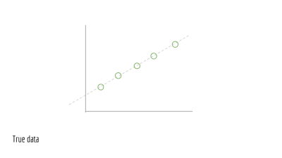
For each point, jiggle it a little bit. In other words, add noise, which is random perturbations. This noise is due to real-world processes.

noise
Noise. Real-world perturbations that affect our data. This may be due to imprecision in measurements, lossy compression, and so on. (Large preview)

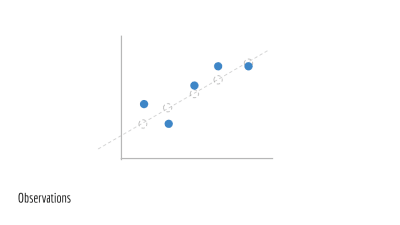
This gives us our observed data. We will call these points (x_1, y_1), (x_2, y_2), (x_3, y_3).... This is the training data we are given to train a model on. We do not have access to the underlying line that generated this data (the original green line).

observations
Observations. Our true data with noise and ultimately what we will use to train a model. (Large preview)

Say we have an estimate for the parameters of a line. In this case, the parameters are m and b. This gives us a predicted line, drawn in blue below.

proposed model
Proposed model. The result of training a model on our observations. (Large preview)

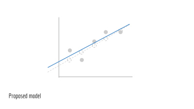
We wish to evaluate our blue line, to see how accurate it is. To start, we use m and b to estimate y. We compute a set of ŷ values.

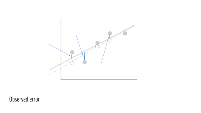
ŷ_i = m * x_i + b 

The error for a single predicted ŷ_i and true y_i is simply

(ŷ_i−y_i)^2 

Our total error is then the sum of squared differences, across all samples. This yields our loss.

∑(ŷ_i−y_i)^2 

Presented visually, this is the vertical distance between our observed points and our predicted line.

observed error
Observed error. The distance between our observed data and our proposed model. (Large preview)

Plugging in ŷ_i from above, we then have the total error in terms of m and b.

∑(m * x_i + b − y_i)^2 

Finally, we want to minimize this quantity. This yields our objective function, abstraction 3 from our list of abstractions above.

min_{m, b} ∑(m * x_i + b−y_i)^2 

The above states in mathematics that the goal is to minimize the loss by changing values of m and b. The purpose of this section was to motivate fitting a line of best of fit, a special case of least squares. Additionally, we showed examined the least squares objective. Next, we need to solve this objective.

Abstraction 4: Optimization Algorithm

How do we minimize this? We take the derivative with respect to m`, set to 0 and solve. After solving, we obtain the analytical solution. Solving for an analytical solution was our optimization algorithm, the fourth and final abstraction in our list of abstractions.

Note: The important portion of this section is to inform you that least squares have a closed form solution, meaning that the optimal solution for our problem can be computed, explicitly. To understand why this is significant, we need to examine a problem without a closed-form solution. For example, we could never solve x=logx for a standard base-10 logarithm. Try graphing these two lines, and we see that they never intersect. In which case, we have no closed-form solution. On the other hand, ordinary least squares have a closed-form — which is good news. For any problem reduced to least squares, we can then compute the optimal solution, given our data and assumptions.

Fundamental Topics

Before studying more methods, it is necessary to understand the undercurrents of machine learning. These will govern the initial study of machine learning:

Bias-Variance Tradeoffs

One of machine learning’s most dreaded evils is overfitting in which a model is too closely tailored to the training data. In the limit, the most overfit model will memorize the data. This might mean that if one does well on exam A, one repeats every detail for exam B — down to the duration of an inter-exam restroom trip and whether or not one used the urinal.

A related but less common evil is underfitting, where the model is not sufficiently expressive to capture important information in the data. This could mean that one looks only at homework scores to predict exam scores, ignoring the effects of reading notes, completing practice exams, and more. Our goal is to build a model that generalizes to new examples while making the appropriate distinctions.

Given these two evils, there are a variety of approaches to fighting both. One is modifying your optimization objective to include a term that penalizes model complexity. Another is tuning hyperparameters that govern either your objective or your algorithm, which may correspond to notions such as “training speed” or “momentum.” The bias-variance tradeoff gives us a precise way of defining and handling both overfitting and underfitting.

Maximum Likelihood Estimation (MLE) + Maximum A Posteriori (MAP)

Say we have ice cream flavors A, B, and C. We observe different recipes. Our goal is to predict which flavor each recipe produces.

One way to predict flavors based on recipes is to first estimate the following probability:

P(flavor|recipe) 

Given this probability and a new recipe, how can we predict the flavor? Given a recipe, simply consider the probability of each of the flavors A, B, C.

P(flavor=A|recipe) = 0.4 P(flavor=B|recipe) = 0.5 P(flavor=C|recipe) = 0.1 

Then, pick the flavor that has the highest probability. Above, flavor B has the highest probability, given our recipe. Thus, we predict flavor B. Restating the above rule in mathematics, we have:

argmax_{flavor} P(flavor|recipe)  # argmax means take the flavor that corresponds to the max value 

However, the only information at our disposal is the reverse: the probability of some recipe given the flavor.

P(recipe|flavor) 

For Maximum Likelihood Estimates, we make assumptions and find that the two values are proportional.

P(recipe|flavor) ~ P(flavor|recipe) 

Since we’re only interested in the class with maximum probability P(flavor|recipe), we can simply find the class with maximum probability, for a proportional value P(recipe|flavor).

argmax_{flavor} P(recipe|flavor) 

MLE offers the above objective as one way to predict, using the probability of data given the labels.

However, allow me to convince you that it’s reasonable to assume we have (x|y). We can estimate this from observed, real-world data. For example, say we wish to estimate the number of marbles each student in your class carries, based on the number of rubber ducks the student carries.

Each student’s number of rubber ducks is the data x, and the number of marbles she or he has is y. We will use this sample data below.

| x | y | |---|---| | 1 | 2 | | 1 | 1 | | 1 | 2 | | 2 | 1 | | 2 | 2 | | 1 | 2 | 

For every y, we can compute the number of x, given us P(x|y). For the first one, P(x=1|y=1), consider all of the rows where y=1. There are 2, and only one of them has x=1. Therefore, P(x=1|y=1) = 12. We can repeat this for all values of x and y.

P(x=1|y=1) = 1/2 P(x=2|y=1) = 1/2 P(x=1|y=2) = 3/4 P(x=2|y=2) = 1/4 

Featurizations, Regularization

Least squares draw lines of best fit for us. Note that least squares can fit the model anytime the model is linear in its inputs x and outputs y.

Say m=1. We have the following equation:

y = x + b 

However, what if we had data that doesn’t generally follow a line? Specifically, consider a set of data sampled along a circle. Recall that the equation for a circle is:

x^2 + y^2 = r^2 

Can least squares fit this well? As it stands, no. The model is not linear in its inputs x and outputs y. Instead, the model above is quadratic in x and y. However, it turns out that we can use still use least squares, just with a modification. To accomplish this, we featurize our samples.

Consider the following: what if the input to our model was x_ = x^2 and y_ = y^2? Then, our model is trying to learn the following model.

x_ + y_ = r^2 

Is this linear in the model’s input x_ and output y_? Yes. Note the subtlety. The current model is still quadratic in x,y but it is linear in x_,y_. This means that least squares can fit the data if we square x^2 and y^2 before training least squares.

More generally, we can take any non-linear featurization to apply least squares to labels that are non-linear in the features. This is a fairly powerful tool, known as featurization.

However, featurizations lead to more complex models. Regularization allows us to penalize model complexity, ensuring that we do not overfit the training data.

Conclusion

In this article, you’ve touched on major topics in the fundamentals of machine learning. Using the abstractions above, you now have a framework to discuss machine learning problems and solutions. Using the fundamental topics above, you now also have quintessential concepts to learn more about, giving you the necessary tools to evaluate risk and other concerns in a machine learning application.

Further Reading

We will continue to explore these topics in depth, both the undercurrents of machine learning and specific methods. In the interim, here are resources to further your study and exploration of machine learning:

Smashing Editorial (ra, il)


Articles on Smashing Magazine — For Web Designers And Developers

The post Getting Started With Machine Learning appeared first on PSD 2 WordPress.


“Killing the URL”

$
0
0

It was Safari who first started hiding the complete URL. Here’s what CSS-Tricks looks like even when you’re on an article page by default in Safari:

The full URL path is hidden.

You can only fix it (YES, FIX IT) by checking “Show full website address” in settings.

Preferences > Advanced

We’ve already damaged the sanctity of URLs in a way with URL shorteners. Thankfully, those are used less and less with social networks, like Twitter, not counting the URL toward the total tweet character count anymore.

Now, Lily Hay Newman reports Chrome sees problems as well:

“People have a really hard time understanding URLs,” says Adrienne Porter Felt, Chrome’s engineering manager. “They’re hard to read, it’s hard to know which part of them is supposed to be trusted, and in general I don’t think URLs are working as a good way to convey site identity. So we want to move toward a place where web identity is understandable by everyone—they know who they’re talking to when they’re using a website and they can reason about whether they can trust them. But this will mean big changes in how and when Chrome displays URLs. We want to challenge how URLs should be displayed and question it as we’re figuring out the right way to convey identity.”

I’m not seeing the same research they are. Anecdotally, I’m not sure I’ve met anyone who doesn’t understand a URL. I wonder if there is something else weird afoot here. URLs are the single greatest feature of the web. I know nobody is arguing about removing them (just visually hiding them by default), but it doesn’t feel like a step in the right direction. It also seems slightly at odds with the celebration of the web in Chrome’s 10-year anniversary post by Paul Kinlan:

We can thank all the browser vendors for their continued work to create and iterate on specs, using streamlined processes like those defined by the WICG and based on the principles in the Extensible Web Manifesto. We’ll continue our commitment to work with browser vendors and the developer ecosystem to prioritize features that users need, and to ensure that those capabilities arrive in a “webby” way.

I’d say seeing URL’s is pretty “webby.”

The post “Killing the URL” appeared first on CSS-Tricks.

CSS-Tricks

The post “Killing the URL” appeared first on PSD 2 WordPress.

Introduction To Animation And The iMessage App Store With Shruggie

$
0
0

Introduction To Animation And The iMessage App Store With Shruggie

Introduction To Animation And The iMessage App Store With Shruggie

Simon Schmid

When the App Store for iMessage in late 2016 went live, I released Kaomotion, a sticker app with animated kaomoji inside. Ever since the release of this app, I wanted to write up a tutorial about how a simple text character like shruggie (i.e. ¯\_(ツ)_/¯) can be animated to give it life-like features:

Shruggie animated
The Shruggie animation we’re going to make. (Large preview)

What you are going to read in this article is a step-by-step guide of setting up a canvas in After Effects and then going through with the animation. You’ll also read about how well the app containing more than 30 animated stickers worked and what some of the specific issues are you might be having on the App Store for iMessage:

  1. Canvas Setup
  2. Working With A (Text) Layer
  3. Working With Rulers
  4. Understanding The Puppet Pin Tool
  5. Animation And Timeline
  6. Further Reading And Tools
  7. Bonus Reading: Life On The App Store For iMessage

Without further ado, let’s jump right in.

1. Canvas Setup

We’re starting with setting up a new composition ( + N) within After Effects with the following settings:

  • 1000px × 1000px;
  • a frame rate of 30 frames per second;
  • a quarter on resolution;
  • a run time of 2 seconds.

This is going to be the basic canvas we’re going to work with during the animation. We’re choosing a square since that is what you have to deal with within iMessage and Apple’s sticker implementation.

After Effects canvas set up
After Effects canvas set up. (Large preview)

2. Working With A (Text) Layer

Since kaomoji are simple text-based emoticons we’re going to copy-paste a a Shruggie “¯\_(ツ)_/¯” from the first source we can find being Jeremy Burge’s Emojipedia via Google.

After having found it on Emojipedia we’re pasting it as a text layer into After Effects. It’s time to utilise the text tool.

The Text Tool

Copy + T in with + V:

After Effects text layer
Using the text layer. (Large preview)

The Shruggie inside your canvas might not look exactly the way you’ve found him on Google, or on Emojipedia for that matter, that’s because of differences in font types. We’ve chosen a font that makes Shruggie look decent and made him stretch across the canvas to prepare him for his facelift: double-click on the Source Name to select all characters.

The Character Menu

Double click Name Source and then get the font type in your Character menu.

After Effects character menu
The character menu. (Large preview)

Scaling A Layer

Select Layer, then S + Scale (by sliding right for example).

To position the layer properly, we’re scaling it up to fill the canvas by selecting the layer by pressing S, then Scale and then finally moving the scale until it fits.

After Effects scale a layer
Scaling a layer. (Large preview)

To further explore some smaller tweaks let’s look into making our Shruggie a little more connected. For that we’re looking into some kerning and height options. To adjust the gap between Shruggie’s arm and hand, we’ll use the kerning tool (V/A) either manually in the menu or with another keyboard shortcut:

Kerning

Select Space + ALT + ← →. When we’re happy with the kerning gaps, we’ll adjust the height of the arms and make it look like the arms are actually connected. To join up the slashes with the underscore we’re going to play around with increasing the height of the slash/vertical scale, moving it vertically and potentially adjusting the baseline. In our case we’ve increased the height of the slash character to 120% and then adjusted vertically:

After Effects text kerning
Text kerning in action. (Large preview)

Moving Vertically

Make selection + ALT + SHIFT + ↑ ↓

After Effects move selection vertically
Move selection vertically. (Large preview)

If you repeat the steps above on the other side we’ll by now have a pretty looking Shruggie, but what’s that, we don’t like how it aligns at all, do we?

After Effects align
Unaligned Shruggy, can we fix it? (Large preview)

Let’s further align this sorry looking Shruggie.

That’s what rulers are for.

3. Working With Rulers

To conjure up rulers we’re going to use another keyboard shortcut:

Display Rulers

+ R

This gives you the ruler view, from which you can practically drag rulers as visual cues into your canvas.

After Effects set up rulers
Setting up rulers. (Large preview)

The next steps are a repetition of what we’ve done before: we’re selecting the middle part and moving it down vertically to align with Shruggie’s arms, shoulders, and hands. It looks pretty good, but let’s double-check on that first impression by zooming in!

Zoom in

You can zoom in by pressing + +, and also by pressing on the , + . keys. In our case, we found we need to change it to properly align Shruggie’s face with his arms, which is another repetition of the above resizing and realigning skills.

Guess what? We’re now ready to animate! 🎊🎉🎈🚀🚀🚀🚀

After Effects zoom
Zooming into Shruggie. (Large preview)

4. Understanding The Puppet Pin Tool

In order to animate our base Shruggie, we’re going to use the Puppet Pin Tool. Essentially it lets us work on any vector elements within After Effects, which includes our text assets. Let’s start:

The Puppet Pin Tool

Now what we’ll want to do is put pins where we want the joints to be: hands, elbows, shoulders, and so on. Press on + P to do the trick:

After Effects puppet pinning
Puppet pinning. (Large preview)

Keep adding joints until we have him fully pinned up and gotten a fully functional human torso:

After Effects pins
Finalized pins view. (Large preview)

When you get a yellow highlight, that means that everything has been well done and After Effects recognizes the element as a vector and therefore you can place your pins. One thing that’s worth looking out for is to make sure that your pins/keyframes are at time 0 in your timeline at this stage:

After Effects timeline
After Effects timeline. (Large preview)

5. Animation And Timeline

The key to doing this effectively is to start with your main poses. We’re going to start with our start and end poses in place. We can do that by copying the keyframes that have been set up by our puppet pins in the beginning to our end state. The reason for this is simple: this is the start and our default pose, that’s the pose we want to return to in order to get a coherent animation.

Set Up Start And End Point

Select the layout and press U, then copy-paste to the end state.

After Effects copy keyframes
Copying keyframes from start state and end state. (Large preview)

As you can see it in in the gif above selecting the layout and pressing U returns every property of a layer that has keyframes as little diamonds. These little 💠 now also constitute your end state.

Setting the Middle Stage

In order to have a stage that we want to animate to and from, we’ll put that right in the middle:

After Effects select timeline
Select the timeline in the middle (1 sec in our example). (Large preview)

Now that we’re in the middle of our animation we’re going to make changes to our default state in such a way that we want to constitute our middle state:

This means we’re going to raise the shoulder puppet pin, get the elbow and arms a little closer to your body and give the hand a proper “shrug” movement. This will automatically create those keyframes at that point in time, which will then animate our two default stages between each other.

Here’s the demonstration of the animation we get when we manually move the timeline with our cursor:

After Effects time ruler
Shoulders on the time ruler. (Large preview)

We’re following the exact same process for the right part of Shruggie’s shoulder and then add a bit of movement to Shruggies face which gives him a distinct look smirking over his shoulders and giving us the impression of: “Meh, you know, nothing to do about that”.

Space Bar To Play

Select layer + Space. When you hit the Space key you can get a first impression of our animation:

After Effects animation test
First animation test. (Large preview)

What you’ll notice immediately is that the character seems to miss character. That is mostly due to the fact that our animation plays at the same speed for the entire two seconds. That is the hallmark of mostly dodgy animation — you’ll want it to not just evenly move between two points.

The easiest way to fix it up and give Shruggie a bit more realism, believability is to use a technique called ease-in and ease-out (or cushioning or a number of other ways). It’s basically speeding up the animation and then speeding it down again before reaching the end of the animation timeline.

It’s a cheap way of breathing some more life into our Shruggie. To do that we’re using a great little After Effects plugin called Ease and wiz that lets us apply some easing without much work:

Select all keyframes and then apply Ease and wizz with the options most suitable for your animation.

After Effects ease and wizz
Applying Ease and wizz and some options. (Large preview)

In our case we’ve chosen to go with the following settings:

  • Easing: Quart
  • Type: In and Out
  • Keys: All
  • Curvaceous: no

If we now run our animation again with the space bar, you’ll notice you’ll get something very close to the animation embedded at the beginning of this post. This means that we’re done, and we can be very proud of our work.

6. Further Reading About The Motion Basics

The tutorial you’ve just read introduces only the very basics of animation by way of making Shruggie move. In order to progress in animation, you’ll need to dig in further into the basics of motion. Further reading on some of those basics will help you improve further.

Below you’ll find an article describing the basics of motion and then some that relate to motion/animation with UX and software to come back full circle on the web:

7. Bonus Reading: Life On The App Store For iMessage

The above tactics were applied to a whole bunch of kaomoji for the already mentioned as stated in the introduction.

I’ve launched the sticker app to some early support on Product Hunt, however, the app itself failed to be picked up by Apple or any audience on the App Store at large. I’d like to point out two realities on the App Store that anyone trying to make a sticker app needs to face:

  • Competition by big brands;
  • The wrath of users who don’t get the concept of stickers.

Problem: Prevalence Of Brands

If you want a shot at being consistently in the top 50 of the top paid iMessage stickers, then it helps to be a big brand or a notoriously known character. I’m not going to attach much meaning to this, just state it as a fact and provide the evidence below of screenshots collected in April 2018 (when I first wrote the draft on this article) on the Swiss App Store for iMessage.

Of the top 40 (that’s the top paid category), around 18 are likely to be well known characters turning that fact into downloads:

iMessage Store top paid sticker apps
Top paid sticker apps. (Large preview)
Top Paid Sticker Apps

The subtitle of this section is somewhat provocatively chosen, as there is no intrinsic problem with this as these characters are uniquely suited for stickers, though it’s an issue as this is just what you’re up against. Of course, the economic reality also shows around curation:

iMessage Store sticker app curation
Sticker app curation. (Large preview)

The left shows a screenshot of the first batch of curated stickers (66% big brand) in April of 2018, the right shows a screenshot of late August of 2018, where I encountered the exact same setup.

Again, this is not to pass judgment at Apple as I think they’ve become much better at curation in the App Store in general. As a summary of this situation, I think it is fair to say that other sticker ecosystems such as LINE’s have allowed more creativity to flourish and that the sticker ecosystem on the App Store is hard to advance into successfully.

Users still don’t get (or do not want?) stickers and the next point is a testament to this:

Problem: Facing The Wrath Of Users

The most annoying problem with the App Store for iMessage is still the fact that users do not know how to use them (i.e. stickers). That results in an abundance of one-star reviews.

In the case of Korea, Kaomotion got 80 one-star reviews in a matter of a few days by users complaining about the app not being there on their phone.

App Store negative review
“아니 삭제하는갓두 업네요..삭제좀요 사용하는 법도 모르겟어요” translates to “I don’t know how to use it.” (Large preview)

This can then look like the next screenshot fast, and Apple doesn’t seem to care to help clean out the mess, even after trying to address the users in Korean:

App Store 1 star reviews
What an abundance of 1 star reviews in Korean looks like. (Large preview)

They’re essentially all saying the same: “The App isn’t on our phone.” Any one-star reviews are essentially also going to stay forever as no-one seems to care about what you have to say.

Solutions to the discoverability problem of stickers in the interface

I’m not the first one or the only one to write about this problem, however I’d like to offer some possible remedies below.

18 months after the introduction of the App Store for iMessage users still don’t know how to send and receive stickers (though I must say that Apple tried to stitch the interface up within iMessage).

In this regard, you can only try to fix these problems by attacking the problem head-on and giving as much information as possible to users.

  • Writing guides on the App Store page
    Use the (text) screen real estate Apple gives you to write a step to step guide about how stickers are sent.
  • Writing more in-depth guides elsewhere
    Do a blog post or something similar about the same topic with screenshots, gifs, or a video (I’ve made one here for Kaomotion).
  • Use a screenshot or app preview
    Finally, you may want to be explicit even on your screenshots about how your app is used. Even Wonder Woman seems to have been experiencing the same problem and used a screenshot to offer remedy:
Wonder Woman stickers
Wonder Woman: “How to send stickers”. (Large preview)

You will likely still get users complaining, this way you’ll have an easy way to describe to them what needs to be done in order to use your stickers.

Were I to go back to the launch of the sticker store, I probably wouldn’t go through the hardship of creating Kaomotion once again, however, I’m glad I got to write about animation basics for After Effects!

I hope this tutorial gave you an interesting glimpse at both After Effects and the iMessage App Store. If you’re into this, you might want to go hang out at this new animation community called Keyframes.

ᕕ( ᐛ )ᕗ

Smashing Editorial (ra, yk, il)


Articles on Smashing Magazine — For Web Designers And Developers

The post Introduction To Animation And The iMessage App Store With Shruggie appeared first on PSD 2 WordPress.

Web Design Weekly #332

$
0
0

Headlines

The ‘Capable Web’: A 10 Year Retrospective

The Chrome team highlight some of the major changes they have helped bring to the web in the last 10 years. (blog.chromium.org)

Accessibility is not a feature

Ethan Marcotte shares some strong thoughts about how we should be treating accessibility within our work. A must read. (ethanmarcotte.com)

Articles

A Portfolio Hiring Managers Can’t Deny

Dan Mall shares some really great advice for helping you land your dream job. Even if you are not looking this is worth bookmarking. (danmall.me)

Behind the scenes of my latest book on JavaScript

A behind the scenes look at Dr. Axel Rauschmayer’s latest book, “JavaScript for impatient programmers”. (2ality.com)

Getting Remote Critique Right

Remote work brings with it some challenges that need careful pruning to create a successful and happy team. One of the first things that comes to mind is critique, a daunting task when in the same room as people, let alone hundreds or thousands of miles away from one another. (medium.com)

Designing With Code (matthewstrom.com)

Tools / Resources

Styled Components Version 4

A brand new global styles API, native support for the “as” and “ref” props, removal of .extend, full React v16 StrictMode-compliance, tons of speed and lots more. (medium.com)

An Intro to Web Site Testing with Cypress

Cypress is a new-ish test runner with some features that take some of the friction out of end-to-end testing. In this post Devon Campbell gives a great run through of how to get up and running. (css-tricks.com)

Progressive Tooling

A list of community-built, third-party tools that can be used to improve page performance. (progressivetooling.com)

React Webworker

A React component for easy communication with a Web Worker. It leverages the Render Props pattern for ultimate flexibility as well as the new Context API for ease of use. (github.com)

mkcert

A simple zero-config tool to make locally trusted development certificates with any names you’d like. (github.com)

Oh Mamma, I’m in love with Gradient (medium.muz.li)

Put Your Webpack Bundle On A Diet (contentful.com)

Inspiration

React Podcast (reactpodcast.simplecast.fm)

Refactoring UI (refactoringui.com)

Jobs

Senior Product Designer at Canva

We currently have 11 Product Designers based in Sydney and we ideally want to double in size over the next 6 months. We’re hiring at multiple levels so whether you have 3 years or 15 years experience, we’d love to hear from you. (canva.com)

Senior UI/UX Designer at Twitch

As a Senior UI/UX Designer, you will design impactful products for creating and consuming content for 100+ million Twitch users worldwide. The team has done ground-breaking work in Video Premieres, bringing previously recorded content to a live audience. (twitch.tv)

Need to find passionate developers or designers? Why not advertise in the next newsletter

Last but not least…

Chrome’s turning 10, here’s what’s new (blog.google)

The post Web Design Weekly #332 appeared first on Web Design Weekly.

Web Design Weekly

The post Web Design Weekly #332 appeared first on PSD 2 WordPress.

The Importance Of Manual Accessibility Testing

$
0
0

The Importance Of Manual Accessibility Testing

The Importance Of Manual Accessibility Testing

Eric Bailey

Earlier this year, a man drove his car into a lake after following directions from a smartphone app that helps drivers navigate by issuing turn-by-turn directions. Unfortunately, the app’s programming did not include instructions to avoid roads that turn into boat launches.

From the perspective of the app, it did exactly what it was programmed to do, i.e. to find the most optimal route from point A to point B given the information made available to it. From the perspective of the man, it failed him by not taking the real world into account.

The same principle applies for accessibility testing.

Designing For Accessibility And Inclusion

The more inclusive you are to the needs of your users, the more accessible your design is. Let’s take a closer look at the different lenses of accessibility through which you can refine your designs. Read article →

Automated Accessibility Testing

I am going to assume that you’re reading this article because you’re interested in learning how to test your websites and web apps to ensure they’re accessible. If you want to learn more about why accessibility is necessary, the topic has been covered extensively elsewhere.

Automated accessibility testing is a process where you use a series of scripts to test for the presence, or lack of certain conditions in code. These conditions are dictated by the Web Content Accessibility Guidelines (WCAG), a standard by the W3C that outlines how to make digital experiences accessible.

For example, an automated accessibility test might check to see if the tabindex attribute is present and if its value is greater than 0. The pseudocode would be something like:

A flowchart that asks if the tabindex value is present. If yes, it asks if the tabindex value is greater than 0. If it is greater than zero, it fails. If not, it passes. If no tabindex value is present, it also passes.

Failures can then be collected and used to generate reports that disclose the number, and severity of accessibility issues. Certain automated accessibility products can also integrate as a Continuous Integration or Continuous Deployment (CI/CD) tool, presenting just-in-time warnings to developers when they attempt to add code to a central repository.

These automated programs are incredible resources. Modern websites and web apps are complicated things that involve hundreds of states, thousands of lines of code, and complicated multi-screen interactions. It’d be absurd to expect a human (or a team of humans) to mind all the code controlling every possible permutation of the site, to say nothing of things like regressions, software rot, and A/B tests.

Automation really shines here. It can repeatedly and tirelessly pour over these details with perfect memory, at a rate far faster than any human is capable of.

However…

Automated accessibility tests aren’t a turnkey solution, nor are they a silver bullet. There are some limitations to keep in mind when using them.

Thinking To Think Of Things

One of both the best and worst aspects of the web is that there are many different ways to implement a solution to a problem. While this flexibility has kept the web robust and adaptable and ensured it outlived other competing technologies, it also means that you’ll sometimes see code that is, um, creatively implemented.

The test suite is only as good as what its author thought to check for. A naïve developer might only write tests for the happy path, where everyone writes semantic HTML, fault-tolerant JavaScript, and well-scoped CSS. However, this is the real world. We need to acknowledge that things like tight deadlines, unfamiliarity with the programming language, atypical user input, and sketchy 3rd party scripts exist.

For example, the automated accessibility testing site Tenon.io wisely includes a rule that checks to see if a form element has both a label element and an aria-label associated with it, and if the text strings for both declarations differ. If they do, it will flag it as an issue, as the visible label may be different than what someone would hear if they were navigating using a screen reader.

If you’re not using a testing service that includes this rule, it won’t be reported. The code will still “pass”, but it’s passing by omission, not because it’s actually accessible.

State

Some automated accessibility tests cannot parse the various states of interactive content. Critical parts of the user interface are effectively invisible to automation unless the test is run when the content is in an active, selected, or disabled state.

By interactive content, I mean things that the user has yet to take action on, or aren’t present when the page loads. Unopened modals, collapsed accordions, hidden tab content and carousel slides are all examples.

It takes sophisticated software to automatically test the various states of every component within a single screen, let alone across an entire web app or website. While it is possible to augment testing software with automated accessibility checks, it is very resource-intensive, usually requiring a dedicated team of engineers to set up and maintain.

“Valid” Markup

Accessible Rich Internet Applications (ARIA) is a set of attributes that extend HTML to allow it to describe interaction in a way that can be better understood by assistive technologies. For example, the aria-expanded attribute can be toggled by JavaScript to programmatically communicate if a component is in an expanded (true) or collapsed (false) state. This is superior to toggling a CSS class like .is-expanded, where the update in state is only communicated visually.

Just having the presence of ARIA does not guarantee that it will automatically make something accessible. Unfortunately, and in spite of its first rule of use, ARIA is commonly misunderstood, and consequently abused. A lot of off-the-shelf code has this problem, perpetuating the issue.

For example, certain ARIA attributes and values can only be applied to certain elements. If incorrectly applied, assistive technology will ignore or misreport the declaration. Certain roles, known as Abstract Roles, only exist to set up the overall taxonomy and should never be placed in markup.

<button role="command">Save</button>  <!-- Never do this --> 

To further complicate the issue, support for ARIA is varied across browsers. While an attribute may be used appropriately, the browser may not communicate the declared role, property, or state to assistive technology.

There is also the scenario where ARIA can be applied to an element and be valid from a technical standpoint, yet be unusable from an assistive technology perspective. For example:

<h1 aria-hidden=“true”>   Tired of unevenly cooked asparagus? Try this tip from the world’s oldest cookbook. </h1> 

This one Weird Trick.

The aria-hidden declaration will remove the presence of content from assistive technology, yet allow it to be still rendered visibly on the page. It’s a problematic pattern.

Headings — especially first-level headings — are vital in communicating the purpose of a page. If a person is using assistive technology to navigate, the aria-hidden declaration applied to the h1 element will make it difficult for them to quickly determine the page’s purpose. It will force them to navigate around the rest of the page to gain context, an annoying and labor-intensive process.

Some automated accessibility tests may scan the code and not report an error since the syntax itself is valid. The automation has no way of knowing the greater context of the declaration’s use.

This isn’t to say you should completely avoid using ARIA! When authored with care and deliberation, ARIA can fix the gaps in accessibility that sometimes plague complicated interactions; it provides some much-needed context to the people who rely on assistive technology.

Much-Needed Context

As the soggy car demonstrates, computers are awful at understanding the overall situation of the outside world. It’s up to us humans to be the ultimate arbiters in determining if what the computer spits out is useful or not.

Debunking

Before we discuss how to provide appropriate context, there are a few common misunderstandings about accessibility work that need to be addressed:

First, not all screen reader users are blind. In addition to all the points Adrian Roselli outlines in his post, some food for thought: the use of voice assistants is on the rise. When’s the last time you spoke to Siri or Alexa?

Second, accessibility is more than just screen readers. The rules outlined in the Web Content Accessibility Guidelines ensure that the largest number of people can read and operate technology, regardless of ability or circumstance.

For example, the rule that stipulates a website or web app needs to be able to work regardless of device orientation benefits everyone. Some people may need to mount their device in a fixed location in a specific orientation, such as in landscape mode on the arm of a wheelchair. Others might want to lie in bed and watch a movie, or better investigate a product photo (pinch and pull zooming will also be helpful to have here).

Third, disabilities can be conditional and can be brought about by your environment. It can be a short-term thing, like rain on your glasses, sleep deprivation, or an allergies-induced migraine. It can also be longer-term, such as a debilitating illness, broken limb, or a depressive episode. Multiple, compounding conditions can (and do) affect individuals.

That all being said, many accessibility fixes that help screen readers work properly also benefit other assistive technologies.

Get Your Feet Wet

Knowing where to begin can be overwhelming. Consider Michiel Bijl’s great advice:

“Before you release a website, tab through it. If you cannot see where you are on the page after each tab; you're not finished yet. #a11y

Tab through a few of the main user flows on your website or web app to determine if all interactive components’ focus states are visually apparent, and if they can be activated via keyboard input. If there’s something you can click or tap on that isn’t getting highlighted when receiving keyboard focus, take note of it. Also pay attention to the order interactive components are highlighted when focused — it should match the reading order of the site.

An obvious focus state and logical tab order go a great way to helping make your site accessible. These two features benefit a wide variety of assistive technology, including, but not limited to, screen readers.

If you need a baseline to compare your testing to, Dave Rupert has an excellent project called A11Y Nutrition Cards, which outlines expected behavior for common interactive components. In addition, Scott O’Hara maintains a project called a11y Styled Form Controls. This project provides examples of components such as switches, checkboxes, and radio buttons that have well-tested and documented support for assistive technology. A clever reader might use one of these resources to help them try out the other!

A screenshot of homepage for the a11y Styled Form Controls website placed over a screenshot of the Nutrition Cards for Accessible Components website.
(Large preview)

The Fourth Myth

With that out of the way, I’m going to share a fourth myth with you: not every assistive technology user is a power user. Like with any other piece of software, there’s a learning curve involved.

In her post about Aaptiv’s redesign, Lisa Zhu discovers that their initial accessibility fix wasn’t intuitive. While their first implementation was “technically” correct, it didn’t line up with how people who rely on VoiceOver actually use their devices. A second solution simplified the interaction to better align with their expectations.

Don’t assume that just because something hypothetically functions that it’s actually usable. Trust your gut: if it feels especially awkward, cumbersome, or tedious to operate for you, chances are it’ll be for others.

Dive Right In

While not every accessibility issue is a screen reader issue, you should still get in the habit of testing your site with one. Not an emulator, simulator, or some other proxy solution.

If you find yourself struggling to operate a complicated interactive component using basic screen reader commands, it’s probably a sign that the component needs to be simplified. Chances are that the simplification will help non-assistive technology users as well. Good design benefits everyone!

The same goes for navigation. If it’s difficult to move around the website or web app, it’s probably a sign that you need to update your heading structure and landmark roles. Both of these features are used by assistive technology to quickly and efficiently navigate.

Two code examples for a sidebar. One uses a div element, while the others uses an aside element. Both have the class of sidebar applied to them, with a subheading of Recent Posts.
Both of these are sidebars, but only one of them is semantically described as such. A computer doesn’t know what a sidebar is, so it’s up to you to tell it.

Another good thing to review is the text content used to describe your links. Hopping from link to link is another common assistive technology navigation technique; some screen readers can even generate a list of all link content on the page:

“Think before you link! Your "helpful" click here links look like this to a screen reader user. ALT = JAWS links list”

Tweet by Neil Milliken

Neil Milliken

When navigating using an ordered list devoid of the surrounding non-link content, avoiding ambiguous terms like “click here” or “more info” can go a long way to ensuring a person can understand the overall meaning of the page. As a bonus, it’ll help alleviate cognitive concerns for everyone, as you are more accurately explaining what a user should expect after activating a link.

How To Test

Each screen reader has a different approach to how it announces content. This is intentional. It’s a balancing act between the product’s features, the operating system it is installed on, the form factor it is available in, and the types of input it can receive.

The Browser Wars taught us the folly of developing for only one browser. Similarly, we should not cater to a single screen reader. It is important to note that many people rely exclusively on a specific screen reader and browser combination — by circumstance, preference, or necessity’making this all the more important. However, there is a caveat: each screen reader works better when used with a specific browser, typically the one that allows it access to the greatest amount of accessibility API information.

All of these screen readers can be used for free, provided you have the hardware. You can also virtualize that hardware, either for free or on the cheap.

Automate

Automated accessibility tests should be your first line of defense. They will help you catch a great deal of nitpicky, easily-preventable errors before they get committed. Repeated errors may also signal problems in template logic, where one upstream tweak can fix multiple pages. Identifying and resolving these issues allows you to spend your valuable manual testing time much more wisely.

It may also be helpful to log accessibility issues in a place where people can collaborate, such as Google Sheets. Quantifying the frequency and severity of errors can lead to good things like updated documentation, opportunities for lunch and learn education, and other healthy changes to organizational workflow.

Much like manual testing with a variety of screen readers, it is recommended that you use a combination of automated tools to prevent gaps.

Windows

The two most popular screen readers on Windows are JAWS and NVDA.

JAWS

JAWS (Job Access With Speech) is the most popular and feature-rich screen reader on the market. It works best with Firefox and Chrome, with concessions for supporting Internet Explorer. Although it is pay software, it can be operated in full in demo mode for 40 minutes at a time (this should be more than sufficient to perform basic testing).

NVDA

NVDA (NonVisual Desktop Access) is free, although a donation is strongly encouraged. It is a feature-rich alternative to JAWS. It works best with Firefox.

Narrator

Windows comes bundled with a built-in screen reader called Narrator. It works well with Edge, but has difficulty interfacing with other browsers.

Apple

macOS

VoiceOver is a powerful screen reader that comes bundled with macOS. Use it in conjunction with Safari, first making sure that full keyboard access is enabled.

iOS

VoiceOver is also included in iOS, and is the most popular mobile screen reader. Much like its desktop counterpart, it works best with Safari. An interesting note here is that according to the 2017 WebAIM screen reader survey, a not-insignificant amount of respondents augment their phone with external hardware keyboards.

Android

Google recently folded TalkBack, their mobile screen reader, into a larger collection of accessibility services called the Android Accessibility Suite. It works best with Mobile Chrome. While many Android apps are notoriously inaccessible, it is still worth testing on this platform. Android’s growing presence in emerging markets, as well as increasing internet use amongst elderly and lower-income demographics, should give pause for consideration.

Popular screen readers
Screen ReaderPlatformPreferred Browser(s)ManualLaunchQuit
JAWSWindowsChrome, FirefoxJAWS 2018 DocumentationLaunch JAWS as you would any other Windows applicationInsert + F4
NVDAWindowsFirefoxNVDA 2018.2.1 User GuideCtrl + Alt + NInsert + Q
NarratorWindowsEdgeGet started with NarratorWindows key + Control + EnterWindows key + Control + Enter
VoiceOvermacOSSafariVoiceOver Getting Started GuideCommand + F5 or tap the Touch ID button 3 timesCommand + F5 or tap the Touch ID button 3 times
Mobile VoiceOveriOSMobile SafariVoiceOver overview – iPhone User GuideTell Siri to, “Turn on VoiceOver.” or activate in SettingsTell Siri to, “Turn off VoiceOver.” or deactivate in Settings
Android Accessibility SuiteAndroidMobile ChromeGet started on Android with TalkBackPress both volume keys for 3 secondsPress both volume keys for 3 seconds

Call The Professionals

If you do not require the use of assistive technology on a frequent basis then you do not fully understand how the people who do interact with the web.

Much like traditional user testing, being too close to the thing you created may cloud your judgment. Empathy exercises are a good way to become aware of the problem space, but you should not use yourself as a litmus test for whether the entire experience is truly accessible. You are not the expert.

If your product serves a huge population of users, if its core base of users trends towards having a higher probability of disability conditions (specialized product, elderly populations, foreign language speakers, etc.), and/or if it is required to be compliant by law, I would strongly encourage allocating a portion of your budget for testing by people with disabilities.

“At what point does your organisation stop supporting a browser in terms of % usage? 18% of the global pop. have an #Accessibility requirement, 2% people have a colour vision deficient. But you consider 2% IE usage support more important? Support everyone be inclusive.”

Mark Wilcock

This isn’t to say you should completely delegate the responsibility to these testers. Much as how automated accessibility testing can detect smaller issues to remove, a first round of basic manual testing helps professional testers focus their efforts on the complicated interactions you need an expert’s opinion on. In addition to optimizing the value of their time, it helps to get you more comfortable triaging. It is also a professional courtesy, plain and simple.

There are a few companies that perform manual testing by people with disabilities:

Designed Experiences

We also need to acknowledge the other large barrier to accessible sites that can’t be automated away: poor user experience.

User experience can make or break a product. Your code can compile perfectly, your time to first paint can be lightning quick, and your Webpack setup can be beyond reproach. All this is irrelevant if the end result is unusable. User experience encompasses all users, including those who navigate with the aid of assistive technology.

If a person cannot operate your website or web app, they’ll abandon it and not think twice. If they are forced to use your site to get a service unavailable by other means, there’s a growing precedent for taking legal action (and rightly so).

As a discipline, user experience can be roughly divided into two parts: how something looks and how it behaves They’re intrinsically interlinked concepts — work on either may affect both. While accessible design is a topic unto itself, there are some big-picture things we can keep in mind when approaching accessible user experiences from a testing perspective:

How It Looks

The WCAG does a great job covering a lot of the basics of good design. Color contrast, font size, user-facing state: a lot of these things can be targeted by automation. What you should pay attention to is all the atomic, difficult to quantify bits that compound to create your designs. Things like the words you choose, the fonts you use to display them, the spacing between things, affordances for interaction, the way you handle your breakpoints, etc.

“A good font should tell you:
the difference between m and rn
the difference between I and l
the difference between O and 0.”

mallory, alice & bob

It’s one of those “an ounce of prevention is worth a pound of cure” situations. Smart, accessible defaults can save countless time and money down the line. Lean and mean startups all the way up to multinational conglomerates value efficient use of resources, and this is one of those places where you can really capitalize on that. Put your basic design patterns — say collected in something like a mood board or living style guide — in front of people early and often to see if your designed intent is clear.

How It Behaves

An enticing color palette and collection of thoughtfully-curated stock photography only go so far. Eventually, you’re going to have to synthesize all your design decisions to create something that addresses a need.

Behavior can be as small as a microinteraction, or as large as finding a product and purchasing it. What’s important here is to make sure that all the barriers to a person trying to accomplish the task at hand are removed.

If you’re using personas, don’t create a separate persona for a user with a disability. Instead, blend accessibility considerations into your existing ones. As a persona is an abstracted representation of the types of users you want to cater to, you want to make sure the kinds of conditions they may be experiencing are included. Disability conditions aren’t limited to just physical impairments, either. Things like a metered data plan, non-native language, or anxiety are all worth integrating.

“When looking at your site's analytics, remember that if you don't see many users on lower end phones or from more remote areas, it's not because they aren't a target for your product or service. It is because your mobile experience sucks.
As a developer, it's your job to fix it.”

Estelle Weyl

User testing, ideally simulating conditions as close to what a person would be doing in the real world (including their individual device preferences and presence of assistive technology), is also key. Verifying that people are actually able to make the logical leaps necessary to operate your interface addresses a lot of cognitive concerns, a difficult-to-quantify yet vital thing to accommodate.

We Shape Our Tools, Our Tools Shape Us

Our tool use corresponds to the kind of work we do: Carpenters drive nails with hammers, chefs cook using skillets, surgeons cut with scalpels. It’s a self-reinforcing phenomenon, and it tends to lead to over-categorization.

Sometimes this over-categorization gets in the way of us remembering to consider the real world. A surgeon might have a carpentry hobby; a chef might be a retired veterinarian. It’s important to understand that accessibility is everyone’s responsibility, and there are many paths to making our websites and web apps the best they can be for everyone. To paraphrase Mikey Ilagan, accessibility is a holistic practice, essential to some but useful to all.

Used with discretion, ARIA is a very good tool to have at our disposal. We shouldn’t shy away from using it, provided we understand the how and why behind why they work.

The same goes for automated accessibility tests, as well as GPS apps. They’re great tools to have, just get to know the terrain a little bit first.

Resources

Automated Accessibility Tools

Professional Services

References

Quick Tests

Further Reading

Smashing Editorial (rb, ra, yk, il)


Articles on Smashing Magazine — For Web Designers And Developers

The post The Importance Of Manual Accessibility Testing appeared first on PSD 2 WordPress.

Issue #330

$
0
0

CSS WeeklyCSS Weekly

The post Issue #330 appeared first on PSD 2 WordPress.

Monthly Web Development Update 9/2018: Native Lazy Loading And Imaginary Work

$
0
0

Monthly Web Development Update 9/2018: Native Lazy Loading And Imaginary Work

Monthly Web Development Update 9/2018: Native Lazy Loading And Imaginary Work

Anselm Hannemann

It’s an interesting concept to compare JavaScript with CO2 and yet a very valid one. Alex Russel who works for the Chrome team and has a lot of insights into the current state of the web says that using too much JavaScript or using it exclusively (without progressive enhancement/graceful degradation) will have the same effect as too much CO2 for the ecosystem on planet Earth — the ecosystem will fall apart. And just like we need a certain amount of CO2 to live, we need JavaScript on the web. It’s that fine line that makes the difference — the line between not too much and none at all.

I feel that with the native browser APIs that we have these days we have a fantastic opportunity to build great web services without bloating them too much and without relying only on JavaScript. We can enhance native elements with the Custom Elements API easily via ES6 Classes, with so little code that it seems ridiculous to build all that on your own in a third-party framework. Coincidentally, the Github engineering team published an article about how they dropped jQuery entirely and what they now use instead: native JavaScript and small, lean code that is progressively enhancing their platform. Less code, better maintainability, and more stability.

News

  • Chrome 70 is now in beta, bringing shape detection as an origin trial that allows us to perform QR code reading, face detection, and text recognition in images. The Web Authentication API got some updates, too, and referrerpolicy support was added to <script> elements. This version will also deprecate Custom Elements v0, HTML Imports, and Shadow DOM v0.
  • Finally, with Firefox 62, Mozilla ships ::selection instead of :-moz-selection. They also implemented flat(), and flatMap() for JavaScript arrays and developers get a new Shape Path Editor.
  • Chrome 69 is out and brings us CSS Scroll Snap Points, the CSS viewport-fit property for cutout-displays like the one of iPhone X, and the Web Locks API which allows scripts running in one tab or worker to asynchronously acquire a lock, hold it while work is performed, and then release it. The update also comes with CSS conic gradient support, toggleAttribute() (which is similar to the classList.toggle() method but for attributes), and flat() and flatMap() for arrays. Unfortunately, this release changed how the browser displays the URL, and it seems that people consider it a security bug. Let’s see how that will evolve.
  • With Firefox 62 supporting variable web fonts, we finally have support in all major browsers and can use it widely now to improve performance, be more creative with typography, and reduce data traffic drastically.
  • Manuel Rego Casasnovas wrote about recent changes on CSS Grid Layout in percentages and indefinite height in the Chrome browser.
  • Anyone who isn’t an expert would be hard-pressed to explain how tracking on the internet actually works. That’s why Firefox now changes their default settings and enforces tracking blocking in their browser by default.
  • PHP7.3 is coming soon with new Heredoc and Nowdoc syntax, trailing commas in function calls, is_countable(), array_key_first(), array_key_last(), and Argon2 password hash enhancements.

General

  • Alex Russell’s “The ‘Developer Experience’ Bait-and-Switch” is a great piece that explains the toxic environments we currently build for the web and why JavaScript can be compared to CO2 — both are needed in small portions, but if there’s too much of it, it’ll put the entire ecosystem (the web) at risk. A thoughtful article that I recommend everyone here to read, share, and remember.
  • As Alexa, Cortana, Siri, and even customer support chat bots become the norm we have to start considering not only how our content looks but how it could sound. We can — and should — use HTML and ARIA to make our content structured, sensible, and most importantly, meaningful.

Web Performance

Security

  • Nightwatch Cybersecurity published a security vulnerability in Android that exposes information about the user’s device to all applications running on it. This seems to include the WiFi network name, BSSID, local IP addresses, DNS server information, and the MAC address — all in all quite a lot of private information that allows people to track individual Android devices. Unfortunately, all Android OS versions including forks (except for Android P/9 where a fix was provided) seem to be affected with no plan to fix older versions.

CSS

  • Chen Hui Jing explains how to customize radio buttons without compromising their accessibility.
  • CSS Shapes have quite some history already. Brought to the web early by an initiative of the Adobe Web team, browser vendors removed the implementations soon again, and are now slowly coming back with iterated, improved specifications and implementations. Rachel Andrew shares how to implement CSS Shapes.
  • Sara Soueidan wrote down the reasons she switched from defining CSS colors as HEX or RGB to HSL and what the benefits are.
  • With the web’s growth come new features to better accommodate its new form factors and use cases. One feature I’m excited about is the color-adjust property, proposed in CSS Color Module Level 4. It is an acknowledgment that the web will continue to show up on devices that have less-than-stellar displays.
Color harmonies
Creating color harmonies becomes a piece of cake with HSL. (Image credit)

HTML & SVG

JavaScript

Accessibility

  • Ethan Marcotte reflects on what accessibility means and realizes that it’s not about making a website compatible with some assistive technology or software but about making it usable for everyone who wants to access it, regardless of the technology. This is a huge difference because his approach includes people who have difficulties reading a website even though they use the same browser and the same laptop as you. Maybe they are in bright sunlight, have difficulties with small text, or get distracted by bright colors or animated elements.
  • Eric Bailey emphasizes how important it is to manually test for accessibility.
  • Scott O’Hara shares a breadcrumb navigation using aria-label to provide an accessible name and aria-current to indicate the currently active link.

Work & Life

Real Work vs. Imaginary Work
We all have been there before: Imagining a solution in your head and implementing it are two entirely different things. (Image credit)

Going Beyond…

  • I love the concept of doodling, and even though I don’t do it regularly, it always fascinates me. Doodle Addicts is a platform that collects doodles from people all around the world. A nice gallery to get inspiration from.
  • Jonny Brooks-Bartlett wrote an interesting article on why so many data scientists are leaving their jobs. The job might sound quite interesting and like a good bet these days, but often expectations don’t match reality and politics and ethical decisions are extremely difficult.
  • Marco Lambertini explains how technology can help us save the planet, but more than anything we need to learn to value nature and its resources.
  • An interesting discussion was raised this week by a very well-known Open Source contributor who tried to change the license of one of their projects in order to prevent companies who support the U.S. ICE institution from using their software. The change was quickly reverted after it was revealed that it wasn’t legally enforceable. However, the entire topic (which comes up way more often lately) shows that more and more people think about the impact of their work. They don’t want it to be used for bad, but for good. And while the idea of open, non-restricted source is desirable, it’s only if people use it to support human rights and for improving lives. I’m curious about new solutions that could ensure this; maybe we’ll see more terms of service for open-source projects soon (which would then be legally binding but may prevent free open-source projects from using them).
Smashing Editorial (cm)


Articles on Smashing Magazine — For Web Designers And Developers

The post Monthly Web Development Update 9/2018: Native Lazy Loading And Imaginary Work appeared first on PSD 2 WordPress.

Smashing Book 6 Is Here: New Frontiers In Web Design

$
0
0

Smashing Book 6 Is Here: New Frontiers In Web Design

Smashing Book 6 Is Here: New Frontiers In Web Design

Vitaly Friedman

Imagine you were living in a perfect world. A world where everybody has fast, stable and unthrottled connections, reliable and powerful devices, exquisite screens, and capable, resilient browsers. The screens are diverse in size and pixel density, yet our interfaces adapt to varying conditions swiftly and seamlessly. What a glorious time for all of us — designers, developers, senior Webpack configurators and everybody in-between — to be alive, wouldn’t you agree?

Well, we all know that the reality is slightly more nuanced and complicated than that. That’s why we created Smashing Book 6, our shiny new book that explores uncharted territories and seeks to discover new reliable front-end and UX techniques. And now, after 10 months of work, the book is ready, and it’s shipping. Jump to table of contents and get the book right away.

Smashing Book 6: New Frontiers in Web Design

eBook

$ 19Get the eBook

PDF, ePUB, Kindle. Free for Smashing Members.

Hardcover

$ 39Get the Print (incl. eBook)

Printed, quality hardcover. Free airmail shipping worldwide.

About The Book

Finding your way through front-end and UX these days is challenging and time-consuming. But frankly, we all just don’t have time to afford betting on a wrong strategy. Smashing Book 6 sheds some light on new challenges and opportunities, but also uncovers new traps and pitfalls in this brave new front-end world of ours.

Our books aren’t concerned with short-living trends, and our new book isn’t an exception. Smashing Book 6 is focused on real challenges and real front-end solutions in the real world: from accessible apps to performance to CSS Grid Layout to advanced service workers to responsive art direction. No chit-chat or theory. Things that worked, in actual projects. Jump to table of contents.

Smashing Book 6
The Smashing Book 6, with 536 pages on real-life challenges and opportunities on the web. Photo by our dear friend Marc Thiele. (Large preview)

In the book, Laura and Marcy explore strategies for maintainable design systems and accessible single-page apps with React, Angular etc. Mike, Rachel and Lyza share insights on using CSS Custom Properties and CSS Grid in production today. Yoav and Lyza take a dive deep into performance patterns and service workers in times of Progressive Web Apps and HTTP/2.

Inner design of the Smashing Book 6.
Inner design of the Smashing Book 6. Designed by one-and-only Chiara Aliotta. Large view.

Ada, Adrian and Greg explore how to design for watches and new form factors, as well as AR/VR/XR, chatbots and conversational UIs. The last chapter will guide you through some practical strategies to break out of generic, predictable, and soulless interfaces — with dozens of examples of responsive art direction. But most importantly: it’s the book dedicated to headaches and solutions in the fragile, inconsistent, fragmented and wonderfully diverse web we find ourselves in today.

Table Of Contents

Want to peek inside? Download a free PDF sample (PDF, ca. 21 MB) with a chapter on bringing personality back to the web by yours truly. Overall, the book contains 10 chapters:

  1. Making Design Systems Work In Real-Life
    by Laura Elizabeth
  2. Accessibility In Times Of Single-Page Applications
    by Marcy Sutton
  3. Production-Ready CSS Grid Layouts
    by Rachel Andrew
  4. Strategic Guide To CSS Custom Properties
    by Mike Riethmueller
  5. Building An Advanced Service Worker
    by Lyza Gardner
  6. Loading Assets On The Web
    by Yoav Weiss
  7. Conversation Interface Design Patterns
    by Adrian Zumbrunnen
  8. Building Chatbots And Designing For Watches
    by Greg Nudelman
  9. Cross Reality And The Web (AR/VR)
    by Ada Rose Cannon
  10. Bringing Personality Back To The Web (free PDF sample, 21MB)
    by Vitaly Friedman
Laura Elizabeth Marcy Sutton Rachel Andrew Mike Riethmuller Lyza Danger Gardner Yoav Weiss Adrian Zumbrunnen Greg Nudelman Ada Rose Edwards Vitaly Friedman
From left to right: Laura Elizabeth, Marcy Sutton, Rachel Andrew, Mike Riethmuller, Lyza D. Gardner, Yoav Weiss, Adrian Zumbrunnen, Greg Nudelman, Ada Rose Edwards, and yours truly.
  • 536 pages. Quality hardcover + eBook (PDF, ePUB, Kindle).
    Published late September 2018.
  • Written by and for designers and front-end developers.
    Designed with love from Italy by Chiara Aliotta.
  • Free airmail worldwide shipping from Germany.
    Check delivery times for your country.
  • If you are a Smashing Member, don’t forget to apply your Membership discount.
  • Good enough? Get the book right away.
Smashing Book 6: Covers of Chapter 1 and Chapter 10

eBook

$ 19Get the eBook

PDF, ePUB, Kindle. Free for Smashing Members.

Hardcover

$ 39Get the Print (incl. eBook)

Printed, quality hardcover. Free airmail shipping worldwide.

About The Designer

Chiara AliottaThe cover was designed with love from Italy by one-and-only Chiara Aliotta. She founded the design studio Until Sunday and has directed the overall artistic look and feel of different tech companies and not-for-profit organizations around the world. We’re very happy that she gave Smashing Book 6 that special, magical touch.

Behind The Scenes Of The Design Process

We asked Chiara to share some insights into the design process of the cover and the interior design and she was very kind to share some thoughts with us:

“It all started with a few exchanges of emails and a Skype meeting where Vitaly shared his idea of the book and the general content. I had a lot of freedom, which is always exciting and scary at the same time. The only bond (if we want to call it like this) was that the “S” of Smashing Magazine should be the main protagonist of the cover, reinvented and creatively presented as per all the other previous Smashing Books.

The illustration on paper. The cover sketched on paper. Also check the close-up photo. (Large preview)

I worked around few keywords that Vitaly was using to describe the book during our meetings and then developed an idea around classical novels of adventure where the main hero leaves home, encounters great hazards, risks, and then eventually returns wiser and/or richer than he/she was before.

So I thought of Smashing Book 6 as a way to propose this basic and mythic structure under a new light: through the articles of this book, the modern web designer will be experiencing true and deep adventures.

I imagined the “S” as an engine, the starting point of this experience, from where different worlds were creating and expanding. So the cover was the map of these uncharted territories that the book explores.

Every element on the cover has a particular meaning that constructs the S
Every element on the cover has a particular meaning that constructs the S. Large view.

I am a person who judges books by its cover and having read some of the chapters and knowing some of the well-established writers, I wanted to honour its content and their work by creating a gorgeous cover and chapter illustrations.

For this edition of Smashing Book, I imagined a textile cover in deep blue, where the graphic is printed using a very old technique, the hot gold foil stamping.

Together with Markus, part of the Smashing Magazine team and responsible for the publishing of all the Smashing Books, we worked closely to choose the final details of the binding and guarantee an elegant and sophisticated result, adding a touch of glam to the book.

Smashing Book 6 comes wrapped with a little bookmark. Photo by our dear friend Marc Thiele.

As a final touch, I added a paper wrap around the book that invites the readers to “unlock their adventure”, suggesting a physical action: the reader needs to tear off the paper before starting reading the book. And for this only version, we introduced a customise Smashing Magazine bookmark, also in printed on gold paper. Few more reasons to prefer the paperback version over the digital ones!”

A huge round of applause to Chiara for her wonderful work and sharing the thoughts with us. We were remarkably happy with everything from design to content. But what did readers think? Well, I’m glad that you asked!

Sketches for chapter illustrations. (Large preview)

Feedback and Testimonials

We’ve sent the shiny new book to over 200 people to peek through and read, and we were able to gather some first insights. We’d love to hear your thoughts, too!

“Web design is getting pretty darned complicated. The new book from SmashingMag aims to bring the learning curve down to an accessible level.”

Aaron Walter, InVision

“Just got the new Smashing Book 6 by SmashingMag. What a blast! From CSS Grid Layout, CSS Custom Properties and service workers all the way to the HTTP/2 and conversational interfaces and many more. I recommend it to all the people who build interfaces.”

Mihael Tomić, Osijek, Croatia

“The books published by SmashingMag and team are getting better each time. I was thrilled to be able to preview it… EVERY CHAPTER IS GOOD! Having focused on a11y for much of my career, Marcy Sutton’s chapter is a personal favorite.”

Stephen Hay, Amsterdam, Netherlands

Smashing Book 6, a thank-you page
The Smashing Book 6, with 536 pages on real-life challenges and solutions for the web. Huge thank-you note to the smashing community for supporting the book and out little magazine all these years. (Large preview)

Thank You For Your Support!

We’re very honored and proud to have worked with wonderful people from the industry who shared what they’ve learned in their work. We kindly thank all the hard-working people involved in making this book reality. We kindly thank you for your ongoing support of the book and our little magazine as well. It would be wonderful if you could mention the book by any chance as well in your social circles and perhaps link to this very post.

We’ve also prepared a little media kit .zip with a few photos and illustrations that you could use if you wanted to — just sayin’!

We can’t wait to hear your thoughts about the book! Happy reading, and we hope that you’ll find the book as useful as we do. Just have a cup of coffee (or tea) ready before you start reading, of course, stay smashing and… meow!

Smashing Book 6: New Frontiers in Web Design

eBook

$ 19Get the eBook

PDF, ePUB, Kindle. Free for Smashing Members.

Hardcover

$ 39Get the Print (incl. eBook)

Printed, quality hardcover. Free airmail shipping worldwide.

Smashing Editorial (ra, il)


Articles on Smashing Magazine — For Web Designers And Developers

The post Smashing Book 6 Is Here: New Frontiers In Web Design appeared first on PSD 2 WordPress.


Removing jQuery from GitHub.com frontend

$
0
0

Here’s how and why the team at GitHub has slowly been deprecating jQuery from their codebase:

We have recently completed a milestone where we were able to drop jQuery as a dependency of the frontend code for GitHub.com. This marks the end of a gradual, years-long transition of increasingly decoupling from jQuery until we were able to completely remove the library. In this post, we will explain a bit of history of how we started depending on jQuery in the first place, how we realized when it was no longer needed, and point out that—instead of replacing it with another library or framework—we were able to achieve everything that we needed using standard browser APIs.

The team explores how using tools like eslint-plugin-jquery discourages developers at GitHub from using jQuery, but the team also notes that they decided to remove certain design behaviors altogether to help them achieve this goal:

As part of our refined approach to building frontend features on GitHub.com, we focused on getting away with regular HTML foundation as much as we could, and only adding JavaScript behaviors as progressive enhancement. As a result, even those web forms and other UI elements that were enhanced using JS would usually also work with JavaScript disabled in the browser. In some cases, we were able to delete certain legacy behaviors altogether instead of having to rewrite them in vanilla JS.

I think all of this is wonderful news. It’s good for jQuery, it’s good for developers, and it’s good for the web. But it also shows just how far browsers have come since the first release of jQuery back in 2006. What will browsers be capable of 12 years from now, I wonder.

Direct Link to ArticlePermalink

The post Removing jQuery from GitHub.com frontend appeared first on CSS-Tricks.

CSS-Tricks

The post Removing jQuery from GitHub.com frontend appeared first on PSD 2 WordPress.

Fixed Elements And Overlays In XD: Incredibly Easy And Fun Methods For Your Prototypes

$
0
0

Fixed Elements And Overlays In XD: Incredibly Easy And Fun Methods For Your Prototypes

Fixed Elements And Overlays In XD: Incredibly Easy And Fun Methods For Your Prototypes

Manuela Langella

(This article is kindly sponsored by Adobe.) A fixed element is an object you set to a fixed position on the artboard, allowing other items to scroll underneath. This way, you get a realistic simulation of scrolling on desktop and mobile. With the new overlay feature, you can simulate interactions such as lightbox effects and submenus.

How do famous brands use fixed elements and overlays? Well, let’s take a look at some examples to get some inspiration first.

Examples of brands using fixed elements and overlays
From left to right: 1) McDonald’s mobile home 2) A submenu slides up when you click on the hamburger menu. This is an example of an overlay. 3) Netflix’s Italian mobile website home screen. 4) Netflix sets its call to action as a fixed element. When you scroll down, the button stays fixed to the bottom of the screen. 5) Adobe mobile home 6) By clicking on the menu symbol, a submenu comes out as an overlay. (Large preview)

In this tutorial, we will learn how to set a menu bar as a fixed element and how to apply an overlay transition in a prototype, to simulate a menu opening from the click of a button. Both examples will be done in a mobile template, so that we can see our simulation in action directly on our mobile device. I’ve also included an Illustrator file with icons, which you can use to set up your examples quickly.

Let’s get started.

Preparing The Mobile Template

Open Adobe Xd, and choose the “iPhone 6/7/8 Plus” template. Then, go to File → Save As and choose a name to save your file (mine is mobile.xd).

(Large preview)

Let’s create a restaurant app in which people can select what to order from a list of food.

We will create two home layouts. The first one will be a long page, which we will use to see how fixed navigation works. The second will have a full-screen image, and the user will be able to click and open a menu bar that overlays the home screen.

To get started, click on the artboard icon on the left side, and click to the right of your current artboard. This will create a second identical artboard, near the first one.

(Large preview)

Let’s begin to design our elements, starting with the navigation bar. Click on the Rectangle tool (R) and draw a shape 414 pixels wide and 48 pixels tall. Set its color as #DE4F4F.

(Large preview)

I’ve prepared some icons in Illustrator to use in our layout. Just open the Illustrator file I’ve provided, and drag and drop the icons in your library, as shown below:

Large preview

In doing so, your icons will be automatically uploaded to your Adobe XD library, too.

To learn more about how to use libraries in different apps, read my earlier article, in which I go over some examples of how to add icons and elements to a library (in Illustrator, for instance) and then access them by opening that library in other apps (XD, in this case).

Once you have added the icons, open your XD library. You should see the icons in place:

(Large preview)

Drag and drop the icons on your artboard, as shown below. Position them, and make sure they are all about 25 pixels wide.

(Large preview)

Because we need our icons to be white, we have to modify these. We can directly modify them in the library, as demonstrated in my previous tutorial. With that done, we’ll see them updated in XD directly, without having to drag them from the library again.

(Large preview)

Now that the icons we want are in place, let’s create a logo. Let’s call this app “Gusto”. We’ll simply use the Text tool to add it. (I’m using the Leckerli One font here, but feel free to use whichever you like.) Align the logo to the middle of the navigation bar by clicking “Align center (horizontally)” in the right sidebar.

(Large preview)

Group all of the navigation elements together, and call the group “Menu”. To do this, select all elements in the left panel, right-click and choose “Group”.

(Large preview)
(Large preview)

Let’s add a beautiful hero image. I selected one from Pexels. Drag it on your artboard, and resize its height to 380 pixels.

(Large preview)

Now, click on Rectangle tool (R), and draw a rectangle the same size as the hero image, and place it on the image. Set a gradient for the rectangle’s color, using the values shown in the image below.

(Large preview)

(If you’d like more information about gradients, feel free to see my previous tutorial on how to apply them in XD.)

Insert some white text on the hero image and a circle for a button. Place a little circle with a number on the cart icon as well; we will need it later.

(Large preview)

Next, let’s increase the artboard’s height. We have to do that in order to insert new elements and to create the scrolling simulation.

After double-clicking on the artboard, set its height to 1265 pixels. Be sure that “Scrolling” is set to “Vertical” and that the “Viewport Height” is set to 736 pixels. A little blue marker will allow you to set the scrolling boundary towards the bottom of the artboard, as seen below:

(Large preview)

Let’s add in our content: Gusto’s mouthwatering menu. Click on the Rectangle tool (R) to create a rectangle for the picture that we will add.

(Large preview)

Drag and drop a picture directly into the box we just created; the image will automatically fit in it. Click on it once, and drag the little white circle from an angle inwards, in order to round all of the angles. Their values should be around 25, as shown in the picture below. Get rid of the border by unchecking the border value in the right sidebar.

Large preview

Click on the Text tool (T), and write a title on the right side of the image. I chose Lato as the font, at 14 pixels. Feel free to use another font, but maintain the 14-pixel size.

(Large preview)

Grab the Text tool (T) again, and write some lines for the description (Lato, 10 pixels) and for the price (Lato, 16 pixels).

(Large preview)

Take the Rectangle tool (R) and draw a rectangle of 100 by 30 pixels. Color it with the same orange we used on the button for the hero image; add the text “Add to Cart” with the Text tool (T); and add the cart icon from the library. All of these steps are covered in the short video below:

Finally, click on “Repeat Grid” to create a grid for this section. Once that’s done, we can change images and text easily, as shown in the video below:

If you want to learn more about how to create grids, follow my tutorial.

I used the following pictures from Pexels:

  • https://www.pexels.com/photo/close-up-of-food-247685/
  • https://www.pexels.com/photo/food-dinner-pasta-spaghetti-8500/
  • https://www.pexels.com/photo/selective-focus-photography-of-beef-steak-with-sauce-675951/
  • https://www.pexels.com/photo/food-plate-chocolate-dessert-132694/
  • https://www.pexels.com/photo/bread-food-sandwich-wood-62097/

Add some titles, descriptions and buttons.

(Large preview)

Finally, let’s add a rectangle for the footer, with the text “Gusto” in the center. Set the rectangle’s fill color to #211919.

(Large preview)

Yes! We’ve completed the first template design. Let’s set up our second template before we begin prototyping.

For our second mobile layout, just copy and paste the navigation and hero section from the first layout, and size the hero image to be full screen. Then, add a “Try Now” button to it.

In the short video below, I show you how to copy and paste elements into the second artboard, create a new button with the Rectangle tool (R) and write text on it with the Text tool (T).

(Large preview)

Excellent! Let’s move on and create our prototypes.

Setting Fixed Elements

We want to make the top navigation of our layout fixed, making it stick to its position as we scroll the artboard.

Click on your “Menu” group to select it, and select “Fixed Position” in the right sidebar.

(Large preview)

Important: In order for all elements to scroll under the menu, the menu should be on top of all other elements. Simply place the menu folder at the top, in the left sidebar.

(Large preview)

Now, to see your fixed navigation in action, simply click on the “Desktop Preview” button and try scrolling. You should see this:

Large preview

Tremendously simple, isn’t it?

Setting Overlay Elements

To see how overlays work in XD, we first need to create the elements that will be overlaid. When you click an item in the menu, what would you expect to happen? Exactly: A submenu should appear.

Let’s create three different submenus, like the ones in the image below, using the Rectangle tool (R). I chose a rectangle because the menu will overlay the screen, so it will cover not the whole artboard but just a part of it.

Follow the video below to see how I created the three overlay menus. You will see that I used the Rectangle tool (R), Line tool (L) and Text tool (T). We’re using rectangles to create the menu backgrounds because we need an object to overlay the screen. I’ve included the icons in the Adobe Illustrator file which you can directly download over here.

Below, you’ll see how I use “Repeat Grid” and how I modify elements inside of it.

Here is the final result:

(Large preview)

We will work on the second home layout at this point.

Set the visual mode to “Prototype”, selecting it from the top left of the screen.

(Large preview)

Next, double-click on the little hamburger menu icon, and drag and drop the little blue arrow onto the “Overlay 1” artboard. When the popup window appears, choose “Overlay” and “Slide right”. Then, click the “Desktop Preview” button to see it in action.

Large preview

Let’s do the same thing with the user icon and cart icon. Double-click on the user icon in Prototype mode, and drag and drop the little blue arrow onto the “Overlay 2” artboard. When the popup window appears, choose “Overlay” and “Slide left”. Then, click the “Desktop Preview” button to see it in action.

Large preview

Now, double-click on the cart icon in Prototype mode, and drag and drop the little blue arrow onto the “Overlay 3” artboard. When the popup windows appears, choose “Overlay” and “Slide left”. Click the “Desktop Preview” button again to see it work.

Large preview

We’re done! These great new features are super-easy to learn, and they’ll add a new level of interactivity simulation to your prototypes.

Quick tip: Want to preview the layout on your phone? Just upload your XD file to Creative Cloud, download the XD app for mobile, and open your document.

Here’s what we have learned in this tutorial:

  • set and create mobile layouts and elements,
  • set fixed elements,
  • use overlays to simulate a click-to-open submenu.

Where would you use fixed elements or overlays? Feel free to share your examples in the comments below!

This article is part of the UX design series sponsored by Adobe. Adobe XD is made for a fast and fluid UX design process, as it lets you go from idea to prototype faster. Design, prototype and share — all in one app. You can check out more inspiring projects created with Adobe XD on Behance, and also sign up for the Adobe experience design newsletter to stay updated and informed on the latest trends and insights for UX/UI design.

Smashing Editorial (il, yk)


Articles on Smashing Magazine — For Web Designers And Developers

The post Fixed Elements And Overlays In XD: Incredibly Easy And Fun Methods For Your Prototypes appeared first on PSD 2 WordPress.

Issue #331

$
0
0

CSS WeeklyCSS Weekly

The post Issue #331 appeared first on PSD 2 WordPress.

Building A PWA Using Angular 6

$
0
0

Building A PWA Using Angular 6

Building A PWA Using Angular 6

Ahmed Bouchefra

In this tutorial, we’ll be using the latest Angular 6 to build a PWA by implementing the core tenets that make a PWA. We’ll start by creating a front-end web application that consumes a JSON API. For this matter, we’ll be using the Angular HttpClient module to send HTTP requests to a statically JSON API generated from the Simplified JavaScript Jargon GitHub repository. We’ll also use Material Design for building the UI via the Angular Material package.

Next, we’ll use the “Audits” panel (Lighthouse) from Chrome DevTools to analyze our web application against the core tenets of PWAs. Finally, we’ll explain and add the PWA features to our web application according to the “Progressive Web App” section in the Lighthouse report.

Before we start implementing our PWA, let’s first introduce PWAs and Lighthouse.

Recommended reading: Native And PWA: Choices, Not Challengers!

What’s A PWA?

A Progressive Web App or PWA is a web application that has a set of capabilities (similar to native apps) which provide an app-like experience to users. PWAs need to meet a set of essential requirements that we’ll see next. PWAs are similar to native apps but are deployed and accessible from web servers via URLs, so we don’t need to go through app stores.

A PWA needs to be:

  • Progressive
    Work for every user, regardless of browser choice, because they are built with progressive enhancement as a core tenet.
  • Responsive
    Fit any form factor, desktop, mobile, tablet, or whatever is next.
  • Connectivity independent
    Enhanced with service workers to work offline or on low-quality networks.
  • App-like
    Use the app-shell model to provide app-style navigation and interactions.
  • Fresh
    Always up-to-date thanks to the service worker update process.
  • Safe
    Served via HTTPS to prevent snooping and ensure content has not been tampered with.
  • Discoverable
    Are identifiable as “applications” thanks to W3C manifests and service worker registration scope allowing search engines to find them.
  • Re-engageable
    Make re-engagement easy through features like push notifications.
  • Installable
    Allow users to “keep” apps they find most useful on their home screen without the hassle of an app store.
  • Linkable
    Easily share via URL and not require complex installation.

Introducing Lighthouse

Lighthouse is an open-source auditing tool created by Google which can be used to audit websites and applications for accessibility performance, SEO, best practices and PWA features.

You can access Lighthouse from the Audit tab in Chrome DevTools as a module in Node.js or as a CLI tool. You can use Lighthouse by providing an URL and then running the audits which will provide you with a report containing the auditing results which are basically suggestions on how you can improve your web application.

Installing Angular CLI v6 And Generating A Project

In this section, we’ll install the latest version of Angular CLI then we’ll use it to create a new Angular 6 project.

Angular CLI requires Node.js >= 8.9+ so first make sure you have the required version installed by running the following command:

$   node -v 
Node.js version
Checking Node version. (Large preview)

In case you don’t have Node.js installed, you can simply head on to the official Node download page and grab the Node binaries for your system.

Now, you can go ahead and install the latest version of Angular CLI by running:

$   npm install -g @angular/cli  

Note: Depending on your npm configuration, you may need to add _sudo_ to install packages globally.

You can generate your Angular 6 project by running the following command in your terminal:

$   ng new pwademo 

This will create a project with a structure that looks like:

Angular project structure
Angular project structure. (Large preview)

Most work that’s done will be inside the src/ folder that contains the source code of the application.

Creating The Angular Application

After generating a project, we’ll build a web application that consumes a JSON API and displays the items on the home page. We’ll use the HttpClient service for sending HTTP requests and Angular Material for building the UI.

Adding Angular Material

Thanks to Angular CLI v6 and the new ng add command, adding Angular Material to your project is only one command away. You just need to run the following command from your terminal:

$   cd pwademo $   ng add @angular/material 
Adding Angular Material
Adding Angular Material. (Large preview)

You can see from the screenshot that the command installs the required package from npm and update a bunch of files for setting up Angular Material in your project which previously needed manual updates.

Setting Up HttpClient And Consuming The JSON API

Now, let’s setup the Angular project to use HttpClient for sending HTTP requests. First, you need to import the HttpClientModule module in the main application module in the src/app/app.module.ts file:

/*...*/ import { HttpClientModule } from  '@angular/common/http'; @NgModule({ declarations: [ AppComponent ], imports: [ /*...*/ HttpClientModule ], providers: [], bootstrap: [AppComponent] }) export  class  AppModule { } 

That’s it. We can now inject and use HttpClient in any component or service that belongs to the main module.

For demo purposes, we’ll consume a statically generated JSON API from the Simplified JavaScript Jargon GitHub repository. If you are consuming any other resource, make sure you have CORS enabled so the browser doesn’t disallow reading the remote resource due to the Same Origin Policy.

Let’s create a service that interfaces with the API. Inside your project folder, run:

$   ng g service api 

This will create a service called ApiService in the src/app/api.service.ts file.

Now open the src/app/api.service.ts file and update it to reflect the following changes:

import { Injectable } from  '@angular/core'; import { HttpClient } from  '@angular/common/http'; import { Observable } from  'rxjs';  export  interface  Item{ name:  string; description:  string; url:  string; html:  string; markdown:  string; }  @Injectable({ providedIn:  'root' })  export  class  ApiService { private  dataURL:  string  =  "https://www.techiediaries.com/api/data.json"; constructor(private  httpClient:  HttpClient) {} fetch():  Observable<Item[]>{ return <Observable<Item[]>this.httpClient.get(this.dataURL); } } 

We first imported the HttpClient and Observable classes then injected the HttpClient in the constructor as httpClient and added a fetch() method which calls the get() method of HttpClient (for sending an HTTP GET request to our JSON endpoint) and returns an Observable that we can subscribe to later.

We also declared an Item interface which represents a single item of the returned JSON data.

Next import this service from the application component. Open the src/app/app.component.ts file and add:

import { Component, OnInit } from  '@angular/core'; import { ApiService } from  './api.service'; import { Item } from  './api.service';  @Component({ selector:  'app-root', templateUrl:  './app.component.html', styleUrls: ['./app.component.css'] }) export  class  AppComponent  implements  OnInit{ title  =  'pwademo'; items:  Array<Item>; constructor(private  apiService:  ApiService){ } ngOnInit(){ this.fetchData(); } fetchData(){ this.apiService.fetch().subscribe((data:  Array<Item>)=>{ console.log(data); this.items  =  data; }, (err)=>{ console.log(err); }); } } 

We import the ApiService that we created before and we inject it as apiService, we also import the Item class which represents a single item of our JSON data and we declare the items variable of type Array<Item> which will hold the fetched items.

Next, we add a fetchData() method which calls our fetch() method that we defined in the ApiService which returns an Observable. We simply subscribe to this observable in order to send a GET request to our JSON endpoint and get the response data that we finally assign to the items array.

We call the fetchData() method in the ngOnInit() life-cycle event so it will be called once the AppComponent component is initialized.

Adding The Application UI

Our application UI will consist of a navigation bar and the skeleton of the page which will be created with Angular Material.

Before using an Angular Material component, you’ll need to import its module. Each Material component belongs to its own module.

Open the src/app/app.module.ts file and add the following imports:

/*...*/ import { MatToolbarModule } from  '@angular/material/toolbar'; import { MatCardModule } from  '@angular/material/card'; import { MatButtonModule } from  '@angular/material/button';  @NgModule({ declarations: [ AppComponent ], imports: [ /*...*/ MatToolbarModule, MatCardModule, MatButtonModule ], providers: [], bootstrap: [AppComponent] }) export  class  AppModule { } 

We import modules for toolbar, card and button components and we add them to the imports array of the AppModule.

Next, open the src/app/app.component.html file, delete what’s in there and add:

<mat-toolbar  color="primary"> <mat-toolbar-row> <span>JS-jargon</span> </mat-toolbar-row> </mat-toolbar> <main> <mat-card *ngFor="let item of items"> <mat-card-header> <mat-card-title>{{item.name}}</mat-card-title> </mat-card-header> <mat-card-content> {{item.description}} </mat-card-content> <mat-card-actions> <a  mat-raised-button  href="{{item.url}}"  color="primary">More</a> </mat-card-actions> </mat-card> </main> 

We use Material components to create the UI. The <mat-toolbar> component is used to create a Material toolbar and the <mat-card> component is used to create a Material card etc.

We iterate over the items array which gets populated by the fetchData() method when the component is initialized, and display items as Material cards. Each card contains the name, description and a link for more information (The link is styled as a Material button using the mat-raised-button directive).

This is a screenshot of the application:

Demo Application
Demo Application. (Large preview)

Building The Application For Production

Typically, when checking your application for PWA features you should first build it for production because most PWA features are not added in development. For example, you don’t want to have service workers and caching enabled in development since you will periodically need to update the files.

Let’s build the application for production using the following command:

$   ng build --prod 

The production build will be available from the dist/pwademo folder. We can use a tool like http-server to serve it.

First, install http-server using the following command:

$   npm i -g http-server 

You can then run it using the following command:

$   cd dist/pwademo $   http-server -o 

The -o option will automatically open the default browser in your system and navigate to the http://127.0.0.1:8080/ address where our web application is available.

Analyzing The Application Using Lighthouse

Let’s now analyze our application using Lighthouse. First, launch Chrome and visit our application address http://127.0.0.1:8080/.

Next, open Developer Tools or press Ctrl + Shift + I and click on the Audit panel.

Perform an audit
Perform an audit. (Large preview)

You preferably need to set the Emulation to Mobile instead of Desktop to emulate a mobile environment. Next, click on Perform an audit… blue button. You’ll have a dialog opened in which you need to choose the types of the audits you want to perform against your web application. Un-check all types but Progressive Web App and click the Run audit button.

Progressive Web App Audits
Progressive Web App Audits. (Large preview)

Wait for the Lighthouse to generate the report. This is a screenshot of the result at this stage:

Initial PWA Report
Initial Report. (Large preview)

Lighthouse performs a series of checks which validate the aspects of a Progressive Web App specified by the PWA Checklist. We get an initial score of 36100 that’s because we have some audits passed.

Our application has 7 failed audits mainly related to Service Workers, Progressive Enhancement, HTTPS and Web App Manifest which are the core aspects of a PWA.

Registering A Service Worker

The first two failed audits (“Does not register a service worker” and “Does not respond with a 200 when offline”) are related to Service Workers and caching. So what’s a service worker?

A service worker is a feature that’s available on modern browsers which can be used as a network proxy that lets your application intercept network requests to cache assets and data. This could be used for implementing PWA features such as offline support and Push notifications etc.

To pass these audits we simply need to register a service worker and use it to cache files locally. When offline, the SW should return the locally cached version of the file. We’ll see a bit later how to add that with one CLI command.

Recommended reading: Making A Service Worker: A Case Study

Progressive Enhancement

The third failed audit (“Does not provide fallback content when JavaScript is not available”) is related to Progressive Enhancement which is an essential aspect of a PWA and It simply refers to the capability of PWAs to run on different browsers but provide advanced features if they’re available. One simple example of PE is the use of the <noscript> HTML tag that informs users of the need to enable JavaScript to run the application in case It’s not enabled:

<noscript> Please enable JavaScript to run this application. </noscript> 

HTTPS

The fourth failed audit (“Does not redirect HTTP traffic to HTTPS”) is related to HTTPS which is also a core aspect of PWAs (service workers can be only served from secure origins, except for localhost). The “Uses HTTPS” audit itself is considered as passed by Lighthouse since we’re auditing localhost but once you use an actual host you need a SSL certificate. You can get a free SSL certificate from different services such as Let’s Encrypt, Cloudflare, Firebase or Netlify etc.

The Web App Manifest

The three failed audits (“User will not be prompted to Install the Web App”, “Is not configured for a custom Splash Screen” and “Address bar does not match brand colors”) are related to a missing Web App Manifest which is a file in JSON format that provides the name, description, icons and other information required by a PWA. It lets users install the web app on the home screen just like native apps without going through an app store.

You need to provide a web app manifest and reference it from the index.html file using a <link> tag with rel property set to manifest. We’ll see next how we can do that automatically with one CLI command.

Implementing PWA Features

Angular CLI v6 allows you to quickly add PWA features to an existing Angular application. You can turn your application into a PWA by simply running the following command in your terminal from the root of the project:

$   ng add @angular/pwa 

The command automatically adds PWA features to our Angular application, such as:

  • A manifest.json file,
  • Different sizes of icons in the src/assets/icons folder,
  • The ngsw-worker.js service worker.

Open the dist/ folder which contains the production build. You’ll find various files but let’s concentrate on the files related to PWA features that we mentioned above:

A manifest.json file was added with the following content:

{     "name": "pwademo",     "short_name": "pwademo",     "theme_color": "#1976d2",     "background_color": "#fafafa",     "display": "standalone",     "scope": "/",     "start_url": "/",     "icons": [         {         "src": "assets/icons/icon-72x72.png",         "sizes": "72x72",         "type": "image/png"     },     {         "src": "assets/icons/icon-96x96.png",         "sizes": "96x96",         "type": "image/png"     },     {         "src": "assets/icons/icon-128x128.png",         "sizes": "128x128",         "type": "image/png"     },     {         "src": "assets/icons/icon-144x144.png",         "sizes": "144x144",         "type": "image/png"     },     {         "src": "assets/icons/icon-152x152.png",         "sizes": "152x152",         "type": "image/png"     },     {         "src": "assets/icons/icon-192x192.png",         "sizes": "192x192",         "type": "image/png"     },     {         "src": "assets/icons/icon-384x384.png",         "sizes": "384x384",         "type": "image/png"     },     {         "src": "assets/icons/icon-512x512.png",         "sizes": "512x512",         "type": "image/png"     }     ] } 

As you can see, the added manifest.json file has all the information required by a PWA such as the name, description and start_url etc.

Angular project structure
Angular project structure. (Large preview)

The manifest.json file, links to icons with different sizes, that were also added automatically in the assets/icons folder. You will, of course, need to change those icons with your own once you are ready to build the final version of your PWA.

Angular project structure
Angular project structure. (Large preview)

In the index.html file, the manifest.json file is referenced using:

<link  rel="manifest"  href="manifest.json"> 

The ngsw-worker.js file, was also automatically added, which contains the service worker. The code to install this service worker is automatically inserted in the src/app/app.module.ts file:

... import { ServiceWorkerModule } from  '@angular/service-worker';  @NgModule({ declarations: [ AppComponent ],  imports: [ ... ServiceWorkerModule.register('/ngsw-worker.js', { enabled:  environment.production }) ], 

The @angular/service-worker is installed by the ng add command and added as a dependency to pwademo/package.json:

"dependencies": { ... "@angular/service-worker": "^6.1.0" } 

The service worker build support is also enabled in the CLI. In the angular.json file a "serviceWorker": true configuration option is added.

In the index.html file a meta tag for theme-color with a value of #1976d2 is added (It also corresponds to the theme_color value in the manifest.json file):

<meta  name="theme-color"  content="#1976d2"> 

The theme color tells the browser what color to tint UI elements such as the address bar.

Adding the theme color to both the index.html and manifest.json files fixes the Address Bar Matches Brand Colors audit.

The Service Worker Configuration File

Another file src/ngsw-config.json is added to the project but It’s not a required file for PWAs. It’s a configuration file which allows you to specify which files and data URLs the Angular service worker should cache and how it should update the cached files and data. You can find all details about this file from the official docs.

Note: As of this writing, with the latest 6.1.3 previous ng add @angular/pwa command will fail with this error: Path “/ngsw-config.json” already exists so for now the solution is to downgrade @angular/cli and @angular/pwa to version 6.0.8.

Simply run the following commands in your project:

$   npm i @angular/cli@6.0.8 $   ng i @angular/pwa@6.0.8 $   ng add @angular/pwa 

Now let’s re-run the audits against our local PWA hosted locally. This is the new PWA score:

Initial PWA Report
PWA Report. (Large preview)

The Angular CLI doesn’t automatically add the JavaScript fallback code we mentioned in the Progressive Enhancement section so open the src/index.html file and add it:

<noscript> Please enable JavaScript to run this application. </noscript> 

Next, rebuild your application and re-run the audits. This is the result now:

Initial PWA Report
PWA Report. (Large preview)

We have only one failed audit which is related to HTTPS redirect. We need to host the application and configure HTTP to HTTPS redirect.

Let’s now run the audits against a hosted and secured version of our PWA.

PWA Final Report
PWA Final Report. (Large preview)

We get a score of 100100 which means we’ve successfully implemented all core tenets of PWAs.

You can get the final code of this demo PWA from this GitHub repository.

Conclusion

In this tutorial, we’ve built a simple Angular application and have turned it into a PWA using Angular CLI. We used Google’s Lighthouse to audit our application for PWA features and explained various core tenets of PWAs such as Service Workers for adding offline support and push notifications. The Web Manifest file for enabling add-to-home-screen and splash screen features, Progressive Enhancement as well as HTTPS .

You may also need to manually check for other items highlighted (under the “Additional items to manually check” section) but not automatically checked by Lighthouse. These checks are required by the baseline PWA Checklist by Google. They do not affect the PWA score but it’s important that you verify them manually. For example, you need to make sure your site works cross-browser and that each page has a URL which is important for the purpose of shareability on social media.

Since PWAs are also about other aspects such as better perceived performance and accessibility, you can also use Lighthouse for auditing your PWA (or any general website) for these aspects and improve it as needed.

Smashing Editorial (rb, ra, yk, il)


Articles on Smashing Magazine — For Web Designers And Developers

The post Building A PWA Using Angular 6 appeared first on PSD 2 WordPress.

A Guide To Embracing Challenges And Excelling At Your UX Design Internship

$
0
0

A Guide To Embracing Challenges And Excelling At Your UX Design Internship

A Guide To Embracing Challenges And Excelling At Your UX Design Internship

Erica Chen

This is the story about my user design internship. I’m not saying that your internship is going to be anything like mine. In fact, if there’s one thing I can say to shape your expectations, it would be this: be ready to put them all aside. Above all else, remember to give yourself space and time to learn. I share my story as a reminder of how much I struggled and how well everything went despite my difficulties so that I’ll never stop trying and you won’t either.

It all started in May 2018, when I stepped off the plane in Granada, Spain, with a luggage at my side, laptop on my back, and some very rusty Spanish in my head. It was my first time in Europe and I would be here for the next three months doing an internship in UX design at Badger Maps. I was still pretty green in UX, having been learning about it for a barely a year at this point but I felt ready and eager to gain experience in a professional setting.

Follow along as I learned how to apply technical knowledge to complete the practical design tasks assigned to me:

  • Create a design system for our iOS app using Sketch;
  • Design a new feature that would display errors occurring in data imports;
  • Learn the basics HTML, CSS, and Flexbox to implement my design;
  • Create animations with Adobe Illustrator and After Effects.

This article is intended for beginners like me. If you are new to UX design looking to explore the field — read on to learn if a UX design internship is the right thing for you! For me, the work I ended up completing went well beyond my expectations. I learned how to a design system, how to compromise design with user needs, the challenges of implementing a new design, and how to create some “moments of delight.” Every day at the internship presented something new and unpredictable. At the conclusion of my internship, I realized I had created something real, something tangible, and it was like everything I had struggled with suddenly fell into place.

Recommended reading: How To Land A First-Rate Graphic Design Internship

Chapter 1: Legos

My first task was to create a design system for our existing iOS app. I had created design systems in the past for my own projects and applications, but I had never done them retrospectively and never for a design that wasn’t my own. To complete the assignment, I needed to reverse engineer the mockups in Sketch; I would first need to update and optimize the file in order to create the design system.

Screenshot of organizing a design file in the program Sketch.
Working with organizing the Sketch file to create a design system. (Large preview)

It was also at this opportune moment when I learned the Sketch program on my computer had been outdated for about a year and a half. I didn’t know about any of the symbols, overrides and other features in the newer versions. Lesson learned: keep your software updated.

Footer symbols and overrides in the program Sketch.
Creating footers and working with overrides in Sketch. (Large preview)

Before worrying about the symbols page, I went through the mockups artboard by artboard, making sure they were updated and true to the current released version of the application. Once that was done, I began creating symbols and overrides for different elements. I started with the header and footer and moved on from there.

As a rule of thumb, if an element showed up in more than one page, I would make it a symbol. I added different icons to the design system as I went, building up the library. However, it quickly became clear that the design system was evolving and changing faster than I could try to organize it. Halfway through, I stopped trying to keep the symbols organized, opting instead to go back and reorganize them once I had finished recreating each page. When I stopped going back and forth between mockups and symbols and worrying about the organization for both, I could work more efficiently.

It was easy to come to appreciate the overrides and symbols in Sketch. The features made the program much more powerful than what I was used to and increased the workability of the file for future designs. The task of creating the design system itself challenged me to dive deep into the program as well as understand all the details of the design of our application. I began to notice small inconsistencies in spacing, icon size, or font sizes that I was able to correct as I worked.

A description of what the image shows for alt text
A caption to be shown below the image. (Large preview)

The final step was to go back into the symbols page and organize everything. I weeded through all the symbols, deleted those not in use and any replicas. Despite being a little tedious, this was a very valuable step in the process. Going through the symbols after working through the document gave me a chance to reevaluate how I had created the symbols for each page. Grouping them together forced me to consider how they were related throughout the app.

By going through this thought process, I realized how challenging it was to create a naming system. I needed to create a system broad enough to encompass enough elements, specific enough to avoid being vague, and that could easily be understood by another designer. It took me a few tries before I landed upon a workable system that I was happy with. Ultimately, I organized elements according to where they were used in the application, grouping pieces like lists together. It worked well for an application like Badger that had distinct designs for different features in the app. The final product was a more organized file that would be a lot easier to work with for any future design iterations.

New design with larger headers, inspired by native apple apps.
Modernizing the design with new header designs. (Large preview)

As a capstone to this project, I experimented with modernizing the design. I redesigned the headers throughout the app, drawing on native apple apps for inspiration. Happily, the team was excited about it as well and are considering implementing the changes in future updates to the app.

Overall, working a Sketch file to such detail was an unexpectedly helpful experience. I left with a much greater fundamental understanding of things like font size, color, and spacing by virtue of redoing every page. The exercise of copying existing design required a minute attention to detail that was very satisfying. It was like putting together a Lego model: I had all the pieces and knew what the end product needed to look like. I just needed to organize everything and put them together to create the finished product. This is one of the reasons why I enjoy doing UX design. It’s about the problem solving and piecing together a puzzle to create something that everyone can appreciate.

Final design for a new feature for the badger maps web application.
Dashboard design for the Badger web application. (Large preview)

Chapter 2: The Design

The next part of my internship allowed me to get into the weeds with some design work. The task: to design a new import page for the Badger web application.

The team was working on redesigning the badger to CRM integration to create a system that allowed users to view any data syncs and manage their accounts themselves. The current connection involves a lot of hands-on work from badger CSAs and AEs to set up and maintain. By providing an interface for users to directly interact with the data imports, we wanted to improve the user experience for our CRM integration.

Current design for the import process.
Existing process: Users currently integrating Badger with their Salesforce accounts can’t manage the flow of information between the two. They can’t view any errors in data being imported to Badger or easily see the status of their import. To the right is the existing errors view for users importing via spreadsheets. We want to improve this user experience and make it accessible to Salesforce-integrated users as well. (Large preview)

My goal was to design a page that would display errors occurring in any data imports that also communicated to users how and where to make the necessary changes to their data. If there were more errors associated with a single import or users would like to view all errors at once, they should be able to download an excel file of all that information.

Objectives

  1. Create an import page that informs the user on the status of an import in process;
  2. Provide a historical record of account syncs between Badger and the CRM with detailed errors associated with each import;
  3. Provide links to the CRM for each account that has an import error in Badger;
  4. Allow users to download an excel file of all outstanding errors.

User Stories

Badger customer with CRM account:
As a customer with a CRM, I want to be able to connect my CRM to my badger and visualize all data syncs so that I’m aware of all errors in the process and can make changes as necessary.

Badger:
As a badger, I want users to be able to manage and view the status of their CRM integration so that I can save time and manual work helping and troubleshooting users syncing their badger to their CRM accounts.

Before I really delved into the design, we needed to go through some thinking to decide what information to show and how:

  1. Bulk versus continuous imports
    Depending on the type of user, there are two ways to import data to Badger. If done through spreadsheets, the imports would be batched and we would be able to visualize the imports in groups. Users integrated with their CRMs, however, would need to have their Badger data updated constantly as they made changes within their CRM. The design needed to be able to handle both use cases.
  2. Import records
    Because this was a new feature, we weren’t absolutely sure of the user behavior. Thus, deciding how to organize the information was challenging. Should we allow users to go for an infinity scroll in a list of their history? How would they search for a specific import? Should they be able to? Should we show the activity day-by-day or month by month?

Ultimately, we were only able to make a best guess for each of these issues — knowing that we could make appropriate adjustments in the future once users began using the feature. After thinking these issues out, I moved into wireframing. I had the opportunity to design something completely different and this was both liberating and challenging. The final design was a culmination of individual elements from various designs that were created along the way.

Design Process

The hardest part of this process was learning to start over. I eventually learned that forcing something into my design for solely aesthetic purposes was not ideal. Understanding this and letting my ideas go was key to arriving at a better design. I needed to learn how to go start over again and again to explore different ideas.

Three design explorations.
First few iterations: Experimenting with the placement of the header, buttons, and list design. Feedback at this point and for the next few days was consistently as it should be: ‘let’s see what else we can do.’ But the advantages to running like a headless chicken was that I occasionally stumbled upon some corn kernels of gold that I used in the final design. (Large preview)
A blue themed design exploration.
One design exploration that stretched a little too far from the badger application. After this, I circled back a little but the final design really benefited from exploring such different ideas. (Large preview)

Challenges

1. Using white space

Right off the bat, I needed to explore what information we wanted to show on the page. There were many details we could include — and definitely the room to do it.

A dashboard design showing a lot of excess information.
Initially, I was very intimidated at the prospect of having a lot of white space and a minimalistic design so tried really hard to come up with filler information, 75% of which our users wouldn’t really need. Then I crammed it all into my design, permitting minimal breathing room. A very good attitude for a city planner in San Francisco; not so much for creating user centric design. (Large preview)

All the unnecessary information added way too much cognitive load and took away from what the user was actually concerned about. Instead of trying to get rid of all the white space, I needed to work with it. With this in mind, I eventually chucked out all the irrelevant information to show only what we expect our users to be most concerned about: the errors associated with data imports.

This was the final version:

Final design featuring a streamlined table design with activity organized by month.
Imports organized according to day and month. This was a more logical organization for our purposes, especially because synchronizations between the CRM and Badger were continuous, not just on demand. (Large preview)
2. Navigation

The next challenge was deciding between a sidebar versus a header for displaying information. The advantages to the sidebar was that the information would be consistently visible as the user scrolled. But we also had to ensure that the information contained in the sidebar was logically related to what was going on in the rest of the page.

The header offered the advantage of a clean, single column design. The downside was that it took up a lot of vertical real estate depending on how much information was contained in the header. It also visually prioritized the contents of the header over what was below it for the user.

Design exploration with a top navigation.
Iteration exploring the top navigation. Cons: users would scroll through the list of imports to view errors and have to scroll back up to see the summary. The contents and location of the two cells to the right was also confusing. It didn’t make sense for the two cells to scroll with the rest of the page because they were a summary of all information to its left. But it would make for a confusing user experience if they didn’t scroll. Overall, the organization of the information on the page was misaligned with the design. (Large preview)

Once I worked out what information to display where, the sidebar navigation became the more logical decision. We expect users to be primarily concerned with the errors associated with their imports and with a large header, too much of that information would fall below the fold. The sidebar could then be a container for an import and activity summary that would be visible as the user scrolled.

Sidebar design: After I decided on having a sidebar, it came down to deciding what information to include and how to display it.

Five different sidebar design explorations.
Different sidebar design explorations. The design became increasingly simple as I narrowed in on the information the users wanted to see. (Large preview)

I struggled to create a design that was visually interesting because there was little information to show. For this reason, I once again found myself adding in unnecessary elements to fill up the space although I wanted to prioritize the user. I experimented with different content and color combinations, trying to find the compromise between design and usability. The more I worked with it, the more I was able to parse down the design to the bare bones. It became easier to differentiate useful information from fillers. The final product is a streamlined design with just a few summary statistics. It also offers great flexibility to include more information in the future.

Final design for a new feature for the badger maps web application.
Final design: Subtext beneath the buttons removed and the accounts created/accounts updated information is placed in its own container and shifted down to add visual interest. (Large preview)

Import process: The import progress page was created after the design for the import page was finalized. The biggest design challenge here was deciding how to display the in-progress import sync. I tried different solutions from pop-ups and overlays but ultimately settled with showing the progress in the sidebar. This way, users can still resolve any errors and see the historical record of their account data while an import is in progress. To prevent any interruptions to the import, the ‘Sync data’ and ‘Back to Badger’ buttons are disabled so users can’t leave the page.

Final design with the sync data and back to badger buttons disabled.
Sync data and Back to Badger buttons disabled to prevent users from interrupting the sync and going back to the application. (Large preview)

With the designs done, I moved onto HTML and CSS.

Screenshot of the sketch program and visual studio code with the code for the design.
Beginning to code my design. (Large preview)

Chapter 3: HTML/CSS

This project was my first experience with any type of coding. Although I had tried to learn HTML and CSS before, I had never reached any level of proficiency. And what better way to start than with a mockup of one’s own design?

Understanding the logic of organizing an HTML document reminded me of organizing the Sketch document with symbols and overrides. However, the similarities ended there. Coding felt like a very alien thing that I was consistently trying to wrap my head around. As my mentor would say, “You’re flexing very different muscles in programming than you are in design.” With the final product in hand now, I’m fully convinced that learning to code is the coolest thing I’ve learned to do since being potty trained.

The first challenge, after setting up a document and understanding the basics, was working with Flexbox. The design I had created involved two columns side by side. The right portion was meant to scroll while the left remained static. Flexbox seemed like a clean solution for this purpose, assuming I could get it to work.

Implementing Flexbox consisted of a lot of trial and error and blind copying of code while I scrambled through various websites, reading tutorials and inspecting code. With guidance from my mentor through this whole process, we eventually got it to work. I will never forget the moment when I finally understood that by using flex-direction: column I would get all of the elements into a single column, and flex-direction: row helped placed them in one row.

It makes so much sense now, although my initial understanding of it was the exact opposite (I thought flex-direction: column would put elements in columns next to each other). Surprisingly, I didn’t even come to this realization until after the code was working. I was reviewing my code and realized I didn’t understand it at all. What tipped me off? In my CSS, I had coded flex-direction: row into the class I named column. This scenario was pretty indicative of how the rest of my first coding experience went. My mental model was rarely aligned with the logic of the code, and they often clashed and went separate ways. When this happened, I had to go back, find my misconceptions, and correct the code.

After setting up Flexbox, I needed to figure out how to get the left column to stay fixed while the right portion scrolled. Turns out this couldn’t be achieved with a single line of code as I had hoped. But working through this helped me understand the parent-child relationship that aided me immensely with the rest of the process.

Table of imports design showing the timeline and calendar icons
Vertical timeline with calendar icons. (Large preview)

Coding the vertical timeline and the dial was also a process. The timeline was simpler than I had originally anticipated. I was able to create a thin rectangle, set an inner shadow and a gradient filling to it, and assign it to the width of each activity log.

The dial was tricky. I tried implementing it with pure CSS with very little success. There were a few times I considered changing the design for something simpler (like a progress bar) but I’m quite happy I stuck with it.

Image showing the original and final dial designs.
Original and final dial designs. (Large preview)

A major struggle was getting outside progress dial to overlap the background circle along the border. This was where I changed the design a little bit — instead of having the unloaded portion of the progress dial cut out, it overlaps all around. It was a compromise between my design and code that I was initially unwilling to make. As it turns out, however, I was satisfied with the final result and once I realized this, I was happy to make that compromise. The final dial was implemented via JavaScript.

There was a moment in my coding process where I threw every line of code I’d ever written into every class to try to make it work. To make up for this lack of hindsight, I needed to spend quite a while going through and inspecting all the elements to remove useless code. I felt like a landlord kicking out the tenants who weren’t paying rent. It was most definitely a lesson learned in maintaining a level of housekeeping and being judicious and thoughtful with code.

The majority of the experience felt like blind traversing and retrospective learning. However, nothing was more satisfying than seeing the finished product. Going through the process made me interact with my work in a way I had never done before and gave me insight into how design is implemented. In all of my expectations for the internship, I never anticipated being able to code and create one of my own designs. Even after being told I would be able to do so on my first day, I didn’t believe it until after seeing this page completed.

Chapter 4: Working With Baby Badgers

As part of the process integrating Badger users with their CRM accounts, we needed our users to sign into their CRM — requiring us to redirect them out of badger to the native CRM website. To prevent a sudden, jarring switch from one website to another, I needed to design intermediate loading pages.

Original design for the redirection page with the badger maps logo and “See ya later!” message.
One of the first mockups of a sample static redirection page. It was simple and fulfilled its purpose but did little else. (Large preview)

I started out with your run-of-the-mill static redirection page. They were simple and definitely fulfilled their purpose, but we weren’t quite happy with them.

The challenge was to create something simple and interesting that informed the user they were leaving our website in just a few seconds it was visible. The design would need to introduce itself, explain why it was there, and leave before anyone got tired of looking at it. It was essentially an exercise in speed dating. With that in mind, I decided to try animations — specifically that of a cheeky little badger, inspired by the existing logo.

Image showing 7 iterations of the badger design and how it changed.
The evolution of “baby badger”. (Large preview)

Using the badger logo as a starting reference point, I created different badger characters in Adobe Illustrator. The original logo felt a little too severe for a loading animation, so I opted for something a little cuter. I kept the red chest and facial features from the original logo for consistency and worked away at creating a body and head around these elements. The head and stripes took a while to massage into shapes that I was happy with. The body took the form a little easier, but it took a little longer to find the right proportion between the size of the head and the body. Once I nailed that down, I was ready to move onto animating.

Stop animation frames animating the baby badger.
My attempt at stop animation. (Large preview)

My first instinct was to try a stop-motion animation. I figured it was going to be great — a lá Wallace and Gromit. But after the first attempt and then the second, and all the ensuing ones, it became clear that watching that show as a child had not fully equipped me with the skills required to do a stop-motion animation.

I just wasn’t able to achieve the smoothness I wanted, and there were small inconsistencies that felt too jarring for a very short loading animation. Animation typically runs at 23 frames per second, and my badger animation only had about 15 frames per second. I considered adding more frames, but upon suggestion from my mentor, decided to try character animation instead.

This was the first time I had animated anything that was more than 5 moving parts and there was definitely a learning curve to understanding how to animate a two-dimensional character in a visually satisfying way. I needed to animate the individual elements to move by themselves independent of the whole in order to make the motion believable. As I worked on the animation, the layers I imported became increasingly granular. The head went from being one layer to five as I learned the behavior of the program and how to make the badger move.

I anchored each limb of the body and set each body part as a child to the parent layer of the body. I set the anchor points accordingly at the top of the thighs and shoulders to make sure they moved appropriately and then, using rotations and easing, simulated the movement of the body parts. The head was a tad bit tricky and required some vertical movement independent of the body. To make the jump seem more realistic, I wanted the head to hang in space a little before being pushed up by the rest of the body, and to come down just slightly after the rest of him. I also adjusted the angle I tried to make him seems as if he were leading with his nose, pointing up during the jump, and straightforward while he ran.

The overly anthropomorphic feet were abandoned from the original designs. They were one of the last changes made to baby badger. I hadn’t considered how odd human toes looked like on a badger.

The animation featured on the page redirecting the user back to badger displayed the baby badger running back to badger with a knapsack full of information from the CRM.

Animation of baby badger running back to the badger application.

And finally: the confused badger. This was done for the last page I needed to create: an error page notifying the user of unexpected complications in the integration process. And what better way to do that then a sympathetic, confused badger?

Image showing four iterations of the baby badger face.
Design exploration of the baby badger face. (Large preview)

The tricky part here was combining the side profile of the existing cartoon badger and the logo to create a front-facing head shape. Before beginning this project, I had never once seen a real live badger. Needless to say, Badger has found its way into my google image searches this month. I was surprised to see how flat the head of a badger actually is. In my first few designs, I tried to mimic this but wasn’t satisfied with the result. I worked with the shape some more, adjusting the placement of the nose, the stripes, and the ears to achieve the final result:

Swirly eyes inspired by the possum from the movie Fantastic Mister Fox.

This animation process has forced me to take my preexisting knowledge to a higher level. I needed to push myself beyond what I knew rather than limiting myself with what I thought I could do. I originally started with the stop-motion animation because I didn’t trust myself to do character animation. By giving myself the chance to try something new and different, I was able to achieve something that exceeded my own expectations.

Four cartoon-style designs based off the baby badger animation.
Designs expanded from the original baby badger to be printed and used around the office and on marketing material. (Large preview)

Conclusion

The three months I spent at my internship were incredibly gratifying. Every single day was about learning and trying something new. There were challenges to everything I did — even with tasks I was more familiar with such as design. Every time I created something, I was very insecure and apprehensive about how it would be received. There was a lot of self-doubt and lots of discarded ideas.

For that reason, it was incredible to be part of a team and to have a mentor to lead me in the right direction. Being told to try something else was often the only encouragement I needed to try something else and achieve something bigger and better. I like to picture myself as a rodent in a whack-a-mole game, being hit on the head over and over but always popping up again and again. Now the struggles and challenges have come to an end, I only want to do it all over again.

I appreciate what I’ve learned and how I was pushed to go beyond what I thought I could do. It’s crazy to see how far I’ve come in a few months. My understanding of being a UX designer has grown immensely, from figuring out the features, to hammering out the design, and then writing front-end code to implement it. This internship has taught me how much more I have to learn and has motivated me to keep working. I’ve come to understand that what I can do should never be limited by what I know how to do.

badger mascot
Smashing Editorial (mb, ra, yk, il)


Articles on Smashing Magazine — For Web Designers And Developers

The post A Guide To Embracing Challenges And Excelling At Your UX Design Internship appeared first on PSD 2 WordPress.

Having fun with link hover effects

$
0
0

A designer I work with was presenting comps at a recent team meeting. She had done a wonderful job piecing together the concept for a design system, from components to patterns and everything in between that would make any front-end developer happy.

But there was a teeny tiny detail in her work that caught my eye: the hover state for links was a squiggle.

Default link (top) and hover effect (bottom)

Huh! Not only had I not seen that before, the idea had never even crossed my mind. Turns out there are plenty of instances of it on live sites, one being The Outline. That was the one that was implementation that inspired the design.

Cool, I figured. We can do something like a linear background gradient or even a background image. But! That wasn’t the end of the design. Turns out it’s animated as well. Again, from The Outline:

Screenshot from The Outline article (source)

Whoa! That’s pretty wild. I wasn’t sure how to approach that, honestly, because animating any of my initial ideas would be difficult, especially for cross-browser support.

So, how did The Outline do it? Turns out, it’s SVG. We can make a squiggly path and animate it pretty easily:

See the Pen Squiggle by Geoff Graham (@geoffgraham) on CodePen.

But how does that work with a link? Well, we can use SVG on the background-image property:

See the Pen Squiggle by Geoff Graham (@geoffgraham) on CodePen.

But that’s kinda crappy because we can’t really animate that. We need better values for that. However, we can inline CSS directly on the SVG in the background-image property. We can’t simply copy and paste the SVG code into the property, but we can with some proper encoding:

See the Pen Squiggle by Geoff Graham (@geoffgraham) on CodePen.

And, since SVG can contain its own styles within the markup, the animation can be tossed right there in the background-image property, the same way we would do it with CSS in an HTML document head or inline CSS in HTML.

See the Pen Squiggle by Geoff Graham (@geoffgraham) on CodePen.

We can style it up a little differently, if we’d like:

See the Pen Link Effectz – Squiggle by Geoff Graham (@geoffgraham) on CodePen.

This is inspiring!

I have no idea if an animated squiggle makes for a good user experience and, frankly, that’s not the point of this post. The point is that The Outline had a fun idea with a slick CSS implementation.

That got me thinking about other non-standard (perhaps even unconventional) hover styling we can do with links. Again, tossing aside usability and have a grand ol’ time with CSS…

The Border to Background Effect

Maybe that same bottom border on the default link can grow and become the full background of the link on hover:

See the Pen Link Effectz – Background on hover by Geoff Graham (@geoffgraham) on CodePen.

Heck, we can even do something similar horizontally:

See the Pen Link Effectz – Horizotonal Background by Geoff Graham (@geoffgraham) on CodePen.

The Outlined Text Effect

Let’s strip out the font color and leave an outline behind.

See the Pen Link Effectz – Outline on hover by Geoff Graham (@geoffgraham) on CodePen.

The Raised Text Effect

Another idea is to raise the text as if it grows out of the page on hover:

See the Pen Link Effectz – Raised text on hover by Geoff Graham (@geoffgraham) on CodePen.

The Font Swapper-oo Effect

This is so impractical that it makes me LOL, but why not:

See the Pen Link Effectz – Swap font on hover by Geoff Graham (@geoffgraham) on CodePen.

The “Turn it Up, Chris” Effect

Sorry, Chris. You know you love it. ❤

See the Pen Link Effectz – Turn it up, Chris! by Geoff Graham (@geoffgraham) on CodePen.

What can you come up with?

Have ideas? Let me know in the comments and I’ll toss ’em in the CodePen collection I’ve started.

The post Having fun with link hover effects appeared first on CSS-Tricks.

CSS-Tricks

The post Having fun with link hover effects appeared first on PSD 2 WordPress.

Visual Studio Live Share Can Do That?

$
0
0

Visual Studio Live Share Can Do That?

Visual Studio Live Share Can Do That?

Burke Holland

A few months ago, Microsoft released its free Visual Studio (VS) Live Share service. VS Live Share is Google Docs level collaboration for code. Multiple developers can collaborate on the same file at the same time without ever leaving their own editor.

After the release of Live Share, I realized that many of us have resigned ourselves to being isolated in our code and we’re not even aware that there are better ways to work with a service like VS Live Share. This is partly because we are stuck in old habits and partly because we just aren’t aware of what all VS Live Share can do. That last part I can help with!

In this article, we’ll go over the features and best practices for VS Live Share that make developer collaboration as easy as being an “Anonymous Hippo.”

list of anonymous animals in Google Docs
Google Docs has an interesting way of handling anonymous participants (Large preview)

Share Your Code

Live Share comes as an extension for both Visual Studio and Visual Studio Code (VS Code). In this article, we’re going to focus on VS Code.

vs code live share extension readme page
(Large preview)

You can also install it via the VS Live Share Extension Pack, which includes the following extensions, all of which we are going to cover in this article…

  • VS Live Share
  • VS Live Share Audio
  • Slack Chat extension

Once the extension is installed, you will need to log in to the VS Live Share service. You can do that by opening the Command Palette Ctrl/Cmd + Shift + P and select “Sign In With Browser”. If you don’t log in and you try and start a new sharing session, you will be prompted to log in at that time.

vs code command palette showing option to sign in with browser
Use the VS Code Command Palette to start a new Live Share session (Large preview)

There are several ways to kick off a VS Live Share session. You can do it from the Command Palette, you can click that “Share” button in the bottom toolbar, or you can use the VS Live Share explorer view in the Sidebar.

vs code with boxes drawn around the different parts of the UI that can be used to start a live share session
There are a myriad of ways to start a new VS Live Share session (Large preview)

A link is copied to your clipboard. You can then send that link to others, and they can join your Live Share session — provided they are using VS Code as well. Which, aren’t we all?

Now you can collaborate just like you were working on a regular old Word document:

The other person can not only see your code, but they can edit it, save it, execute it and even debug it. For you, they show up as a cursor with a name on it. You show up in their editor the same way.

The VS Live Share Explorer

The VS Live Share explorer shows up as a new icon in the Action Bar — which is that bar of icons on the far right of my screen (the far left of yours for default Action Bar placement). This is a sort of “ground zero” for everything VS Live Share. From here, you can start sessions, end them, share terminals, servers, and see who is connected.

vs live share viewlet
The VS Live Share Explorer is a heads-up view of all things Live Share (Large preview)

It’s a good idea to bind a keyboard shortcut to this VS Live Share Explorer view so that you can quickly toggle between that and your files. You can do this by pressing Ctrl/Cmd + K (or Ctrl/Cmd + S) and then searching for “Show Live Share”. I bound mine to Ctrl/Cmd + L, which doesn’t seem to be bound to anything else. I find this shortcut to be intuitive (L for Live Share) and easy to hit on the keyboard.

the keyboard binding screen in vs code with a binding created for the vs live share viewlet
You can create a binding for the VS Live Share Explorer viewlet (Large preview)

Share Code Read-Only

When you start a new sharing session, you will be notified thusly and asked if you would like to share your workspace read-only. If you select read-only, people will be able to see your code and follow your movements, but they will not be able to interact.

vs code notification prompting user to choose read-only sharing
Sharing sessions are read-write by default, but you can make them read-only (Large preview)

This mode is useful when you are sharing with someone that you don’t necessarily trust — maybe a vendor, partner or an estranged ex.

It’s also particularly useful for instructors. Note that at the time of this writing, VS Live Share is locked to 5 concurrent users. Since you probably are going to want more than that in read-only mode, especially if you’re teaching a group, you can up the limit to 30 by adding the following line to your User Settings file: Ctrl/Cmd + ,.

"liveshare.features": "experimental" 

Change The Default Join Behavior

Anyone with the link can join your Live Share session. When they join, you’ll see a pop-up letting you know. Likewise, when they disconnect, you get notified. This is the default behavior for VS Live Share.

vs code notification with the name of the person who has joined the live share session
VS Code will alert you whenever someone joins your session (Large preview)

It’s a good idea to change this so that you have to manually approve someone before they can join your session. This is to protect you in the case where you go to lunch and forget to disconnect your session. Your co-workers can’t log back in, change one letter in your database connection string and then laugh while you spend the next four hours trying to figure out how your life has gone so horribly wrong.

To enable this, add the following line to your User Settings file Ctrl/Cmd + ,.

"liveshare.guestApprovalRequired": true 

Now you’ll be prompted when someone wants to join. If you block someone, they are blocked for the duration of the session. If they try to join again, you won’t be notified and they will be unceremoniously rejected by VS Live Share.

Go and enjoy your lunch. Your computer is safe.

Focus Followers

By default, anyone who joins your Live Share session is “following” you. That means that their editor will load up whatever file you are in and scroll whenever you scroll. Even if you switch files, participants will see exactly what you see.

The second that a person makes changes to a file, they are no longer following you. So if you are both working on a file together, and then you go to a different file, they won’t automatically go with you. That can lead to a lot of confusion with you talking about code in the file you’re in while the other person is looking at something entirely different.

Besides just telling each other where you are (which works, btw), there is a handy command called “Focus Participants” that is in the Command Palette Ctrl/Cmd + Shift + P.

vs code command palette showing live share focus command
Access the “focus” command from the VS Code Command Palette (Large preview)

You can also access it as an icon in the VS Live Share Explorer view.

vs code live share explorer focus icon
Send a follow request by clicking the follow icon in the VS Live Share Explorer viewlet (Large preview)

This will focus your participants on the next thing you click on or scroll to. By default, VS Live Share focus requests are accepted implicitly. If you don’t want people to be able to focus you, you can add the following line to your User Settings file.

"liveshare.focusBehavior": "prompt" 

Also note that you can follow participants. If you click on their name in the VS Live Share Explorer view, you will begin to follow them.

Because following is turned off as soon as the other person begins editing code, it can be tough to know exactly when people are following you and when they aren’t. One place you can look is in the VS Live Share Explorer view. It will tell you the file that a person is in, but not whether or not they are following you.

A good practice is to just remember that focus is always changing so people may or may not see what you see at any given time.

Debug As A Team

Participants can share any debug sessions that you run. If you start a debug session, they will get the exact same experience that you do. If it breaks on your side, it breaks on theirs, and they get the full debug view into all of your code.

They can step in, out, over, add watches, evaluate in the Debug Console; any debugging that you can do, they can do too, and they can control it.

Debugging can also be launched by participants. Be default, though, VS Code does not allow your debugger to be started remotely. To enable this, add the following line to your User Settings file Ctrl/Cmd + ,:

"liveshare.allowGuestDebugControl": true 

Share Your Terminal

A lot of the work we do as developers isn’t in our code; it’s in the terminal. Some days it seems like I spend about as much time on my terminal as I do in my editor. This means that if you have an error on your terminal or need to type some command, it would be nice if your participants in VS Live Share can see your terminal in addition to your code.

VS Code has an integrated terminal, and you can share it with VS Live Share.

vs code command palette with share terminal selected
Access the “Share Terminal” command from the VS Code Command Palette (Large preview)

When you do this, you have the opportunity to share your terminal as read-only, or as read-write.

vs code prompting to share terminal as read-only or read-write
Always share your terminal read-only unless you absolutely have to share it with write access (Large preview)

By default, you should be sharing your terminal as read-only. When you share your terminal read-write, the user can execute arbitrary commands directly on your terminal. Let that sink in for a moment. That’s heavy.

It goes without saying that having remote write access to someone’s terminal comes with a lot of trust and responsibility. You should only ever share your terminal read-write with people that you trust implicitly. Estranged ex’s are probably off the table.

Sharing your terminal read-only safely allows the person on the other end of the line to see what you are typing and your terminal output in real time, but restricts them from typing anything into that terminal.

Should you find yourself in a scenario where it would be quicker for the other person to just get at your terminal instead of trying to walk you through some wacky command with a ton of flags, you can share your terminal read-write. In this mode, the other person has full remote access to your terminal. Choose your friends wisely.

Share Your localhost

In the video above, the terminal command ends with a link to a site running on http://localhost:8080. With VS Live Share, you can share that localhost so that the other person can access it just like it was their own localhost.

If you are running a shared debug session, when the participant hits that localhost URL on their end, it will break for both of you if a breakpoint is hit. Even better, you can share any TCP process. That means that you can share something like a database or a Redis cache. For instance, you could share your local Mongo DB server. Seriously! This means no more changing config files or trying to get a shared database up. Just share the port for your local Mongo DB instance.

Share The Right Files The Right Way

Sometimes you don’t want collaborators to see certain files. There are likely private keys and passwords in your project that are not checked into source control and not suitable for public viewing. In this case, you would want to hide those files from anyone participating in your Live Share session.

By default, VS Live Share will hide any file that is specified in your .gitignore. If there is a file that you want to hide, just add it to your .gitignore. Note though, that this only hides the file in the project view. If you are in a shared debugging session and you step into a file that is in the .gitignore, it is still loaded up in the editor and your collaborators will be able to see it.

You can get more fine-grained control over how you share files by creating a .vsls.json file.

For instance, if you wanted to make sure that any files that are in the .gitignore are never visible, even during debugging, you can set the gitignore property to exclude.

{     "$  schema": "http://json.schemastore.org/vsls",     "gitignore":"exclude" } 

Likewise, you could show everything in your .gitignore and control file visibilty directly from the .vsls.json file. To do that, set the gitignore to none and then use the excludeFiles and hideFiles properties. Remember — exclude means never visible, and hide means “not visible in the file explorer.”

{     "$  schema": "http://json.schemastore.org/vsls",     "gitignore":"none",     "excludeFiles":[         "*.env"     ],     "hideFiles": [         "dist"     ] } 

Sharing And Extensions

Part of the appeal of VS Code to a lot of developers is the massive extensions marketplace. Most people will have more than a few installed. It’s important to understand how extensions will work, or not work, in the context of VS Live Share.

VS Live Share will synchronize anything that is specific to the context of the project you are sharing. For instance, if you have the Vetur extension installed because you are working with a Vue project, it will be shared across to any participants — regardless of whether or not they have it installed as well. The same is true for other context-specific things, like linters, formatters, debuggers, and language services.

VS Live Share does not synchronize extensions that are user specific. These would be things like themes, icons, keyboard bindings, and so on. As a general rule of thumb, VS Live Share shares your context, not your screen. You can consult the official docs article on this subject for a more in-depth explanation of what extensions you can expect to be shared.

Communicate While You Collaborate

One of the first things people do on their inaugural VS Live Share experience is to try to communicate by typing in code comments. This seems like the write (get it?) thing to do, but not really how VS Live Share was designed to be used.

VS Live Share is not meant to replace your chat client of choice. You likely already have a preferred chat mechanism, and VS Live Share assumes that you will continue to use that.

If you’re already using Slack, there is a VS Code extension called Slack Chat. This extension is still a tad early in its development, but it looks quite promising. It puts VS Code in split mode and embeds Slack on the right-hand side. Even better, you can start a Live Share session directly from the Slack chat.

vs code slack chat extension
The Slack Chat extension puts Slack inside of your editor (Large preview)

Another tool that looks quite interesting is called CodeStream.

CodeStream

While VS Live Share looks to improve collaboration from the editor, CodeStream is aiming to solve that same problem from a chat perspective.

The CodeStream extension allows you to chat directly within VS Code and those chats become part of your code history. You can highlight a chunk of code to discuss and it goes directly into the chat so there is context for your comments. These comments are then saved as part of your Git repo. They also show up in your code as little comment icons, and these comments will show up no matter which branch you are on.

When it comes to VS Live Share, CodeStream offers a complimentary set of features. You can start new sessions directly from the chat pane, as well as by clicking on an avatar. New sessions automatically create a corresponding chat channel that you can persist with the code, or dispose of when you are done.

If chatting isn’t enough to get the job done, and you need to collaborate like it’s 1999, help is just a phone call away.

VS Live Share Audio

While VS Live Share isn’t trying to reinvent chat, it does re-invent your telephone. Kind of.

With the VS Live Share Audio extension, you can call someone directly and do voice chat from within VS Code.

vs code command palette showing start audio call option
Make audio calls from VS Code using the VS Live Share Audio extension (Large preview)

The other person will then get a prompt to join your call.

vs code notification asking if you would like to join the audio call
VS Code will ask you if you want to join an audio call that is in process (Large preview)

You will see a speaker icon in the bottom status bar when you are connected to a call. You can click on that speaker to change your audio device, mute yourself, or disconnect from the call.

vs code options showing options like mute and disconnect for live share audio extension
You have full control over audio settings when in a VS Live Share Audio call (Large preview)

The last tip I’ll give you is probably the most important, and it’s not a fancy feature or obscure setting you didn’t know existed.

Change Your Muscle Memory

We’ve got years of learned behavior when it comes to getting help or sharing our code. The state of developer collaboration tools has been so bad for so long that we are conditioned to paste code into Slack, start an awkward Skype calls that consist mostly of “tell me when you can see my screen”, or crowd around a monitor and point excessively, i.e. stock photo style.

a group of people pointing at a computer screen
(Large preview)

The most important thing you can do to get the most out of VS Live Share is to actually use VS Live Share. And it will have to be a “conscious” effort.

Your brain is good at patterns. You are constantly recognizing and classifying the world around you based on patterns you have identified, and you are so good at it, you don’t even realize you are doing it. You then develop default responses to these patterns. You form instincts. This is why you will default to the old ways of collaboration without even thinking about what you are doing. Before you know it you will be on a Skype call with someone sharing your screen — even if you have Live Share installed.

I’ve written a lot about VS Code and people will ask me from time to time how they can get more productive with their editor. I always say the same thing: the next time you reach for the mouse to do something, stop. Can you do that something with the keyboard instead? You probably can. Look up the shortcut and then make yourself use it. At first it’s going to be slower, but if you are willing to deliberately adopt a different behavior, you will be astonished at how fast your brain will default to the more productive way of doing something.

The same goes for Live Share. You will be on a call sharing your screen when it occurs to you that you could be using Live Share. At that moment, stop; click that “Share” button in the bottom of VS Code.

Yes, the person on the other end may not have the extension installed. Yes, it may take a moment to set it up. But if you work on establishing this behavior now, the next time you go to do this, it will “just work” and it won’t be long before you don’t even have to think about it, and at that point, you will finally have achieved that “Anonymous Hippo” level of collaboration.

More Resources

Smashing Editorial (rb, ra, il)


Articles on Smashing Magazine — For Web Designers And Developers

The post Visual Studio Live Share Can Do That? appeared first on PSD 2 WordPress.


Issue #332

$
0
0

CSS WeeklyCSS Weekly

The post Issue #332 appeared first on PSD 2 WordPress.

Building Websites With Tilda (Full Review)

$
0
0

Building Websites With Tilda (Full Review)

Building Websites With Tilda (Full Review)

Nick Babich

(This is a sponsored article.) The modern web is very unified. Designers use the same patterns, and, as a result, websites created by different people look like clones. The only way to stand out from the crowd is via content. Content is what brings people to your website in the first place.

Tilda is a website builder that can be used to create websites, landing pages, online stores and special projects. Tilda’s creators practice a “content-first” philosophy: Content precedes design. Being big fans of storytelling, they came up with block mechanics for creating websites, so that users not just create web pages, but also tell stories about their products or services. And it helps to turn visitors to customers more effectively.

preview of Tilda website builder
(Large preview)

This article is a story of how Tilda differs from other website builders and how it helps you focus on what you know and love, without having to think about technical stuff — because you often don’t have time to learn technical things. Below are a few key benefits of using Tilda to create websites.

Blocks Mechanics

When designers make websites, they often have to implement the same objects over and over again. This not only makes the design process tedious, but also takes up valuable time.

To solve this problem, the Tilda team created blocks, which are commonly used modules. This modular editing mechanism is at the core of the platform. When you create a website, you don’t need to use a hardcoded template; all you need to do is choose predesigned blocks that satisfy your requirements.

You have access to a library of 450 blocks. This library is updated constantly. To facilitate navigation between blocks, Tilda organizes them into categories. Each block in a collection is categorized either by function (for example, cover) or by meaning (for example, product reviews, “our team”, etc.).

A collection of 450+ blocks to suit almost any kind of content.
A collection of 450+ blocks to suit almost any kind of content. (Large preview)

All blocks have been created by professional designers, so you don’t need to worry about the core design properties. Also, all blocks work harmoniously together, so you don’t need to worry about how to adjust one block to another.

Tilda block library
Tilda block library (Large preview)

You might be thinking, “Does this mean that all websites created using blocks will look like clones?” No. Think of a block as a skeleton: It gives you something to modify according to your own needs. Tilda gives you a lot of control over the details. Almost everything in a block is adjustable.

Tilda allows you to customize blocks using the content and settings areas. Click on the “Content” button to edit all of the information that a block contains. The “Settings” button allows you to adjust different parameters, such as the visual appearance of a block. If you want to change the text, click on it and change it directly on the screen. To replace a picture, simply drag it from the folder on your computer.

(Large preview)

The following are the biggest advantages of using blocks:

  • Readability
    Tilda puts a strong focus on typography. Tilda’s team take care of all typographic elements such as line length, spacing and font sizes to harmonious proportions. Every block is perfectly balanced to make the reading an enjoyable experience.
  • Responsiveness
    There’s no need to spend any time optimizing pages for tablets and smartphones.
  • Visual appearance
    The appearance of the blocks can be changed dramatically: the sizes of text and images, buttons — you can do everything on your own on the tab ‘Settings.’
  • Solving complex problems
    Using blocks, you can solve pretty complex tasks such as collecting applications or selling goods and services.

Zero Block

No matter how rich a default collection of blocks is, some users will always want to create something truly unique. Precisely for this case, Tilda provides a Zero Block editor: a built-in editor for creating your own blocks. Think of it as a graphic editor for your website that lets you explore your creativity: add text, shape, button, image, video, tooltip, form, even insert HTML code; move, transform and hide every element on the canvas. You can start from scratch and create new unique blocks!

Zero Block
(Large preview)

All you need to do to start using the editor is to click the “Zero” button on a newly created page. Zero Block allows you to manage every detail of your design. You can change the style options for objects, change their position, change their size and more.

Here is how this process looks:

Using Zero Block it’s possible to turn a promising idea into reality by designing a bespoke block.
Using Zero Block it’s possible to turn a promising idea into reality by designing a bespoke block. (Large preview)

Just like regular Blocks, Zero Blocks are adaptive. Tilda provides five modes for adapting content to different screen sizes. You can preview a design in the following screen modes:

  • mobile (portrait mode),
  • mobile (landscape mode),
  • tablet (portrait),
  • tablet (landscape mode),
  • desktop.

Zero Block can be used together with existing blocks. It’s possible to convert an existing block into a Zero Block and modify it however you like.

Animated Effects

Animation brings a sense of interactivity to the user experience. Properly incorporated, animation make a website’s elements come alive. There a lot of different ways in which adding motion can benefit users. For example, you can use animation to focus the user’s attention on a particular object (such as by assigning a specific animated effect to a call-to-action button to direct the user’s attention to that element) or for purely aesthetic purposes (such as to create a sense of craftsmanship).

Tilda allows you to create stunning interactive pages without any code. Tilda provides three types of animation, which we’ll go over now.

1. Basic Animation

In all standard blocks, you can adjust the appearance of any element to make the website more alive and interesting. For example, you can add an animated effect for a cover title.

Opacity animated effect
Opacity animated effect (Large preview)

Animations work in all blocks, except for the slider. All you need to do to add an animated effect is simply select the desired effect in the block settings.

2. Extended Animation In Zero Block

With Tilda, you can also create a step-by-step animation where any element of the page can be a part of motion sequence. Tilda allows you to set the trajectory of elements. You can implement complex behaviors for elements on the page and add maximum interactivity.

An example of step-by-step animation
An example of step-by-step animation (Large preview)

In addition to the appearance effects, you can adjust parallax and fixing. Parallax enables objects to move at different speeds when users scroll a page. Fixing allows you to fix an object on the screen during the scroll. You can play with following parameters: speed, duration, delay, event triggers for starting the animation.

Make elements come alive with animation!

Here is a quick video that demonstrates how to create a complex animated effect.

3. Specially Designed Blocks

Those blocks are designed to add animation effects. You can also create animation using special blocks, such as:

  • a typewriter effect,
  • a galaxy effect for covers,
  • an animated slideshow for covers

Templates

While templates and blocks sound pretty similar to each other, they are different. Templates are for common use cases (such as landing pages for businesses, event pages, blogs, etc.); they can be used as a base and later changed according to your own style. Choose a template that’s most relevant to your project, and customize it according to your preferences. Unlike many other website builders, Tilda doesn’t force users to select a template from a list. It’s entirely up to you whether to use a template or start with a blank slate.

Tilda provides ready-made templates for landing pages, online stores, etc. Save time by using predesigned store templates.
Tilda provides ready-made templates for landing pages, online stores, etc. Save time by using predesigned store templates. (Large preview)

It’s also possible to design your own template. All you need to do is design your own page and save it as a template. You can share the template with others.

SEO Optimization

The web has over 1 billion websites and is continually growing. All of those websites are competing for visitors. In today’s competitive market, search engine optimization (SEO) &mdash improving a website’s rankings in search results — is more important than ever, and it’s become a critical task of web designers.

The great news about Tilda is that it’s a search-engine-friendly platform; websites created with Tilda are automatically indexed by search engines. A robots.txt file (which contains special instructions for search engine robots) and a sitemap.xml file (which lists the URLs of the website) are generated automatically.

Users can improve search results using special settings:

  • You can manage title and description settings and set meta tags for HTML objects (for example, alt tags for images).
  • Add h1, h2 and h3 tags. The h1 heading carries the most weight for search engines.
  • Set https or http, www or non-www, and 301 redirects (a 301 redirect improves SEO when you change a URL).

Users have access to Tilda’s “Webmaster Dashboard”. This tool tests a website against basic recommendations from search engines and identifies errors that would affect indexing. The tool is available in “Site Settings” → “Analytics and SEO” → “Tilda Webmaster Dashboard”. Users can click “Check Pages” in “Critical Errors and Recommendations” to see which pages need work.

Tilda Webmaster Dashboard, a tool for SEO.
Tilda Webmaster Dashboard, a tool for SEO. (Large preview)

If you want specific recommendations on SEO optimization, consider reading the guide to SEO by Tilda.

Fonts

95% of the information on the web is written language. As Oliver Reichenstein states in his article “Web Design Is 95% Typography”: Optimizing typography is optimizing readability, accessibility, usability(!), overall graphic balance.

Geometria font, designed by Gayaneh Bagdasaryan and Vyacheslav Kirilenko, courtesy of Rentafont. Free to Tilda users.
Geometria font, designed by Gayaneh Bagdasaryan and Vyacheslav Kirilenko, courtesy of Rentafont. Free to Tilda users. (Large preview)

I’ve already mentioned that Tilda has a strong focus on typography, but it is worth saying a few words about the font collection. Fonts have a direct impact on a website’s aesthetics. Tilda users have access to a rich font collection. Tilda integrates with Google Fonts and Typekit. Users can use distinctive fonts such as Futura, Formular, Geometria, Circe, Kazimir and others provided by Rentafont.

Data Collection Forms

The primary goal of the business is creating and keeping customers. And one of the main tools that allow business to work with it customers is forms. Forms allow customers to send applications and feedback, or subscribe to mailing list. Using Tilda, you can create vertical, horizontal, pop-up, and step-by-step forms. The library has a separate category with ready-made design options.

example of using forms from Tilda block library
(Large preview)

In vertical forms, you can add an unlimited number of fields. For each field you can choose its type: drop-down list, checkbox, phone number, file attachment, etc. Tida provides a few special form fields such as ‘Split’ and ‘Calculator.’ The ‘Split’ field allows you to divide the form into a few steps. The ‘Calculator’ field allows you to calculate the cost using a specific formula and shows the cost to the visitor before sending. This can be extremely useful for e-commerce websites (during product purchase).

Tilda integrates with various data-receiving services. It helps you solve common problems with data collection, such as:

  • Connecting emails, Telegram or Slack messengers, Trello or Google Table to quickly proceed new applications.
  • Running email campaigns and collecting email subscribers
    Set up a form on Tilda and connect it to mailing lists in MailChimp, UniSender, SendGrid or GetResponse.
  • Collecting data about online orders into a CRM system
    Trello, Pipedrive and AmoCRM are CRM systems that all have native integration with Tilda. All you need to do to start receiving the data is to link up your account.
logos
(Large preview)

Email Campaign Builder

Tilda has a built-in constructor for emails which allows you to create a nice looking email from blocks in no time. You can connect MailChimp, UniSender, SendGrid services and send mail directly from the Tilda interface. If you use other email services, email builder still can be useful for you — you can download HTML code of a template created in Tilda and use it in your service.

Built-In Analytics

Tilda has built-in analytics that show basic measurements of a website’s effectiveness: page views, page conversions, visitor engagement, etc. These key performance indicators satisfy the basic needs of users. It’s possible to view high-level details (general performance) and page-specific data.

Tilda has an embedded webmaster panel that allows for analysis of a website without third-party tools.
Tilda has an embedded webmaster panel that allows for analysis of a website without third-party tools. (Large preview)

Tilda users can view source, medium and campaign tags in the UTM table. If you click the tag itself, you will be taken to a page where you can see statistics linked to this parameter, such as visitors, sessions, leads and a detailed view by day.

While Tilda analytics will cover you in 90% of cases, sometimes you need more data. At such times, you might need to switch to Google Analytics. Tilda allows you to connect Google Analytics and Google Tag Manager to monitor your website’s traffic. You don’t need to code in order to add Google counters to your pages; simply add your account to the page settings when setting up Analytics tracking.

Online Store Functions

Building online stores is one of the most common tasks of web designers. Unlike with other types of websites, web designers need to not only create a great design but also integrate with payment gateways. The great news is that Tilda has built-in e-commerce tools that enable you to build a small online stores in minutes, not hours or days.

Shopping Cart

Tilda’s users can add a shopping cart to their website. The cart widget is universal, and you can use it to sell both goods and services. The cart is integrated with the order form, which you can customize as you want. Simply add the fields you need, and you’ll get the information you need.

The order form is very user-friendly. Visitors will be able to add a number of products and change the quantity of a product. You can modify checkout form wherever you like — for example, you can add a few different delivery options and/or a special field for promo codes. The final sum is calculated automatically. After successful payment, the customer will receive an email with order details (this feature is configured in the payment systems settings).

Activate the shopping cart block from the “Store” category.

Accept Payments On Your Website

Receiving payment online might seem like a problem. But with Tilda, you don’t need to worry. Setting up payment gateways is very easy. All you need to do is choose your preferred way of taking payments: credit card, PayPal or Stripe. The order details will come to your email, Google Drive or CRM — you can connect any data reception service.

Assign a payment system in the “Payment systems” tab in “Site settings”.
Assign a payment system in the “Payment systems” tab in “Site settings”. (Large preview)

Features For Web Developers

Tilda provides a few excellent features for web developers:

  • Tilda API for website integration
  • Bespoke code
    You can always add advanced functionality to your website with code. It’s easy to add bespoke HTML code, JavaScript or CSS to your Tilda website. You can add HTML code using the “Insert HTML” block or embed any type of code, including script and style tags.
  • Data exporting
    What if you don’t want to depend on Tilda and want to host your website on your servers? No problem. Everything you make on Tilda can be easily exported in an archive. To export your code, go to “Project Settings” → “Export”. The archive will include static HTML code and all files, such as images, CSS and JavaScript. The exported code is ready to use; all you need to do to run the website is unpack the archive and copy the files to your server.

Publication Platform

Tilda isn’t just a website builder. It’s also a powerful cloud-based platform for publication. Websites created using Tilda can be published on Tilda’s servers or exported to yours. Below are a few benefits of using Tilda’s publication platform.

Hosting Not Needed

With Tilda, you don’t need to pay for hosting. Tilda guarantees a high loading speed and DDoS protection.

Optimized Page Speed Out Of The Box

The high loading speed is provided by the content delivery network (CDN), which is used to store images. All websites created on Tilda have lazy-loading enabled by default. This allows content to be downloaded very quickly, even on mobile devices.

Connect Your Domain Name

Assigning a unique address to your website is easy. Just go to “Project Settings” → “Domain”, and put your domain name in the “Custom Domain” field.

Configure HTTPS

Tilda provides free HTTPS for its users. Installing an SSL certificate is relatively easy. Go to “Settings” → “Analytics and SEO” → “Tilda Webmaster Panel” → “HTTPS Settings”, and generate your free certificate.

Who Tilda Is For

Now that you know what Tilda is and what features it has, it’s time to discuss how web designers can use this tool. According to Tilda’s team, the tool is used for a few purposes:

  • Creating websites for business
    It could be a company website or a small online store.
  • Creating landing pages
    A landing page that gathers people to a conference, presents a new product or describes a special project.
  • Create a corporate blog or online magazine
    It’s possible to create an outstanding visual presentation for an article or a case study using Tilda.
  • Validating a hypothesis
    Create a website that serves as a proof of concept. For example, create a landing page and verify whether people are interested in the product or service.
  • Learning web skills
    Tilda educates designers by providing examples of how to create things right.

Examples Of Websites Created Using Tilda

Tilda’s team also collects the best examples of websites built using the tool on its inspiration page. Below are a few inspiring websites that were designed with Tilda.

You can also read what people say about Tilda on the Capterra and Product Hunt (Tilda became Product of the day in 2016)

Trend Reports

Tilda helps you to display high-quality images, videos and text in a fully customizable gallery. “Visual Trends 2018” by Deposit Photos is an excellent example of how to present visual information interestingly and engagingly.

(Large preview)

Events

When it comes to creating web pages for events, it’s essential to present a lot of information in a logical and easy-to-scan way. Check out UX Sofia 2018, a website for a UX conference. It combines different information, such as the main talks and workshops, information about speakers, and the location, in easy-to-scan chunks.

UX Sofia 2018 front page
(Large preview)

Landing Pages

The purpose of a landing page is to convert visitors into customers. A lot of factors can affect conversions, but it’s clear that better-designed landing pages outperform competitors. Check Metric.ai’s landing page, which has a tool that estimates a project’s profitability.

(Large preview)

Company Website

In the modern world, the first interaction between a customer and business happens online. People visit a website and decide whether they want to do business with that company. Design plays a vital role in the decision. When a website looks fresh and modern, there’s a better chance that people will work with the company. Quantum Attorneys uses a lot of popular visual effects (vibrant colors, duotones, attention-grabbing typography) to create a truly unique feel for visitors.

(Large preview)

Artwork

People often come to a website for inspiration. Inspiration can come in many forms. But sometimes, a relatively simple design can arouse a lot of emotions. White space is one of the most significant aspects of design. Check out Buro247’s project called Silent Rebellion Fashion. The black and white aesthetic paired with the white space create a unique feel.

(Large preview)

How Much Does Tilda Cost?

Tilda has both free and paid plans:

Tilda has both free and paid plans:

  • The free plan allows you to create one website using a collection of 50 fundamental blocks. This plan has a few limitations: You can’t connect your own domain, and a UI element saying “Made on Tilda” will be placed on all pages by default.
  • The personal plan is $ 10 per month. This plan allows you to create one website and provides access to the full blocks collection. It also allows you to configure a custom domain. There are no extra charges when you create an e-commerce website.
  • The business plan is $ 20 per month. It includes everything in the personal plan but also allows you create up to five websites and to export source code.

Conclusion

Whatever website you want to create, whether it be a landing page, an online store or a personal blog, your goal is to make the content and design work together harmoniously and play off each other. With Tilda, it’s become much easier to achieve that harmonious balance.

Register in the platform today and try all the features yourself.

Smashing Editorial (ms, ra, al, yk, il)


Articles on Smashing Magazine — For Web Designers And Developers

The post Building Websites With Tilda (Full Review) appeared first on PSD 2 WordPress.

Representing Web Developers In The W3C

$
0
0

Representing Web Developers In The W3C

Representing Web Developers In The W3C

Rachel Andrew

One of the many things that I do is to be a part of the CSS Working Group as an Invited Expert. Invited Experts are people who the group wants to be part of the group, but who do not work for a member organization which would confer upon their membership. In this post, I explain a little bit about what I feel my role is in the Working Group, as a way to announce a possible change to my involvement with the support of the Dutch organization, Fronteers.

I’ve always seen my involvement in the CSS Working Group as a two-way thing. I ferry information from the Working Group to authors (folks who are web developers, designers, and people who use CSS for print or EPUB) and from authors to the Working Group. Once I understand a discussion that is happening around a specification which would benefit from author input, I can explain it to authors in a way that doesn’t require detailed knowledge of CSS specifications or browser internals.

This was the motivation behind all of the work I did to explain Grid Layout before it landed in browsers. It is work I continue, for example, my recent article here on Smashing Magazine on Grid Level 2 and subgrid. While I think that far more web developers are capable of understanding the specifications than they often give themselves credit for, I get that people have other priorities! If I can distill and share the most important points, then perhaps we can get more feedback into the group at a point when it can make a difference.

There is something I have discovered while constantly unpacking these subjects in articles and on stage. While I can directly ask people for their opinion — and sometimes I do — the answers to those direct questions are most often the obvious ones. People are put on the spot; they feel they should have an opinion and so give the first answer they think of. Even with they’re in an A or B choice about a subject (when asked to vote), they may not be in a place to fully consider all of the implications.

If I write or talk about a subject, however, I don’t get requests for CSS features. I get questions. Some of those I can answer and I make a note to perhaps better explain that point in future. Some of those questions I cannot answer because CSS doesn’t yet have an answer. I am constantly searching for those unanswered questions, for that is where the future of CSS is. By being a web developer who also happens to work on CSS, I’m in a perfect place to have those conversations and to try to take them back with me to the Working Group when relevant things are being discussed, and so we need to know what authors think.

To do this sort of work, you need to be able to explain things well and to have a nerdy interest in specifications. I’m not the only person on the planet who has these attributes. However, to do this sort of work as an Invited Expert to the CSS Working Group requires something else; it requires you to give up a lot of your time and be able to spend a lot of your own money. There is no funding for Invited Experts. A W3C Invited Expert is a volunteer, attending weekly meetings, traveling for in-person meetings, spending time responding to issues on GitHub, chatting to authors, or even editing specifications and writing tests. This is all volunteer work. As an independent — sat at a CSS Working Group meeting — I know that while practically every other person sat around that table is being paid to be there — as they work for a browser vendor or another company with an interest — I’m not. You have to care very deeply, and have a very understanding family for that to be at all sustainable.

It is this practical point which makes it hard for there to be more people like me involved in this kind of work — in the way that I’m involved — as an independent voice for authors. To actually be paid to work on this stuff usually means becoming employed by a browser vendor, and while there is nothing wrong with that it changes the dynamic. I would then be Rachel Andrew from Microsoft/Google/Mozilla. Who would I be speaking for? Could I remain embedded in the web community if I was no longer a web developer myself? It’s for this reason I was very interested when representatives from Fronteers approached me earlier this year.

Fronteers are an amazing organization of Dutch web developers. One of my first international speaking engagements was to go to Amsterdam to speak at one of their meetups. I was immediately struck by the hugely knowledgeable community in Amsterdam. If I am invited to speak at a front-end event in the Netherlands, I know I can take my nerdiest and most detailed talks along with me; the community there will already know the basics and be excited to hear the details.

Anneke Sinnema (Chair of Fronteers) and Peter-Paul Koch (Founder) approached me with an idea they had about their organization becoming a Member of the W3C, which would then entitle them to representation within the W3C. They wanted to know if I would be interested in becoming their first representative — a move that would make me an official representative for the web development community as well as give me a stipend in order that I would have some paid hours covered to do that work. This plan needs to be voted upon my Fronteers members, so may or may not come to fruition. However, we all hope it will, and not just for me but as a possible start to a movement which sees more people like myself involved in the work of creating the web platform.

My post is one of a few being published today to announce this as an idea. For more information on the thoughts behind this idea, read “Web Developer Representation In W3C Is Here” on A List Apart. Dutch speakers can also find a post on the Fronteers blog.

Smashing Editorial (il)


Articles on Smashing Magazine — For Web Designers And Developers

The post Representing Web Developers In The W3C appeared first on PSD 2 WordPress.

Web Design Weekly #333

$
0
0

Headlines

The 9am Rush Hour

Do you feel overwhelmed at the vast array of approaches and tooling? Struggle with performance? Fight almost daily to create compelling apps & sites that work across devices and browsers? If so, you’ll probably enjoy this. (medium.com)

Responsive Images

An excerpt from his new book, Image Performance, Mat Marquis shines a light on one of the biggest challenges for website performance. (alistapart.com)

Things To Consider When Evaluating A JavaScript Library (freecodecamp.org)

Articles

Idle Until Urgent

Philip Walton shares a strategy he has dubbed “Idle Until Urgent”. The main idea being, to treat UI work as non-essential by default and only upgrade render priority when certain criteria are met. (philipwalton.com)

Designing with real data

Zach Johnston goes into detail about how Dropbox uses Framer X and real data to design. If you have recently adopted Framer X this is a must read. (medium.com)

All Fired Up About Specificity

Chris Coyier pulls together some thoughts over a recent twitter poll that escalated a little. (css-tricks.com)

Cache your React event listeners to improve performance

Charles Stover shares some advice on an under-appreciated concept in JavaScript to help the performance of your code. (medium.com)

Why Google is the most important design company of 2018

In an exclusive interview with Fast Company, CEO Sundar Pichai explains how Google got design and is nailing it. (fastcompany.com)

How and why I redesign my portfolio every year (uxdesign.cc)

Tools / Resources

Measure Performance with the RAIL Model

A user-centric performance model that breaks down the user’s experience into key actions. RAIL’s goals and guidelines aim to help you ensure a good user experience. I have linked to this in the past but it has just been updated. (developers.google.com)

Get ready for your frontend interview. Practice for free.

Increase your chances of success with extra practice. Schedule a peer-2-peer mock interview on Pramp – make sure you ace your next technical interview (pramp.com)

What’s New in Safari 12

Safari 12 ships with iOS 12 and macOS 10.14. The main highlights are icons in tabs, automatic strong passwords, 3D & AR model viewer and more. (developer.apple.com)

Gatsby Version 2 Released (gatsbyjs.org)

Framer X Is Here (framer.com)

ColorBox
(colorbox.io)

Inspiration

Shop Talk Show – Dan Mall on Building a Portfolio (shoptalkshow.com)

Notes to Myself on Software Engineering (medium.com)

Jobs

Senior UX Engineer at InVisionApp

Help shape the next generation of digital design tools by joining the InVision team as a UX Engineer. (invisionapp.com)

Front-end Engineer at Creative Market

Join the team to help us continue our meteoric growth, and your work will be used by millions of people every month. As a front-end engineer, you’ll work on a team of talented individuals working closely together to ship the best possible product. (creativemarket.com)

Need to find passionate developers or designers? Why not advertise in the next newsletter

Last but not least…

What makes a good front-end developer? (css-tricks.com)

The post Web Design Weekly #333 appeared first on Web Design Weekly.

Web Design Weekly

The post Web Design Weekly #333 appeared first on PSD 2 WordPress.

Privacy By Design: How To Sell Privacy And Make Change

$
0
0

Privacy By Design: How To Sell Privacy And Make Change

Privacy By Design: How To Sell Privacy And Make Change

Joe Toscano

Privacy is a fundamental human right that allows us to be our true selves. It’s what allows us to be weirdos without shame. It allows us to have dissenting opinions without consequence. And, ultimately, it’s what allows us to be free. This is why many nations have strict laws concerning privacy. However, in spite of this common understanding, privacy on the Internet is one of the least understood and poorly defined topics to date because it spans a vast array of issues, taking shape in many different forms, which makes it incredibly difficult to identify and discuss. However, I’d like to try to resolve this ambiguity.

In the United States, it is a federal offense to open someone’s mail. This is considered a criminal breach of privacy that could land someone in prison for up to five years. Metaphorically speaking, each piece of data we create on the Internet — whether photo, video, text, or something else — can be thought of as parcel of mail. However, unlike opening our mail in real life, Internet companies can legally open every piece of mail that gets delivered through their system without legal consequence. Moreover, they can make copies of it as well. What these companies are doing would be comparable to someone opening our mail, copying it at Kinkos, then storing it in a file cabinet with our name on it and sharing it with anyone willing to pay for it. Want to open that file cabinet or delete some of the copies? Too bad. Our mail is currently considered their property, and we have almost no control over how it gets used.

Could you imagine the outrage the public would experience if they found out that the postal service was holding their mail hostage and selling it to whoever was willing to pay? What’s happening with data on the Internet is no different, and it’s time this changes.

It’s more than just a matter of ethics that this happens, it’s a matter of basic human rights.

The problem with making the changes that need to be made (without changes being forced into place by regulation) is putting dollar signs to the issues. What is the financial return on a 20,000-hour engineering investment to improve consumer privacy standards? Are consumers demanding these changes? Because if it doesn’t make a fiscal return and consumers aren’t demanding it, then why should change be made? And even if they are and there is a return, what does 20,000 hours of investment even look like? What is going to be put on the product roadmap and when? These are all valid concerns that need to be addressed in order to help us move forward effectively. So, let’s discuss.

Recommended reading: Using Ethics In Web Design

Do Consumers Want It?

The answer to this question is a hard yes. Findings by Pew Research Center show that 90 percent of adults in the United States believe it is important that they have control over what information is collected about them, 93 percent believe it’s important they can control who has access to this information, and 86 percent have taken steps to remove or mask their digital footprints. Similar numbers were discovered about Europeans in doteveryone’s 2018 Digital Attitudes report. Despite these numbers, 59 percent still feel like it is impossible to remain anonymous online, 68 percent believe current laws do not do enough to protect their privacy, and only 6 percent are “very confident” that government agencies can keep them secure.

Now, I know what you’re thinking. This is consumer demand, and until those consumers start leaving old products behind, there’s no fiscal reason to make any change. And (although I don’t agree with your logic) you’re right. Right now there is little fiscal reason to make any change. However, when consumer demand reaches a critical mass, things always change. And the businesses that lead the way before the change is demanded always win in the long run. Those who refuse to make a change until they’re forced to always feel the most pain. History shows this to be the truth. But what’s going to happen in legislation that will change business so much? Great question.

What’s about to happen to data protection and privacy standards across the world, through regulation, will not be so different than what occurred less than a decade ago when consumers demanded protection from spam emails, which resulted in the CAN-SPAM Act in the United States — but on a much greater scale, and with exponentially greater impact. This legislation, which was created because consumers were sick of getting spam emails, set the rules for commercial email, established requirements for commercial messages, gave recipients the right to have individuals and companies stop emailing them, and spelt out tough penalties for violations. As we enter a period where consumers are beginning to understand just how badly they’ve been deceived (for years, giving people intimate control of their data will undoubtedly be the future of data collection) — whether that be through free will or legislation. And those who choose to move first will win. Don’t believe me?

Consider the fact that engineers can get in legal trouble for the code they write. Apple Watch, Alexa, and FitBit data, among others have been used as evidence in court, changing consumer perception of their data. Microsoft and the Supreme Court of the United States went to court earlier this year to define where physical borders extend in cloud-based criminal activity, the beginning of what will be a long fight. These examples are just a peek into what’s coming. The people are demanding more, and we’re reaching the tipping point.

The first to take steps to respond to this demand is the EU, which established the GDPR, and now policymakers in other countries are beginning to follow suit, working on laws in their country to define our cyber future. For example, United States Senate Intelligence Committee Vice Chairman, Mark Warner recently laid out some of ideas in a summary report just a couple months ago, demonstrating where legislation may soon be headed in the States. But it’s not just the progressives who believe this to be the future; even right-wing influencers like Steve Bannon think we need regulation.

What we’re seeing is a human reaction to incredible manipulation. No matter how domesticated we may be compared to previous generations, people will always push back when they feel they’re being threatened. It’s a natural reaction that has allowed us to survive for millennia. Today, tech has become more than just a consumer-facing industry. It is now also becoming a matter of national security. And for this reason, there will be a reaction whether we like it or not. And it will be better if we come out with a strategy to prepare instead of getting swept under the rug. So, what’s the financial return you ask? Well, how much is your business worth? That’s how much.

Recommended reading: How GDPR Will Change The Way You Develop

For a simple framework of what exactly needs to be addressed and why, we can hold several truths to be foundational in the creation of digital systems:

  1. Privacy must be proactive, not reactive, and must anticipate privacy issues before they reach the user.
    These issues are not issues that we want to deal with after a problem has come to life but are instead issues we want to prevent entirely, if possible.

  2. Privacy must be the default setting.
    There is no “best for business” option in regards to privacy; this is an issue that is about what’s best for the consumer, which, in the long run, will be better for the business. We can see what happens when coercive flaws are exposed to the public through what happened to Paypal and Venmo in August 2018 when Public by Default was released to the public, bringing a smattering of bad press to the brand. More of this is sure to come to the businesses that wait for something bad to happen before making a change.

  3. Privacy must be positive sum and should avoid dichotomies.
    There is no binary relationship to be had with privacy; it is a forever malleable issue that needs constant oversight and perpetual iteration. Our work doesn’t end at the terms and service agreement, it lasts forever, and should be considered a foundational element of your product that evolves with the product and enables consumers to protect themselves — not one that takes advantage of their lack of understanding.

  4. Privacy standards must be visible, transparent, open, documented and independently verifiable.
    There’s no great way to define a litmus test for your privacy standards, but a couple of questions we should all ask ourselves as business people are: First, if the press published your privacy agreement, would it be understandable? Second, if it were understandable, would consumers enjoy what they read? And last but not least, if not, what do you need to change?


These principles will be highly valuable foundations to keep in mind as products are built and evolve. They represent quick and easy questions to ask yourself and your team that will allow you to have a good baseline of ethics, but for a lengthier piece on legal foundations you can read more from Heather Burns, who outlined several additional principles last year on Smashing. And for a full list of things to inspect during a Privacy Impact Assessment (PIA), you can also check out how assessments are done according to:

But before rushing off to make changes in your product, first let’s point out some of the current flaws out in the wild and talk about what change might look like once they are implemented properly.

How To Make Change

One of the biggest problems with US privacy practices is how hard it is to understand terms and service agreements (T&S), which play a major role in defining privacy but tend to do so very poorly. Currently, users are forced to read long documents full of legal language and technical jargon if they hope to understand what they’re agreeing to. One study actually demonstrated that it would take approximately 201 hours (nearly ten days) per year for the average person to read every privacy policy they encounter on an annual basis. The researchers estimated that the value of this lost time would amount to nearly $ 781 billion per year, which is beyond unacceptable considering these are the rules that are supposed to protect consumers — rules that are touted to be easy and digestible. This puts consumers in a position where they’re forced to opt-in without truly understanding what they’re getting into. And in many cases it’s not even the legal language that’s coercive, it’s the way options are given, in general, as clearly proven across various experiences:

This image shows what many sites currently do to collect consent in a way that assumes consent and gets the consumer to agree in a way that is dangerous.
When consent is collected this way, it is assumed. (Large preview)

The example given above is generic wireframe, but I chose to do this because we’ve all seen patterns like this and others like it that are related to collecting more specific types of data. I could list specific examples, but the list would go on forever and there’s no reason to list off specific companies demonstrating manipulative patterns because these patterns (and other, very similar patterns) can be found on nearly every single website or app on the Internet. There’s one major problem with asking for consent this way: Consumers aren’t allowed to not accept terms and services without several extra steps, lots of reading, and often much more. This is a fundamental flaw that needs to be addressed because asking for consent means there needs to be an option to say no, and in order to know whether “no” is the best option, consumers need to understand what they’re consenting to. However, products aren’t built that way. Why? Well, it’s best for business.

If we really sit and think about this, what’s easy to see but let go unrecognized is that companies spend more time creating splash pages to explain how to use the app than we do to explain what data is being collected and why. Why? Simple changes to the way T&S agreements are made would not only make consumers more aware of what they’re signing up for, but also allow them to be more responsible consumers. We can see some of these changes already being made due to the impact the GDPR has been having across the world. In many European nations, it is not uncommon for consent to be asked through modals like these:

In this image, the benefits of giving consent have been recognized, but there is still room for improvement.
In this image, the benefits of giving consent have been recognized. (Large preview)

This first example is a good step forward. It tells the consumer what their data will be used for, but it’s still lacking transparency about where the data will be going and giving priority to the agreement without an option to decline. It also jams everything into a single body of text, which makes the information much less digestible.

A better example of how this might be designed is something like the modal below, which is now common among many European sites:

This image shows how consent is asked across many sites in Europe, in order to comply with the General Data Protection Regulation (GDPR) and give consumers better options. It’s still not what they need though.
After GDPR compliance became an issue, many more options were given but improvements could still be made. (Large preview)

This gives consumers a comprehensive understanding of what their data will be used for and does it in a digestible manner. However, it still lacks any significant information about where the data will be going after they consent. There’s not a single clue as to where their data will be shared, who it will be shared with, and what limitations exist within those agreements. While this is much better than the majority of options on the web, there are still improvements to be made.

Third-Party Login Prompt

For example, when using a third-party service to log into your platform, consumers should be made well aware of the following:

  1. What data is going to be taken from the third-party;
  2. What it’s being used for and how it might affect their experience if you don’t have access to it;
  3. Who else has or might have access to it.

To implement this in a way that gives the consumer control, this experience should also allow consumers to opt-in to individual parts of the collection, not be forced to agree to everything or nothing at all.

This mock-up shows a generic version of how a site might ask for consent when using a 3rd party login on their site. It demonstrates how listing a bunch of variables is no good and why we need to ask for consent on each point individually.
By forcing consumers to check off at each point, it adds friction to the process, yes, but also makes sure the content is digestible. (Large preview)

This would make the T&S digestible and allow consumers to opt into what they truly agree to, not what the company wants them to agree to. And to make sure it’s truly opt-in, the default should be set to opt-out. This would be a small change that would make a dramatic difference in the way consent is asked for. Today, most companies blanket this content in legal jargon to hide what they’re really interested in, but the days of asking for consent in this way are quickly coming to an end.

If you’re providing consumers with a meaningful service, and doing so ethically, these changes shouldn’t be an issue. If there is a true value to the service, consumers are not going to resist your ask. They just want to know who they can and cannot trust, and this is one simple step that can help your business prove its trustworthiness.

Single- And Multi-Point Data Collection Requests

Next, when it comes to creating understandable T&S agreements for your platform, we have to consider how this might play out more contextually — within the application experience. Keep in mind that if it’s all given up front, that’s not digestible. For this reason, data collection request should happen contextually, when the consumer is about to use part of your service that requires an extra layer of data to be collected.

To demonstrate how this ask may occur, here are a couple of examples of what a single- and multi-point data collection request might look like:

These mockups show what it might look like when asking for permission to use specific points of data. This includes showing people what their data is being used for, why it’s important to that process, and allowing them to opt-in or -out of each individual point, without having to read through a long list of legal jargon in the terms and service agreement.
Single- and multi-point data requests can be designed to reduce the complexity of current terms of service agreements. (Large preview)

Breaking the T&S down into digestible interaction points within the experience instead of asking the user for everything up front allows them to get a better understanding of what’s going on and why. If you don’t need the data to improve the experience, why is it being collected? And if it’s being collected for frivolous reasons that only benefit the company, then be honest. That’s just basic honesty, which unfortunately is considered revolutionary, progressive customer service in the modern world.

The biggest key to these initial asks is that none of this should be opt-in by default. All initial triggers should give the people using the tool to opt-in if they choose and use it without opting in if they choose. The days of forced opt-in (or, worse yet, coercive opt-in) are coming to an abrupt halt, and those who lead the way will stay ahead of the pack for a long time to come.

Data Control Center

Beyond asking for consent in a meaningful way, it will also be important that we give consumers the ability to control their data post-hoc. Consumers’ access to control their data should not end at the terms and service agreement. Somewhere in their account controls, there should also be a place (or places) where consumers can control their data on the platform after they’ve invested time with the service. This area should show them what data is being collected, who it’s being shared with, how they can remove it, and much more.

This mockup displays the way to create data controls that inform the consumer not only of what data is being used, but where it’s going, and it allows consumers to intimately control those flows of data in a way they feel safe with.
While we can often download our data now, we generally have no, or very little, control over it. This needs to change. (Large preview)

The idea of full data control may seem incredibly liberal, but it is no doubt the future. And as the property of the consumer creating the data, it should be considered a basic human right. There’s no reason why this should be a debate at this point in history. Data represents the story of our lives — collectively — and combined it creates vast amounts of power against those who create it, especially if we allow the systems to remain black boxes. So, beyond giving consumers access to their data, as we’ve discussed in the previous sections, we’ll also need to make the experience more understandable so that consumers can defend themselves.

Create Explainable AI

While it is incredible to get a suggested result that shows us things we want before we even knew we wanted them, this also puts machines in a powerful position they are not yet ready to uphold alone. When machines are positioned as experts and perform at a level that is intelligent enough to pass as such, the public will generally trust them until they fail. However, if machines fail in ways the public is incapable of understanding, they will remain expert despite their failure, which is one of the greatest threats to humanity.

For example, if someone were to use a visual search tool to identify the difference between an edible mushroom and a poisonous mushroom, and they didn’t know that the machine told them a poisonous mushroom was safe, that person could die. Or what happens when a machine determines the outcome of a court case and isn’t required to provide an explanation for its decision? Or worse yet, what about when these technologies are used for military purposes and are given the right to use lethal force? That last situation might sound extreme, but it is an issue that is currently being debated within the United Nations.

To ensure the public is capable of understanding what’s happening behind the scenes we need to create what DARPA calls explainable artificial intelligence (XAI) — tools that explain how machines make their decisions and the accuracy with which these tasks have been achieved. This isn’t about giving trade secrets away but allowing consumers to feel like they can trust these machines and defend themselves if an error were to occur.

Although it is not based in artificial intelligence, a good example of what this might look like is CreditKarma, which allows people to have a better understanding of their credit score — a system that used to be hidden just like algorithms are today. This tool allows consumers to have a better understanding of what’s happening behind the scenes and debate the legitimacy of their results if they believe the system has failed. Similar tools are being created with systems like Google’s Match score on Maps and Netflix Percent Match on shows but these systems are just beginning to scratch the surface of explainable AI.

The image includes screenshots from Google Maps and Netflix to demonstrate how it might look to make a system that explains its decisions. Both are good first steps, but there is much improvement to be made.
Here we see systems that attempt to explain the machine’s decision on a very superficial level. This is a good start, but we need better. (Large preview)

Despite these efforts, most algorithms today dictate our experience based on what a company thinks we want. But consumers should no longer be invisibly controlled by large, publicly traded corporations. Consumers should have the right to control their own algorithm. This could be something as simple as letting them know what variables are used for what parts of the experience and how changing the weights of each variable will impact their experience, then giving them the ability to tweak that until it fits their needs — including turning the algorithm off completely, if that’s what they prefer. Whether this would be a paid feature or a free feature is still up for debate, but what is not debatable is whether this freedom should be offered.

The mockup shows how we might make artificial intelligence that explains itself in a way that consumers are capable of using and controlling themselves, instead of the control being left to the hands of privately held or publicly traded corporations.
Algorithm controls will be the future of business. Could this be a way to generate service revenue instead of relying solely on ads? Should it be free? (Large preview)

While the example above is a generic proposal, it begins to imagine how we might make the experience in more specific situations. By giving consumers the ability to understand their data, the way it’s being used, and how that affects their lives, we will have designed a system that puts consumers in control of their own freedom.

However, no matter how well these changes are made, we must also realize that giving people better control of their privacy does not automatically imply a safer environment for consumers. In fact, it may make things worse. Studies have shown that giving people better control of their data actually makes it more likely that they’ll provide more sensitive information. And if the consumer is unaware of how that data may be used (even if they know where it’s being shared), this puts them in harm’s way. In this sense, giving consumers better control of their data and expecting it to make the Internet safer is like putting a nutrition label on a Snickers and expecting it to make the candy bar less fattening. It won’t, and people are still going to eat it.

While I do believe that consumers have a fundamental right to better privacy controls and greater transparency, I also believe it is our job, as data-literate technologists to not only build better systems but also to help the public understand Internet safety. So, the last step in bringing this together is to bring awareness to the fact that control isn’t all consumers need. They also need to understand what is happening on the backend — and why. This doesn’t necessarily mean providing them with source code or giving away their IPs, but at least providing them with enough information to understand what’s going on at a base level, as a matter of safety. And in order to achieve this, we’ll need to push beyond our screens. We’ll need to extend our work into our communities and help create that future.

Recommended reading: Designing Ethics: Shifting Ethical Understanding In Design

Incentivize Change

Giving up privacy is something the population has been corralled into due to the monopolies that exist in the tech world, consumers’ misunderstanding of why this is so dangerous within, and a lack of tactical solutions associated with fiscal returns. However, this is a problem that needs to be solved. As Barack Obama noted in his administration’s summary of concerns about internet privacy:

“One thing should be clear: Even though we live in a world in which we share personal information more freely than in the past, we must reject the conclusion that privacy is an outmoded value. It has been at the heart of our democracy from its inception, and we need it now more than ever.”

Creating trustworthy and secure data-sharing experiences will be one of the biggest challenges our world will face in the coming decades.

We can look at how Facebook’s stock dropped 19 percent in one day after announcing they’re going to re-focus on privacy efforts as proof of how difficult making these changes may be. This is because investors who have recently been focused on the short-term revenue growth know how badly companies need to implement better strategies, but also realize the cost involved if the public starts to question a business — and Facebook’s public statement admitting this startled the sheep.

While the process will not be easy (and at many times may be painful), we all know that privacy is the soft underbelly of tech and it’s time to change that. The decisions being made today will pay off big in the long run; a stark difference to the short-term, quarterly mindset that has come to dominate business in the past decade or so of growth. Thus, discovering creative ways to make these issues a priority for all stakeholders should be considered essential for businesses and policymakers alike, which means our job as technologists needs to extend beyond the boardroom.

For example, a great way to incentivize these changes beyond discussing the numbers and issues brought up in this article would be through tax breaks for companies that allocate large amounts of their budget to improving their systems. Breaks could be given to companies that decide to supply regular training or workshops for their staff to help make privacy and security a priority in the company culture. They could be given to companies that hire professional hackers to find loopholes in their systems before attacks occur. They could be given to those who allocate large amounts of hours to restructuring their business practices in a way that benefits consumers. In this sense, such incentives would not be so different than tax breaks given to businesses that implement eco-friendly practices.

The idea of tax breaks may sound outrageous to some, but incentives such as these would represent a more proactive solution than the way things are handled now. While it may feel good to read a headline stating “Google fined a record $ 5 billion by the EU for Android antitrust violations,“ we must keep in mind that fines like this only represent a small fraction of such companies’ revenue. Combine this with the fact that most cases take several years or decades to conclude, and that percentage only gets smaller. With this for consideration, the idea of tax breaks can be approached from a different perspective, which is that they are not about rewarding previously negligent behavior but about increasing public safety in a way that is in the best interest of everyone involved. Maintaining our current system, which allows companies to string out court cases while they continue their malpractices is just as, if not more, dangerous than having no laws at all.

If you enjoyed reading this article and think others should read it as well, please help spread the word.

This article is the beginning of a series of articles I will be writing about dedicated to Internet safety, in which I will work to put fiscal numbers to ethical design patterns so that we, as technologists can change the businesses we’re building and create a better culture surrounding the development of internet-connected experiences.

Smashing Editorial (il, ra, yk)


Articles on Smashing Magazine — For Web Designers And Developers

The post Privacy By Design: How To Sell Privacy And Make Change appeared first on PSD 2 WordPress.

Viewing all 163 articles
Browse latest View live